Login or Register for free to create your own customized page of blog posts from your favorite blogs. You can also add blogs by clicking the "Add to MyJacketFlap" links next to the blog name in each post.
Viewing: Blog Posts from the illustrator category, Most Recent at Top [Help]
Results 73,726 - 73,750 of 156,698
How to use this Page
You are viewing the most recent posts from blogs in the illustrator category in the JacketFlap blog reader. These posts are sorted by date, with the most recent posts at the top of the page. There are hundreds of new posts here every day on a variety of topics related to children's publishing. Scroll down through the list of Recent Posts in the left column and click on a post title that sounds interesting. Click a tag in the right column to view posts about that topic. You can view all posts from a specific blog by clicking the Blog name in the right column, or you can click a 'More Posts from this Blog' link in any individual post.
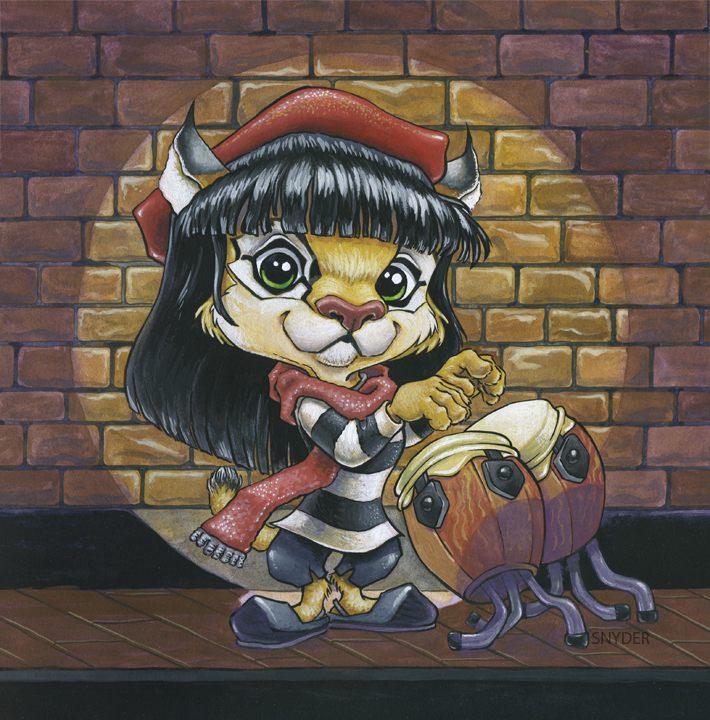
Wow, lovely character! I'm not sure which I like best, have you tried an intermediate version? It seems a pity to hide the textural details of the wall... Looking forward to seeing the other characters :)
That's so cute. I'm marvelling at the wonder of Photoshop. I'm hoping someday I will understand it! For now, crop, resize, erase and the magic healing tool are about all I know and those are still iffy. :)
31 Days of Halloween continues! Here is the card for Thursday, October 14th - Doug Bradley as the infamous Pinhead from Clive Barker's classic Hellraiser (1987). This card is currently up for grabs - $20.00 plus $5.00 for shipping, flat rate. If interested, please email me at [email protected], subject heading "Pinhead Sketch-Card." More on 31 Days of Halloween.
0 Comments on October 14th - Pinhead as of 1/1/1900
“It Came from the Nightosphere!” is an exceptional episode of Cartoon Network’s Adventure Time that combines inventive drawing and animation with funny, heartfelt storytelling. It aired last Monday, which was the show’s second season premiere. Writing and storyboarding duties belonged to Adam Muto and Rebecca Sugar, while the story is credited to Merriwether Williams, Steve Little, Patrick McHale, Pendleton Ward, and Thurop van Orman.
I wrote a song for this episode, Marceline sings it at the beginning while Finn beatboxes. When Pen pitched this storyboard to CN, he beatboxed as Finn and I played the music on a uke and sang as Marceline. It was super terrifying, my first network pitch.
I also did all the monster stuff at the end! Adam Muto did all the meat in the middle! Generally, in our episodes, anything that is actually witty was done by Adam. I’m usually responsible for sex jokes and violence.
Also, just for fun, here’s Sneezy, a short animation piece that Adam created with Pen Ward a few years back. The stylistic evolution and growth from Sneezy to Adventure Time is fascinating to watch:
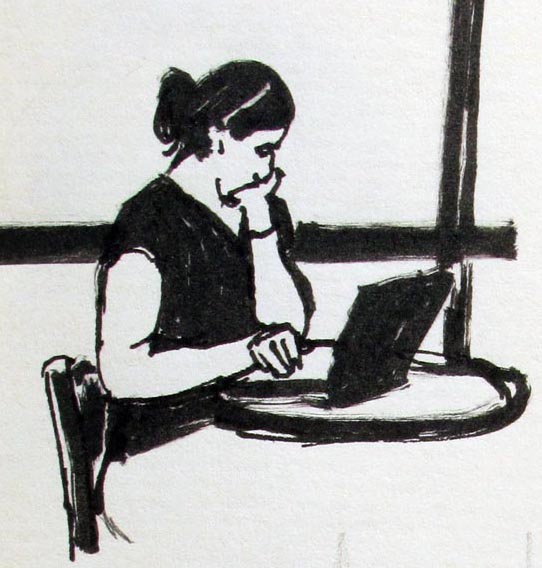
Jeanette and I have been mooching Wi-Fi from coffee shops like everyone else does. She did this sketch of a cafe patron using a Micron brush pen.
I guess we’re part of an alarming trend. In one Starbucks, we noticed 14 patrons. Eleven of them were busy with laptops, two were interested in hand-held devices, and one was a kid playing quietly with an empty coffee cup.
Nobody spoke, except to say, “Do you mind if I plug this in?”
13 Comments on Cafe Culture, last added: 10/16/2010
The little town I live in is bucking this trend because two of our three cafés are 50 yr old local businesses with no interest in wifi. You go in there and it's noisy - people stop in, see someone they barely know, and start chatting. Definitely an older crowd, though - you don't find many 20 yr olds at wifi dead zones.
I wonder, when today's 20 yr olds are 70, will they have discovered the value in talking to people rather than messaging them?
I live in a house with my girlfriend and two other room-mates. We all have computers, and at times we'll all be on them in separate rooms of the house. In these situations we sometimes email or instant message each other rather than walking down the hall. We still have sit-down dinners together at the table every night though, so it's not like we're going to forget what each other look like, but it is still a bit odd.
We now live in a fairly rural area where our internet options are very limited (one prvider for our area). If you go in to town or another town, they have some wi fi coffee shops. I suspect that anything people can do to save money, they are doing it, including using someone else's wifi. I actually think that is the real trend.
It's the same on the train I take to get to work, everyone is on their iPhone/Blackberry/laptop including me some of the time, although I try to read a book if I can.
I find it funny to see this post, right as I was planning to get out of the apartment and go to a coffee shop to get some work done on a paper! I use wi-fi at cafes to keep me connected while I do work, and at the same time get me out of my apartment, where I'm more easily distracted.
I've had a cafe patron move to a different table outside my line of vision when they noticed I was up to something with those suspicious-looking ink brushes.
Besides setting up to reduce head movement, are there any other tricks to surreptitious people sketching?
ooh sometimes that annoys me so much! I liked it better when Starbucks limited their internet to at&t customers. Now every time I go all the good seats are taken by laptop users. If I'm lucky, I'll find a seat outside, where the sun is burning and all the smokers hang out.
the iphone thing bugs the hell out of me. all my friends have iphones, and many times during a conversation, they'll glance down and fiddle with it, WHILE I'M TALKING TO THEM! :) Do they not think I would notice?
In Melbourne, Australia we have cafes absolutely everywhere! I've only used wifi when I was changing internet plans at home but I noticed a lot of travelers use it.
Tiffany - I got a friend who does that iphone dropout while talking to them. I even made a word for it to tell him off... "iphoning", as in "hey you're iphoning again, pay attention!" :)
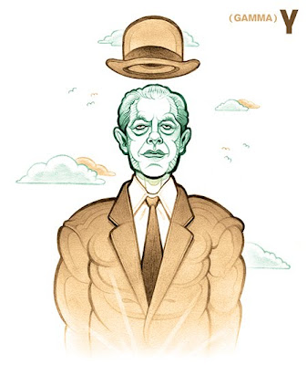
[Drawing Inspiration is a portrait-and-profile feature highlighting the outstanding figures of the art world—and!—my monthly contribution to the art and design blog, Illustration Pages.]
0 Comments on Drawing Inspiration: René Magritte [γ] as of 1/1/1900
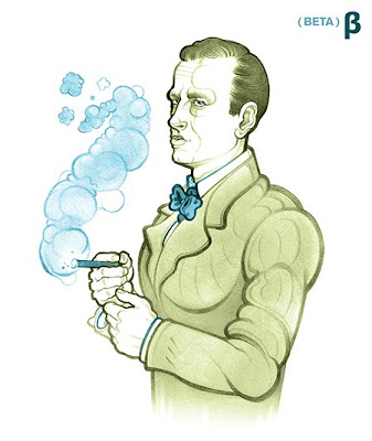
[Drawing Inspiration is a portrait-and-profile feature highlighting the outstanding figures of the art world—and!—my monthly contribution to the art and design blog, Illustration Pages.]
2 Comments on Drawing Inspiration: Otto Dix [β], last added: 10/16/2010
[Drawing Inspiration is a portrait-and-profile feature highlighting the outstanding figures of the art world—and!—my monthly contribution to the art and design blog, Illustration Pages.]
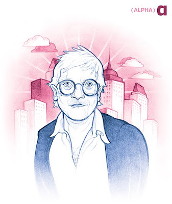
0 Comments on Drawing Inspiration: David Hockney [α] as of 1/1/1900
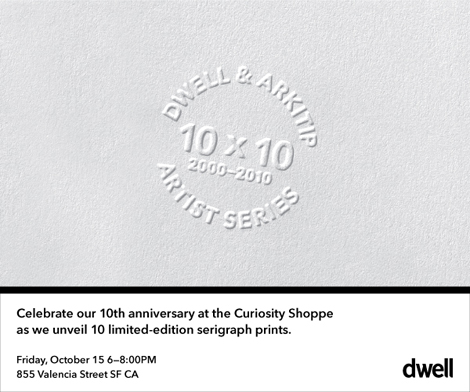
Dwell magazine is turning 10! To commemorate the event, they’ve produced a series of limited-edition serigraphs in collaboration Arkitip and some of their favorite artists. These posters will be on display at the Curiosity Shoppe in San Francisco, starting this Friday the 15th, and running through the end of the month.
If you’re in the area, stop by and say hello! The Curiosity Shoppe is located at 855 Valencia Street in San Francisco’s beautiful Mission District.
(Illustration by Gina Triplett, Creative Direction by Sally Morrow)
Episode 55 of the Escape from Illustration Island Podcast features an audio interview with Sally Morrow, Creative Director for Sandstrom Partners. Together we discuss her experiences in working for a design firm as well as her approach to seeking out and working with Illustrators.
Here are links to some of the things mentioned on the show:
Fun photo shoot on Wednesday morning for a high school year book class picture. I was the test shot before they arrived. Great kids...
Read the rest of this post
Pillow Peter is a junior year film made by Nigel Clark at the School of Visual Arts in New York. It’s an eccentrically drawn film about an eccentric boy who loves pillows. The droll storybook narration works perfectly as does the short’s gentle tone, which masks the heartbreak beneath the surface. Share your thoughts on the film here.
Pillow Peter is a junior year film made by Nigel Clark at the School of Visual Arts in New York. It’s an eccentrically drawn film about an eccentric boy who loves pillows. The droll storybook narration works perfectly as does the short’s gentle tone, which masks the heartbreak beneath the surface.
Nigel, who’ll be answering questions in the comments, made these observations about his film:
Pillow Peter starts out happy and then gets sad, very very sad. I hope you find it funny when Pillow Peter is happy; I also hope you find it funny when Pillow Peter is sad. If you cannot do that for me, I hope that you can at least find it sad when he is happy and sad when he is sad. Actually it would be even better if you find it happy and sad when he is happy and when he is sad, and then you could get hungry or something.
Aside for having once been a small boy, I have known a catholicity of small boys. This has lead me to an understanding. Small boys (and girls) don’t realize what is going on out there in that big wacky world of ours. Eventually most of these small people experience experiences that educate them as to what is out there. This painful education process may be more or less extreme than what Pillow Peter experiences, but regardless, the experience or experiences remove something from them. I am not sure if that something is innocence or naivety but what ever it is, it is irretrievable.
I’m not sure even Disney knows about this… Thanks to animation historians David Gerstein and Cole Johnson, The Museum of Modern Art has just finished restoring two lost Laugh-O-Grams cartoons they had long held in their archives, previously misidentified under alternate titles. International animation archivist Serge Bromberg (Lobster Films) is going to host a showing of the new prints on Halloween, Sunday October 31st at 2pm.
Cole Johnson located Goldie Locks and The Three Bears at MoMA under a 1929 sound reissue title “The Peroxide Kid” and Gerstein recently identified the lost Jack The Giant Killer, which the Museum had under the name “The K-O Kid”.
In addition to the two new discoveries, newly preserved and restored prints of Little Red Riding Hood, Puss In Boots and The Four Musicians Of Bremen will be screened at MoMA along with Disney’s original 1921 Laugh-O-Gram sample reel and several Ub Iwerks cartoons – Flip the Frog in Techno-Cracked (1933) and the ComicColor Don Quixote (1934).
Bromberg is coming in from Europe for MoMA’s annual To Save and Project festival to introduce the Laugh-O-Grams screening and provide piano accompaniment. The program will repeat only one more time, later that week, on November 4 at 4:30pm.
The two Laugh-O-Grams not being screened, Cinderella and Jack and The Beanstalk, are not held by MoMA. Beanstalk was also long considered lost, but has also been discovered by Gerstein in a private collection. This means that all seven 1922 Disney Laugh-O-Grams fairy tales – Holy Grails to Disney historians – are now known to exist.
For more background information on this incredible find, read David Gerstein’s blog for the full story.
The prompt for Illustration Friday this week is transportation. If you could travel any way you wanted, what mode of transportation would you choose? I’d pick something fun, like flying by paper airplane, if it were possible.
Paper Airplane Night Flight
Jumping out of the airplane might be fun too …
Parachute Chicken
… as long as your parachute opens! Eep! Maybe I should stick to something closer to the ground, like skateboarding.
Skateboarding Chicken
Then again, since I don’t have a skateboard anymore and I’m not a chicken, I’ll pick something I do on a regular basis.
Fun While Grocery Shopping
But only until they invent paper airplanes that you can fly in. What kind of transportation would you choose, if you could choose anything? Have you ever had grocery cart races? (I have!)
10 Comments on What’s your favorite mode of transportation? (Illustration Friday), last added: 10/15/2010
Love the Airplane image. Nice perspective and composition.
C.K. said, on 10/14/2010 1:10:00 PM
You have me wanting to fly by paper plane now. What a view! My husband and I were tempted to take the grocery cart for a spin the last time we went shopping but nope, never had grocery cart races. Sounds like I’m missing out! I keep seeing the shots of blimps in TV show Fringe and thinking how cool that would be (http://thumbsnap.com/i/zWz8eMlj.jpg).
stephanie said, on 10/14/2010 1:23:00 PM
Damon, thank you!
C.K. The view from a paper airplane would be amazing! I’m guessing you could use a glider, but it wouldn’t be the same. Cool view from the blimp though. That’s another cool option (as long as it wasn’t the Hindenburg). Grocery cart races are fun, but don’t get caught! Probably something best done at night, or when in high school or college. Haven’t raced for a loooong time, but I do ride once in a while
Ann Pilicer said, on 10/14/2010 7:17:00 PM
Oh how wonderful! This is great I get to choose too! I love you perspective of the paper airplane. That would be fun! Oh and I definitely tried the shopping cart. Now my kids have all the fun! wonderful animal characters! Great job! love it all! okay I will stop now!
adrienne said, on 10/14/2010 7:36:00 PM
Cute images! It’s been too long since I took a grocery cart for a spin.
stephanie said, on 10/14/2010 10:05:00 PM
Ann, thanks for the comments and the enthusiasm! Next time you’re at the grocery store, take a ride
Adrienne, thank you! What are you waiting for? It’s time for you to get back on the (shopping) cart and have some fun!
Donna Earnhardt said, on 10/14/2010 11:16:00 PM
I might choose a firebreathing Gryphon. As long he was tame, of course. And I didn’t have to feed him or clean up after him.
No wait – I’d rather travel by dragonfly. They are beautiful and I’d look so cool riding on one. I’d prefer one that looked cool with a tatoo. They seem like the kind of bug that would have one of those, don’t ya think?
(thanks for stopping by my blog today, too)
hugs,
Donna
Anne M Leone said, on 10/15/2010 1:44:00 AM
Pegasus, definitely.
Beautiful images! Your art is always so much fun!
Momo said, on 10/15/2010 3:04:00 AM
Love the night flight on a paper plane.
Ann Pilicer said, on 10/15/2010 5:46:00 AM
Hi! thanks so much for visiting and your wonderful comments on my blog! I use a combo of gouache,watercolor and ink. Thanks for asking. Great chatting with ya! I look forward to seeing more of your illo’s
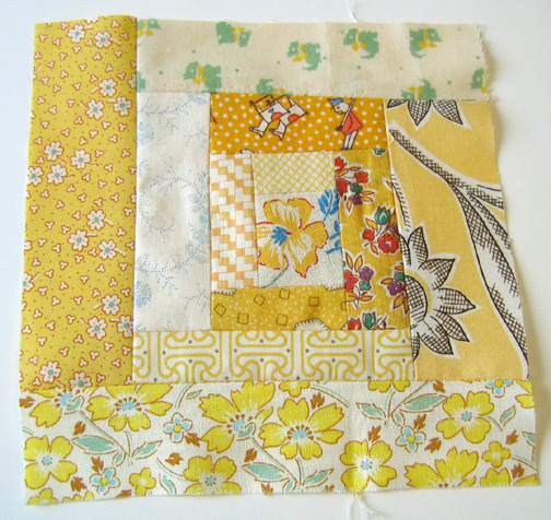
I've been wanting to make a yellow quilt forever. So just in time for the rainy days we've been having, I've finally gathered up the yellow prints I had on hand. I've never sewn a log cabin quilt square before, but I've read online that it's addictive. Now that I've made my first one I can confirm that it's true! I decided to do my cutting freehand, just making strips as I went along and not worrying about having them all be the same width.
I like the result. At the end I will true up each square using a cardboard template and then when I join all the squares my quilt won't be too wonky! At the end when I have a stack of squares I can arrange them before joining them together and make sure the quilt is balanced. I'm not sure yet whether I'll add sashing (extra strips between the squares).
As usual I have hoarded tiny scraps of my favourite prints, so it's been very nice to finally be able to use even the smallest pieces. Things have been busy lately so this quilt could go very slowly, but I've decided I'd rather just do a square at a time, and not cut it all out beforehand, and maybe even not do any chain piecing. I've found it very relaxing to just choose and cut a piece at a time and put it all together.
This square went together very quickly so I think you could whip up a quilt top this way in no time. For the quilt back I think I'll just keep an eye out for a vintage sheet with some yellow. My quilt is going to be so cheerful!
3 Comments on Yellow log cabin quilt, last added: 10/15/2010
I decided to go up to our attic today in search of some brown kraft paper and came out with a gigantic ruler of some sort, my old books lots of ‘em! and a very pink cutting matt which is something I’d been meaning to buy so I’m pretty psyched about this find.
This very pink cutting matt probably use to belong to my mom (use to…because it’s mine now). I don’t know if many people know this about my mother but she’s quite a talented seamstress and I think she could have been in fashion had she opened her mind to that calling in her yester-years, but instead she became a teacher and makes a hobby out of her dressmaking skills…which is all fine and dandy!I’m just really glad she got past her “I’m going to make dashiki’s for everyone” phase..
Oh Yah and I totally found my copy of one of my fav books ever that I picked up during my internship at Sesame…ahh those were really good times… I’m looking forward to reading this again.If you have yet to read Stink: The Incredible Shrinking KidI totally suggest you pick it up soon, it’s a fun read for those who are just starting out with chapter books…like me…HAH!


.jpg?picon=1009)


.)
great character!
Wow, lovely character!
I'm not sure which I like best, have you tried an intermediate version? It seems a pity to hide the textural details of the wall...
Looking forward to seeing the other characters :)
That's so cute. I'm marvelling at the wonder of Photoshop. I'm hoping someday I will understand it! For now, crop, resize, erase and the magic healing tool are about all I know and those are still iffy. :)
great, strong image--can't wait to see the other beatniks! really good idea
This is so boss! How fantastic!
Oh this kitty made me smile. Your work is great.