new posts in all blogs
Viewing Blog: , Most Recent at Top
Results 1 - 25 of 35
Statistics for
Number of Readers that added this blog to their MyJacketFlap:
By: Kali Ciesemier,
on 11/4/2013
Blog:
(
Login to Add to MyJacketFlap)
JacketFlap tags:
Add a tag
Thanks for all the support on my blog, I truly appreciate every comment. However, in the interests of trying to post more, work more, and simplify my life, I'll be making any new posts about my work on my tumblr. I hope you'll join me there! http://kalidraws.tumblr.com/
By: Kali Ciesemier,
on 8/20/2013
Blog:
(
Login to Add to MyJacketFlap)
JacketFlap tags:
Add a tag
Omoide Yokocho (otherwise known as "Memory Lane" or "Piss Alley") for Light Grey Art Lab's
In Place show.
Buy a print here!
Omoide Yokocho is a series of slim, cramped alleyways in Shinjuku, packed with yakitori stalls that can only fit 5-10 people at a time and salarymen looking for a drink after work. It's basically a timecapsule from post-war 1950's Japan, and it looks like an amazing place to visit. A lotta work & reference, but one of my favorite pieces I've done. Take a quick walk through via youtube,
here! And thanks to
Irene Koh for double-checking all my japanese signage!
Can you spot the cat? :3
By: Kali Ciesemier,
on 7/25/2013
Blog:
(
Login to Add to MyJacketFlap)
JacketFlap tags:
Add a tag
So it’s been a while since I posted anything…but that’s because I just moved! I’m currently in Philadelphia, which is a 5 week stop on my way to living in Brooklyn at the end of the summer. Alright!!
These pieces are from the June issue of Ebony, about the 7 deadly sins in relationships. Thanks to my awesome AD Lynn Galloway, who saw my
Mothers Superior illustrations and requested illos that incorporated text similarly. I had a fantastic time working on these modern-y illuminated manuscripts!
I thought of “Adam & Eve being tempted" as a general theme, but was asked to tiptoe around any direct religious connotation. It was a good challenge to try and figure out decorative shapes & images that hearken to ye olde manuscripts, but also ‘feel’ right for the mood of the sins. (Also, have you looked up medieval demons? These dudes are the
dooooofiest!)
If anyone needs any more illuminated manuscripts, lemme at ‘em!
By: Kali Ciesemier,
on 6/20/2013
Blog:
(
Login to Add to MyJacketFlap)
JacketFlap tags:
Add a tag
My piece for Mike Mitchell's SPACE! The Gallery Show, opening this friday at Gallery 1988 in LA! (with a ton of other amazing artists, oh man!)
I'm a lifelong sci-fi fan, and when I was deciding what to contribute to the SPACE! show I thought of my more memorable sci-fi experiences. Watching
Silent Running with my dad as a kid both fascinated and terrified me, and I've been interested in how nature fits into a space travel ever since. What are the logistics of putting something so beautiful and complicated into a very fragile & isolated location?
In the 1970's, NASA, with the help of Dr. Gerard K. O'Neill, studied a variety of plans for
space colony designs. I think it's notable that there was a lot of awesome
original art created for these plans to inspire people and generate interest in space travel. It's amazing that these same designs have also informed
so many modern day depictions of space stations in books, tv and movies!
In the spirit of those NASA illustrations (and after
doing a
silly amount of additional research) I made a travel poster for a new ecological space habitat of my own design!
Shoutout to
Sam for inspiring me to use
Google Sketchup....I've been watching him use it very effectively to make simple environment/perspective reference and decided to take the plunge myself. No way in hell I'd be patient enough to draw an inverted curved perspective otherwise!
Some of my preliminary process steps:
Having good perspective reference is invaluable. I made a simple mockup of my space habitat in Google Sketchup & took a screenshot to use in PS. It's a fiddly program...but it's free, and was definitely useful for this!
After taking the screenshot, I deleted everything except the lines in Photoshop, and colored them white. I drew my rough color sketch underneath so I could figure out what goes where!
Once the rough color sketch was in place, I started working out the colors and details more. (using adjustments/adjustment layers to fiddle with color)
Once I got the color figured, I added in even more rough details. After this, it's just a matter of polishing up the lines and shapes and adding some bits of texture on top!
By: Kali Ciesemier,
on 6/11/2013
Blog:
(
Login to Add to MyJacketFlap)
JacketFlap tags:
Add a tag
...aren't always the most relaxing. I was asked to illustrate an essay in Boston Globe magazine written by an author who prefers to just stay HOME during the summer and let everyone else clog up the roads and sweat out in the heat.
My AD suggested an uncomfortable roadtrip, and I thought that adding a glimpse of the cool and relaxing house she's leaving behind would be a nice contrast. (as a homebody at heart, I sympathize)
I myself will be moving apartments not once but TWICE this summer--in two different states no less--so I'm getting geared up for my own "uncomfortable roadtrip" haha. But! I'll be living it up in Brooklyn at the end of it, so here's to some future summer fun!
Thanks again to my AD Ryan Huddle!
By: Kali Ciesemier,
on 5/14/2013
Blog:
(
Login to Add to MyJacketFlap)
JacketFlap tags:
Add a tag
In between a few longer-term projects I've worked on recently, I've had a bundle of editorial pieces from various times this year that I've been slow in sharing. So here they are now!!!
Family Circle-- An illustration for a personal essay about a teachable moment that happened in a grocery store check-out lane.
 |
| Sketches |
 |
| Final |
Boston Globe-- For a personal essay about beer snobbery--craft beer enthusiasts are often labeled as snobs, but the people who exclusively drink Coors or Bud Light are just another kind of snob too!
 |
| Sketches |
 |
| Final |
The New York Times--A quick illustration for the Preoccupation column. The article was about the clash between older management and young college grads--the younger generation is having a hard time finding employment because many CEOs are skeptical of their workplace value.
 |
| Sketches |
 |
| Final |
Thanks to my ADs Amanda Kirk, Ryan Huddle, and Minh Uong!
By: Kali Ciesemier,
on 4/11/2013
Blog:
(
Login to Add to MyJacketFlap)
JacketFlap tags:
Add a tag
Here's a quickie illustration for today's New York Times Letters section! (it's less than 2.5 in tall in print! Eee, so cute) You can find the letters & my piece online as well!
The letters are all in response to the
Op-Ed article "The Secrets of Princeton", which argues that the social connections that happen in elite universities are far more important to the graduates' success and privileged standing than is generally acknowledged. "It's not what you know, but who you know"
My ivy-centric sketches:
Thanks to my AD Alexandra Zsigmond for the chance to draw some secrets!!
By: Kali Ciesemier,
on 3/28/2013
Blog:
(
Login to Add to MyJacketFlap)
JacketFlap tags:
Add a tag
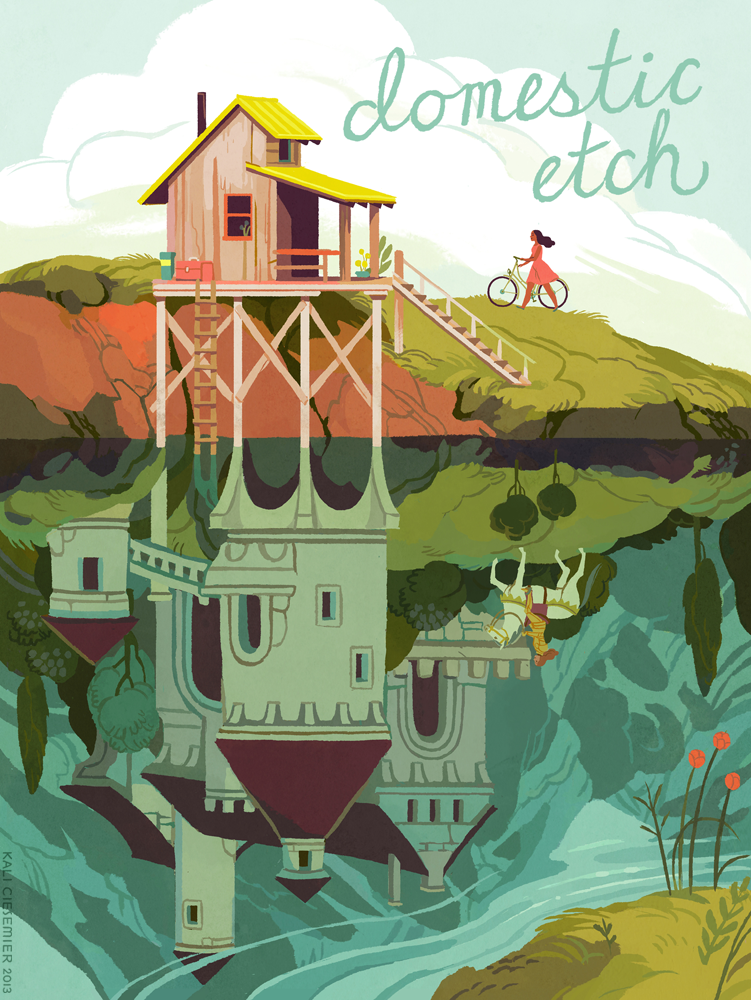
Hey guys!
I wanted to post my cover illo/design for an upcoming issue of
Domestic Etch magazine! The theme was “The Past”, and of course I wanted to draw a medieval alternate reality! It was a while back, but I’m very happy to report that my cover was featured in the Society of Illustrators editorial show this year (along with this
piece, and
this one!) Thanks to my AD, Elizabeth Godspeed!
Also, I updated my
print store with a bunch of new pieces, including my Domestic Etch cover (minus the type), the rest of the images you see below, and more! Inprnt has seriously amazing print quality—the colors SUPER ACCURATE—so
check ‘em out if you need to fill some wall space with lady space marines or floating donuts!
By: Kali Ciesemier,
on 3/25/2013
Blog:
(
Login to Add to MyJacketFlap)
JacketFlap tags:
Add a tag
Mitzi, an American girl attending international school in Tokyo, discovers the mysterious Lost Property Office while searching for her friend Maki's homework in the sprawling Tokyo subway system. Mitzi gets her own chance to become a Finder like Mr. Motomeru and his nephew Yuki, and she soon learns that there's more to Finding than traveling through space-time!
This is a two-part young adult short story by Marji Napper in the March and April issues of Cricket magazine. It was a lot of fun to illustrate and research (Tokyo subway tunnels! Japanese houses! Tokyo Station in the 1930's!) and I'm pleased with the results. I worked on both chunks of illustrations at different times, but I tried to keep the feel and colors relatively tied-together.
Thanks to my AD Karen Kohn--I met Karen way back when I was still in college and I interned at Carus Publishing for a summer. I subscribed to Cricket magazine when I was a kid, so it was wonderful to get a chance to contribute!
Looking at the images all together, what I remember most are the things I was listening to while I worked on these illustrations. For the last 3, I specifically remember listening to the Feast for Crows/Dance With Dragons
audiobook mashup, Victo Ngai's
interview on
Your Dreams My Nightmares, and Stella live in Boston. This seems to happen with most of my illustrations....the strongest memories are what I was watching or listening to while drawing them. Go figure, brains!
By: Kali Ciesemier,
on 3/18/2013
Blog:
(
Login to Add to MyJacketFlap)
JacketFlap tags:
Add a tag
My contribution to the Lady Knights//Women Warriors zine! I'm psyched to be in it with all the other awesome contributors, every piece i've seen for it looks RAD. Thanks to
Abby,
Julia, and
Roxie for putting it all together--they'll be selling at MoCCA!
I've always had a thing for mysterious heroes, and I recently started a love affair with motorcycle ladies. (this one is a
bosozoku bike!)
When I was asked to be in the zine, I was already considering making a book of my own warrior women...I'm even more excited now, so we'll see!
By: Kali Ciesemier,
on 2/20/2013
Blog:
(
Login to Add to MyJacketFlap)
JacketFlap tags:
Add a tag
Before spring swings into full bloom, I wanted to share another postcard I created for french fashion designer Anne Fontaine! I had a great time working with them on a Bastille Day postcard and was happy to try my hand at it again for a holiday-season themed mailer!
I was provided with photos of one of their new winter coats & bags, gloves, belt, a neck ruff, and a pair of cute booties. They wanted a Karlie Kloss sort of look for the model, and the backdrop this time was to be another iconic french location like the Arc de Triomphe or the Pont Alexandre III bridge!
For my sketches, I actually spent a pretty long time looking for reference images of these locations that weren't your typical straight-on tourist views--I wanted to show a little more depth of space. (in the process I ended up looking through a lot of flickr accounts and french blogs!)
The Arc de Triomphe background was chosen, and we ended up changing the pose and the hair a bit. (it became sort of an inverse-pose of the previous Bastille Day postcard!)
When I was creating my color sketch, I couldn't decide between a purpley daytime background or a cool blue nighttime background (with or without snow!) so I left it up to the client. Before I finalize an image, I like to get the colors juuuust right, so I don't have to worry about changing them later! In the end, the snowy daytime background was chosen and I'm happy with the result! (but I still like the nighttime setting too!)
Thanks again to my contact Christina Ramirez-Madisson and Anne Fontaine for the lovely job!
By: Kali Ciesemier,
on 2/7/2013
Blog:
(
Login to Add to MyJacketFlap)
JacketFlap tags:
Add a tag
A fun one for MentalFloss magazine's Jan/Feb issue! No nuns this time, but there IS a haunted house! 50 Berkeley square is a townhouse believed to be haunted as far back as the mid 1800's--the reclusive owner at the time let the place fall apart, and there are tales of ghosts there that have actually frightened visitors to death!
The article is about whether the mysterious owner, Mr. Myers, was actually the inspiration for Dickens' Miss Havisham from Great Expectations. My AD wanted an image of a modern person exploring a decayed & spooky Georgian style townhouse, preferably with some nice blue/yellow colors. I thought it'd be nice to use a flashlight as the image's light source, and an interesting graphic element.
 |
| Sketches |
Despite its dark past, if you visit 50 Berkeley Square today, you will find the Maggs Bros. Antiquarian Booksellers housed inside! It looks pretty cute to me.
Thanks again to my AD Winslow Taft for the fun & spooky assignment!
By: Kali Ciesemier,
on 1/30/2013
Blog:
(
Login to Add to MyJacketFlap)
JacketFlap tags:
Add a tag
As part of my MAKE 2013 workshop, I led a project with all my participants for Light Grey Art Lab's Message in a Bottle show. It's a little show within a show--ours is called Searching For Secrets, and each person created a piece with a letter hidden inside. The pieces are arranged in order, so once you find the letter in each image, they spell out a message together! I couldn't be happier with all my participants' work, it's a great range of styles and subjects with plenty of mystery to go around (and letters hidden in different ways!) Take a look and figure out the message for yourself!
The theme I gave everyone was Searching for (or discovering!) a secret.
Here's mine, 'Relic'
 |
| Can you find my letter?? |
Part of the project was challenging everyone to use
informal subdivision to help come up with sketches. I felt that the working method itself is appropriately secrets-themed--you're looking at a bunch of lines and trying to figure out an image hidden within them.
Here's my informal subdivision lines and the sketch I settled on:
I actually had a million other sketches, but lost the file with all of them in it. D'oh!
I thought that something sci-fi themed would be fun to draw--I've been reading a lot of cyberpunk recently (Snowcrash, The Diamond Age, Neuromancer) and visions of dirty dystopian futures have been floating around in my mind.
I ended up moving the whole image down a bit for better compositional value, which means my final image doesn't line up with my informal subdivision quite as well. However, I think the main value of informal subdivision is to
suggest composition and generate ideas. If you decide to work with informal subdivision and think that something doesn't look right, change it!
Thanks again to all my participants for their fantastic work! You guys did great.
By: Kali Ciesemier,
on 1/22/2013
Blog:
(
Login to Add to MyJacketFlap)
JacketFlap tags:
Add a tag
 |
| Starting things off! |
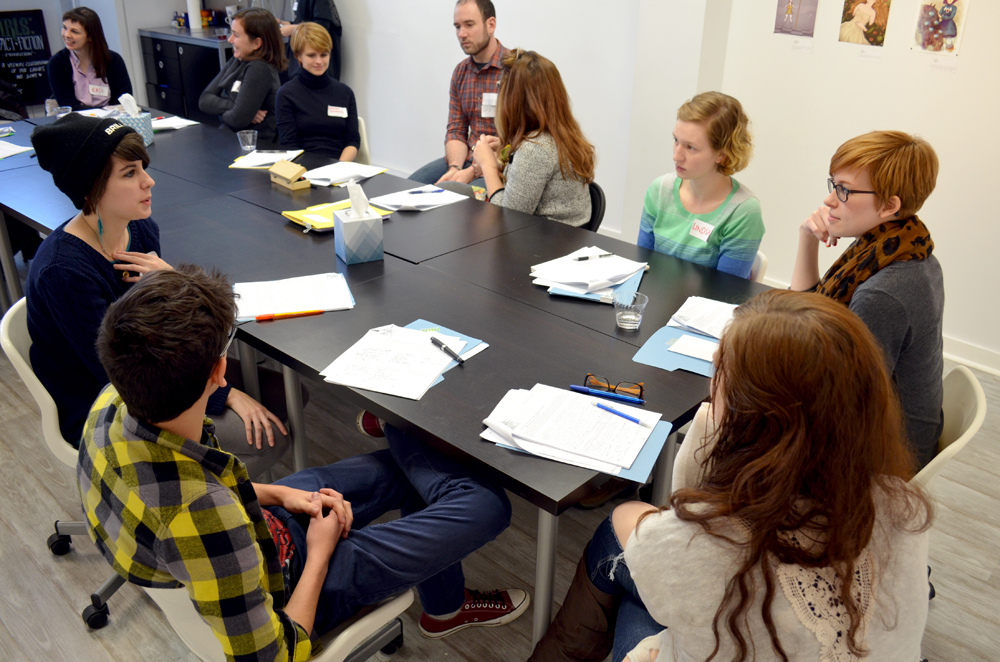
First off: Whoa! What an amazing experience! Its already been 2 weeks since my MAKE 2013 illustration workshop that I led at Light Grey Art Lab, but I still get the warm-and-fuzzies when I think of all my awesome participants and and the LGAL crew!
For a blow-by-blow breakdown of everything we did that weekend, be sure to read Light Grey Art Lab's lovely
writeup of the workshop! You can also take a look at alllll the photos from the weekend
here! (which is where I got almost all my photos for this post. Thanks Chris!)
Freelance illustration can often be an isolating pursuit, so it was a real treat to be reminded of all the fun that happens when you get a group of artists talking and sharing together in one room. All of my participants came from different walks of life and various career paths--students, designers, animators, freelancers, company artists--and it was really eye-opening for me to hear about all of their goals and experiences. As a bonus--the chilly temperature in MN has made my Baltimore winter feel positively breezy in comparison. ;)
Our talented panel guests
Brad Mcginty,
Alyssa Thomas &
Allegra Lockstadt were also very generous and informative about their own practices! Good insights all around and great to meet them all!
 |
| From the left: Brad, Allegra, me & Alyssa! |
Overall, I wanted to write up a few key things that I took away from the workshop:
1. Holy cow, everyone is awesome!!
2. Everyone has a different goal and a different timeline. And that's as it should be! It's easy to sabotage yourself by comparing your path to others (I've definitely been guilty this) but racing against other people isn't healthy, and it's not helpful. There is no One True Road To Success, everyone has different needs and different steps. At the workshop we all analyzed what we really wanted out of life and work and then came up with a doable step-by-step plan for how to achieve our 2013 goals. It was a great exercise, and made me realize that some of things I
thought I wanted weren't actually the important goals for me. It's all too easy to set lofty ideals for your work and then become disappointed when you don't reach them. Breaking an overall goal (like working on jobs in a certain field or balancing work/life) into tiny monthly chunks is much more palatable and easy to fulfill. My own biggest goal is to try and separate, equalize, and maximize my social time and my working time!
3. Artists LOVE to make things hard on themselves. I think everyone does this in one way or another--agonizing over the tiniest details, feeling guilty about doing or not doing a particular thing, for being at a particular place in life, for working too hard or not working hard enough. It's easy to feel like you're alone in this situation
, but
everyone feels unsuccessful sometimes, and sometimes quite often. I certainly do! And actually hearing all the same insecurities from other people at the workshop made me realize that this is a massive delusion--if we all feel like we're insufficient in ways other people aren't, it can't be true. So why torture yourself needlessly? Self-criticism & self-doubt is definitely healthy and needed, but it was a good reminder that giving yourself some love and forgiveness should be just as important. Feel pride in what you have accomplished as a creative person and don't give up!
4. Share! In my experience, when you are generous with other people, they are more likely to be generous with you. It sounds so cliché, but you can learn a lot from others by giving away your own resources. You can also learn a lot about yourself! Most of my illustration decisions/processes were internalized or just intuition when I graduated school. However, in the process of teaching/blogging/workshopping, I started to analyze the differerent aspects of image creation, how I do it, and how I'd present it to other people. That got me thinking about the decisions I make, why I make them, and how other people approach the same things. Working consciously and sharing with others has been so helpful to me in generating new insights about myself and illustration in general.
 |
| You guys are the best! |
This was my first workshop and I REALLY HOPE it isn't my last! My time in Minneapolis was the perfect experience I needed to get reinvigorated for the new year, and I can't wait to see where my participants go from here! Big thanks to everyone who came to the workshop--I can't believe we had people from all across the US (and Canada!) and every single person was so friendly, generous, and talented.
 |
| From the left, thanks to Lindsay, Chris, Jenny, Jared & Francesca! And if you THINK that I added Jenny to this image through the magic of photoshop...you are clearly mistaken. |
I certainly wouldn't have been able to do this without the Light Grey Art Lab crew. Huge thanks to Lindsay Nohl, Chris Hajny, Francesca Butchko, Jenny Bookler and Jared Tuttle for inviting me to lead the workshop, chauffering me around town like royalty, regaling me with stories and delicious food, and organizing every single thing so it ran without a hitch. Lindsay was my go-to gal in the planning stages and a huge help in figuring out workshop activities and schedule--she is such a pro and it was a real treat to talk shop with her. I was also super inspired by the thoughtfulness, collaboration, and talent that Lindsay, Chris, and Francesca share together as
Paper Bicycle. Overall, the effort that Jenny, Lindsay, Francesca, and Chris take to organize LGAL shows and events is amazing. What great people all-around!
Lastly, as part of the workshop, I gave everyone (including myself) a group art project! I'll be putting up my piece a bit later this week and hopefully linking to all my participants' work as well! Everyone's awesome work will be seen in a special section of the
Message In A Bottle show at Light Grey Art Lab, opening this friday, so check it out!
By: Kali Ciesemier,
on 1/14/2013
Blog:
(
Login to Add to MyJacketFlap)
JacketFlap tags:
Add a tag
Happy 2013! Man, time flies.
I've been so busy working and teaching over here (I will be putting up a post about my workshop with Light Grey Art Lab soon!) that I've been neglecting a bunch of pieces to share with you guys...I'm going to try and post at least once a week and get things back on track again. Let's do this!!
Okay, so a while back I was asked to do another illustration for Ebony magazine, this time about the supposed difficulties in getting married for college-educated women. Spoiler alert: not true! The marriage gap between women with and without degrees just doesn't exist anymore, and although college graduates do tend to get married later in life, they also have lower rates of divorce.
 |
| My sketches--I still really like the one on the right, too! Maybe I should make it into another illustration? |
 |
| My color sketch with the layout mock-up. Had to reposition some things! |
Thanks again to my great AD Lynn Galloway!
By: Kali Ciesemier,
on 12/18/2012
Blog:
(
Login to Add to MyJacketFlap)
JacketFlap tags:
Add a tag
Is a snowy, seasonally-appropriate holiday season too much to ask?? Baltimore seems to think so...it's either been unusually warm, or just sort of rainy over here. At least I got to draw some snow for the Dec/Jan cover of The Progressive!
I was tasked with making a typographical cover about issue's theme, "Living Our Values".
All of the writers' values were wide-ranging, so at first I thought it'd be interesting to put different illustrations inside of the "Living Our Values" letterforms. However, I was disappointed to find that I couldn't get the letters big enough to actually be usable spaces for images!
So, after re-reading all the articles, I thought that the main connecting thread was a hope for a better future and a connection with the land/people/environment. I thought that a snowy, unspoiled new-years landscape, with a person just stepping out of of their cabin to enjoy the vista, might work as a symbol for a new beginning.
My AD thought so too, so I tried out some other variations! One of my ideas was to incorporate the sun as part of the Progressive title, and we ended up using it.
I submitted several color variations for the title--this was one of the other options that I liked, besides the red-lettered version which they ended up choosing.
Hand-lettering the whole thing (title included!) was a little intimidating at first, but I'm pleased with the result. I'd love to do more environment-based (or typography-based!) illustrations in the future. Thanks to my AD Nick Jehlen for the fun assignment--and I get to share the issue with lovely illustrators like
Victo Ngai &
Yuko Shimizu to boot! Happy Holidays guys!
By: Kali Ciesemier,
on 12/3/2012
Blog:
(
Login to Add to MyJacketFlap)
JacketFlap tags:
Add a tag
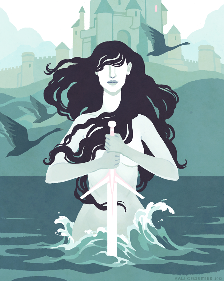
The Lady of the Lake, for the GIRLS: Fact or Fiction art show at Light Grey Art Lab! She was my first choice—what’s not to love about a mysterious, super-powerful, watery maiden, from the tales of King Arthur? I think the most interesting thing about her, to me, is that her exact identity is so vague (it’s thought that she may be based on celtic water deities or nymphs) and yet she had such a big impact on the events in Arthurian legend.
You can buy a print of my Lady
here!
I’m sure you’ve already seen some of the other amazing contributions to the show, if not,
take a gander! The collected book and all the other prints are all available for purchase there. Plus, if you spend $100 on ANYTHING in the store before the 7th, LGAL will give you a free GIRLS book!
Footnote: The black swans in the background are a small tip of the hat to NC Wyeth's gorgeous Excalibur piece! What a guy.
By: Kali Ciesemier,
on 11/13/2012
Blog:
(
Login to Add to MyJacketFlap)
JacketFlap tags:
Add a tag
I recently had the pleasure of illustrating some kickass nuns for Mental Floss magazine's December issue! Thanks to my AD Winslow Taft for the fantastic layout and the idea to have me do the illustrations in illuminated manuscript style. It's always been really fun for me to try and imitate other illustration styles (
japanese woodblock prints,
art deco) and it's a good challenge to try and add my own twist while still making the style recognizable.
 |
| Sketches! |
I had a grab-bag of cool ladies from different centuries & locations to inspire me, including Ani Pachen (tibetan warrior nun), Katharine Drexel (fought against the Ku Klux Klan & segregation), Hildegard of Bingen (a crowd favorite in the 11th century), Juana Ines de la Cruz (intellectual, writer, early feminist from the 17th century), and Dolores Hart (former hollywood actress).
 |
| The final layouts! |
There were so many individualized stories so I tried to keep the illustrations general in scope (pursuing knowledge, fighting against the forces of evil, etc.). However, because Ani Pachen was the only tibetan nun, I thought it'd make sense to show her specifically. She led 600 tribesman on horseback to fight against the Chinese army. Pretty cool!
All in all, a really fun assignment.
By: Kali Ciesemier,
on 10/25/2012
Blog:
(
Login to Add to MyJacketFlap)
JacketFlap tags:
Add a tag
Big news! Are you ready to get creative in 2013?? I am! And I am
so excited to announce that I will be leading a
2.5 day intensive illustration workshop at Light Grey Art Lab in Minneapolis, January 4-6! The wonderful Lindsay Nohl (of
Light Grey Art Lab &
Paper Bicycle) contacted me about putting this workshop together. Lindsay has a lot of great resources around Minneapolis and at LGAL to draw on (and had previously set up an
illustration bootcamp with Meg Hunt), and it's great to be partnering with her & the LGAL crew!
We'll be covering a lot of ground in a lot of different ways, including group discussions, one-on-one creative sessions with me, talks with other industry professionals, and a big fun illustration meet 'n greet party! We'll be talking about creativity and idea generation, the business and practice of illustration, illustration process, and more!
Plus we'll have an exciting in-studio project which will be featured in the gallery. This will be a collaborative experience, and whether you're a current creative professional or just want to kick-start your art in 2013, we'll be working together to help & inspire each other!
Space is limited to 18 participants, so reserve your spot now!
You can see Light Grey Art Lab's writeup on their
blog, and check out the
sign-up page for the full schedule, specifics, and prices!
Looking forward to seeing you there!
By: Kali Ciesemier,
on 10/9/2012
Blog:
(
Login to Add to MyJacketFlap)
JacketFlap tags:
Add a tag
Over the summer, I designed a postcard image for french fashion designer Anne Fontaine! The company was looking for an illustration for their Bastille Day event mailer and I was happy to oblige.
Chic ladies in Paris? Yes please.
They wanted an image that incorporated the Eiffel tower and the french flag, as well as showcasing one of their signature bags & all-white outfits. (it was fun getting a sneak-peek of the new clothing they were introducing!)
They chose the walking sketch on the right, but requested that I add a shopping bag & some Bastille Day fireworks as well.
After a last minute costume-change, voila! A chic Anne Fontaine woman, running off to a Bastille Day party after shopping at her favorite store!
Thanks to my contact Christina Ramirez-Madisson and Anne Fontaine for the lovely job! (and thanks to fellow MICAn Haniya Rae!)
By: Kali Ciesemier,
on 9/24/2012
Blog:
(
Login to Add to MyJacketFlap)
JacketFlap tags:
Add a tag
QUITE the belated post here, but I just wanted to say a giant THANK YOU to everyone who stopped by and said hello (or bought something!) during SPX. It was lovely meeting you all face to face! I had such an amazing time that weekend and every single person I met—both exhibitors & attendees— was so kind, welcoming, and excited! It was a giant hotel full of talented awesome people! I feel lucky that my first exhibiting experience was so positive, I know Sam and I are definitely going to do it again.
I’ve been inside a maelstrom of work ever since I got back, (sorry about the lack of updates), but I have some posts on the horizon & will be putting the remaining samurai shirts up for sale soon!
I was so caught-up in SPX fun that I totally forgot to take any photos (nooooo!) So big thanks to
Burton Durand for the lovely shot of Sam & I’s table, &
Russ Creech for the full-length photo!
By: Kali Ciesemier,
on 9/3/2012
Blog:
(
Login to Add to MyJacketFlap)
JacketFlap tags:
Add a tag
Hey guys! This year my friends and I have 2 tables at
SPX—
Sam & I are sharing one, and our talented pals
Andrea &
Jimmy are sharing the one right next to us!
I’m going to primarily be selling prints this year, and I need your help to figure out which prints I should bring!
Of the prints above,
please let me know what your top 5 favorites are. Which would you wanna buy? (and for those of you who have already given me your picks on tumblr or twitter, thanks so much for your help!)
Also, for anyone who won’t be attending SPX, these prints are also available from my inPRNT shop, and there’s a Labor Day sale today!
By: Kali Ciesemier,
on 8/28/2012
Blog:
(
Login to Add to MyJacketFlap)
JacketFlap tags:
Add a tag
Many months back I started and neeeeearly finished this piece, for fun, between work. I have been (and am currently) in a long busy stretch, so I didn't get the chance to put the finishing touches on it until last week!
This all started as a composition exercise. I was reading the wonderful Creative Illustration by Andrew Loomis (out of print, but
free pdfs available online) and he has a great section about informal subdivision as a compositional tool. Informal subdivision is a process Loomis created, where you divide your image space unequally (and somewhat randomly!) by drawing a series of horizontal, vertical, and diagonal lines. As he shows it in the book:
Once you create this dynamic linear plan for your image, you let it suggest your composition for whatever subject you have in mind. Here's the subdivision I made:
I didn't have a particular subject in mind, I just wanted to draw a lady. So I kind of just let myself meander a bit with the drawing.
I settled on the lady in the chair, who I made into a space lady (one of the best kinds of lady) who maybe got herself into some sort of a sticky situation.
Here's the final lined up with my informal subdivision.
It's a pretty fun exercise! It might be a little tricky to use if you need to have a specific sort of layout, but it's great for suggesting ideas. Try your own! Composition for all!
By: Kali Ciesemier,
on 7/30/2012
Blog:
(
Login to Add to MyJacketFlap)
JacketFlap tags:
Add a tag
Right on the heels of my last piece are two more illustrations for this past weekend's Boston Globe magazine! This time I was honored to be illustrating the cover again, as well as an accompanying page inside.
The theme of both illustrations was the power that moms wield through online networking (the cover is focused on the power, and the inside illo is focused on the connectivity). It's easier than ever for moms to connect and share tips, info, advice, and warnings on a variety of sites, blogs, and forums that are catered to them. From the article, "While a mom’s opinions once only stretched so far — to her local play group or over the backyard fence — now they are amplified and shot around the world with a keystroke. And if you make a mom mad, the power of her network is a force to be reckoned with." You can read the rest of the article
here!
The cover I made is a deliberate riff on Eugene Delacroix's Liberty Leading the People. I remembered the painting from my college art history class partly because it was the first time I learned about triangular compositions!
The revolutionary spirit also seemed to fit the article, though the editorial staff didn't want any moms with mean faces, so my ladies are a little more lighthearted instead of murderous.
There was limited time for both illustrations so the inside illo is more simplified out of necessity, but because the colors for both are all in the same families I think they fit together, and I enjoyed working in both styles.
Thanks again to my great AD Ryan Huddle for the assignment, and the fun layout he created inside!
Sketches for the cover:
Sketches for the inside illo:
By: Kali Ciesemier,
on 7/23/2012
Blog:
(
Login to Add to MyJacketFlap)
JacketFlap tags:
Add a tag
An illustration in this past weekend's Boston Globe Magazine about the uniforms for female Olympians. Some sport leaders want to create "a more female aesthetic", i.e. sex appeal, to draw in more crowds and attention for female sports--but this can come at the cost of athlete practicality and performance. This year boxing and badminton started requiring all female competitors to wear skirts, but later dropped the rule after bad press and complaints from athletes. Female beach volleyball players have always been required to wear bikinis (and some feel most comfortable in them), but the association recently changed their dress code to allow for shorts and t-shirts too. Yes, aesthetics can have a powerful effect--drawing a bikini'd butt will almost certainly direct attention to the article-- but I think the article's writer, Shira Springer, sums up the issue nicely "The Games should showcase the world’s best athletes at the peak of their abilities, and that means team uniforms should be about practicality and performance, not eye candy.
"Hear hear!Sketches:
Thanks again to AD Ryan Huddle! You can read the rest of Shira's article here.
View Next 9 Posts


Kali... will you marry me ?
Your colors are amazing ! ♥
I Love your work Kali, the compositions and colors are allways very, very interesting and the concepts are smarts too.
I attached this blog to mi list of awesome illustrators!
Cheers from Mexico
Daniel T. (illustrator)
jeje I also used the same photo for one of my drawings, what a coincidence!
alejandrofuentes.blogspot.com.es/2012/06/hace-unos-meses-empece-un-nuevo.html :P
I love how you solved the illustration, nice work!!❤