JacketFlap connects you to the work of more than 200,000 authors, illustrators, publishers and other creators of books for Children and Young Adults. The site is updated daily with information about every book, author, illustrator, and publisher in the children's / young adult book industry. Members include published authors and illustrators, librarians, agents, editors, publicists, booksellers, publishers and fans. Join now (it's free).
Login or Register for free to create your own customized page of blog posts from your favorite blogs. You can also add blogs by clicking the "Add to MyJacketFlap" links next to the blog name in each post.
Blog Posts by Tag
In the past 30 days
Blog Posts by Date
Click days in this calendar to see posts by day or month
Author/Illustrator Maurie Manning's blog focusing on "tradigital" illustration -- or using the computer as your pencil. Imagine a sketchbook with unending pages, inks that don't smear and drawings that can be shared instantly with friends all over the world. Welcome to my Digital Pencil!
Statistics for The Digital Pencil
Number of Readers that added this blog to their MyJacketFlap: 18
My boring, boring workstation! I used to have another large table to the left in an 'L' shape, but lugged it downstairs for my sewing machine room. So this is all that's left. (Hmm, need to recycle that 50 pound red Dell underneath the table. It has been unplugged for a year.)
The Cintiq slides easily forward like this when I draw. I keep the mouse underneath and just stick my hand between the legs of the cintiq to use it. Keyboard to my left so I can use my Painter or Photoshop shortcut keys. (I don't use the buttons on the Cintiq at ALL -- my brain is just too addicted to "command-Zing"
Just tilt the Cintiq up again and slide it back to use it for a monitor. The iMac screen to the left is where I normally have my email and whatever site I've been procrastigoogling. That's a TV above.
2 Comments on Cintiq Workstation, last added: 10/11/2010
Great set up, Mo! I think it's elegant. You have a TV in your studio? Yikes, I have a hard enough time staying off the internet. Second thought, it would probably keep me off the internet.
I dunno. Girl looks scary to me. Not often that I draw a picture that makes me burst into chuckles when I gaze on it. Poor doggie. I woke up with this illustration on my mind (I've been fermenting an idea for a new picture book starring these two) Click on the picture to check out the book cover mockup in my online portfolio and select the second thumbnail down.
Pencil was sketched directly onto Painter using the Cintiq, then faded the line back as a guide. On a second transparent layer used my favorite Painter pen -- the scratchboard tool -- to "ink" the drawing in brown. Next colored on the canvas layer with the digital watercolor, keeping it wet the whole time. Finished up modeling Bella's (the girl) face with the scratchboard rake. Probably could add some more modeling to Bronte's fur with the rake, but she was a "unique" looking cattle dog in real life (RIP my poor Bronte, who died last week) and I want to keep her DNA slighly ambiguous. Is she part pig? Part seal? Will have to think on this.
2 Comments on Bronte (hearts) Bella, last added: 6/22/2009
Oh no...just last week. I'm so sorry Mo! Why can't our pups live as long as people? I miss my Brandy every day! We will probably be getting a new golden next Spring. Or maybe a newfoundland...we'll see what's available at the rescues.
I can't wait to see this in book form! I have been working on a picture book ms ever since Brandy died last Oct. and still haven't got it right...
I'm not sure what 'edgy' is, but I like this one. She's fresh. I go through a similar process, I draw the same character over and over until one 'speaks' to me. I figure if they're talking they must be real. (or I must be crazy...maybe both)
I'm glad you like this one, Erin. I like it too, It's sort of my breezy style, the one that only takes a few minutes to draw and is (on a good day) full of happy mistakes.
I think "edgy" would be a character that is appealing in some way you can't quite define. Not: "MY GOD, what an adorable toddler!" But more along the lines of, "MY GOD, that kid looks like a total firecracker!"
I like this one and the former one, but think I also like the ruffled shirt better. I don't know exactly why, but it seems to work so well. Great "edge" to this little tyke.
Ugh. Marketing. It's so hard for an introvert like me -- especially when my publisher, Clarion, seems to be cutting costs everywhere. But a few weeks ago, my Google Alert sent me a link to Pinot and Prose after the blog's author, Laura Lutz, mentioned in a post that she was looking forward to seeing Kitchen Dance (which she declared a "foodie book" yay!) Laura is the children's materials selector at Queens Library in NY. Her excellent blog brings together two of my favorite things -- Food and Books!
You'd think since I head two kids book review blogs, (3 Evil Cousins and Toad Hill Reviews )I'd have had some clue to the joy an author gets when her book is reviewed online. But I didn't have an idea until Laura wrote this SWEET review.
Now if I can just convince Clarion to send out review copies when I ask them to, because I'm thinking blog reviews are completely going to replace printed reviews.
So -- for my very first book trailer I tried some of the free software that came with my computers, Windows Movie Maker and Microsoft Photo Story for the PC and iMovie for the Mac, but they seemed a little limited. I didn't want to spend a whole lot of money for Adobe Premiere, so I settled on Pinnacle Studio Ultimate for $129 bucks and I'm very happy. For sound effects I joined "The Freesound Project" which is a really cool site (and made me go out to buy my own little Sony digital recorder so I can start recording my own effects.)
This was a really fun little project. A few hours yesterday doing a "first draft," then a few more hours today tweaking in all the great input I got from my friends.
Your book looks like it's super fun. I just kept wanting the trailer to show even more! I guess that's the mark of a great trailer - showing even to intrigue, but not giving away too much that the viewer is satisfied and doesn't need to see the book. Well done.
Thanks, Kristi! I tried to keep SOME art for the book, teehee! It was so much fun though. I think I may do one more tweak if my brother sends me the bit of "voice" he promised to record.
This is great! Love the way the effect went slowly down the steps then jerked to where the kids were peeking in the door. The added sound effect of the pans clanging made it ideal. You're right, I have Windows Movie Maker and Photostory and they don't allow as much creativity, though Photostory 3 is OK :) Your book looks great!
. . . from my editor, Marcia Leonard, comes the upcoming Fall 2008 Clarion Houghton Mifflin catalogue. One side shows an illustration from David Macaulay's THE WAY WE WORK, and flip it over, here on the Clarion side is the cover from my upcoming book, KITCHEN DANCE!
KITCHEN DANCE begins as two sleepy young children are awakened by mysterious sounds from downstairs. They sneak down the dark stairs to see what is going on. Peeking through the kitchen door, they spy their parents who are dancing and singing in the bright, tropical-colored kitchen as they put away the dinner dishes. But, ¡HOLA! the children are discovered! What ensues is a joyous family dance that slowly turns to lullaby and finally ends with the children tucked cozily back into their beds. Umm-hmm!
On sale this October 6th, 2008.
0 Comments on HOT OFF THE PRESS as of 1/1/1900
Phyllis Harris said, on 4/26/2008 6:15:00 PM
Can't wait to get my hands on it, Mo!! Congratulations!!
Here's a really quick (15 minute) example of a digital "cut paper" illustration. (Click to see a little more detail.) This is so easy to do in Painter. If I spent more time on this I would give some areas a larger drop shadow and scan in some favorite paper textures to use instead of ones in the Painter library.
Each color or texture of paper gets its own layer.
Use your lasso tool as a pen to draw your shape.
Fill in with the bucket tool either a color or pattern.
Add an Effects>Apply Surface Texture
Add an Effects>Objects>Create drop Shadow
You can reorder layers any time you want, move shapes around, recolor paper or add new patterns or textures.
I said I didn't see the use -- I already feel 100% natural on the regular Wacom tablet, but watching the demo videos and realizing I could pivot the Cintiq around like an animation board was something I hadn't thought about. I've got a new picture book in the works with old NYC in perspective and I don't use straight edges so I've got to be able to tilt the tablet to draw accurate lines.
Here's how I'm set up, L-shaped desks (actually cheap Ikea dining tables) and my chair with arms removed and set at maximum height. I have a stool under my desk for my feet. I had thought to put the Cintiq straddling both desks (diagonally) and keep the keyboard on the left for typing software shortcuts in Painter/Photoshop -- but decided to go cold turkey and get used to using the Cintiq tabs for the shortcuts I use most often.
My other two concerns in investing in the Cintiq were messing up the screen with my palm (I'm the type to yell "DON'T TOUCH THE SCREEN" if anyone so much as points in the direction of one of my monitors) and secondly, it seems to me that perching bent-necked over a table again is a step backwards in terms of ergonomics. Time will tell. Stay tuned.
0 Comments on Cintiq 21UX as of 1/1/1900
Sherry Rogers said, on 1/11/2008 12:43:00 AM
I just hope you love yours as much as I love mine!
Kristi Valiant said, on 1/11/2008 5:52:00 AM
Congrats on the new picture book! Your artwork is wonderful. I hope the new Cintiq works well for you.
Doug said, on 1/11/2008 6:01:00 AM
just found your blog thru Jacketflap. I'm enjoying looking around in it. You mentioned that you updated your website recently. I can't find a link on your blog to your website... where are you hiding it?
oh... nice work!
MJM said, on 1/11/2008 8:29:00 AM
SHERRY: It is a beautiful machine. First thing I thought was -- YAY --it looks just like a monster version of my Intuos 3! Then I turned it on. Definitely the nicest "monitor" I own.
KRISTI: Thank you! First proofs are back from the printer and KITCHEN DANCE is almost a real book!
DOUG: Wow, can't believe I didn't have a link to my site. Now I do -- thanks for letting me know!
Doug said, on 1/11/2008 6:18:00 PM
thanks, I found the link to you website. You have some great looking work there!
I'm looking at the pile of post-its on the schedule to my right and I have seven jobs due next month. This is not counting the massively time consuming digital pastel finals for one trade book due at the end of next month (two samples just up on my website -- "winter" and "autumn" -- and the sketches for Kitchen Dance. So what am I doing this Friday? Playing with Painter and wondering why I didn't establish myself with a simpler style like this!
My next stage of procrastination before full-out creative panic and 24 hour workdays begin, will be to notice every speck of dust on my furniture and ball of dog fur on the floor and decide cleaning takes immediate priority over working on my deadlines.
And yet, if I schedule myself sensibly, my finishes are all tight and overworked.
0 Comments on At the Beach as of 1/1/1900
Jack said, on 5/29/2007 10:36:00 AM
Great blog, Maurie; I looked at all the posts up to today and loved all the detail about working with Painter. Your stuff looks terrific. I dabble in watercolor, & Life Drawing, (and YA writing), and I'm inspired to check out Painter.
Character sketch from a manuscript I'm working on. I used Painter's digital "Fine Sumi-e Small" brush tool, which I don't think I've ever used before. It has a very nice line, easily controlled. I think I might prefer it over the scratchboard tool I normally use.
Here's a new illustration just published in the May '07 issue of Cricket. It's done in the same "sketchy style" as TEA WITH MRS. ROSENBERG
I've had quite a few people lately telling me that they would like to learn to use Painter, but are too worried about a high learning curve.
While in reality Painter may be a complex program (there are a lot of things it can do using filters and brush building and "shapes"for example) In all the years I've used this software, I have been ignoring every tool but the few I actually need. I am only doing three basic things for each picture.
Setting a size (usually 300 DPI) for my image and choosing the canvas texture
Choosing a brush tool and color so I can actually sketch/draw/paint
Using layers to keep my pencil drawings separate from my watercolor layer while I work.
Then I just save it as a .tif if it's to be uploaded to my FTP site for the client to grab. If it's just a sketch, at a smaller resolution, I will just compress it and email it to the art director.
I don't recommend attending classes or sitting through tutorials or heaven forbid, reading the manual. I think the best way to learn Painter is to sit down and play with it. If you get stuck somewhere, Google your specific question. Even the most basic questions have been asked and answered on the internet. Or, you can just send your question to me and I'll try to help.
0 Comments on Poem Illustration for Cricket as of 1/1/1900
I appreciate your comments about Painter. I am a Painter geek with very little patience for a manual or a tutorial. I find after the number of years I have used Painter and continually upgraded it, there are some seven or eight tools I use consistently with some of the oil brushes being my favorites. I like that you can set the bristles on a brush apart and grab a range of colors at one time.
Your work shows a mastery of the program but more than that a mastery of painting, composition and good illustration.
YAY! For the first time in 5 years I've updated my website. This recently became a top priority after my sister compared my old light yellow design to a "country kitchen" once too often and even my agent had been pleading with me to take the embarassingly ancient dates off the copyright notices at the bottom of my images. Hopefully it looks more current and maybe a even a little edgy?
I almost thought I should start this blog over now that I've attached it to my website -- but instead I think I'll just keep plodding along. Those old posts will scroll off the site sooner or later. So I'm going to blab here more regularly and post some stuff I've been working on.
I've got a few new B&W images up. I've been thinking of trying a graphic novel, or just an illustrated chapter book and need to have more samples. Plus, almost all my book ideas begin with an illustration I've done for myself, for fun.
My big news is that my wonderful agent, Scott Treimel, sold KITCHEN DANCE, a story that came out of one of the images I had drawn for my website a while back while testing my "sketchy" style. The publisher is Clarion Books, which would probably be on the top of my list of publishers I've wanted to work with. More than 20 years ago, while I was still an illustration student as MassArt, I sent my very first manuscript to James Cross Giblin at Clarion. He sent me a personal rejection encouraging me to send him more in the future. I never did -- instead put that rejection letter in a frame and gazed lovingly at it over the years. And no matter what icky art job I had to endure in order to pay the rent (like drawing tanks and M16 rifles for a US Army contractor and drawing dentists and realtors for yellow page ads) I always knew that the letter from Jim Giblin inviting me to submit "more" to him was solid proof I was a writer.
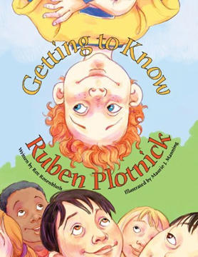
Getting to Know Ruben Plotnick, written by Roz Rosenbluth and illustrated by moi comes out tomorrow, September 28, 2005. Another 100% digitally drawn endeavor, it was featured on the Dr. Laura show yesterday and has made a brief (thanks to the promo) showing in the Barnes and Noble top 100 sales rank. YAY! (Usually my books hover around, oh, 300,000th.) I'm calling everyone I know so I can tell them that for the moment, they know a bestselling illustrator! So far, all are suitably impressed, hahaha! Unfortunately, I am beaten out by Martha Stewart's "Apprentices" and their rendition of Jack and the Beanstalk, conceptualized, written and illustrated in 24 hours (#15 on the Barnes and Noble Children's Bestseller list.) Who knew it was so quick and easy to sell a book to Random House??
0 Comments on Getting to Know Ruben . . . as of 1/1/1900
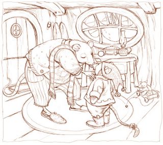
A little departure in theme for me. I don't draw a lot of anthropomorphized animals. These are supposed to be mice, haha. The little one looks sort of moleish to me. This drawing is done in Painter, using the digital 2B pencil (with brown "lead".) Next week (big deadline this weekend) I'll print it out on watercolor paper and do the main washes in traditional watercolor, then scan it back into the computer and build up details with digital pastel.
REAL watercolor. Wow, well I lied about this site being digital only, I am putting up a traditionally painted watercolor, ta dahhh! It's the first I've done in probably seven or eight years. (The pencil drawing underneath was done digitally and printed on watercolor paper using my Epson 2200 and I added a little contrast and some tweaking of shadows after scanning in the finished painting.)
All the wonderful things I've heard about printing out a drawing with the 2200 are true. The printout looks like genuine pencil lines, but doesn't smear or lift off with paints or even when using a liquid mask. Most of my illustrator friends seem to scan in their traditionally drawn pencil sketch where I still like to sketch in Painter. But either way, how freeing to know that my sloppy watercolor work won't ruin my drawing. I can just print out another if I screw up!
A 5-10 minute digital chalk sketch. I used to do these shadowy face drawings all the time for practice. Just kind of fun to see who emerges from the dark.
I'm completely addicted to digital drawing. I buy new watercolor paper and traditional paints and pristine sketchbooks at The Art Store, but they gather dust beside my desk. I feel less worthy somehow when I sketch using my computer. Ridiculous, I tell myself -- it's really just like choosing a mechanical pencil over a Berol 2B, or a Rapidograph over a quill pen. No digital god steers my fingers when I sit at my computer. I know that, but somehow I keep planning to get back to "real drawing" someday, where my mistakes aren't permanently erased by a simple "Ctrl-Z" command.
There was that day years ago when a Lt. Gov of Texas stood over my shoulder as I worked inhouse at an educational software company. He watched me maneuver my mouse (yes, we drew with a mouse back then,) coaxing the pixels into the running figure of a child. I was proud and excited as he stood behind me, obviously transfixed at the illustration appearing on the 16 color Tandy monitor. Finally he announced, "I didn't know computers could draw like that!" I guess I still carry that scar.
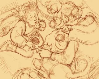
Here is an example of a sketch for a picture book I wrote (and my literary agent is about to peddle) "Tea with Mrs. Rosenberg." I drew the sketch freehand, directly with my Wacom and stylus. I used Corel Painter. The brown digital pencil was done on a layer floating above the tan-colored canvas. I have always lamented the loss of that loose, original pencil sketch we artists do before committing it to a final painting surface. The ability to keep and use that sketch as the base of my finished art is for me, the number one advantage of using the computer as a medium.
The finished color piece for "Tea With Mrs. Rosenberg." The painting was done in digital watercolor on tan colored canvas layer. In between the canvas and the top pencil drawing, I inserted another floating layer. On that middle layer I used digital pastel to give some opaque color. The brown pencil layer was kept separate and available for refinement or tweaking, and also allowed the original pencil drawing to be on "top" of any coloring underneath.
All of the drawings here were created completely online, using a Wacom tablet and Corel's Painter IX. While I hope you enjoy looking at my work, please remember that every image on here is copyrighted and cannot be used for any reason without written permission from me.
0 Comments on Welcome to the Digital Pencil! as of 1/1/1900


Great set up, Mo! I think it's elegant. You have a TV in your studio? Yikes, I have a hard enough time staying off the internet. Second thought, it would probably keep me off the internet.
If it's on I find I hardly pay attention to it (but it's company!) Lately I've been documentaries via netflix on the iMac screen. :)