new posts in all blogs
Viewing Blog: light night rains, Most Recent at Top
Results 1 - 25 of 721

Illustrator, Corey Godbey
Statistics for light night rains
Number of Readers that added this blog to their MyJacketFlap: 12

By: Corey Godbey,
on 9/26/2013
Blog:
light night rains
(
Login to Add to MyJacketFlap)
JacketFlap tags:
Add a tag
I've had this blog longer than Erin and I have been married. I began it in 2005 post-college. It's been around for every major event, professional and personal.
At long last I've got a new site and a brand new blog.
Thanks for all the good times, this blog.
You know what, I should do a final series of posts, a collection of all the best posts on this thing as a proper send off.
Next week.
By: Corey Godbey,
on 9/2/2013
Blog:
light night rains
(
Login to Add to MyJacketFlap)
JacketFlap tags:
Add a tag
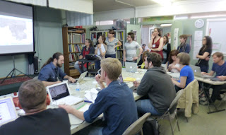
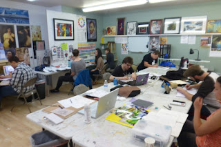
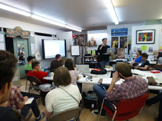
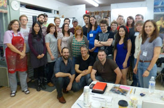
Behold! At long last a TLC Workshops wrap up.
The wonderful Tara Chang invited Justin and me to teach an illustration workshop back at the end of August. We ventured forth unto the lands called Seattle and crafted many drawings (and some paintings things).
From Justin,
Last week Cory Godbey, Iain Mccaig and I did a workshop in Seattle for TLC Workshops. It was absolutely fantastic. There was action, romance, drama, pencil drawing and Iain did real-life, actual magic tricks in front of everyone. It was a great experience and if you are wondering if I would recommend that you go to one, then yes. Yes I do.
Here follows my attempt to chronicle our exploits and convince you that yes, this was actually the best.
 |
| Don't worry, we are professionals! |
 |
| Digital demo! |
 |
| Left. Jedi Knight and friend of Capt. Solo, Iain McCaig. |
 |
| Flaming death! I mean, Justin painting things. |
 |
| HARD AT AWORK |
 |
| GET BACK TO WORK |
 |
| Iain making magic tricks. |
 |
| Don't mind me, looking a little rough on the third day of class. |
 |
| A nice picture. |
 |
| Another nice picture. |
* * *
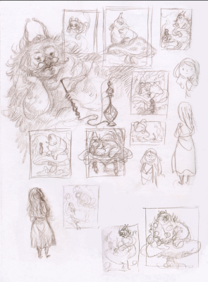
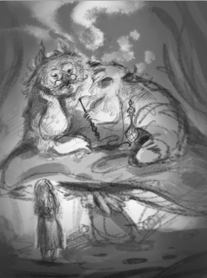
I worked on Alice and the Caterpillar for my piece. Here's a look at the progress.
 |
| Thumbnails. |
 |
| Digital rough. |
As you can see, I turned Alice around and had her creep from underneath the mushroom because my digital rough was beyond boring having her facing away from the viewer.
 |
| Finished drawing. |
 |
| WIP, Alice. |
 |
| WIP, Caterpillar. |
I have yet to complete it but you can be sure I'll post it here when I do. The main thing was demoing my process.
You can find many more pictures as well as the attendees projects at the
TLC Workshops blog.* * *
This whole experience was some of the most fun I'd ever had and I certainly hope we get to wreck Seattle once again sometime.
By: Corey Godbey,
on 7/10/2013
Blog:
light night rains
(
Login to Add to MyJacketFlap)
JacketFlap tags:
Add a tag
My course for The Lamp Post Guild,
The Art of Personal Work is launching next week!
This 10 week program covers my working method for planning and producing a new collection of work every year. It's a process that's become invaluable to me and I hope it will be useful for you as well!
You can check what those 10 weeks would look like and the trailer introducing the course
here.
Also, you can use the code "PersonalProject2013" to get 15% off.The class starts on Tuesday of next week, July 16th. I hope to see you there!
By: Corey Godbey,
on 7/2/2013
Blog:
light night rains
(
Login to Add to MyJacketFlap)
JacketFlap tags:
Add a tag
Hey, I'm very pleased to announce that I'm returning for the Fall semester of the Motivarti 10 week mentorship program!
Motivarti is an organization dedicated to providing resources, networking, and inspiration for people who create art related to the entertainment industry. Whether you’re a working professional, a recent graduate, or a student, you’ll find lectures, classes, workshops, and events that will broaden your creative horizons. Motivarti strives to bring together an alliance of entertainment artists, as well as providing motivation and resources to support the community.
Apply! I'd love to work with you.
Applications run from July 1st - July 24th.
By: Corey Godbey,
on 6/24/2013
Blog:
light night rains
(
Login to Add to MyJacketFlap)
JacketFlap tags:
Add a tag
At long last my 2013 sketchbook,
Lyrebird, is now available online!
_____________________________________________
Here is a video tour of the book. All 54 pages.
_____________________________________________
Lyrebird represents the sixth entry in yearly sketchbook series.
6 x 9. Soft cover, perfect bound. 54 pages.
Thank you for supporting my work! By picking up Lyrebird you help to fund this and other personal projects like it. I can't thank you enough for that.
By: Corey Godbey,
on 6/6/2013
Blog:
light night rains
(
Login to Add to MyJacketFlap)
JacketFlap tags:
Add a tag
The upcoming TLC Workshop that Justin Gerard and I are teaching just got an exciting (and massive) update: Iain McCaig will join us for an afternoon!
Seattle in August, the guy who created Darth Maul, two other guys who saw the movie. I don't know what else you could ever want!
Space is limited.
Fri-Sun, August 16-18. $500.
In this dual-faculty workshop, Justin and Cory will cover their illustration processes and approaches to character-driven art. Students will work alongside the instructors to conceptualize and design their own character, craft their visual story and put it all together into a single image. The class will be heavily geared toward drawing and painting traditionally, but Justin and Cory will also demonstrate how they use digital tools to enhance their work (digital artists welcome!). Limit: 23 students.
Announcing a Special Guest - the amazing and fabulous Iain McCaig!
Iain will spend an afternoon with us sharing his process for creature and character creation - a very entertaining and hands on demo.
By: Corey Godbey,
on 5/27/2013
Blog:
light night rains
(
Login to Add to MyJacketFlap)
JacketFlap tags:
Add a tag
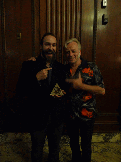
Last weekend was Spectrum Fantastic Art Live, the convention organized by the creators of the celebrated Spectrum annuals.
Last year SFAL was, for me, the best show I had ever been apart of. In terms of quality of exhibitors, collectors, and really the whole event, from the awards show to meeting everyone. It was hands down the best show I'd ever had. Going into year two I had terribly high expectations. I'm pleased to report that the Fenners, and everyone involved with making SFAL outdid themselves again.
As long as it's around, Spectrum will be my big show for the year. It's no exaggeration to say it's everything I love about conventions and none of the stuff I hate. No filler, no entertainment and media, just fantastic work and people who love it.
Here's a look at our time. Some of these are pictures Erin took, some of them are from other friends.
 |
Me, Zach, and Justin.
Zach's going "COOORRRYYY" you can see his mouth do that. |
 |
| Last day of the show oh my gosh |
But, award.
 |
| Behold that triangular object. |
See, one of the great things about getting everyone together for a show likes this is the award show. Saturday night, what amounts to the Oscars of Imaginative Realism takes place at the Midland Theater.
This year I'm pleased to report that I was nominated in the Unpublished category and The Fish Master won gold.
 |
| The Fish Master |
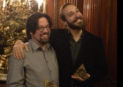 |
| David Petersen and me. This is an award winning photograph. |
 |
| Paul! |
 |
| Zach and me. A nice picture. |
 |
| CALLING MOM OF COURSE |
* * *
 |
Paul Bonner and Justin Gerard.
WHAT'S SO FUNNY HUH GUYS |
By: Corey Godbey,
on 5/14/2013
Blog:
light night rains
(
Login to Add to MyJacketFlap)
JacketFlap tags:
Add a tag
At long last! I've got in hand my new 2013 sketchbook, Lyrebird.
The 54 page book, my longest and most densely packed collection of work to date, will debut at
Spectrum Live this weekend.
Lyrebird will be available online in
my shop in early June.
This represents my sixth yearly sketchbook and marks the I don't know number of personal projects I have taken on in my quest to better myself as an artist.
By: Corey Godbey,
on 4/4/2013
Blog:
light night rains
(
Login to Add to MyJacketFlap)
JacketFlap tags:
Add a tag
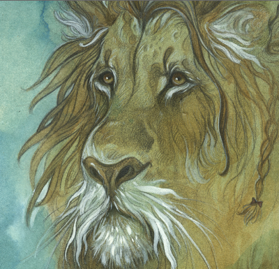
 |
Ready for watercolor.
|
 |
| First wash. |
 |
| Gouache stage. |
 |
| Drawing back in with the paint. |
 |
| Ink. |
 |
| Final, with terribly messy edge. |
By: Corey Godbey,
on 4/3/2013
Blog:
light night rains
(
Login to Add to MyJacketFlap)
JacketFlap tags:
Add a tag
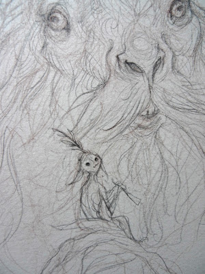
Here's the next set in this weekly series, the finished drawing stage.
 |
| Notice the upcoming eye shift. |
 |
| Finished. |
 |
| Detail. |
Next post, Thursday. Watercolor.
By: Corey Godbey,
on 4/2/2013
Blog:
light night rains
(
Login to Add to MyJacketFlap)
JacketFlap tags:
Add a tag
Planning out the piece, I knew I wanted to do something with a new creature or something else I hadn't really drawn much before.
The work started out as a faun-type creature but over the course of the piece changed into something a little rabbit-like, somehow.
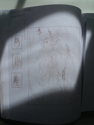 |
| Thumbnails. |
* * *
Next time, under-drawing and finished drawing.
 |
| Under-drawing. |
By: Corey Godbey,
on 4/1/2013
Blog:
light night rains
(
Login to Add to MyJacketFlap)
JacketFlap tags:
Add a tag
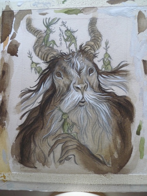
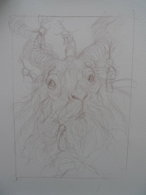
Hey everyone, I'm pleased to show my piece for MicroVisions 2013!
MicroVisions is a yearly charity art auction at the Society of Illustrators benefiting students.
I'll let you know when the piece is available for bidding.
A huge thanks to Irene Gallo for inviting me!
 |
| Bells and Horns |
* * *
Over the course of this week I'll be posting the process of this watercolor and ink piece.
By: Corey Godbey,
on 3/29/2013
Blog:
light night rains
(
Login to Add to MyJacketFlap)
JacketFlap tags:
Add a tag
Here's a look at a one-off piece, unrelated to any personal series. It's for John O'Marra's Chocolate Chips and Rocket Ships, an anthology of children's poems.
 |
| Thumbnail |
 |
| The rough. |
 |
| Under-drawing. |
 |
| Finished drawing. Cat and Fairy kid with a pear. |
 |
| Finished drawing. White Knight. |
* * *
 |
| Color work in progress. |
 |
| Finished color. White Knight. |
And I'll be posting the final next week!
By: Corey Godbey,
on 3/25/2013
Blog:
light night rains
(
Login to Add to MyJacketFlap)
JacketFlap tags:
Add a tag
Here's my watercolor in @gallerynucleus' current show, "Not in Kansas Anymore."
I've experienced a few recent breakthroughs in traditional media. Between this piece and my upcoming MicroVisions 8 work I feel like I've gained a whole new way of working.
The Oz show is up for another for another two weeks! You can view the entire collection online here, or if you think you might like this piece enough to actually want it around you can inquire here.
 |
| Detail. |
By: Corey Godbey,
on 3/11/2013
Blog:
light night rains
(
Login to Add to MyJacketFlap)
JacketFlap tags:
Add a tag
Spent some time today updating some of my various haunts around the internet (including some updates to this old blog).
The main work I did was updating my Carbonmade portfolio site. I really enjoy the direct simplicity.
For the time being I've kept some older portfolio work archived there. Enjoy it while it lasts!I also updated and tidied up my
Behance.The main changes around the blog here are updates to the
About and
Contact pages. Refreshed illustrations, updated and newly worded bio, cleaned up tabs.
Speaking of the blog, these days it would seem that I only post for major events. To keep up with my day to day workings you can follow me on
Twitter and my
Cory Godbey Illustration Facebook page.
Enjoy!
By: Corey Godbey,
on 2/12/2013
Blog:
light night rains
(
Login to Add to MyJacketFlap)
JacketFlap tags:
Add a tag
Hey! Here's a weekend that's sure to show up in legends to come: I'll be teaching a
TLC Workshop, "Story and Pictures" along with Justin Gerard!
TLCWorkshops is a professional art series of instruction for the working illustrator. Located in the greater Seattle area, each weekend workshop is packed with one-on-one interaction and gives you the opportunity to rub shoulders with some of the most brilliant art professionals working today.
In this dual-faculty workshop, Justin and Cory will cover their illustration processes and approaches to character-driven art. Students will work alongside the instructors to conceptualize and design their own character, craft their visual story and put it all together into a single image. The class will be heavily geared toward drawing and painting traditionally, but Justin and Cory will also demonstrate how they use digital tools to enhance their work (digital artists welcome!).
August 16-18, 2013.
By: Corey Godbey,
on 2/1/2013
Blog:
light night rains
(
Login to Add to MyJacketFlap)
JacketFlap tags:
Add a tag
Big thanks to @iridially, an intern at The Society of Illustrators, who got some pictures of my piece, "Seeing the Forest Amid the Trees" in the Editorial show!
And here's a series of blogs about the making of the piece.
Thanks again, Ruby!
By: Corey Godbey,
on 1/7/2013
Blog:
light night rains
(
Login to Add to MyJacketFlap)
JacketFlap tags:
Add a tag
Hey! Here's a pretty great thing I've gotten the chance to be involved with called
Motivarti.
* * *
Motivarti is an organization dedicated to providing resources, networking, and inspiration for people who create art related to the entertainment industry. Whether you’re a working professional, a recent graduate, or a student, you’ll find lectures, classes, workshops, and events that will broaden your creative horizons. Motivarti strives to bring together an alliance of entertainment artists, as well as providing motivation and resources to support the community.
You can find the application
here.
And here's a direct link to
my page.
I'd love to work with you!
By: Corey Godbey,
on 12/24/2012
Blog:
light night rains
(
Login to Add to MyJacketFlap)
JacketFlap tags:
Add a tag
A little while ago I got an email from Random House asking if I'd like to review Maurice Sendak's illustrated Nutcracker.
I jumped at the chance and I'm very pleased to be able to talk about it with you here.
The book is, as you might expect, lovely. Sendak's take on the E. T. A. Hoffman classic is surely the best and brightest, darkest and most imaginative version of the story.
Many others will be able to explain the story, the music, or indeed the production design of the ballet better than I can. What I hope to be able to provide you with here is a little of the history and the feeling of the book from a life long follower of Maurice Sendak's work.
To set the scene, here's look at the official book description.
__________________________________________
"A classic, new and complete. One of the ten best illustrated children's books of the year."
New York Times Book Review.
The tale of Nutcracker, written by E.T.A. Hoffmann in 1816, has fascinated and inspired artists, composers, and audiences for almost two hundred years. It has retained its freshness because it appeals to the sense of wonder we all share.
Maurice Sendak designed brilliant sets and costumes for the Pacific Northwest Ballet's Christmas production of Nutcracker and created even more magnificent pictures especially for this book. He joined with the eminent translator Ralph Manheim to produce this illustrated edition of Hoffmann's wonderful tale, destined to become a classic for all ages.
The world of Nutcracker is a world of pleasures. Maurice Sendak's art illuminates the delights of Hoffmann's story in this rich and tantalizing treasure.
__________________________________________
This book's history is two-fold; it was born of the 1983 stage production where Sendak served as the production designer.
 |
| A quick Google search yields a few pictures of the ballet. |
I love hearing Maurice Sendak in his own words and the book benefits from having an Introduction by Sendak himself. Here he provides insight into the characters, the designs, and how he and Kent Stowell even came to partner on the original production. Characteristically Sendak, the first line of the Introduction is,
"My immediate reaction to the request that I design Nutcracker was negative."
Throughout the Introduction, Sendak tells how he warmed to the project, overcoming his initial distaste for the play ("I didn't want to be suited to the confectionery goings-on...") and how ultimately the production culminated, for him, in a "superb moment" at the premiere.
Sendak thought of this book as being comprised of "two separate entities" with the costumes and designs from the production making up the one half and the other being the new work he did specifically for the book.
Here he speaks to retracing some of his steps and adding new work for the book:
"In changing hats from designer to illustrator I have been faced with a curious dilemma. After all, there are whole sequences in the tale itself that never appear on the stage. Rather adjust these designs to fit the book, I decided to completely illustrate 'The Story of the Hard Nut'. Because of this decision the pictures for this book are composed of two separate entities. There are the designs and costumes from the ballet version and then the fresh pictures done specifically for the tale. In addition, there are a few to animate the original stage designs and a few more that I could not or would not resist doing."
What draws me, and I suspect many others, in to Sendak's worlds are his treatment of children. Speaking of the heroine Clara ("Marie" in the book)
"I endowed her with the wisdom and strength I conjure up to endow all my children and then surrounded her with a minefield of problems."
And very like a certain Max,
"The stage became her half-real, half-nightmare battleground. The drama grew naturally as we watched Clara, frightened yet exuberant, cross that battleground."
The sprawling spreads found in The Capital are some of my personal favorite examples of Sendak's haunting, lyrical work which meshes so well, in my estimation, with the poetry of the story.
"Who is this on the rosy waters?
A fairy or fairy's daughter?
Bim-bim little fishes,
Sim-sim golden swans.
Faeries come hither,
Fly through the spray
Splish splash, splish splash
The rosy spray."
 |
| Naturally. |
The book is a delight. And comes well recommended from me.
 |
| Again, an image from the ballet itself, not from the book. |
By: Corey Godbey,
on 11/30/2012
Blog:
light night rains
(
Login to Add to MyJacketFlap)
JacketFlap tags:
Add a tag
I'm so pleased to once again to be able to say that I'm a part of the most recent Spectrum.
I scored two pages, one full and one quarter.
Many thanks to the judges and The Fenners!
______________________________________________________
By: Corey Godbey,
on 11/9/2012
Blog:
light night rains
(
Login to Add to MyJacketFlap)
JacketFlap tags:
Add a tag
I couldn't resist this one.
The Walking Hill.
Prints available from my shop.
___________________________________
By: Corey Godbey,
on 11/7/2012
Blog:
light night rains
(
Login to Add to MyJacketFlap)
JacketFlap tags:
Add a tag
$30.
2 hour painting demo (sped up to 1 hour). 720p HD. (1GB)
Includes the file + bonus layered file.
A look at my basic digital painting process. Adobe Photoshop CS5.
* * *
Here it is! I recorded this whole thing back over the summer (pre-LPG) and just now got some free time to edit it together and do the narration. I'm very excited to finally share it with you.
It's a look at what I've learned over the years working in Photoshop, just some of my basic process.
The first 10 buyers will get a free download of the eBook edition of Menagerie.
Enjoy!
* * *
This video is part of my new digital shop! Check it out for some free stuff, eBook editions of my sketchbooks, wallpapers, and more.
By: Corey Godbey,
on 10/26/2012
Blog:
light night rains
(
Login to Add to MyJacketFlap)
JacketFlap tags:
Add a tag
Last year, 2011, I did two conventions. By the end of this year I'll have done eight.
Between speaking engagements, film festivals, and conventions, I've burned through many more business cards and postcards that I have in years past.
So! I decided to put together some new ones for late 2012 / early 2013.
Here's a peek at the new work.
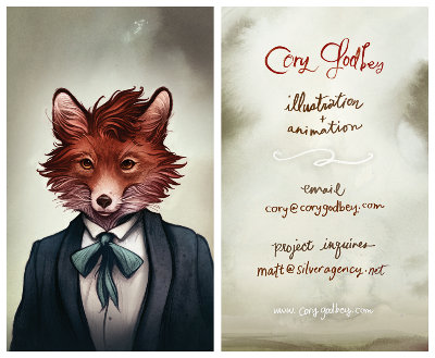 |
| Business. |
 |
| Post. |
By: Corey Godbey,
on 10/24/2012
Blog:
light night rains
(
Login to Add to MyJacketFlap)
JacketFlap tags:
Add a tag
Because of you guys my second
fire sale was a raging success! Thank you so much. Most all of the proceeds go right back into making more work: reprinting sketchbooks, convention expenses, and all. I can't thank you enough for supporting my work.
More than half of the drawing have sold, saved from a fiery fate, but there are still some cool things left.
Some of my favorite work was snapped up right away but I managed to get a couple screen shots to commemorate them.
____________________________________________________
And so here we've got the first piece sold and then the whole collection packaged up and ready to go!
Thank you again for supporting this stuff!
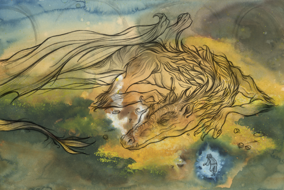
And now comes the scene which I have imagined time and again since I read the first read The Hobbit so many years ago. Smaug. Smaug the Golden. Smaug the Magnificent.
For the back cover of the book I got the chance to illustrate Bilbo's conversation with this last dragon.
My goal was to follow Tolkien's original painting as a guide (as far as overall dragon design and color work).
 |
| Tolkien's original illustration. |
___________________________________
From there I arranged my figures and figured, since there wouldn't be too much room on the back cover, that I would vignette the image somewhat, keep the edges in shadow to help out the designer.
 |
| The thumbnail. |
 |
| The finished drawing. |
 |
| The watercolor. |
 |
| Working in the final, digital color. |
___________________________________
 |
| The finished piece. |
 |
| Smaug, detail. |
___________________________________
I hope you've enjoyed Hobbit week!
If you'd like to catch up on all the posts, you can find the collection below:
View Next 25 Posts


It looks and sounds like it was a fantastic workshop–-certainly makes me wish I could have been there. Also, I love the caterpillar picture so far, and cannot wait to see the finished piece.