JacketFlap connects you to the work of more than 200,000 authors, illustrators, publishers and other creators of books for Children and Young Adults. The site is updated daily with information about every book, author, illustrator, and publisher in the children's / young adult book industry. Members include published authors and illustrators, librarians, agents, editors, publicists, booksellers, publishers and fans. Join now (it's free).
Login or Register for free to create your own customized page of blog posts from your favorite blogs. You can also add blogs by clicking the "Add to MyJacketFlap" links next to the blog name in each post.
Blog Posts by Tag
In the past 7 days
Blog Posts by Date
Click days in this calendar to see posts by day or month
Viewing: Blog Posts Tagged with: drawing, Most Recent at Top [Help]
Results 1 - 25 of 1,606
How to use this Page
You are viewing the most recent posts tagged with the words: drawing in the JacketFlap blog reader. What is a tag? Think of a tag as a keyword or category label. Tags can both help you find posts on JacketFlap.com as well as provide an easy way for you to "remember" and classify posts for later recall. Try adding a tag yourself by clicking "Add a tag" below a post's header. Scroll down through the list of Recent Posts in the left column and click on a post title that sounds interesting. You can view all posts from a specific blog by clicking the Blog name in the right column, or you can click a 'More Posts from this Blog' link in any individual post.
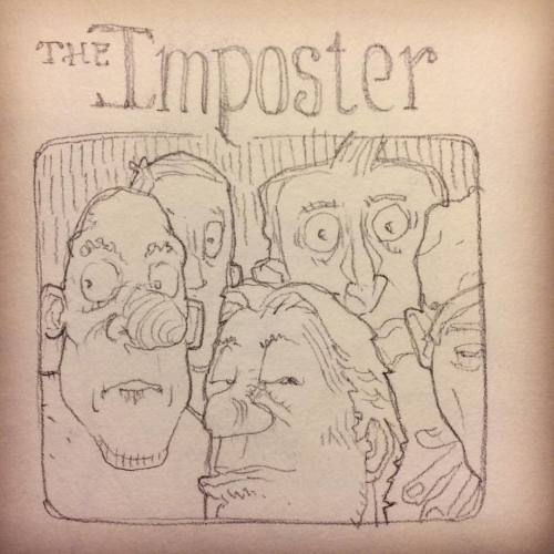
crazy last couple of weeks....between a commission, matting and framing prints for some friends who are always kind enough to buy my work for their littles and a pretty intense flare up in my right arm from all the osteoarthritis, radiculopathy, nerve damage and chronic inflammation in my cervical spine (something i know i rarely talk about in this blog) after three neck surgeries. i guess i've always been one to try and not dwell on the not so positive stuff but perhaps it helps others who deal with pain just to follow their biggest and most loved passion. there is (and always will be) a FERAL need in me to create. maybe you have to be an artist to really get it. you just can't live without out. really. so, apologies for the lack of posts but if you know me personally, you know my drive far outweighs my tiny stature. in the words of my favorite Pixar film, Meet the Robinsons, "KEEP MOVING FORWARD!!"
now to what i've been up to (besides the pain)...a sweet commission from one of my drawings (FOR SALE HERE) which i turned into a painting for a sweet little ginger. i will be posting the finished painting as well as offering prints of her very soon! you'll have to check back and see...;)
here are some WIP pics as well as a cute little blue penguin i sketched...just because.
0 Comments on BAD BLOGGER!! as of 12/19/2016 9:11:00 AM
let me start by saying i always consider any/every commission a blessing but when they are back to back really kind wonderful clients, well that just makes the "blessing" so much sweeter.
a couple of weeks ago the sweetest lady came to me wanting to completely redo her daughter's bedroom based on a few of my drawings (really?! this is really my life?! hashtag-blessed) and wanted this particular drawing turned into a painting because it looks smooch like her adorable little girl who happens to be a "budding artist" herself. i wound up selling her some prints and taking on this commission...painting her ginger haired, december born baby girl (ginger...winter...december...three of my favorite things....destiny, indeed).
this is and always has been (and always will be) my philosophy...treat your customers like friends, make personal connections with them and they will come back to you time and time again. always staying true to myself...
"Nicole has been absolutely fantastic to work with! She is extremely responsive and has really worked with us to accommodate our special requests. The prints we ordered are absolutely beautiful! She shipped them out quickly and were packaged with great care. Nicole is an amazing artist! When you work with her you don't only get a quality product, you get great customer service. We look forward to working with her again!"
thank you, sara...for your kind words, becoming a "friend" and giving me a really good *excuse* to paint a ginger, winter loving little girl.
*LIMITED EDITION PRINTS OF THESE DRAWINGS AVAILABLE HERE...ONLY THROUGH THE MONTH OF NOVEMBER!!
0 Comments on throwback Thursday to one of my favorite drawings.... as of 1/1/1900
What to do when your drawers and portfolios are overflowing with original paintings? You have a flash sale of course! ONE DAY ONLY Friday October 28th 9am - 9pm CST All original paintings and drawings on www.sarabillustration.com will be hugely marked down! There's a new chapter in my life coming, and I am pretty certain I will be inspired to make much of it through drawing and painting. I have also been wanting to play with working larger, which will require more room!
So in celebration of the arrival of our son Jaxon (and the crisp cool holiday season! My favorite!), I am holding this ultra rare sale, marking my original art for almost half the price! This is a great way, I hope, for those of you who have been wanting an original piece but haven't been able to afford it, are able to find something that resonates with you and is within your reach.
All of the paintings available demonstrate my progression as an illustrator...
I have original paintings from ten years back when I was still inking my lines with microns because I feared loosing my lines and didn't like getting graphite all over my hand.
All the way through to the most recent, finished just a couple weeks ago. No inked lines but instead using erasable gray pencil, showing more confidence in my values, and creating far more inviting atmospheres that help tell the story.
Each step in the process is vital for the following step. Without experimenting and playing, I would not be where I am today as an illustrator.
Most of my work is small for those little areas of the house that need some magic.
It is very well known that I prefer to work small, usually smaller than 8x10. I enjoy the challenge and quite possibly have always been interested in the miniature (LOVE dollhouses and all things small). Most of the larger works I create are requested commissions, but there will be a range of sizes available at the sale.
I know each piece has a soul mate, created just for them.
I pray that some of these pieces will find their match tomorrow. It's bittersweet to let go of your creative works. I am always so blessed to see how the work inspires and deeply touches those who purchase it, but then also sad to see them go. Each piece has a story for me, what inspired the imagery and why I created it...yet when I see them sitting in my studio I see a bird caged, waiting to be free and serve as inspiration for another.
For the seventh selection in A History of my Archive in 10 Objects here are some surviving sketchbooks from my 3 years on the Illustration course at Manchester Polytechnic.
Collection of sketchbooks, 1978-1981
Okey, so this is cheating a bit - these are clearly more than one object! But the contents are pretty consistent and were all bundled together in my father's loft, so I think I can safely lump them together as a single item.
Actually, very little remains of my work from the years 1978-1981 while I was at Manchester, as previously mentioned on this blog I ceremoniously threw almost all of my course work out of the 4th Floor window of Chatham House on the final day of the last term, keeping only my degree show portfolio work. It was an act of bravado, but also a statement of the frustration and disillusionment many of us sensed at the end, I felt I'd somehow lost direction during the course. So I was pleasantly surprised to find these sketchbooks still in existence in my dad's loft.
Unfortunately there's not much I want to share, most of the pages are testament to a struggle within confines I'd placed myself in as a pen and ink illustrator. Some time during the First Year I was told by my course head Tony Ross (yes, that Tony Ross) that painting wasn't really my thing, I shouldn't worry about colouring and would be best served by concentrating entirely on pen and ink drawing, with just a splash of colour. I took this advice rather too much to heart and pen drawing was pretty much all I did for most of the 2nd and 3rd years. When I wasn't galavanting off to punk gigs I spent much of my studio time illustrating some of my favourite novels in black and white - The Wind in the Willows, The Lion, the Witch and the Wardrobe, Treasure Island, Tom's Midnight Garden, Mrs Frisby and the Rats of NIMH... all really imaginative books for an illustrator to explore.
College project: Treasure Island, pen & ink 1980. This drawing survived as a degree show piece.
I saw myself as a black-and-white specialist in the manner of E. H. Shepherd, Mervyn Peake and Edward Ardizzone, it didn't occur to me that in the late '70's fewer and fewer publishers were actually printing novels with text illustrations, that my heroes were all of their time. Most surprisingly of all (and this is something I was to particularly wonder about later), I either wasn't given, or chose to ignore, any guidance to study, write, or dummy picture books, the stock-in-trade of any would-be children's illustrator!
Years later when I met Tony Ross again at Bologna I questioned him about this, and was told, "you have to remember John, it was a commercial illustration course, not a children's book course"... which only partly answered the question. Tony was the head of the course and a children's illustrator, I was the only children's book illustrator in my year (all the others working towards the broader illustration market). I'd set myself very narrow constraints, my pen and ink drawings were still clumsy, the sketchbooks are full of marginalia, doodles rather than dynamic ground breaking work. Maybe I'm being rather hard on myself, but looking through the sketchbooks now from a professional point of view, of the illustration work there's very little I would want to share, I'm not surprised I wanted to throw most of my course artwork out of the window!
College project: Mrs Frisby and the Rats of NIMH, pen & ink 1981. Another degree show survivor.
However, mixed in with the heavy-handed experiments (which I'm NOT going to show!) the sketchbooks also contain lots of drawings from life, sketches of those around me which bring back very clear memories of the time. As a break from struggling with pen and ink I drew fellow students, the things around me... it seems the more I tried to be a 'proper illustrator', the further away I was drifting from inspiration, yet the sketches from life have an authenticity and lighter touch I was somehow missing in my course work. Here are a few.
The most ready-to-hand subjects were the other illustration students on my course....
Fellow student Shirley Barker sketch mixed in with a page of course work on The Wind in the Willows, 1979
Melanie Dabbs, 1980
Bob Wood 1980
Jean Yarwood, 1981
Tammy Wong, 1981
... even occasionally the course teachers...
...then there were the places I lived...
A scruffy room in Didsbury, 1980. That's my Corona typewriter on the table.
The All Saints campus from the Halls of Residence, around 1979. Student Union on the right, Oxford Road in the distance.
...and there was the Thursday afternoon life class (regretably stopped half way through the course), which was a wonderful escape while it lasted as it was purely observed drawing.
My eyes were greatly opened by my time at Manchester, not least thanks to the Manchester indie music scene and my friends. The course itself though had narrowed my output and possibly development, but I don't exclusively blame the tutors, I've a tremendous respect for Tony Ross. We must have been a tough bunch to teach.
Tony Ross drawing in my sketchbook margin, I think he was encouraging me to make my animals fatter.
0 Comments on A History of my Archive in 10 Objects. No.7: college sketchbooks, 1978-1981 as of 10/1/2016 8:04:00 AM
In part three of 10 objects from the archive of objects found in my dad's house, I'd like to offer this.
School project: Toothless Old Man. Pen & Ink. 80cm x 60cm, 1976
After the tentative steps of the Henry Hudson picture I worked on two other school projects before setting to work on this large piece, which proved to be the most experimental and successful of my school drawings in pure pen and ink. It was drawn from a randomly selected photo reference using a multi coloured pen and ink line technique - on the face and hat I used three separate pen nibs to switch colours and gradually build up the drawing in different coloured cross-hatching, the waistcoat was filled in by dabbing ink with sponge. It was a labour-intensive technique for such a large sized drawing, but proved a great success. Sadly many of the coloured inks have faded over time.
The image was the centre piece of my school's 1976 art show during the summer festival, and made it to the pages of the local newspaper - my first press appearance! Even my junior school headmistress came to see it. By this time I was absolutely determined to be an illustrator and had my sights set on art college.
After the show this picture adorned the walls of my parent's house for a few years before being consigned to the loft. The identity of the man in the photo I never knew!
0 Comments on A History of my Archive in 10 Objects. No.3: Toothless Old Man, 1976 as of 9/26/2016 5:22:00 AM
Number 2 in the discoveries made at my dad's house from long hidden archives of my work. In my wildest dreams I never thought I'd ever see this picture again, but there it was, in my dad's loft, warts and all, the very first drawing I ever attempted in pen and ink, from 1975, aged 16.
School project: The Last Voyage of Henry Hudson, copy of an engraving in The Graphic, after the painting by John Collier. Pen & Ink with watercolour on paper. 73cm x 51cm. 1975.
Prior to this drawing I'd worked steadily but quietly at school on assigned projects. It was acknowledged that I was "good at art", but this was post modernist, late hippy mid 1970's, most of the art classes were light on drawing skills, heavy on texture and tactility, I found little to inspire me. Batik tshirts? Organic bio-plant patterns? Yeuk! No, I wanted to draw! Draw people! Things!
Away from school however I'd long since discovered the joy of the BIC biro, and filled old unused school exercise books with drawings, copied or inspired by WW2 Commando comics. After my dad bought me a couple of Adrian Hill guides to drawing and sketching I'd taken a sketchbook with me everywhere I went, and on every holiday over the previous year filled it with directly observed sketches from life in biro. This was all entirely independant from school. Finally a confrontation with a school bully ended up with the contents of my school bag scattered across the classroom floor, and my sketchbooks were discovered by my form tutor (and art teacher) Al Sayers.
Everything changed from then on. My wonderful art teacher Jackie Asbury (where is she now?) introduced me to a dip pen and a bottle of indian ink for the first time, and told me to draw something challenging. A 19th engraving of Collier's The Last Voyage of Henry Hudson seemed to fit the bill. I knew absolutely nothing about Henry Hudson or John Collier, or for that matter pen and ink drawing, but I set to and produced this clumsy, tentative piece, little knowing that pen and ink was to become my chief medium for the next 40 years.
Well, this is what I wanted it to look like....
The source engraving, The Last Voyage of Henry Hudson, after the painting by John Collier
It's embarassing - those terribly badly drawn hands... it bears little resemblance to the source image, how could I hope to reproduce an engraving with a dip-pen? I had a lot to learn, but it was a start, and I never looked back.
0 Comments on A History of my Archive in 10 Objects. No.2: The Last Voyage of Henry Hudson, 1975 as of 1/1/1900
For the first in the Museum of My Archive in 10 Objects (apologies to Neil MacGregor and the British Museum) I bring you a sketch of our house, drawn just before my 17th birthday from our back garden during the sweltering summer of 1976.
23 Butler's Lane from the Back Garden Rotring pen and Winsor & Newton ink on paper, June 1976.
We lived in Butlers Lane, Sutton Coldfield from 1970 until the end of 1977, this was the house where I grew from child to teenager.
It was a corner house and significantly bigger than any of our previous (and subsequent!) homes. My parents bought it for a bargain, it hadn't been altered since it was built in the 1920's and was in desperate need of complete modernisation, much of which my dad did himself. I still have clear memories of when we moved in - there were slate fossils of ammonites and other pre-historic sea life left in the kitchen from the previous owner, also a big, black cast iron built in range, and in one of the bedroom cupboards an old clockwork railway set. All were disposed of very quickly in the urgency to fix up the house, much to my regret!
The reason this is the first in my History is because this house is where it all started, this is where I really embraced a love of history and of art, where I began drawing in earnest. I've more fond memories of this house than any other.
One of the best things about it was the long extended back garden, which had two large trees and several smaller ones (not visible in this drawing), a rock garden and an allotment at the bottom, which my grandfather cultivated when he later moved in with us. I shared a bedroom with my brother (on the whole amicably), on my side of the room my dad built a study alcove which we were supposed to use for homework, but which I actually used mainly to paint Napoleonic soldiers. Airfix model aeroplanes hung from the ceiling in an eternal dogfight. On my brother's side of the room was a large cardboard cut-out of Marc Bolan, Roger Dean posters and a fur trimmed record player. We gone on okey. My sister always had her own room, bedecked with posters of Black Sabbath and David Bowie. The house was easy walking distance to school and local shops at Mere Green, a bike ride from Sutton Park, and just a couple of minutes walk from Butlers Lane train station, which gave us access to Sutton Coldfield and Birmingham. In the summer I'd cycle the opposite direction along country lanes out towards Lichfield.
From this distance in time it seems a pretty well perfect place to have grown up. I loved this house.
This wasn't the first time I'd drawn it, nor would it be the last, but this particular image seems to me to sum up a perfect summer at one of the happiest and most carefree times of my life.
0 Comments on A History of my Archive in 10 Objects. No.1: Sketch from the back garden of Butlers Lane, 1976 as of 1/1/1900
Sunday at the Albuquerque Rail Yards Market. Kuretake Watercolor, Sakura Micron Pen
How has your summer been? For me it went a little too fast. Thankfully here in Albuquerque it's still sunny and warm, but there is definitely a tinge of autumn in the air. Which means it's time to buckle down with a "back-to-school" attitude and get back to my main WIP, Ghazal.I also want to get back into a dedicatedsketching schedule that fits in with all my other projects.
Two things that are currently helping me get there are my writer's group summer art journal project and my outings with Urban Sketchers. Starting with my writer's group, because we've been meeting at the Albuquerque Museum we've been able to stay inspired by all the amazing art exhibited throughout the halls and galleries. Several weeks ago we had the idea to set out individually to find a painting or installation that could be the basis of some of our art journal pages. For me it was coming across an entire room devoted to the travel sketches of New Mexico-based architect, Antoine Predock. The extensive collection ended with an intricate proposal for a southern branch of the Palace Museum in Taiwan (unfortunately never realized), but I was so taken with the loose and easy style that led up to this final, intricate fantasy that I had to go visit the exhibition three more times over the next month. Predock's example and implied advice to scribble, go for color blocks and bold lines, and to follow what you feel about a place and its landmarks, rather than what you're "supposed to see" was exactly what I've been trying to achieve on my own for the last couple of years. I kept all of that in mind last Sunday when I went with Urban Sketchers to the Albuquerque Rail Yards Market for two hours of morning sketching:
Albuquerque Rail Yards--abandoned but not forgotten! Kuretake Watercolor and Sakura Micron Pen
The more I go out with the group the better I'm becoming at relaxing and losing my self-consciousness. I care more about the experience than the results, and consequently I'm drawing more than I ever have before. I love it!
Kuretake Watercolor, Fine-line Sharpie, Akashiya Sai Watercolor Brush Pens
I then wondered how this approach could work with writing and I found it fit perfectly. For instance:
Go BOLD. Don't hold back; don't edit, mince your words, or fear critique and censure. Let go and let the words flow.
Similar to a "gesture drawing," capturing the essence of a subject rather than the details, try gesture writing. First thoughts, first attempts, first drafts contain a lot of energy--energy that can transform your voice and writing into something only you could write.
Write hundreds and hundreds of pages. I was impressed at how many sketches Predock had made, many of them simply a few lines in the center of the page, but each was so strong and effective. His examples reminded me to not skimp on materials, ideas, or any step that will express where I completely want to go.
Good ideas for some good writing time!Enjoy the season.
Tip of the Day: Thinking of editing your work? Whatever you do, please don't kill the sketch. Whether you're sketching towards creating a more polished painting, or freewriting dozens of vignettes and character studies for your novel, screenplay, or short story collection, don't go crazy with the polishing. Yes, weed out awkward phrases, lines, and repetitions, but stay true to what made you fall in love with your ideas in the first place. Stay loose.
"The Chinese consider it childish to look for details in pictures and then to compare them with the real world. They want, rather, to find in them the visible traces of the artist's enthusiasm."
– E. H. Gombrich, The Story of Art
0 Comments on Visible Traces as of 9/8/2016 10:36:00 AM
What’s that called? That image up there… yes, I know this is a blog for artists but humor me.
It’s the periodic table, right? Right. To be even more precise it’s the Periodic Table of the Elements.
What are elements? Elements are things that help you build other things. The elements on the periodic table build pretty much everything. We can’t break them down smaller, and when you put them together, they make new things. For example, when the elements of hydrogen and oxygen combine they make water.
Ok, I’m done talking about science, but there is a point. Just like elements make the world around us, We also use elements to make pictures. They are the Elements of design.
The Elements of Design Are:
Line, Shape, Value, Texture, and Color.
Take a moment to think about any art you’ve ever seen. If you can think of a piece that doesn’t use one or more of these elements, I would think you were crazy. Because as far as I know, it’s not possible to make art without the Elements of Design.
Let’s talk about them now.
Line
Leonardo Da Vinci used line to create this sketch.
I’m pretty sure you know what a line is. We use them all the time. Lots of times we use lines to make shapes. Lines can be hesitant, beautiful, bold, straight, curved, sketchy, and much more. Read more about line by clicking here.
Shape
As I said, lines can make shapes, but you can make them in other ways. Take a paint brush and blob it on your paper. You’ve just made a shape. Lots of times we think the shapes with names, triangle, circle, square, oval, etc. But there are also shapes that don’t have names. These shapes are part of the elements of design too.
The way you choose to design your shapes can have a huge impact on how your art looks. Let’s face it; some shapes are just more interesting than others.
Value
Value is how light or dark something is. Think of a black and white movie or a grayscale image. The reason you can still tell what is going on is because of the values. Values tell us a lot of stuff, where the light is coming from, where forms change direction, if it’s a sunny or overcast day, and lots of other things.
When I see paintings that aren’t working, it’s usually because there is a problem with the values. I’ve written some other articles about value. Read this one, or this one.
Texture
Monet used Heavy Brush Strokes created paintings with Real Texture.
Texture is how something feels, rough, smooth, furry, slimy, etc. and texture can be real, or implied.
Real texture is really there. Like the texture of the paper, or the ridges and bumps created from brush strokes.
Implied texture is texture you only show in your picture. For example, if you paint a tree trunk, and it looks rough but actually isn’t if you touch it, that is implied texture.
Red, Yellow, Blue, etc. Right? Right… The thing is it doesn’t just stop there. Every color has a value, temperature, and saturation.
I’ve created a worksheet to walk you through the different aspects of color and show you ways to use them. You can download it free when you sign up for my mailing list. Click here to sign up and Get The Color Worksheet.
The Elements as building blocks
By now you I hope you see how the Elements of Design make up the pictures, sculptures, and other art we see. If you want to work more with them, I’ve created a downloadable worksheet so you can get to know them a little better. You know, make friends and stuff. I hope you enjoy it.
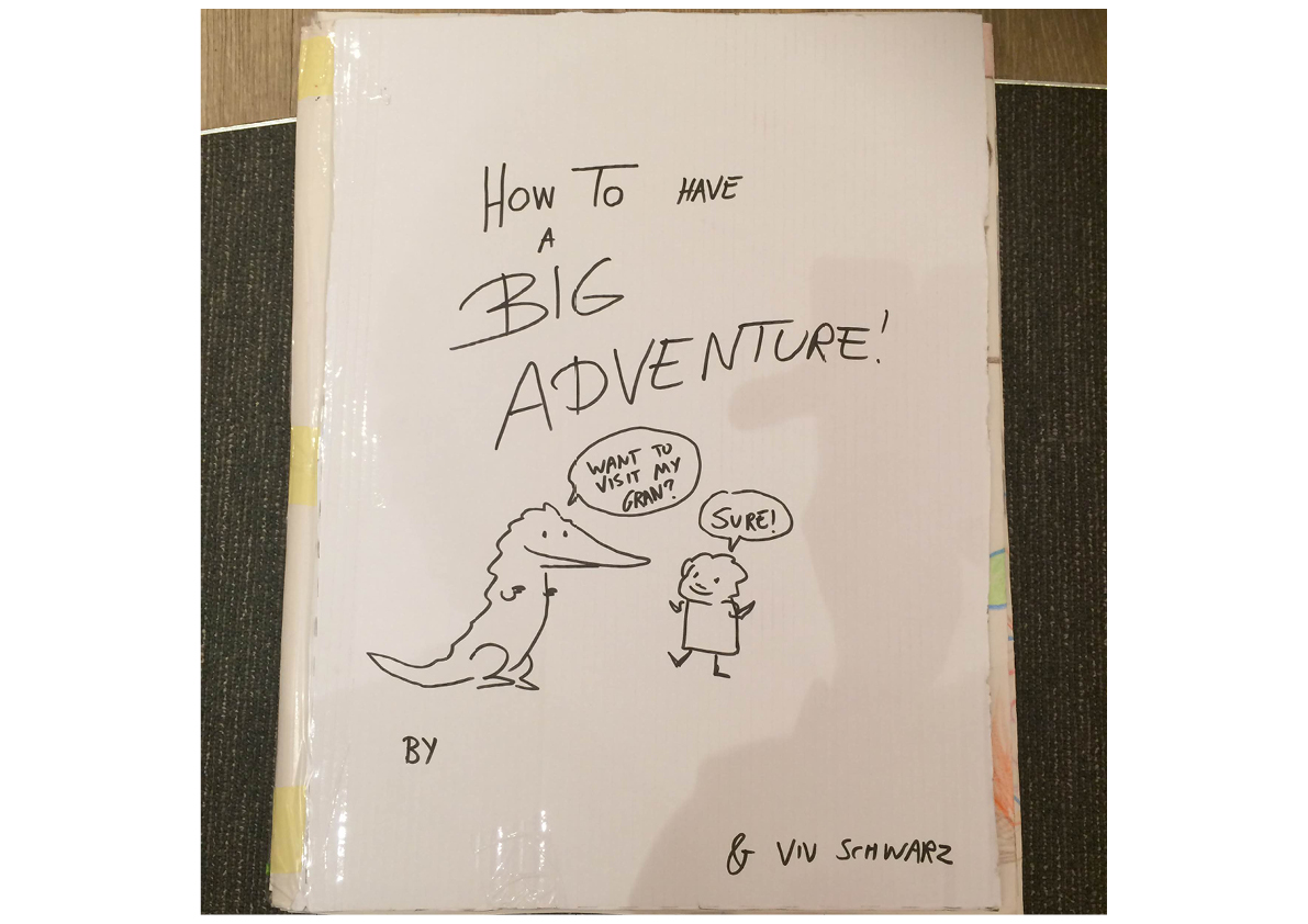
I had a brilliant time at Foyles in Birmingham doing a reading HOW TO FIND GOLD and then drawing a massive picture with everyone...in the end it turned into an impromptu book! Here it is.
So there you go, now you've met Crocodile's LARGE FAMILY and seen some strange omens in the upside down world, and you know that there's fine cake to be had by the Dream Lake of the Nose Sharks.
but managed to leave it on the train. Amazingly, I was provided by the excellent people at Foyles with a replacement roll and some paint, and it all worked out just fine. THANK YOU, EXCELLENT PEOPLE!!!! Especially Matt who last minute brought new paint and paper and Andi who organised it all brilliaintly and let me glue a massive book together in the middle of the shop. And also especially everyone who drew this.
0 Comments on ANNA AND CROCODILE find ADVENTURE in Birmingham, in Foyles. as of 8/15/2016 5:20:00 PM
"Mussel Shells" Faber-Castell Polychromos Pencils on Canson Pastel Paper
The drawing challenge from my color pencil group this month was to draw seashells. As you can see, I tackled four of them including the inside surfaces. Despite my initial resistance (too hard, too repetitive, not my thing, etc., etc.), I learned a lot from this exercise, much of which can be also be applied to my writing life, starting with practice, practice, practice. Thanks to my reluctance to start, I procrastinated like a pro. I answered email, cleaned my house, wrote more poetry; anything to avoid drawing. Finally the day came when I either had to get to work or go to my group empty-handed, aka "being a quitter." Not my favorite option. So with deep misgivings I started in with just one. Hmm. Not so bad. So I tried another. And another. And before I knew it I had drawn all four. Hey, I did it! Which made me realize:
Repetition is valuable. One of the main things holding me back was fear of boredom: how could I draw four similar shells without losing my mind? The truth, however, was very different: first, the shells were NOT similar, and second, by repeating the process several times my technique improved as I got to the last shell. Practice, practice, practice! Whether you want to improve your drawing, write exciting action scenes or learn the intricacies of arranging a pantoum, it takes more than one attempt to get it right.
Don't hide away in your "I can't do it" shell. Rather than setting yourself up for failure by aiming for the most incredible work in the whole of human history, start a dreaded project by drawing or writing in your most basic style: just get some shapes or words down on paper. Once that's done, tweak a little here, add a little there--before you know it your right-brain will be engaged and intrigued with all the possibilities. At this point, I dare you to stop.
Shells make great writing and art journal prompts. The first time I wrote about a seashell in my art journal was an entry about playing with my grandmother's collection of shells from the Gulf of Mexico when I was a little girl. I loved holding those shells to my ear and "listening to the sea." You might have a similar memory, or you might want to write about your first trip to the beach, or your own collection of seaside finds. On the fiction side, including a seashell in a short story, poem, or novel could trigger all sorts of themes, associations, and plot twists--especially if the shell is rare and valuable!
Artwork isn't always about drawing. How about brushing some ink or paint onto a shell and using it as a stamp in your art journal or mixed-media piece? Or pressing a shell into earthen or polymer clay? Drilling a hole into the top of a shell to add to a jewelry piece? Or simply painting and/or collaging the shell itself for a whole new look?
Using shells for meditation and mindfulness. No matter how small or seemingly insignificant, there's something profound about a seashell. Whether it's the patterning, the colors, or just the fact it once housed and protected some small and distant creature, shells make a good start to pondering life's mysteries. Add them to household altars, your writing room or studio, your garden or any other kind of creative sanctuary you like to visit. Personally I like to keep them all over the house in various nooks and crannies.
Shells have always fascinated me, but that's no reason to take them literally and hide out inside one of my own. The drawing challenge for July is to draw green leaves. I'm so fired-up by the prospect I'm going to start and base an entire art journal on the subject. No hesitation, no holding back, just going for it. Parsley, sage, rosemary, and thyme! Tip of the Day: One of the things I love about drawing is how it relaxes and pulls me into what I could almost call a different dimension. Memories; new ideas for writing; the book I'm currently reading: my mind seems to just float along with the tide. While I was working on my seashell piece I was reminded of one of my favorite books that I hadn't thought of for a long time: Anne Morrow Lindbergh's Gift from the Sea. If you've never read it, or haven't read it for a long time, I can't think of a better text to check out for summer inspiration. Enjoy!
0 Comments on Break Out of Your Shell! as of 7/3/2016 9:37:00 AM


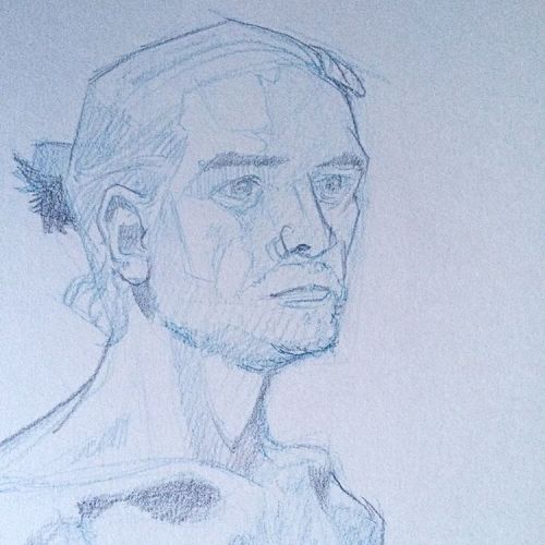
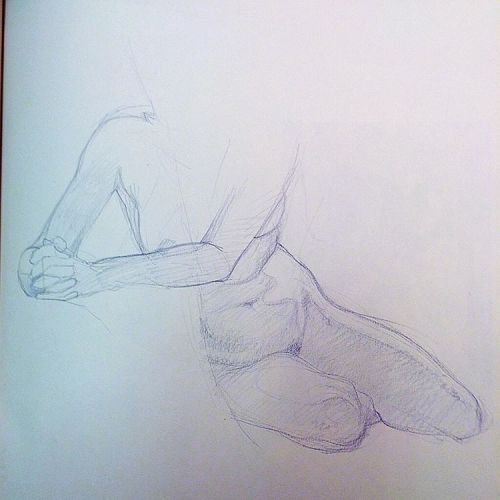
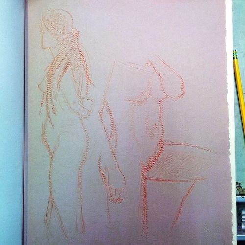
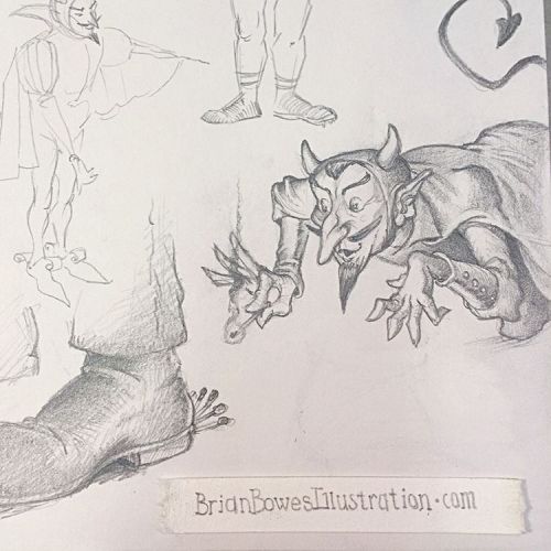
 By: Brian Bowes,
on 12/21/2016
By: Brian Bowes,
on 12/21/2016
 By: nicole,
on 12/19/2016
By: nicole,
on 12/19/2016


 By: Gerald Hawksley,
on 11/17/2016
By: Gerald Hawksley,
on 11/17/2016

.png.jpg?picon=3640) By: Sara Burrier,
on 10/27/2016
By: Sara Burrier,
on 10/27/2016


 By: Lisa Keeler,
on 10/6/2016
By: Lisa Keeler,
on 10/6/2016
 By: John Shelley,
on 10/1/2016
By: John Shelley,
on 10/1/2016


 By: Valerie Storey,
on 9/8/2016
By: Valerie Storey,
on 9/8/2016


 By: Matt Phelan,
on 9/8/2016
By: Matt Phelan,
on 9/8/2016

 By: Manelle Oliphant,
on 8/23/2016
By: Manelle Oliphant,
on 8/23/2016


 By: Viviane Schwarz,
on 8/15/2016
By: Viviane Schwarz,
on 8/15/2016


 By: dibujandoarte,
on 7/28/2016
By: dibujandoarte,
on 7/28/2016
