new posts in all blogs
Viewing: Blog Posts Tagged with: art, Most Recent at Top [Help]
Results 1 - 25 of 3,930
How to use this Page
You are viewing the most recent posts tagged with the words: art in the JacketFlap blog reader. What is a tag? Think of a tag as a keyword or category label. Tags can both help you find posts on JacketFlap.com as well as provide an easy way for you to "remember" and classify posts for later recall. Try adding a tag yourself by clicking "Add a tag" below a post's header. Scroll down through the list of Recent Posts in the left column and click on a post title that sounds interesting. You can view all posts from a specific blog by clicking the Blog name in the right column, or you can click a 'More Posts from this Blog' link in any individual post.
Here are the polar friends, nearly finished,
hoping to bring light and love
into the world.
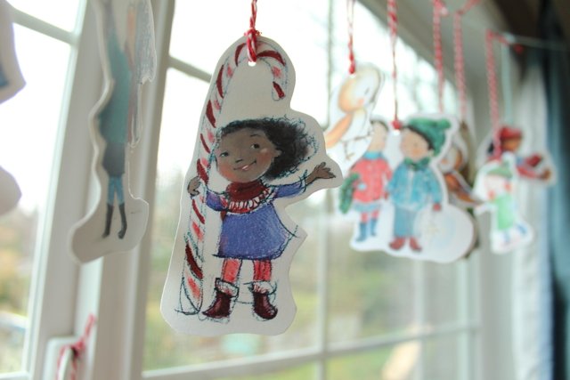
They kind of make me feel like the party has arrived.
See? They even brought candy canes and made cookies.
I kind of forgot to make Christmas cards
so these are going to be my tiny love and light-bringers.

And these.
Happy Advent, my friends.
May thankfulness,
love
and light
fill you up
and bring you peace.
Happy Holidays from Me to You! How will you spend the next few weeks? My plans include:- Watching Game of Thrones Season 6. I've been waiting for this for a long time.
- Reading Book 3 of the Elena Ferrante Neapolitan series: Those Who Leave and Those Who Stay.
- Decorating the clay pieces I made last month. I'm still working with an Asian-inspired theme: tiny landscapes, goldfish, and all embellished with beads and coins.
- Making jewelry: earrings, necklaces, bracelets--using up more of my beads!
- Being more present and aware with my social media friends: leaving comments on blogs, retweeting their tweets, and really getting to know who everyone is.
- While I'll be busy online, I'm also taking a small break from all my various writing and art groups until February 2017.
- Preparing more manuscript submission lists to agents and editors to use in the New Year. (Mindful submission is so much better--and more rewarding--than going willy-nilly through agents and editors A-Z "just because they're there.")
- Goal planning. One of my favorite year-end tasks! I'll be deciding and finalizing what I really want to do in 2017. (Hint: it's going to include a lot of painting!)
- And finally, despite the ginormous and very tempting sales in all the stores, I'm NOT buying any new journals, sketchbooks, or any art and writing supplies for myself until I've used 100% of what I already have. And that's a promise!
I hope you've had a happy and miraculous 2016 and that you'll use the holiday season to unwind, relax, and enjoy all the wonderful moments of this beautiful season. I'm so grateful for everything that has come to me this year, and I'm grateful for all of you for sticking with me and reading my blog so faithfully. Thanks for visiting and I'll see you soon. Until then, drink cocoa, stay warm, and remember to stay creative every day!
Tip of the Day: Celebrate the season with a special outing for your writing or art group. In my case I was able to spend a wonderful get-together yesterday with my writer friends at the oh-so-amazing St. James Tea Room here in Albuquerque. (Highly recommended if you're ever visiting New Mexico.) The decor was 100% English Victorian and the December menu was based on Charles Dickens's A Christmas Carol. It was all so authentic I thought I'd traveled to the UK--and without any jet lag! Find somewhere special in your own neighborhood to gather, rejoice, and share your 2016 successes and your 2017 goals.
Here's a peek at some of my new treats:
Tiny buttons!
Prints!
More batches of sight word cards - in new boxes to boot!
Plus greeting cards, stickers,
and small, gifty surprises
that I'm still finishing.
If you are local, you're welcome to come visit me downtown this Friday or Saturday.
Happy Thanksgiving, friends.
I hope your day is rich and deep.
surrounded in love,
bright in gratitude.
I made it: All 31 days of InkTober 2016. Some days were easier than others, some days were total disasters, and every day presented a new challenge, mainly: how to use ink in an effective and interesting way. I learned much more than I expected to, and in spite of wanting to give up more than once, I think I've come to appreciate ink and the artists who use it more than I ever have before.
The best part of the challenge though, was the set time frame of an entire month. I've always enjoyed taking on creative projects with some kind of pre-set deadline in mind, even if I only give myself a few days, a topic I covered in "The Value of a 5-Day Challenge." Concentrating on ink for a month was an entertaining, and educational, road trip and one I'm glad I followed.
Another benefit I derived from my ink-splattered journey was the chance to learn more about ink--what it is, how it's used, and why. For a writer, ink is as necessary, and as natural, as breathing and eating, but I don't think I'm alone in being in constant pursuit of the "perfect pen." Over the years I've gone through fountain pens, felt-tip models, roller-balls, gel pens, purple ballpoints--you name it, I've tried it! Thanks to InkTober, though, I've fallen in love all over again with Pilot Precise V-5 and V-7 pens, and was also able to discover Tikky Rotring pens. Along with these I added my favorite Akashiya Sai brush pens as well as my perennial go-to combination of bottled sumi ink and a sharpened bamboo stick. (Nothing like the basics.)
So . . . some random thoughts about the month and what I got from it:- Prior to the challenge, my daily drawings were solely for practice, nothing fancy, just simple sketches no one but me would see. However, InkTober required that I post my drawings every day on social media--eek. I therefore had to explore subjects that could be drawn up in 30 minutes or less yet still appear finished. My most successful efforts turned out to be small sketches of Taiwan based on my photos from my trip last year, and studies of trees drawn with a distinct Asian influence. In other words, I found a voice and method I liked.
- Sticking to ink-only was a challenge in itself. I craved variety. Even though I often added color from other mediums to my drawings (mainly watercolor background washes) it was difficult to stay so rigidly adhered to one type of drawing tool. The day the challenge was over I threw myself into oil pastels, charcoal, graphite--anything but ink! Consequently, I learned I am for sure a "mixed-media" artist, a good piece of knowledge if I ever need to describe my artist-self in a professional manner.
- One of the more trivial things encouraging me to take up the challenge in the first place was that I wanted to use up a sketchbook I didn't like. (Out of the negative, find the positive!) There really was nothing wrong with this particular book--it was filled with cold-press watercolor pages and quite expensive--but I just never jelled with it. It order to get it out of my life and stick with my daily plan, I decided to just draw on those expensive pages and the heck with results. This approach turned out to be a lot of fun--especially as I could never truly control the lines my pen made due to all the natural irregularities common to watercolor paper. So rather than waste the book or leave it to molder over the years, I used it, enjoyed it--and now have a good record of my InkTober experience.
- Finally, as much as I often resisted using that particular sketchbook (some days I just had to go back to my old favorites) the "bad sketchbook" allowed for two new drawing styles to emerge. The first contained a child-like whimsical quality, with the second being a loose and easy "just get the idea down" style. Both of these could be great for illustrating children's picture books, and I definitely plan to explore them further.
Now that it's November I'm immersed in--you guessed it--NaNoWriMo, or National Novel Writing Month, but I'm still taking a daily 30 minutes+ to work on my drawing skills. It's amazing to me what can be accomplished in such a short amount of time, but just like sitting down for half an hour to freewrite, you can only get the work done if you take the time to do it. It's that simple! Whatever length of time you choose, five days or five months, keep in mind that the whole point is to give yourself a unique opportunity, one that will help you achieve your goals, especially those you've been too afraid to start (or finish).Good luck and stay creative every day!And just to prove I did my homework, here's some samples from my InkTober sketchbooks: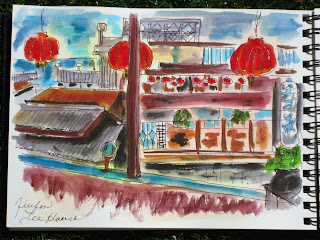 |
| Jiufen Tea House, Taiwan |
 |
| I was supposed to be practicing drawing horses, but zebras were more fun. |
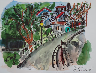 |
| Taipei residential neighborhood. |
 |
| Dreaming on a Sunday. |
 |
| Portugal seaside. Fun to travel by pen! |
Tip of the Day: Similar in spirit to National Novel Writing Month, InkTober is a chance to be part of a world-wide creative support group: one that wants you to succeed and meet your goals. Over the last few years all kinds of equivalent challenges have sprung up: Picture Book Writing Month, Poetry Month . . . even A-Z Blogging Month. Now is the perfect time of year to decide which one (or two or three) you'd like to try in 2017. Google some topics you might be interested in, find a group challenge, and then block out a schedule on your calendar for next year--it's never too early to prepare.
I'm playing with tiny paper people lately.
It seems easier to figure out than real Halloween costumes.
I keep hoping the wildebeests will agree to dress up like book characters.
Easy characters.
Like Baghead by Jarrett J. Krosoczka
That sounds reasonable, right?
Grocery bag?
A costume that doubles as a trick-or-treat bag!
Okay I'm mostly kidding.

The tiny guys are my way of getting ready for a virtual boo party
with Puddle Jump Collective.
Coming soon!
Do you have any easy costume ideas to share?
.png.jpg?picon=3640)
By:
Sara Burrier,
on 10/27/2016
Blog:
warrior princess dream
(
Login to Add to MyJacketFlap)
JacketFlap tags:
artist,
art,
drawing,
painting,
watercolors,
original,
sara burrier,
sara b illustration,
flash sale,
Add a tag
What to do when your drawers and portfolios are overflowing with original paintings?
You have a flash sale of course!
ONE DAY ONLY
Friday October 28th
9am - 9pm CST
All original paintings and drawings on www.sarabillustration.com will be hugely marked down!
There's a new chapter in my life coming, and I am pretty certain I will be inspired to make much of it through drawing and painting. I have also been wanting to play with working larger, which will require more room!
So in celebration of the arrival of our son Jaxon (and the crisp cool holiday season! My favorite!), I am holding this ultra rare sale, marking my original art for almost half the price! This is a great way, I hope, for those of you who have been wanting an original piece but haven't been able to afford it, are able to find something that resonates with you and is within your reach.
All of the paintings available demonstrate my progression as an illustrator...I have original paintings from ten years back when I was still inking my lines with microns because I feared loosing my lines and didn't like getting graphite all over my hand.
All the way through to the most recent, finished just a couple weeks ago. No inked lines but instead using erasable gray pencil, showing more confidence in my values, and creating far more inviting atmospheres that help tell the story.
Each step in the process is vital for the following step. Without experimenting and playing, I would not be where I am today as an illustrator.
Most of my work is small for those little areas of the house that need some magic.It is very well known that I prefer to work small, usually smaller than 8x10. I enjoy the challenge and quite possibly have always been interested in the miniature (LOVE dollhouses and all things small). Most of the larger works I create are requested commissions, but there will be a range of sizes available at the sale.
From a few of the smallest....
The many in the middle...
 |
| "July" 8 x 10 inches |
To a couple of the largest....
I know each piece has a soul mate, created just for them.
I pray that some of these pieces will find their match tomorrow. It's bittersweet to let go of your creative works. I am always so blessed to see how the work inspires and deeply touches those who purchase it, but then also sad to see them go. Each piece has a story for me, what inspired the imagery and why I created it...yet when I see them sitting in my studio I see a bird caged, waiting to be free and serve as inspiration for another.

By: Franca Driessen,
on 10/15/2016
Blog:
OUPblog
(
Login to Add to MyJacketFlap)
JacketFlap tags:
Music,
art,
Philosophy,
Jazz,
programming,
aesthetics,
computer science,
voyager,
*Featured,
computer art,
Arts & Humanities,
aesthetic theory,
Bernard Hay,
digital production,
four by three,
george lewis,
Add a tag
Between 1986 and 1988, the jazz musician and experimental music pioneer George Lewis created the first version of Voyager. After spending some time making work that involved compositional programmes in Paris, Lewis returned to the US and began work on Voyager. His aspiration was not simply to use computers as a tool or raw material, but to create software that could take an equal improvisational role to the other (human) musicians in the performance.
The post Art in the age of digital production appeared first on OUPblog.
I love Autumn. Absolutely love it! Every day there seems to be so much incentive to create, explore, start new projects--and the holidays are some of the best. This month I'm trying #InkTober (haven't skipped a day yet!), and next month will see me celebrating NaNoWriMo (National Novel Writing Month) again. I've lost count of how many years I've participated in NaNo, but win or lose it's always been a productive experience.
So besides the chance to try out new pens, journals, sketchbooks and unfamiliar materials, some of my other reasons for being crazy for Autumn include:- The weather is near-perfect, quite a bit cooler than summer, but here in New Mexico we can still wear T-shirts in the afternoon. As far as I'm concerned, there's no better time of year for sitting outside to read, write, or paint--especially as all the bugs have magically disappeared.
- Along with the more comfortable temperatures, the autumn scenery is magnificent. Talk about inspiration! The colors are at their absolute best: amethyst, pomegranate, yellow gold, black plum, pumpkin orange, and every shade in between.
- The stores are full of "back to school" sales; the discounts on stationery and other supplies are massive. Buy those gel pens! Grab those glue sticks!
- Some of the best new movies and books are released in the fall. (Which can also be something of a distraction when you're trying to fill pages with your own work.) But giving yourself a few hours to read or watch a new movie makes a good reward for meeting your daily word count.
- The flavors of autumn are so conducive to story-telling: spicy warm drinks, buttery cakes and cookies. Just don't forget to go for a nice long autumn walk to burn off the calories!
- Misty, foggy, rainy, nippy: my favorite books and stories have always contained a Gothic ambience that I like to include in my own writing. I can't think of a better time to write than when you're cocooned inside against the elements.
- Shorter days mean less time to be outside playing or lounging in the yard, which means I have a little extra time to write or draw every night before dinner or before going to bed.
- Although the weather can be a bit colder in the morning, it's not too cold to get up and still write my morning pages in relative comfort.
- There's a sweet sense of harvest in the air, making this a great season to examine and appreciate what you've accomplished in the previous months. If you find there are still some items on your goal-list, the good news is we all still have time to catch up before the New Year.
- I don't know about you, but I always think sweaters and socks are just cozier to wear while writing. (Especially my cat ones.)
- Bonfires. The other day at my writing group I tried to explain my memories of Guy Fawkes and the 5th of November, but I guess you have to be from a British background to understand "A penny for the Guy" and why English and Commonwealth children commemorate a centuries-old attempt to blow up the Houses of Parliament. No matter; fire pits, barbecues, and Homecoming and Halloween bonfires are good American traditions, too, and there's nothing nicer than toasting marshmallows or tofu-dogs on a moonlit autumn night.
- Travel--consider taking your WIP or sketchbook to a new and/or foreign setting. The fares are lower, hotels have more rooms available, and most tourists are back at work or back in school. The only problem is choosing where to go!
Whatever season you prefer, each one, or all four, can become the cornerstone of your creativity: painting a single scene in four versions of summer, fall, spring, winter; or using seasonal transitions when you're trying to invoke a sense of time, place and character in your manuscript. Even jewelry and ceramic work can reflect the changing seasons: blues and greens for summer, reds and oranges for fall. Each time of year has its own associations, many of them unique to our own memories and tastes. For me, it will always be autumn, hence my new Autumn Pinterest board. Enjoy the scenery!
Tip of the Day: How about creating a seasonal sketchbook or journal to record your favorite memories? Try some collage, or use natural elements such as leaves or seashells for printing and stamping. Write or draw on toned paper with colored inks. Make each turn of the year a season to remember.

By:
Faith Pray,
on 9/23/2016
Blog:
SACRED DIRT
(
Login to Add to MyJacketFlap)
JacketFlap tags:
#kidlitart,
#backtoschool,
#puddlejump,
puddlejumpcollective,
great books,
writing,
art,
writers,
artists,
failure,
good books,
Add a tag
How do you feel about failure?
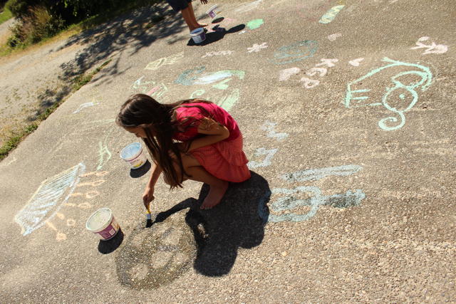
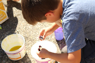
This summer, we made chalk paint with cornstarch, food coloring, and water.
Summery delight!
See our driveway canvas?
Little did we know that a thunderstorm brewed two hours away.
All our chalky wonders washed away overnight.
It's that resonance of art and failure that makes us strong, right?
Do you ever wonder if we can learn as much from our flops
- our sloppy first drafts, our rejections, our imperfections -
as from our neat and tidy successes?
I have this thing. This fear of ruining a brand new notebook or sketchbook.
I figure if I'm constantly working at something, then naturally, I'll keep improving.
And when I look at my old notebooks stuffed with terrible first drafts and awkward brainstorms,
I get panicky. What if this first page represents who I am through that entire notebook or sketchbook? Can't it at least start out perfect?
Talk about writer's block, eh?
So, I solved it.
It's my secret to hurdling the fear of failure. (in a notebook.)
I just skip the first page.
Then I'm set. I have a one-page cushion keeping me from a first-page flop.
(Really, it means that the second page becomes the first page, but shhh.)
But really, don't we gain something in being brave with each feeble offering of ourselves?
In truth, even if I jump right into the first page of a notebook and ink it up with a scratchy failure,
actually my "failure" teaches me something, and that becomes growth.
And if that's true, then maybe "failure" isn't so much of a failure.
Maybe the effort of trying something stretches and grows our skills.
And actually, that is beauty right there: being brave.
So, go out and be brave, my friends!
Ruin some second pages.
Scribble your heart out.
Make sloppy chalk paint that gets rained on overnight.
Get all muddy and splash around in those glorious flops.
Chalky books!
Journey by Aaron Becker
Quest by Aaron BeckerChalk by Bill Thomson
Art & Max by David Wiesner
The Dot by Peter H. Reynolds
Harold's Purple Crayon by Crockett Johnson

By:
Valerie Storey,
on 9/8/2016
Blog:
Valerie Storey, Writing at Dava Books
(
Login to Add to MyJacketFlap)
JacketFlap tags:
Antoine Predock,
Taiwan,
Writing,
Art,
Drawing,
Sketchbooks,
Letting Go,
Urban Sketchers,
Writer's Group,
Art Journaling,
Add a tag
 |
Sunday at the Albuquerque Rail Yards Market.
Kuretake Watercolor, Sakura Micron Pen |
How has your summer been? For me it went a little too fast. Thankfully here in Albuquerque it's still sunny and warm, but there is definitely a tinge of autumn in the air. Which means it's time to buckle down with a "back-to-school" attitude and get back to my main WIP, Ghazal. I also want to get back into a dedicated sketching schedule that fits in with all my other projects.Two things that are currently helping me get there are my writer's group summer art journal project and my outings with Urban Sketchers. Starting with my writer's group, because we've been meeting at the Albuquerque Museum we've been able to stay inspired by all the amazing art exhibited throughout the halls and galleries. Several weeks ago we had the idea to set out individually to find a painting or installation that could be the basis of some of our art journal pages.
For me it was coming across an entire room devoted to the travel sketches of New Mexico-based architect, Antoine Predock. The extensive collection ended with an intricate proposal for a southern branch of the Palace Museum in Taiwan (unfortunately never realized), but I was so taken with the loose and easy style that led up to this final, intricate fantasy that I had to go visit the exhibition three more times over the next month. Predock's example and implied advice to scribble, go for color blocks and bold lines, and to follow what you feel about a place and its landmarks, rather than what you're "supposed to see" was exactly what I've been trying to achieve on my own for the last couple of years.
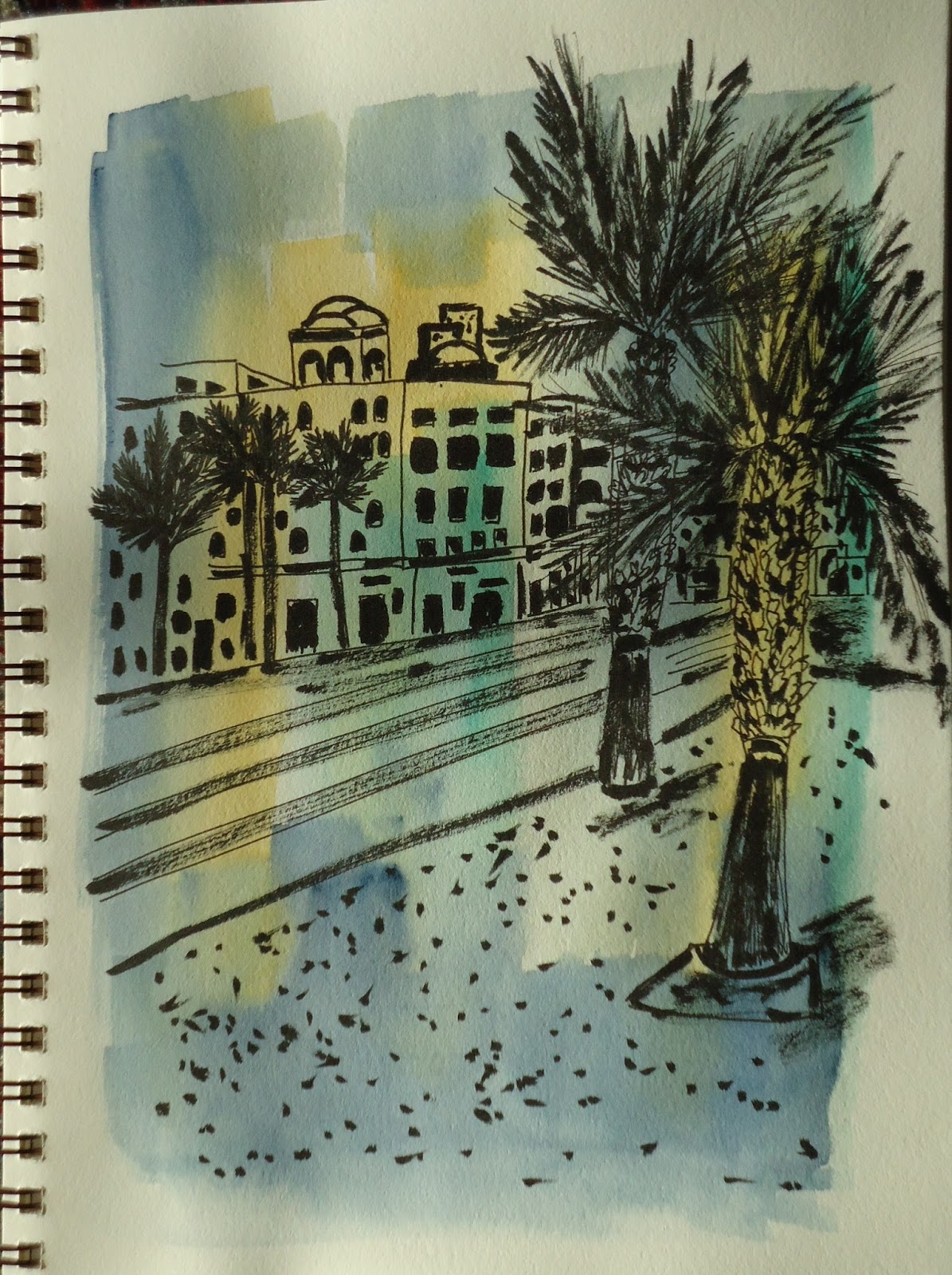
I kept all of that in mind last Sunday when I went with Urban Sketchers to the Albuquerque Rail Yards Market for two hours of morning sketching: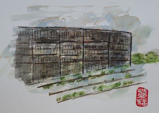 |
Albuquerque Rail Yards--abandoned but not forgotten!
Kuretake Watercolor and Sakura Micron Pen |
The more I go out with the group the better I'm becoming at relaxing and losing my self-consciousness. I care more about the experience than the results, and consequently I'm drawing more than I ever have before. I love it! |
Kuretake Watercolor, Fine-line Sharpie,
Akashiya Sai Watercolor Brush Pens |
I then wondered how this approach could work with writing and I found it fit perfectly. For instance:
- Go BOLD. Don't hold back; don't edit, mince your words, or fear critique and censure. Let go and let the words flow.
- Similar to a "gesture drawing," capturing the essence of a subject rather than the details, try gesture writing. First thoughts, first attempts, first drafts contain a lot of energy--energy that can transform your voice and writing into something only you could write.
- Write hundreds and hundreds of pages. I was impressed at how many sketches Predock had made, many of them simply a few lines in the center of the page, but each was so strong and effective. His examples reminded me to not skimp on materials, ideas, or any step that will express where I completely want to go.
Good ideas for some good writing time! Enjoy the season.Tip of the Day: Thinking of editing your work? Whatever you do, please don't kill the sketch. Whether you're sketching towards creating a more polished painting, or freewriting dozens of vignettes and character studies for your novel, screenplay, or short story collection, don't go crazy with the polishing. Yes, weed out awkward phrases, lines, and repetitions, but stay true to what made you fall in love with your ideas in the first place. Stay loose.
"The Chinese consider it childish to look for details in pictures and then to compare them with the real world. They want, rather, to find in them the visible traces of the artist's enthusiasm."
– E. H. Gombrich, The Story of Art
Here is a little something I wrote for
Puddle Jump Collective about magic and art-making:
My twins just read the Harry Potter series -
seven books and one play.
My whole rabble of wildebeests is now running through the house with pointy sticks, saying, "Wingardium Leviosa!" and "Expelliarmus!"
Aside from the bad parenting of letting children run with pointy objects,
I myself would not mind a wand for a few things in life.
1. The dishes. (A den full of four hungry wildebeests and their keepers can be very full of dishes)
2. The laundry. (Again with the den analogy.)
3. The writing and the art.
Wouldn't it be fun to flick a pointy stick
and magic oneself into a brilliant writer and/or illustrator?
So, really, where is that magic spell?
Wouldn't it make everything easier?
So, I once had the opportunity to hear picture book illustrator
Renata Liwska and her husband Mike Kerr speak at a SCBWI conference in Seattle.
Wide eyed and wonderstruck,
I wanted to know the tricks and magic spells
that would turn me into a picture book illustrator exactly like Renata Liwska.
Ever do that?
Well, maybe not. But I did.
So, we all of us watched thirstily as Renata and Mike unpacked for the talk.
They pulled out a motherlode of black sketchbooks and laid them in a mountain in front of us.
Each sketchbook was filled with perfect illustrations.
Perfect! Pristine in skill and finish!
How was there not even one scratched out, loopy mess up in the entire collection? How?
Renata is soft-spoken, humble, and has such a kind smile.
Her husband Mike pointed to the pile of books and told us Renata's magic spell:
"This!"
Sketch every, every day.
That's it?
W-w-w-work?
Just work?
Where's the magic in that?
Two years later, it's beginning to sink in.It isn't an instant change, but each drop in the bucket is a spell of sorts.
Each drop is a growing of your eyes and ears and hands,
every sketch is an observation, a study of the world,
each page is a honing of your vision -
and therein you find the transformation!
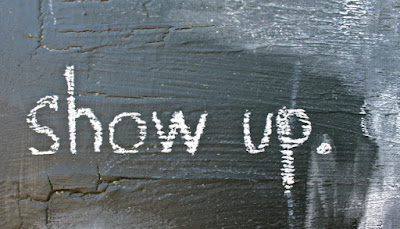
So, my friends, let me share some magic spells for improving your craft in a nutshell:
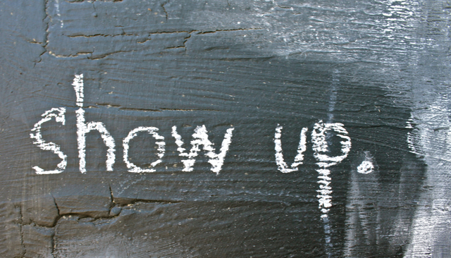
1. Show up. Every day.
(Writers also call this "butt-in-chair.")
2. Sketch. Sketch. Sketch.
(Or insert your passion here. Bake cakes. Practice soccer. Juggle fruit.)
3. Write. Write. Write.
(Especially important for aspiring authors.)
4. Read. Read. Read.
(Observe and learn from the world relating to your craft. If you want to be a picture book illustrator, by golly, read picture books like a sieve!)
5. Repeat.
6. Every, every day.
Once more:


And the thing is?
The more I do it, the more I love this daily rite.
It's like magic.
Books!
Harry Potter and the Sorcerer's Stone by J.K. Rowling
Tuesdays at the Castle by Jessica Day George
Withering-By-Sea by Judith Rossell
Half Magic by Edward Eager
The Magic Half and Magic in the Mix by Annie Barrows
A Snicker of Magic by Natalie Lloyd
Sylvester and the Magic Pebble by William Steig
Strega Nona's Magic Lessons by Tomie de Paola
Books on Writing and Art:
Writing Magic: Creating Stories That Fly by Gail Carson Levine
Rip the Page: Adventures in Creative Writing by Karen Benke
Spilling Ink by Anne Mazer & Ellen Potter, illustrated by Matt Phelan
Ed Emberley's Drawing Book of Animals
20 Ways to Draw a Cat by Julia Kuo
Let's Draw a Story by Sachiko Umoto
By: Estefania Ospina,
on 8/31/2016
Blog:
OUPblog
(
Login to Add to MyJacketFlap)
JacketFlap tags:
Books,
History,
art,
Philosophy,
oed,
Realism,
Plato,
romanticism,
*Featured,
Classics & Archaeology,
historical periods,
Arts & Humanities,
platonism,
-ism,
literary studies,
periodization,
philosophical categories,
Postmodernism,
Add a tag
There has lately been something like an arms race in literary studies to name whatever comes after postmodernism. Post-postmodernism, cosmodernism, digimodernism, automodernism, altermodernism, and metamodernism rank among the more popular prospects.
The post The last -ism? appeared first on OUPblog.
It's here! It's here! It's here!
Puddle Jump Collective : 13 children's book author / illustrators combining forces to showcase art, discuss craft, collaborate, and contribute to the kidlit world.
We'll blog, share projects, and splash often.
I'm honored to be one of the lucky 13.
This rain-loving girl skipped to the front of the line
for the our very first project -
a collaborative Puddle Parade.
Author/illustrator
Lorian Dean is next up
to combine my rainy girl with an entirely new character and set up,
which she will post, and tag another illustrator to follow suit.
I can't wait to see what transpires.
I hope you'll join us as we journey into the big pond.
Jump!
They say some people match their dogs.
I wish I had a dog so I could know what I look like.
I so often enjoy looking behind the camera at the world.
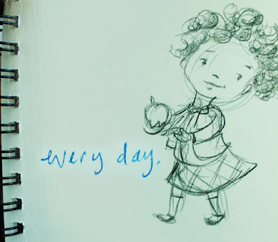
For an upcoming project, I was asked to make a kid portrait of myself.
A selfie? A sketchie? A skelphie?
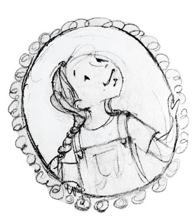
I approached it the same way I approach a new character.
Sketch a zillion bundle of possibles,
then hone in on who that character is.
So.. who am I?
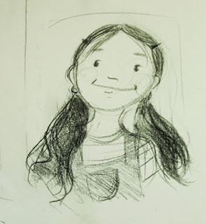
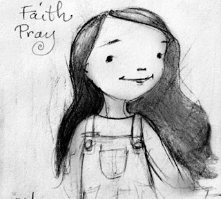

What do I look like anyway?
What do I feel like?
What would I look like if I combined me now
with some of my favorite things from childhood?
Books. Overalls. Sunshine. Rain.
Puddle boots.
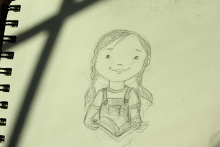

This is the girl I settled on. Bookish. Hopeful. Happy.
Not afraid to get messy.
Here's to finding your happy self this week, my friends.
It was an Instagram darling during its run. People couldn't stop posting pictures of themselves with the re-constructed trees, walls of bugs, glass marble-encrusted waterways, index card mountains, and hobbit-ish nests that had been installed inside the newly-renovated Renwick Gallery in DC.
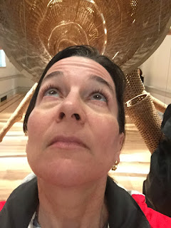 |
| Me, wondering |
Each artist had a whole room to work with. No other art was displayed. It was a playground for both creators and viewers alike.
No wonder the exhibit was called WONDER. I was lucky enough to catch it before it closed in June, and shared a few photos with my Poetry Sisters to inspire our poems this month.
For my poem, I chose to be look closer at
In the Midnight Garden, created by installation artist Jennifer Angus. She works entirely with bugs.
Yes, bugs. (Her fascinating website is
here.)
The Renwick Gallery puts it this way: "By altering the context in which we encounter such species, Angus startles us into recognition of what has always been a part of our world."
And that is exactly what I'm interested in: that moment of being startled by art.
Because as much as I love art, I love watching people interact with art even more. I love eavesdropping on their comments and watching them tilt their heads and contort their limbs as the art invades their head space.
I mean, look at this guy...he really, really wants to take it all in, but the room is too small, and soon, he'll figure this out and walk through that next door and look back, but at the moment, he's doing what we do when we're trying to take art home in our pocket.
Okay. After I took that photo of him taking a photo, I slipped through the archway and and took these two photos, trying to take some piece of the experience home in my pocket, too.
 |
Viewing In the Midnight Garden
by Jennifer Angus |
Then I wrote a poem about them. To extend the wonder, of course.
WonderAre they real? a child
asks. In answer, a woman looks
through the eyes of her cell phone.
Above her, a hot but bloodless red
backs death, the pixilated-eyed
watcher over her shoulder.
What do we capture of art, to port
tidily home in our pockets? Do mandalas
like t-shirt designs, fit into our hive
of possibilities? Look! A compass
rose points the way, as bugs flock
over other bugs, posed for family portraits—
or are they circled in therapy, masticating
unhealed hurts? In an aerial photo, I’ve seen
twenty-five thousand human bodies form
a blurry-edged Liberty Bell, but these flat-backed
bugs, so perfectly symmetrical, so aptly suited
for display, with their fine-wire legs and boldly
faceted bodies, could be fastidiously sewn
to a contessa’s dress. Snap. Snap. Snap.
The woman takes pictures. The child asks
again: Are they real? Yes. They are real—-
and clean, and desiccated, repulsion
removed so we can wonder
at wonder, at a museum within
a museum, at a body of bodies,
wing to wing, our mandibles open.
----Sara Lewis Holmes (all rights reserved)
NOTE:
If you're curious about that fantastic magenta color of the walls, according to the Renwick website, "The pink wash is derived from the cochineal insect living on cacti in Mexico, where it has long been prized as the best source of the color red."
And that Liberty Bell made by 25,000 human bodies? Here.
See how my Poetry Sisters wondered and wandered through the exhibit with their poems:
LizTanitaLauraAndiKellyTricia
Poetry Friday is hosted today by Tara at A Teaching Life.

By:
nicole,
on 7/28/2016
Blog:
the enchanted easel
(
Login to Add to MyJacketFlap)
JacketFlap tags:
art,
painting,
children's art,
mixed media,
wip,
paper,
mermaid,
acrylics,
experiment,
whimsical,
mod podge,
the enchanted easel,
Add a tag
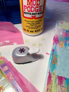
so, last week i was doing some cleaning/organizing (i do that often-major OCD girl here) and i found tons of paper (which i LOVE) and all kind of little art goodies that i had laying around. i decided to stop looking at them (so perfectly organized) taking up space and actually USE them (there's a novel concept...) and now i seem to have gotten myself into a full fledged mixed media painting.
 |
| originally intended to be an abstract... |
 |
| mixed media fun... |
 |
background mix of papers and acrylic....
|
 |
a tangerine haired mermaid decided she'd like
to be the featured attraction
of the *experiment*... |
{'cause i can never just "experiment" (OCD+perfectionist=all or nothing). more pics to follow...in between other paintings, that is.}
It's birthday week for my three girls.
It took them awhile to agree on a theme.
Paris + kitty cats + French pastries.
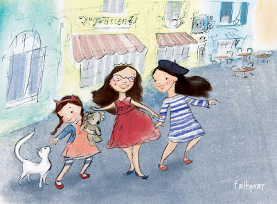
Kitty cat cafe ?
Ooh la la.
And you know me - I love any chance to make art,
especially for a party.
After researching all manner of things French,
I sat down to sketch in the book fort.
(Avec iced coffee in a jar, no less.)
Oh, happy day, mes petits.
I think I'll make some hanging art
and some tiny, cupcake art.
I should probably figure out games.
I'm no good at games.
Anyone?
Hide the baguettes?
Name the French cities?
Guess the French words?
Some French books we love:
This is Paris - Miroslav Sasek
Madeline by Ludwig Bemelmans
The Story of Babar - Jean de Brunhoff
The Fantastic Drawings of Danielle by Barbara McClintock
Madame Martine by Sarah S. Brannen
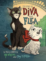
The Story of Diva and Flea by Mo Willems & Toni DiTerlizzi
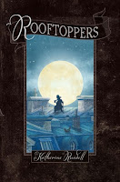
Rooftoppers by Katherine Rundell, ill. by Terry Fan


Via the SPX tumblr, a reminder that once San Diego Comic-COn is over it’ll be straight to the fall show line-up including the annual Small Ppess Expo in Bethesda, the annual Camp Comics for the indie inclined. Visionary master Jim Woodring created this animated poster, and a 3D version will be available at the show. […]
On Tumblr, artist Ronald Wimberly wrote a very cogent post on why artists should get paid to do sample pages: A quick preface: Yesterday a friend of mine told me the story of how she was scouted by DC Comics to participate in their “talent” workshop. My colleague, who worked as a professional for 7 years […]
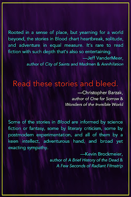
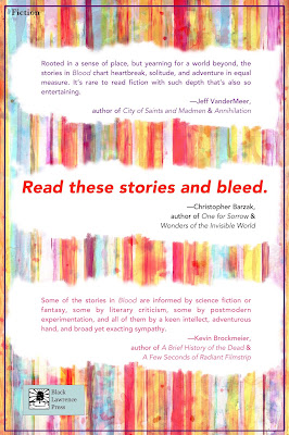
In the
Weird Fiction Review conversation I had with Eric Schaller, Eric asked me to talk a bit about designing the cover of
Blood: Stories, and in my recent
WROTE Podcast conversation, I mentioned an alternate version of the cover that starred Ronald Reagan (this was, in fact, the cover that my publisher originally thought we should use, until she couldn't get the image we ended up using out of her mind).
I thought it might be fun to share some of the mock-ups I did that we didn't use — the covers that might have been...
Front(click on images to see them larger)
 |
| 1a |
 |
| 1b |
1a & 1b. These two are variations on an early design I did, the first one that seemed to work well, after numerous attempts which all turned out to be ghastly (in a bad way). 1b for a while was a top contender for the cover.
 |
| 2 |
2. I always liked the idea of this cover ... and always hated the actual look of it.
 |
| 3 |
3. I made this one fairly early in the process, using the
Robert Cornelius portrait that is supposedly the first photographic portrait of a person ever made. It ended up being my 3rd choice for the final cover. I love the colors and the eeriness of it.
 |
| 4 |
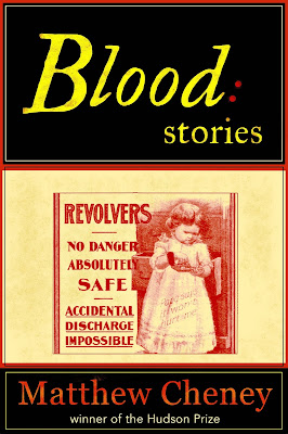
4. This never had a chance of being the actual cover, but I love it for the advertisement alone. As far as I can tell, that was a real ad for revolvers.
 |
| 5 |
5. The inset picture is one I took in my own front yard. I like this cover quite a bit, but there's too much of a noir feel to it for the book, which isn't very noir.
 |
| 6 |
6. Here it is, the Cover That Almost Was. The image is a publicity photo from one of Ronald Reagan's movies.
 |
| 7a |
 |
| 7b |
 |
| 7c |
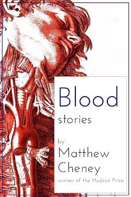
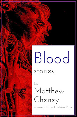
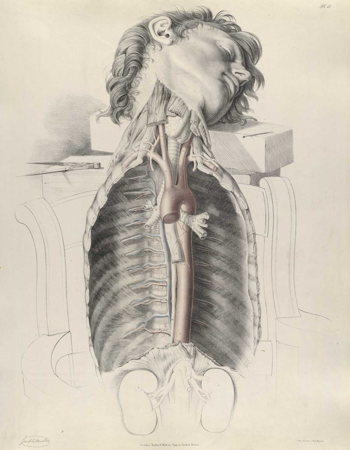
7a, 7b, 7c. Once I found
the Joseph Maclise image, I immediately thought I'd found the perfect illustration for the book. It took a long time and innumerable tries to figure out the final version, but it was worth the effort.
 |
| Actual cover |
Back
Though the book designer Amy Freels ultimately did the back cover herself, I gave it a stab. As you'll see, we went back and forth on whether to use all of the blurbs or just Chris Barzak's and put the other blurbs on an inside page.
 |
| 1 |
 |
| 2 |
 |
| 3 |
 |
| 4 |
 |
| 5 |
 |
| 6 |
 |
| 7 |
1-7. These are a bunch of early attempts. None quite works (some
really don't work), and they would have all felt sharply separate from the front cover. We had lots of conversations about #4, though, as the publisher was quite attracted to the simplicity and boldness of it for a while.
 |
| 8 |
 |
| 9 |
 |
| 10 |
 |
| 11 |
 |
| 12 |
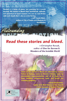
 |
| 13 |
 |
| 14 |
8-14. I love these, but they're all too complex for the back cover. As images, though, they still appeal to me deeply. I also like that they use
the Alejandro Canedo (or Cañedo) painting from Astounding (September 1947) that plays such an important role in the story "Where's the Rest of Me", though I also know we probably would have had to figure out how to get the rights to use it, and that could be a huge headache and a wild goose chase.
 |
| Full, final cover |
 |
"Mussel Shells"
Faber-Castell Polychromos Pencils
on Canson Pastel Paper |
The drawing challenge from my color pencil group this month was to draw seashells. As you can see, I tackled four of them including the inside surfaces. Despite my initial resistance (too hard, too repetitive, not my thing, etc., etc.), I learned a lot from this exercise, much of which can be also be applied to my writing life, starting with practice, practice, practice.
Thanks to my reluctance to start, I procrastinated like a pro. I answered email, cleaned my house, wrote more poetry; anything to avoid drawing. Finally the day came when I either had to get to work or go to my group empty-handed, aka "being a quitter." Not my favorite option. So with deep misgivings I started in with just one. Hmm. Not so bad. So I tried another. And another. And before I knew it I had drawn all four. Hey, I did it! Which made me realize:- Repetition is valuable. One of the main things holding me back was fear of boredom: how could I draw four similar shells without losing my mind? The truth, however, was very different: first, the shells were NOT similar, and second, by repeating the process several times my technique improved as I got to the last shell. Practice, practice, practice! Whether you want to improve your drawing, write exciting action scenes or learn the intricacies of arranging a pantoum, it takes more than one attempt to get it right.
- Don't hide away in your "I can't do it" shell. Rather than setting yourself up for failure by aiming for the most incredible work in the whole of human history, start a dreaded project by drawing or writing in your most basic style: just get some shapes or words down on paper. Once that's done, tweak a little here, add a little there--before you know it your right-brain will be engaged and intrigued with all the possibilities. At this point, I dare you to stop.
- Shells make great writing and art journal prompts. The first time I wrote about a seashell in my art journal was an entry about playing with my grandmother's collection of shells from the Gulf of Mexico when I was a little girl. I loved holding those shells to my ear and "listening to the sea." You might have a similar memory, or you might want to write about your first trip to the beach, or your own collection of seaside finds. On the fiction side, including a seashell in a short story, poem, or novel could trigger all sorts of themes, associations, and plot twists--especially if the shell is rare and valuable!
- Artwork isn't always about drawing. How about brushing some ink or paint onto a shell and using it as a stamp in your art journal or mixed-media piece? Or pressing a shell into earthen or polymer clay? Drilling a hole into the top of a shell to add to a jewelry piece? Or simply painting and/or collaging the shell itself for a whole new look?
- Using shells for meditation and mindfulness. No matter how small or seemingly insignificant, there's something profound about a seashell. Whether it's the patterning, the colors, or just the fact it once housed and protected some small and distant creature, shells make a good start to pondering life's mysteries. Add them to household altars, your writing room or studio, your garden or any other kind of creative sanctuary you like to visit. Personally I like to keep them all over the house in various nooks and crannies.
Shells have always fascinated me, but that's no reason to take them literally and hide out inside one of my own. The drawing challenge for July is to draw green leaves. I'm so fired-up by the prospect I'm going to start and base an entire art journal on the subject. No hesitation, no holding back, just going for it. Parsley, sage, rosemary, and thyme!
Tip of the Day: One of the things I love about drawing is how it relaxes and pulls me into what I could almost call a different dimension. Memories; new ideas for writing; the book I'm currently reading: my mind seems to just float along with the tide. While I was working on my seashell piece I was reminded of one of my favorite books that I hadn't thought of for a long time: Anne Morrow Lindbergh's Gift from the Sea. If you've never read it, or haven't read it for a long time, I can't think of a better text to check out for summer inspiration. Enjoy!
By:
Faith Pray,
on 6/27/2016
Blog:
SACRED DIRT
(
Login to Add to MyJacketFlap)
JacketFlap tags:
great books,
picture books,
birthdays,
writing,
art,
writers,
parties,
good books,
time to write,
teen writers,
word therapy,
Add a tag
A small friend is turning 6 in two weeks.
She lives across the country,
and we can't make it to the luau party.
We can't come for cake and balloons and birthday hugs,
but we can send pineapples
and kitties
and fancy toothpicks.
They're like tiny, paper aloha hugs.
So, in shuttling wildebeests to soccer camp lately,
I have discovered a few good surprises
in being the carpool soccer mom.
Books on CD.
Car-goofy kids.
And sketchbook time
while all my soccer players
do their runs and drills.
Big chunks of sketchbook time
help when working out new ideas.
It's funny that I can sketch happy around a crowd,
but I can't write a drop.
My thoughts turn to stone and my stories sink.
But then, that's kind of a theme for me with words anytime lately.
I know some writers who scribble serious magic
in coffee shops and airplanes.
What about you?
When do you do your deep story work?
Can you create masterpieces with everyone there?
Do you thrive with hum and buzz?
Or do you like a hush when you create?

Wherever you find yourself this week,
I wish you peaceful breezes, sweet surprises, and
aloha.
Books {and CD books} we're enjoying this week:
Captain Cat by Inga Moore
Dream Friends by You Byun
Ling and Ting Share a Birthday by Grace Lin
Ling and Ting: Together in All Weather by Grace Lin
A Boy and a Jaguar by Alan Rabinowitz, ill. by Catia Chien
Where the Mountain Meets the Moon by Grace Lin
Chasing Secrets by Gennifer Choldenko
The Cat Who Came in Off the Roof by Annie M. G. Schmidt


Goodnight, pencil jars.
Goodnight, lunchboxes.
School's out!
Hello, sunshine books.
Hello, swing seats.
Hello, sandy feet.
Summer is in session!
Summery reads:

Sam and Jump by Jennifer K. Mann
A Beach Tail by Karen Lynna Williams, ill. by Floyd Cooper
Listen to Our World by Bill Martin Jr & Michael Sampson, ill. by Melissa Sweet
Surf's Up by Kwame Alexander, ill. by Daniel Miyares
Ocean Sunlight by Molly Bang & Penny ChisholmIsland: A Story of the Galapagos by Jason Chin
We’ve covered Out of Steps Arts here a few times before. OOSA is an art collective that offers prints from some talented artists and sells their original art as well. They work with top notch people, and I’ve heard good things about them. Right now they’re competing for a $25,000 small business grant that FedEx […]
View Next 25 Posts


 They kind of make me feel like the party has arrived.


.jpg?picon=848)


.jpg?picon=160)


Merry Christmas to you and your sweet family, Faith! Keep shining your beautiful light! xo