new posts in all blogs
Viewing: Blog Posts Tagged with: graphic, Most Recent at Top [Help]
Results 1 - 25 of 36
How to use this Page
You are viewing the most recent posts tagged with the words: graphic in the JacketFlap blog reader. What is a tag? Think of a tag as a keyword or category label. Tags can both help you find posts on JacketFlap.com as well as provide an easy way for you to "remember" and classify posts for later recall. Try adding a tag yourself by clicking "Add a tag" below a post's header. Scroll down through the list of Recent Posts in the left column and click on a post title that sounds interesting. You can view all posts from a specific blog by clicking the Blog name in the right column, or you can click a 'More Posts from this Blog' link in any individual post.

By: Hannah Charters,
on 4/28/2016
Blog:
OUPblog
(
Login to Add to MyJacketFlap)
JacketFlap tags:
science,
World,
biology,
dinosaurs,
graphic,
timeline,
Infographics,
Oxford Reference,
OR,
infographic,
Editor's Picks,
*Featured,
jurassic,
oxford dictionaries,
Science & Medicine,
evolutionary biology,
triassic,
life sciences,
Online products,
Earth & Life Sciences,
oxford online,
cretaceous,
terrible lizards,
History,
Add a tag
Dinosaurs, literally meaning 'terrible lizards', were first recognized by science, and named by Sir Richard Owen (who preferred the translation ‘fearfully great’), in the 1840's. In the intervening 170 years our knowledge of dinosaurs, including whether they all really died out 65 million years ago, has changed dramatically. Take a crash course on the history of the dinosaurs with our infographic.
The post A timeline of the dinosaurs [infographic] appeared first on OUPblog.
Post by Jeanine


I’ve been a long time fan of the super talented design, illustration, and printmaking team known as Strawberry Luna. My art crush on this husband-wife studio might have a little to do with the fact that some of my favorite rock bands are among their impressive client list. And because they hand pull their beautiful silkscreens the super old-fashioned way. Or, because they hail from my hometown of Pittsburgh, PA. But, mostly I just am in love with their distinctive and smart graphic style! Best known for their silkscreen prints and posters, they also work on custom illustration and design projects including CD & vinyl packaging,web-ready icons, t-shirt designs, and logos & identity packages.
Their impressive client list includes Belle and Sebastion, Camera Obscura, Andrew Bird, Feist, Bright Eyes, Death Cab for Cutie and many, many more.
It was hard to choose just a few favorite pieces to share, so be sure to stop by their website and Etsy shop to see more!

Sarah Andreacchio is an illustrator living in France. Her playful patterns are packed with florals and happy critters in cheerful colorways. In all of her pieces there is an energy and rhythm that keeps a captive audience while eliciting a happy mood. Her work has appeared on journals, cards, silk scarves and even dimensional object such as rings, little sculptures and pendants.


 Be sure to follow along with Sarah’s creative adventures on her blog, or add some of her cheery prints to your art collection by visiting her shop.
Written by Bryna Shields.

By: Jeanine Henderson,
on 3/3/2015
Blog:
Illustration Friday Blog
(
Login to Add to MyJacketFlap)
JacketFlap tags:
cover,
graphic,
hand lettering,
Jeanine,
typographic illustration,
illustration,
typography,
packaging,
artists,
Lettering,
Add a tag
Post by Jeanine


I fell completely in love with the gorgeous work of illustrator and hand-lettering artist Kate Forrester as soon as I stumbled upon it. Her striking and versatile style has earned her an extensive list of international clients and diverse projects, including book jackets, packaging, greeting cards, advertisements, billboards, and much more. Kate combines dynamic hand-lettering with lovely illustrations to create flowing, organic images and often explores new & exciting mediums including wood, chocolates, tattoos, laser-cut paper illustrations—and even wedding cake!
Kate is based in the UK and her impressive list of clients includes Tiffany NYC, Victoria’s Secret, Random House, Penguin Books, Crate and Barrel, The Guardian, Little Brown, Walker Books, Moonstruck Chocolates and many more.
See more of Kate’s work here: Portfolio | Blog
Wishing everyone a day full of love and wonderfully positive energy!


By: Julia Callaway,
on 4/8/2014
Blog:
OUPblog
(
Login to Add to MyJacketFlap)
JacketFlap tags:
Literature,
shakespeare,
editions,
graphic,
tour,
Humanities,
cornerstones,
infographic,
*Featured,
Theatre & Dance,
Images & Slideshows,
Arts & Leisure,
Oxford Scholarly Editions Online,
Online products,
OSEO,
Shakespeare 450 birthday,
Shakespeare quotations,
interlinked,
sleeve,
Add a tag
“But I will wear my heart upon my sleeve …”
– Othello (Act 1, Sc. 1, l.64)
April 2014 sees Shakespeare mature to the ripe old age of 450, and to celebrate we have collected a multitude of quotes from the famous bard in the below graphic, crafting his features with his own words.
To read the free scenes, open the graphic as a PDF.
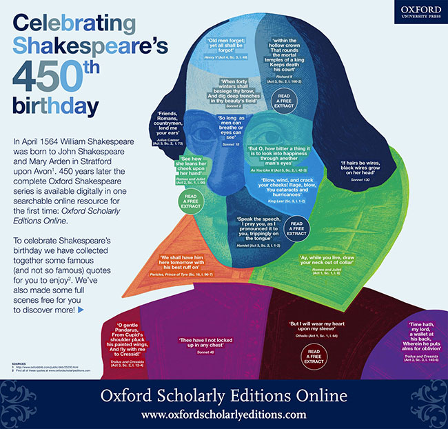
Download the graphic as a jpg or PDF.
Oxford Scholarly Editions Online provides an interlinked collection of authoritative Oxford editions of major works from the humanities. Scholarly editions are the cornerstones of humanities scholarship, and Oxford University Press’s list is unparalleled in breadth and quality. Read more about the site, follow the tour, or watch the full story.
Subscribe to the OUPblog via email or RSS.
Subscribe to only literature articles on the OUPblog via email or RSS.
The post Happy 450th birthday William Shakespeare! appeared first on OUPblog.


By:
Betsy Bird,
on 12/24/2013
Blog:
A Fuse #8 Production
(
Login to Add to MyJacketFlap)
JacketFlap tags:
Best Books,
graphic,
Graphix,
middle grade graphic novels,
Best Books of 2013,
Reviews 2013,
2013 funny books,
2013 reviews,
2013 graphic novels,
2013 science fiction,
AJ Lieberman,
Darren Rawlings,
Reviews,
graphic novels,
Scholastic,
Add a tag
 The Silver Six
By A.J. Lieberman
Illustrated by Darren Rawlings
Graphix (an imprint of Scholastic)
$22.99
ISBN: 978-0-545-37097-4
Ages 9-12
On shelves now
Ambition. It’s not a term I usually associate with children’s graphic novels. Your average everyday children’s comic is not particularly ambitious. There are so few of them out there that you can’t make any grand sweeping statements about them, except maybe to stress that the difference between a GN for adults and a GN for kids is scope. While an actual prose novel for the kiddos can set its sights rather high (see: The Golden Compass, Hokey Pokey, The Book of Everything, etc.) children’s graphic novels have more of a tendency to limit themselves. They might encompass sprawling narratives over the course of several books (see: the Bone series, the Amulet series, etc.) but in a single book? Usually there’s not a lot you can say (unless you’re Shaun Tan, of course). So I would have thought prior to picking up Lieberman and Rawlings’ The Silver Six. What looks on the outside to simply be yet another tame adventure tale for the kiddos turns quickly into a story so packed with excitement that in any other author’s hand this could easily have been split into a trilogy (at the very least). With a large diverse cast, a relatable heroine, and a good old-fashioned evil corporation, Lieberman and Rawlings dare to dream big and it pays off. Like I say . . . ambitious!
Phoebe Hemingway’s been doing okay. Sure, her parents died in a mysterious crash about a year ago and ever since she’s been faking it with her robot Oliver, living on their own. But when child welfare services track her down and send her to the ultimate nasty futuristic orphanage she discovers she may be in grave dangerd. Fortunately she meets up with five other kids that share some shocking similarities to Phoebe. Like the fact that their parents all died in the same crash. Or that they all willed to their children the same moon registration forms. Now the team is on an epic quest to escape the orphanage, travel off the planet, dodge the bad guys, and find out the true conspiracy behind their parents’ deaths.
They say that people relate to action movies/books/comics etc. because immediate peril is instantly understandable and accessible to an audience. That said, you can write all the action thrillers in the world but unless you’ve a little additional heart it’s not going to have a lot of emotional impact. What makes “The Silver Six” a little different from the other books out there is that it isn’t afraid to go for the emotional heart more than once. So you’ve six orphans, and that’s fairly heartrending on paper. And you’ve one of the villains dealing with his own tragic past as well. But the moment that makes all the difference in the world comes when Phoebe must willingly give up the one last family member she has for the greater good. When you sacrifice the comic relief to stop the baddies, that’s tough enough. When you actually LIKE said comic relief? Pull out those hankies and blow.
And I love the way the book rewards rereadings. As you read through and pick apart the conspiracies, the first page is going to make a lot more sense. Throwaway moments, like when a character sees the initials S.O.S. scrawled on a wall, are explained at length later. Then there are the little in-jokes. My personal favorite was the tech geek who worries that he didn’t feed his fish that morning, with a glance later at the fish he’s since raised in their absence. Trust me, it makes sense in the book.
The art itself wasn’t a lure at first. Darren Rawlings hails from the world of animation and motion graphics, so there’s going to be a certain level of slickness to any enterprise he stands behind right from the start. I’ve no idea if Mr. Rawlings did his own inking and coloring (no one else is credited) but it’s a good job. Still, the first thing you’ll notice is how much the man has had to cram onto each and every page. I’m not just talking words but number of panels and even images that appear on those panels. You get the distinct impression over the course of this book that Rawlings would do best if the pages were long and extended as you might find in a Tintin or Little Nemo collection. Yet for all that, I never had the feeling that the pages felt cramped. The art packs a punch but at the same time it has a way of carrying you along. I wouldn’t give it to a novice GN reader, but for those kids with some experience it’s going to be enormously satisfying.
If there’s a problem with the book, and there are surprisingly few, I suppose it’s the ending. The big showdown with the baddie happens and then everything looks lost. Then we get a LOT of exposition and badda bing, badda boom, end of story. In a book of false climaxes and honestly awesome moments where the action rises and falls, this letdown of an ending momentarily sours an otherwise skillful outing. I won’t deny that there’s a sweet justice in the way the villain personally brings about his own destruction, but it’s odd watching your heroes stand idly by while the world comes around to their way of thinking.
Many is the parent who decides to buy their kids some comics for vacation only to find that within the first 20 minutes of the car trip their children have read every single one. If you want something with a little more meat that’s going to keep their attention for AT LEAST an hour, The Silver Six is your friend. Also recommended for fans of epic adventures, bored kids, comic lovers, boys, girls, anyone who likes snarky robots, and people who has to read these kiddos bedtime stories. A quick and exciting little package (the book literally begins with an explosion) with a surprising amount of depth. Nicely done.
On shelves now.
Source: Galley sent from publisher for review.
Like This? Then Try:
Other Blog Reviews:
Professional Reviews:
Videos: And here’s the book trailer -
The SILVER SIX – Book Trailer from Rawls on Vimeo.


By: Gemma Robinson,
on 4/9/2013
Blog:
Sugar Frosted Goodness
(
Login to Add to MyJacketFlap)
JacketFlap tags:
gemma robinson,
editorial illustrator,
Illustrator,
illustration,
education,
technology,
digital,
vector,
editorial illustration,
editorial,
graphic,
conceptual,
conceptual illustration,
Add a tag
US based Educause Review commissioned me to illustrate three stories in their March/April issue. Educause Review is an award-winning magazine which takes a broad look at current developments and trends in information technology and how they may affect colleges and universities. All three stories were in some way linked to the impact technology has on higher education.
 |
| Disaggregated Accreditation by Gemma Robinson |
The first story was about accreditation and the need to view higher education institutions as fragments rather than a whole in our rapidly changing world.
 |
| We Love E-Books by Gemma Robinson |
The second story was titled 'We Love E-Books!' and focussed on the need to increase the availability of e-books at libraries. You can read the story here.  |
| Gateway To The Universe by Gemma Robinson |
The third story was about the disruptiveness of technology within higher education which, if embraced, can expand the classroom beyond the limits of four walls to encompass the whole known universe. Full story here.
Check out more of my illustrations on my website or Behance portfolio.
Some of the work from Lamosca is pretty familiar, but I became reacquainted with them through a weave of who-did-what for a recent IBM campaign. One of the things they handle quite nicely is the combination of layout and illustration. Their colorful and bold illustrations give the work an immediate pop, but it’s paired nicely with legible, insightful layout. It’s nice when those two can live together in harmony.
Their work feels consistent and jives as a whole, without feeling bored, tired or expected. Among their standout work is their info graphics — which have a quirky, colorful liveliness that isn’t often seen in that area of design.
Also, fittingly, their information and data work live over at www.lamosca.info.
Like what you see? Great!
Check out these other jim dandies:
Design Coordination and Corporate Images
Chris Bettig / The Mountain Label
Carl De Torres
No Tags
Share This
Grain Edit recommends: Karel Martens: Printed Matter. Check it out here.
©2009 Grain Edit - catch us on Facebook and twitter
I just love all the HAPPY words I see. What will you see?
Thanks to
Elizabeth Dulemba for the connect to
WORDLE... go visit and have some fun finding out which words you use most on your blog or website. The graphic representation is interesting and quite lovely. And I see a lot of familiar names in this design. Try it, you'll like it*:)
Many of the MG and YA authors I know are talking about partipating in NaNoWrMo and how they are getting their word counts accomplished. I kind of felt a little left-out.
As a picture book writer, I don’t have that many words to work with, so like Tara Lazar and others, this is my way of joining in on the fun. One starter a day until the end of November is what I will attempt to do.
*Disc laimer: Stories based on the exact set of words, names and attached graphics are already in the work.
The three words that I selected to base my story on are Curly, Bike and Pathway. My contribution is:
 Lady flicked her curly ears as she galloped down the pathway after CC’s bike. There was no way she was staying home. Not if CC was going fishing. Fishing was way too much fun. . . splashing around in all that water. Watching the fish scurry out of the way of her hooves. Listening to CC’s excited screams.
Maybe that was why CC took her bike.


By: Chris Whetzel,
on 10/28/2009
Blog:
Chris Whetzel Illustration
(
Login to Add to MyJacketFlap)
JacketFlap tags:
voice,
angry,
graphic,
whetzel,
mob,
village,
art talk,
artist,
illustrator,
illustration,
Add a tag
Hello, hello. As promised last week, I come bearing art. Its been getting busy around here since the last post, and it has made me almost forget about Halloween! I have to start my costume, and that means brevity in this month's post. Sorry!
Earlier this month, I was very lucky to be contacted by Tom at Riverfront Times. Not only was I glad to receive a job after a break, but it was a cover! Nice! Then Tom dropped the bomb that the article would be national among Village Voice Media publications, and that was awesome!
Tom had an idea of what he wanted so I sent him two quick layouts to choose from (I used a frame from another assignment's sketches as an indicator):

After layout approval, I worked up a tight sketch. While doing so, Tom ran the layout by the other art directors and wrote me with the feedback that it seemed very "farmer" with the pitchforks and such. I made it more urban by replacing them with pikes wrapped in barb wire. I thought it might be too much, but I guess not:

And I submitted two versions of final art. Initially, I was working the piece to emulate images on my website that Tom had mentioned. However, I really wanted to explore this as a two-color image, and Tom responded to that as the direction to move in:


After some discussion, we settled on this final version:
 The difficult part of this assignment was creating a suitable composition that would work with all of the papers' mastheads. Tom allowed me some leeway and said that overlapping the logos is fine and actually encouraged in some cases. Good news for me!
The artwork is being featured as an interior image in Minneapolis City Pages as well as the cover of Riverfront Times, Village Voice, Houston Press, SF Weekly, Miami New Times, New Times Broward Palm Beach, and Dallas Observer. Needless to say, I am SUPER-PSYCHED to have this artwork coming out this week! It's one of those days where you can't stop smiling and whistling, and people look at your weird.
Many thanks to Tom, Ivylise, Miche, Alex and Alex, Monica, Justin, and Nick for such a great opportunity as well as the great exposure. I hope to work with each of them again in the future!
Enjoy the Day,
Chris

By: Chris Whetzel,
on 10/15/2009
Blog:
Chris Whetzel Illustration
(
Login to Add to MyJacketFlap)
JacketFlap tags:
graphic,
whetzel,
chris,
campaign,
dew,
artist,
illustrator,
illustration,
film,
art,
poster,
Add a tag
By: Chris Whetzel,
on 10/7/2009
Blog:
Chris Whetzel Illustration
(
Login to Add to MyJacketFlap)
JacketFlap tags:
illustrarot,
artist,
illustration,
art,
charity,
digital,
graphic,
solomon,
representation,
Add a tag
By: Chris Whetzel,
on 9/30/2009
Blog:
Chris Whetzel Illustration
(
Login to Add to MyJacketFlap)
JacketFlap tags:
illustrator,
illustration,
photoshop,
digital,
vector,
sketchbook,
graphic,
bloomberg,
pension,
whetzel,
chris,
exploration,
gm,
Add a tag
Hello all. Welcome to another post! All is well in the studio, and I'm in the middle of a little breather. Two possible projects are being sorted out, and I am taking advantage of the downtime to really attack my sketchbook. I'm really trying to feel out why and how I draw while trying to let go of any idea I have of what is "good drawing." I'm also sorry to say that I am adopting a "my eyes only" approach to the sketchbook; the idea is that I will only focus on progress and experimentation instead of making pretty pictures for other folks to see. So there may or may not be additional sketchbook updates.
Although it was poorly made, listening to a documentary about Henry Darger (In the Realms of the Unreal) brought to light how a person can make art only for oneself. Until this time, I felt all artists crave attention, and I often joke that "all artists want to be famous" as we really just want people to view our work; we need to be validated! But there is certainly something to be said for a man who spent his whole life writing and illustrating a 15,000 page manuscript that no one saw until he was close to death. It makes me wonder where the assumption that I have to show my art comes from and that keeping it to myself feels selfish. But hey, keeping it to myself should keep it honest, right? I already find myself drawing differently and drawing subjects I wouldn't otherwise. So its off to a good start.
While exploring the sketchbook, I am also trying to really explore other aspects of drawing by looking at as many drawings as I can and trying to figure out WHY it appeals to me, reading and researching how drawing works from both an artist's and a viewer's perspective, and trying to discover how one moves from drawing to another technique such as painting; they really are two different beasts. Defining such things can be very frustrating and there are always artists and images that counteract any definition one hypothesizes. however, I feel doing so and asking myself such questions will make me more honest with myself and my work.
I am also trying to "step out of the box" within my regular assignments as a loose continuation of this exploration. A good example of this approach is a recent illo for John at Bloomberg Markets. I was very happy to be contacted by John from a referral by Kam, the Bloomberg designer I worked with last summer on a great assignment concerning Asian stock market regulators. John was looking for a metaphorical image to represent the mistreatment of retirement pensions by General Motors. We discussed concepts and such, and I provided the following sketches:
 John wanted to see a sketch of a "pension" license plate that was beat up and rusty. The plate is a Michigan plate to allude to GM and "motor city."
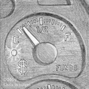 In the other sketches, I wanted to explore the pensions as dwindling. This sketch of an emptying funds gauge fit the bill, but I think it was too static.
 I enjoyed this sketch that worked in both my idea as well as John's license plate request. However, it was decided that the size of the image was going to be small, and certain elements of the sketch would be hard to read. The final art:
 Initially, the image was "too clean," and John asked that the license plate be dirtier. Upon revision, we were both quite happy with the finished product.
This image was a little intimidating for me as I do not usually work with textures, and I do not usually aim for a more realistic representation. However, I was adamant that those two elements were key to this image being successful so I basically jumped in feet first to scanning textures and making brushes in photoshop. I had not worked in this manner for years! Replaying the creation of this art in my head, I have to say that exciting nervousness of not knowing where the image and just trusting yourself is going is a lot of fun; I hope to push it into more work.
Thanks for reading! Look for a new post next week!
Enjoy the Day,
Chris

By:
mrana,
on 8/21/2009
Blog:
Bit by Bit
(
Login to Add to MyJacketFlap)
JacketFlap tags:
design,
illustration,
Flowers,
cafepress,
drawing,
France,
Drawings,
BotanicalArt,
cards,
Daily Sketches,
garden,
happy,
Dabbling,
Colored Pencil,
artwork,
French,
graphic,
sunny,
sunflowers,
yellow,
floating lemons,
cheerful,
Provencal,
Provence,
Add a tag

I bought a bunch of sunflowers from the markets the other day, they are so wonderfully cheerful. It's also the first time in my life that I've seen fields absolutely full of sunflowers, a sea of bobbing yellows and oranges capturing the joys of the day, I love it.
Am not so crazy about the drawing though, I'm not quite sure why but it seems pale in comparison to the real thing. I haven't captured the vibrancy and am a bit disappointed -- maybe next time ...
Floating Sunflower cards and matching gifts at Floating Lemons at zazzle

By: Chris Whetzel,
on 6/15/2009
Blog:
Chris Whetzel Illustration
(
Login to Add to MyJacketFlap)
JacketFlap tags:
action,
whetzel,
chris,
espn,
illustrator,
football,
illustration,
magazine,
fantasy,
digital,
vector,
graphic,
Add a tag
Hello, reader! Welcome back! I'm happy to say this post will feature ART!
In regards to my last post concerning the field of illustration, I would like to say that after some research and correspondence, I was educated on the Conyers Bill from 2002. Check it out for info on what was almost an illustrators' union as well as info on antitrust laws. Its interesting stuff. I do still think some type of universal creative organization would be beneficial but I will stop talking about it as it appears its been tried before and didnt work out as parties could not agree or act in unison.
No worries, though! Lots of other things to focus on! New cards are coming this week. Maybe you will get one. Six new pieces are finished or in the works for future publication in the coming months. I'm hopefully getting to work in some personal project book covers this summer, and I'm looking for new ways to promote. I am looking for illustration groups and organizations to join as well in order to just have some sense of community as working from home is very solitary.
What else to mention? Currently, I am halfway through a multi-illustration project that I look forward to sharing when published. Its all hush-hush now but hopefully it wont be for long!
So for now, I can only share some artwork that is being published tomorrow:
ESPN the Magazine contacted me back in March with a cool illustration assignment: the defensive line of the Pittsburgh Steelers. The artwork was for ESPN's Fantasy Football 2009 Magazine. I had been wanting to do some sports-related art but I could never find the time; so I was super-psyched to do the job!
I was actually a little intimidated as the magazine is for "SUPER DIE HARD football fans." I was so paranoid (as is always the case) that I would mess up a uniform aspect or a player's name/number. So I did tons of research before even starting sketches to really familiarize myself with the team. Ed Mann, the art director, also sent me some nice high-res reference as well which helped greatly. After Ed and I settled all the details of the project, I sketched up these action-based images for him.
The Sketches:
 I called this one "the stack." I was really having fun just trying to show the defense as a mass of helmets and uniforms. A swarm, if you will. I liked how this one was a stack of players where you don't notice the ball carrier at first; it focuses on the defense by not even show the carrier's face/front.

I called this one "the wave." In this sketch, I was going for more of a "crashing down" on the ball carrier. Unlike the first sketch, this one features the ball carrier prominently but in a position of weakness. I really enjoyed how the figures are unrealistically stacked to the right; this sketch feels almost like fantasy to me. Perfect for fantasy football! The last sketch was one I called "the wall." I wanted to show the defense as a literal "wall" between the ball carrier and the goal. The aspect I liked of this sketch was the hands obscuring the ball carrier's uniform number; this would help by not singling out any particular player as the victim, and its also a bit metaphoric. I also liked the "back against the wall" aspect that no one would probably ever notice but me :)
Ed chose the third sketch ("the wall"), and I was off to create the final art. I decided to flip the image so that the viewer's eye would travel top left to bottom which made more sense to me. I also altered my use of blacks to focus more on the Steelers' uniforms and less on light and shadow; it worked well in this piece as there is still a healthy pattern of blacks and value.
Final Art:
 One note I would like to make is the effort put into the logos and uniform numbers. I dont mean to boast, but its all there, even the helmet "Riddels!"
Thanks to Ed for the opportunity to make artwork I really enjoyed! I hope to do more action-oriented artwork in the sports field for future assignments.
Enjoy the Day,
Chris

By: Sevensheaven.nl,
on 6/15/2009
Blog:
Sugar Frosted Goodness
(
Login to Add to MyJacketFlap)
JacketFlap tags:
hills,
exhaust gas,
illustration,
car,
metin seven,
sevensheaven,
pollution,
stylized,
illustratie,
moon,
3d,
graphic,
grass,
Add a tag

3D style experiment.
More at Sevensheaven.nl
Join me at Twitter [I mainly write in the Dutch language]
By: Chris Whetzel,
on 4/20/2009
Blog:
Chris Whetzel Illustration
(
Login to Add to MyJacketFlap)
JacketFlap tags:
juliet,
romeo,
illustrator,
illustration,
shakespeare,
poster,
digital,
cover,
hamlet,
graphic,
conceptual,
othello,
whetzel,
chris,
Add a tag
Hello.
Well, here we are. April. The end of this month will mark one year of this new journey. I am very happy to say I have been able to survive as a freelancer for a whole year. Much has changed, and at times I am still uncertain of what to do. There is still much to learn and much to be done. But I do think I'm off to a good start!
To mark this anniversary of sorts, I took it upon myself to re-design chris-whetzel.com(being uploaded tonight). Lately, I had been really unhappy with the website layout so I read up on some coding issues I was having with the site, and fixed it up to look a little better on any size screen. Also, I decided to use clearer thumbnails and add some features to make things easier for art directors after viewing joshuamiddleton.com. Thanks to Scott and Irene for bringing this website and its positive qualities to my attention. Also, thanks to Josh Middleton for amazing art on a well-designed site. I am really happy with the re-design, and I feel it may be around for a while. Of course the artwork will be updated as close to monthly as I can manage!
The time since my last post has been filled with work, thankfully. All are pending publication, so they will eventually be featured here. I have been very lucky to have some children's work to supplement my income! I am considering featuring the kids work on this blog as well as setting up a site for it. Also just completed was artwork for a client I was very excited to work with! Sadly, this artwork will not be released until June, and I can't wait to add it to the portfolio!
Its been a weird period. I have found myself to be very artistically driven as of late. I just added three new self-initiated pieces to the portfolio (which was a project in itself), planned more portfolio work, and provided artwork for three commissions. The odd part is that while being very busy with this work, I have had this yearning to be reading more. These past two weeks I read Robinson Crusoe and Lord of the Flies; I am currently working my way through Walden again. Walden is a very important book for me; a much of the book reflects how I attempt to live my own life (with some allowances :) Anyway, I have found that this rekindling of the desire to read has really inspired my creative side. What a pleasant surprise.
Now shut yer trap, Chris! Its time for the artwork!
This blog post features three new self-initiated pieces based upon Shakespeare's works. I took these on as a vehicle to experiment within my own artistic methods: playing with color, cropping, and composition as concept:
 I am pretty happy with these, and I hope to get more work along these lines. If not, I'll just keep making them for myself, experimenting along the way!
Enjoy the Day,
Chris

By:
mrana,
on 4/6/2009
Blog:
Bit by Bit
(
Login to Add to MyJacketFlap)
JacketFlap tags:
Awards,
design,
illustration,
Food and Drink,
Coffee,
typography,
Drawings,
crazy,
cards,
Daily Sketches,
text design,
typography design,
Colored Pencil,
mugs,
artwork,
graphic,
floating lemons,
coffee cups,
caffeine addicts,
coffee lovers,
hot beverages,
Add a tag

First, I started out with this doodle of coffee mugs (this was while I was sipping one in the morning as one does) which I am not terribly fond of ... But it inspired me to do this:

And so the end result was this:

And then I ended up getting a Today's Best Award at zazzle for this:

Now, THAT put a smile on my face :D Cheers!

By: Chris Whetzel,
on 4/1/2009
Blog:
Chris Whetzel Illustration
(
Login to Add to MyJacketFlap)
JacketFlap tags:
green,
statue,
mangement,
illustrator,
illustration,
poster,
energy,
waste,
editorial,
graphic,
liberty,
Add a tag
Hi! How ya doin'?
Welcome back! So whats new? Well, two posts back work was very slow and I am very grateful to have had some projects come in these past two weeks. So while working on them, I just got my new postcard out last week, and I am working on some new pdfs for the website. I FINALLY just got all my taxes sorted out and found that my amount due wasn't too bad at all. Nice! What else is going on?
Plenty! I actually wanted to talk a bit in this post about the slow times in freelance. It only took a little slow down to make me panic. I was sure the business was done, and I needed to find another production job. Maybe that will be the case if the economy continues the way it has this past year. But for now, I see the past two months as a great test to my fortitude and desire to really be doing this type of work. No doubt about it, my faith was definitely tested every time I looked at my bank account. Also, when not working, one's self-esteem takes a pretty big hit, too. "Why isn't anyone hiring me? Do I suck?" These questions creep up on you in the quiet times.
I have found the best way to deal with these times is to focus. Focus on one's work. Promote more. Fix anything you don't like about your portfolio; make it stronger. Clean up your website. Go draw. JUST DO SOMETHING so you aren't constantly doubting yourself.
I find this is a great time for personal projects. For me, its hard to make time for them when commissions are on the drafting table. So to utilize the time, and to assuage my doubts, I took on the Joker portrait from the last post, and another personal project. Sometihng I have worked on here and there is a comic concept my brother is tinkering with. I liked it so much I want to draw some stuff for it. We are currently reworking a short script, and here are the non-final character concept sketches:
 The main character and his father (we are discussing a re-design of the father as I feel his character is wimpy)
 The villain in armor and in robes
 Supporting characters
 A character study to capture a "crazy look"
I also started a little poster campaign for myself concerning our current economic situation and energy needs. It will eventually be a three poster series but for now it just one :)
Sketch:
This was just a sketch in my book. I had been tinkering with the concept for a bit prior instigating the poster project.
Final 11x17:
 I decided to crop the art to more easily draw attention to the bulb; I felt the sketch had too much info in it. I mocked it up as a Waste Management poster to work my typography muscles, and I sent it to 'em. My contact there forwarded it to the proper channels, but I don't expect to hear anything as WM works with a design studio for all of their materials. But still, I wanted to at least try my hand as pitching an idea to a cold client to exercise those muscles as well. Anyway, the other two posters are looking to be themed around recycling and public transportation while using the term "green thinking." Someday, you'll see them. They are actually on a far back burner for projects I am much more excited about right now, both commissioned and personal.
And that's that. I have sketches for more posters underway, and some work due early next week so I better get back to it.
Enjoy the Day,
Chris

By:
mrana,
on 1/15/2009
Blog:
Bit by Bit
(
Login to Add to MyJacketFlap)
JacketFlap tags:
digital,
balance,
cards,
text design,
typography design,
positive thinking,
graphic,
text,
font,
floating lemons,
hand drawn,
encouregement,
motivational,
design,
life,
harmony,
typography,
Add a tag

Life is also very insistent when it needs attending to and easily distracts one from creative pursuits no matter how much one procrastinates ... :) I've had so much to attend to lately that I find myself slightly (or hugely depending on how I want to view it) blocked where art is concerned at the moment. So I've been fiddling around more with typography lately and this is one of the results.
I hand-draw into my sketchbook first now, as my tablet PC seems to have given up on me, and then scan the drawing in and polish it up in photoshop. After which I transfer it into Illustrator to fine tune the lines as it's the smoothest way of changing the colours on the letters if I wish to do so.
I'm considering opening up a new store on zazzle devoted entirely to my play with fonts and type design, as they seem to be getting increasingly popular. It's also fun and almost as therapeutic as drawing, so I won't be giving up on it anytime soon. Cheers!

By:
mrana,
on 12/25/2008
Blog:
Bit by Bit
(
Login to Add to MyJacketFlap)
JacketFlap tags:
thanks,
floating lemons,
grateful,
hand drawn,
design,
generosity,
gratitude,
appreciation,
typography,
digital,
cards,
Daily Sketches,
thank you,
kindness,
text design,
typography design,
graphic,
Add a tag

I first began blogging here on the 23rd December 2006. I can barely believe that it's been two years. And so much has happened since then that I would never have imagined or envisioned. If anyone had told me that in a couple of years I would be drawing and living in French countryside I'd have laughed. Loud and long. But here I am ...
I need to thank everyone who has encouraged and inspired me, taken the time to drop by to comment, chat, motivate, and turn into amazing friends whom I hugely admire both personally and artistically. I live a blessed life and appreciate it, and all of you, daily. Hourly. By the second!
Cheers and a Happy New Year to every one of you wonderful, talented, inspiring artists/friends out there! May 2009 bring even more creative sunshine into our lives.
P.S.: My Thank You Blue mug design won me a "Today's Best" Award over at Zazzle :)


View Next 10 Posts


Starts with an explosion? Ought to be a good one for boys. I’ll keep the eye open for this one.