new posts in all blogs
Viewing: Blog Posts Tagged with: chris, Most Recent at Top [Help]
Results 1 - 18 of 18
How to use this Page
You are viewing the most recent posts tagged with the words: chris in the JacketFlap blog reader. What is a tag? Think of a tag as a keyword or category label. Tags can both help you find posts on JacketFlap.com as well as provide an easy way for you to "remember" and classify posts for later recall. Try adding a tag yourself by clicking "Add a tag" below a post's header. Scroll down through the list of Recent Posts in the left column and click on a post title that sounds interesting. You can view all posts from a specific blog by clicking the Blog name in the right column, or you can click a 'More Posts from this Blog' link in any individual post.

By:
Darcy Pattison,
on 2/29/2012
Blog:
Darcy Pattison's Revision Notes
(
Login to Add to MyJacketFlap)
JacketFlap tags:
publishing,
historical fiction,
bock,
self,
chris,
indie,
niche,
how to publish a book,
kris,
Alternate Publishing,
eboch,
Add a tag
Continuing the series about Alternate Publishing. This is part 3 of 7.
Dodging Trends: Why I Turned to Self-Publishing
Guest Post by Chris Eboch
“If a book is good enough, it will find a home.” I’ve heard that a lot in the publishing industry, especially from editors and agents.
There’s just one problem. It’s not true.
After 15 years in this business, 12 traditionally published books, and years as a teacher through the Institute of Children’s Literature, writing organizations, and local colleges, I think I’m a pretty good judge of quality. And yet I’ve seen too many great manuscripts fail to sell. Maybe some authors just need to keep trying, but when multiple published authors say, “I can’t believe her novel hasn’t sold yet,” you have to acknowledge that the publishing business judges by standards other than quality.
That’s not to say you can sell a terrible book. Rather, a manuscript has to be great AND trendy, or at least something editors and marketing departments predict will sell enough copies to make money for the company. When vampires were selling big, publishers released more vampire books.
 I happen to like historical fiction. My first middle grade novel, The Well of Sacrifice (Clarion Books), came out in 1999. It’s an adventure set in ninth-century Mayan Guatemala, and because many schools teach the Maya in fourth grade, it’s still in print and I get a nice royalty check twice a year.
 A few years ago, I wrote a mystery set in ancient Egypt. The Eyes of Pharaoh is better written than The Well of Sacrifice, since I’ve become a better writer. Yet wherever I sent it, I got one of two responses – “Historical fiction isn’t selling well these days” or “We already have an Egypt book.”
I do know writers who have sold historical fiction more recently—mainly literary novels set in America in the last 200 years. And a couple of young adult novels have touched on ancient Egypt (well, at least on Cleopatra, who isn’t all that ancient by Egyptian standards). But despite great feedback on my story, despite teachers telling me they wanted the book for their classroom, despite the l
Hello again. I'm sorry that I don't have any art to share this week. Instead, I wanted to share some work-related stuff that I have going on. To quote Milton Glaser, "Art is Work." But I also think Art is Play. We all started because it was fun, right? Doodles and mark-making were fun. So to keep it as such, I am trying new and old things outside of my usual methods.
I just got a Wacom in hopes of experimenting with Photoshop. It was a gift from my lady friend, and its pretty fun. I went with a tiny one as my desk space is pretty cramped already, and I didn't want to spend too much money in case I didn't like working in this manner. I hope to post some results eventually.
 The Bamboo is pretty cool as it can also basically replace your mouse. Not only can you use it with a pen, but you can also use your fingers as if it were a mousepad (think scrolling and clicking on you smartphone or itouch).
I have also been experimenting a bit with "analog" work. Aside from the sketchbook, I want to try some media on different papers. Here is a result of inks on a watercolor block; no preliminary drawing here, just putting pen to paper and seeing what happens:
 I also keep forgetting that I finally got a toned-paper sketchbook! Its in my bag, but I immediately grab ol'trusty. Hopefully, I'll stumble upon it and get some playing done there as well.
Sorry again for the lack of commissioned work this week; I need to spread it out :) Check back next week for a new piece!
Enjoy the Day,
Chris


By: Chris Whetzel,
on 10/15/2009
Blog:
Chris Whetzel Illustration
(
Login to Add to MyJacketFlap)
JacketFlap tags:
graphic,
whetzel,
chris,
campaign,
dew,
artist,
illustrator,
illustration,
film,
art,
poster,
Add a tag
By: Chris Whetzel,
on 9/30/2009
Blog:
Chris Whetzel Illustration
(
Login to Add to MyJacketFlap)
JacketFlap tags:
illustrator,
illustration,
photoshop,
digital,
vector,
sketchbook,
graphic,
bloomberg,
pension,
whetzel,
chris,
exploration,
gm,
Add a tag
Hello all. Welcome to another post! All is well in the studio, and I'm in the middle of a little breather. Two possible projects are being sorted out, and I am taking advantage of the downtime to really attack my sketchbook. I'm really trying to feel out why and how I draw while trying to let go of any idea I have of what is "good drawing." I'm also sorry to say that I am adopting a "my eyes only" approach to the sketchbook; the idea is that I will only focus on progress and experimentation instead of making pretty pictures for other folks to see. So there may or may not be additional sketchbook updates.
Although it was poorly made, listening to a documentary about Henry Darger (In the Realms of the Unreal) brought to light how a person can make art only for oneself. Until this time, I felt all artists crave attention, and I often joke that "all artists want to be famous" as we really just want people to view our work; we need to be validated! But there is certainly something to be said for a man who spent his whole life writing and illustrating a 15,000 page manuscript that no one saw until he was close to death. It makes me wonder where the assumption that I have to show my art comes from and that keeping it to myself feels selfish. But hey, keeping it to myself should keep it honest, right? I already find myself drawing differently and drawing subjects I wouldn't otherwise. So its off to a good start.
While exploring the sketchbook, I am also trying to really explore other aspects of drawing by looking at as many drawings as I can and trying to figure out WHY it appeals to me, reading and researching how drawing works from both an artist's and a viewer's perspective, and trying to discover how one moves from drawing to another technique such as painting; they really are two different beasts. Defining such things can be very frustrating and there are always artists and images that counteract any definition one hypothesizes. however, I feel doing so and asking myself such questions will make me more honest with myself and my work.
I am also trying to "step out of the box" within my regular assignments as a loose continuation of this exploration. A good example of this approach is a recent illo for John at Bloomberg Markets. I was very happy to be contacted by John from a referral by Kam, the Bloomberg designer I worked with last summer on a great assignment concerning Asian stock market regulators. John was looking for a metaphorical image to represent the mistreatment of retirement pensions by General Motors. We discussed concepts and such, and I provided the following sketches:
 John wanted to see a sketch of a "pension" license plate that was beat up and rusty. The plate is a Michigan plate to allude to GM and "motor city."
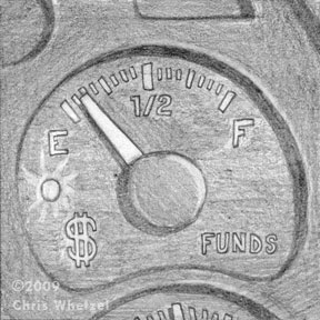 In the other sketches, I wanted to explore the pensions as dwindling. This sketch of an emptying funds gauge fit the bill, but I think it was too static.
 I enjoyed this sketch that worked in both my idea as well as John's license plate request. However, it was decided that the size of the image was going to be small, and certain elements of the sketch would be hard to read. The final art:
 Initially, the image was "too clean," and John asked that the license plate be dirtier. Upon revision, we were both quite happy with the finished product.
This image was a little intimidating for me as I do not usually work with textures, and I do not usually aim for a more realistic representation. However, I was adamant that those two elements were key to this image being successful so I basically jumped in feet first to scanning textures and making brushes in photoshop. I had not worked in this manner for years! Replaying the creation of this art in my head, I have to say that exciting nervousness of not knowing where the image and just trusting yourself is going is a lot of fun; I hope to push it into more work.
Thanks for reading! Look for a new post next week!
Enjoy the Day,
Chris

Whoops! Found these pictures on my camera that I meant to post a while back. These are some images of the new studio after we moved from Beacon NY to New Paltz. Prior to this, I was working at my desk in the living room. The studio is a small room in our apartment, and is already getting full. The first rule of the new studio was NO CATS! It gets lonely, but it will be warm in the winter and is in the shade during the summer. Its a bummer that we will have to move in a year.
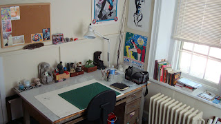 Corner 1: Drafting table gifted by Uarts when they decided to replace their studio equipment. My travel-sketch bag is on the table, but I've since replaced it with another. Homemade lightbox under the table (coke crate lined with lights and topped with plexiglass). the empty spot on the wall is for the later mentioned art to be displayed.
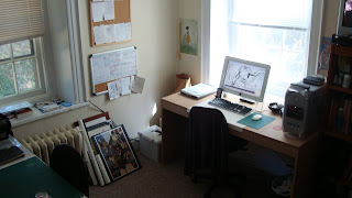 Corner 2: Computer and Office Space. I built the table when we moved for about $35. I love the light in the room throughout the day. I must say its very quiet here in New Paltz, and I enjoy it much more than living on Main St in Beacon. to the left of the table are boxes of job files and artwork to hang. Corkboards and a calendar keep me on schedule and serve up reminders. The computer is a mac gifted to me by Scott Brundage. Its doing the job as I don't do much that requires huge processing speed or memory. I'm hoping to replace it someday with a new imac, however, I am very stingy with that type of purchase :)
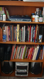
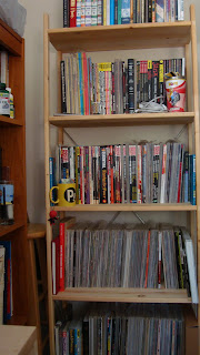
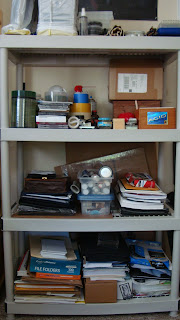
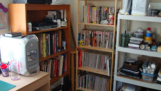 Corner 3: Books and Supplies. the left shelf contains sofware books, my laptop, and mostly "art books." The stereo doesn't get much use as I usually use headphones throughout the day as our upstairs neighbor is very loud and obnoxious at all hours of the day. Headphones let me concentrate :) The middle shelf is pretty much all comics. Hey, I read a lot of comics. The shelf to the right is all supplies. Up top is an old PC that I don't know what to do with so I keep it around as a "backup" in case something ever happens to my regular computer on a deadline. Paints, inks, recordable media, postcards, portfolios, paper, and office supplies. To see the shelves' contents and book titles, the next images are pretty large:
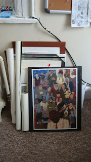 A larger image of Francis Vallejo's Nas I was lucky enough to win when he auctioned it. I'll hang it eventually, and I hope to get more original art from my peers for studio decor. Peter and Tim's gift paintings are on the living room mantle. Sorry! I also have some James Jean prints I could hang from the Kindling portfolio (not pictured).
 And lastly, here are some more books I picked up at a library sale in New Paltz. Great deals; I think I paid $8 for the lot plus an old RSVP that was pretty disappointing. Shown are two Rockwell books, a collection of Little Nemo strips, a book on Michelangelo's sculpture, and a winslow Homer portfolio. Good stuff.
And that's that. Thanks for looking!
Enjoy the Day,
Chris

By: Chris Whetzel,
on 8/19/2009
Blog:
Chris Whetzel Illustration
(
Login to Add to MyJacketFlap)
JacketFlap tags:
artist,
football,
illustration,
art,
painting,
sketching,
whetzel,
chris,
imc,
cincinnati,
Add a tag
Hello, hello! Hooray, its my fortieth blog post!
Today, I'm going to change things up a bit; I'd like to get personal. Come, scootch closer.
After this bit, I'll share a new piece!
I want to talk about an experience I had a while back that has somehow slipped under the blog radar. It was in June that I attended the Illustration Master Class' Open Studio with my buddy Scott Brundage. First off, I really enjoyed hours of car-ride with Scott talking about art and illustration, business practices, and everything else under the sun. Its always nice to have someone to talk to who is in the same boat as you. Anyway, this year's IMC featured Rebecca Guay, Greg Machess, Irene Gallo, Scott Fischer, and Charles Vess. What a lineup. The Open Studio is basically that: after a week of workshop and lecture, the studio is open to the public so that you can see some sweet paintings.
All of the artwork is fantasy-based as that is the focus; I gathered that the faculty gives a choice of assignments and the artists produce a piece within the week. First, let me say that the paintings were really intimidating. Not being a painter, what they do is a magical mystery to me. So many pieces were so impressive and inspirational. However, the most inspirational aspect of the open studio was the first thing I saw upon walking in the door:
Everyone was sketching! Like madmen! IMC provides a complimentary sketchbook to anyone who attends the workshop, and the artists were passing them around getting and giving sketches. Wow. I think I spent most of my time there just watching so many artists sketch! Doing so really opened my eyes; their skills and confidence were amazing. Its really inspired me to just attack my sketchbook as much as possible. I'm really enjoying it, and I think its helping my confidence in my work.
Also, just seeing actual physical paintings by the faculty was also quite inspiring. They really make you want to pick up a brush and join in. Also making you want to be a part of the group is the genuine friendliness of everyone there. All of the faculty and "students," were so familiar and friendly with each other. It was like being in a room filled with a giant group of friends. And they are so welcoming of new faces to the field; there does not seem to be the competitiveness I associate with editorial illustration. Everyone there just shared a passion to make beautiful images.
That really spoke to me. Artists working as illustrators that put creating a beautiful image before a clever concept. Its really something else, and it is very appealing. Its made me want to focus more on that type of imagery with my self-initiated work. I was going to work on a body of fast black/white newspaper editorial work in hope of getting into some of the larger newspapers, but I think I will focus on more poster/book oriented images.
We'll see what happens! And here's the artwork for the post:
Football illustrations during summer? Seems to be a trend for me.
Dennis Huynh, art director of Cincinnati Magazine, emailed me recently with a new illustration challenge. The article was to be about Cincinnati's semi-pro football league. It consists of mostly blue-collar workers volunteering to live out their football dreams. I was very excited about working with Dennis again after our "Nerdcore" collaboration so I readily accepted the challenge. Dennis lined up a blurb for me to work from, and I provided these sketches:
 The blurb described the league's players as "heroes" for football fans that were tired of watching the NFL's Cincinnati Bengals lose. I latched onto that sentence, and I sketched up this idea of the players as heroes a la Superman/Clark Kent.
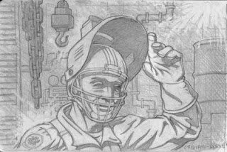 Continuing the "secret identity" motif, this sketch was a play off of helmets. I liked the idea of a welder flipping up his helmet to reveal a football helmet facemask beneath.
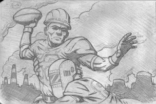 This last sketch is more action-oriented, however, I also felt it was the obvious solution; its the "safe" sketch: the sketch the art director can choose if my other concepts are too abstract.
Luckily, Dennis and I think alike! He chose the first sketch, and I was so excited to render the final art:
 I provided two versions (a different color background), and Dennis chose the brighter of the two. I was super-psyched to add this piece to my portfolio, and I look forward to working with Dennis and Cincinnati Magazine again in the future!
Enjoy the Day,
Chris

By: Chris Whetzel,
on 7/27/2009
Blog:
Chris Whetzel Illustration
(
Login to Add to MyJacketFlap)
JacketFlap tags:
artist,
illustrator,
illustration,
industry,
art,
digital,
whetzel,
chris,
outdoor,
Add a tag
Welcome back to the ol’ blog. Whats new? Well, the cycle continues.
New cards went out in July with a pretty good spike in web traffic; hopefully, this will mean some commissions to come. I have also gotten some good web traffic from my emails with several direct responses about the artwork. I even had a commission come from the last set of images, however we were not able to work out a suitable budget for the rights requested. It always sucks to turn down a job, and you get scared that it was a mistake. But if we do not ever say “no,” then we will never re-establish a value to the use of illustration.
You gotta value what you offer; I don’t mean you should be conceited or pompous. Don’t talk down to the client or insult them. Simply offer what you can at their budget and then state what you would need to charge for what they are requesting; this way, the choice is theirs. You aren’t “backing out;” you are providing options, and if neither option works, then the job dies with no one being at fault. I think some artists take offense at a low-budget offer, and then lash out at an art director; what purpose does that serve? Not only does it make you look like a big-headed jerk, but it also make illustrators in general look the same way.
I digressed; I wont rant about etiquette and manners today.
I’ve been a little behind on the blog posts again. Sorry. So this post features the creation of an illo for Matthew Bates, art director of SNEWS. This magazine is a trade-based magazine for folks in the outdoor/recreation field. Matthew is also art director for Backpacker; I had sent him promos aimed at work in Backpacker, and he brought me onto SNEWS, which he was re-tooling with better visuals. Confusing? Sorry!
The article was a profiling of several up-and-coming outdoor industry designers. Matthew wanted something bold and iconic, and he referenced several pieces on my site as well as some poster art that he thought would guide me in the right direction. Matthew was a pleasure to work with; he was really flexible as I was simultaneously working on other projects. We verbally communicated concepts, and we reached a point where only one sketch was needed:
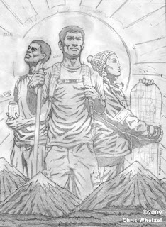 I was working off of the phrase “giants of industry” which came into my mind while reading the article. I brought in specs that one would see on a blueprint or model sheet to re-enforce the industry aspect. I was really motivated by the phrase “outdoor industry,” and I wanted to somehow juxtapose the two words visually.
Matthew approved the sketch and I created two versions as he was not sure if his editors would want the “specs” or not. So I did one without (more of a portrait) and one with (more of a concept). Also, I hated the guy to the left so I re-drew his head:
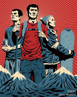
 In the end, Matthew used the version with specs, and that was a great relief as I felt the other version felt a little generic.
In the end, I’m not thrilled with what I did with this piece; some of the drawing isn’t my strongest. However, the artwork does what its supposed to do so it is a success. I sometimes think I lose sight of the forest for the trees. However, this piece has also inspired me to try my hand at more “group portraits” in the future. Planning is in progress so hopefully I’ll get to them soon.
Enjoy the Day,
Chris

By: Chris Whetzel,
on 6/15/2009
Blog:
Chris Whetzel Illustration
(
Login to Add to MyJacketFlap)
JacketFlap tags:
action,
whetzel,
chris,
espn,
illustrator,
football,
illustration,
magazine,
fantasy,
digital,
vector,
graphic,
Add a tag
Hello, reader! Welcome back! I'm happy to say this post will feature ART!
In regards to my last post concerning the field of illustration, I would like to say that after some research and correspondence, I was educated on the Conyers Bill from 2002. Check it out for info on what was almost an illustrators' union as well as info on antitrust laws. Its interesting stuff. I do still think some type of universal creative organization would be beneficial but I will stop talking about it as it appears its been tried before and didnt work out as parties could not agree or act in unison.
No worries, though! Lots of other things to focus on! New cards are coming this week. Maybe you will get one. Six new pieces are finished or in the works for future publication in the coming months. I'm hopefully getting to work in some personal project book covers this summer, and I'm looking for new ways to promote. I am looking for illustration groups and organizations to join as well in order to just have some sense of community as working from home is very solitary.
What else to mention? Currently, I am halfway through a multi-illustration project that I look forward to sharing when published. Its all hush-hush now but hopefully it wont be for long!
So for now, I can only share some artwork that is being published tomorrow:
ESPN the Magazine contacted me back in March with a cool illustration assignment: the defensive line of the Pittsburgh Steelers. The artwork was for ESPN's Fantasy Football 2009 Magazine. I had been wanting to do some sports-related art but I could never find the time; so I was super-psyched to do the job!
I was actually a little intimidated as the magazine is for "SUPER DIE HARD football fans." I was so paranoid (as is always the case) that I would mess up a uniform aspect or a player's name/number. So I did tons of research before even starting sketches to really familiarize myself with the team. Ed Mann, the art director, also sent me some nice high-res reference as well which helped greatly. After Ed and I settled all the details of the project, I sketched up these action-based images for him.
The Sketches:
 I called this one "the stack." I was really having fun just trying to show the defense as a mass of helmets and uniforms. A swarm, if you will. I liked how this one was a stack of players where you don't notice the ball carrier at first; it focuses on the defense by not even show the carrier's face/front.

I called this one "the wave." In this sketch, I was going for more of a "crashing down" on the ball carrier. Unlike the first sketch, this one features the ball carrier prominently but in a position of weakness. I really enjoyed how the figures are unrealistically stacked to the right; this sketch feels almost like fantasy to me. Perfect for fantasy football! The last sketch was one I called "the wall." I wanted to show the defense as a literal "wall" between the ball carrier and the goal. The aspect I liked of this sketch was the hands obscuring the ball carrier's uniform number; this would help by not singling out any particular player as the victim, and its also a bit metaphoric. I also liked the "back against the wall" aspect that no one would probably ever notice but me :)
Ed chose the third sketch ("the wall"), and I was off to create the final art. I decided to flip the image so that the viewer's eye would travel top left to bottom which made more sense to me. I also altered my use of blacks to focus more on the Steelers' uniforms and less on light and shadow; it worked well in this piece as there is still a healthy pattern of blacks and value.
Final Art:
 One note I would like to make is the effort put into the logos and uniform numbers. I dont mean to boast, but its all there, even the helmet "Riddels!"
Thanks to Ed for the opportunity to make artwork I really enjoyed! I hope to do more action-oriented artwork in the sports field for future assignments.
Enjoy the Day,
Chris

By: Chris Whetzel,
on 4/20/2009
Blog:
Chris Whetzel Illustration
(
Login to Add to MyJacketFlap)
JacketFlap tags:
juliet,
romeo,
illustrator,
illustration,
shakespeare,
poster,
digital,
cover,
hamlet,
graphic,
conceptual,
othello,
whetzel,
chris,
Add a tag
Hello.
Well, here we are. April. The end of this month will mark one year of this new journey. I am very happy to say I have been able to survive as a freelancer for a whole year. Much has changed, and at times I am still uncertain of what to do. There is still much to learn and much to be done. But I do think I'm off to a good start!
To mark this anniversary of sorts, I took it upon myself to re-design chris-whetzel.com(being uploaded tonight). Lately, I had been really unhappy with the website layout so I read up on some coding issues I was having with the site, and fixed it up to look a little better on any size screen. Also, I decided to use clearer thumbnails and add some features to make things easier for art directors after viewing joshuamiddleton.com. Thanks to Scott and Irene for bringing this website and its positive qualities to my attention. Also, thanks to Josh Middleton for amazing art on a well-designed site. I am really happy with the re-design, and I feel it may be around for a while. Of course the artwork will be updated as close to monthly as I can manage!
The time since my last post has been filled with work, thankfully. All are pending publication, so they will eventually be featured here. I have been very lucky to have some children's work to supplement my income! I am considering featuring the kids work on this blog as well as setting up a site for it. Also just completed was artwork for a client I was very excited to work with! Sadly, this artwork will not be released until June, and I can't wait to add it to the portfolio!
Its been a weird period. I have found myself to be very artistically driven as of late. I just added three new self-initiated pieces to the portfolio (which was a project in itself), planned more portfolio work, and provided artwork for three commissions. The odd part is that while being very busy with this work, I have had this yearning to be reading more. These past two weeks I read Robinson Crusoe and Lord of the Flies; I am currently working my way through Walden again. Walden is a very important book for me; a much of the book reflects how I attempt to live my own life (with some allowances :) Anyway, I have found that this rekindling of the desire to read has really inspired my creative side. What a pleasant surprise.
Now shut yer trap, Chris! Its time for the artwork!
This blog post features three new self-initiated pieces based upon Shakespeare's works. I took these on as a vehicle to experiment within my own artistic methods: playing with color, cropping, and composition as concept:
 I am pretty happy with these, and I hope to get more work along these lines. If not, I'll just keep making them for myself, experimenting along the way!
Enjoy the Day,
Chris

By: Chris Whetzel,
on 10/17/2008
Blog:
Chris Whetzel Illustration
(
Login to Add to MyJacketFlap)
JacketFlap tags:
illustrator,
illustration,
water,
graphic,
chris,
vortex,
swirl,
business,
digital,
whetzel,
Add a tag
Hello again, and welcome back. October is a busy month for me, but I am currently waiting for an approval on some sketches. So while I wait over the weekend, I'm having lots of coffee, writing a blog entry, labeling/stamping my new mailer, and getting a little personal drawing done.
First, lets speak on the subject of promotion yet again. I received my next run of postcards yesterday, and I am very pleased with the quality. I have seen/used cards from many places, and cards from uprinting.com are comparable to anything else. This company is a little different, though. First, you can choose your delivery options: the longer you give them, the less it costs. Obvious, right? Well, with uprinting I went with 1000 color front/black back card (14pt, glossy) and a six-day turnaround for $86. Almost $20 less than my previous supplier, and almost $100 less than a certain popular west coast printer. I did a rough count,and I think there are even more cards than I ordered (around 1150). And the BONUS of uprinting: they will do custom pieces i.e. they will do non-typical printing sizes to meet your needs. Very cool; it really opens up the possibilities for unique marketing material next year. But for now, I'll be getting 1000 cards out on Monday. Wow, I am usually a week behind on these mailers.
And I guess I would still have been if the sketch approval I'm waiting on had come yesterday. Sadly, the art director was out of the office so I had to send the sketches to another designer who was not familiar with the project. The sketches were shown to the client who specifically liked one, but I could not get approval until it was signed off by somebody else...
So I get the weekend off (sort of). I try not to take any days off so I'm pushing through this mailer, updating lots of spreadsheets (taxes, deductions, income, client list, etc) and online images on the site and ispot, and trying to figure out how to push my artwork farther as I feel its getting a bit monotonous. My buddy, Scott Brundage, turned me onto the website of Frank Stockton who talks alot about pushing the style and trying new things while still satisfying the clients needs. So I think I'm going to play a little, maybe some holidays gifts!
I have also spoken with Nate about the November show, and it is being pushed back to January which is a bit of relief as I am feeling a little overwhelmed with work and social expectations (especially with the holidays coming up). Monday, I'll talk with Dan at OpenSpace to see when he will need prints for the December show. I'm wondering how this works as apparently its a "salon style" show with prints in acetate sleeves; I do not know if each sleeve will hold numerous prints for immediate sale or just a single print. If numerous are needed, that may be a large financial drain at the worse time (over the holidays). Eh, gotta spend money to make money!
And speaking making money, I provided artwork for the Boston Business Journal's 2008 Biotech insert yesterday. The art director contacted me after receiving an email promo that I had sent out at the beginning of October. The subject dealt with how the biotechnology industry has lost $5 billion since 2003. This was a project where the art director and editors had a concept they liked before contacting me. Normally, I do not like working that way, but it is a good concept that I thought I could make unique. They wanted various "biotech items" swirling in water that is heading down a drain. In terms of layout, the art director requested that the illustration be circular, and he provided a pdf of a temporary layout.
The sketches:
 The first sketch was pretty straightforward. Various pills, syringes, test tubes, money swirling around. However, I felt this sketch lacked something so I decided to try to the old comic book technique of "moving the eye" in the second sketch.
 Now this is more like it. I have always loved that moment in movies where the video camera gives the audience a split view of both above and below the water. In fact, I think I may want to explore this more. I was happy with this sketch, but I decided to try a concept outside of the art director's suggestion just to explore the possibilities:
 This concept had potential, but it feels very "photo friendly." One thing I try to do with my illustrations is to make them "unphotographable." What I mean is that I do not like to provide an illustration that could easily be a photograph. So I was hesitant to show this sketch, but I was confident that it would not be chosen when shown with the other two.
The art director chose the "vortex" sketch, but there were a few concerns. He was afraid that the circular format was actually working against the image, and he wanted the surface of the water to be bursting out of the circle. After some discussion and layout testing, we actually decided to lose the circle completely and bleed the image behind all of the type elements.
The final:
 The blue at the bottom and the black at the top bleed to top/bottom with the logo and text over them. I think it worked out well, and the art director seemed very happy! Here is a little jpeg I made with the temp pdf he sent:
I think we both felt that we took both the image and the design to a level higher than the initial concepts. He is sending me both a pdf and issue samples upon publication; I'm starting to accrue a library of published work on my bookshelf. Mom will approve.
So thats the week. Next week, I will (maybe) be doing a piece I am very excited about! Hopefully, the sketch will be approved with no revisions :)
Until next time, I bid you adieu.
Enjoy the Day,
Chris
chris-whetzel.com
By: Chris Whetzel,
on 10/11/2008
Blog:
Chris Whetzel Illustration
(
Login to Add to MyJacketFlap)
JacketFlap tags:
artist,
illustrator,
illustration,
digital,
promotion,
graphic,
freelance,
whetzel,
chris,
Add a tag
Hello, friends. Much has happened since my last post. So let's hop to it!
First off, after finishing up the rodeo piece, I had time to tackle a calendar event piece that was on the back burner:

This has already been posted on some blogs, and I was fortunate enough to be featured as
Little Chimp's Society's "Editor's Pick" again. Very cool. This piece has really gotten my website ALOT of traffic from
Sugar Frosted Goodness as well as Little Chimp Society. I added it to my ispot portfolio in hopes to bring in some work. Anyway, the
SFWeekly assignment (which I had to turn down due to a full schedule) was a jetpack event in San Francisco. I sent a jpeg of the art director at
SFWeekly just to remind him I'm alive, and he said "nice one" so that was cool. I have also decided to use this piece for October's promotional postcard.
After finishing up the above piece, I focused in on setting up a rotating quarterly promotional schedule. My client possibilities have grown dramatically so I am now promotiong through both postacrds, blogs, and email. The rotation works out so that once per quarter, I am contacting three groups (one per month) every month with two months in between. To explain better:
-Group 1: contact in Sept.
-Group 2: contact in Oct.
-Group 3: contact in Nov.
And repeat.
My promotions were getting a bit unwieldy, so this schedule will keep me on-track and consistently promoting every month. I found myself in a bit of a dry spell a while back; hopefully, this will help to avoid that situation again.
As cheesy as it may be, I want to take a moment and express how grateful I am that I can support myself doing strictly freelance illustration. It really was just a dream for the longest time, and I am thankful for every day (even the "slow" ones). My outlook on life has changed dramatically since making the transition, and I feel healthier and more satisfied than ever. I thrive on the stress this lifestyle brings in terms of deadlines and creativity as it really seems to keep me going. There are still the money worries that come with the uncertainty of not having a salary, but I'll get used to it.
I am already becoming familiar with the "quiet days" (promotion/marketing and administrative duties), and I am taking steps to make those more artistically productive toward the other dream of someday working in comic books. Onward and upwards, right? So I have someone writing scripts for me to work up into sequential artwork. I am really looking forward to this. The reason this has come to pass is that I feel my illustration portfolio is now self-sustaining so I do not need to make new work specifically for the portfolio. Granted, there are still pieces I do want to make to add to the portfolio, but they will have to work beside this new endeavor. Of course, it all goes on the back burner when paying work comes a-knockin'! Also, I'm considering trying to get into the comic book field by showing my illustration portfolio to some comic folks; maybe I can get some covers or pin-up work. Hey, its a foot in the door!
So while I wait on those scripts, its been a timultuous time! The day after I finished up the jetpack piece, I recieved an email from the art director of Arrive Magazine. Arrive is the on-board reading supplied by Amtrak! A big deal for me at least, as its a good recognizable name to have as a client. This assignment came from my promotional postcards sent to the art director in May and August. The assignment was for an article titled "The Art of Woo." The basic premise is that among the business crowd, everyone is getting bored with PowerPoint presentations. To re-energize both their presentations as well as their audience, people are changing over to person-to-person (verbal) communication and dropping the digital standby. The art director wanted to explore the idea of a speaker addressing a rapt audience while standing on/infront of/next to a pile of laptops. After shooting tons of reference of myself sweating in a business suit, I explored this idea along with two others in sketches:

The initial sketch was an interpretation of the art director's concept. I had a to change a bit as a stack of laptops just really looks like books to me, and it felt very"soapbox" i.e like a lecture, not an enjoyable event. So instead, I changed the image into a speaker on the confernece room table, captivating the audience with charm. I was trying to make the situation like that of a rock concert with groupies cheering next to the stage.

The second sketch was based off of the art director's original concept, but I wanted to try and make it a little more personal. The premise is that the presenter has lit his laptop on fire, and he is verbally presenting his idea. I liked the idea of alluding to telling stories around a campfire. This felt very Norman Rockwell, and I really wanted to play with shadows if this one was chosen.
 The third sketch idea was a bit over the top, but fun. I wanted to work on the "woo" concept of the title. I try to do this with every assignment as my philosophy is that the title and image should work together. I was worried this would be too similar to the Filmy-Eyed piece already in my portfolio, but I was confident that the art director would favor one of the other sketches.
As was my assumption, the first sketch was chosen . The only correction needed was to add some ladies to the mix. No problem. After shooting some reference of the lovely Aliyah Gold all gussied up, I added in two figures, and the sketch was approved:  I was a little concerned with this piece as it was getting very crowded, and I had never rendered such a large group in the timeframe I was being alotted for the commission. But you just sleep less and eat at your desk, right? Everything actually worked out quite well in terms of time management, and I finished up the rendering with a good amount of time to experiment with color. I worked on some great color combinations that do not work for THIS project, but they are filed away for when I do need them :)
On the subject of color: Lately, I have been submitting two versions of my final art from which the art director gets to choose a version. I like showing both a "loud" and "quiet" color theme, and I think this makes the experience more enjoyable for the art directors as they are more involved. So far, it seems to have gone over well. For this assignment, I submitted the following two images:

Now, I was pretty sure that this version would not be chosen, but I do like the pink:) I feel its very "woo."

A close-up:  The orange version was chosen. Apparently, I am commissioned for the "high visibility" quality of my work. I'm fine with that :) Nonetheless, I am trying to show that I can work in both striking and subdued color combinations so that I can be more versatile to meet the client's needs. The final art changed a bit from the original idea of "rock star" to more a "Jesus" type figure. Nonetheless, the central idea of getting the audience's attention is still the main gist of the image, so I'm happy with it. Hopefully, we don't get sued for using or alluding to Sony's or Dell's logos :) The art director seemed thrilled with the art as he passed on some contacts that may be interested in my work. Also, they are running a bio and photo of me in their "Contributors" section. Lovely!
Now, while working on this project, I got a phone call from a magazine art director for cover sketches that I am currently sketching with final art due on the 17th. Busy busy! I'll be posting the details and artwork along with another magazine cover I will be finishing on the 24th. Look for the post hopefully before Halloween along with a website update! Also, this month's mailer should be out on the 20th! I am trying out a new printer, so I'm excited to see how these cards turn out.
Today was a sketch day and also a family day as we visited Aliyah's grandparents for thier 61st wedding anniversary. I was kind of "under the gun" today as lots of folks were asking about what I do, how i do it, etc. It really felt good to be able to field their questions not as a "freelancer," but really as a small-business operator i.e. I am my product; I have to consistently sell me to make money. I have to always be looking for new clients, and I have to keep my current clients satisfied by providing my best artwork. I must be confident in what I provide, and not sell myself short by settling for low rates or deadlines that are not feasible. And most importantly, I must not waste time or be docile; I must consistently be doing SOMEthing that progresses the business that day. Simple, right? What surprised me most is how I didn't break out in a pouring sweat while answering these questions; I'm becoming more and more familiar with this way of life, and I'm proud to do what I do!
And that's that, folks. I'll share more as I'm sure there's more to learn :)
Thanks for stopping by!
-Chris

By: chriswhetzel,
on 9/28/2008
Blog:
Sugar Frosted Goodness
(
Login to Add to MyJacketFlap)
JacketFlap tags:
illustration,
digital,
portfolio,
seagull,
drama,
graphic,
whetzel,
chris,
speed,
bold,
jetpack,
Add a tag
Something done to add drama to the portfolio:

Enjoy the Day,
Chris
chris-whetzel.com
By: Chris Whetzel,
on 9/6/2008
Blog:
Chris Whetzel Illustration
(
Login to Add to MyJacketFlap)
JacketFlap tags:
illustration,
digital,
spot,
house,
graphic,
houston,
newspaper,
freelance,
whetzel,
chris,
texans,
kubiak,
Add a tag
Wow, its been as while since my last post! Looking back, its odd that my last post was about a lull in the workflow. I certainly don’t feel like things have been moving slowly! To start things off, I’ll talk about some “business” aspects of the past month.
Taking advantage of the downtime, I implemented an income/collections/taxes tracking system. Basically, now I know roughly what I’ll need to pay in terms of federal taxes come April. I am keeping this estimated amount in its own savings account. In conjunction, I’ve also revamped my deduction-tracking technique so that its a lot simpler and easier to process come April.
Another administrative task I’ve been tackling as of late is collecting on invoices. I have learned that the end of the job is never the end of the job. Its can get pretty hairy and confusing. I’ve learned that folks process invoices immediately, at the end of the week, at the end of the month, or after publication. As such, I never know what going on with the invoice after the job so I have to email to follow-up. With the new system, its been easier though. Upon invoicing, I’ll now simply ask the client when they process their invoices so I can project a rough estimate of when I should be looking for a check. Then I can contact clients as needed after the date passes. I don’t know how other people feel about this or how they work, but I can get spacey on these matters when I’m concentrating on artwork. So instead of randomly hoping for checks when I open my mailbox, I am being more active and organized in collecting. Working in this manner, I now know where every invoice I have out stands in terms of processing and delivery. Sadly, some payments have been sent to my old address (long story) so I assume they will be forwarded by the always-punctual postal service.
What else has come up these past weeks? Ah, another thing taken into account since the last post was communication i.e, talking with other artists and illustrators. With Aliyah starting her graduate classes, it has been a very difficult solitude. Having just moved to the town of Beacon, I barely know anyone. After exhausting my trips to coffee shops and running errands, I have started posting on blogs to meet other artists. This also exposes me to a lot of new art. Recently, I was featured on thelittlechimpsociety.com as the “Editor’s Pick:”
 Pretty cool. Also, that feature bumped up web traffic at chris-whetzel.com for a bit. I have been told that a lot of the members of that site are art directors so I see it as free promotion. Thanks to the guys at The Little Chimp Society! I look forward to posting more, and I tend to check out the blog every day or so. Similarly, I was invited to join sugarfrostedgoodness.com this week. I know that none of this is a big deal in terms of moneymaking, but I really feel that posting on these blogs as well as chris-whetzel.blogspot.com and theautumnsociety.blogspot.com really keep me motivated. As lame as it sounds, it fends off the lonelys :) And the bonus is that links from these sites increase chris-whetzel.com’s search engine ranking. Cool.
And the final thing I would like to say about blogs is to simply mention a helpful one: cedricohnstadt.wordpress.com. This blog is awesome for anyone freelancing. Its basically years and years of one guy’s experiences in the field. He also posts so many links that are illustration-business related. Great blog! One gem I found (of many) was the freelanceswitch.com podcast. Very cool. If you like the ICONIC podcasts, you may enjoy these. However, the Freelance Switch panel focuses on the BUSINESS of illustration by discussing a show-specific topic and answering questions about everything from contracts to etiquette to networking. And its all handled in a fun and light-hearted manner! This podcast also comes in handy when working long days alone and you just want to hear human voices! Its like being in a roundtable discussion!
Ah, discussion. I am jealous to hear Aliyah talk about class discussions. I miss it. I’m kind of disappointed that my friends and I never really got a collective together. I tried to establish “drink and draws” patterned after Dave Johnson’s group, but it never really took off. Its cool that Philly has The Autumn Society, but I’m in New York! Granted, I had a great artistic talk with Joe Game last week, but its not the same as sitting around looking at each other art, having crits, etc (and he totally guilted me for not blogging). However, I’m finding out that the artists in Beacon do meet; I just have to find out how to get involved. I was working at a coffee shop last night when a group formed next to me. Not really paying attention (I listen to my ipod when working outside the apartment), I noticed they were discussing art in between songs. Turns out they meet to just talk art, tell what they are doing, and pass on opportunities. This is awesome. I wanted to talk to someone in the group after the meeting, but I had to leave before they disbanded.
But hopefully, an opportunity to chat will present itself as I have been asked to take part in a show at that very coffee shop! After speaking with Nate (the manager) today, it seems the show will be November-ish. He really liked my drawings enough to ask a price on one! So it will be my “artsy” drawings as opposed to digital prints. He said he is still looking for illustrators who specifically have drawings to show. If you would like to be considered, drop me a line and I'll give him your website.
Striking off on a tangent, I was recently asked to attend the Baltimore Comic Con as part of The Autumn Society Collective. This was a great honor as I really respect the art of the other collective artists taking the trip: Joseph Game, Peter Wonsowski, and Craig Parillo. Good guys who make good art. What sucks is that I can’t go. Financially, I just don’t feel comfortable spending a lot of money to travel, for space, etc to promote to a field that probably can’t use my artwork. Plus I'll have a big expense thi smonth that I'll discuss later. I REALLY tried to rationalize going as I am a hardcore comic fan and I just wanted to be a fanboy for a weekend, but logical-me won the battle. Best of luck to the guys attending! Wish I could be there!
And so, being proud of my willpower, I have decided to commit to an ispot portfolio this month. I am worried about spending the money but its deductible, and I really think I’ll get some work from it. Dave Tabler at the ispot has been very accommodating with my hesitancy. It turns out they have a payment plan so that assuaged the fear a bit. And as a bonus, it turns out that ispot and Adbase have a deal where ispot members get a discount at Adbase. Cool. Next year, I hope to take advantage of it!
Another reason I decided to go for the ispot portfolio was that work picked up. August has been a super-busy month. It was sad to leave a personal piece unfinished to start new jobs, but I hope to have it done next week. Anyway, on to new work!
Ok, so the first commission came via email from Houston Press. This paper was a new addition to the mailing list so that was a good sign that the new card wasn’t such a bad image choice after all! The job was four spot illustrations for their “Best Of” issue due in a little over aweek. The budget was lower than I could afford, but we negotiated a budget that worked for both of us. Awesome. I can’t discuss the subject matter or post images until after publication on the 25th of September. But these were a lot of fun, and I think they add a little diversity to the portfolio. I’ll post them, sketches and all after the 25th.
Although fun, the period of working on them was a little crazy as while sketching them, I got a call from the art director of Retail Traffic who needed a quarter page spot by that Tuesday! Awesome, but the tight deadline was a little intimidating. Nevertheless, I knew I could do it so I accepted (just sleep less). He sent me a version of the article titled “Taking On Water.” It was about the California budget crisis and how its affecting the housing economy. It was an odd subject matter, but I enjoyed the challenge. Pushing back the Houston Press sketches, I ripped out these three sketches: 

 I like them all for different reasons. I assumed they would go with the first one of the house sinking on the chart, but he surprised me by choosing the house with the life preserver. I also like the "stormy weather" one, but we both agreed its more of a full-page image as everything is so small. The final:
 This isn’t my greatest piece, but I like that it shows I can think outside of figurative work. Originally, I left off the “S.S. California,” but I was really happy that they asked me to put it back on the life preserver. I took this piece a little farther in terms of color as I want to push for more color in this graphic style.
One interesting aspect of this commission was that Retail Traffic is a magazine published by Penton Media, the same folks that commissioned the 10 portraits for Registered Rep a few posts back. My first return customer! Sort of. I worked with two different art directors but whatever. I count it.
So anyway, I finished the piece up on Tuesday. Prior to this, while doing the finish for
Retail Traffic, I also finished and submitted sketches for the “Best Of” article. The art director really liked them, and we were set. However, the day I finished the
Retail Traffic piece, the
Houston Press art director called and asked if I could provide a cover in addition to the spot illustrations! Whoa! I told here there was no way I could have both done in four days. Then she explained that the spots were not needed until later in September and that the cover was for that week’s weekly paper. Now that I can do! On a sidenote, I have been becoming more relaxed with art directors, and it makes things more fun and light-hearted on both ends. Everything has been very laidback with everyone this month aside from getting work done. Its really kind of cool. So anyway, the spots got pushed back a week so that I could do this cover.
It is a portrait of Gary Kubiak, coach of the Houston Texans (football team). The idea was pretty simple: parody the popular Obama campaign poster using Kubiak instead. I was hesitant to do this as I like coming up with my own concepts, but I like paying rent so I agreed to do it. I was little worried about plagiarism, but my good buddy,
Scott Brundage, said its not as he has seen this issue dealt with at his dayjob. I won’t show the sketches for this as there were like four versions with both the art director and myself photoshopping things, and they are really just messy sketches (not my usual rendered drawings). So anyway, here is the finish:

I like it. Initially, I wasn’t going to put it in my portfolio, but it really opened me up to using a palette without black and white. So I’ll keep it in there and add more pieces like it. What I really like about is that it’s a pretty good likeness in a totally non-existent pose i.e, I didn’t have direct reference to work from so I was making up lighting. I like jobs that challenge me and make me work harder. This one was a real test of my abilities! I never really thought my likenesses were good enough to market, but people seem to like them. As such, I’m trying to draw more popular figures in my non-commissioned works to get better at capturing a likeness. I have a list to work from!
However, there was one downside of this commission. Less than eight hours after taking the cover job, the art director at
SFWeekly emailed me with a job for a half-page calendar illustration about a JETPACK EVENT! Arrrgh! I was so bummed to turn this down, but there was no way I could do both pieces as the turn around on the calendar was less than two days. We have a good, jovial relationship and he understood. Still, I hate turning anyone away. I think I’m still gonna do a jetpack piece just for fun and send it to him. I told him I might work it up for the portfolio, and he said its inspired him to break out his acrylics. Cool stuff.
And that’s all I got, folks. I just finished up the “Best Of” spots today, and they were approved. So the next post will probably feature those as well as the personal piece I am getting back to after almost a month. I don’t even remember where I was on it…Plus I stil lwant to do a particlular portrait and new drawings for the coffee shop show.
And maybe I’ll do something with this sketch I did while watching the DNC last week:

I like Obama. Good guy.
So who knows what next week holds? I'm sure I'll find something to occupy my time :)
Enjoy the Day,
Chris
chris-whetzel.com
By: Chris Whetzel,
on 8/7/2008
Blog:
Chris Whetzel Illustration
(
Login to Add to MyJacketFlap)
JacketFlap tags:
news,
illustrator,
illustration,
cartoon,
color,
portrait,
digital,
postcards,
graphic,
linear,
whetzel,
chris,
candle,
loomis,
burnout,
SFWeekly,
Add a tag
Hello, again. Where to begin? Well, we can re-cap the last post with a screnshot of the Dolly Parton portrait on SFWeekly.com:
Hopefully, this will be seen by someone either online or in print. "The best promotion is published work" is what I keep reading. We'll see I guess.
I'm a little bummed out as I have not gotten any responses from my end-of-July postcard mailing. I know to give it time, but I really get anxious when I'm not working on paying gigs. Plus, its been almost 10 days since I sent the invoice to SFWeekly, and that was really my last "official" freelance work. The client list and website are freshly updated so really its been the waiting game all over again. Obviously I'm working on projects for the site, but time moves so slowly here in Beacon!
The days seem twice as long as there really isn't anything exciting going on here. I am in this routine of getting up, working on projects over coffee at the local coffee shop until lunch (I love th econvenience of working digitally), and then working at home until dinner. Then I try to spend time with Aliyah and then I'll work until I'm off to bed. Errands work their way in as little distractions here and there but its really just working with bits of excercise and chores. On a positive note, I did get my fishing license :) For those who don't know I love to fish for bass. Sadly, I'm out of my element here in NY so I'll have to adjust. Still, just catching little guys feels good.
So even though its slow here, I 'm working alot and THINKING alot. Boredom either begets lethargy or creativity and I'm glad to say that so many concepts for pieces keep entering the ol' noggin. So I can defintely keep myself busy if work does slow down. But I got my fingers crossed that something comes along. I'm waiting to hear back from a dude at the ispot as I have decided to go with an online portfolio for now (as opposed to adbase which I want to do later). Hopefully, that will bring in some work too.
All four of these hardbound, out-of-print ANTIQUES cost me a whopping eight bucks! Then Aliyah noticed "The Ultimate Portfolio" on a "Free Books" cart. I insisted on paying the standard two dollars for this hardback as well as the money appears to go to a charity. I was a little too excited to really pay attention :) So I have plenty to work on, plenty to read, and plenty of visual concepts in my brainworms to weather the storm (actually, an eerie calm).
Until the calm recedes, I'm doing pieces in which I take turns with the syles (i.e. one linear, one graphic, another linear, another graphic) to keep my skills up. So here's a linear piece:

Its about burnout, something we all suffer from time to time. I really like the way this piece looks when super-big on my screen :) I am thinking I need to get archival prints of some of my favorite images at large scale. Perhaps for sale as well as for myself. If anyone has any leads on a affordable archival printing place in the New York area, please let me know!
And whats next? I think a certain "gangsta" or maybe science :)
Enjoy the Day,
Chris
By: Chris Whetzel,
on 7/29/2008
Blog:
Chris Whetzel Illustration
(
Login to Add to MyJacketFlap)
JacketFlap tags:
pork,
whetzel,
chris,
cook-off,
dolly,
cooks,
parton,
news,
illustration,
music,
cooking,
cartoon,
pigs,
color,
portrait,
digital,
singer,
graphic,
linear,
Add a tag
Hello, all!
Today marks the three month anniversary of chris-whetzel.blogspot.com! Hooray! We're doing it! The goal is to keep this blog going strong for a whole year. I won't lie; its pretty tedious and often gets put on the back-burner, but its definitely keeping me working.
So whats new since the last post? Well, chris-whetzel.com is newly updated with two distinct portfolios. New images have been added to both portfolios as well as the News section being updated. The new Graphic vs. Linear division of artwork had paid off as it seems to help art directors. This became apparent after getting an email from the art director at SF Weekly where he requested a portrait in the "graphic style." Wonderful!
This portrait was to go with a music article on Dolly Parton who has started her own recording lable and will be performong in LA on the 5th. It was an interesting read, and the art director wanted me to specifically work from the excerpt "the biggest, brightest Dolly she can be." Sadly, since the commission was for an alt-weekly, the budget wasn't as high as I had hoped. But I really wanted to do a celebrity for the portfolio so I took the job after some negotiations. The lone sketch was approved:
I personally like the sketch more than the finish on this one. It was awkward working in black-and-white for this piece, but I like the quiet, subdued tones in comparison to alot of my two-color pieces:
 So, yeah. A fun piece, a really easy-going art director, and a good addition to the portfolio. A three-pointer! *Swish!
The only bad thing was that this commission came through the day AFTER I had just sent my promo card files to the printer. Drat! This would have made a better one than my choice of the Crisis Magazine image a few posts back. Especially if I had colored it. Ah, well. Speaking of the cards, they just arrived. And I have to say: I am losing my patience with overnightprints.com. Many of the cards were off-center on multiple sides and text was right on the edge of a few even though I had stayed within the "safe area." Grrr. Its really frustrating and luckily I was able to trim some down and still use them. But really, its just more incentive to try the USPS print-and-mail service. Think thats gonna be the way I go for the Halloween mailer.
Another thing I'm considering for the future is using AdBase. We all know how awesome it is and I'm considering subscribing to that as opposed to the ispot. I can only do one right now, and I really can't decide. Decision, decisions. Hopefully, whichever I choose will fund the other. I think I'm going to wait for a bit as my list is freshly updated, and I should be fine for a spell. I want to see the response to this next mailer before I do anything. Don't want to spend money I don't have :)
And that's that. It promotion and drawing this week! Oh, and I'm still working in the spare time between jobs. Its a little harder with Aliyah being home all day, but I must be strong! That, and I'm just getting over a cold from last week so its been twice as hard to get cracking. Nonetheless, I managed to get out another "linear" piece for the site at the last week. Sorry I waited so long to post it:

I like it. The piece is for a community pork cook-off and fair, one of the options given to me to illustrate from Cleveland SCENE way back in May. Its nice to work in full-color as well as limited color. I think one makes the other better. And I think its a good subject to add to the portfolio as its not a typical theme.
All this with web updates, building a small site for my personal drawings, and re-building/updating Aliyah's site has kept me busy. It seems there is always something to do, even though there's nothing to do in this town :) Let's hope the mailer going out tomorrow brings in more work to occupy my time as well. Fingers are crossed!
Enjoy the Day and thanks for reading!
Chris
By: Chris Whetzel,
on 6/30/2008
Blog:
Chris Whetzel Illustration
(
Login to Add to MyJacketFlap)
JacketFlap tags:
artist,
illustration,
blog,
art,
digital,
editorial,
graphic,
conceptual,
bubble,
head,
flat,
whetzel,
chris,
Add a tag
Howdy doo. Well, I just got back from an exhausting wedding weekend. It was a lot of fun though, and I even managed to get a little artwork in on Friday night. Currently, I am just happy to be back in my little corner studio working on the next piece. Sadly, after the current piece, I have to take another break for the move to Beacon, NY on the 8th and 9th of July. Throw in the 4th of July weekend, and time gets tight especially with all of the packing to be done. But it should all be worth it to be able to easily head into New York City on a whim or on business.
Speaking of the business, here are the sketches for the Crisis editorial mentioned in the last post. The article is about sexism and the oppression of females in rap music. The art director wanted a "I am woman, hear me roar"-type of illustration. So I decided to explore that as well as other avenues.
Sketches:


I actually did five sketches, but two were pretty lame so I didn't even show them. The art director like the "fist-in-yo'-face" sketch so that was that. I personally like the "spitting fire" sketch but was happy to do either. Perhaps I'll do another finish off of the unused sketch if I feel so inclined.
The Final Art:

This was a fun job. I am actually using this as my next mailer around July 15th (after the move and getting situated). Hopefully, it will arouse some interest. Also thinking of working on some likenesses for the portfolio before the end of the summer in this style as well as continuing to push the linear-style with new pieces. A newly updated www.chris-whetzel.com should be up by this Friday to coincide with the mailer.
And thats that. Back to work :)


All your sketches are damn sweet, man.