new posts in all blogs
Viewing: Blog Posts Tagged with: Found design, Most Recent at Top [Help]
Results 1 - 25 of 831
How to use this Page
You are viewing the most recent posts tagged with the words: Found design in the JacketFlap blog reader. What is a tag? Think of a tag as a keyword or category label. Tags can both help you find posts on JacketFlap.com as well as provide an easy way for you to "remember" and classify posts for later recall. Try adding a tag yourself by clicking "Add a tag" below a post's header. Scroll down through the list of Recent Posts in the left column and click on a post title that sounds interesting. You can view all posts from a specific blog by clicking the Blog name in the right column, or you can click a 'More Posts from this Blog' link in any individual post.
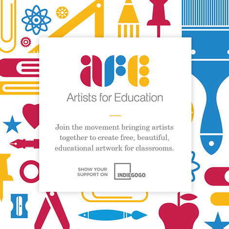
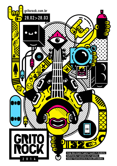
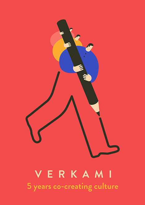
America’s public schools are underfunded and teachers are often lacking essential tools to effectively do their job. To address this, Brad and Krystal Woodard of the design studio, Brave the Woods, created Artists For Education (AFE). The artist-led initiative aims to produce posters that educate and inspire students. To support these efforts, a fundraising campaign has been launched as well as an open call for designers to submit art. Submissions that are accepted will be available for teachers to download free of charge. In addition, giclée prints of the designs can be purchased, with a portion of profits benefiting educational programs. Participating artists include: Invisible Creature, Eight Hour Day, Mary Kate McDevitt, Justin Pervorse, Tuesday Bassen and many more.
To contribute to AFE, please visit their Indiegogo campaign.
Save
Save
Save
Save
 Share on Facebook
Thanks to this week's
Sponsor // Foto Sushi

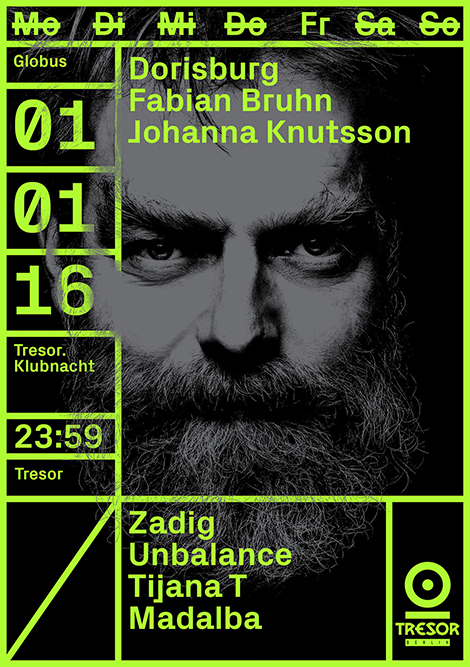
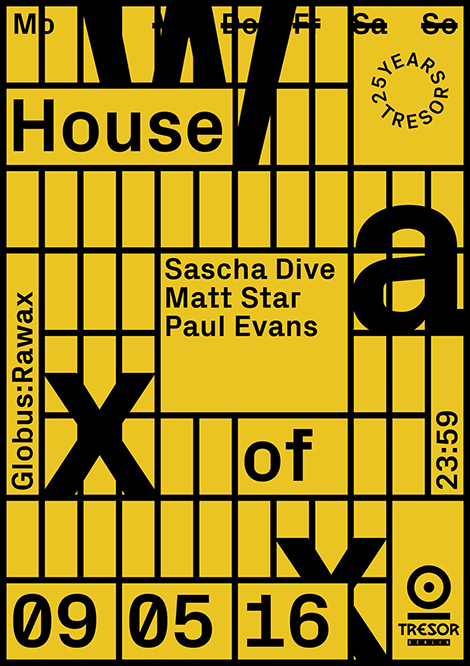
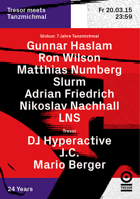
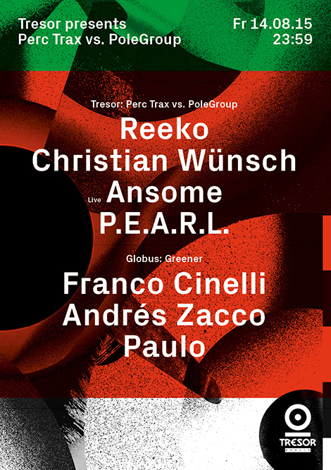
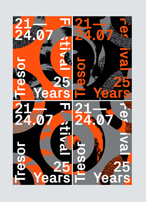
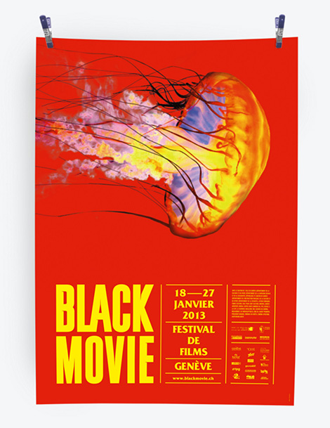
Vanja Golubovic is a graphic designer that splits her time between Geneva and Berlin. Having an affection for music, film, and theater, she often collaborates with cultural institutions. I’m especially fond of her work for Tresor, a Berlin-based techno club and recording label. Fusing dynamic photography, neon colors, and dense textures, she creates posters that express the music’s pulsating rhythms and the venue’s lively ambiance. Uniting these elements is a rigid grid system that provides a visual hierarchy and represents the illustrious cage that the DJs perform in.
In addition to the club’s posters, here are some of her other projects:

——————–
Also worth viewing:
burkhardthauke
Louis Reith
Mike Cina Interview
Follow us on RSS, Instagram, Pinterest, Wanelo,
——————–
Share on Facebook
Thanks to this week's
Sponsor // Foto Sushi

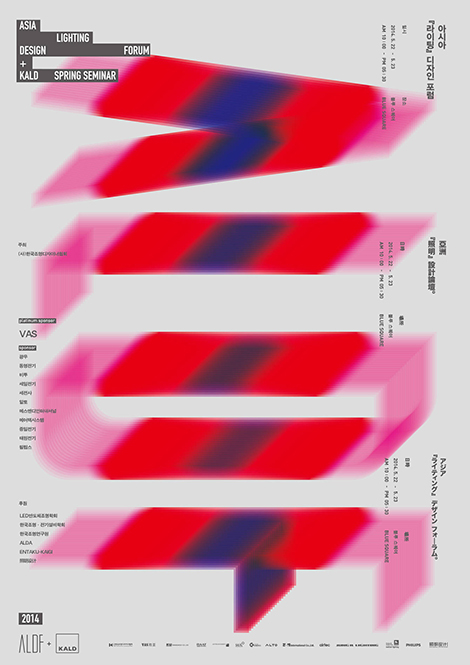
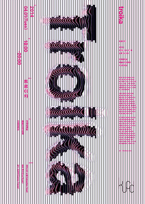
Seoul-based graphic designer, Joonghyun Cho, crafts inventive and highly conceptual posters that capture the essence of the institutions that they promote. This can easily be seen within his vibrant series for the Asia Lighting Design Forum. In each poster, he spells out the event’s acronym with layered gradients that beautifully represent the movement of light and the effects of its properties. Clever and alluring, his work has been recognized by numerous publications including, Communication Arts Korea, Nylon Korea, and Notefolio Magazine.

——————–
Also worth viewing:
Joseph Navarro
Rifle
It’s Time to Move
Follow us on RSS, Instagram, Pinterest, Wanelo,
——————–
Share on Facebook
Thanks to this week's
Sponsor // Foto Sushi

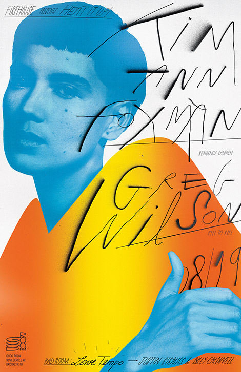
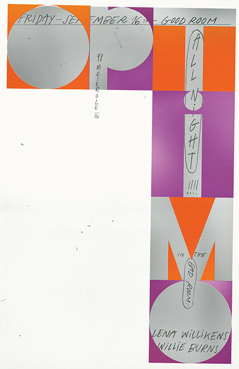
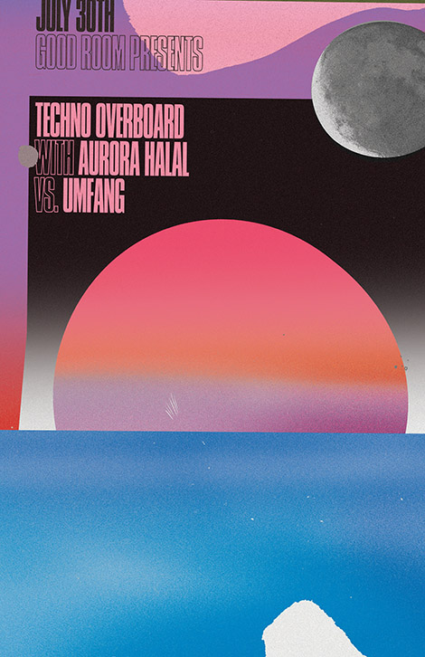
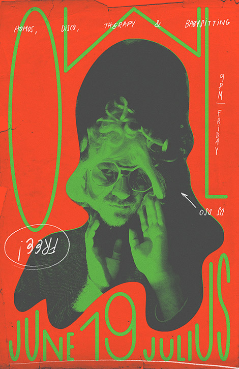
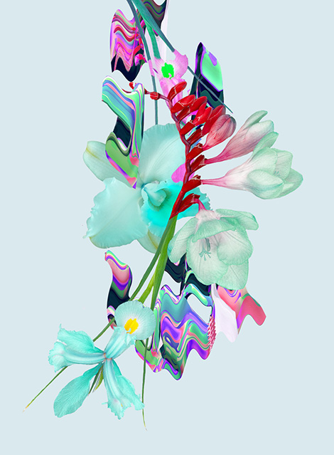
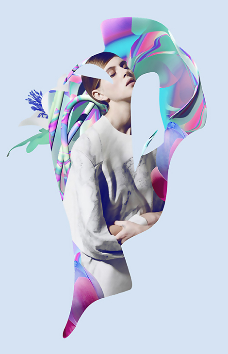
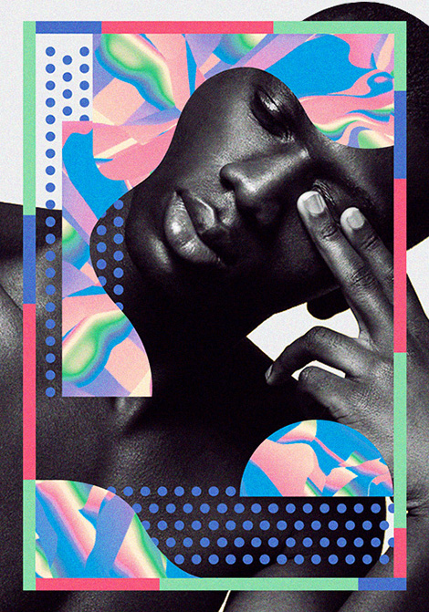
Bráulio Amado is a graphic designer living and working in New York. From comics to music videos, he takes on a number of creative endeavors and always seems to do so with humor and authenticity in mind. I’m particularly impressed with his ongoing poster work for music venues throughout New York. Abstract and experimental, these designs fuse lush gradients with illustrations and photographs in a collage-like fashion. Adding to these compositions, he layers in expressive typography that accentuates the pieces and acts as an analog counterpoint to the purely digital work.
——————–
Also worth viewing:
Mike Lemanski Update
Motoi Shito
Daniel Zender
Follow us on RSS, Instagram, Pinterest, Wanelo,
——————–
Share on Facebook
Thanks to this week's
Sponsor // Foto Sushi

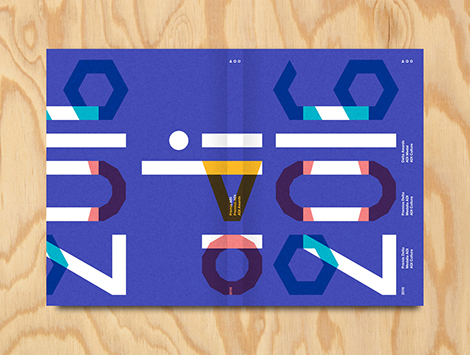
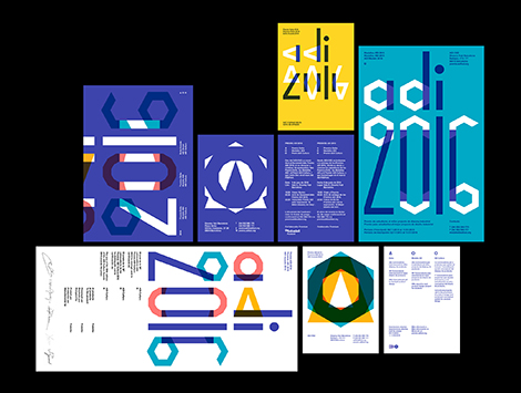
Founded by Lupi Asensio and Martin Lorenz, TwoPoints.Net is a design studio known for their flexible visual identities (FVI). Rather than being static and repetitive, the studio believes that an identity system should be adaptable. This can easily be seen in their work for ADI’s Delta Awards. Using a series of icons, they created a versatile system that could be incorporated into the event’s branding, typeface, and awards.
Two Points’ appreciation for the efficiency of FVIs also fueled the studio to develop a program that helps their clients create designs on their own. While working with Tonangeber, a website for sharing playlists, Two Points created “supertool” — a program that guides DJs through the design process while maintaining the constraints of Tonangeber’s identity system.
——————–
Also worth viewing:
Michael Spitz
Studio Beige
Anymade Studio
Follow us on RSS, Instagram, Pinterest, Wanelo,
——————–
Share on Facebook
Thanks to this week's
Sponsor // Foto Sushi

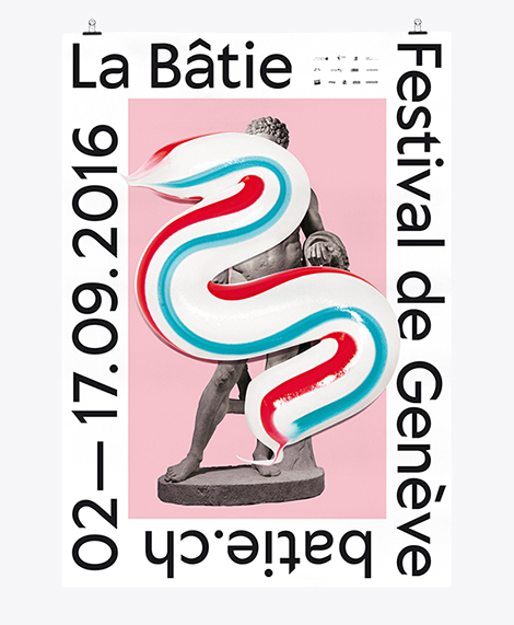
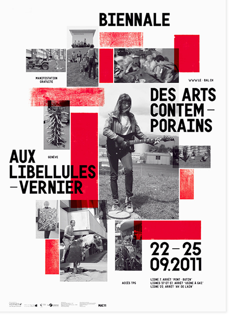
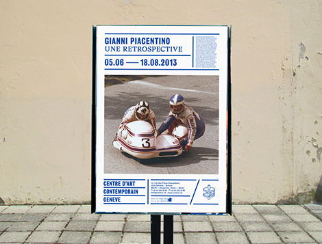
Neo Neo is a Swiss design studio led by Thuy-An Hoang and Xavier Erni. They collaborate with cultural institutions around the world, including Geneva’s Contemporary Art Center and Tokyo’s National Film Center. Not afraid to get a little funky, the studio uses bold and sometimes surprising visuals and mediums within their designs. For Geneva’s La Bâtie Festival, an event in which the city celebrates music and art, the studio employed a long splash of toothpaste as the festival’s key graphic. No matter what they decide to use, their pieces are always chic, fresh, and a testament to the current state of Swiss design.
——————–
Also worth viewing:
Twice
Atelier Tout va bien
Eight Hour Day Interview
Follow us on RSS, Instagram, Pinterest, Wanelo,
——————–
Save
Share on Facebook
Thanks to this week's
Sponsor // Foto Sushi

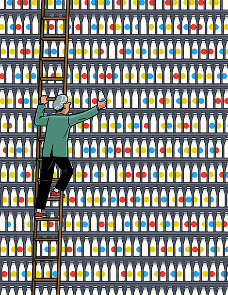
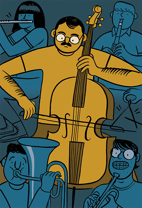
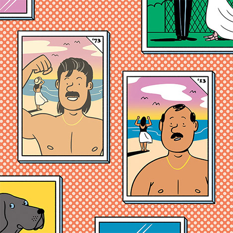
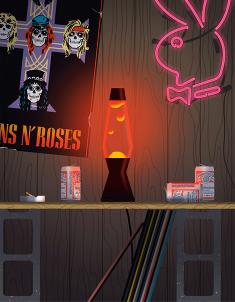
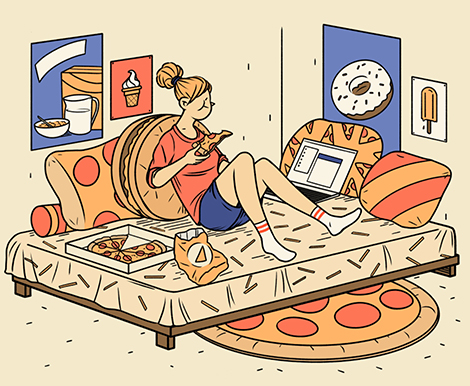
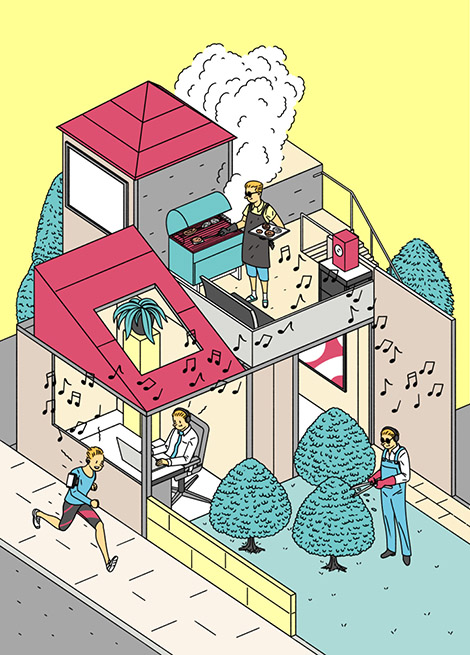
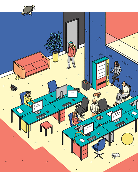
Kyle Metcalf is a Canadian illustrator whose work has graced the pages of The Walrus, Swerve Magazine, and The New York Times. Using thick black outlines and soft colors, he creates charming characters that are often caught in comical situations. Much of this humor comes from a sense of nostalgia that is present throughout his work. Many of the personalities found in his illustrations seem bewildered by their middle age and yearn for their youth. These themes are also present in his still life compositions that portray novelty toys and articles from the past.

——————–
Also worth viewing:
Josh Cochran
Mike Ellis
Danielle Kroll
Follow us on RSS, Instagram, Pinterest, Wanelo,
——————–
Share on Facebook
Thanks to this week's
Sponsor // Foto Sushi

Janne Iivonen is a contemporary devotee of ligne clair, a drawing style made popular by Hergé, the creator of The Adventures of Tintin. Inspired by observing the world around him, Iivonen beautifully captures modern life and the behavioral idiosyncrasies that come with living with today’s technologies. His charming illustrations and relatable characters have helped him accumulate an impressive portfolio of clients including The Guardian, Time Magazine, and GQ.
——————–
Also worth viewing:
Dan Woodger
Marie Assénat
Sarah Mazzetti
Follow us on RSS, Instagram, Pinterest, Wanelo,
——————–
Save
Share on Facebook
Thanks to this week's
Sponsor // Foto Sushi

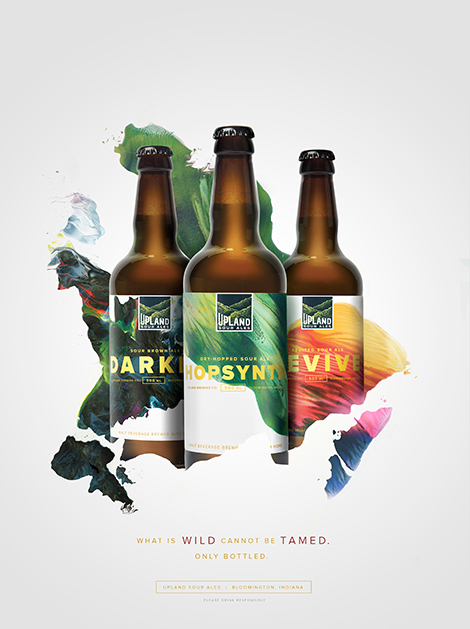
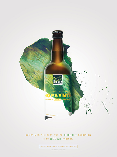
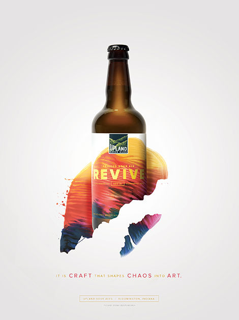
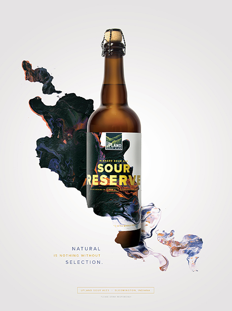
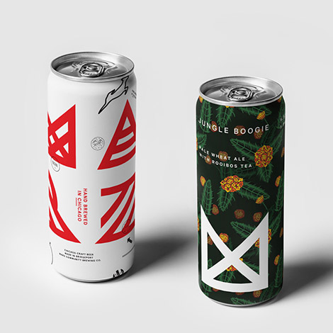
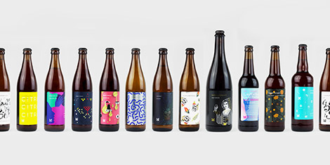
Young & Laramore teamed up with artist Michael Cina to brand Upland Brewing’s wood-aged sour ales. Cina crafted abstract compositions that represent the brewery’s careful blending of different batches to create complex flavors. This collaboration resulted in a vibrant packaging and advertising campaign that signifies the craft and artistry that is put into every bottle.

——————–
Also worth viewing:
Keith Shore
makebardo
Franklyn
Follow us on RSS, Instagram, Pinterest, Wanelo,
——————–
Share on Facebook
Thanks to this week's
Sponsor // Foto Sushi

Eric Palmér and Karolina Eriksson run Studio Moss in Gothenburg, Sweden. The designers strive to utilize analysis and research to form concepts that fuel their designs. They often collaborate with artistic exhibitions and festivals throughout Gothenburg and have won multiple awards, including a Kolla! Gold in 2014. Passionate about art education, the designers also teach workshops and tutor at design schools.
——————–
Also worth viewing:
makebardo
Dadu Shin
Mike Cina Interview
Follow us on RSS, Instagram, Pinterest, Wanelo,
——————–
Share on Facebook
Thanks to this week's
Sponsor // Foto Sushi


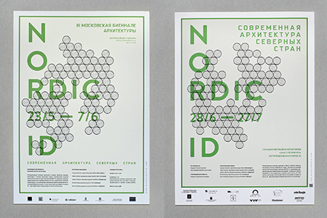
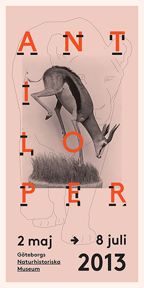
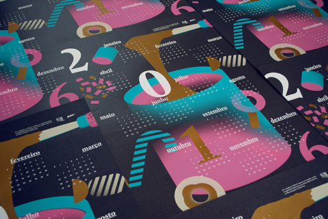
Anna Kulachëk crafts vibrant posters for schools, festivals, and entertainment venues throughout Russia and the Czech Republic. Her compositions range from sparse and minimal, to active arrangements brimming with large typography, geometric accents, and bold grids. Her use of saturated colors and emphasized modularity make her pieces ingeniously alluring.


——————–
Also worth viewing:
Michael Spitz
Marta Gawin
Lamm & Kirch
Follow us on RSS, Instagram, Pinterest, Wanelo,
——————–
Share on Facebook
Thanks to this week's
Sponsor // Foto Sushi

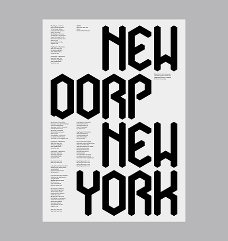
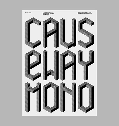
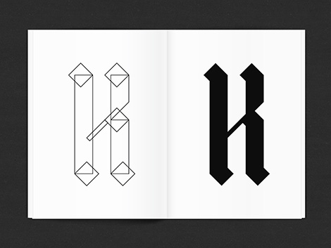
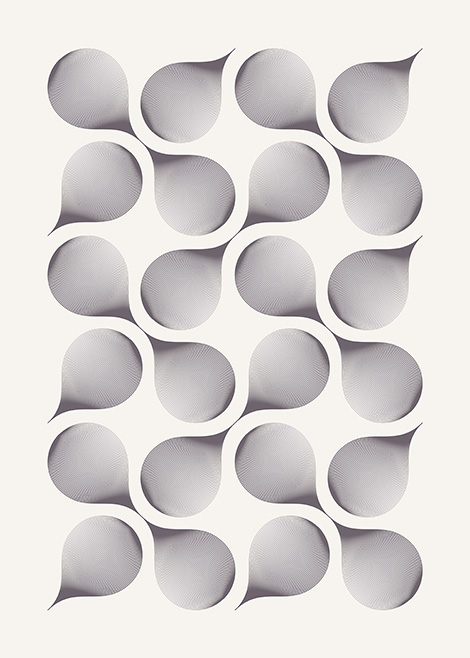
Marius Roosendaal has continued to craft impressive work since we last featured him. He’s invested in a number of self-initiated projects in which he’s designed typefaces inspired by geometry and gothic scripts. I’m especially impressed with his typeface, Causeway, which is highly customizable and can be shaded to appear three-dimensional in isometric perspective. In addition to his typographic work, he’s also released prints of complex explorations with geometric patterns and organic forms. Roosendaal’s work is a great example of how artists can use passion projects to heighten their curiosity, expand their creativity, and refine their skills.
——————–
Also worth viewing:
Jordan Metcalf
Garbett Design
Anne Jordan
Follow us on RSS, Instagram, Pinterest, Wanelo,
——————–
Share on Facebook
Thanks to this week's
Sponsor // Foto Sushi

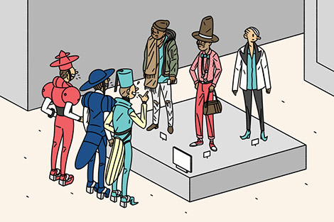
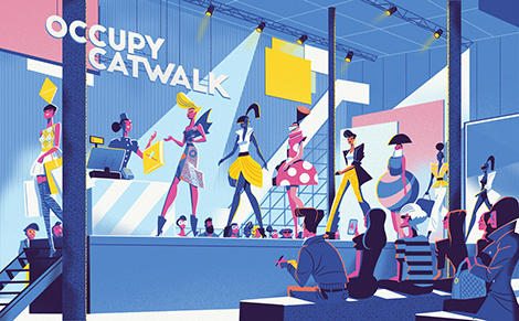
Steve Scott is a London-based illustrator who often tells multiple stories within a single illustration. Like an author writing a novel, he crafts details that enrich the themes of his narratives and reveal the purpose and motivation of each of his characters. He thoughtfully executes his dense compositions by utilizing only 3 or 4 colors at a time. The brightest colors highlight essential elements and guide the viewer’s eyes throughout the piece.
——————–
Also worth viewing:
Jun Cen
Til Hafenbrak
Scott Balmer
Follow us on RSS, Instagram, Pinterest, Wanelo,
——————–
Share on Facebook
Thanks to this week's
Sponsor // Foto Sushi

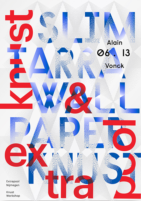
L’atelier Irradié is a French studio founded by brothers Alain and Laurent Vonck. With a passion for photography and experimental type design, the studio creates work that is rich and dynamic. In addition to their commercial work, they’ve launched a series of self-initiated projects that allow them to explore different creative avenues such as collage and 3D modeling. This appetite for creative discovery has fueled inventive work that has been exhibited in galleries around the world and recognized by respected organizations such as the New York Type Directors Club.
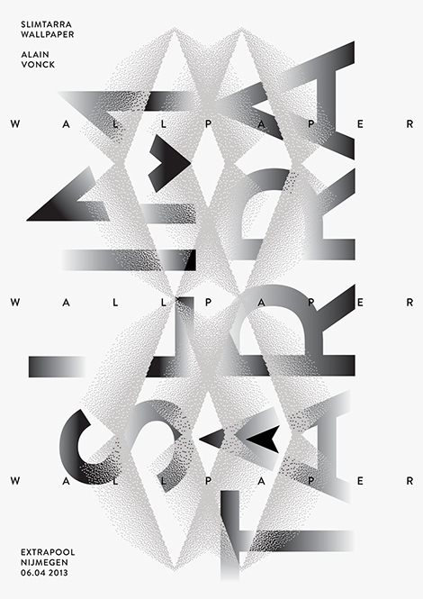
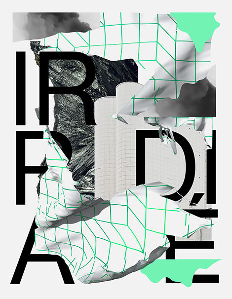


Via Typographic Posters
——————–
Also worth viewing:
Violaine & Jérémy
Rationale
CCRZ
Follow us on RSS, Instagram, Pinterest, Wanelo,
——————–
Share on Facebook
Thanks to this week's
Sponsor // Foto Sushi

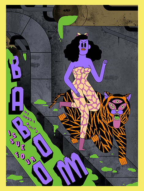
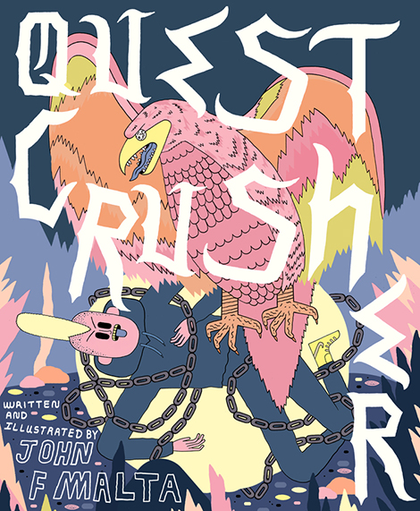
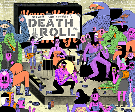
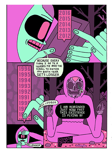
John F. Malta creates imaginative work inspired by his teenage years in the Midwest. His zines and comics, such as Baboom! and The Junkyard, are filled with humorous (and sometimes existential) stories full of rebellious skateboarding punks, guitar playing monsters, and cosmic jungle tigers. His neon color schemes and the mystifying large dark eyes of his characters create lively scenes that vibrate with excitement and mischief. In addition to his personal work, he also collaborates on pieces for The Washington Post, The New Yorker, and Valley Cruises Press. To learn more about his illustrations and creative influences, make sure to follow him on Instagram and to take a look at his annual art anthology, Universal Slime.


——————–
Also worth viewing:
Okay
Til Hafenbrak
Bunker
Follow us on RSS, Instagram, Pinterest, Wanelo,
——————–
Share on Facebook
Thanks to this week's
Sponsor // Foto Sushi

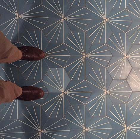
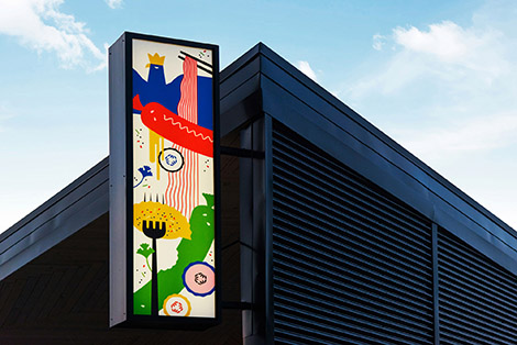
In this edition of Finds from The Field, we feature awesome tile work and signage we’ve found throughout San Francisco including these amazing tiles at Volta.

Liholiho really knows how to welcome its customers.
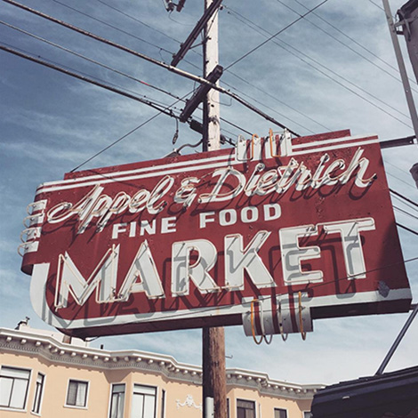
Check out this dandy sign we discovered out in the avenues.
See all of our Instagram finds here.
——————–
Also worth viewing:
Instagram Finds from the Feild
Rasmus Koch Studio
Design Facts
Follow us on RSS, Instagram, Pinterest, Wanelo,
——————–
Save
Share on Facebook
Thanks to this week's
Sponsor // Foto Sushi

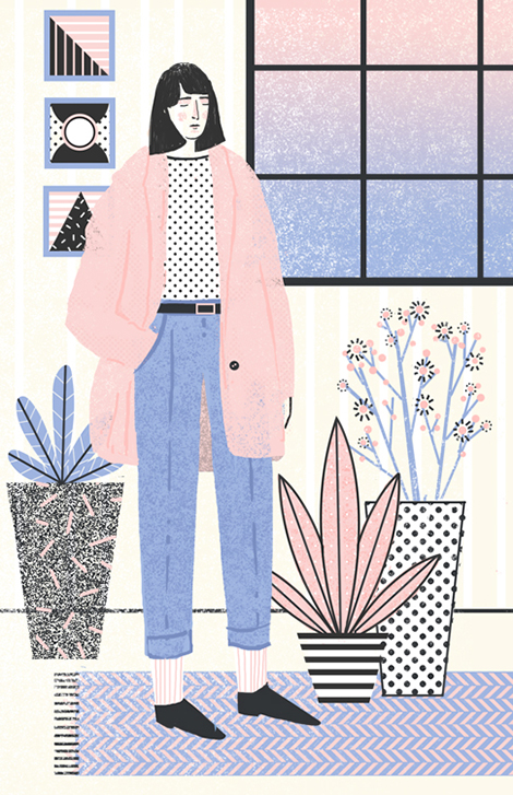
Abbey Lossing is a Brooklyn based illustrator who crafts charming drawings and animated gifs full of lively characters and whimsical narratives. Her pastel color palettes and playful use of halftone patterns give her pieces a warm and lighthearted quality, reminiscent of children’s books and comics. Her work has graced the pages of Variety Magazine and The Magazine of Contemporary Illustration as well as Buzzfeed and Vice News. To see more of her portfolio and to take a peek at her process, make sure to follow her Instagram and blog.


——————–
Also worth viewing:
Josh Cochran
Martina Paukova
Sarah Mazzetti Update
Follow us on RSS, Instagram, Pinterest, Wanelo,
——————–
Share on Facebook
Thanks to this week's
Sponsor // Foto Sushi

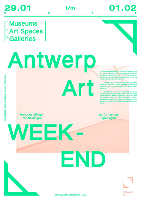
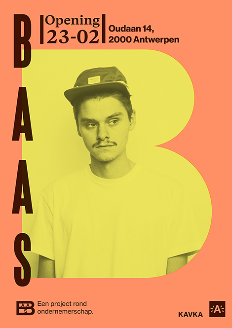
Maxim Leurentop is a Belgian graphic designer who formerly worked under the alias Studio Turbo Turbo and with the Antwerp-based studio Mirror Mirror. A passionate photographer, he often couples his photographs with typographic arrangements that are playful and intriguing, yet still easily read.
——————–
Also worth viewing:
burkhardthauke
Dan Christofferson AKA BeeTeeth
Sindy Ethel
Follow us on RSS, Instagram, Pinterest, Wanelo,
——————–
Share on Facebook
Thanks to this week's
Sponsor // Foto Sushi

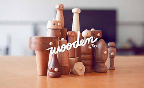
Estudio Pum proudly states, “In order to find new solutions, we must leave our comfort zone.” This passion for exploration and innovation is evident through the variety of illustrative and typographic styles utilized within their body of work. From playful paper cutouts to refined type-driven websites, Pum proves that they aren’t afraid to tackle a diverse range of projects and visual aesthetics. To expand their creativity and learn how to work with different tools, the studio takes on a number of passion projects including a Risograph printed zine and a line of wooden toys and rattles.
——————–
Also worth viewing:
Jun Cen
Tsto
Nate Koehler
Follow us on RSS, Instagram, Pinterest, Wanelo,
——————–
Share on Facebook
Thanks to this week's
Sponsor // Foto Sushi

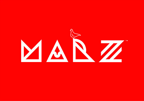
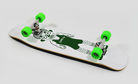
Franklyn in a Brooklyn-based creative studio founded by Michael Freimuth and Patrick Richardson. While designing for a wide range of clients, they strive to “stay trill” and create eye-catching designs that genuinely represent the companies they work with.
Their talent for creating alluring and authentic brands can be seen within their work for Marz Brewing, a collective of brewers and artists. The studio created a flexible branding system in order to easily collaborate with the artists to craft distinctly different labels for each flavor of beer. This innovative approach to branding has led to an alluring packaging system that beautifully symbolizes the diverse personalities of each brewer.
Having a passion for expanding their imaginations and showcasing the creativity of others has led to charming self-initiated projects. They create official Franklyn swag, like toothbrushes and skateboards, and collaborate with designer Kyle Poff to create Matérial Magazine.

——————–
Also worth viewing:
Keith Shore
Made You Look
Brad Woodard Interview
Follow us on RSS, Instagram, Pinterest, Wanelo,
——————–
Share on Facebook
Thanks to this week's
Sponsor // Foto Sushi

In this edition of Finds from the Field, we feature our trip to Sea Ranch – a modern housing community established in the mid-sixties along the Northern California coastline. Featured on and within several of these structures are supergraphics and icons by Bay Area designer Barbara Stauffacher-Solomon. In addition, she designed the logo which can be easily seen on the signage at the Sea Ranch Lodge and welcome center.
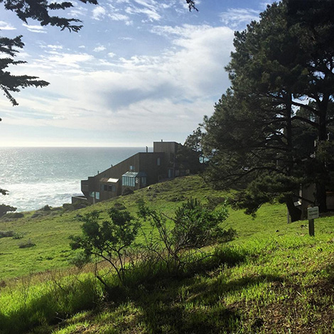
Sea Ranch was designed by Moore, Lyndon, Turnbull, Whitaker and a significant smidgen of Escherick
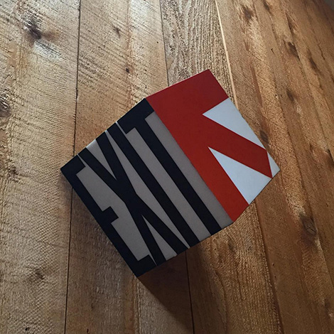
Super fun exit sign
See all of our Instagram finds here.
——————–
Also worth viewing:
Eye Sea Posters
Bulgaria Black Sea Resort Stamps 1972
Script and Seal Posters
Follow us on RSS, Instagram, Pinterest, Wanelo,
——————–
Share on Facebook
Thanks to this week's
Sponsor // Foto Sushi

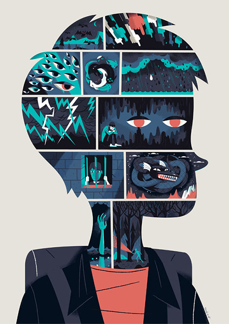
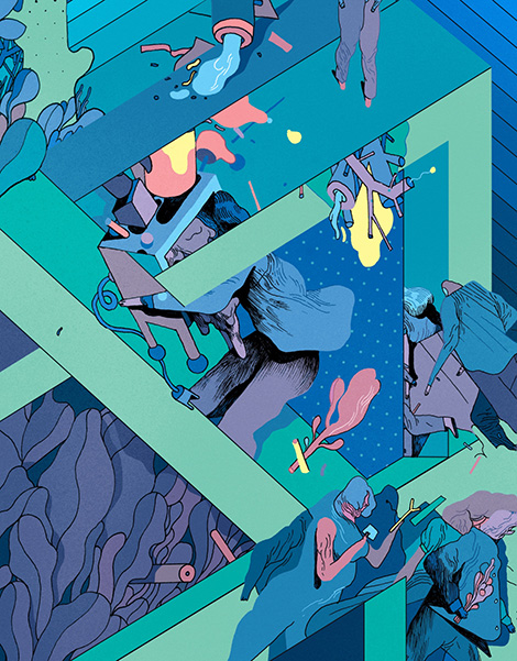
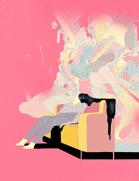
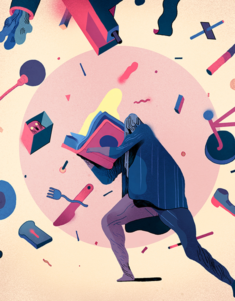
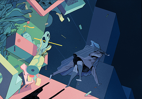
Rune Fisker’s illustrations are vignettes of a curious and surreal land. The blank and emotionless faces of his characters add a dose of mystery to his dreamlike landscapes full of leafy vegetation, flying household items, and geometric accents. By depicting just glimpses of each narrative, he creates scenes that are enticingly ambiguous and bound to spark the viewer’s imagination.
——————–
Also worth viewing:
Raúl Soria
Andrea Dell’Anna
Caitlin Keegan
Follow us on RSS, Instagram, Pinterest, Wanelo,
——————–
Share on Facebook
Thanks to this week's
Sponsor // Foto Sushi


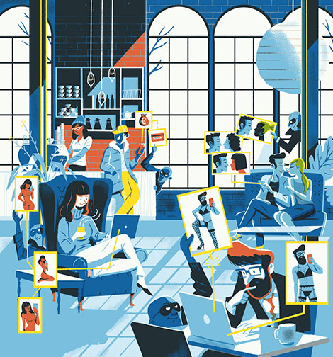
A world traveler who has lived in numerous countries, Magoz, is a self-described “nomadic illustrator” currently based in Madrid. His portfolio is a colorful collection of highly conceptual and minimal pieces made up of simple shapes and eccentric characters. He often posts his work on his blog where he also shares artistic advice and the knowledge he’s gained during his travels. He is currently in the process of creating Illustrator’s Essentials, an online workshop inspired by questions readers have left on his blog. His course will give helpful insights how to be an efficient professional illustrator.


——————–
Also worth viewing:
Karolis Strautniekas
Twice
David Biskup
Follow us on RSS, Instagram, Pinterest, Wanelo,
——————–
Share on Facebook
Thanks to this week's
Sponsor // Foto Sushi

View Next 25 Posts