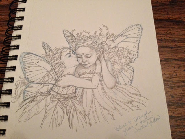
JacketFlap connects you to the work of more than 200,000 authors, illustrators, publishers and other creators of books for Children and Young Adults. The site is updated daily with information about every book, author, illustrator, and publisher in the children's / young adult book industry. Members include published authors and illustrators, librarians, agents, editors, publicists, booksellers, publishers and fans. Join now (it's free).
Login or Register for free to create your own customized page of blog posts from your favorite blogs. You can also add blogs by clicking the "Add to MyJacketFlap" links next to the blog name in each post.
Blog Posts by Tag
In the past 7 days
Blog Posts by Date
Click days in this calendar to see posts by day or month
Viewing: Blog Posts Tagged with: Tutorial, Most Recent at Top [Help]
Results 1 - 25 of 67
How to use this Page
You are viewing the most recent posts tagged with the words: Tutorial in the JacketFlap blog reader. What is a tag? Think of a tag as a keyword or category label. Tags can both help you find posts on JacketFlap.com as well as provide an easy way for you to "remember" and classify posts for later recall. Try adding a tag yourself by clicking "Add a tag" below a post's header. Scroll down through the list of Recent Posts in the left column and click on a post title that sounds interesting. You can view all posts from a specific blog by clicking the Blog name in the right column, or you can click a 'More Posts from this Blog' link in any individual post.
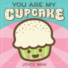
Author and illustrator Joyce Wan is back on Ready Set Draw! This time around she teaches you how to draw a delicious treat from her board book, You Are My Cupcake! No matter your skill level you will be able to draw a super cute cupcake. Go wild with your markers, colored pencils, or crayons by adding sprinkles and your favorite toppings.
When you’re finished drawing these cupcakes perhaps you’ll be inspired to make a batch of your own. Watch Joyce’s episode of StoryMakers, with Kathleen DeCosmo, to learn how to make cupcakes and easy toppers!
If your child or student isn’t ready to draw their own cupcake, they can decorate this printable:
Click the image above to download the full-sized printable.
Did you, a child, or student draw cupcakes using this video? Share your images with us via Facebook, Instagram, or Twitter! Use the hashtag #ReadySetDraw on Instagram and Twitter too. We can’t wait to see what you’ve drawn!
You Are My Cupcake
Written and illustrated by Joyce Wan
Published by Cartwheel Books
A scrumptious board book, filled with sweet terms of endearment. This bite-sized board book is an ode to all the names we call our children: cutie pie, sweet pea, peanut, pumpkin. With a candy-colored palette and irresistible art with glitter and embossing.
ABOUT JOYCE WAN
Joyce is inspired by Japanese pop culture, Scandinavian design, modern architecture, and the little things that put a smile on her face. In Joyce’s perfect world “everything would be cute, round, and chubby,” which is evident in her illustrations. Joyce is the author of several bestselling board and picture books including You Are My Cupcake and The Whale in My Swimming Pool, a Spring 2015 Junior Library Guild Selection.
Although Joyce’s parents had the equivalent of a middle school education, and her mother wasn’t able to speak English, her mother took Joyce and her siblings to the library every week. Picture books were integral to Joyce’s love of reading as she and her siblings made up stories to go along with the illustrations. Joyce counts the determination of her parents as a driving force behind her perseverance and success. “When I first started Wanart, I was working at a 9am-6pm job at an architectural firm. I spent many late night hours on my own business with only a few hours of sleep in between the two “jobs”. I did this for two years before I quit my full time job to pursue my own business full-time.”
Joyce graduated from Barnard College, Columbia University in New York City with a liberal arts degree in Architecture. Joyce teaches greeting card design and art licensing at the School of Visual Arts. The self-proclaimed night owl prefers drawing and writing in the early morning hours “when everyone’s asleep and the world is quiet.” Joyce lives in Ridgewood, New Jersey with her husband. The architect turned author and self-trained illustrator hopes to inspire people to “embrace the spirit of childhood and follow their dreams.”
Ah, my gosh. Somebody please run my blog! I just will do just about anything but do it.
I make myself so mad sometimes. I frustrate the hell out of myself.
Anyways, I'm going to endeavour to update it with some of the things I've been doing whilst I've been away. I can only but try.
COLOURING BOOKS?! I have made colouring in books. It was not something I'd ever intended doing. It all felt a bit, well, you know, done. But when my printers started a new range of colouring books it got me thinking about some of my drawings that may be cool to colour in. And I tried thinking of ways of putting a twist on the whole colouring book phenomena.
I'm calling it 'advanced colouring' but really it's for any ability. But, if you're already used to wielding the pen then I've added tips to take your colouring to the next level.
There are two sizes of book, you can find them HERE.
See you back here in about six months time!
*I will blog more often. I will. I will. I will....*
0 Comments on advanced procrastination as of 1/1/1900
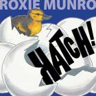
Roxie Munro was one of KidLit TV’s very first StoryMakers guests. On this episode of Ready Set Draw! She is back to teach you how to draw a wise and strong owl from her book, Hatch!
Roxie is the author and illustrator of more than 40 books for kids and develops apps based on her books. Each book is filled with Roxie’s signature detailed style.
Did you, a child, or student draw their own owl using this video? Please share your images with us via Facebook, Instagram, or Twitter! Use the hashtag #KidLitTV on Instagram and Twitter too. We can’t wait to see what you’ve drawn!
Hatch! Written and illustrated by Roxie Munro
Published by Cavendish Square Publishing
Crack! Who is inside the eggs? All kinds of baby birds! Can you guess what kind of bird is like a superhero and can fly as high as a jet plane? Or which bird builds nests that can weigh as much as a car? Or which bird sleeps on the water with one eye open? Read Hatch! and find out. Hatch! gives young readers a bird’s-eye view into the fascinating world of birds and their unique eggs and nests.
ABOUT ROXIE MUNRO
Via RoxieMunro.com
Roxie is the author/illustrator of more than 40 nonfiction and concept books for children, many using “gasification” to encourage reading, learning, and engagement. Her books have been translated into French, Italian, Dutch, Chinese, and Japanese.
Roxie was born in Texas, and grew up in southern Maryland, by the Chesapeake Bay. At the age of six, she won first prize in a county-wide contest for a painting of a bowl of fruit. She has been a working artist all her life, for a while freelancing in Washington DC as a television courtroom artist. It was great training for life drawing, concentration under pressure, and making deadlines. Clients included CBS, the Washington Post, and the Associated Press. Fourteen of her paintings have been published as covers of The New Yorker magazine.
She also creates oils, watercolors, prints, and drawings, primarily cityscapes, which are exhibited widely in the US in galleries and museums. Roxie’s work is in numerous private, public, and corporate collections.
Roxie Munro studied at the University of Maryland, the Maryland Institute College of Art (Baltimore), earned a BFA in Painting from the University of Hawaii, attended graduate school at Ohio University (Athens), and received a Yaddo Fellowship in Painting. She lectures in museums, schools, libraries, conferences, and teaches in workshops.
Many oils and watercolors are views from the roof of her sky-lighted loft studio in Long Island City, New York, just across the East River from her home in mid-Manhattan. Roxie is married to the Swedish writer/photographer, Bo Zaunders.
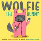
Kid lit illustrator and author Zachariah OHora draws Wolfie, the lovable and huggable main character from Ame Dyckman’s Wolfie the Bunny!
In this installment of Ready Set Draw! Zachariah OHora explains the evolution of Wolfie and teaches KidLit TV host Rocco Staino how to draw Dot’s bunny brother.
Did you, a child, or student draw their own Wolfie using this video? Please share your images with us via Facebook or Twitter!
Wolfie the Bunny by Ame Dyckman, illustrated by Zachariah OHora
Published by Little, Brown Books for Young Readers/Hachette Book Group
Families of all kinds will delight in this sweet tale of new babies, sibling rivalry, bravery, unconditional love…and veggies! The Bunny family has adopted a wolf son, and daughter Dot is the only one who realizes Wolfie can–and might–eat them all up! Dot tries to get through to her parents, but they are too smitten to listen. A new brother takes getting used to, and when (in a twist of fate) it’s Wolfie who’s threatened, can Dot save the day?
ABOUT ZACHARIAH OHORA
Via zohora.com
Zachariah OHora is an award winning illustrator and children’s book author. His work has been recognized by the Society of Illustrators, Communication Arts, American Illustration, and Print. His work has been collected by Alice Waters, Stephan Jenkins of Third Eye Blind and late night talk show host Jon Stewart.
His debut children’s book Stop Snoring, Bernard! won the 2011 Founders Award at the Society of Illustrators, a Merit Award from the New York Bookbinders Guild and was chosen as the PA One Book for 2012. The PA One Bookprogram is a state and private funded program that seeks to encourage literacy in the state of Pennsylvania by giving books to every library, Headstart program and low income schools. The program distributed 100,000 copies ofStop Snoring, Bernard! and hosted the author on a six week tour of the states schools and libraries.
He illustrated The Pet Project written by Lisa Wheeler (Atheneum Books April 2013) and his next book No Fits, Nilson! (Dial Books June 2013). His latest book, My Cousin Momo (Dial Books 2014) about a Japanese flying squirrel visiting his North American non-flying cousins. His illustration work has appeared on posters, album covers and in numerous magazines and newspapers. Clients include The New York Times, The Atlantic, Bloomberg BusinessWeek, Oxford American, Wax Poetics and NPR.
Zachariah was raised in New Hampshire, and lived in San Francisco, Berlin, and New York. He now lives and works in Narberth, PA with his wife Lydia Ricci and two sons Oskar and Teddy. Like the main character in Stop Snoring, Bernard! he is known to snore, sometimes loudly.
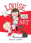
Author and illustrator Kelly Light shows Storymakers host Rocco Staino how to draw the fierce and fantastic cat from Louise Loves Art.
Video
Ready! Set! Draw! is the drawing tutorial show for anyone who aspires to draw like their favorite kid lit illustrators. In each episode a bestselling and/or award-winning artist draws a character from their book. Budding artists will enjoy creating their very own versions of familiar and new characters.
Did you, a child, or student draw their own cat using this video? Please share your images with us via Facebook or Twitter!
Louise Loves Art – Meet Louise. Louise loves art more than anything. It’s her imagination on the outside. She is determined to create a masterpiece—her pièce de résistance! Louise also loves Art, her little brother. This is their story. Louise Loves Art is a celebration of the brilliant artist who resides in all of us.
ABOUT KELLY LIGHT
Via kellylight.com
Author and illustrator Kelly Light grew up on the New Jersey shore surrounded by giant pink dinosaurs, cotton candy colors, and Skee-Ball sounds. She was schooled on Saturday-morning cartoons and Sunday funny pages. She picked up a pencil, started drawing, and never stopped. Kelly has illustrated Elvis and the Underdogs and Elvis and the Underdogs: Secrets, Secret Service, and Room Service by Jenny Lee, and The Quirks series by Erin Soderberg.
Kelly is an International Ambassador of Creativity for The Chuck Jones Center for Creativity! The Center is a non-profit founded by Chuck Jones, the animator, artist and director of so many of the cartoons that we think of when we just think the word “cartoon”. In his lifetime, Chuck enjoyed talking to and encouraging younger artists. The center continues in this spirit to ignite creative thinking through free art classes for kids, creativity workshops, presentations and talks for kids and adults meant to inspire and enlighten. The center also has outreach programs to local schools who have lost their art funding and visits senior citizen centers to provide drawing and creativity exercises for greater mental and emotional health.
Here's a post from the archives. It's from July 2010. The first thing that goes through my head is how things have changed! I would never use this method these days. My drawing is so much more instinctual now, but back then I was learning. I was teaching myself to draw. And, for me, that makes it a valid exercise, but then any sort of drawing that you do is valid. It's all about practice, and no matter how much we'd love magic pens the fact is that if you want to get to a place where you're confident enough to become instinctual you need to put the learning in first. And, what I have found also is that drawing is all about looking, seeing, and that is something else I was teaching myself to do here. Look. See.
The other thing that has changed is an obsession with drawing shoes - where did that come from??!Anyway, here's
How To Draw a Shoe by Andrea Joseph 2010
Over the past few years I have worked through many different processes, when drawing from still life, to get to the one that I am happy with. As I'm self taught it's been a process of elimination to find the ways that work best for me. I have narrowed it down to a couple of methods actually. I'll show you both in the next two posts, and demonstrate with my favourite subject matter; shoes.
Above are the tools I have used. They are; a cartridge paper sketch book; tracing paper; pencil; rubber (I believe that means something different in the US?!); three blue ballpoints; one red ballpoint. I want to stress at this point, because I'm asked so frequently, I use ANY kind of ballpoint pen. No special makes or brands. Any. As long as they aren't blotchy I'll use them.
Step 1. I am pretty obsessive about getting the shape 'right', so if I'm sketching something, for eaxmple an Adidas trainer, I will do the sketching stage on tracing paper. I realised, a while back, that I do not have any 'sketchy' books as such. I only ever produce finished drawings. I do, however, have huge amounts of roughs on tracing paper. Doing things this way means I can work on the shape I want to achieve and then transfer it easily to paper. It also means that, if I should want to, I can reproduce the same image (in different mediums). Which is something I do quite often.
Step 2. When I've got shape I want I transfer it to paper. In the image above you can see the ballpoint outline. I would obviously start with a pencil outline, but the scan I did for that was rubbish - you couldn't see anything. So when the pencil outline is put down on the paper, I go over it faintly with a ballpoint.
Step 3. I have started to add some shading (values?) to some areas. I work out where this shading should be by observing the shoe and where the shadows and light fall. Excuse me if all this sounds really patronising, it's not meant to. It's just how I have learnt to draw. Step by step.
Step 4. Here comes the cross hatching. This is the part where I feel I can really get into the zone with this drawing. I love this bit. The shoe is starting to come alive, and more texture is being added through the hatching.
Step 5. A continuation of the last step. More building, more hatching, more texture. Also at this point I'm starting to add the detail. That's another bit I love doing.
Step 6. The finishing touches. My most favourite bit. Details, a bit of extra hatching and a splash of red. In this drawing the final finishing touch was to outline the shoe with a bolder line, using a ballpoint that has a bigger nib.
And that's it!
That's how I did things back then. Actually, this is the way I'd work these days for an editorial or book illustration job or for something that needed planning and page layout. So, I learnt quite a lot from that period. Mostly, I learned about seeing. And, funnily enough, I went on to teach a Sketchbook Skool course of that very name ('Seeing') five or so years later.
More demonstrations and things from the archives all month, here, on my blog.
But for now, that's all folks!
0 Comments on how to draw a show revisited as of 1/5/2016 9:46:00 AM
Do you ever find yourself struggling to remove the white paper-textured background from around your images? I used to, until I learned this incredibly simple method using the “Channels” function in Photoshop. Here’s what you need to do, step by step.
1. Open up your image in Photoshop. Today I’ll be using this bicyclist illustration. Click the “Channels” icon (circled in red below.) You should see four rows: RGB, red, green, and blue. (Unless your image is CMYK, in which case you’ll have a channel for cyan, magenta, yellow and black instead.)
2. Depending on the dominant colors in your image, one channel will likely be darker than the others. I like to start with that one, but really any of them would probably work. In my case, the darkest channel is the the “Blue” channel. When I click on it, I see a grayscale version of my image. I’m going to copy this channel by dragging it down to the “copy” icon in the channels box. (See red arrow.)
3. Now there should be a fifth row in the channels box called “Blue copy.” You can re-name it if you like. While this channel is active, go to Image -> Adjustments -> Levels. Use the sliders to adjust the levels so that everything you want to be deleted (the background) is white, and the image is black. Anything that appears gray will be semi-transparent.
4. Once you’ve adjusted the levels on your channel, use the brush tool to clean it up, making sure the interior of the image is completely black if you don’t want the background showing through. (I didn’t want my cyclist’s mustache to be transparent!) When you’re done, click on the “RGB” composite channel so that your image appears as normal.
5. Exit the “Channels” view by clicking back on the “Layers” icon. Now it’s time to make the mask. To do this, go to Select ->Load Selection.
6. You will see a pop-up box something like this. Choose your “Blue Copy” channel, and click the checkbox for “invert.” (If you forget to do this, you can always just go to “Select -> Inverse”)
7. Now your background should be selected. To make it transparent, make a mask by clicking on the “Add a Mask” icon in your Layers box.
8. That’s all there is to it! It’s super easy. From here you can add any background you want, or just leave it transparent. Here I’ve added a blue background so that you can see how my mask turned out:
In our continuing effort to keep you inspired we’d like to tell you about this really fun online course that will walk you through the steps necessary to take your character illustrations to the next level.
In this class Matt Kaufenberg will take you through his process of illustrating a character, starting with the concept, then moving into Illustrator to create the shapes, and finally, rendering it in Photoshop.
Here's another of my passions folks. Zines. I am a fully fledged zine maker. A zinester, to use the technical term. What is it about making zines I love? Well, it is the whole process. But the main main thing is that it is DIY publishing which means you only answer to yourself. You write, draw, play, create whatever it is that you want to. Totally and utterly authentic. Nobody else has any say, influence or sway over what you want to produce. What can be better than that? Well, making money out of it would be nice. But, that's never the starting point. You'd be sorely disappointed if it was. They are a labour of love. No, the starting point is 'I'm going to make this because I want/need to'.
It does, however, mean that sometimes we have to flog our creations. So, here's a bundle of my five current zines. Each has a run of 1000. No more no less. And, I've put a SALE on. Normally $50 but I've knocked 20% off so until the end of the week they're just $40.
This is the perfect inspiration kit for anyone who loves drawing or just loves to look at drawings.
Molezine 2
A collection of some of the drawings from my travel themed Moleskine sketchbook. Limited stock.
How To Draw Like a Loon
Created with nothing but a four colour ballpoint. This zine is all about drawing and handwriting. Filled with lots of exercise for you to try. Including how to make a zine! Very limited stock.
An Idle Daydream
A zine that reviews my favourite (and not so favourite) pens. Also includes some of my favourite blog images from the last eight years.
How to Draw Like a Barmpot
Another tutorial zine. This one focuses on drawing with your imaginations. Includes lots of little exercises to get your imagination working.
The Daily Tamp
A tiny cut-out-and-make newspaper full of stories, film reviews, classified ads and all the usual features of a big full sized newspaper but just tiny.
If you'd like to purchase, or read more about this zine bundle you can do so HERE. You will be supporting an artist to create more publications that you won't find on the supermarket shelves.
Many thanks for listening.
0 Comments on How to Do It (self publishing) Yourself as of 1/1/1900
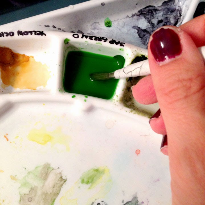
Laying in a background color around a subject can be tricky, and it can be very frustrating, especially after taking the careful time to draw out all of your details. It can be approached loosely, or with a tight hand. I will demonstrate both.
Keep in mind, these are my methods, and by no means the ONLY way to go about it. Watercolor painting is a very personal in application. Trial and error are the best ways to learn the medium. The worst thing you can do for your painting is get furious and give up. Give yourself grace and have patience.
Okay, here we go.
Set Up
Place your water, paper towel, and paints on the side you write with, keeping your painting in the middle. Grouping your supplies will help you grab what you need more efficiently.
Choose your brushes. I usually have three different sizes on hand. They are #2, #5, and a #12 (or around that). These are not my BEST kept brushes, and are typically used for events such as this.
Prepare enough paint to fill the space you're going to cover. Choose a transparent color, like my Sap Green here. It will allow light go travel through down to the white of the paper and back. Trust me. I have also chosen a color that will work well with the other colors I'm going to lay down, such as blues, yellows, and reds.
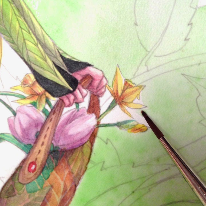
Painting Around the Subject The Tight Hand Approach
Choose the smallest of your brushes to start, but keep that medium size close by. You want it to be small enough to get into the tight spots, but large enough to hold a decent amount of paint/water mix. You can see I have placed it close to the face (most important to me) to ensure I'll be able to get in around the nose and lips with the point of the brush.
Scary part, start laying in the color. Charge (meaning fill the brush) with your color making sure it's full. Lay down next to the subject, but NOT along your line. Give yourself wiggle room. Make a little 'puddle' of paint, but don't over extend it. The idea is to keep plenty of wet paint sitting there, hence the 'puddle'.
Now pull from the puddle to your line with the color. Slow down here...it should all be wet enough to give you at least a moment to do this. It will take practice to find your sweet speed spot. Remember, give yourself grace.
To prevent unwanted lines, RIGHT after you do some of the face move to the other side of your puddle with a rinsed brush. Fade it out, this way, if it dries, you'll be able to paint and fade over it giving the illusion that you painted it all at once. ;) NOTICE I didn't do the entire face all the way down.
Work in little puddles/spots and work your way down and around, using the same method over and over again.
Again, fading out with a rinsed brush and clean water, getting rid of any unwanted crisp edges.
With this method I can confidently move away from my subject and begin to venture out. You may need to switch to your medium sized brush to have enough paint and water.
I will begin to add droplets of clean water in to help give my background texture, depth, and this will give the eye something to look at other than what I may have missed. Naturally, in my opinion, this is the most beautiful characteristic of watercolor, they're called blooms.
You can continue the entire painting with this approach.
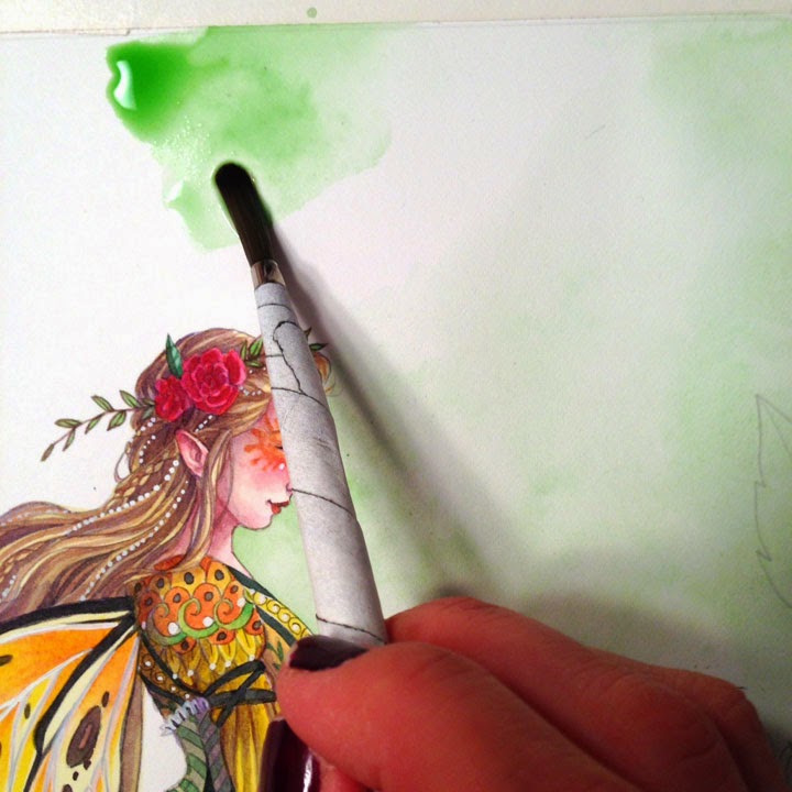
Grab your big brush and charge it up. Lay down a good size puddle, but small enough that you still have a puddle (remember, don't over extend your paint). Also, don't go to your lines, you need the space between.
Rinse out your brush and return to the edge of your puddle, pulling the paint towards and OVER your line art. You are fading out the color on top of your subject.
Like with the tight approach, take your rinsed brush and fade out the back end of the puddle. Repeat.
In the tiniest of spots, take your smallest brush and pull the wet paint in. If it's dry charge your brush, but first dab it on your paper towel so that it won't over flow or bubble in the tight space you're painting. Try to match the intensity of the color.
If there are crisp edges you don't want...
...go back in with a rinsed brush and clean water, gently scrub and fade them out.
There are tiny little white spots left around the forehead and nose...see them?
Very lightly, and very gently, with your small brush, pull the paint left in the crisp edge onto the white. Go in, lightly do this, and get out. Too much scrubbing too aggressively will leave inconsistent marks you don't want.
Just to show I know what I'm talking about, once your first faded section is dry, go in to a new section and start again with a puddle.
Keep making puddles and scooting/painting them over the dry faded area. Once you've overlapped start to fade out your puddle with a rinsed brush. Again, might take some practice, so use light water droplets if you need to. ;)
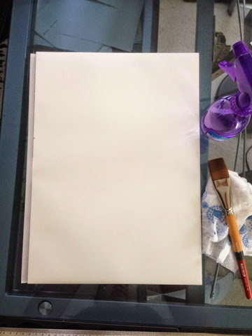
Prep your hot pressed watercolor paper while it is still attached to the watercolor block.
Although watercolor blocks lean more on the expensive end, they are far more easier to work with. You don't have to stretch your paper with tape or a staple gun.
Simply spray your paper so it is saturated with a spray bottle. Next, take a flat brush and even out the water on the paper's surface. Lastly pick up any water that drips on the sides of your block or table surface with a paper towel.
Let it dry completely before you transfer your image or begin painting.
By doing this it will loosen the sizing in the paper and allow the fibers to relax, which in turn will let the watercolor absorb easier into the paper. If you don't prep the paper with water on hot press, you tend to get a more wax resist reaction.
Happy painting!
:)
0 Comments on Studio Tip - Hot Pressed Prep as of 7/2/2014 1:38:00 PM
Now Playing - Girl Is On My Mind by The Black Keys
For the last few years my wife and I have been selling our
handmade décor and geeky stuff on Etsy, an online marketplace. What is the
first thing people ask us when they find out that’s what we do for a living?
Not “What’s the shop?” or “Ooh, what do you sell?” No, it’s almost invariably
something like “I make things too… I
0 Comments on How To Sell On ETSY - Introduction as of 7/2/2014 2:01:00 PM
How scary is it to you to just begin doodling onto a piece you admire and have 'finished'?
What if I told you is healthy and wise to do this from time to time?
I believe it is. As an instructor I always look for ways to push my students ever so slightly out of their comfort zone (or sometimes, way out of their comfort zone...but more on that a different time).
Doodling straight onto the watercolor, around or on an already exisiting piece, demands several thoughts at once. You thinking about composition, you make your marks with more meaning and intent, but at the same time you're doodling!
So let's focus on the art part. In all seriousness, it's to not think, yet to just do idly. When you doodle on a piece that you've already invested in you're using both your right brain and your left. A great exercise!
I encourage you to find a piece, one that MATTERS to you, one you've INVESTED in, and do some doodling upon it. It doesn't have to be a masterpiece, just something you ENJOY.
Look up Zentangles if you haven't before, they're great inspiration. ;)
What does it do for the art?
It's great for the mind and practice, but what does it really do for the art? How is this a tip for drawing?
Doodles are loose, highly creative, and usually detailed. They can add a great layer of interest and some of the best ideas, ones that can compliment your subject, will come through. It will keep the viewer's eyes moving and interested. I find some of my best backgrounds come when I don't plan them.
I'm interested in seeing what you've done. Please post in the comments below and share your work!
0 Comments on Tip: Doodling on Art as of 5/26/2014 2:18:00 PM
I think we've all seen illustration where the children or babies look like miniature adults? Of course sometimes, like in this medieval painting, that can be a stylistic choice but other times it can just look downright creepy.
I have definitely had times where I have had characters look 10 when they needed to be look 5. Sometimes it can be hard to figure out why a character looks the wrong age and even harder to fix it. Here are some pointers and things to keep in mind when changing the age of your child characters.
First of all, you need to consider the size of the face. Look at photos of babies or, even better, draw babies from life (you'd better be quick - they are squirmy little suckers!) But you will soon notice, that compared to adults, their chins and noses are quite small.
So, one of the easiest things you can do is move the face lower on the head. Even a smiley face can look younger when you shift the eyes down and make the chin and mouth smaller.
The smaller you make the chin, the pudgier the cheeks will appear. If you look at the profile of a real baby sometimes you can't see their mouth or chin because their cheeks are so round.
Another thing you can do to make your characters younger is change the size of the head compared to the body. A real adult is approximately 7 1/2 heads tall, a real 5 year old is about 6 heads tall and a real infant is about 4 heads tall, but depending on your drawing style those proportions might not look right. When I draw kindergartners they are usually about 4 heads tall, the same proportions as a real life infant!
In the above diagram, all the figures have the same head placed on the same body. The body is just smaller each time (I also made the neck a little shorter each time.) By the 3rd figure, the body was getting too narrow, so I widened it a bit. But you can see by just changing the head/body proportions you can go a long way to changing the age of a character.
When you pair that with the facial changes discussed above, you can really alter the age of characters. I hope this helps.
Good luck and happy drawing!
0 Comments on Tips for Drawing Child Characters as of 9/13/2013 12:40:00 PM
I haven't done a tutorial in a long time so I thought I'd share some of the newer Photoshop tricks and techniques that I've learned lately. Here's a piece that I did for the Illustration for Kids February promotional mailer.
For this image, I knew I wanted to make two love birds so I downloaded a bunch of reference photos of love birds and created a rough pencil drawing.
It was pretty messy, so I redrew it on tracing paper.
I scanned the pencil drawing of the birds into Photoshop and cut and pasted it into a new photoshop document, making sure this new file was the size of the final artwork and in RGB color mode. I made sure I included all the necessary bleeds, so there weren't any surprises later.
Then I created the heart shape in Adobe Illustrator and cut and pasted (paste as pixels) into the Photoshop file. Then I erased the parts of the heart that should be hidden by the birds. I also sketched in the rest of the leaves on the end of the branch.
For this illustration, I wanted everything in the image outlined in a grainy pencil line. To do that I could have created a new layer in Photoshop and traced the image using the brush tool, but I haven't found a pencil brush in Photoshop that I'm completely happy with. So I decided to print the image out on drawing paper and trace it with a soft graphite pencil. But before I did that, I made some modifications to the image.
I selected the layer with the birds and clicked on Image->Adjustment->Levels. I then adjusted the level sliders in order to make the whites whiter and the pencil lines darker.
Next, I wanted to make the whole image a pale blue color, sort of like a non-photo blue pencil. To do this I made sure I was on the topmost layer of the file and I created a new "Hue/Saturation" adjustment layer. In the Adjustments window I checked the "Colorize" check box and moved the hue slider to a cyan blue color and increased the Saturation and Lightness until I was happy with the results.
Next I stuck a sheet of Strathmore drawing paper in my inkjet printer and printed the image. I then traced over it with at 4B pencil.
Then I scanned it back into Photoshop, adjusting the Levels as needed to make the whites white and the darks dark. It wasn't bad, but I had a few places where I didn't follow the lines exactly so I had some light blue lines showing through.
In order to get rid of these blue lines I went the the "Channels" window. By default Photoshop makes all three color channels visible (red, green and blue) By clicking on the little eyeballs next to each channel I could turn each one on and off. I could see that the blue lines show up much more on the red channel but not so much on the green and blue channels. I took advantage of that to get rid of those pesky blue lines.
To do so, I clicked on the blue channel while holding down the CTRL key. This selected everything in the blue channel, actually this selected all the white areas in the blue channel. By clicking on Select->Inverse I was able to select all the dark parts. Then I created a new layer in my file, made sure my foreground color was black and press ALT-Backspace to fill the selection. Tada! now I have a new layer that is just my pencils lines an nothing else.
Phew! I think this is a good place to stop for now. Next time I'll go over how I colored the artwork.
0 Comments on Love Birds Tutorial as of 1/29/2013 8:44:00 PM
Because everyone and their brother makes a New Year's resolution to read more (yours truly included), here's something to help you out: a bookmark tutorial.
You'll need cardboard (I used a leftover mailer), paint, a paintbrush, a pen and scissors.
Trace the template onto your cardboard (full size = about 1 3/4 by 4 inches). Cut out, then carefully make a slit for both arms, slightly rounding out the hands once free. After you've cut out the figure, fill in features with a pen and add accents with paint. Let dry.
To use, place arms over the page you want to mark, slipping the body a few pages behind. Happy Reading!
3 Comments on Mark Your Place, last added: 1/19/2013
I am in a lull.
A quiet spot.
No deadlines. Yet. Oh, they are coming, just as soon as contracts get signed and I could start acting like I have a deadline. But I know the deadlines are fake and can’t quite commit to them.
So, I am in a lull.
What am I doing?
Build Platform. I am doing the behind the scenes work on my blog, and enjoying the luxury of reading other blogs and commenting on them. It’s always good to participate in the online community of writers, but deadlines mean it is more restricted. So–point me to one of your best blog posts in the last 30 days and I’ll read it!
Read or study tutorials. On the topic of Facebook, I’ve been fascinated by THE LIKE ECONOMY: How Businesses Make Money with Facebook by Brian Carter. Did you know that there’s such a thing as the EdgeRank Algorithm? When you have a Fan Page, only about 17% of your fans see your posts because of this Algorithm. Basically, Facebook decides how to prioritize what a person sees on FB by using a complicated math formula that takes into account the type of post (text, photo, video), the frequency of interactions with that page or person before (you see your BFF’s posts on top always, but others drop off because you don’t care about them as much) and how long it’s been since you interacted with them on Facebook. See more from Brian Carter about EdgeRanks here. After reading through his book, I am thinking and evaluating where to put my efforts for the next year.
Plan Ahead. I am trying to read the crystal ball and decide where to put efforts right now. There are always blog posts to write, new manuscripts to write. What should I be doing TODAY? By anticipating deadlines, I can work now to get blog posts written, formatted and scheduled for publishing. So often, planning events, school visits, etc. mean lots of emailing, calling, reading material and making decisions, etc.–trying to take care of the details of future events.
Try something new. It’s also important for me to try something new and fresh and different during this time period. I want to visit the local art center, try some online advertising, visit a friend who just needs a warm body to listen.
Bug those involved with the forthcoming projects with endless emails demanding attention.. Work on my work and Be Patient. Work on projects that I like, whether they have commercial possibilities or not. And check my email every other minute for emails about those forthcoming projects. And wait patiently for the forthcoming projects to mature.
This Saturday on Awesome Horse Studios, Aaron will do a live critique, and Cynthia will be doing a creature design from scratch with help from the viewers!
Come join in the live chat, ask questions, and paint along at 2PM EST.
What happens when four illustrators share a passion for their work and sharing what they know with others? Awesome Horse Studios is Marc Scheff, Cynthia Sheppard, Noah Bradley, and Aaron Miller. They do a weekly Livestream on Saturdays at 2pm EST. Each episode consists of 1-2 critiques of art submitted from the audience, and a demonstration.
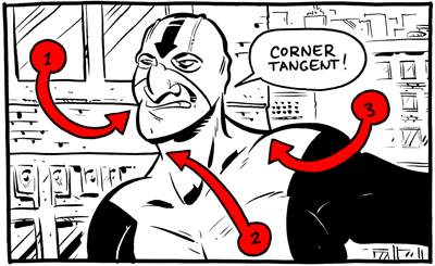
I do compositional lectures a lot in my classes, as well as at the occasional convention. I’ve been asked to post them, so here’s part one: The Schweizer Guide to Spotting Tangents!
Comic art is, as a general rule, a line-based medium. I know, I know, there are plenty of artists whose work is painted, or who depict their subject in ink using solely light and shadow. But these folks are unquestioningly in the minority, as the history of printing technology originally dictated the use of line to depict form in the early days of comics. This became a stylistic expectation, and it’s an expectation that I enthusiastically embrace, as have many others. But using line to draw the world invites chances for that cardinal sin of composition: the tangent.
A tangent is when two or more lines interact in a way that insinuates a relationship between them that the artist did not intend.
It can create confusion on the part of the audience as to what it is that they’re looking at. It can cause the spatial depth that one attempts to cultivate through the use of planes to become flattened. Most of all, it creates a decidedly unwelcome aesthetic response: tangents are just plain ugly.
There are a lot of different types of tangents, as least according to the way I define them. In order to make it easier on my students when giving critiques, I’ve categorized them and named them. This may have been done before, but I’ve not encountered it. My hope is that, by making this “spot-the-enemy” guide, fewer artists will fall into the tangent trap by knowing what to look for.
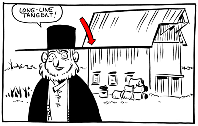
1. The Long Line
The long line is when a line from one object runs directly into the line of another This is the tangent that everybody knows. The one that’s easiest to spot, easiest to avoid. For a lot of folks, this is the only thing meant when one refers to a “tangent.”
Even in the work of the very best comic artists, a vigilant eye can find the occasional tangent. Even when a cartoonist is constantly on the lookout, a tangent can slip through. But, as each of strive to better ourselves and the quality of our work and our medium,
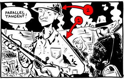
2. The Parallel
The parallel tangent is when the containing lines of two objects run alongside each other. This causes one of two negative outcomes. Either one object becomes “lost,” as the other overpowers it (figure 1), or one object feels strangely contained by another (figure 2). This can be avoided by ensuring that any object that COULD run alongside another is angled at least 45 degrees from the first. The next two are REALLY tough to spot, and most artists have fallen victim to them before.
3. The Corner
The corner tangent is when two lines in an object meet in a way intended by the artist, but another (accidental) line runs directly into the place where they meet.
4. The Bump-Up
0 Comments on DUNNING-KRUGERDAR: The Schweizer Guide to Spotting Tangents as of 1/1/1900
So the last blog post had the body split up the Delsarte way. Head, heart, & body (or, as a commenter before had mentioned, mental, moral, & vital.) Head, torso, limbs--each with three more splits of the same. And, in those sections, there are even more divisions!
The eyes, for example, are split: head in pupil, iris is heart, and white is body.
(There are also divisions for the nose, mouth, around the eyes, etc...it's a crash course so we can't get in to all of that. But you can always read the google book.)
Hands (the head part of the body section) also have three parts: palm = body, back = heart, side = head.
So, it makes sense why holding the back of your hand to your forehead = romantic faint (heart to head) vs. palm of hand to head (more logical--do you have a fever?)
The power & movement behind the head/heart/body divisions also had those three parts. The more powerful and convex is body, the least powerful, more head = concave, and the happy middle is the heart.
Delsarte took all these movements & pieces and created exercises and gestures that symbolized the characters' emotions & desires.
Here's a (rough) Delsarte gesture lineup:
4 Comments on More gesture funs (Delsarte prt 2), last added: 9/21/2011
I took 4 semesters of American Sign Language in college, and it would be really interesting to look and see how signs correlate to this as well. Naturally not all will, but in sign language where you hold a sign on your body (like at your heart or head) changes the meaning. Cool stuff!
One COULD always read Delsarte's work (and i intend to someday) but in the mean time, this is wonderful! Thank you! Very precise and easy to understand- and I am learning! :)
In the video embedded above, Roger Hargreaves‘ son, Adam Hargreaves, shows you how to draw Mr. Tickle, Mr. Grumpy, Mr. Funny, Little Miss Sunshin, Mr. Bump and Little Miss Naughty.
Six-year-old Adam inspired his father to create the Mr. Men series when he asked: “What does a tickle look like?” After Roger’s passing in 1988, Adam took over and continued his father’s work. What character is your favorite?


.jpg?picon=572)


.png.jpg?picon=3640)


.jpeg?picon=2786)


.png.jpg?picon=3916)


Yes! These are great. Love the cardboard brown and gouache colors together. Also, your characters!
Oh my goodness, I love this! I'm going to make some tonight!
I'm officially obsessed with this. So adorable - and I highly support the idea of more illustration based DIYs! More more!