It took a while but finally the page views on my blog have surpassed the one million mark. I wondered if the counter would return to zero once it reached a million, but it is still clicking up …phew! I know some blogs get a million page views or more a day, but I didn’t expect to get any so it means the world to me. I also know page views are not the same as unique views, but I don’t care! Thank you lovely blog readers you are the best!
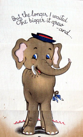
My wish is a long time in coming to you ...
But the longer I waited the bigger it grew - and ...
GREW!
THANK YOU! Just like this little elephant I will never forget.
* Colour printed birthday card part of my collection. Published by Satchwell Smiths, London, c1950s. One sheet of paper folded to create a card that ‘grows’. I’ve added quite a few vintage Christmas cards to my collection this year and will be sharing some of them in a future post.
Follow my blog with Bloglovin
Jiving
These were my three sketches for the second day of the post-three-sketches-for-five-days challenge. I went from three girls drawing, in my last post, to three girls dancing. I love this idea of drawing people whilst they are indulging in their own passion. Whatever that may be. That can only add another layer of richness to the work I think. Richness? Not the word I'm looking for, but it's late. And, I'm not so good with words. That's why draw.
Burlesque
You can find opportunities to draw people, doing their thing, here there and everywhere. I drew these three ladies at various events and places. In the last few months I've drawn a local choir, orchestra, band, knitters, drinkers. If you're brave enough (and I know it's not easy) just find out where people are meeting or rehearsing and ask if they mind you coming along and sitting quietly in a corner scribbling away. If it helps take a fellow sketcher or two.
Mexican
Last year I drew the
TED Talks
event in Manchester. That was a great day. It was a gig I got just through asking the organisers if I could do it. I got to listen to inspiring speakers whilst sketching them. I made a big A2 drawing, over the course of the day, of the 25 different speakers. I also stole a quote from each of them and worked them in amongst the sketches. Pretty much everyday I see that drawing (it's lay on top of my scanner as I haven't found anywhere to put it -with it being that big). One of the quotes that I borrowed was "life begins where your comfort zone ends". It's a great quote. And an even better idea.
Book: The Spy Catchers of Maple Hill
Author: Megan Frazer Blakemore
Pages: 320
Age Range: 8-12
 The Spy Catchers of Maple Hill is a historical mystery novel set in a small Vermont town in 1953. Hazel Kaplansky lives with her parents in a home adjacent to the graveyard that they manage. She's prickly and smart, and doesn't fit in very well, despite having grown up in Maple Hill. At a time when everyone is nervous about Russian spies and possible nuclear attacks, Hazel is suspicious of the new gravedigger, a man with the too-banal-to-be-true name of Mr. Jones. Hazel soon enlists lonely new kid Samuel Butler in her investigation. But she soon learns that Samuel has secrets, too, which everyone seems to know about except Hazel. Hazel and Samuel's developing friendship is set against a backdrop that includes a McCarthy investigation of the men in the local factory, and corresponding swirl of local rumor and innuendo.
I think that Blakemore does a nice job integrating the historical time period with Hazel's story. She introduces lots of details, but keeps all of them tied closely to Hazel's perspective. For instance, she captures Hazel's mortification when she sneezes during an air raid drill. The Spy Catchers of Maple Hill covers everything from the scars that remain from the depression and influenza epidemic to how people treated unwed mothers during and after World War II to the fear and gossip triggered by McCarthyism. And she slips in little tidbits, too, like the fact that Alaska isn't a state yet.
There is a bit of an old-fashioned feel to The Spy Catchers of Maple Hill, as you would expect from a book so decisively set in the 50s. Bike riding, microfiche searches at the library, only mothers expected to show up at school events, etc. I think that the presence of a graveyard, together with active spying, will still keep kids interested, but there's always that risk with historical fiction that it will appeal more to adults than it does to the kids. There's a pretty clear sub-text in some of the scenes, where the adults, particularly Hazel's parents, talk over her head. I suppose that kids who understand this will have the chance to feel superior. Certainly I would expect young readers to be surprised at how different the world was 60 years ago.
Anyway, I quite liked Hazel, despite (or perhaps because of) that fact that she isn't completely likable at all. She makes mistakes, she runs away with her assumptions, and she is flat out wrong about most things. But she's smart and loves books and doesn't really try to fit in - she is utterly herself. When a popular girl invites Hazel, unexpectedly, to a birthday party, she attends only so that she can conduct her investigation. She attempts to turn a mausoleum into a fallout shelter. She does remind me a bit of Harriet the Spy, writing things down in a little notebook, though the lives of the two girls are quite different.
Here's a snippet, to give you a feel for Hazel:
"What was in that box?
Hazel sat up in the tree chewing her lip. Something was not on the up-and-up. Last year she had read every single one of the Nancy Drew mysteries, and just like Nancy always did, she had a hunch, but you didn't need to be a young sleuth like Hazel and Nancy to know that when a person locked something up, he was hiding something. And just like that, Hazel had her first real mystery." (Chapter 2)
and:
"It should come as no surprise that Hazel loved the library. She loved everything about it, even the smell, like paper, and paste, and sometimes, when Richard Begos was there, a little bit like pipe smoke." (Chapter 6)
Despite the presence of some mean-spirited, gossipmongers in the town, there are several wonderful adult role models for Hazel, including a service station owner and a librarian. I also liked the fact that the conflict that Hazel has with a couple of mean girls is not resolved to any great degree. This comes across as realistic, and Hazel never feels like she needs their approval anyway.
A hint of a mystery is left open at the end of The Spy Catchers of Maple Hill. It's not a cliffhanger, just something to keep the reader guessing. Kids who enjoy mysteries or realistic historical fiction (like Gary Schmidt's Okay for Now) will definitely want to check this one out. I enjoyed it as an adult, and I think that I would have loved it when I was ten (having been something of a geek like Hazel). Although this is Hazel's story, the engaging cover should help it to appeal to boys, too. Recommended!
Publisher: Bloomsbury (@BWKids)
Publication Date: May 6, 2014
Source of Book: Advance review copy from the publisher
FTC Required Disclosure:
This site is an Amazon affiliate, and purchases made through Amazon links (including linked book covers) may result in my receiving a small commission (at no additional cost to you).
© 2014 by Jennifer Robinson of Jen Robinson's Book Page. All rights reserved. You can also follow me @JensBookPage or at my Growing Bookworms page on Facebook.


50cc Astor Super Sport 1969 /Itom (1948–73), Turin, Italy / Courtesy of Stewart Ingram
During the Second World War many of Italy’s motorcycle and automobile manufacturing facilities were destroyed by allied bombing. To aid in the post-war economic recovery of these industries, the Italian government revised a highway code which reduced the minimum driving age to fourteen. With this, motorcycle manufacturers could create a new class of vehicles aimed at the younger generation. What these bikes lacked in power, they easily made up in style.
In 2012, SFO curated a small collection of these motorcycles for an installation in their international terminal. Included in the display were pieces by Itom, Benelli and MV August - all of which are scarcely seen on the roadways of Europe let alone the U.S. Although these vehicles have long ceased production, their legacy lives on through their iconic design.

50cc Giulietta Super Sport 1959
Fratelli Peripoli (1957–80), Vicenza, Italy

125cc Competition SS 52 “Gobbetto” 1952
Moto Rumi (1950–63), Bergamo, Italy

48cc Record Sport 1968
FB Mondial (1948–79), Milan, Italy
Images via SFO
—–
Also worth viewing:
Citroen Brochure
Monaco 1975 poster
Vintage Porsche Posters
Not signed up for the Grain Edit RSS Feed yet? Give it a try. Its free and yummy.
Share This
Featured Book:
Matte Stephens: Selected Works.
A Huge thanks to Squarespace for sponsoring this week’s RSS Feed!

These are the final couple of drawings from the rock n roll day last weekend. Actually, there's also a motorbike but that might take some time to finish. I must say that I'm pretty pleased that in just one day I produced so much stuff.
I'l let you into a secret about the car below; it most definitely wasn't that shape. I started off at the front of the car, which was going okay. Not great but okay. Then I realised that there was absolutely no bloody way I was going to fit the whole thing onto the page. It was, after all, a big long Zodiac! So, I had a decision to make and, yes, I did. I squashed the whole thing into the space I had. Ah well, as long as we keep it to ourselves nobody else ever needs to know.
Throughout this drawing I was thinking of my friend
France Belleville and her 'ladies'.

Thanks to Johan Anderson for notifying me of the brand new Olle Eksell tribute site! Included on the website are videos, suggested links, a timeline, as well as rare photos of Olle with his wife and peers. In addition, Johan worked with the Eksell family to release a small collection of products which feature Olle’s stunning illustration work.

photo credit: Bruno Ehrs


More images +info are available at the Olle Eksell shop.
Catch Olle on Facebook as well.
——————–
Also worth viewing:
Alvin Lustig
Alexander Girard Book
Karel Martens: Printed Matter
Not signed up for the Grain Edit RSS Feed yet? Give it a try. Its free and yummy.
——————–
Share This
Grain Edit recommends: Saul Bass - Henri's Walk to Paris. Check it out here.
©2012 Grain Edit - catch us on Facebook and twitter

By: Alice,
on 3/6/2012
Blog:
OUPblog
(
Login to Add to MyJacketFlap)
JacketFlap tags:
*Featured,
Art & Architecture,
Arts & Leisure,
Charles Cushman,
Day in Its Color,
Eric Sandweiss,
Kodachrome,
Photographic Journey Through a Vanishing America,
cushman,
sandweiss,
life,
1950s,
Add a tag
By Eric Sandweiss
Charles Cushman has gotten me into some pretty tight spots. He’s dragged me through green pastures and led me beside still alleys. He’s drawn me closer than I cared to come to the shadow of death, as I weaved my car through freeway traffic with one eye on the road and the other on my map, one hand balancing a camera and the other tending to the steering wheel.


In Atlanta, Georgia, the round Coca-Cola Neon Spectacular lit up the foot of Peachtree Street from 1948 to 1981. Today, hotels and office buildings dominate a more demure downtown streetscape. Left: Charles Cushman Photograph Collection, Indiana University Archives, Peachtree St., Atlanta, 1951, P05130. Right: Photo by Eric Sandweiss.
I didn’t know, when I started getting into those spots eight years ago, that I’d be following Cushman. As a historian of the built environment, I was after something else: the landscape of farms, small towns, and big cities that this part-time businessman photographed during the period from 1938 to 1969. I wanted to find the places Cushman had pictured, to learn how they’d weathered the transformations that had taken Americans from Depression, through war, and into a period of abundance.
I couldn’t help imagining that during that thirty-year interval, the nation had turned from gray to color. At least that’s how it had always seemed to a kid comparing the newest issue of Life, lying on the kitchen table (“Fonda’s Little Girl Jane as a Futuristic Space Traveler in the Movie ‘Barbarella’!”), with the clothbound early volumes of the same publication (“US Wins Race with Nazis for Brazilian Trade”) that he would pull off the shelves at the public library on a rainy Saturday afternoon.
")

Empty blocks and overgrown lots are all that remain of the steel mills and working-class neighborhoods that once dominated Chicago’s far southern lakeshore. Left: Charles Cushman Photograph Collection, Indiana University Archives, Carnegie-Illinois Ore Docks, E. 90th St., Chicago, 1941, P02256. Right: Photo by Eric Sandweiss.
It was many years after those library weekends that I found Cushman’s pictures. I was old enough to know better, but somewhere beneat

Todd Oldham who put together an excellent monograph on Charles Harper and Kiera Coffee recently released an exciting new book chronicling the work of the late Alexander Girard. This 672-page beast published by Ammo covers virtually every aspect of Girard’s distinctive career. As one of the most prolific and versatile mid-20th century designers, Girard’s work spanned many disciplines, including textile design, graphic design, typography, illustration, furniture design, interior design, product design, exhibit design, and architecture. Exhaustively researched and lovingly assembled by Oldham, this tome is a must-have book on Girard’s oeuvre.


Details:
Alexander Girard
By Todd Oldham & Kiera Coffee
16 x 12 inches / 672 pages
You can pick up a copy here.
In addition, Ammo is releasing several other products related to Girard.

Alexander Girard Memory Game
7.5 x 7.5 inches / 36 pairs/72 cards total

Alexander Girard Floor Puzzle
24-piece jigsaw puzzle / completed puzzle size: 24 x 36 inches

Alexander Girard Color Board
6 x 6 inche

I’m an avid fan and collector of architectural ephemera, so I was excited to discover David Liaudet’s inspiring blog Architectures de Cartes Postales. Since 2007 David has used the space to explore modern and contemporary architecture through its representation in postcards. The online archive is filled with amazing examples of sculptural elements, signage, memorial buildings and Brutalist architecture from the 1950s-70s. If you have a couple of hours to spare I highly recommend a visit.


——————–
Also worth viewing:
Cite des Choux
Nakagin Capsule Tower
The Architecture of Gomorrah
Not signed up for the Grain Edit RSS Feed yet? Give it a try. Its free and yummy.
——————–
No Tags
Share This
Congrats to our winners in the Bike Print giveaway: Gianluigi Farnetti, Brian_HF, brianjbarron, Adrienne Wu
Grain Edit recommends: Karel Martens: Printed Matter. Check it out here.
©2009 Grain Edit - catch us on Facebook and twitter
By: Grace Danico,
on 7/8/2011
Blog:
inspiration from vintage kids books and timeless modern graphic design
(
Login to Add to MyJacketFlap)
JacketFlap tags:
vintage,
1960s,
1970s,
Charley-Harper,
kids-books,
J.P. Miller,
Off Our Bookshelves,
Alain Gree,
Illustration,
out-of-print,
1950s,
Add a tag

On a recent and most adventurous trip to the South of France, I had the pleasure of visiting the small village of Montolieu. Known as the “Village of Books,” Montolieu has a grand array of artisans that specialize in book binding and printing as well as antiquarian bookstores specializing in everything from vintage periodicals and antiquities to comics, art and kids books.
Today’s post will unearth some of my favorite finds from my trip, including books illustrated by J.P. Miller, Charley Harper, and Alain Gree.

I went with a few other folks to Montolieu during the awkward hour of 11:30A, which is right before all shops close up for lunch. I was on a time crunch, and the first (and only) bookstore I visited was La Rose Des Vents, which translates to “The Compass” in English. The shop was fairly small and had two rooms, with regional and history books in the front and children’s books in the back.

While there, I was able to find a few neat books, including a drawing book titled Voyage a Travers Le Monde (Journey Through the World), c. 1974. The book provides instructions on how to draw various cultures from around the world, not by any means accurately by the way.

In addition to that book, I was able to find Le Manege Vivant (c. 1950), which is the French edition of The Marvelous Merry-Go-Round, written by Jane Werner and illustrated by J.P. Miller. I had not seen the book before, and the hippo alone on the cover was enough reason to hold onto it! Upon opening the book, I was pleased to see so many whimsical and colorful illustrations, trademark of Miller’s style.


![]()
By: Melody,
on 5/17/2011
Blog:
Redeeming Qualities
(
Login to Add to MyJacketFlap)
JacketFlap tags:
books,
list,
illustrations,
historical,
stuff,
1950s,
1970s,
1980s,
childrens,
1940s,
ebwhite,
cecildaylewis,
jeanleelatham,
marthaalexander,
Add a tag
Here’s part two. You may notice that the formatting is unbelieveably horrible. I tried to fix it, but I’ve given up now.
7. The Trumpet of the Swan, by E.B. White

The dust jacket on my copy is long since lost.
So, here’s an unpopular opinion for you: this is the best E.B. White book. Charlotte’s Web is pretty good. I like it a lot. Stuart Little coasts on the fact that tiny things are cute. The Trumpet of the Swan is better than either of them. When I was little, I also thought it was completely hilarious — I would reread bits and sit there giggling to myself — but it’s probably only moderately funny. That’s okay, though, because it’s clever and thoughtful and enormously weird, and when it comes to children’s books, that’s what I want most.
The Trumpet of the Swan, for those of you unlucky enough not to have read it, is about a mute trumpeter swan named Louis. He can’t attract a mate without being able to make trumpet-y noises at her, so his father goes off and steals him a trumpet, and the rest of the book is all about people being wowed by his excellent trumpet-playing skills, which makes me happy because one of my favorite things in books is characters who are really good at what they do (cf. Carry On, Mr. Bowditch, two of the three books in the final section of this list, and that post I will someday write on Trustee from the Toolrom). Anyway, it’s a wonderful book all around, and a deeply satisfying one. Most books that I like leave me wanting to know more, but I think it’s actually better when a book gives you exactly as much as you need, and this is one of those.
***
6. Carry On, Mr. Bowditch, by Jean Lee Latham

I think this cover is gorgeous.
Okay, here’s one I read several times when I was, oh, maybe twelve? I ran across it at a used bookstore last summer, and thought, “I adored that book. Why haven’t I thought about it for the last dozen years?” And then I reread it, and, as it turns out, I still adore it.
This is a fictional take on the life of Nathaniel Bowditch, who revolutionized navigation in the late 18th century. Latham introduces us to Nat as a kid about to be apprenticed to a ship chandlery in Salem in the 1770s, and from there we follow his struggles to educate himself and others. It’s a sad book, because massive numbers of people die, but it helps to know that they’re real people who died, rather than characters the author is gratuitously killing off. And also, it’s an incredibly moving book, and I think it owes some of that to the historical environment. Nat’s family is very poor, and a career at sea includes the possibility of death, and Latham doesn’t minimize those things.
And then there’s the people-being-really-good-at-what-they-do thing. It’s fun to see Nat surprising people with his surreptitiously acquired book-learning, and it’s even better to see him winning over his shipmates with his expertise on practical matters. Especially
By: Kirsty,
on 11/10/2010
Blog:
OUPblog
(
Login to Add to MyJacketFlap)
JacketFlap tags:
Art,
Politics,
1950s,
World History,
Communism,
Early Bird,
britain,
flight,
labour,
Patrick Wright,
*Featured,
Clement Attlee,
Stanley Spencer,
History,
Mao,
china,
UK,
Add a tag
By Patrick Wright
On 1 October 1954, Sir Hugh Casson, the urbane professor of interior design who had been director of architecture at the Festival of Britain, found himself standing by the Tiananmen Gate in the ancient and still walled city of Peking. In China to present a statement of friendship signed by nearly 700 British scientists and artists, he was watching a parade that the reporter James Cameron reckoned to be “the greatest show on earth”. First came the troops and the “military ironwork”, grinding past for a full hour. This was followed by a much longer civil parade in which the people marched by in barely imaginable numbers, beaming with joy at their elevated leaders who gazed back with the slightly “subdued” expression of still unaccustomed new emperors.
The spectacle with which China celebrated the fifth anniversary of the communist liberation was brilliantly organised, as Casson felt obliged to admit. He was less impressed by the admiring expressions worn by many of the other international guests: “Gold-rimmed spectacles misted with emotion, cheeks creased with years of well-meant service in this cause or in that, shirts defiantly open at the neck, badges in lapels, and there in the middle – could it have been? – an MCC tie.” That particular specimen was Ivor Montagu, a cricket-loving friend and translator of the great Soviet film-maker Sergei Eisenstein.
Sickened by the rapture of the communist regime’s ardent western friends, Casson quickly retreated to the shaded “rest room” beneath the viewing stand. Here he lingered among yellow-robed Tibetan lamas, sipping tea and exchanging impressions with other doubtful Britons: the classically minded and no longer Marxist novelist and poet Rex Warner, and AJ Ayer, the high-living logical positivist who would come home to tell the BBC that China’s parade had reminded him of the Nuremberg rallies.
Enraptured or appalled, none of these British witnesses appears to have regretted the absence of Stanley Spencer. The 63-year-old painter, so famously associated with the little Berkshire village of Cookham, had managed to escape the entire show – thanks, he later explained, to “some Mongolians”, whose timely arrival at the hotel that morning had provided the cover under which he retreated upstairs to his room.
It was the discovery that Spencer had been to China that persuaded me to look further into this forgotten episode. I soon realised that an extraordinary assortment of Britons had made their way to China in 1954, nearly two decades before 1972, when President Nixon made the stage-managed and distinctly operatic visit that has gone down in history as the moment when the west entered rapprochement with the People’s Republic of China. Were these motley British visitors just credulous idiots, for whom “Red China” was another version of the legendary Cathay? That is what the 24-year-old Douglas Hurd and the other diplomats in the British embassy compound in Peking appear to have suspected of these unwelcome freeloaders. Or was something more significant going on?
Nowadays, the rapidly increasing number of British travellers to China think nothing of getting on a plane to fly directly there. Yet Spencer had good reason to feel “trembly” as he and the five other members of his entirely unofficial cultural delegation approached the runway at Heathrow on 14 September 1954. Though Britain had recognised China a few months after the liberation, it had yet to establish proper diplomatic relations with the communist-led government, and the embarking Britons couldn’t pick up a visa until they had reached Prague. That meant crossing the iron curtain dividing Europe. “Did you go under or over it?” one joker would later ask, making light of a passage that was

Opening in Dublin this week:
The Vintage Irish Book Covers blog is presenting an exhibition of Cor Klaasen’s wonderful book and record cover designs.
Cor Klaasen: Jackets, Covers & Sleeves
Venue: Adifferentkettleoffishaltogether, 18 Ormond Quay Upper
Times: Daily 11 – 5pm. Thurs 4 – Wed 10 November inclusive
Opening: Wednesday 3 November, 2010, 6 – 8 pm. Guest Speaker: Brian Lalor


——————–
Also worth viewing:
Born Modern: The Life and Design of Alvin Lustig
18 Dick Bruna Covers
Japanese Graphic Design in the 1950s
Not signed up for the Grain Edit RSS Feed yet? Give it a try. Its free and yummy.
——————–
No Tags
Share This
Only a few grain edit shirts left.Get yours now!
Grain Edit recommends: Born Modern: The Life and Design of Alvin Lustig. Check it out here.
©2009 Grain Edit - catch us on Facebook and twitter
By: Melody,
on 10/26/2010
Blog:
Redeeming Qualities
(
Login to Add to MyJacketFlap)
JacketFlap tags:
1920s,
1940s,
1910s,
colinwatson,
dorothylsayers,
books,
nonfiction,
mystery,
1950s,
1930s,
1960s,
Add a tag
I ordered Snobbery with Violence, by Colin Watson, on the recommendation of Cristiane, and on the whole I liked it, but I do have some reservations. Well, a lot.
Snobbery with Violence is a discussion of some of the most popular authors of crime fiction between, approximately, World War I and the 1960s, when the book was written. Watson’s premise is that an era’s most popular fiction tells you the most about its reading public, and obviously that’s a thesis I can get behind. What bothered me was that most of the snobbery involved seemed to come from the author. Colin Watson may think he likes mystery novels, but my impression is that he hates them and the people that read them.
The best parts are when he recounts the plots of ridiculous thrillers by Edgar Wallace, Sapper, and the like — my favorite includes an episode where Bulldog Drummond hits a tarantula between the eyes with a poker — but once he finishes the description, he always makes sure you know that he’s laughing at the authors and the readers, not just the funny plot twists. At times, the book feels like a list of popular mystery writers with a brief explanation of why each one was bad. He rarely gives anyone credit for anything positive.
I also, somewhere near the middle of the book, became a little bit suspicious of Watson. I wasn’t very familiar with most of the writers he talked about, but I have read all of Dorothy Sayers’ Peter Wimsey novels, and when Watson began to talk about them, I could see where he was simplifying things in order to make his points, and where that simplification led to false impressions.
An example: he talks about a bit in Have His Carcase in which Harriet Vane spends time with a professional dancer. She can dance with him, says Watson, but she can’t socialize with him for any other purpose than to get information from him, because heroines have to be chaste. And that’s true enough, as far as it goes, but Watson probably ought to have chosen another example, because we are frequently reminded, throughout the books in which she appears, that Harriet Vane used to live with a man she wasn’t married to, and to leave that out seems deliberately misleading. And it’s a little thing, but it made me doubt Watson’s information on the books I was less familiar with.
So, yeah. Watson is a horrible snob who hates popular authors, the reading public, and television, and I don’t think he’s the most ethical writer out there. But Snobbery with Violence is a fun book to read, and it’s helped me to add lots of things to my reading list. Just — if you read it, take it with a grain of salt.


 2 Comments on Snobbery with Violence, last added: 10/28/2010

Tom Schifanella is Senior VP/Executive Creative Director for The Robin Shepherd Group and a passionate collector of hotel luggage labels. I highly recommend his Flickr stream which is filled with amazing examples of these labels and other travel-related ephemera. Tom also handles the collection of the late Gyorgy Razso, a Hungarian who amassed one of the biggest luggage label collections in the world. Many of the labels from the collection are available for purchase here.


(via the excellent Aqua-Velvet)
——
If you like this, check out: Istanbul Luggage Label, Swiss Luggage Label
Not signed up for the Grain Edit RSS Feed yet? Give it a try. Its free and yummy.
——
No Tags
Share This
Only a few grain edit shirts left.Get yours now!
Grain Edit recommends: Born Modern: The Life and Design of Alvin Lustig. Check it out here.
©2009 Grain Edit - catch us on Facebook and twitter


Untitled painting casually referred to as White Block Quadrupeds
Jim Flora was a fine artist/illustrator best known for his album cover art for RCA Victor and Columbia Records, as well as his illustrations for children’s books. In this uncirculated and untitled early 1940s painting, he presents us with a (literally) twisted cast of characters. As mentioned on the Jim Flora website, the work “depicts an inscrutable panorama of disconnected facial features, headless quadrupeds, and someone’s nightmare of a fanged horse”. This piece along with select paintings from the Jim Flora collection are now available as limited edition prints for purchase over at the Poster Cabaret.

Manhattan

The Big Bank Robbery
Related Books:
The Sweetly Diabolic Art of Jim Flora
The Curiously Sinister Art of Jim Flora
——————–
Also worth viewing: Sigrid and Hans Lammle
Not signed up for the Grain Edit RSS Feed yet? Give it a try. Its free and yummy.
——————–
No Tags
Share This
Only a few grain edit shirts left.Get yours now!
Grain Edit recommends: Born Modern: The Life and Design of Alvin Lustig. Check it out here.
©2009 Grain Edit - catch us on Facebook and twitter
By: Dave,
on 10/12/2010
Blog:
inspiration from vintage kids books and timeless modern graphic design
(
Login to Add to MyJacketFlap)
JacketFlap tags:
swissair,
1950s,
posters,
1960s,
1970s,
Found design,
ephemera,
swiss,
switzerland,
Add a tag

Patrick Eberhard has amassed an amazing collection of Swissair-related material. His website, Sr692 which is named after the flight number from Zürich to Lisbon, is filled with vintage posters, flyers, logos, stamps, route maps, tickets and books, as well as a detailed history of the airline. This is an absolute goldmine for those interested in Swiss design.
A hat tip to Shelby at Wanken for discovering this amazing resource.


(via iso50 + Delicious Industries)
——————–
Recommended Reading:
Airworld: Design And Architecture For Air Travel - Published by Vitra
This book focuses on the corporate design of airlines, uniform fashion, the graphics of air travel posters and the significant role that aviation played as an inspiration for architecture, design and art up to the present day.
Copies are available at Amazon.
——————–
Also worth viewing: Swiss Graphic Design by Geigy, Jorg Hamburger, Publicity and Graphic Design in the Chemical Industry.
Not signed up for the Grain Edit RSS Feed yet? Give it a try. Its free and yummy.
——————–
No Tags
Share This
Only a few grain edit shirts left.Get yours now!
Grain Edit recommends: Born Modern: The Life and Design of Alvin Lustig. Check it out here.
©2009 Grain Edit - catch us on Facebook and twitter
 Nothing like a week’s worth of posts about grammar and punctuation to make you feel like you’re in school again. So it seems only appropriate to feature Jene Barr’s Good Morning, Teacher (note the comma!) for this week’s archive. Published in 1957, with illustrations by Lucy and John Hawkinson, Good Morning, Teacher makes us remember a time in our lives when we were just learning to master words and learn the rules of all those tidy little sentences. Sometimes we all could stand to have an encouraging voice like Miss Bell’s in our heads.

Barr, whose papers are in the De Grummond Children’s Literature Archive, was a teacher herself for many years, and her books for Whitman, with titles like Mr. Zip and the US Mail and Paul the Policeman, are the quintessence of 1950s children’s books. There’s something strangely poignant about the simple text of these stories. The moment conveyed in the spread below, for instance, feels almost Raymond Carveresque, except that it’s as quietly hopeful as those little plants on the windowsill.
 Oh, Miss Bell. Somebody loves you. Somebody loves us all.
Happy Friday!


Tomingekijo Music Circle concert pamphlets from 1963
In a prolific career that spanned over 5 decades, Japanese designer Ayao Yamana left behind a rich body of work that few could duplicate. He is mainly known for his elegant and delicate illustrations of women which graced the packaging and printed advertisements for Shiseido cosmetics. These concert pamphlet covers for the Tomingekijo Music Circle represent a side of Yamana that is less familiar, but equally as impressive.

Tomingekijo Music Circle concert pamphlet 1964

Tomingekijo Music Circle concert pamphlet 1960

Tomingekijo Music Circle concert pamphlets from 1956

Tomingekijo Music Circle concert pamphlet 1963

Tomingekijo Music Circle concert pamphlet 1963
The images seen above are from the now hard-to-find Ayao Yamana’s Graphic Design (Pie Books ©2004).
—–
Also available for your viewing pleasure: Japanese Graphic Design in The 1950s
Enjoy this post? Sign up for our tasty free grain edit RSS feed.
—–
No Tags
Share This
Only a few grain edit shirts left.Get yours now!
Grain Edit recommends
We’ve been publishing books since 1919, which means we have one heck of an archive. Every Friday we highlight one of our more unusual, beautiful, or hilarious titles unearthed from the storage bins.
This week’s selection is Skip Sees the Signs, by Virginia Novinger; illustrated by Beth Wilson, 1953.

WHOA THAT'S A LOT OF SIGNS
Does Skip see the signs of a world gone mad? The cover would seem to indicate this. And yet inside the book, to our delight, we find a gorgeous and orderly world rendered in that lush 50s Technicolor palette that we love. It still looks dreamy after all these years. Look at those cars!

 What are you doing this weekend? Maybe you’d like to take a drive over to Big Town and grab a bite at that new joint, Hot Dogs?
Me, too, my friends. Me, too.


.jpeg?picon=2420)
By:
jen,
on 6/2/2010
Blog:
the fabled needle | an art, craft and sewing blog!
(
Login to Add to MyJacketFlap)
JacketFlap tags:
1940s,
Sewing,
Style,
1950s,
blue,
1930s,
Vintage,
1960s,
dress,
handmade,
Add a tag

I have this habit of buying vintage for a bargain (because pieces are damaged, ill-fitting, etc.) and taking forever to getting around to making repairs and thus wearing said items. But I’ve made the commitment to change this bad habit into a good one and I’m working my way through my to do pile. This is the first post of my vintage dress parade and I’ll detail the fixes and tweaks I’ve made for each one. I’ll try to remember to include “before” shots next time, hee hee.
The above late 1930s or early ’40s dress was quite the steal as it was falling apart in various places, had a motley crew of ugly buttons and was an unflattering mid-calf length. My fixes:
- Changed the buttons to clear glass ones with faceted edges; I figured this would work well both in the light-colored printed (and flocked!) fabric as well as the navy blue organza. (My camera died before I could get any close up shots.)
- Added bust darts for a better fit.
- Trimmed the flutter sleeves for a little bit more modern look. (I felt like I would fly away before I narrowed them down!)
- Hemmed the skirt by a few inches. Each tier in the skirt was a little bit wider (taller?) than the proceeding one, from waist to hem. Instead of hemming just the bottom tier (and messing up the sequence) or hemming each tier (too much work!), I hemmed the second navy blue tier to match the width of the first one. This way there is still some order/design to the width of the tiers.
- Used the piece I trimmed off the skirt and turned it into a sash (original belt was missing). I can see here that the sash could stand to be shortened (that’s the beauty of taking photos of your projects - you see things you might miss in the mirror!).
- Made other minor repairs like loose seams, wonky tiers, etc.
Next: I love wearing this ’50s dress. I found it soon after seeing (500) Days of Summer and thought it looked like something Zooey’s character might wear. I bought a pale grey-blue crinoline just for this dress. I’m also wearing the same pale blue slip I’m wearing under the dress above. I considered going dark but then you wouldn’t be able to see the print on the sheer fabric very well. Anyway, here’s what I did:

- Removed the sleeves: this dress had half sleeves with quick and dirty hems that were not so great. Since I don’t like fixing/sewing sleeves I just took them off and finished the openings by simply folding under the edges (which doesn’t always work due to the curves but luckily it did in this case).
- Let the waist out: the wearer before me had a tiny waist and had taken it in in several spots around the ruched waist panel.
- Hemmed the skirt. (I will almost always do this!)
- Repaired little holes and opened seams.
- (I thought about pinning on that dark blue rose that I’m holding at the waist along with a ribbon sash but the flower is a bit dark and I think the dress looks nice unadorned.)

Hope you enjoyed this little dress tour!
(By the way, thanks for the Lucy love from the last post - it made her blush!)
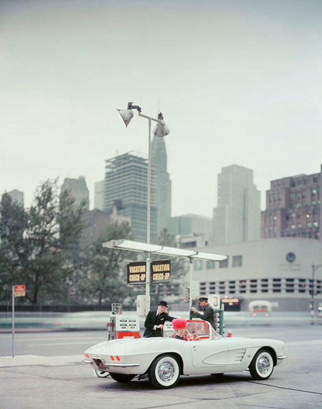
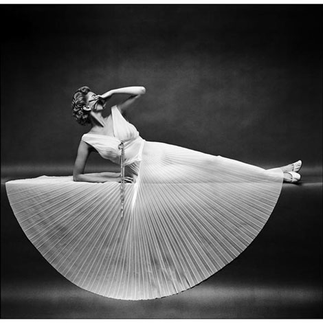
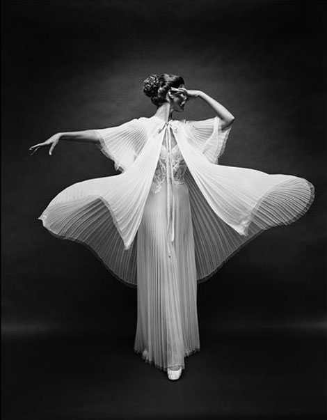
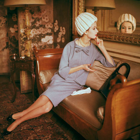
Photo for Chevrolet/”New Yorker” magazine c1960
Svenska Mobler has a beautiful collection of photos from famed photographer Mark Shaw. Mark is best known for his photographs of Jacqueline and John F. Kennedy and his work in capturing couture fashion from the middle of the century. During the 1950s and early 1960s Mark shot the European fashion collections for LIFE magazine. It’s interesting to note that he was one of the first photographers to shoot fashion on the runways and backstage at shows.
(via Matthew Lyons via Ultra Swank)
—–
Also worth checking: Tom Palumbo photography
Enjoy this story? Sign up for our tasty free grain edit RSS feed.
—–
No Tags
Share This
Vintage kids book Mi Diccionario is in the Grain Edit Shop
Grain Edit recommends Colo Pro A font designed by Font Fabric. Check it out here.
©2009 Grain Edit - catch us on Facebook and twitter
By: Dave,
on 2/3/2010
Blog:
inspiration from vintage kids books and timeless modern graphic design
(
Login to Add to MyJacketFlap)
JacketFlap tags:
illustration,
1950s,
modern,
architecture,
1960s,
1970s,
Found design,
USA,
paulrudolph,
Add a tag

Callahan Residence, Birmingham, Alabama 1965 - Rendering by Paul Rudolph
Architect Paul Rudolph (1918-1997) was known for his much-loved (and loathed) Brutalist yet spatially complex buildings. As one of the pioneering figures of the ‘Sarasota School of Architecture’ in the late 1940s, Rudolph gained a worldwide audience with his innovative design for the modern American home. His best known architectural masterpieces are the Yale School of Architecture, the Boston Government Center and the Crawford Manor. By the late 70’s and into the 90’s, Rudolph who was unmoved by the Post-modern dominance in architecture, steadfastly continued to design powerful Modernist structures now gracing the urban skylines of the Far East.

Burroughs Wellcome Company, Research Triangle Park, North Carolina, 1969-1972
Aside from his built works, Paul Rudolph was also a master renderer known for his dynamic graphic presentations drawn with incredible precision much like a Victorian etching; from the building elements to the texture of the materials realistically amplified with light and shadows. His trademark presentation technique involves a black-and-white rendering of a building’s cross-section which is drawn to a large scale on a single-point perspective. Such accuracy enabled him to illustrate and investigate the realities of his buildings and their spaces, and thus allowing his designs to evolve as he further refined his rendering techniques.

Walker Residence, Sanibel Island 1952-1953

Resort Community, Stafford Harbor, Virgina 1966
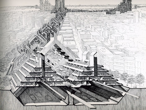
Study of Lower Manhattan Expressway, Ford Foundation, NY, NY 1967-1972
For more information about Paul Rudolph and his works, check out The Paul Rudolph Foundation and the blog.
——————–
Elizabeth Surya is the editor of Pleatfarm: an informational blog about folds in design.
——————
Also worth checking: Mid Century Modern Home Plans.
Not signed up for the Grain Edit RSS Feed yet? Give it a try. Its free and yummy.
——————
No Tags
Share This
I just received some sad news. Edie Harper, the wife of the late Charles Harper passed away last week. Edie, a talented artist in her own right, was known for her beautiful illustrations of biblical stories.
The official announcement from the Harper Estate after the jump
Below is the official announcement from the Harper Estate:
Edith Riley McKee was an only child born in 1922 in Kansas City, Kansas. A dreamy child, she moved with her parents to Liberty, Missouri, when her father chose to open a short-order restaurant. On trips to see relatives on their farms and small ranches in the Sand Hills of Nebraska, she developed a lifelong love for animals and the vast, lonely expanses of the Middle West.
The family moved again, to Cincinnati, in the 1930s when Edie’s father landed a position with Procter & Gamble. They lived in an apartment on Springfield Pike while Edie attended Wyoming High School (graduating in 1939), all the while creating art at a level beyond her actual years. The desire for formal art training burned in her heart. So in 1940 the respected Art Academy of Cincinnati welcomed Edie as one of its most eager new admissions.
On the first day of the program, on the steps of the administration building, Edie met an equally earnest young man from West Virginia, Charley Harper. In classes and conversations, she learned that he shared her admiration of painters such as Miro and Klee. They studied printmaking with the Stampers and were fortunate enough to spend a semester with legendary Josef Albers, visiting to teach his Color Theory course. For several years afterwards Albers sent Edie his hand-screened Christmas cards.
When Charley was drafted for service in World War II, Edie interrupted her classes to aid the war effort in a civilian capacity. She photographed hydro dams and cement test samples and processed the film in the lab for the Corps of Engineers. Later, she would receive critical acclaim for the black and white photographs she took with her 8 x 10 camera employing her own imaginative subject matter. This resulted in an exhibition at the Cincinnati Contemporary Art Center.
Soon after the war, Edie and Charley resumed their studies at the Academy. Following graduation in 1947, they embarked on a six-month camping honeymoon throughout America. Edie kept an illustrated journal. Every day they sketched and painted, occasionally the same natural setting, and compared the results.
Upon their return from the honeymoon, Edie and Charley maintained separate studios in the basement of Edie’s parents’ home in Roselawn. The young couple helped care for Edie’s father, who had multiple sclerosis, and were able to save Charley’s earnings from his day job at Schaten Studio. In 1953 Edie gave birth to their son, Brett, named after California photographer Brett Weston. Throughout the 1950s Edie continued painting, supplemented by a rich output of jewelry, contemporary photography, enameling, sculpture, and silkscreen prints.
In the 1960s Edie added weaving to the roster of media she had mastered. During this decade she converted to acrylic paint and completed a series of grid-centric images. Toward the end of th
View Next 25 Posts


.jpg?picon=572)


I love your "squashed" car - it would also probably get better gas mileage than the full size. Great sketches!
OK, so you squished the car. Just a bit! But the Forever Sketchcrawl tattoo more than makes up for it! Laughing my socks off here!
(I thought of "Wagonized"when you drew the Consul)
You see here's what happens: any car you draw goes through a transformation and becomes really cute!
what a charming vehicle! love it!
Thanks, guys.
I'm finding it very difficult to draw a car and not make it look like a France Belleville car. More practice is needed!
Dan, I just like cute cars!
Cheers, my dears.