

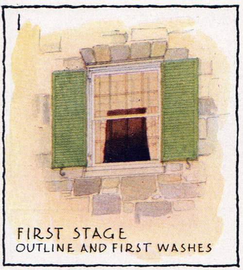
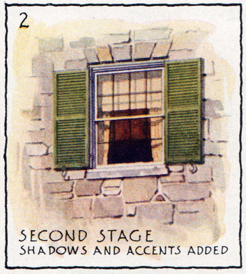
Gouache of the Highland Park Theater.
18X14"

0 Comments on Highland Park Theater as of 12/14/2016 2:53:00 AM
Add a Comment

 By: Stephane Kardos,
on 11/30/2016
By: Stephane Kardos,
on 11/30/2016
 By: Hannah Paget,
on 9/8/2016
By: Hannah Paget,
on 9/8/2016
“What a chance for an architect!” Charles Barry exclaimed as he watched the old Palace of Westminster burning down in 1834. When he then went on to win the competition to design the new Houses of Parliament he thought it was the chance of a lifetime. Instead it turned into the most nightmarish building project of the nineteenth century. What ‘lessons learned’ might the brilliant classical architect draw up today based on his experiences?
The post Rebuilding the Houses of Parliament: Victorian lessons learned appeared first on OUPblog.
By: Stephane Kardos,
on 8/23/2016
Gouache painting of the Petersen Museum last weekend.
 By: Tanya,
on 7/27/2016
By: Tanya,
on 7/27/2016


The Brownstone Written by Paula Scher Illustrated by Stan Mack Princeton Architectural Press 1973–1/05/2016 978-1-61689-428-3 32 pages Ages 3—8 “Living in harmony with your neighbors isn’t always easy, but it’s doubly difficult if you’re a bear in a New York City brownstone, trying to hibernate. Who can sleep through the Kangaroos’ tap dancing, or …![]()
By: John Priest,
on 3/14/2016
Every year, millions of people visit California in search of beaches, hiking, celebrity sightings, and more. In the map below, Peter J. Holliday shows us his version of California, focusing on the rich history of classically inspired art and architecture in Southern California. Enjoy the stories of grand landmarks such as Hearst Castle, Pasadena City […]
The post A guide to Southern California for classical art enthusiasts [interactive map] appeared first on OUPblog.
 By: Chloe Baldwin,
on 10/5/2015
By: Chloe Baldwin,
on 10/5/2015
Post by Chloe


Sarah McMenemy is an illustrator based in London who began by illustrating many of the beautiful houses in the city. Her portfolio now contains an abundance of painterly work depicting stunning architectural works around the world. Sarah McMenemy’s work has appeared in a range of magazines which have covered finance, beauty, architecture and home decor. If you would like to see more of Sarah McMenemy’s sophisticated colour palettes and characterful illustrations, please visit her portfolio.
By: Barney Cox,
on 8/24/2015
On October 27, 2005, two French youths of Tunisian and Malian descent died of electrocution in a local power station in the Parisian suburb of Clichy-sous-Bois. Police had been patrolling their neighborhood, responding to a reported break-in, and scared that they might be subject to an arbitrary interrogation, the youngsters decided to hide in the nearest available building. Riots immediately broke out in the high-rise suburbs of Paris and in hundreds of neighborhoods across the country.
The post Why we like to blame buildings appeared first on OUPblog.
.jpg?picon=1009) By: James Gurney,
on 8/9/2015
By: James Gurney,
on 8/9/2015
After yesterday's post about my 1982 concept painting called "Skysweepers," I thought I'd post a checklist for things to consider to give your scene a backstory, a feeling that the world has been lived in. This is a good post to bookmark for future reference.
A painting of a futuristic world should provide evidence of what happened in the period of time leading up to the moment you’re showing. For example, some of the vehicles and buildings might be new, but others might be holdovers from an earlier period in your world’s history. I went around and took some photos and found some samples to suggest the kinds of effects we're talking about.
Here are 25 tips to help give your scene that convincing “lived-in” look.


 |
| Detail of Spaceport Bar by James Gurney from Imaginative Realism |


Kids Art Russia lesson!
Today we learned about Russian architecture and ‘onion domes,’ as depicted in St. Basil’s Cathedral.

We used sharpie markers on watercolor paper to make our drawings permanent. Then we added watercolor paint and salt. The salt separates the water in a beautiful pattern. They turned out SO original! This technique is always a parent favorite, and the kids always love to paint.
Here are some examples of our final art:

Onion Domes by Katie, age 7

Onion Domes by Vivian, age 5

Onion Domes by Emilia, age 6

Onion Domes by Jeffrey, age 7

Onion Domes by Samantha, age 7

Onion Domes by Anne, age 6
We also sampled some delicious Russian Tea Cakes and I’ve included the recipe below. These are easy to make with kids!
Russian Tea Cakes (no nuts)
Butter, powdered sugar, vanilla, flour, salt
Ingredient List:
1 cup softened butter/margarine
1/2 cup powdered sugar
1 tsp. vanilla
2 1/4 cups all purpose flour
1/4 tsp salt
optional – chopped nuts
How to Make Russian Tea Cakes:
(I did this part since they were hot!)
The post Kids Art Russia appeared first on Scribble Kids.
Add a Comment
By: Heather Ryerson,
on 5/14/2015
Post by Heather Ryerson


Nina Cosford’s work is charming and playful. Her vibrant use of color and expressive mark-making fill everyday scenes with beauty and intrigue. Her illustrations appeal to children and adults alike and easily translate across advertising, education, and publishing.
Not long after she graduated from Kingston University, Cosford’s love of travel and architecture led to a series of pop-up accordion travel guides with Walker Books. Meanwhile, HBO noticed one of Cosford’s personal projects inspired by their hit television show Girls and commissioned her work to promote the show’s next season. Since, she has worked with the Scouts, The Foundling Museum, and Nokia while her work as been in publications as varied as Bloomberg Businessweek and Marie Clare.
Frances Lincoln Publishers released Cosford’s most recent book series on May 7. The first two illustrated biographies of exceptional females—Virginia Woolf and Jane Austen—will be followed by an additional title on Coco Chanel in September.
See more of Nina Cosford’s illustrations on her website.
 By: keilinh,
on 4/24/2015
By: keilinh,
on 4/24/2015
April is National Poetry Month! All month long we’ll be celebrating by posting some of our favorite poems for Poetry Friday. For our final Poetry Friday post, we chose a poem from Dreaming Up: A Celebration of Building, written and illustrated by Christy Hale.
One by one,
block by block,
plastic shapes
interlock.

Yellow, red,
white, and black,
all connect
in a stack.

Build a world
brick by brick.
Hold them close.
Hear the click.
What are you reading for National Poetry Month? Let us know in the comments!
By: Eleanor Jackson,
on 3/14/2015
Every campus has one, and sometimes more than more: the often unlovely and usually unloved concrete building put up at some point in the 1960s. Generally neglected and occasionally even unfinished, with steel reinforcing rods still poking out of it, the sixties building might be a hall of residence or a laboratory, a library or lecture room. It rarely features in prospectuses and is never – never ever – used to house the vice chancellor’s office.
The post How I stopped worrying and learned to love concrete appeared first on OUPblog.
.jpeg?picon=3306) By: Zoe,
on 2/25/2015
By: Zoe,
on 2/25/2015

To celebrate World Book Day 2015 and to support the work of Book Aid International, I’ll be spending most of Thursday 5 March 2015 creating utter chaos in my home, using hundreds of our books to build the largest book den I can.
As a reader of this blog, you’ll know that I’m utterly passionate about children’s books and doing crazy things inspired by them. It’s what gets me up in the morning. But building a large scale book den out of books is wackiest thing I’ve yet tried to do. I haven’t done a recent book count, but I reckon I’ve got about 3000 to play with, so that gives you some sense of the scale of the challenge.
 It’s going to be pretty disruptive, probably physically knackering and quite possible a challenge to the laws of gravity so please donate to Book Aid International to make it all worthwhile! You can donate securely online here:
https://www.justgiving.com/Zoe-Toft-2015/
Or if you prefer you can donate via text by texting BOOK62 £3 to 70070 (you can change the amount by swapping £5 or £10 for the £3).
I’ve been a supporter of Book Aid International for several years now. Book Aid International increases access to books to support literacy, education and development in sub-Saharan Africa, including in Zambia where I was born. In 2011 the girls and I completed a fundraising Librarithon, and in 2012 we played “guess the number of books in my home“.
In sub-Saharan Africa 151 million people are illiterate. 72 million children still do not got to school, and most people simply cannot afford books of their own. But without literacy people are not able to access education or healthcare, their work opportunities are limited as are their opportunities for participation in the social, economic and political decisions which affect their lives.
Each year Book Aid International sends 500,000 brand new and carefully selected books to libraries in communities, schools, universities, prisons, cities and refugee camps and more. They also provide grants for purchasing books locally (especially those in local languages), and training and advice to ensure that books are targeted to the right groups of people and are well used.
When it comes to donations…
£2 will send one book to sub-Saharan Africa
£10 could send five dictionaries to a university library in Tanzania
£24 could send 12 health books to a community library in rural Eritrea
£60 could send 30 books to a refugee camp in Kenya
£100 could help purchase 70 HIV/AIDS awareness books for children
£380 will send a starter collection of 200 books to a community library
I’m aiming to raise £500.
I’ll be tweeting my progress throughout the day on March 5 (@playbythebook), and will then blog about it once the den is built and habitable. You can donate any time (before, during or after the build).
If you’ve ever enjoyed my blog, found it useful, or been helped out on twitter by me, please consider “paying it forward” by donating today to Book Aid International.
*Thank you* (and please wish me good luck and stable building skills!)
By: James Gurney,
on 12/14/2014


 By: Wendy Schiller,
on 11/17/2014
By: jilleisenberg14,
on 10/19/2014
By: Wendy Schiller,
on 11/17/2014
By: jilleisenberg14,
on 10/19/2014
Celebrate architecture and design for Archtober with students!
October, or “Archtober” as it is called, marks the 4th annual month-long festival of all things architecture and design in New York City.
 Recommended reading to teach about architecture for students:
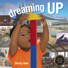 Dreaming Up: A Celebration of Building
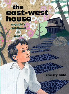 The East-West House: Noguchi’s Childhood in Japan
STEM + Literacy Activities:
1. Encourage students to examine the differences between architecture and engineering. How do these two fields depend on each other? What is unique about each field? What do architects contribute to building a structure? What do engineers contribute? For a simplified breakdown of the duties of an architect and an engineer, the New School of Architecture + Design has a clear infographic.
2. Have students in small teams research a well-known structure in their community, city, or state (such as a museum, performing arts center, or place of worship). Who built it and when? For what is the structured used? Where is it located? What is it made of? Why were those materials used? What is special about the design? What challenges did the architect have in creating this structure? In addition to online and print resources, students can interview someone who works at the structure, if possible. After research is complete, students can create a model of the structure, design a poster advertising it to tourists, or write and present a report on the structure to the class.
3. Ask students to imagine that they are architects assigned to design a new school. Describe the materials you will need and what the building will look like. As you think about the design and materials needed, consider the types of spaces children in the school will need to learn, read, eat, study; what you will need to make the building safe and sturdy; and what will make it an attractive place in which to learn.
4. Set up a hands on, or sensory, station with materials from home or a local hardware store that are used to build structures. Examples could be a wood spoon for wood, a cooking pot for steel, etc. Have students touch and record the characteristics of each sample material. Why might an architect use steel instead of wood, or bamboo instead of concrete? Students can make a chart of popular building materials to compare the advantages and disadvantages of each. Have students study the physical characteristics (based on sight, touch, sound, and even smell) of brick, wood, bamboo, clay, concrete, steel, glass, iron, rock, straw, recycled materials, and more. For advanced or older students, topics to compare include cost of the material, availability, resiliency in natural disasters, typical lifetime, flexibility and ability to shape the material, environmental friendliness, and beauty/appeal.
5. Have students study the roles that appeal/beauty, safety, and function/purpose play in the design of a structure. Is one preferable over the other? Why? Do these factors all work together or can they be in conflict with one another? Students can look at one specific structure to see how the architect addressed each of these issues. If possible, ask a local architect or professor from an area college to discuss these factors.
6. Watch PBS’s “Building Big,” a five-part miniseries on bridges, domes, skyscrapers, dams, and tunnels. Each one-hour program explores the different type of structures and what it takes to build them. An educator’s guide of activities from PBS is available online.
7. Lead students in a step-by-step activity to create their own geodesic dome, sandcastle, toothpick structure, or floor plan. Instructions can be found online at the archKIDecture website.

Jill Eisenberg, our Resident Literacy Specialist, began her career teaching English as a Foreign Language to second through sixth graders in Yilan, Taiwan as a Fulbright Fellow. She went on to become a literacy teacher for third grade in San Jose, CA as a Teach for America corps member. She is certified in Project Glad instruction to promote English language acquisition and academic achievement. In her column she offers teaching and literacy tips for educators.
 By: James Gurney,
on 10/9/2014
By: James Gurney,
on 10/9/2014
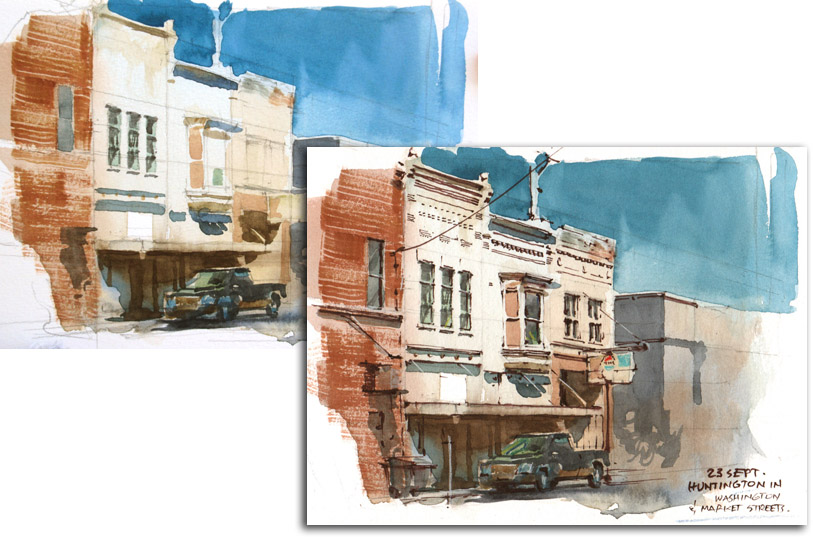
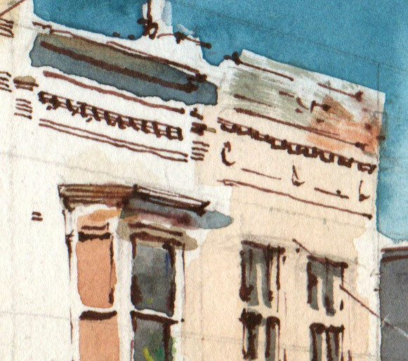
Here's a video that I made while painting a row of shopfronts in Huntington, Indiana. (Direct link to video)
 By: James Gurney,
on 10/8/2014
By: James Gurney,
on 10/8/2014
 By: Heather Ryerson,
on 9/10/2014
By: Heather Ryerson,
on 9/10/2014


Natsko Seki collages lively, saturated scenes of urban life from her own drawings and photographs. Begging to be explored, each illustration is populated with human activity and contains clues left by a moment in time that—if only yesterday—is now lost. Iconic architecture stands as a grandiose reminder that Seki’s people are living in the shadows of history and are unknowing participants in the writing of their city’s centuries. Seki’s interest in architecture, fashion, and contemporary urban life has landed her commissions with Transport for London, Royal Historic Palaces, The Guardian, Bloomsbury, and Hermès. In 2013, Louis Vuitton published a book of Seki’s London illustrations as part of their travel books collection. Seki grew up in Tokyo and studied illustration in Brighton, UK. She now lives in London.
A look into Natsko Seki’s process | Online Portfolio
By: ChloeF,
on 9/5/2014

Everything in the natural world has structure – from the very small, like the carbon 60 molecule, to the very large such as mountains and indeed the whole Universe. Structure is the connecting of parts to make a whole – and it occurs at many different levels. Atoms have structure. Structures of atoms make molecules, structures of molecules make tissue and materials, structures of materials make organs and equipment and so on up a hierarchy of different levels as shown in the figure. Within this hierarchy of structure, man-made objects vary from the very small, like a silicon chip to the very large like a jumbo jet. Whereas natural structures have evolved over aeons, man-made structures have to be imagined, designed and built though our own efforts.
Many people, including much of the media, attribute this activity solely to architects. This is unfortunate because architects rely on engineers. Of course the responsibilities are close – it is a team effort. Architecture is the devising, designing, planning and supervising the making of something. Engineering is the turning of an idea into a reality – it is about conceiving, designing, constructing operating and eventually decommissioning something to fulfil a human need. The fact is that engineers play a critical creative role in making structural forms that function as required. They should be given at least equal credit.
Your personal structure is your bones and muscles – they give you form and shape and they function for you as well – for example bone marrow produces blood cells as well as lymphocytes to support your immune system. Your musculoskeletal system also includes all of your connecting tissue such as joints, ligaments and tendons which help you move around. On it are hung all of your other bits and pieces, such as your heart, brain, liver etc. Without structure you would just be a blob of jelly – structure supports who you are and how you function.
In a similar way the structure of a typical man-made structure, like a building, will have beams and columns together with all of the connecting material such as joints, slabs, welds and bolts which keep it together. On it are hung all of the other parts of the building such as the equipment for heating, lighting, communication and all of the furniture, fixtures and fittings. Without structure a building would just be a random pile of components – the function of structure is to support all the other functions of the building.
We can think of the form of a structure from two different points of view – I’ll call them architectural and functional. If you were a building, then the architect would decide your gender, what you look like, your body shape and appearance. However the architect would not decide what is necessary to make the various parts of your body function as they should – that is the job of various kinds of engineer. In other words the architectural form concerns the sense and use of space, functional occupancy by people, symbolism and relationship to setting. It can be decorative and sculptural. The role of an architect is to understand and fulfil the needs of a client for the ways in which a building is to be used and how it will look – its overall form, appearance and aesthetic effect. But the architects who design buildings are not engineers and rarely have the level of scientific knowledge required of professionally qualified engineers. So for example structural engineers must design a structural form that has the function of making a building stand up safely. Indeed engineering safety dominates the design of large structures such as sky-scrapers, bridges, sports stadia, dams, off-shore platforms, fairground rides, ships and aeroplanes.
So what happens when the best architectural form and the best structural form are different – which takes precedence?
Safety and functionality are important necessary requirements – but of course they aren’t sufficient. We need more than that and herein lies the issue. Functionality is often taken for granted, assumed and dismissed as not needing an artistic, creative input – requiring ‘mere’ technique and ‘known’ science. But that is a misreading of being innovative and creative – engineers often do breathtaking complex things that have never been done before. Scientific knowledge is necessary but not sufficient for inspirational engineering – many assumptions and assessments have to be made and there is no such thing as zero risk. Engineering requires practical wisdom.
Some argue that form should follow function – another way of saying that the ends determine the means. However the original meaning, by the American architect Louis Sullivan in 1896, was an expression of a natural law. He wrote ‘Whether it be the sweeping eagle in his flight or the open apple-blossom, the toiling work horse … form ever follows function, and this is the law …’
.jpg)
The philosopher Ervin Laszlo pointed out the difference between form and function does not exist in natural structures. So nature shows us the way. Form and function should be in harmony. We should recognize that good architecture and good engineering are both an art requiring science – but aimed at different purposes. Their historical separation is unfortunate. If an architect specifies a structural form which (whether for artistic/aesthetic reasons or through incompetence) is unbuildable or unnecessarily expensive to build then the final outcome will be poor. The best and most successful projects are where the architects and engineers work together right from the start and given equal credit. At the most mundane level good structural design can leverage orders of magnitudes of savings in costs of construction.
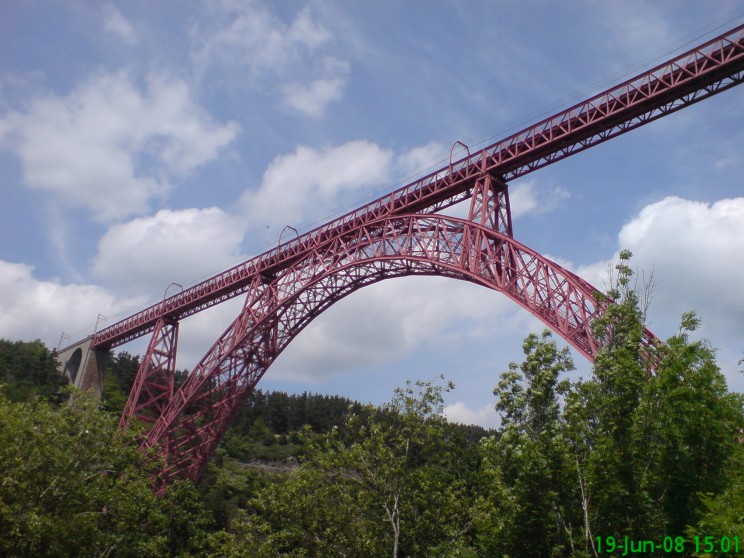
Michel Virlogeux, the French structural engineer responsible for a number of big bridges including the Millau Viaduct in France, says that we design beautiful bridges when the flow of forces is logical. A good architect welcomes the engineering technical discipline to create form through structural art and intelligence and a good engineer welcomes architectural conceptual discipline to create form through aesthetic art and intelligence.
The post The ubiquity of structure appeared first on OUPblog.
By: Julia Callaway,
on 7/19/2014
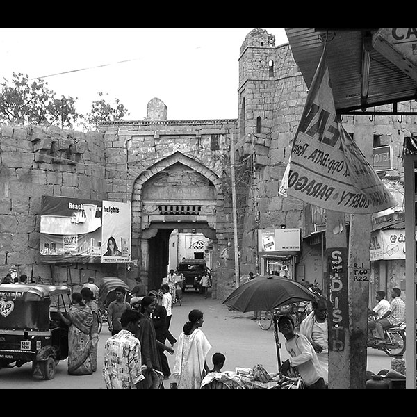
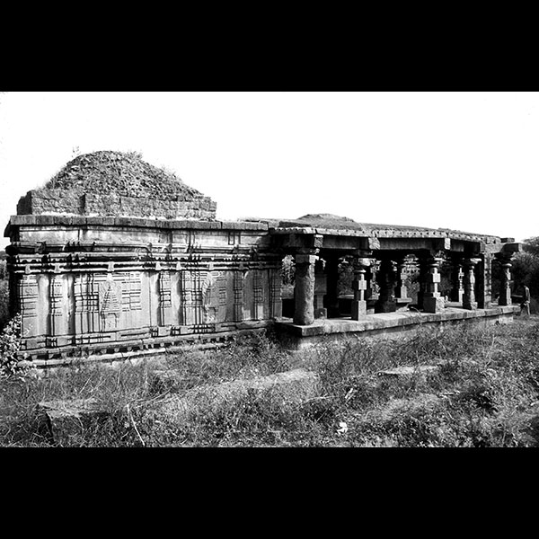
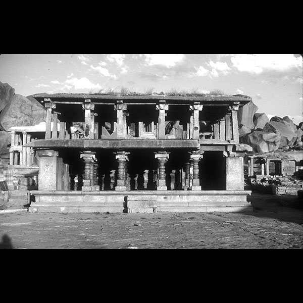
Power and memory combined to produce the Deccan Plateau’s built landscape. Beyond the region’s capital cities, such as Bijapur, Vijayanagara, or Golconda, the culture of smaller, fortified strongholds both on the plains and in the hills provides a fascinating insight into its history. These smaller centers saw very high levels of conflict between 1300 and 1600, especially during the turbulent sixteenth century when gunpowder technology had become widespread in the region. Below is a selection of images of architecture and monuments, examined through a mix of methodologies (history, art history, and archaeology), taken from our new book Power, Memory, and Architecture: Contested Sites on India’s Deccan Plateau, 1300-1600.
Richard M. Eaton is Professor of History at the University of Arizona, Tucson. Phillip B. Wagoner is Professor of Art History at Wesleyan University. They are authors of Power, Memory, Architecture: Contested Sites on India’s Deccan Plateau, 1300-1600.
Subscribe to the OUPblog via email or RSS.
Subscribe to only history articles on the OUPblog via email or RSS.
Subscribe to only art and architecture articles on the OUPblog via email or RSS.
The post Contested sites on India’s Deccan Plateau appeared first on OUPblog.
By: Tanya,
on 6/24/2014
For those of you not familiar with the amazing work of Stephen Biesty, be sure to read my review ofInto the Unknown: How Great Explorers Found Their Way by Land, Sea and Air, written by Stewart Ross. Sadly, most of Biesty's cross section books are now out of print, but his work shines even brighter when he pairs with other authors, as in Into the Unknown, and now The Story of Buildings,
 By: David Hohn,
on 6/5/2014
By: David Hohn,
on 6/5/2014
 By: ChloeF,
on 5/30/2014
By: ChloeF,
on 5/30/2014

It comes as a surprise to many people that landscapes can be designed. The assumption is that landscapes just happen; they emerge, by accident almost, from the countless activities and uses that occur on the land. But this ignores innumerable instances where people have intervened in landscape with aesthetic intent, where the landscape isn’t just happenstance, but the outcome of considered planning and design. Frederick Law Olmsted and his partner Calvert Vaux coined a name for this activity in 1857 when they described themselves as ‘landscape architects’ on their winning competition entry for New York’s Central Park; but ‘landscape architecture’ had been going on for centuries under different designations, including master-gardening’, ‘place-making’, and ‘landscape gardening’. To avoid anachronism, I’m going to call the entire field ‘landscape design’. The ‘top ten’ designers that follow are those I think have been the most influential. These people have shaped your everyday world.
André Le Nôtre (1613 –1700). France’s most famous gardener was employed by Louis XIV to create, at the palace of Versailles, the most extensive gardens in the Western world. Le Nôtre brought the Renaissance style, based upon symmetry and order, to its zenith. Versailles was copied, not only by the designers of other princely gardens, such as those at La Granja in Spain, the Peterhof near St. Petersburg or the Schönbrunn Palace in Vienna, but by city planners who appropriated its geometry of intersecting axes. The most surprising example is the influential plan for Washington D.C. produced in 1791 by the French engineer Pierre-Charles L’Enfant, who had grown up at Versailles.
.jpg)
The palace of Versailles gardens
Lancelot ‘Capability’ Brown (1716 –1783). Lancelot Brown is credited with changing the face of eighteenth century England. From humble origins, he become the most sought-after landscape designer in the country, undertaking over 250 commissions, including Temple Newsam in Yorkshire, Petworth in West Sussex and Compton Verney in Warwickshire. He swept away many formal gardens to create the naturalistic parkland which subsequently become an icon of Englishness. The style has been emulated worldwide: Munich has its Englischer Garten, while Stockholm has the Hagaparken and Paris the Parc Monceau.

Compton Verney gardens, Warwickshire
Thomas Jefferson (1743 –1826) Yes, the principal author of the Declaration of Independence and the third President of the United States was also a landscape designer. Not only did he lay out the grounds of his own property at Monticello in Charlottesville, Virginia as an ornamental farm, but he also created the influential masterplan for the campus of the University of Virginia. However, his greatest impact upon the American landscape, for better or worse, was his advocacy of the grid for the subdivision of territory and for rational town planning.

Drawing of Pavilion III, The Lawn, University of Virginia campus
William Wordsworth (1770-1850). The poet might seem an unlikely selection, but Wordsworth designed several gardens, not just for his own houses, but also for those of friends. However, my principal reason for including him in this list is that he wrote the Guide to the Lakes, first published in 1810, which was notionally a travel guide, but was just as much a design guide, full of thoughtful advice about how to build – and when not to build – in a sensitive cultural landscape. Wordsworthian values were a significant influence upon the founders of the National Trust and continue to inform thinking about landscape conservation.
Frederick Law Olmsted (1822-1903) Olmsted is often seen as the founding father of the landscape architecture profession. He thought that the creation of pastoral parks within teeming cities could counteract the adverse effects of industrialization and urbanization. In addition to Central Park, New York City, he was the designer of Prospect Park in Brooklyn and the system of linked parks in Boston known as the ‘Emerald Necklace’. His plan for the residential community of Riverside, Illinois, became the template for innumerable suburbs, not all of the same quality. He was also prominent in the campaign to preserve scenic landscapes, such as the Yosemite Valley and the Mariposa Big Tree Grove from development and commercial disfigurement.

The 1894 plan for the Emerald Necklace Park System in Boston, Massachusetts
Thomas Dolliver Church (1902-1978) When a style becomes ubiquitous, we sometimes forget that someone pioneered it. Church was a Californian designer who created elegantly functional ‘outdoor rooms’ for a sybaritic West Coast lifestyle. Those curvaceous, free form swimming pools that appear in American movies and TV shows from the 1950s onwards are Church’s principal contribution to cultural history, but he was an important figure in the rise of Modernist landscape design in the mid twentieth century.
Ian McHarg (1920-2001) Scottish-born McHarg was teaching at the University of Pennsylvania when he wrote Design with Nature, published 1969, the most influential book ever written by a landscape architect. McHarg’s thesis was that we should design our environment in harmony with natural forces, rather than in opposition to them. He pointed out the foolishness of such practices as building houses on floodplains. His advice seems ever more prescient as the world begins to cope with the consequences of climate change.
Peter Latz (1939 -) Landscape designers in many countries have been involved in the reclamation of derelict industrial sites. Latz’s office recognized that reclamation does not need to mean the complete erasure of all history. Instead it can recognise the value of what remains. Most famously, Latz turned a rusting Ruhr valley steelworks into the Landschaftspark Duisburg Nord, where gardens flourish in former ore bunkers, rock-climbers practice on old concrete walls, and scuba-divers plunge into pools created within onetime gasholders. This approach to reclamation, which works with memory and aims to preserve as much of the existing site as possible, is rapidly becoming mainstream.

Landschaftspark Duisburg Nord
James Corner (1961 -) English-born Corner is now Professor of Landscape Architecture at the University of Pennsylvania and principal of the New York based practice, Field Operations. He is perhaps the world’s most celebrated landscape architect, following the extraordinary success of the High Line project on Manhattan, which turned an abandoned railway viaduct into a linear park, visited by around four million people per year. Field Operations are also working on the Freshkills Landfill on Staten Island, transforming it into one of the world’s biggest urban parks.
Kongjian Yu (1963-) Educated at Beijing Forestry University and Harvard Graduate School of Design, Professor Yu now heads the innovative Turenscape practice which has created many remarkable new landscapes in China, including the Zhongshan Shipyard Park, a reclamation project similar in philosophy to Landschaftspark Duisburg Nord. Turenscape makes use of vernacular features of the Chinese agricultural landscape, such as paddy fields and irrigation channels, to create striking new urban parks. Many of Yu’s park designs, such as the Floating Garden at Yongning River Park, demonstrate an ecological approach to flood control.
Ian Thompson is a Chartered Landscape Architect and Reader in Landscape Architecture in the School of Architecture, Planning and Landscape at Newcastle University. He worked as a landscape architect from 1979 to 1992, mostly on work related to environmental improvement, derelict land reclamation and urban renewal, before taking up a lecturing post at Newcastle University. He is the author of many books including Landscape Architecture: A Very Short Introduction.
The Very Short Introductions (VSI) series combines a small format with authoritative analysis and big ideas for hundreds of topic areas. Written by our expert authors, these books can change the way you think about the things that interest you and are the perfect introduction to subjects you previously knew nothing about. Grow your knowledge with OUPblog and the VSI series every Friday, subscribe to Very Short Introductions articles on the OUPblog via email or RSS, and like Very Short Introductions on Facebook.
Subscribe to the OUPblog via email or RSS.
Subscribe to only art and architecture articles on the OUPblog via email or RSS.
Image credits: 1) By Michal Osmenda from Brussels, Belgium [CC-BY-2.0] via Wikimedia Commons 2) Graham Taylor [CC-BY-SA-2.0] via Wikimedia Commons 3) By Leslie S. Claytor [Public domain], via Wikimedia Commons 4) By Boston Parks Department & Olmsted Architects (National Park Service Olmsted Archives) [Public domain], via Wikimedia Commons 5) By Martin Falbisoner (Own work) [CC-BY-SA-3.0 ] via Wikimedia Commons
The post Ten landscape designers who changed the world appeared first on OUPblog.


Go Zoe!! Great cause and absolutely fantastic idea! Have donated and will be watching via twitter on the day. Best of luck!
177 books! I like that measurement. It reminds me of a fabulous book by Tim Hopgood, where kids measure themselves in terms of popcorn http://www.playingbythebook.net/2013/09/25/big-by-tim-hopgood-a-perfect-storytelling-start-to-the-school-year/
Thank you Carmen. The prospect is both terrifying and delicious!