new posts in all blogs
Viewing: Blog Posts Tagged with: posters, Most Recent at Top [Help]
Results 1 - 25 of 164
How to use this Page
You are viewing the most recent posts tagged with the words: posters in the JacketFlap blog reader. What is a tag? Think of a tag as a keyword or category label. Tags can both help you find posts on JacketFlap.com as well as provide an easy way for you to "remember" and classify posts for later recall. Try adding a tag yourself by clicking "Add a tag" below a post's header. Scroll down through the list of Recent Posts in the left column and click on a post title that sounds interesting. You can view all posts from a specific blog by clicking the Blog name in the right column, or you can click a 'More Posts from this Blog' link in any individual post.

By:
Emma Pocock,
on 7/22/2016
Blog:
The Leaky Cauldron
(
Login to Add to MyJacketFlap)
JacketFlap tags:
News,
Movies,
Conventions,
Films,
Posters,
Fan Events,
Film Images,
Warner Bros.,
Pottermore,
Fantastic Beasts Movie,
Add a tag
Tomorrow, The Leaky Cauldron will join the Fantastic Beasts team at San Diego Comic-Con and Warner Bros’ special event at Leavesden Studios in London. Leaky will be involved with an exclusive Q&A with the cast and crew of the film, so listen out for us!
The Fantastic Beasts Facebook page also shared some new movie art celebrating their appearance at Comic-Con, and gave the username of the new Harry Potter Snapshat account (wizarding_world), which will be shared by Pottermore, Harry Potter and Fantastic Beasts teams. A special message will be delivered via the app tomorrow, so be sure to add them and check it!
Be sure to add wizarding_world on snapchat and watch the Q&A at 10:10pm BST/ 2:10pm PT/5:10pm ET tomorrow via the Fantastic Beasts Facebook page (here) and Twitter (here), and listen out for Leaky’s question!
Excalibur Auctions will be selling off a Sirius Black ‘wanted’ style poster from the promotion of Harry Potter and the Prisoner of Azkaban film in just a few days time.
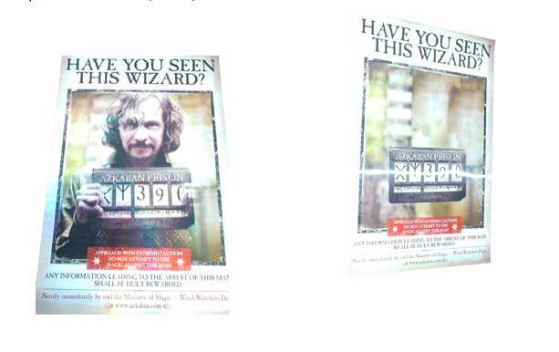
The promotional poster is one of less than ten of this kind known to be produced for the film, leading Excalibur Auctions to call this ‘one of the rarest posters ever produced to publicise the films’.
It is particularly unique due to its lenticular design, meaning that the images changes depending on which angle you view it from. Sirius Black (Gary Oldman) is in the shot if you view the poster from head on, and he disappears if you angle the poster slightly differently. Clearly this format was much more expensive to produce, leading to the remaining posters being coveted!
The poster is predicted to sell for £4,000-£6,000, and the auction will take place at The Village Hotel in Elstree, Watford on Saturday 28th May 2016 at 10:30am. Live bidding will occur in the room, with internet bidding available at The Sale Room and Invaluable.
The auction will also feature a Star Wars Episode II Yoda lenticular poster, a 1920s Sherlock Holmes window card and many James Bond themed items (including original Quad posters from Dr No and From Russia With Love.
More information can be found on the Excalibur Auctions website, here.
Empire have just released a brand new promo photo of Newt Scamander (Eddie Redmayne) in New York (below), from the set of Fantastic Beasts and Where to Find Them!
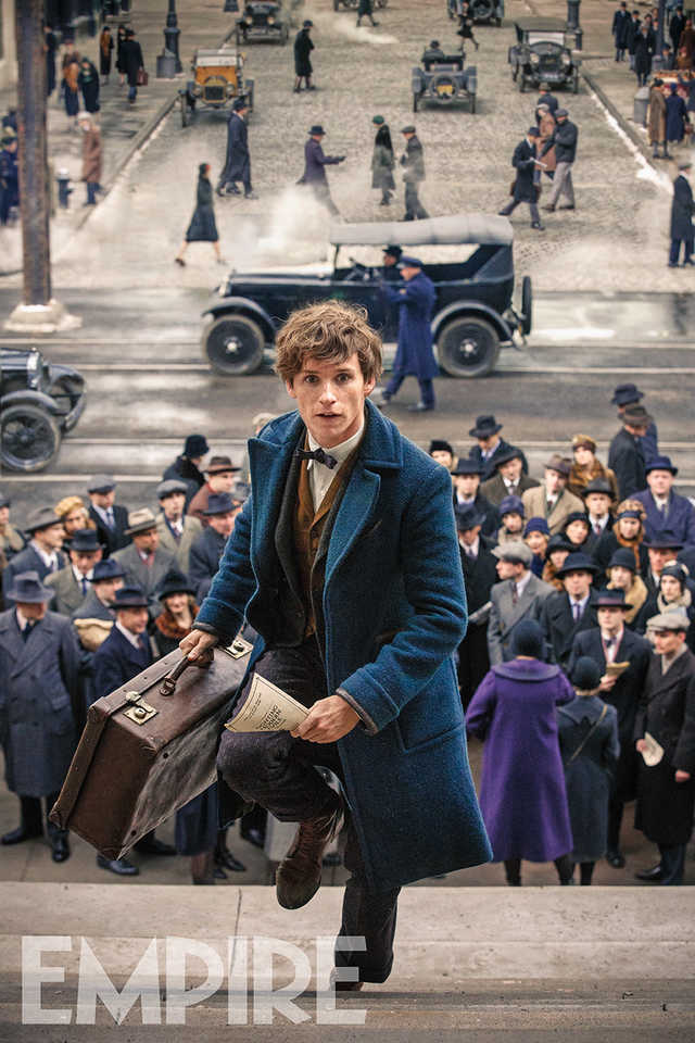
The February issue of Empire Magazine will feature this promo photo, and Producer David Heyman will be releasing more information about the film in the next issue of the magazine, released December 31st. From the photo, Newt Scamander seems very immersed in the hustle-and-bustle of the muggle (or No-Maj) New York life, and Heyman has said of the film so far:
“On some days we’ve had several hundred extras, all done up in 1920s costumes. We are going into the magical world, but we’re bringing the magical characters into the Muggle, or ‘Nomaj’, world.’
Watch the teaser trailer for Fantastic Beasts below!

By: Early Childhood Programs and Services committee,
on 6/22/2015
Blog:
ALSC Blog
(
Login to Add to MyJacketFlap)
JacketFlap tags:
Committees,
parents,
Guest Blogger,
posters,
Early Literacy,
Il Sung Na,
Blogger - Early Childhood Programs and Services committee,
ALA Annual 2015,
30 million word gap,
changing table initiative,
the ALSC Early Childhood Programs and Services Committee,
Add a tag
This year, I was delighted to be appointed to the ALSC Early Childhood Programs and Services (ECPS) Committee under the fabulous leadership of Matt McLain. Because ALSC members typically serve two years on a committee and then rotate out, when I began attending meetings they had already decided to create posters for parents to be displayed above or around changing tables in libraries, businesses, and other public places, highlighting the five practices from Every Child Ready to Read (Talk, Sing, Read, Write, Play). These early literacy practices posters would be downloadable and printable, and hopefully customizable.
The posters would be beautiful but simple, combining each of the five practices with a rhyme and a developmental tip. Our goal was to inspire parents to talk, sing, read, write and play with their children, beginning with one poster per practice initially,
All parents of young children need to change diapers. If visually appealing, easy-to-read posters were posted above changing tables in public locations, parents would likely glance up and see them during the diaper change. If the rhyme was short and familiar, and the language was easy to understand, our committee hoped that parents would actually recite the rhyme on the spot to their children. Using a simple developmental tip to accompany the rhyme would help parents understand that reciting rhymes with their children is a valuable activity that can help build important skills for the future. By combining the tips with easy, practical suggestions, our committee hoped to encourage parents to begin incorporating the five practices into everyday life with their child.
Research has indicated that there is a link between the number of vocabulary words children know and their economic background. Published in 2003, “The Early Catastrophe: The 30 Million Word Gap by Age 3” by researchers Hart and Risley demonstrated that during the first years of life, children from low-income families hear about 30 million words less than their peers who come from more affluent homes. Young children learn words by hearing them spoken by other human beings (not necessarily electronic media!); when parents speak with their babies, they are building neural connections in their children’s brains. In addition to building a larger vocabulary, the young brains are growing more synapses to enable easier learning later on in life.
The study by Hart & Risley determined that lower income parents were speaking less or using fewer words while in conversation with their children. Further studies made the connection between having larger vocabularies when entering kindergarten and higher rates of graduation from high school. Having a high school degree influences the type of job and salary a person can generally expect to get. It has also been shown to affect health outcomes, family stability, and lifetime earnings. Thus, the number of words a child knows when entering kindergarten can lead to disparities, increasing the economic divide in our country.
Yet this gap can be easily bridged; having a large vocabulary before entering kindergarten can make a difference!
With encouragement from the ALSC Board of Directors, the ALSC Early Childhood Programs and Services (ECPS) accepted the mission of addressing the 30 million word gap by creating posters to tell parents that babies need to hear words every day.
The ECPS committee held monthly online chats in addition to meeting at ALA Conferences and exchanging regular emails. At first, committee members submitted early literacy tips such as “Sing a rhyme (or do a fingerplay) while bathing or changing your baby,” for each of the five practices. Then we compiled a short list of rhymes to go along with each of the suggested tips. The rhymes had to be in the public domain; if there was any question about a rhyme’s copyright, the rhyme was excluded .The next step was to select an artist; Il Sung Na was chosen. Then, committee members looked through his books and videos in order to find images to match the tips or rhymes on each poster. Once this was done, ALSC secured rights with Random House to use those specific images.
Although the posters use simple language, it was not so simple to design them! After the rhymes, tips, and illustrations were put together on posters, committee members weighed in on issues such as font size, placement of text, and spelling. Finally, the posters were ready and our excitement about increasing children’s exposure to language was growing.
Our “Babies Need Words Everyday” posters are now available for free download from the initiative’s webpage: http://www.ala.org/alsc/babiesneedwords . They are meant for EVERYONE: your library, community partners, businesses in your community, and families. At ALA Midwinter, the ECPS committee will be hosting a session called “Babies Need Words Everyday,” starting with keynote speaker Patti Miller from the Clinton Foundation’s Too Small to Fail initiative and followed by a panel discussion and a talk about the posters. Printed posters will be available at the session.
Our thanks go to the ALSC Board of Directors who were instrumental in this project’s success by funding the poster printing, ensuring their translation into Spanish, and encouraging free distribution. Because of ALSC’s strong commitment to bridging the 30 million word gap, and the valuable work that can be done by a cohesive committee with strong leadership, the concept of creating posters for changing tables has become reality.
Please check out the posters at http://www.ala.org/alsc/babiesneedwords, join in the session at ALA, and volunteer to serve on an ALSC committee for the coming year. Together, we can make a difference.
Today’s guest blogger is Betsy Diamant-Cohen, posting on behalf of the ALSC Early Childhood Programs and Services Committee, of which she is a member. Betsy developed the Mother Goose on the Loose early literacy program; she enjoys consulting and presenting training workshops to fellow librarians.
The post Changing Table Initiative Come to Fruition appeared first on ALSC Blog.


By: Mo Willems,
on 9/29/2014
Blog:
Mo Willems Doodles
(
Login to Add to MyJacketFlap)
JacketFlap tags:
contest,
Comix,
Yay,
Theater,
stuff,
radio,
posters,
bestseller,
upcoming,
Add a tag
UPCOMING!
November 4th, 2014 will see the release of Elephant and Piggie's newest adventure, WAITING IS NOT EASY!
It sure isn't.
So....
APPEARANCES!
Because waiting really, really is not easy, I'll be giving a sneak peek reading and signing of the new Elephant and Piggie adventure 2 days early!
DON'T WAIT! Come on by:
Sunday, November 2nd
at the ERIC CARLE MUSEUM OF PICTURE
By: Mo Willems,
on 8/29/2014
Blog:
Mo Willems Doodles
(
Login to Add to MyJacketFlap)
JacketFlap tags:
try it,
contest,
Books,
Appearances,
Comix,
Interview-y stuff,
video,
radio,
exhibits,
posters,
foreign,
chalk,
Add a tag
COMIX!
One of the real fun things about my last year in Paris was being able to share sketches, gags, and photos from the trip on uclick as a comic strip called PARIS DOODLES.
In fact, it was so fun, I've decided to keep sharing drawings and ideas on uclick with a new strip called FROM THE MO WILLEMS SKETCHBOOK.
I'll be sharing drawings from my sketchbook, dining room dinner doodles,

By:
John Nez,
on 4/6/2014
Blog:
John Nez
(
Login to Add to MyJacketFlap)
JacketFlap tags:
summer reading,
Posters,
Highlights for Children,
#childrensbooks,
#kidlit,
#kidlitart,
#picturebooks,
#alamw14,
#pblit,
Add a tag
This was a fun project for the wonderful folks at Highlights. It's a summer reading poster that will be appearing in libraries and schools for summer reading. It's really, really big - much bigger than my 22" monitor.
It actually started out as just a spot drawing, but they liked it so much they decided to turn it into a poster.
With a little digital magic I adjusted the dpi and sizes, so that a larger drawing would work at poster size. This is the largest illustration I've ever done.
I was very pleased with how it turned out. I tried out a new technique of isolating some of the images as layers with shadows, so it looks kind of like a collage.

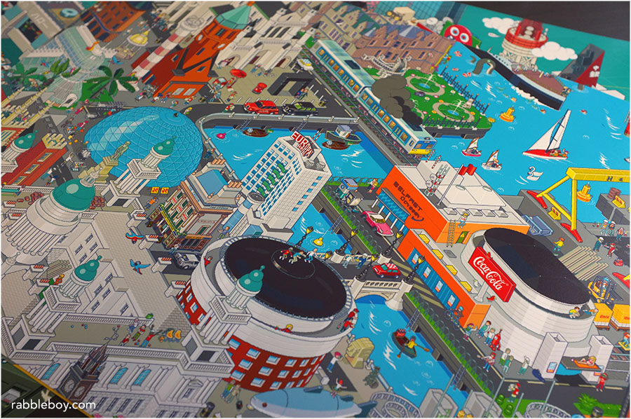
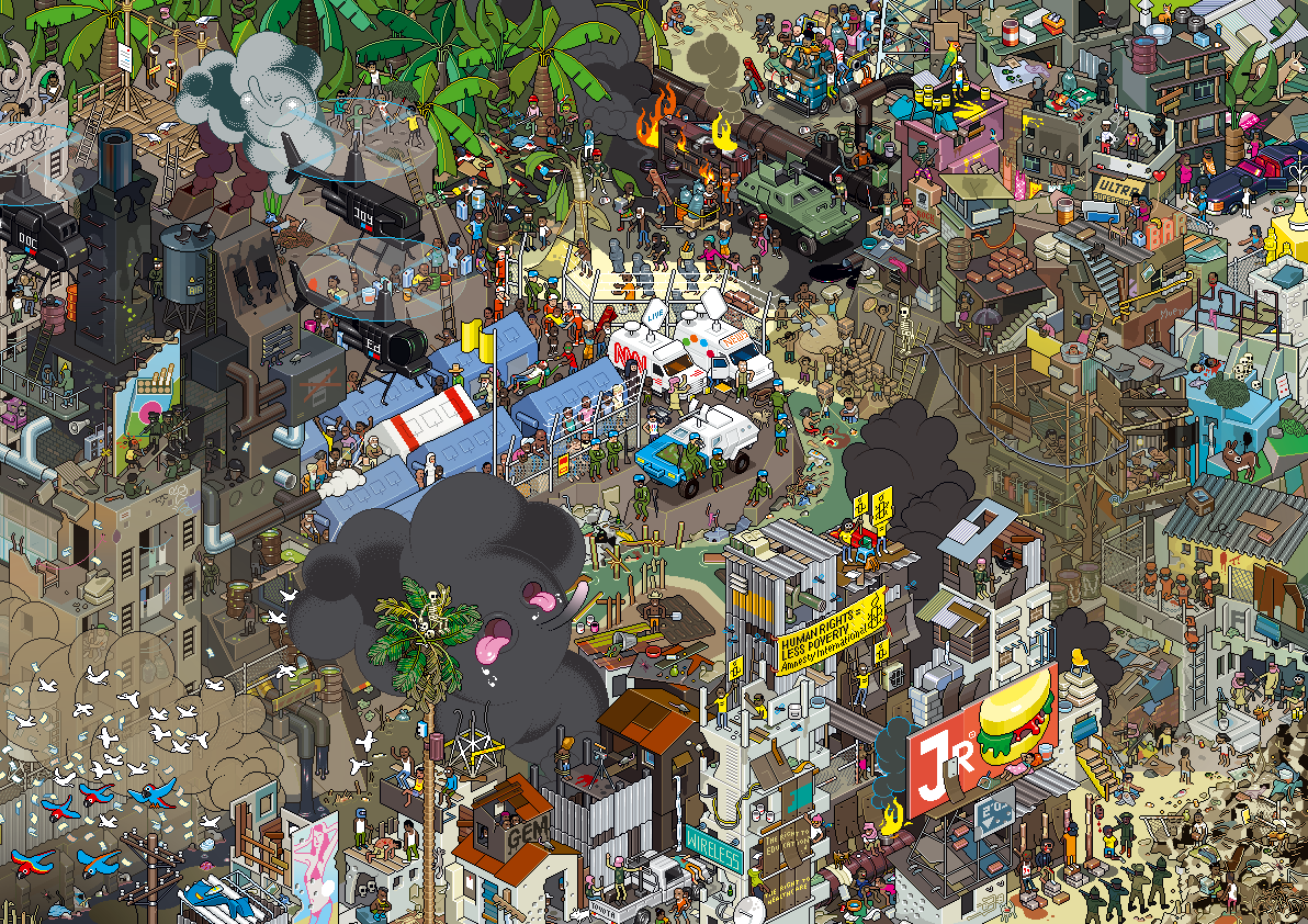
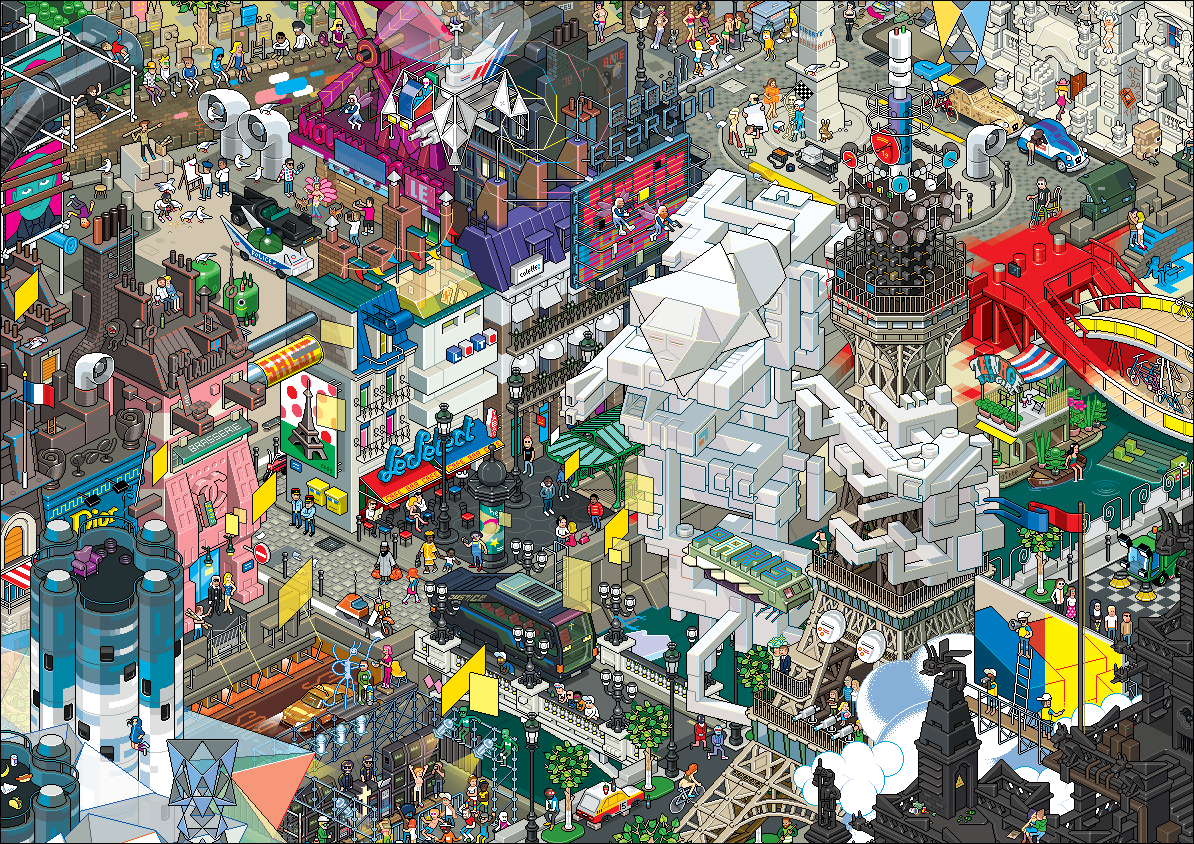
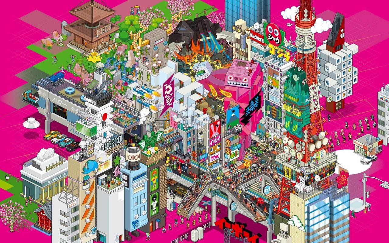
By: Kenneth Kit Lamug,
on 3/5/2014
Blog:
RabbleBoy
(
Login to Add to MyJacketFlap)
JacketFlap tags:
Digital Art,
retro,
Visual Art,
posters,
Fine Art,
pixel art,
cities,
8-bit,
eboy,
Book Reviews,
16-bit,
8-bit posters,
cities pixel art,
city pixel art,
Kai Vermehr,
Modular Art,
pixelart,
Steffen Sauerteig,
Svend Smital,
where's waldo 8-bit poster,
Add a tag
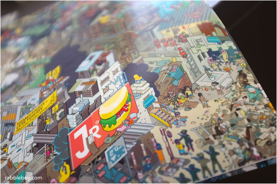
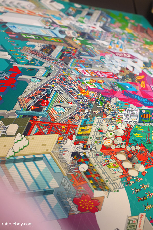
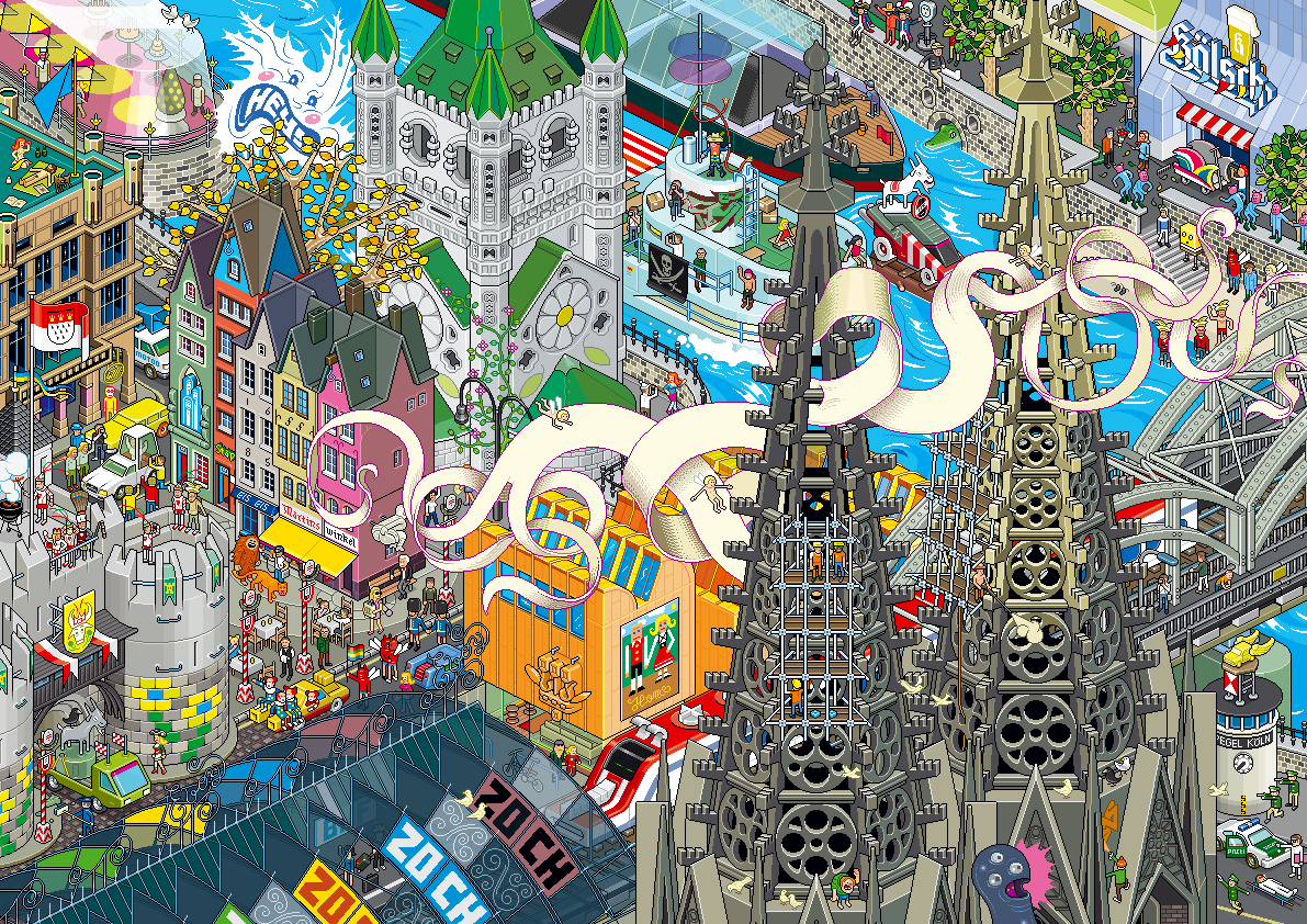
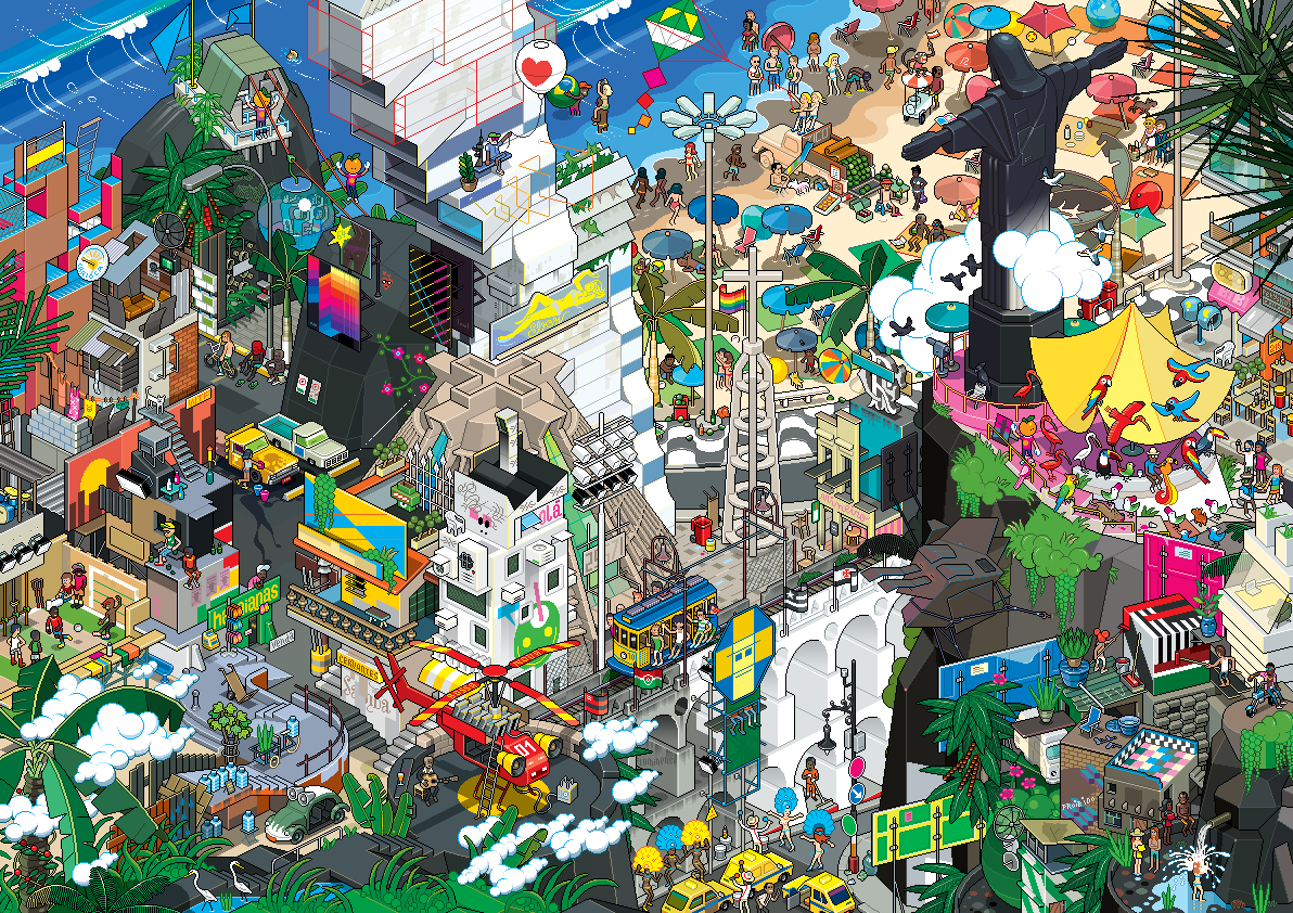
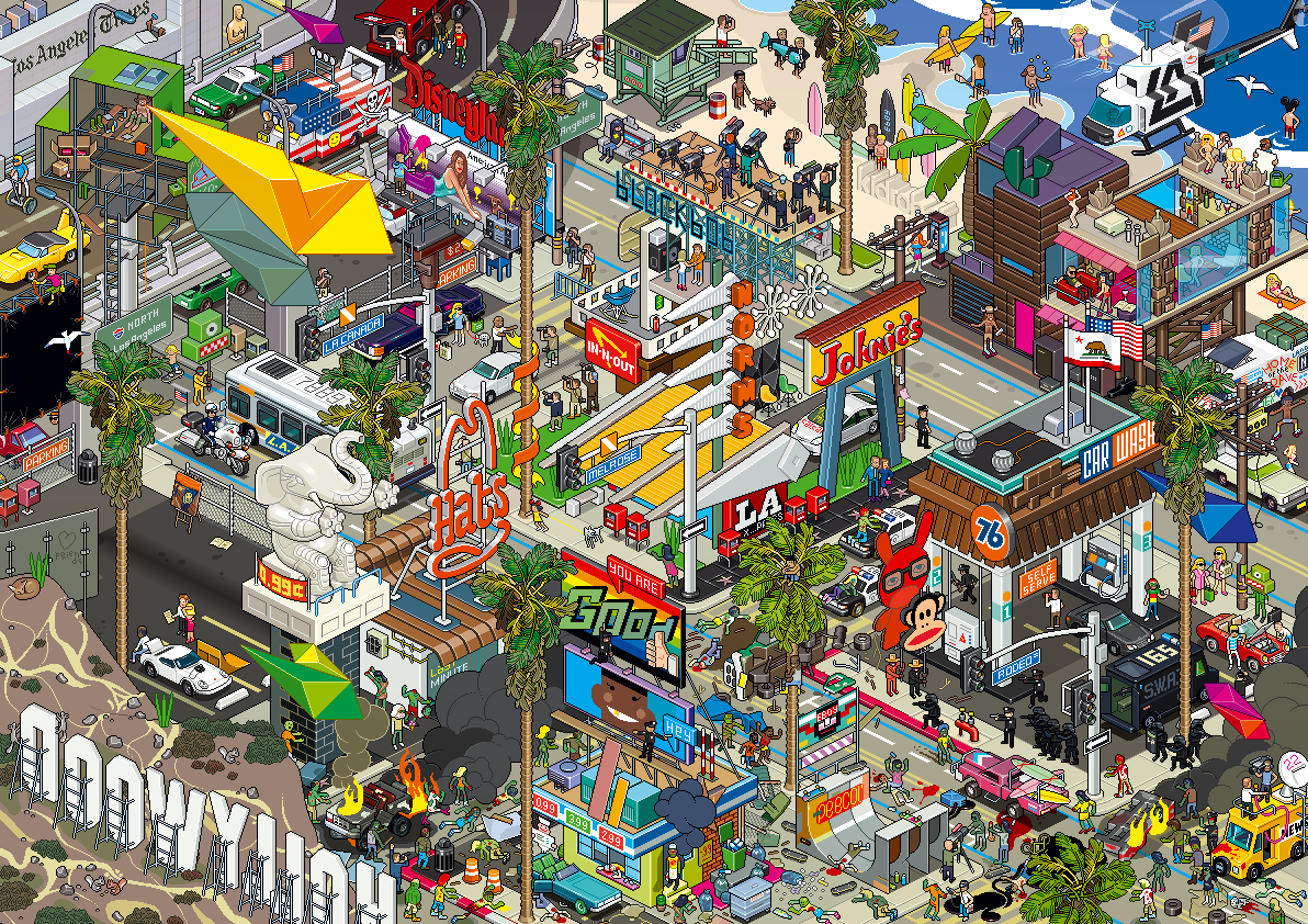
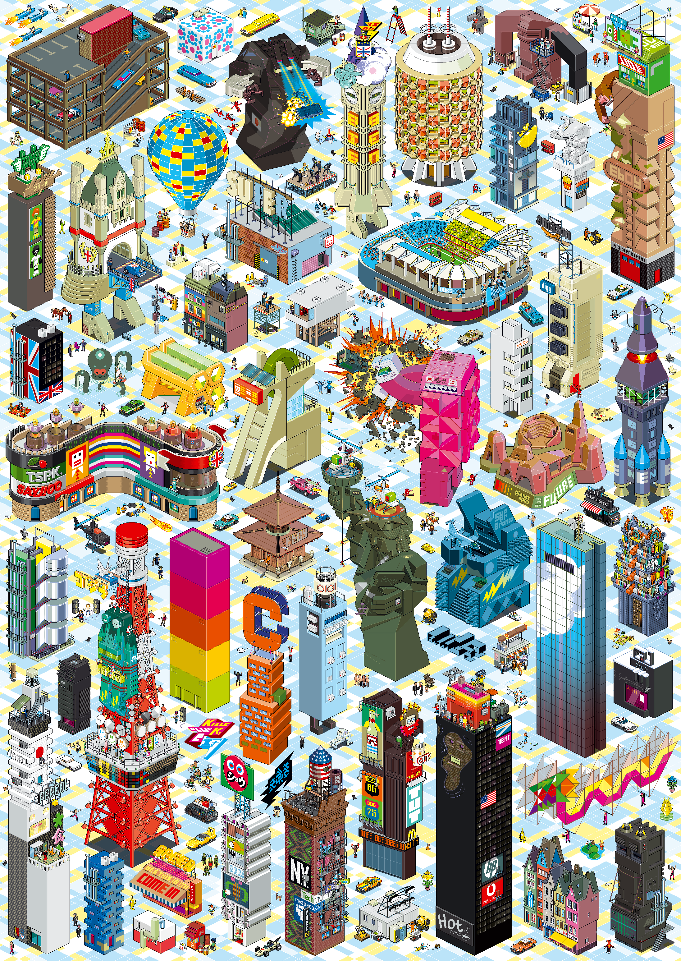
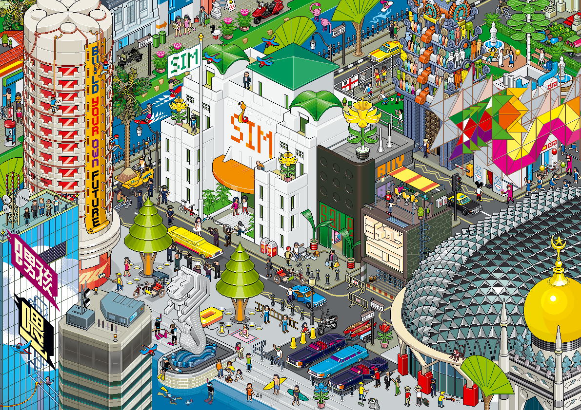
eBoy (“Godfathers of Pixel“) is a pixel art group founded in 1997 by Kai Vermehr, Steffen Sauerteig and Svend Smital.
Their complex illustrations have been made into posters, shirts, souvenirs, and displayed in gallery exhibitions.[1] They were founded on May 2, 1997. “We started working with pixels because we loved the idea of making pictures only for the screen. It’s the best way to get really sharp and clean looking results. Also, handling pixels is fun and you are forced to simplify and abstract things, which is a big advantage of this technique.” [1] eBoy is based in Berlin (Germany) and Vancouver (Canada).
Their influences come from: “Pop culture… shopping, supermarkets, TV, toy commercials, LEGO, computer games, the news, magazines…”[2] Kai grew up with Nintendo to inspire him, the rest of the eBoys lived in East Germany where video games did not exist.[3] Their work makes intense use of popular culture and commercial icons, and their style is presented in three-dimensional isometric illustrations filled with robots, cars, guns and girls. Now, most of their designs are printed and not used solely for computer screens, allowing images to get more complex with details.[1]“If we don’t work on other projects at the same time it takes about six to eight weeks to finish a very detailed cityscape, three eBoy’s working on it, nearly full time. But, if we have to do it in our spare time, which happens often, it could take years to finish a picture since we can’t spend so much time on it.”[1] Their style has gained them a cult following among graphic designers worldwide,[1] as well as a long list of commercial clients. Their latest project are plastic Peecol toys with Kidrobot, and a line of wooden toys are to be produced under their own label.
Source: Wikipedia
Visit Eboy’s web site here.
Check out Amazon for Eboy Posters


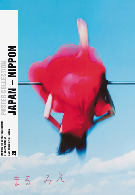
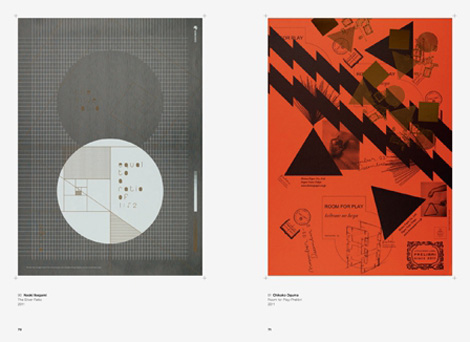
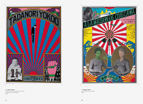
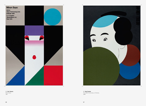
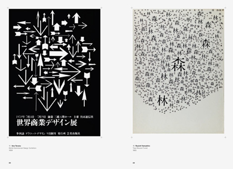
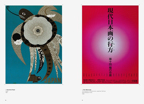
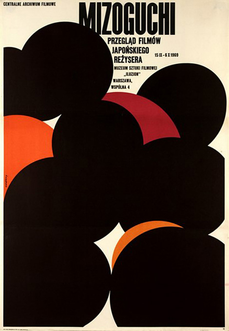
Japanese graphic design is characterized by a unique aesthetic, oscillating between its own pictorial tradition and Western visual culture. In Lars Muller’s lastest release, Japan-Nippon they explore the Japanese poster and how it functions most notably as a highly aesthetic image advertisement, presupposing the designer as an artist.
——————–
Also worth viewing:
Saul Bass Book
Design Books
Holiday wish lists
Not signed up for the Grain Edit RSS Feed yet? Give it a try. Its free and yummy.
——————–
 Share on Facebook
Thanks to Mister Retro: Machine Wash Deluxe for being this week's sponsor.


Josef Müller-Brockmann’s graphics left a lasting mark on Swiss visual communication from the 1950s onward. His posters demonstrate how a sober, formally reduced language works best for conveying a universal, timeless message. Poster campaigns for longtime clients such as the Tonhalle concert hall in Zürich or the Automobile Club of Switzerland follow strict functional criteria–and yet exhibit a variety of design solutions and exciting, dynamic compositions.
This book presents selected posters by Müller-Brockmann and places them in the context of their own time while also examining the validity of his solutions from today’s point of view.
Pre-order a copy via Lars Muller, Amazon or your local bookstore.


——————–
Also worth viewing…
Herb Lubalin: American Graphic Designer
Wim Crouwel: A Graphic Odyssey
Recently Received Books
Share on Facebook
RSS Sponsor: Try Squarespace today for free at squarespace.com


By: Kathy Temean,
on 9/9/2013
Blog:
Writing and Illustrating
(
Login to Add to MyJacketFlap)
JacketFlap tags:
Places to sumit,
Real Simple Essay Contest,
Contest,
Maurice Sendak,
Posters,
authors and illustrators,
opportunity,
No fee Contest,
Life Lessons,
earn money,
Add a tag
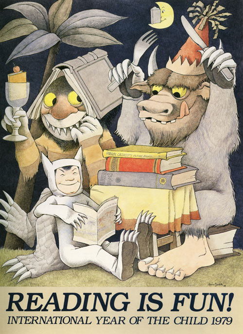
Maurice Sendak’s Little-Known and Lovely Posters Celebrating Books and the Joy of Reading
http://www.brainpickings.org/index.php/2013/09/03/maurice-sendak-posters-reading-books/
Real Simple – Sixth Annual Life Lessons Essay Contest
What’s the bravest thing you’ve ever done?
Maybe, in the course of your life, you’ve had an Erin Brockovich moment: say, the time you stood up to a bully in second grade, or the day you ended a long-standing friendship that had turned toxic. Or maybe your acts of courage have been less dramatic but no less powerful: moving to a new country. Daring to fall in love a second time around. Leaving a settled career to embark on a risky new venture. Whatever your story, share it with us.
Enter Real Simple’s sixth annual Life Lessons Essay Contest and you could have your essay published in Real Simple and receive a prize of $3,000.
Send your typed, double-spaced submission (1,500 words maximum, preferably in a Microsoft Word document) to [email protected].
Contest runs through 11:50 P.M. EST on September 19, 2013.
All submitted essays must be nonfiction. Open to legal residents of the United States age 19 or older at time of entry. Void where prohibited by law. (Entries will not be returned.)
Read This Year’s Winning Essays
Frequently Asked Questions
Q. How should I format my entry? A. Essays should be submitted in English at a maximum of 1,500 words and typed and double-spaced on 8½-by-11-inch paper. Essays exceeding this length or handwritten may not be considered. If submitted by e-mail, we prefer that you send the essay in a Microsoft Word document; however, we will also consider essays that are pasted into the body of the e-mail itself.
Also be sure to include your name, address, and phone numbers (home, work, cell) in the body of the e-mail and on any copies or attachments of the essay itself.
Q. How do I submit my entry? A. You have two options.
- E-mail your submission to [email protected].
- Mail your entry to the following address: Essay Contest Real Simple 1271 Avenue of the Americas, 9th floor New York, NY 10020
Each e-mail submission will receive a return message verifying that the essay was received. Please be aware that due to the volume of submissions, we cannot send verification that we have received your specific submission by mail. Additionally, please note that winners and runners-up will be notified in and around January 7, 2014. If you are not contacted, you are free to submit your piece elsewhere.
Q. What happens if I go over the word limit? A. Your essay can be excluded from consideration. And although there is no word minimum, we strongly encourage all contest participants to submit at least 1,000 words to maximize their chances of winning.
Q. Can I choose to remain anonymous? A. Unfortunately, we cannot consider anonymous entries for this contest.
Q. My piece has been previously published. Will you consider it? A. No. All entries must be original pieces of work and not be previously published.
Q. Should I send in photos or other memorabilia that relate to my essay? A. Please don’t. The essays are judged on the following criteria: originality (25 percent), creativity (25 percent), use of language (25 percent), and appropriateness to contest theme (25 percent). No supporting materials will be considered, and they cannot be returned to you.
Q. Is there anything else you can tell me about how to stand out from the crowd? A. Certainly. Here are a few pointers from the Real Simple editors who judge the contest.
- Stick to the theme of the contest. Sounds obvious, right? But every year we get many entries that diverge—sometimes wildly—from the stated topic. You may have an amazing essay in the bottom drawer of your desk, but if it doesn’t cover the contest theme, it’s not going to win.
- But don’t feel the need to parrot back the exact wording of the contest theme in your essay. For example, if the theme is “What was the most important day in your life?” try not to begin the piece with “The most important day of my life was…”
- Check your spelling. Double-duh, or so you’d think. But as many as one in five entries has multiple misspellings.
- Avoid clichés. (And please don’t try to work the phrase ‘real simple’ into your essay. It almost never works.)
- Try writing on a less-expected subject. Many submissions cover similar ground: pregnancies, weddings, divorces, illnesses. Many of these essays are superb. But you automatically stand out if you explore a more unconventional event. In one year’s batch of submissions, memorable writers described the following: a son leaving for his tour of duty; getting one’s braces off; and learning that an ex-wife was remarried.
For more information, see the official contest rules.
What do you have to lose? Fifteen Hundred Words is easy and you only have to email it in. Who knows you could put a little extra cash in your pocket.
Talk tomorrow,
Kathy
Filed under:
authors and illustrators,
Contest,
earn money,
opportunity,
Places to sumit Tagged:
Life Lessons,
Maurice Sendak,
No fee Contest,
Posters,
Real Simple Essay Contest 

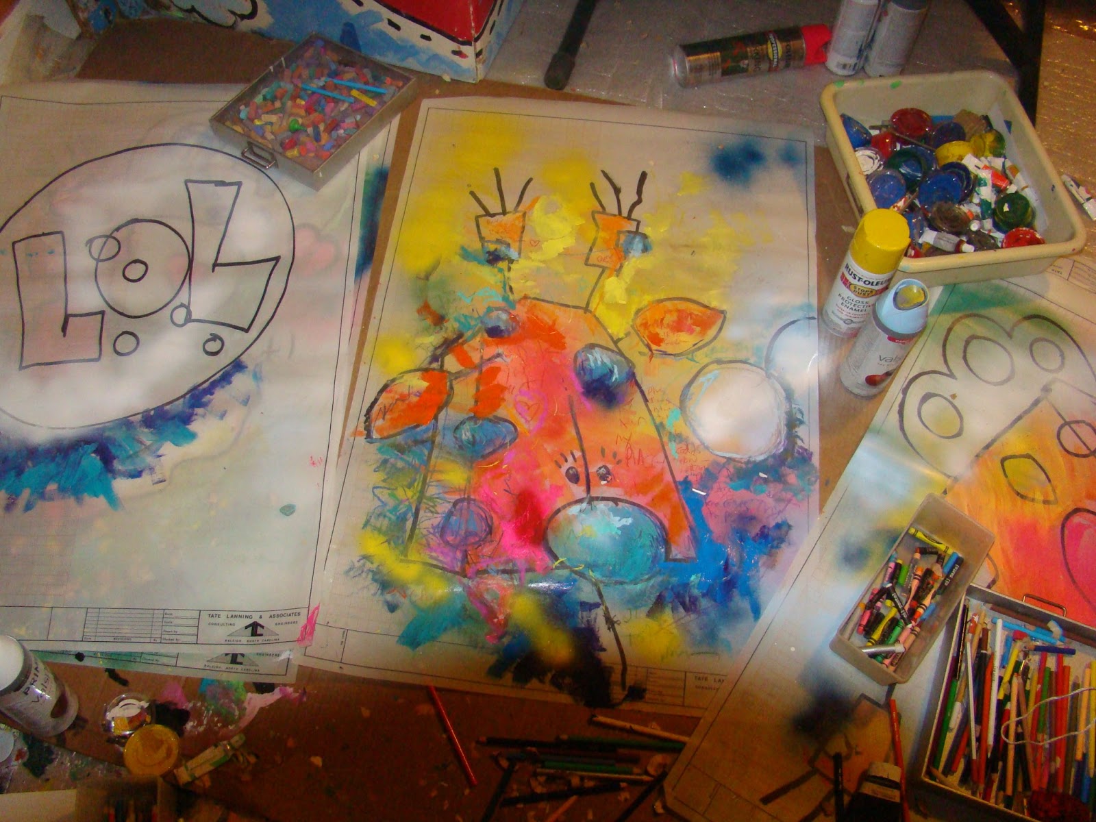
Meanwhile, back in the studio...
For those of you sick of reading about stuff that makes us angry.. stuff that makes us mad.. stuff that makes us unhappy...
Along with cranking out a few books this summer I'm also
back in the studio working on a few paintings.
An art teacher friend of mine once described my work as "A Party On Paper."
These works are going to be a combination of the concept behind
the Critter Cubes created for a public art project in Wake Forest and the style of my digital work, only using mixed media.
So these are (still) just started. Let's see where it all goes...
Hope it makes you.. happy!
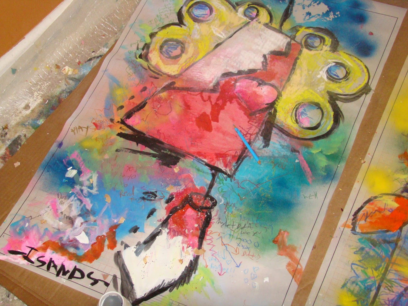
These just under way. I haven't made any non-street art since my last show at the
Block Gallery. To be honest, I wasn't sure if I wanted to show again.. Now I'm thinking, this might be fun.
These works are going to be a combination of the concept behind
the Critter Cubes created for a public art project in Wake Forest and the style of
my digital work, only using mixed media.
So these are just started. Let's see where it all goes...
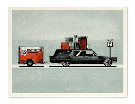
Lovely work from Shed Labs, the Greenville, SC-based design and screenprinting studio. Their aesthetic is bold and textural, and their work is very lively. The wit and sense of humor found in the work functions nicely with their colorful, playful style.
Share This
Featured Book:
Matte Stephens: Selected Works.
A Huge thanks to Squarespace for sponsoring this week’s RSS Feed!


Inspired by vintage airline baggage tags, UK illustrator Neil Stevens (aka crayonefire) created these stunning posters. If they prove popular he will make them available in his online shop this Spring. Lets make that happen! Drop Neil a note here.


—–
Also worth viewing:
Tad Carpenter Interview
Asatte
Design Books
Not signed up for the Grain Edit RSS Feed yet? Give it a try. Its free and yummy.
Share This
Featured Book:
Matte Stephens: Selected Works.
A Huge thanks to Squarespace for sponsoring this week’s RSS Feed!

Nice post on Mubi talking about the Polish film-poster documentary, Freedom on the Fence, and also highlighting some of the work of Waldemar Swierzy.
Share This
A Huge thanks to Depositphotos for sponsoring this week’s RSS Feed!
©2012 Grain Edit - catch us on Pinterest , Facebook and twitter


Introducing Wee Society, a new kids brand created by the folks behind the design firm Office.
The first line of products introduces the Wee Alphas – a quirky crew of 26 illustrated animals with a letter of the alphabet hidden in each one. The Wee Alphas appear in a series of art prints – including a limited edition 13-color screen print and a personalized print that you can customize with your child’s name and a silly (or slightly more serious) statement. See them all here.

—–
Also worth viewing:
Publicity and Graphic Design in the Chemical Industry
Swiss Photobooks
The Visual Language of Herbert Matter
Not signed up for the Grain Edit RSS Feed yet? Give it a try. Its free and yummy.
Share This
A Huge thanks to Squarespace for sponsoring this week’s RSS Feed!
©2012 Grain Edit - catch us on Facebook and twitter


By: John,
on 7/17/2012
Blog:
DRAWN!
(
Login to Add to MyJacketFlap)
JacketFlap tags:
Illustration,
Comics,
Conventions,
Art,
Typography,
Posters,
Chris Ware,
2012,
Special Guests,
SPX,
Small Press Expo,
September 15-16 2012,
Add a tag
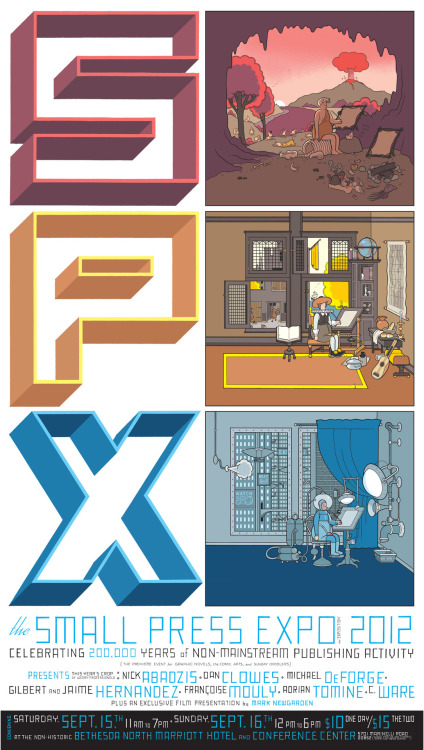
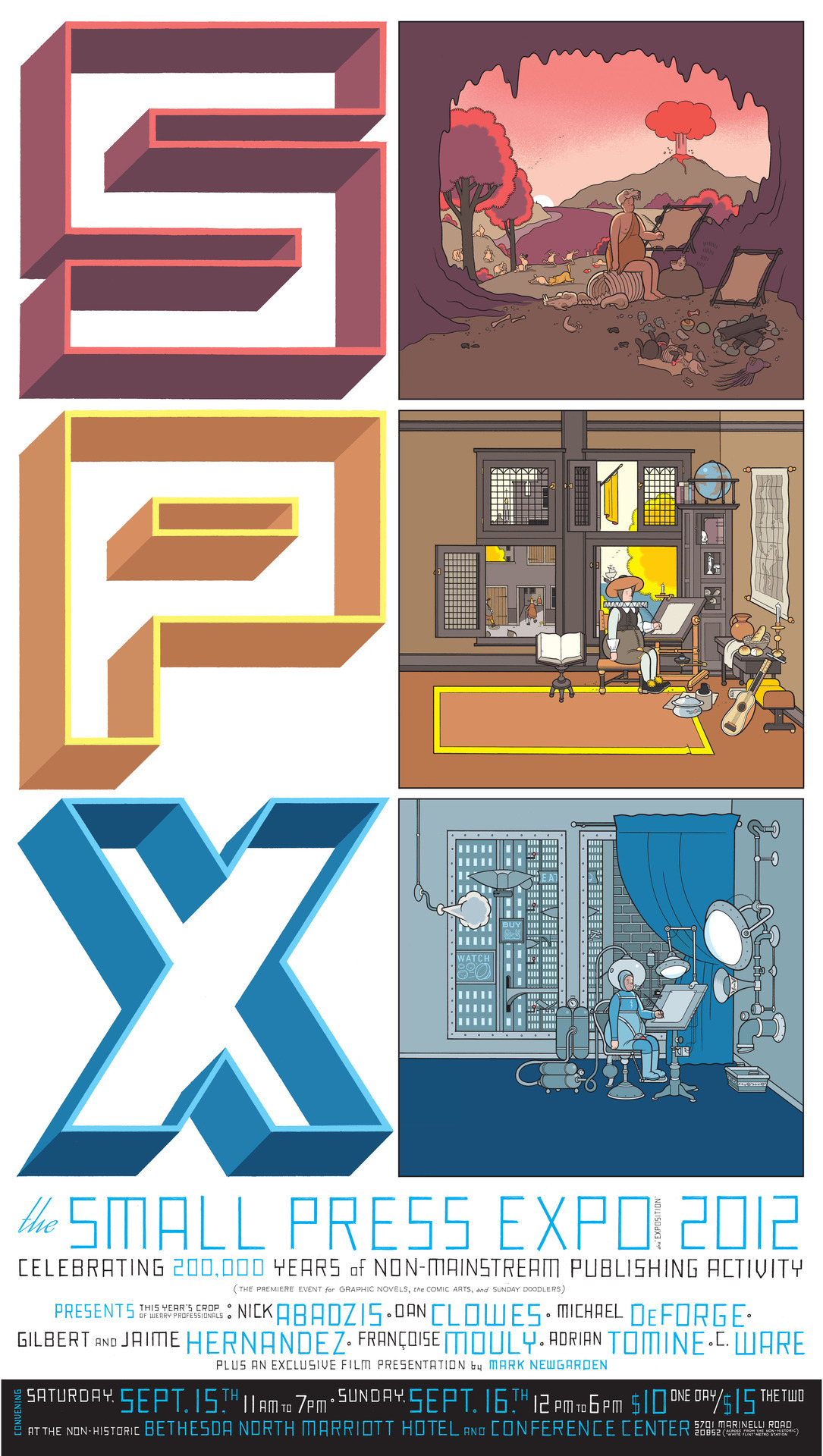
spx:
Chris Ware’s beautiful poster art for the 2012 Small Press Expo.
I have no words.
The mega sized version lives here.
Chris Ware’s breathtaking poster for this year’s Small Press Expo. Just look at that lineup of names, and that’s not even getting into the titular “small press” exhibitors, which the show is ostensibly about. And which number includes not one but three Drawnists.


Eight Hour Day
Design strategy and marketing agency Zeus Jones was recently hired to bring a fresh perspective to Purina ONE BeyOnd’s sponsorship of the Pitchfork Music festival. For this year’s event they came up with the idea of giving away professionally-designed posters that celebrate the awesomeness of pets and music. Zeus Jones sought out some of their favorite designers and had them imagine what “Pets Rock” meant to them. Check out the following from grain edit faves - Lab Partners, Brent Couchman, Tad Carpenter and Eight Hour Day.

Brent Couchman

Lab Partners

Tad Carpenter
——————–
Also worth viewing:
Lab Partners: California Gold Posters
Eli No!
Tad Carpenter Interview
Brent Couchman
Not signed up for the Grain Edit RSS Feed yet? Give it a try. Its free and yummy.
Share This
Grain Edit recommends: Wondering Around Wandering: Work-So-Far by Mike Perry. Check it out here.
©2012 Grain Edit - catch us on Facebook and twitter
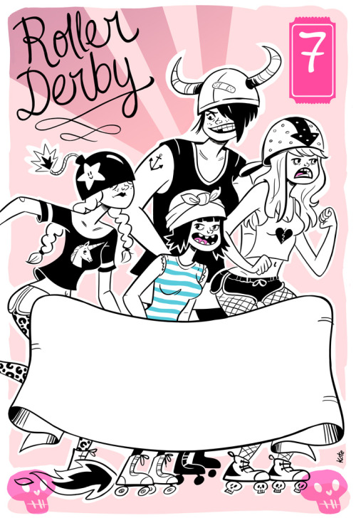
genevievekote:
My first poster :D I am soooo thrilled!! Still missing all the text but I love it! Got me wanting to do more in this style and more not for kids images once in a while :)
Genevieve Kote is on Tumblr, and I love seeing her try something new.


Heartwork is a project designed to raise money for art supplies at Target House—this wonderful home-away-from-home for the families of children facing long-term treatment at St. Jude’s Children’s Research Hospital. The idea is simple. Every year, a group of talented artists are selected to create a series of 11″ x 14″ giclee prints with a specified theme, this year being the word ‘HOPE’. Each edition is limited to only 10 pieces and signed/numbered by the artist.
Here’s a sample of the prints available in this year’s Heartwork benefit.

“In Bloom” by Aesthetic Apparatus

“Love Grows” by Don Clark / Invisible Creature

“Dream Butterfly” by Gina Triplett

“Finding Hope Through Friendship” by Jessica Hische

“Hope Garden” by Lab Partners

“Feather-Finder” by Meg Hunt

“Growing Hope” by Nate Wragg

“Special Delivery” by Ryan Clark / Invisible Creature

“Hope” by Julia Rothman

“Spring” by Jason Munn
Pick up a print at the Heartwork website
<

To the M83 fans that were unable to attend their show last week in Seattle, the gig poster is now available. The limited edition three color print was created by our good friends Don and Ryan Clark of Invisible Creature and includes a special dark metallic copper ink. Pick up a copy at the Poster Cabaret.
——————–
Also worth viewing:
Heartwork: Art Benefit for Target House
Invisible Creature: Arcade Fire
Invisible Creature Interview
Not signed up for the Grain Edit RSS Feed yet? Give it a try. Its free and yummy.
Share This
Grain Edit recommends: Wondering Around Wandering: Work-So-Far by Mike Perry. Check it out here.
©2012 Grain Edit - catch us on Facebook and twitter

By: stephanie,
on 4/13/2012
Blog:
sruble.com
(
Login to Add to MyJacketFlap)
JacketFlap tags:
illustration friday,
art,
drawing,
if,
process,
digital,
cows,
posters,
my art,
stenberg brothers,
Add a tag
The prompt for Illustration Friday this week is, puzzled. You might be puzzled about my image until you learn more about the inspiration behind it (unless you area Russian avant-garde movie poster buff). The cow in the picture is puzzled as to why her hooves are in a different part of the picture and why she has two tails! She’s also a bit scared about what that means. The image itself reminds me a bit of a puzzle, in that it looks like you need to rearrange the pieces for it to make sense. Here is my puzzled moo:

This picture is a new version of an old image I did in 2004. When I heard the prompt this week was puzzled, I immediately thought of this image because it’s always reminded me of a puzzle in the way it looks and how I pieced it together the first time. The original image was done February 26, 2004, as part of a year long project. For a whole year (366 days because it was leap year), I drew/painted a cow a day. This image came towards the end of the project, when I was trying to find more creative ways to draw my daily cows. Here’s my first image:

I’ve always liked this drawing … probably because I always liked the poster that inspired it. When I was trying to think of a cow to draw that day, I remembered a movie poster by the Stenberg Brothers and decided it would look cool with a cow instead of a person. Here’s the Stenberg Brothers poster for the 1929 movie A Fragment Of An Empire:

My first image is almost a direct representation of the original, although bovine themed and with English words. The one I did today still recalls the original, but when you look at them side by side, they’re very different. The new image is closer to my style both now and when I used to be an abstract painter.
My style was, and still is, influenced by graphic images in advertising and art. In 2008 I did another series of cows that played with the idea of using a single cow and a simple palette to create multiple graphic images. They aren’t directly related to any art or artist, but the style is influenced by graphic art images. Here’s the first cow:

And here’s a sample of the cows I created off of this one image and turned into my own poster. I actually like them better all together, rather than as separate images. Still need to get this poster framed …

BTW, I first fell in love with the Stenberg Brothers when MOMA held an exhibition of their art. I w

Diana Sudyka is a talented illustrator and printmaker from the Chicago area. She’s illustrated several books including The Mysterious Benedict Society and the Perilious Journey, and The Mysterious Benedict Society and the Prisoner’s Dilemma as well as created silkscreen posters for well-known bands such as Pearl Jam and the Decemberists. Her gig poster designs often employ her beautiful hand-drawn lettering skills. This is evident in the the Andrew Bird poster seen above, which also happens to is be this week’s poster pick.


——————–
Also worth viewing:
Jay Ryan
Jason Munn Interview
Poster Pick: Landland
Not signed up for the Grain Edit RSS Feed yet? Give it a try. Its free and yummy.
Share This
Grain Edit recommends: Saul Bass - Henri's Walk to Paris. Check it out here.
©2012 Grain Edit - catch us on Facebook and twitter

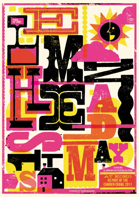
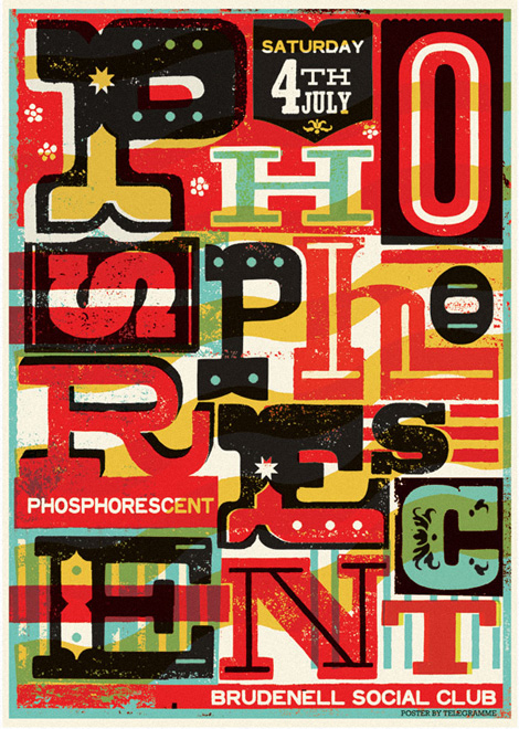
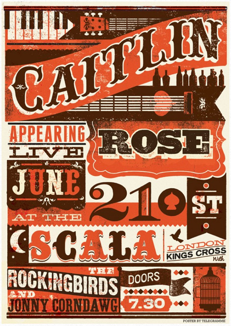
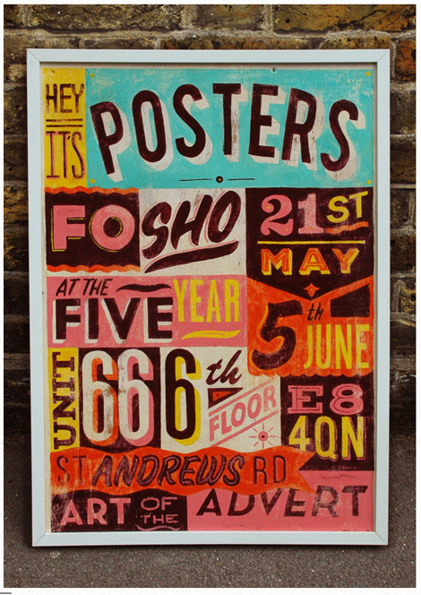
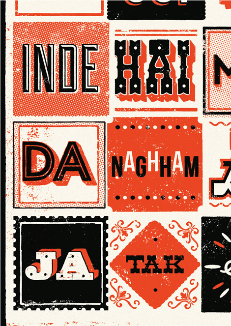
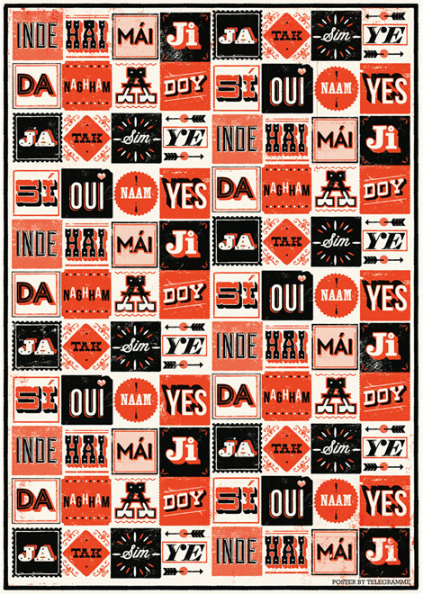
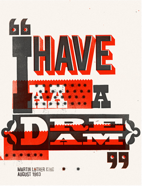
Interesting concept behind Telegramme Studio, this fantastic UK-based studio. It started as a collab between two designer/illustrators sending work and things back and forth in the post. Eventually this mutual love for design and mail sprang up a fully-functional studio, which we now enjoy here.
Most striking to me are the gig-posters and typography. They really keep it wonderfully fresh and inventive. I love the loud colors and heavy textures on a lot of the work. And lots of details. I love all the typographic detailing.
Share This
Grain Edit recommends: Eli No! by Katie Kirk. Check it out here.
©2011 Grain Edit - catch us on Facebook and twitter

View Next 25 Posts


Hmmm….could definitely use the prize! Let’s hope life allows!
Thanks, Kathy
Kathy – when you use artwork at your site as you have done with Sendak poster,is this considered free use or do you need permission to use? Thanks, Holly
http://www.zhousestories.com
Hi Kathy,
This sounded like the perfect contest to entry. Then I read, “U.S. entrants only”. The same rules applied to the Holiday Card contest that you posted a few weeks ago. Guess I’ll have to move to the U.S. Anyway, keep posting great content.
Thanks,
Tracy
Reblogged this on Darlene Beck-Jacobson and commented:
For the budding writers out there. Take a chance and enter a contest. You never know…
Holly,
No, it is just used to point everyone to the article about his posters. It over 34 years old, but it might be 50 years to be use. No sure about that. Can’t check with Sendak, since he has passed away. If I wanted to use it in a book about him, I would contact his estate for permission.
Kathy
Thank you for sharing this. I just finished my rough draft for the contest. Love flexing my writing muscles on alternate, and unexpected ideas.