I need to get all the artwork for Baby Goes Baaaa! done by the end of this week. When you last looked in on me, I'd done the ducks and monkeys and had almost finished this baby tiger (who, as you can see, now has his stripes). All that was left was the cover and the Nana Crocodile illustration.

I got the go-ahead on the cover re-design last week and, apart from my sneaky day off, have been working away on the artwork. As there are several characters on the cover that I've already designed for the inside of the book, I needed to tack all that previous artwork to my desk, for colour reference: 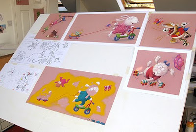 I'd previously sent all the artwork I'd done so far to the publisher, so they could present the project at Bologna, but they had to post it all back to me for this part.
With the inside illustrations, I've not worried about the background colours and will try things out later, in Photoshop. With the cover though, I wanted to design it with a background colour in mind: it's so important, as it can completely change the book's appeal. After much thought, I decided to go for golden yellow, keeping all the outfits and toys as bold, strong colours, to stand out against it.
 As the yellow will be dropped in digitally, I didn't intend to colour it in like this but, without it, I soon began having trouble judging the effect of the other colours. So I stopped and, very carefully, coloured around what I'd already done in the golden yellow pastel, as above.
 Then I carried on. Except, the yellow was very messy and kept getting all over my hand and smudging. So I stopped again, to spray it with fixative before continuing. And this is why I HATE fixative! Just look at the effect it has on the colours:
0 Comments on The Perils of Fixative! as of 4/11/2011 5:18:00 AM
I have finished my swinging duckling illustration:

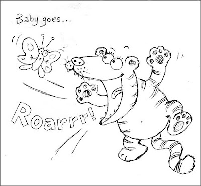
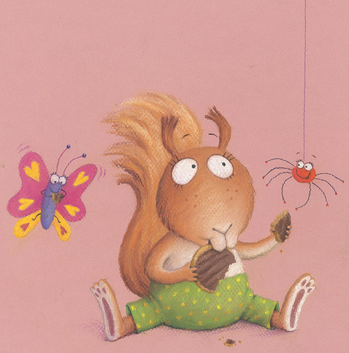
This page sits opposite the illustration for 'R' - a baby tiger, trying out his roaring on a butterfly - the next piece I have decided to colour up. Below is the original rough I submitted to Egmont. Though there were minor changes to other illustrations at that stage, the tiger came back as an immediate green light, with no changes needed.
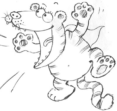
But later, taking a fresh look at the various roughs, I realised that the tiger would be more fun in a dressing-up outfit, like the squirrel, so I gave him a little superhero cape, and re-submitted the drawing to my editor.
 They pointed out that the cape was a bit minimal and so got a little lost. They suggested I give him a T-shirt as well, perhaps with some kind of superhero picture on the front. This seemed a good idea. I thought for a moment, then realised the simplest idea would be the Superman logo:

Even as I was drawing it, I worried about copyright - you have to be very careful how you use existing logos. But the design worked really well, so I decided to see if Egmont picked it up as an issue. They did. Ah well.
 Sarah, my designer on Baby Goes Baaaa! sent me this lovely tiger-superhero logo she designed herself, and asked me to give that a try. I took into Photoshop, shrunk it down and manipulated it so that it 'sat' on the rounded front of the shirt properly.
tricia frizzell tharp is a michigan based illustrator. a former position as a children's textile artist uncovered her passion for creating art for kids. tricia now works on her own and has a small shop selling critters on fabric, art and stamps, but her ambition is to expand and see her art used in more areas of the children's market.
these are the bold and colourful works of itxaso torrontegui palacios. itxaso is based in madrid spain and was one of the designers featured in this years texitura trends magazine.
UK designer hannah davies recently won the "one year on" award the new designers show 2010. hannah specialises in fine detailed surface pattern and draws on her love of nature for inspiration. see her work online here.
The value of a good self promotional piece cannot be overstated – especially in the current state of the economy. The crucial mistake we sometimes make as artists is to scale back our promotional efforts in tough economic times. But that is exactly what you don’t want to do. The economy is cyclical, things will bounce back and when they do you don’t want to be spending your time playing catch-up – rushing to get clients by producing poorly printed, half baked marketing materials. Self promotion is a year round endeavor in good times and in bad and requires careful planning. If you put the right amount of energy into promoting yourself you will benefit from the fruits of your labor. Below cartoonist and designer Guy Smalley takes us through the process for a recent self promotion project of his that has proven to be quite successful for him, catching the eye of many new and existing clients.
Giving Birth to a Self Promotion Piece in 9 Weeks not 9 Months.
Contributed by Guy Smalley
Far be it for me to give any advice to the self-employed artist out there. After 38 years of being a full time cartoonist and designer, and after years of my style being in and out of fashion, I now have reached vintage status.
These days the internet is good for promotion but there are other areas of promotion such as direct mail that should still be utilized for your marketing efforts. The plum jobs are out there, but fewer in numbers than the “good old days” when budgets were larger and perhaps the field was not as competitive. As an experienced professional I know a one-of-a-kind self promotional piece allows me to target the agencies that have clients I think are a good fit for my work and target medium size agencies where I can pitch my creative as solutions to their marketing needs.
Before I set out to create my promotion I wrote out 5 parameters and goals.
- The recipient should be able to get use out of it, insuring the promotion has a long shelf life.
- Top quality printing with the best materials I could afford was a must.
- Since I’m a humorist, the concept needed to be witty and pander to the creative/art director as an overt funny gag.
- I wanted my promotion to be a soft sell and show from the quality of the piece that a professional created this promotion.
- And finally creating something different that stood out from the rest was paramount. As I stated previously, competition is fierce these days. We’re all competing on a global scale. Simple postcard mailers will not stand out from the rest.
I’ve learned from past experiences that all creative types like a vellum pad to sketch, trace, doodle and make notes. I knew if the creative/art director could use it, then there would be a perceived value. With that, parameter one would be satisfied.
Front of Self Promotion Notepad
Web portfolios are great, but there isn’t that tact
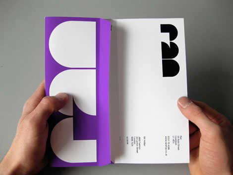
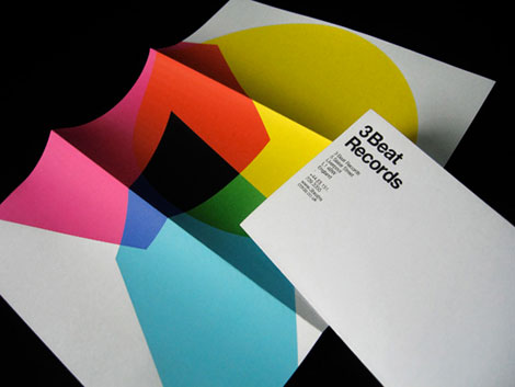
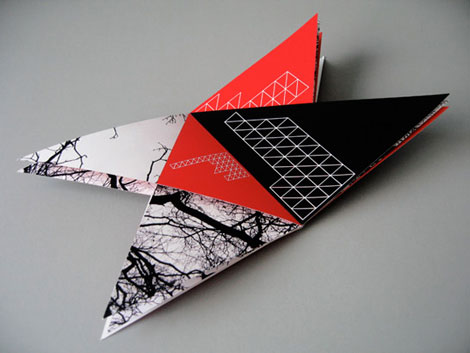
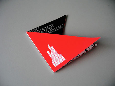
Matt Keers, the UK-based designer responsible for the above design, has a portfolio full of the same: bold, colorful, and compelling.
Like the piece shown, I appreciate Matt’s use of simplicity to make something interesting. Throughout Matt’s work there is a consistent use of scale, refreshing color palettes, and bold typography, all working toward a restrained sophistication.
Check out Matt’s site.

No Tags
Share This
Vintage kids book Mi Diccionario is in the Grain Edit Shop
Grain Edit recommends Colo Pro A font designed by Font Fabric. Check it out here.
©2009 Grain Edit - catch us on Facebook and twitter

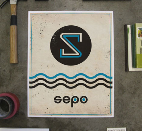
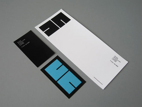
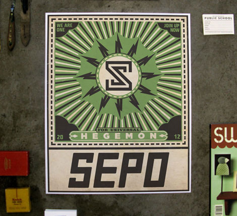
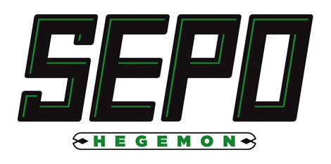
Fun work and a new site from Shaun Lind, a designer, illustrator, Austin-living person, man, and member of the esteemed design/creative collective Public School. There’s a nice balance between the fun and the useful in Shaun’s work. For example, I love amount and quality of identity alongside his interesting self-initiated projects.
Shaun’s web site is also refreshing — in a land of flat white portfolio sites, it’s nice to see something with a little pizazz. And as we know, it’s all about pizazz.
Shaun’s site / Shaun’s store
No Tags
Share This
Vintage kids book Mi Diccionario is in the Grain Edit Shop
Grain Edit recommends Colo Pro A font designed by Font Fabric. Check it out here.
©2009 Grain Edit - catch us on Facebook and twitter

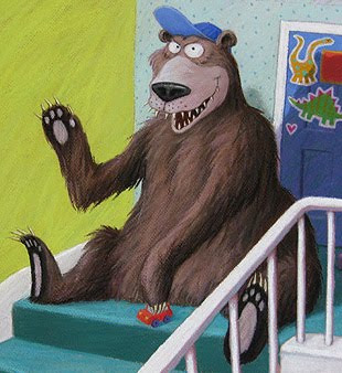
I've spent the whole weekend glued to the computer, turning the scans of my Bears on the Stairs illustrations into print-ready images. They came back from Switzerland as a DVD last week.
Here's a taster, to give you an idea of the sort of thing I've been up to...
This is how the front cover is going to look:

But this is the digital scan off the DVD, of my original illustration:

My job was to knock out the pink paper background and replace it with the green (chosen by the Designer at Anderson Press) being careful to keep the soft pastel edge to the drawings. You might also have noticed, I've touched up a bit of smudging in the stairs too.I didn't add the text by the way: that was sent to me by the Designer, to help me judge how it would look printed.
No time for further detail, as I'm off to schools again first thing in the morning (6.45am cab!) and have to pack my stuff, but will tell more later.
 Our 3 furry friends arrived safely at Andersen Press (phew) and everyone is really pleased (double phew).
They have already been repackaged and sent off to Switzerland, to the printer. No skiing for our bears though: they are there to be scanned on a drum-scanner, which turns them into high quality digital files.
Andersen will get sent these the minute they're done, ready for the designer to do page layouts, and for me to do the digital finishing work. It's a bit of a race to get things ready in time to create a mock-up book for the massive Frankfurt Book Fair on Oct 14th, to woo all those lovely foreign editions...
My problem is that I am booked solid with school visits until well after the Fair. My only window of opportunity is one free weekend, squeezed between my travels when, instead of a well-earned bit of feet-up, I'll have to set to on those scans.
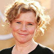
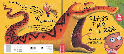
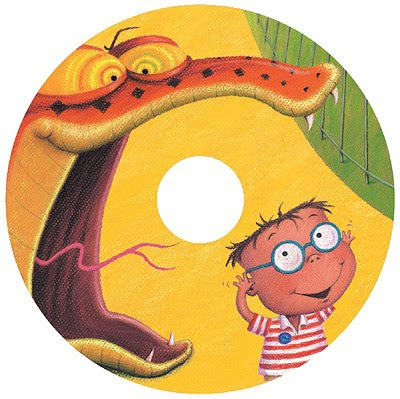 A brand new edition of Class Two at the Zoo will soon be available with a CD! We are really lucky to have bagged the brilliant Imelda Staunton to read the story.
The publisher has created these designs for the CD and case, re-using my illustrations from the original picture book. They emailed them to me for my approval: this is always done when my illustrations are re-used in a different format.
 I've illustrated Chapter books, which have occasionally become talking books, such as the Broomstick series, but this is my first picture book in this format, and I'm chuffed to see our reptilian friend hob-nobbing with all these celebs: first Robson Green, now Imelda. Ssssssssssuper!
This new edition will be in the shops from November 5th, with the CD sold as a package with the picture book, UK price £7.99. I can't wait to hear it!
View Next 4 Posts


.jpg?picon=572)


 5 Comments on Crocodile on a Trampoline!, last added: 9/28/2011


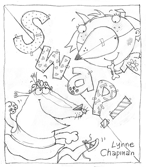
Lovely to see the stages from line to colour.dividing the page diagonly and the title being"swap" is a clever idea,one that really has inpact!
Thanks Jabbott. Actually, I think it was John who came up with the diagonal line idea. Having another brain around to pick for ideas is invaluable.