


By Arpan K. Banerjee
In May this year, the American Osler Society held a joint meeting with the London Osler Society and the Japanese Osler Society in Oxford at the Randolph Hotel. The Societies exist to perpetuate the memory of arguably one the most influential physicians of the early twentieth century, and to discuss topics related to Sir William Osler’s interests. It is fitting that this meeting was held in Oxford, where Osler spent his time as the Regius Professor of Medicine having transferred from another great seat of medical learning at Johns Hopkins Medical School in the United States.
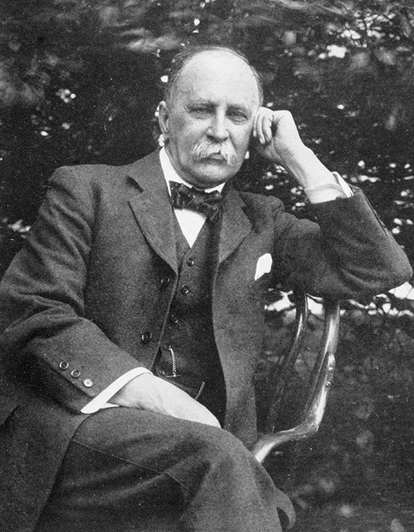
William Osler. CC-BY-4.0 via Wikimedia Commons.
Osler was interested in medical education (he produced his classic textbook, which ran to several editions) and set about trying to improve the education of future doctors. Osler’s other great legacy was his combination of superb clinical skills honed by experience not only on the wards but also in the laboratories, and his great interest in the humanities. Osler always tried to combine these two approaches in his work, and much of his writings and aphorisms are as relevant today as when they were first written. Medical students could read Aequanimitas today more than a century after it was written, and would profit from much of the advice to students within this volume of essays and addresses.
Osler had a great interest in the History of Medicine and helped found the history section of the Royal Society of Medicine in London. This scientific section has continued to flourish for over a century. He believed physicians should be well rounded and well read, and that medicine was a calling of both art and science. Although Osler was not against the idea of specialisation in medicine, he was a superb generalist and could manage both adult and child patients. He believed that doctors owed it to themselves to be well versed in the range of disease and illness afflicting mankind. His early interest in comparative pathology during his time at the Montreal Veterinary College prepared him well when dealing with infectious diseases which in the pre-antibiotic area were the scourge of the day, as compared with today in the West where degenerative diseases, cancers and diseases of longevity have overtaken infections as a major killer in the Western world.
The centenary of the Great War is 2014; it was Osler who started a campaign for the compulsory vaccination of soldiers for typhoid, publishing letters in the Times and The British Medical Journal on this topic. That year his literary output also included his Incunabula Medica, a study of 214 of the earliest printed medical books from 1467-1480. Although finished, it was not published until 1923, four years after his death.
Throughout the late twentieth century medicine has continued to super-specialize at an alarming pace throughout the world, driven by the rapid advances in medical diagnosis and treatment. X-rays were only invented in 1895, and the early part of the twentieth century began to see the introduction of chest x-rays into clinical practice. This was still a world away from CT scans, ultrasounds, and MRI scans, which are now de rigueur in the management of patients. Yet in spite of all this progress, disaffection with the medical profession seems rife. Could it be that the general physicians are going to make a comeback? Perhaps a more humanitarian approach to the patient is what is required again, maybe combined with the inexorable technical progress which will undoubtedly continue in the future. Osler would have been amused to see how the wheel of medical fashion has turned full circle.
Arpan K Banerjee qualified in medicine from St Thomas’s Hospital Medical School in London, UK and trained in Radiology at Westminster Hospital and Guys and St Thomas’s Hospital. In 2012 he was appointed Chairman of the British Society for the History of Radiology of which he is a founder member and council member. In 2011 he was appointed to the scientific programme committee of the Royal College Of Radiologists, London. He is the author/co-author of six books including the recent The History of Radiology.
Subscribe to the OUPblog via email or RSS.
Subscribe to only science and medicine articles on the OUPblog via email or RSS.
The post In praise of Sir William Osler appeared first on OUPblog.


great job :)
your work is just lovely...what an inspiration you are. Thanks for sharing x
Hello Lynne!
Wow! What a great talent you have! Your illustrations are absolutely amazing but I guess you already know that. You have also managed to make this blog a very good platform for your work - its a good read. Anyway, I think I could help to further increase your readership (yes, I do realise that you already have a pretty big following - and rightfully so).
I am looking for quality blogs to include into our community of bloggers - glipho.com
Please check us out and drop me a line at [email protected] for any questions.
Best!
Hubert
That is fascinating. So your old Corel continues to work on an updated computer?
So far. .. :-]
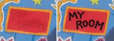
Nice explanation Lynne! I've had similar issues too in the past. I really don't like the way text tends to hover over artwork, so whenever possible I avoid using text within the artwork. Shop signs are an inevitable exception though. Well treated!
Looks amazing! Do we have a publishing date yet?
Remember I mentioned a while back about hoping to have my own picture book published soon? Well, that is about to come true in the next few months! A picture book I illustrated is to be published end of summer :)
Congratulations Louise! That's great news - well done. You are going to beat me to it big-style, as 'Swap!' is unfortunately not going to be around for some time yet. The new publication date is August 2014, simultaneously in the UK, US and Australia.