new posts in all blogs
Viewing: Blog Posts Tagged with: pastels, Most Recent at Top [Help]
Results 1 - 25 of 82
How to use this Page
You are viewing the most recent posts tagged with the words: pastels in the JacketFlap blog reader. What is a tag? Think of a tag as a keyword or category label. Tags can both help you find posts on JacketFlap.com as well as provide an easy way for you to "remember" and classify posts for later recall. Try adding a tag yourself by clicking "Add a tag" below a post's header. Scroll down through the list of Recent Posts in the left column and click on a post title that sounds interesting. You can view all posts from a specific blog by clicking the Blog name in the right column, or you can click a 'More Posts from this Blog' link in any individual post.
I've not reported on my picture book artwork recently, but it's going really well. I'm not used to the slow pace though: normally I would be head-down every day, so things would move along at a reasonable pace. It generally me takes 6 - 8 weeks to complete the pastel stage of my artwork, but this year I am getting 2 days a week instead of 5, so it's taking more than twice as long as normal, which feels like an eternity!
There's a worse snag though. Back at the outset, when I calculated how long it would take, I worked on having 3 days a week, since my residency project is only 2 days, but the extra admin of juggling both projects, plus all the back and forth emails setting up my various educational visits, not to mention writing this blog of course - all that stuff wipes out at least one day a week. Which means that I have been slowly creeping more and more behind schedule.
So, I've been pretty stressed, working late most nights to try and keep up, worrying about how to break the news to my publisher. In the end though, when I finally plucked up courage, they were great. My editor not only extended my deadline to fit the new timescale, but added a couple of extra weeks, to give me wriggle-room. HUGE sigh of relief! In all my years as an illustrator, I've never missed a deadline, so I'm delighted and feeling much better.
As you can see, I have been working recently on some of the single pages. This is because all the double page spreads are now done (hurrah!), all EXCEPT one of the most complex of all - the final spread, which I have been putting off:
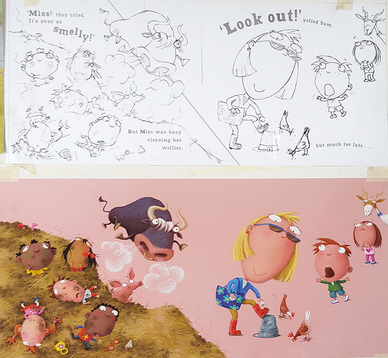
The two illustrations above are from the middle of the book, where the bull is loose and stalking various children, prior to tossing them into the air. Oh no! Oh yes... You wicked author Julia Jarman!
The one below is from quite early on, before things go pear-shaped on the farm. Julia's text says:
They saw ducks dabbling in the lake,
And cows vibrating - making milk shakes.
Tee hee.
When I finished the last of these three pieces yesterday, I suddenly realised that everything was done, all except - yes - that final spread. So I'm nearly there.
Before I can even start colouring that last piece though, I have to trace it up onto my pink paper, which will take ages because it's so detailed, and be VERY boring. Unfortunately (fortunately?), I am going to struggle to get that job done at all next week, as I have a pretty full schedule, with my usual two days residency at the Morgan Centre, plus a lecture in Sheffield, then a school visit entailing an overnight stop in London... Good grief. it's all go.
No excuse the following week though. I'm guessing it will take me 3 - 4 days to pastel up the last piece, instead of the two I generally allow. Then, finally, the last job is to cut lots of card and paper, ready to mount everything up for sending off to the publisher. Another boring but necessary task.
Or maybe I can twist John's arm to do that bit for me...
I am gradually creeping forwards, though it's taking longer than I would like. So many fiddly bits! I am rather pleased with the effect of the muck heap though. My favourite bit on this one is the knitting sheep though. And I really like how the cockerel colours contrast so well against the background:
This is spread 3, coming directly after the artwork I showed you last. You can see Julia's text on the rough which, as usual, was tacked to my drawing board directly above the artwork as I worked, to allow me to keep checking the details of what I was creating, because of course, when you use pastels, a lot of that detail from the pencil drawing gets obliterated:

It's useful, taking a photo of the artwork once it's done. I hadn't realised this before but, seeing it reduced like this really helps me to spot things I've missed. A book like this is a bit of a nightmare, making sure I have coloured every tiny shoe, not missed out any hands, left off any freckles etc. I can see, looking at this artwork, I have forgotten the eyebrows on the lad throwing the muck at his classmate, so he doesn't look quite naughty enough. I'll just go and fix that...
As you probably already know, I am working on my artwork in a rather random order. Actually, it's not random to me: it's about content on the page, rather than story progression, but it probably looks random from the outside. Having drawn the smelly muck heap spreads, I went back a bit and tackled the farmer and the prickly haystack. I wanted to get the look of the muck heap under my belt first, then I could ensure that the haystack looked sufficiently different.
This was a lovely bold spread, so much easier to tackle in pastels. It another one where the background will be dropped in later, in a nice, bold colour, which is why there is so much of my pink paper visible. I have already established the look of both the farmer and the bull in earlier spreads, which made things even easier.
When that was finished, I thought I would go back to the other spread where that same gate appears: spread 2. As you can see, the muck heap is just being delivered to the field, complete with stowaway piglet. At this stage, Class One are still oblivious to the bull, though the reader can't fail to notice him glaring through the gate bars:
Of course, this was a much fiddlier piece to do and, in the end, it took nearly 3 days to get all the detail in. The pastel 'clogs' after a while: you can only build it up so much, then you have to use fixative, which allows you to continue to layer over the top. Having fixed it when it was 2/3rds finished, I had to more or less rework everything, to bring back the brightness of the colour. A bit of a nightmare, especially when there is this much going on. Fixative has always been an unfortunately necessary evil.
Here it is on my desk, with the rough I always mount alongside, for guidance. That will allow you to read Julia Jarman's text:
Before people send me messages pointing out that I've 'missed a bit', the writing has been left off the sign on the gate deliberately - you always leave text off picture book artwork, so it will work for foreign editions. I will create the 'Beware of the Bull' text separately, so it can be taken off for any translations.
You might also notice another little anomaly in that area of the illustration. In my rough, there is more of the bull showing. Actually, on my very first drawing, it was just a tail visible, as a teaser, but my art director thought we should see a bit more of him. My re-work of that rough is the one above. However, when I was preparing to start the artwork, tracing the image onto the pink paper, using my lightbox, I forgot to trace the bull's body! I noticed my error in plenty of time, but thought it actually looked better. With just his face, it looks like he's hiding, and yet he's perilously near to the boy, which I think will amuse my young readers.
So, I coloured up the spread with just the bull's head showing and have sent the photo to my art director to see if they agree. I can easily add the body back in if they would rather. Cross fingers they like it as it is!
I have been working on a couple of illustrations from the middle of the Class One Farmyard Fun. This is the bit where the bull is free and biffing people into the air, left right and centre. He tosses a whole bunch of children into a smelly muck heap and is then creeping up on the teacher...
As usual, I stuck other previously finished pieces onto the drawing board, to use as colour reference for the characters:
Perversely, I tackled the muck heap illustrations in reverse order. This is the one I did least week, where the children are already in the muck. Teacher is too busy wiping muck from her wellies to notice the bull behind her...
The background on this one has been left blank (the pink is just my pink paper), because I intend it to be cut away to a block colour, which we will drop in digitally. Or rather, 2 colours (which is what the diagonal line on the rough is about).
This digital background technique is firstly to create additional visual variety as the reader works through the book. I hit on the idea of the two-coloured background because, when doing the original rough, I had trouble with the scale of the children against the teacher / bull scenario. The kids should really be much bigger, if they are in front, but this didn't work, because they eclipsed too much of the page and didn't allow teacher and the bull enough impact. But I wanted a spread, for added drama. Hmmmm.... problem! By slicing the background into two colours, I am hoping to create a half-way house between two separate illustrations side-by-side, and a single spread.
I have just this morning finished the artwork for the spread before the one above: one of my favourites:
The children are flying through the air and landing in the muck heap. I created a stowaway piglet in the muck heap earlier on in the story, so it was fun to have him here, worrying about children landing on his head!
Next, I'm going to tackle a spread with the bull up close, a nice simple illustration for once, with the poor farmer flying through the air, about to land in a prickly haystack. Hee hee. Thanks for the great subject matter Julia.
I had a bit of a time, trying to get the first spread of Class One Farmyard Fun finished off. It was SO fiddly. Unfortunately, there are quite a few spreads in the book with this level of complexity (I have only myself to blame, since I designed them!). Fiddly and pastels do not go very well together, so my pastel pencils had to be brought into the action quite a bit. The pencils are great for detail, but the colour is not as rich and dense as the pastel sticks, so I then have to go over the top of the pencil elements with regular pastel, to give it oomph, trying not to blob where I don't need it.
Yep, a nightmare, and very slow, but worth it in the end:
The other tricky thing is keeping track of who's who with the children in the class. There are so many of them, all with different complexions, hair colour and outfits, it will be very easy to get them mixed up along the way. So I added little colour swatches to my 'crib sheet' - the original sketch-sheet where I designed the various children. I can use this as an aide memoir on my desk, as I work my way through all the artwork.
I was working until 7pm on Saturday night, despite having a nasty cold (pause for violins...), because I was desperate to get this first spread finished, before I started Book Week and had to stop work until March 7th, because of being out every day in schools.
I just got done in time and, on Sunday afternoon, I headed down to Bedford, ready for Monday's school event at Cotton End Primary. Since the school is near to where Julia Jarman lives, John and I drove down and stopped overnight with her, which was lovely (thanks Julia!). Every day of this week has been a different place - I've been zipping all over. It's always the busiest week of the year. Back to normal and making a start on my next spread on Monday.
It has taken absolutely ages to get the go-ahead on my roughs for Class One Farmyard Fun. I was beginning to be concerned... Perhaps the publisher hated them. Maybe there would be loads of redraws to do...
I needn't have worried. They finally came back and there was less than a day's worth of changes needed. Phew! I don't know what the delay was, but at least it's sorted now and I am up and running at last.
The first job was really really boring: working out what dimensions to do the artwork (based mostly on how big the final package will be, for posting), enlarging all my roughs to that size, printing them out and then tracing them up onto pastel paper on the lightbox (with all the blinds drawn). Tedious. At least John helped out by cutting all the pastel paper to size, so that was one less boring job.
I've made a start on the pastel bit now. The first marks are a bit scary as I don;t really know what colours I am going to do things - I work it out as I go along, starting with the big 'givens', like blue sky, green grass etc, then making everything else coordinate and contrast. It's going to be a bit of a slow one, as there is such a lot of detail (all the kids in their little outfits...). Because of my Artist-in-Residence work though, I only have half each week, so that will make it twice as long as it would have been.
A long haul. better get to it!
I had a bit of an adventure recently...
It began with me getting a plane to Scotland on a Sunday afternoon. Things got off to a dodgy start though - I nearly missed my flight. I had bags of time, right up to the point where, approaching the departure gate, I realised I'd left my watch in the tray at the security bit, so had to try and get back through. It's not so easy in the other direction. 'Last call for Lynne Chapman...' Luckily someone had handed my watch in. Thank goodness I noticed before I got on the plane.
I had been invited to spend 4 days at the International School of Aberdeen: the longest school visit I think I've ever done. I was put up in a rather nice hotel and had a big, if VERY taupe room: not a whisper of colour anywhere!
Bizarrely, on that Sunday night, I was the only person staying in the entire hotel. I could have run naked through the corridors at midnight. Instead I was very boring and went to bed. Well, I needed to be up bright and early for my first day at school.
The excitement was at a pretty high level before I even got there but, as the days went by, it got better and better. I moved around the school to a constant soundtrack of 'There she is!' and 'Look, it's Lynne Chapman!' with children waving and calling hello. I was nipping to the loo one lunchtime when I overheard an excited whisper: 'Look, she's going to the toilet!', as if it was a shock that I actually needed to.
I kicked off that first Monday morning with a lecture about how picture books are created. They had a totally gorgeous theatre. It was packed tight with all the kids and quite a few parents. I immediately felt very welcome. Everyone was obviously really keen and the talk went down extremely well. Good start!
I read stories and larked about with the younger ones as usual. I read Rocky and the Lamb for the first time in ages and we designed monsters. These are some of the children's monster drawings. Very inventive - I love how they often come up with elaborate stories about their invented creature:
At the end of the session, I got them all to hold them up and make a monster noise:
With the slightly older ones, I had time for 2 different workshops for each group, which is very unusual - normally it's a squeeze to see everyone once. This meant I could try a couple of new things. After passing on all my hot tips for creating characters (basically the 'best of' my Craftsy class), I tried demo sessions, showing them how to colour artwork. Some classes experimented with the Inktense watercolour pencils I love so much and others used pastels.
I did a big demo-drawing of Giddy Goat in pastels to show them specific techniques. I added to it over the days until it was finished and left it with the school as a present. These are a few of the pastel drawings the children created:
It was a bit scary doing something I've not tried before, but the children were great and absolutely loved the Inktense watercolour pencils. Both children and teachers were all so enthusiastic about everything I shared, I walked around in a warm glow all week.
I was looked after really well too. I was taken out a couple of times for meals in the evenings with the school librarian who had booked me (Thai and Lebanese - yum). I even got to try my hand at an after-school yoga class (oh dear: lots of creaky bits). Come Thursday afternoon, I was almost sad to be going home.
Luckily, the flight back home went without incident or recourse to stupidity.

By:
nicole,
on 1/31/2016
Blog:
the enchanted easel
(
Login to Add to MyJacketFlap)
JacketFlap tags:
girl,
winter,
flowers,
fantasy,
snow,
painting,
acrylic,
children's art,
kawaii,
pastels,
canvas,
whimsical,
snowdrops,
mythical,
icicles,
the enchanted easel,
Add a tag
 |
silence of the snowdrops
8x10 acrylic on canvas
©the enchanted easel 2016 |
winter, my favorite season. meet Eyra...."silence of the snowdrops".
this is my most favorite painting i have ever done. i am a winter lover through and through and nothing will ever change that. snow, icicles, cold air, snowdrops....i love all of it. tried a softer color palette for this piece to (hopefully) convey that frosty feel that winter brings and i also tried a bit of a new technique (which i am currently obsessing over)...
MULTIPLE coats of gesso on an already pre-primed canvas. i. am. smitten. i wanted something smoother, something that didn't *eat* the paint like the very lightly pre-primed canvas did. i tossed around painting on wood but then didn't want to have to go down the road of heavy shipping rates being that the wood is considerably heavier than canvas. plus, i love canvas....painted on it since i was a little girl when i got my hands on my first paintbrush so i kind of have a sentimental attachment to it (big surprise, what am i NOT sentimentally attached to?!). anyhoo...i have found that 6 coats (yes, 6) got me the texture (or lack of) that i was seeking. applied in alternate directions (one app-vertical, next app-horizontal...and so forth) with LIGHT sanding in between...paint applied like a dream. time to start buying gesso in buckets...:)
beautiful little Eyra is for sale as a PRINT
here with other novelties featuring this lovely
here.
see, winter can be beautiful...:)
*ORIGNAL PAINTING IS FOR SALE. EMAIL ME
HERE IF INTERESTED.

By: Christopher Denise,
on 7/7/2015
Blog:
Christopher Denise
(
Login to Add to MyJacketFlap)
JacketFlap tags:
Character Deisgn,
The Great Redwall Feast,
Christopher Denise,
Children's Books,
Original art,
Redwall,
Otters,
Pastels,
Brian Jacques,
Add a tag
Getting this Redwall painting ready to offer at my ETSY shop. I love drawing otters!
A nice surprise package arrived this afternoon. I was trying to work out what it could be, as I wasn't expecting anything big and flat. I had completely forgotten about the American editorial commission I took on at the beginning of the summer, via my US agent:
I haven't worked in editorial for years, though it was where I learnt my trade, back in the late '80s. On publication day, they always send you at least one copy of the magazine, for your portfolio. So here it is!
The spread was for Spider - a subscription magazine for children, mainly full of stories and poetry, with some activities to try. This fabulous front cover illustration was done by Dom Mansell:
If you are interested to see how the artwork was created, I blogged the process in three different stages and you can see them all here.
This large pastel painting was one of the first that I created while illustrating The Great Redwall Feast (Philomel Books, 1996). I remember trying to create a sense of discovery, much as we do when reading Brian's first Redwall novel. Tucked into Mossflower woods on two sides, the meadow and the great road on the others, we see Redwall for the first time! This book and image pre-date the animated series by several years. This view of Redwall would be from the south. This small party of woodland characters is probably returning from St. Ninian's.
The finished art area measures approximately 13 inches x 16 inches, roughly 133% larger than the reproduction in the book.
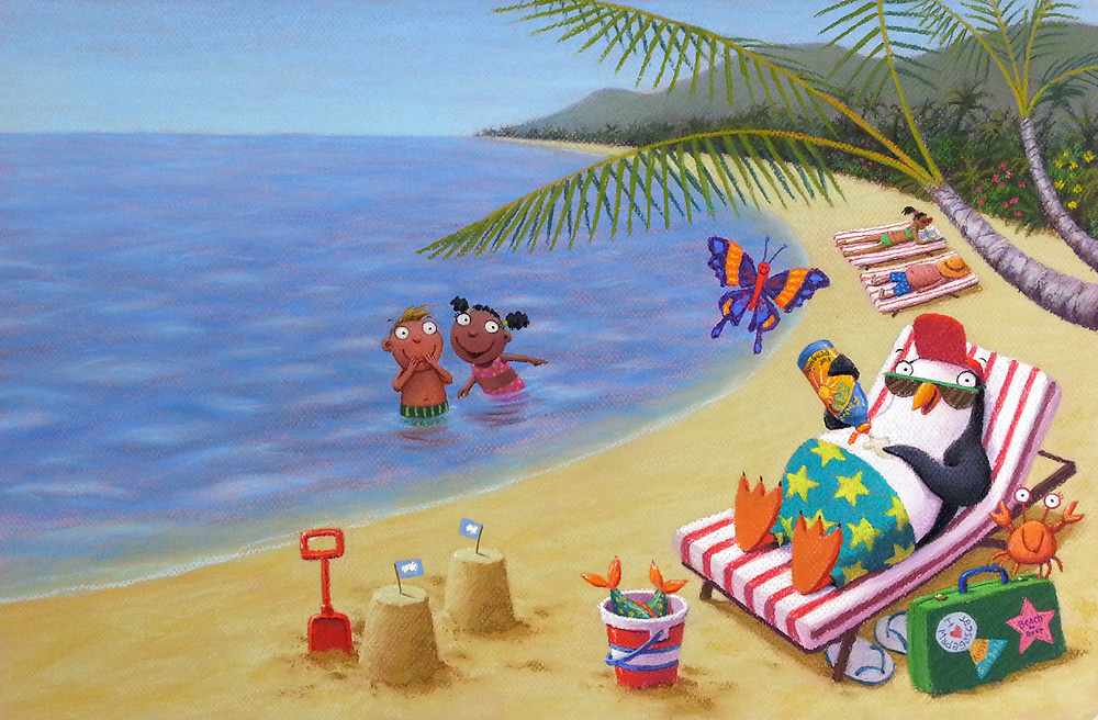
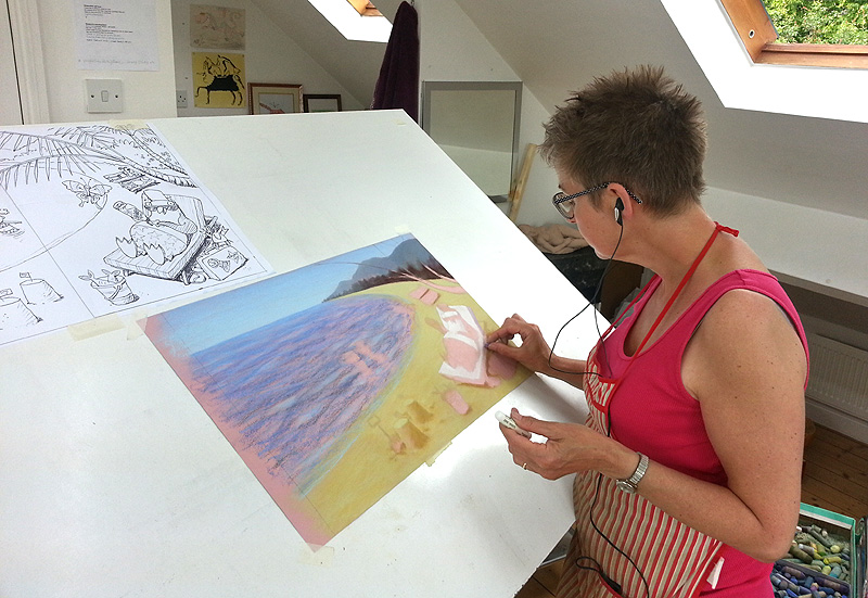
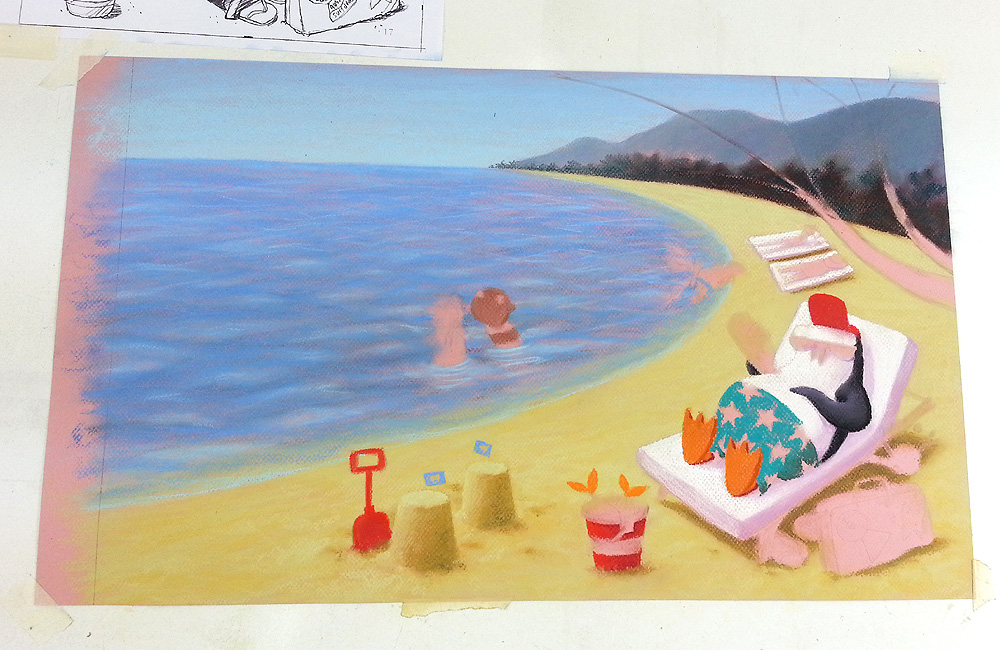
I'm been continuing work on my penguin artwork for Spider magazine. I didn't quite get it finished on the 2nd day, as I suspected. Not far off though. Mainly the butterfly and the palm leaves to do. This was how it was looking at the end of Day 2:
Unfortunately, once I had done the butterfly, I had to fix it. I couldn't draw the palm leaf fronds on top of the background without doing this, as the paper was too packed with pastel to take another layer.
As you know, I hate fixative because it messes things up: everything goes a bit dingy (and strangely, while everything else gets darker, the blacks go less dark). Once it was dry, I had to spend a while re-lightening certain areas, then adding back the darkest shadows on the penguin. At least fixing the base layer will make the artwork slightly less vulnerable.
I had to turn everything upside down to do the writing on the sun cream. REALLY fiddly. Hope it is legible, so people get the joke:
There's another wee visual joke on the sandcastles, which you might not have noticed: I have used the Antarctic flag, since that's where Mo has come from.
The palm leaves were a bit I was not looking forward too, so I left them until last. I knew they would pull it all together, but also knew they could seriously muck things up if I wasn't very careful. This was how things looked at lunchtime on Day 3 - finished at last.
The courier is coming to pick it up any time now, to wing it across the ocean to America. Let's hope they like it! The Penguin Who Didn't Like Snow is due for publication in the November/December edition of Spider magazine.
It took me most of the morning enlarging the line work and printing it out, cutting my Canson Teintes pastel paper to size and then tracing the image up on the light box. Then, finally, I was ready to go.
Here I am getting stuck into the artwork. I laid down the background first, as you do with pastels and am just beginning to pick out features:
It's been so warm lately and it gets really hot in the studio, being at the very top of the house, but it's been really nice to have the windows open. We have Veluxes on both sides of the roof, so you get a lovely through-breeze. It's almost like being outdoors, if you use your imagination, because we get birds sitting on the roof outside too. Sometimes I hear scrabbling scratching noises - the toenails of the fat pigeons slipping on the slates outside the window!
This is how things stood at the end of the day. Still at least another day of work to go I would say, but it's getting there:
By:
nicole,
on 9/9/2013
Blog:
the enchanted easel
(
Login to Add to MyJacketFlap)
JacketFlap tags:
nursery art,
the enchanted easel,
slumber,
cute,
clouds,
painting,
sketch,
children's art,
elephant,
baby,
sleep,
moon,
stars,
pastels,
whimsical,
celestial,
Add a tag
 |
eli in slumberland
©the enchanted easel 2013 |
is what is on the table this week. actually, i started him over the weekend and am about half way done. this cutie is a SURPRISE gift for a wonderful part of my neurosurgeon's staff...who's expecting her first baby next month. (let's hope she doesn't follow my blog, or i've just ruined the surprise...).
since the baby's gender isn't known, i decided to go with a neutral gender friendly color palette of soft yellows and a multitude of pastels. and because i'm like a child, i have to name EVERYTHING so...i named the elephant eli. could be short for elijah, if it's a boy or elison, if it's a girl.
either way, i'm super excited to deliver this to jackie. hopefully by the end of this week! these people have taken such amazing care of me in the last three years after three neck surgeries, that NOT doing something for her would just feel so wrong.
oh, and i will be selling this piece as a PRINT as soon as i get it scanned. below are some peeks at the process of little eli in slumberland. i "heart" this elephant :)
 |
| ©the enchanted easel 2013 |
 |
| ©the enchanted easel 2013 |
By:
nicole,
on 9/4/2013
Blog:
the enchanted easel
(
Login to Add to MyJacketFlap)
JacketFlap tags:
acrylic,
children's art,
mermaid,
kawaii,
sea,
jellyfish,
pastels,
whimsical,
October,
mythical,
original painting,
nursery art,
the enchanted easel,
opal,
gemstone,
girl,
Add a tag
October's mermaid.
loving the way her hair turned out...and the cute little jellyfish, of course ;)
she is listed FOR SALE HERE:
go have a peek at the other mermaids in the series also listed for sale in my shop.
next up...little Esmerelda, May's mermaid, based on the gorgeous gemstone emerald. i'll be posting the sketch soon...:)
I am doing a lot of waiting at the moment. I can't proceed with my mural until I get the go-ahead on the rough and I am also waiting to hear back from publishers about book projects. I hate that 'in-limbo' feeling, so have decided to get on with other things and forget about it all.
Over the Bank Holiday weekend, I was inspired by all the different work I saw at Sheffield's Open Up. It's so lovely to visit other local artists, especially in their work space. Since the weather was so lovely at the start of the week, I took my pastels out into the Peak District for some sketching:
I don't normally use pastels on location, as they are really messy, tricky to transport and the results are a bit of a nightmare to get home unscathed (especially as I can never resist the double-page spread). But I tried doing it once last year, during a SketchCrawl out in Edale and was really pleased with the results...
...so I had another go on Tuesday morning. The one below was what I spent most time on. The light changed a lot, as the sun was in and out, which was quite a challenge, but I didn't mind, as I wasn't trying for naturalism, more an impression, capturing colours and shapes:
I tried fixing it, but of course, all the colours were immediately dimmed and it lost its impact (grrrrrrr...), so I then spent ages reworking it, to brighten it up, and didn't spray it again.
Then I did the drawing at the top very quickly, as the sun had gone and things had turned windy and cold. I used a 2nd sketchbook, so as not to damage the first drawing any more than was necessary.
I was back in the studio by lunchtime, so felt very pleased with myself. It was just what I needed to kick-start the day.You can see the rest of my sketchbooks on my website or, if you are interested to watch me create a sketch, take a look at this film from my YouTube channel:
All the pastel artwork for my latest book Swap! is now done. Hurrah! The last pieces, which I finished this week, were the front endpapers:
These little images will be shrunk down still further and used to create a repeat pattern in the front of the book. I think perhaps this is my favourite one:

These illustrations show Lucy and Sparky before they swap places. The
back endpapers, after their little adventure, are rather different!
John mounted everything up for me, but my final task, before sending this 2nd batch off to my publisher, was a continuity check. It would be so easy to miss off Sparky's whiskers, or Lucy's sock tail, or get her mud splots in the wrong places. I have already spotted a discrepancy in Sparky's markings and had to make changes. As half the artwork has
already been scanned, I had to change the new pieces to fit the first batch.
To try and get an overview, we laid out all the artwork so I could see as much as possible at once. But there were too many illustrations (or insufficient surfaces) to get it all out at once, so I did it in a couple of batches.
I did spot a couple of things, so good job I checked!
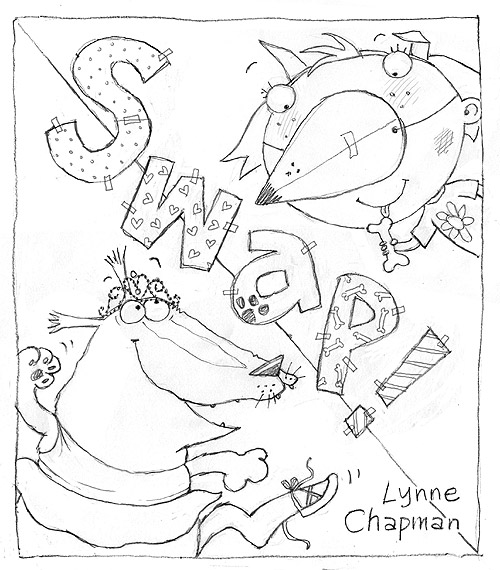
Yes, I have coloured Swap!'s front cover! Do you remember I talked you through the process of designing the cover a while back? The winning rough was this one:
I left the pastelling until virtually the end (I still have the
front endpapers to do), so I could be sure I was truly warmed up to the characters and properly motoring. I'm so pleased I was allowed colour for the text on this one, as I think it makes a real difference. Often the title text is black: it's been that way on quite a few of
my other books. That's to save money on translations (all the translated text goes on together, throughout the book, in a single black, which is cheaper than paying for extra colours).

There's a massive bleed on this piece of artwork: you can see I have extended the illustration on the two sides and bottom. I always provide a 5mm bleed on my illustrations, which is standard to aid the printer, but covers always need more like 30mm. I'm not 100% sure why (perhaps to allow for the larger paper jacket the US editions sometimes employ). It will be cropped back, on the UK edition at least, more or less to what you see on the rough. The background 'triangles' will be created in Photoshop once it's scanned.
Right, those endpapers next...
Every year, I used to design my own Christmas card to send out to clients, family and friends. But for the last 2 or 3 years I've been either too busy or too lazy and have let things slip a little. This year however, I've got things sorted already...
Yes, this is Giddy Goat, albeit looking a little compromised by his circumstances! He's being sold to raise money for charity by It's Good 2 Give, who support young people with cancer, and their families, in a whole range of fantastic ways.
There are other lovely designs you can choose from too. I particularly like this stunning Robin photo which won a photography award for Alexis Manson in the Royal Botanic Gardens Edinburgh / Scotsman photo competition this year.
All the cards are packed in ten’s and cost £3.50 per pack. NB: I don't have the cards at my end: you order them here.
Today I am out doing a school visit in Nottingham, but for all the rest of this week, I have been working away on my Swap! artwork. On Wednesday morning I finished off the school room illustration I was half way through last time we met:

Since Wednesday was a nasty, overcast day (hence the slightly dingy-looking photo), I pulled the blinds and set-to at my light box, tracing up the last two pages I've yet to do. Of course that doesn't include the cover artwork and the front endpapers (which you remember are different from the back ones on this book, which I already coloured, just before the first batch of artwork went off to Frankfurt). At last the end of the actual story is in sight though.
I decided to tackle the other 'school chaos' illustration next, as I could use the image above as reference. It's so tricky making sure the various kids remain constant across the different spreads - who has teeth showing, who has freckles, which child has which hair colour, which hairstyle, which hair slides...

I got it finished by mid-afternoon yesterday. This is Sparky's favourite part of the school day: the lunch hour. The publisher asked me not to make the food too obviously English, so I gave them a choice of pasta or good old sausages and mash. I don't know if you can make the food out - the light was bad again, so it's a wee bit fuzzy:
Before the end of the day, I just had time to sort out all my gear, ready for today's visit to Ambleside Primary School, where I will have a whole day with a single Y3 class, which is quite unusual. We'll start with an illustration workshop in the morning, then use the images we create to weave stories for a creative writing workshop in the afternoon. That's the plan anyway - wish me luck!
Finishing this spread seemed to take forever: sometimes I lose momentum if I stop half way and it takes a while to get things up to speed again. Anyway, I finally got it done by Wednesday afternoon:
The next one I tackled was Sparky's first go at being Lucy:
I'll be honest: I chickened out at the start of doing the Swap! artwork and pastelled all the easier bits first. Unfortunately, that means I have some really tricky, complicated pieces to finish off with. This kind of heavily detailed illustration is really not what pastels were designed for, but with patience I'll get through it. I find listening to stories while I work is very calming.
I made a good start on the classroom spread on Thursday, so I'm hoping another day might be enough.

By:
Lynne Chapman,
on 9/24/2012
Blog:
An Illustrator's Life For Me!
(
Login to Add to MyJacketFlap)
JacketFlap tags:
drawing,
digital,
sketchbook,
Swap,
artwork,
pastels,
watercolour pencils,
scans,
illustration,
Photoshop,
Add a tag
I try not to work weekends. Self employment is inclined to gobble up your private life if you're not careful. But things are really full-on at the moment. My latest deadline in Thursday first thing, so my Sunday had to be sacrificed to Swap!. At least I got Saturday. It was a gloriously sunny day again and, since each one could be our last, we drove out to Chatsworth, to spend the day in the gardens, looking at the Barry Flanagan sculpture exhibition. I did some sketching towards the end of the afternoon. Thought I'd experiment with a crazy colour hare, after my Colour Games workshop.
I was about to attempt the drawing below, the same hare from the back, when a couple of children came over to ask what I was doing. I explained, showing them what I'd done so far. Their two friends came over and joined in. They were curious about my pencils, so I gave them a quick demo-scribble in the back of my sketchbook.
I asked if they wanted to try. Well, that was it. They got so excited, especially about the water brush, that they all set-to in a huddle while I chatted to their parents (who kindly offered to leave them with me for an hour or so...). They created this spread together:
We rounded off the day watching some cricket, which I know nothing about, but it was a good excuse for sitting on the grass just a bit longer.
But Sunday it was down to work: the scans have come back from that first batch of artwork I sent off a couple of weeks ago. Now the rush is to get them all cut-out in Photoshop by Wednesday night. I need to get rid of the pink paper backgrounds and replace them with flat digital colour, like the illustration at the top and below.
You can see the rough of this illustration and my pastel artwork before the cut-out job here.
My previous books with Gullane have had colour backgrounds on the covers, but been cut away to white on the inside, but I feel this one is calling out to be more funky. I'm having fun seeing how they look on the colours - it makes them really come together.
Do you ever have a task that you just can't seem to quite get finished? That's how I've been feeling about the two illustrations I've been working on for the last week.
Perhaps it's partly because I've had only the limited reference of the little dancing endpaper vignettes stuck to my desk, but I suppose it's mostly because they are both a bit fiddly.
The illustration above is Sparky telling Lucy that he won't swap back yet - he wants to have a go at ballet class (although clearly he's going to have trouble with those tiny shoes!). This is the rough I had a bit of trouble getting right. The publisher decided they liked this layout best.
The illustration below comes slightly later, after Sparky has been humiliated in class. Lucy is expecting him to want to swap back now (but she's in for a nasty surprise). If you're interested, I explained earlier on how I designed the drawing for this image.

I decided to work on the two pieces together, like earlier, as they featured the same characters, so it made it easier to keep them consistent, but also helped me to choose the colours of people's outfits, hair colour etc, having both contexts in front of me (I wanted to get a nice even balance of colours across both pictures).
At last I finished both illustrations on Monday, at 6.30pm - I was determined not to stop work until I had done. Still, after John mounted them up for me this morning, I noticed I had missed off Lucy's sock tail on the smaller piece, so had to quickly pop it on and I have just this minute noticed that Lucy's eyebrows are missing - she doesn't look smug enough without them!
Both these illustrations of Lucy also need some mud, from the earlier incident where she is digging holes in the garden, but I want to wait until the earlier pieces of artwork come back from the publishers, to make absolutely sure I put all the mud splodges in the right place.
On Thursday morning, I discovered that the deadline for getting my Swap! artwork to my publisher, in time for them to prepare it for presentation at the Frankfurt Book Fair, was today. Yikes! I thought I had a little longer, and have been trying to get as much done as possible but, come Friday afternoon, I had to stop and post what I'd done to date.
It's not too bad: I've completed over 7 spreads, so enough to get a good flavour of how the finished book will look.
Luckily, with John to help me, I was relieved of the task of cutting all the mounts, labelling all the artwork and packaging everything up, (which seems to take ages), so I was able to continue with the artwork up to the last minute. By Thursday evening I'd finished the spread I started that morning, the final spread of the book, and wasn't sure how best to spend my final day.
It's always a problem when half my artwork is sent on ahead - I'm left with no colour reference for the rest of the illustrations, so have to down-tools until it's returned. So, I hatched a cunning plan... I decided to spend my last day colouring something I wouldn't send with the rest:
I worked on the vignettes for the back endpapers, doing all 6 together, since they are so similar. Sparky is in lots of positions, so I get all his markings recorded, plus the ballet costume colours, ready to do the ballet spread next.
I have finished the two pieces of artwork I showed you last time, which were left half done on Friday afternoon. Sparky is enjoying tucking into Lucy's dinner (while she gets his dog food), when Mum calls out that it's Lucy's bath time. I am really pleased with this batch in particular. A big thanks to John for the suggestion of the yellow table, which really throws the other colours forwards.
Yesterday I finished a third piece from this part of the book, which actually comes before the other two: when Lucy looks at how much fun Sparky is having being her, suddenly realising she is going to have to remain as the dog forever!
This morning I have been tracing up a new one to begin work on this afternoon: the final spread of the book (the rough has been slightly re-worked again since you last saw it, to help sort out the gutter position a little).
I have to make yet another small change before the artwork though - my publisher is not keen on the chip being extracted from Sparky's nose.
Unfortunately though this is the last spread of the book, it is far from the final piece of artwork I have left to do. The pastel artwork will keep me busy for the rest of the month. No more days off in the sunshine for me! Best get on...
View Next 25 Posts


so beautiful, I love the way you are using the colors in this pictures. I can feel the sun and the wind... :-)
Beautiful colors:)What a great place to draw:)
Being in Nature and creating art....I can't think of a better combination!
Your interpretations are just gorgeous. Such splendid color...a delight to the eyes :)
Yes;] I plan to draw some landscapes soon too, Can't wait ;]