new posts in all blogs
Viewing: Blog Posts Tagged with: planning, Most Recent at Top [Help]
Results 1 - 25 of 103
How to use this Page
You are viewing the most recent posts tagged with the words: planning in the JacketFlap blog reader. What is a tag? Think of a tag as a keyword or category label. Tags can both help you find posts on JacketFlap.com as well as provide an easy way for you to "remember" and classify posts for later recall. Try adding a tag yourself by clicking "Add a tag" below a post's header. Scroll down through the list of Recent Posts in the left column and click on a post title that sounds interesting. You can view all posts from a specific blog by clicking the Blog name in the right column, or you can click a 'More Posts from this Blog' link in any individual post.
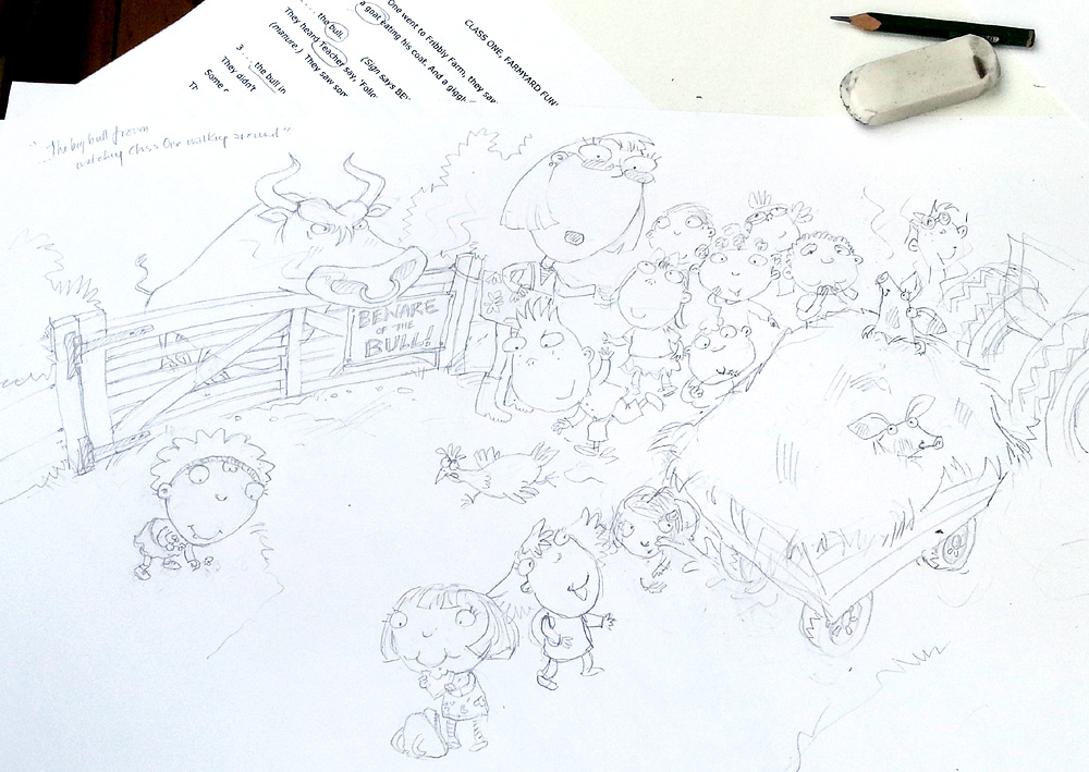
As you probably already know, I am working on my artwork in a rather random order. Actually, it's not random to me: it's about content on the page, rather than story progression, but it probably looks random from the outside. Having drawn the smelly muck heap spreads, I went back a bit and tackled the farmer and the prickly haystack. I wanted to get the look of the muck heap under my belt first, then I could ensure that the haystack looked sufficiently different.
This was a lovely bold spread, so much easier to tackle in pastels. It another one where the background will be dropped in later, in a nice, bold colour, which is why there is so much of my pink paper visible. I have already established the look of both the farmer and the bull in earlier spreads, which made things even easier.
When that was finished, I thought I would go back to the other spread where that same gate appears: spread 2. As you can see, the muck heap is just being delivered to the field, complete with stowaway piglet. At this stage, Class One are still oblivious to the bull, though the reader can't fail to notice him glaring through the gate bars:
Of course, this was a much fiddlier piece to do and, in the end, it took nearly 3 days to get all the detail in. The pastel 'clogs' after a while: you can only build it up so much, then you have to use fixative, which allows you to continue to layer over the top. Having fixed it when it was 2/3rds finished, I had to more or less rework everything, to bring back the brightness of the colour. A bit of a nightmare, especially when there is this much going on. Fixative has always been an unfortunately necessary evil.
Here it is on my desk, with the rough I always mount alongside, for guidance. That will allow you to read Julia Jarman's text:
Before people send me messages pointing out that I've 'missed a bit', the writing has been left off the sign on the gate deliberately - you always leave text off picture book artwork, so it will work for foreign editions. I will create the 'Beware of the Bull' text separately, so it can be taken off for any translations.
You might also notice another little anomaly in that area of the illustration. In my rough, there is more of the bull showing. Actually, on my very first drawing, it was just a tail visible, as a teaser, but my art director thought we should see a bit more of him. My re-work of that rough is the one above. However, when I was preparing to start the artwork, tracing the image onto the pink paper, using my lightbox, I forgot to trace the bull's body! I noticed my error in plenty of time, but thought it actually looked better. With just his face, it looks like he's hiding, and yet he's perilously near to the boy, which I think will amuse my young readers.
So, I coloured up the spread with just the bull's head showing and have sent the photo to my art director to see if they agree. I can easily add the body back in if they would rather. Cross fingers they like it as it is!
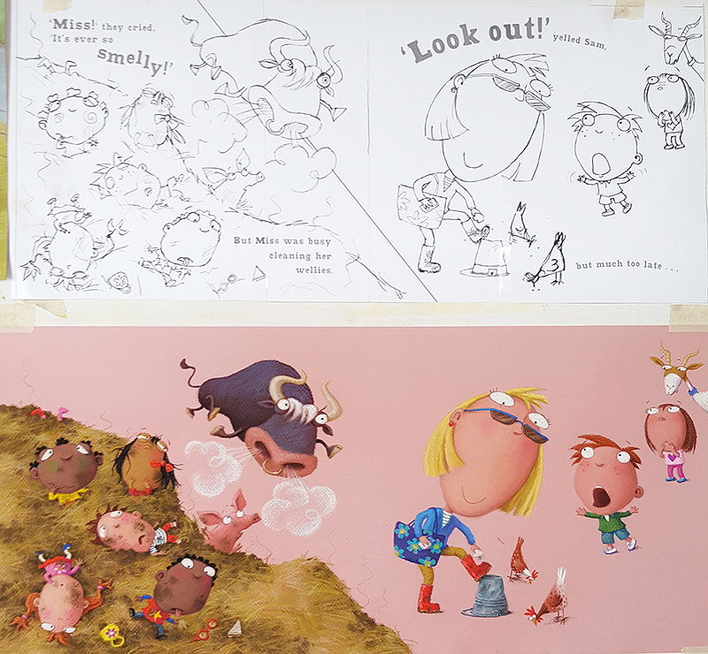
I have been working on a couple of illustrations from the middle of the Class One Farmyard Fun. This is the bit where the bull is free and biffing people into the air, left right and centre. He tosses a whole bunch of children into a smelly muck heap and is then creeping up on the teacher...
As usual, I stuck other previously finished pieces onto the drawing board, to use as colour reference for the characters:
Perversely, I tackled the muck heap illustrations in reverse order. This is the one I did least week, where the children are already in the muck. Teacher is too busy wiping muck from her wellies to notice the bull behind her...
The background on this one has been left blank (the pink is just my pink paper), because I intend it to be cut away to a block colour, which we will drop in digitally. Or rather, 2 colours (which is what the diagonal line on the rough is about).
This digital background technique is firstly to create additional visual variety as the reader works through the book. I hit on the idea of the two-coloured background because, when doing the original rough, I had trouble with the scale of the children against the teacher / bull scenario. The kids should really be much bigger, if they are in front, but this didn't work, because they eclipsed too much of the page and didn't allow teacher and the bull enough impact. But I wanted a spread, for added drama. Hmmmm.... problem! By slicing the background into two colours, I am hoping to create a half-way house between two separate illustrations side-by-side, and a single spread.
I have just this morning finished the artwork for the spread before the one above: one of my favourites:
The children are flying through the air and landing in the muck heap. I created a stowaway piglet in the muck heap earlier on in the story, so it was fun to have him here, worrying about children landing on his head!
Next, I'm going to tackle a spread with the bull up close, a nice simple illustration for once, with the poor farmer flying through the air, about to land in a prickly haystack. Hee hee. Thanks for the great subject matter Julia.

By:
Melissa Wiley,
on 3/10/2016
Blog:
Here in the Bonny Glen
(
Login to Add to MyJacketFlap)
JacketFlap tags:
Organization,
moleskine,
sketchbook,
fountain pens,
planning,
Household,
planners,
Nerd,
Midori,
Lesley Austin,
Paper & Desk,
Homeschool Record-Keeping,
travelers notebook,
Lamy,
Add a tag
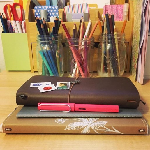
My everyday favorites. After a year of experimenting, I’ve got my system figured out. Top to bottom:
• Midori Travelers Notebook for my monthly calendar, weekly journal, and a scribble notebook;
• Moleskine Cahier for daily to-lists (bullet journal);
• Wild Simplicity Daybook for homeschooling notes and records (including our weekly Shakespeare lines—we learn monologues two lines at a time); and
• the Lamy Safari fountain pen my family gave me for my birthday. (LOVE.) (That’s an Amazon affiliate link but if you’re buying pens in the U.S., you should order from the nice people at Goulet Pen Company. Their instructional videos are invaluable, their customer service is top notch, and they offer inexpensive ink samples so you can try out all sorts of gorgeous colors. And that is not an affiliate link. I’m just a happy customer.)
I still keep the family appointments on Google Calendar, but I enjoy writing everything out in the TN monthly calendar (#017) as well. I use the horizontal weekly TN insert (#019) for chronicling the day after it happens—just a few notes about highlights. For the last several months I’ve used a blank TN insert (#003) for my bullet journal but came to realize I need a separate space for scrawling, sketching, doodling, working things out on paper. If I do that in the bullet, things get messy. WAY messy. So I’ve gone back to my old (cheaper) Moleskine grids for task lists.
The Midori travels with me everywhere; the bullet journal lives on my desk where I do most of my work; and the Daybook has a home in a basket by my rocking chair in the living room.
I’m laughing at how complicated this must seem if you aren’t a pen-and-paper fanatic…but I juggle a lot of roles (and kids) and I find having different paper spaces helps me keep things straight.
More nitty gritty:
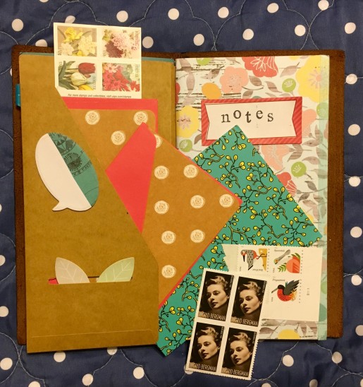
I also have a kraft folder (#020) in my Midori to tuck ephemera and snail-mail supplies into. Since I started carrying notecards and stamps around, I’ve gotten much more prompt with my thank-you notes.
• I love the feel of Prismacolor colored pencils on the paper Lesley Austin uses in the Wild Simplicity Daybook. I’m sure I’ve raved about this before—the lovely creamy pencil on this recycled paper with just the right amount of tooth.
• Prismacolor pencils also delight me in the bullet journal: I like ’em for filling in my checkboxes.
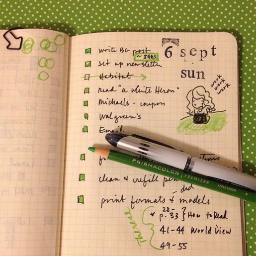
• This pic, which I’ve shared here before, shows my favorite way to organize a task list: to-do items on the right, and the verso is for related notes and numbers. I also keep a running “Nag List” on a sticky note that travels from spread to spread. It’s for important tasks that I might not get done today but I gotta deal with soon—like finishing my taxes or booking a doctor appointment. I consult it each evening when making out my bullet list for the next day.
• Sometimes I’ll tuck another insert into the Midori to be used for a specific purpose. For example, I keep a log of incoming and outgoing snail mail. I don’t like a superfat Midori, though, so more often that insert lives in my stationery pouch.
• As I mentioned, I do a lot of casual sketching in my blank Midori insert. I find I’m often more comfortable there than in my proper sketchbook, because it feels more casual. But I do have a couple of sketchbooks going and I try to work in at least one of them daily. One is a spiral-bound 7×10 Canson Mixed Media pad, which gets lukewarm reviews from real artists but I quite like its toothy paper—not to mention its price point when Michael’s has a good sale + coupon combo. You have to watch for it, but now and then they’ll give you a 20% off including sale items coupon during a buy-one-get-one-free sketchbook sale. My other sketchbook is a Moleskine Art Plus, and it’s…okay? I love its size and shape (fits nicely in my bag), but the paper is too smooth for my liking. I much prefer the feel of Moleskine’s watercolor sketchbook—a lovely texture to that paper. But so far I’ve mostly just used that for color charts.
• For sketching pens, I like Sakura Pigma Microns or my Pilot Metropolitan fountain pen (check out all the groovy colors at Goulet Pens) with Platinum Carbon ink, which is waterproof so it plays nice under watercolors. However, lately I’ve come to realize that what I enjoy most of all is sketching in pencil. I love the look of black or brown ink drawings, and most of the sketchbook artists I admire work directly in ink, but I really love the way a pencil feels on the paper. I keep hitting that point over and over, don’t I—the tactile experience matters more to me than how it looks.
Ha, this got long! Would you believe it was just going to be a quick copy-paste of something I tossed on Instagram today?
By: Sharon Ledwith,
on 1/4/2016
Blog:
Sharon Ledwith: I came. I saw. I wrote.
(
Login to Add to MyJacketFlap)
JacketFlap tags:
Happy New Year,
Writing Business,
Publishing Business,
Writer's Life,
Planning,
Success Strategies,
Sharon Ledwith,
Taking Stock,
Goalsetting,
2016,
Mirror World Publishing,
Add a tag
In the Tarot Cards, the Seven of Pentacles is all about taking stock. Reevaluating what you’ve been working on for some time, and reflecting on what you’ve accomplished so far. The beginning of a new year is a perfect time this. It’s a time for assessment and future planning, as well as a time for a change.
I’m lucky to be with a publishing company who sets business goals for the year and shares these plans with their authors. Some of these plans include to publish a certain amount of books while keeping slots open for authors who are writing an ongoing series, featuring a new book each month with blog posts, videos, and discounts, attending many events and festivals, and producing audiobooks. They want to continue improving and growing, and so do I. Part of that growth includes building their brand. And that’s my goal too.
So how am I going to continue building my author brand? By blogging weekly, sharing interesting and helpful information on the social media, helping other authors achieve their goals, connecting with readers through events and visits, offering sales and giveaways, and of course writing more books. Due to circumstances beyond my control, I’ve not been able to get more of my books into the hands of my readers these last two years. This will change in the upcoming year with the publication of the second installment of The Last Timekeepers series, The Last Timekeepers and the Dark Secretlater in 2016. I also plan to work on researching and outlining the third book in the series next year too!
My literary agent also has big plans as Walden House (Books & Stuff) has set up a satellite office in the UK, and will begin re-submitting the first book in my Mysterious Tales from Fairy Falls series throughout North America and Europe. Patience is the name of the game when you’re working with an agent, and since I’m busy producing my time travel series, it’s a win-win for me. This is the beauty of developing an author brand. When potential publishers check you out, you’ve got a platform and a body of work already on the go. And that’s when all your hard work and persistent effort will pay off!
Finally, I can’t stress this enough, but having a positive mental attitude helps tremendously. It will not only carry you through the tough writing times where you’re lucky to get a paragraph written in a day or make enough sales in a month to buy a coffee and donut, but will see to it that you stay true to your dreams. Trust me, you’ll have good days and bad days, but if you take stock on where you’ve been and how far you’ve come as a writer, things will become brighter, better, and lighter.
How do you take stock? Are you in a happy place now with your writing career? Wishing you all a very Happy New Year, and thank you for taking the time to read my blog! Cheers!
The roughs for Class One, Farmyard Fun are finished! Well, what I mean to say is, they have all been drawn up and submitted to my publisher. You never know at this stage whether you are actually finished or not - it is not at all unusual for there to be quite a few changes needed. We''ll see. This is the opening spread:
Actually, I had a bit of a false start - I thought I was finished, somewhat prematurely. I was just reading through everything with John, in preparation to emailing the roughs off to Hodder (it can be very useful to have a 2nd pair of eyes - John often spots things I've missed). It was all looking good though. Lots of chaos and plenty of children flying through the air...
Anyway, we read the last spread and the story ended rather suddenly. It was only then that I realised I had missed off the end! There's always a final single page, the one you get after the final spread. It's not always used - it depends on the book and the length of the text. In this series of books, that final page is always a sort of cautionary ending, sometimes with the hint of a sting in the tail.
I worked out what went wrong: when my art director printed me a slightly reduced set of layouts to work from (blank pages with just the text), the single page had got forgotten at her end. I didn't notice because of not working through the illustrations in order.
So, I had to go back to the drawing board (literally) and get scribbling again. This is what I came up with (the little girl will of course be wearing a red dress):
I have been really busy lately - even more than usual! I have mostly been dividing my time between my residency and my drawings for the new picture book Class One, Farmyard Fun.
The roughs are going very well and I'm very nearly there. It's been slightly frustrating, working in fits and starts, rather than just ploughing on every day until it's done, but in some ways it's been better, as having 'rest' days keeps me fresh.
I hit a snag though, so had a meeting with Julia Jarman...
That's not something we would normally do, but we happened to be working together in Durham, doing a couple of storytelling events for the big Gala Day at the Northern Children's Book Festival, so we grabbed our chance after breakfast at the hotel.
I was having a bit of bother with my knickers...
Actually, they were Julia's knickers.... Well, the knickers in her story anyway. The sort-of villain in the story, the bull, accidentally knocks himself out near the end, and the first thing he sees when he comes round is a pair of bright red knickers hanging on a washing line. Being red, they get him rather upset.
I was having logistical problems, getting the knickers in the right place for them to be directly in the bull's line of sight as he opened his eyes, because I also needed the bull to be looking out of the picture at us as he wakes, for dramatic impact. While battling with this, I got a good idea: why not get him actually tangled in the washing before he knocks himself out and get the knickers caught on his horns? Funnier.
But this created another problem. On the next spread, Sam, one of the children, grabs the knickers from the line and uses them to lure the bull away. If the knickers were actually on the horns, this wouldn't be credible for a 5 year old child to do, even in picture book world. So I introduced a washing prop, for brave Sam to use to whip the knickers from the horns.
The knickers are Julia's means of saving the day in the story: with the help of the teacher at the wheel of the farmers truck, Sam gets the bull to chase the knickers all the way back to the field where he came from:
All of which worked pretty well when I sketched it out, but it needed a significant change to the text - extra tricky, since the whole thing is in rhyme. So that's why I wanted to get together with Julia; I needed to show her my ideas, see if she agreed that it worked better and was funnier, and see how she felt about the text change.
Of course Julia was fabulous. She always is. She's such a great author to work with. She immediately got it. Luckily, we have a similar sense of humour, so she loved my idea. Within seconds, she was trying out bits of new rhyme aloud (much to the amusement of the hotel staff), experimenting with ways to create the new lines we needed. She had re-written it before I was back home at my drawing board. Thanks Julia!
I have now drawn everything and finished all but 4 spreads. They just need re-drawing (I always have to go through it all again, improving things and making changes). Nearly there. Better get to it!
In between my residency sketching days, I have been working on the roughs for Class One Farmyard Fun, my new picture book. It's another one by the lovely Julia Jarman, our 6th collaboration. It is full of all the usual fun and mayhem which Julia writes so well.
The action involves an escaped bull who moves around the farm, chasing various children and tossing then into the air. I tried to make a start, but was having trouble getting my head around the 'geography' of the story. I realised that I needed to create a map of the farm, so I could establish the layout and know which animals were where (ignore the 'flying' truck on the map by the way - that's me drawing a bit of reference off Google Images):
The map was instantly a great help. As I'm working my way through the drawings though, I am occasionally having to go back and make changes to the farm's layout, so that certain things will fall alongside others which are juxtaposed in the text.
For instance, I originally sited the whiffy muck-heap to the left of the bull, under the trees by the lake. The sheep had to be nearby, because Julia's text mentions them both on the same page:
They saw a lot of woolly sheep
And a cock on top of a whiffy muck-heap.
But they didn't see...
But this bit of text comes immediately after a page about the bull, so the two bits of the rhyme are on either side of a single spread. This is the first bit, about the bull:
...the bull in a strop.
They didn't see the big bull frown
Watching Class One walking round
Some of them wearing red
Which makes bulls cross - or so it's said.
I started off drawing this spread as two single pages, but there was such a lot of text to work around on the bull page, I couldn't get it to work.
So I combined the two sets of drawings and turned it into a spread instead. Which meant going back to my map and moving the muck-heap and the field of sheep over to the right of the bull. Unfortunately, this change had a knock-on effect on an earlier page, but at least I had got things to work at last.
This is not the finished rough. It's early days. I get better as I go along, so often come back and re-draw the earlier spreads.
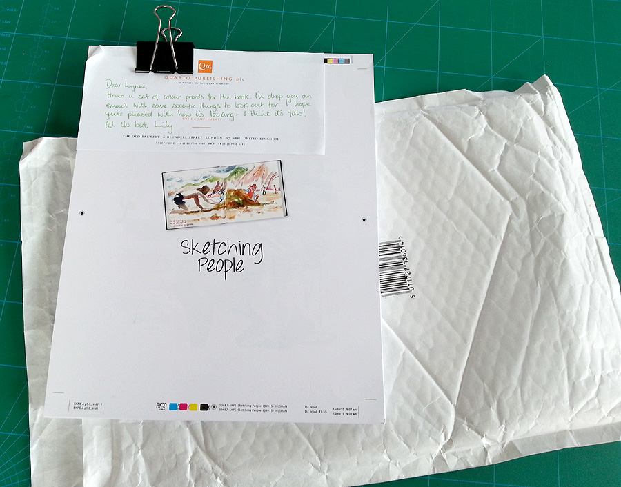
I received a package from my publisher just the other day, with some very exciting contents...
It was the colour proofs of my Sketching People book.
I seem to be juggling lots of different projects at the same time right now, but the urban sketching book is at least one which is very nearly finished.
The colour proofs are when you finally get to see what it's going to look like. Even though I've been very hands-on throughout the progress, I've been dealing with it in batches, so never had the chance to look at it as a complete project. Plus I'd never seen the final design of many of the spreads, so I couldn't wait to get a look.
By this stage, all the design has been finalised, all the text is in place, exactly as it will look, and all the images, whether photos or sketches, are in their final positions on the spreads. It was lovely to see everything looking gorgeous!
But I wasn't just sent them to admire: my job was to go through the whole thing with a fine tooth-comb, checking it over and making any final notes about alterations that needed making, or errors I noticed. That meant reading the entire book, which took a while, as you can imagine.
There were actually lots of little things I picked up, both to do with images and text: I made two pages of notes!
One slight complication was that this was the US version - the text has been Americanised throughout, which does not just involve changes to words, but also some big changes to punctuation. I was surprised to discover for example, that in the US, a colon is followed by a capital letter! There were also many differences over where comas are used.
The text will be re-Anglicised after the proofs have been approved, which means Quarto employing someone to make all the changes: apparently less complex than trying to re-instate my original text. All a bit odd, but everything is, as usual, very US-led. That's where the biggest market for the book will be, despite it originating in the UK.
The biggest single issue I picked up, was the placement of annotation arrows: used to point to where I am making specific comments about particular elements of a sketch. Many of them were not quite pointing to the right place, because my designer didn't always quite understand where I was referring to.
All sorted now though. I am very pleased with how it looks. The quality of the colour is great and the design really sets everything off beautifully (thanks Moira!).
I'm told that it should be ready for publication sometimes around the end of February. You can pre-order already, but don't worry - I will definitely be letting you know when it's ready.
Do you remember absolutely ages ago, I was telling you about how Julia Jarman and I often talk through her ideas for new picture book texts? Well, the text I was talking about was successful: it got contracted by the publisher, so we are off! The huge delay is entirely my fault, because I have had too much work on until now with my Sketching People book and my Craftsy workshop to be able to start the work.
It's called Class One Farmyard Fun and is a sequel to Class Two at the Zoo and Class Three all at Sea - both big favourites of mine and really good fun to illustrate, because of all the crazy things that happen on their ill-fated school trips out and about.
I'm really enjoying getting stuck into this new one. I started with characterisation, as always. All this series feature an entire class, so my first job was playing around, designing lots of different kids:
It's important that they are all different and suggest different personalities, like any real class of five year olds. They'll evolve a little I'm sure, as I draw, but I was very pleased with my first efforts.
I went on to have a think about the teacher. It's a woman again. This was my initial sketch sheet, trying things out. I've gone for the person on the far right:
I wanted to make her kind (she's always a touch incompetent in the stories, but never a nasty teacher). The teachers in primary schools are usually pretty young too. It was important to make her different to the other two class teachers, in Class Two and Class Three though:
I am now waiting for the designer at Hodder to send me a set of page layouts. They will chop Julia's story up into spreads and set the font size and style, so I know how much text I need to work around on each page. In the meantime, I am itching to get going, so have played around with one or two scenareos from the story. This introduces the bull, who is going to be the source of all the trouble!
Julia came to visit us last week, which was lovely. She was doing an event in a Sheffield school, so she came to stop at our house the night before. She was of course desperately curious to see what I had been up to. Luckily, she loved the drawings - phew!
Last week I officially finished work on my urban sketching book. Last Monday, my editor sent me a print-out (just done on their office printer) of how it looks so far. This was for us to go through together, over the phone, ironing out any remaining issues.
This is the first time I have seen the design of certain elements, like the title page and contents above. I just chose images, then the fairies turned them into something lovely! I am very pleased with how the chapter headers are all looking too. These were the images I chose when I was at the meeting down in London, but the graphics has now been fine-tuned and they are looking really punchy:
There are still the colour proofs to check, which are due in 2 or 3 weeks, and my final job will be to check over the re-anglicised version of the text, in just over a month. My English text has already been Americanised for the Barron's edition. All the main proofing and checking is done on this version, then it is turned back again to UK English. At which stage, I will quickly run my eye over things, to make sure the punctuation fits with the meaning I want to get across (control freak...).
As far as the real work is concerned though, I finished it off on Saturday. Hurrah!
Earlier in the week, I went though my print-out, troubleshooting remaining anomalies and marking it up in red. I was looking at the image placement and graphics, re-reading through my text and looking at 'holes'. The holes were problems with guest images - people whose work I had selected, but who could not be contacted, or couldn't find the sketchbook the work was in.
I was on the phone to my editor for nearly 2 hours last Wednesday afternoon, going through the whole book, pointing up things I felt still needed tweaking and talking through any last-minute text which needed writing to fit the new, replacement guest images we were choosing to fill the holes. Then on Saturday, I spent the day doing all the bits and pieces of final work.
The design team did a great job on the kit-list page, don't you think? Remember when I was talking about it
all being photographed? My print-out is only A3, but the actual book is larger, so I can't wait to see the full-size proofs, where it will be all glossy and gorgeous too!

In this podcast (click through to download or connect to online player), LeeAnna Mills, Former Legislative Chair and Past President of the Alabama School Library Association, librarian at Northside Middle School and District Library Media Coordinator for Tuscaloosa County Schools, discusses how you can use data to reach administrators, school board members, and legislators in support of library services for young people.
Wendy Stephens is a member of the YALSA Advocacy Resources Taskforce.

I've got a mini-exhibition of my sketchbooks this month at The Point gallery in Doncaster. On Tuesday, I travelled there for a meeting, to finalise which sketchbooks I am going to have on display and to install them.
For now, it's only a small display: just 6 open books in neat glass cases, set into the wall of the gallery. I chose various contenders to show to the curator at the gallery. I also needed to test out which would fit best in the spaces, which are only 12 inches square, which meant neither small ones nor long ones would work.
Luckily they were perfect for A5 books, of which I have quite a few. We chose a selection of different subjects, for visual impact, but also to get across the idea that you can sketch anything. I was keen to show work in various media too, because for me, sketchbooks are about experimentation and having fun, rather than creating predicable results.
It was lovely seeing the gallery. It's not somewhere I was aware of before they got in touch, which is shameful, given how close it is. The Georgian front belies a very modern interior. It's more than a gallery too: it's an arts centre, with music and dance studios, as well as a lovely cafe (which was very good value - lovely coffee for £1!)
If you are thinking of going to take a look, you have until October 21st.
There is also currently an Urban Sketching exhibition on, with drawings by artist Terry Chipp. There's free parking for 2 hours on the street outside the gallery too. What more could anyone want?
While I was away having my adventures in Denver, my Sketching People book went off to our US publisher, Barron's, for a pre-publication evaluation. It's standard procedure apparently. They have a list of questions they check against, to decide if they think the book needs any changes before they publish it in the States.
The check-points cover quite fundamental quality issues. They include questions like:
Is the writing style, reading level, interest level, and level of detail appropriate for the intended audience?
What is the general quality of scholarship and accuracy of the text?
Is the coverage of topics thorough and well balanced?
Under each question, the evaluator at Barron's writes a paragraph or two of feedback, before sending the report back to Quarto in the UK. Any problems then come back to me, via my editor, and changes need to be made to fit in with their requirements.
I got the email this morning from my editor at Quarto. She was so delighted, she sent me a copy of the Barron's evaluation report.
Turns out, they loved it. We passed with flying colours - no changes at all. The opinion was that everything was extremely clear, without being overly technical and that I had done 'an excellent job of offering many different approaches and techniques' with 'exactly the details that will help and inspire readers to draw people in urban settings', covering my subject 'well and completely'.
They believe my audience will be find it a 'lively and colourful read'. Best of all was in the summing up at the end, where it says: 'I am ...very familiar with all of the books about onsite drawing that have been published in recent years. "Sketching People" is one of the best books on the subject of urban sketching that I have seen... I am sure (it) will be popular and will sell well.'
That's such a wonderful vote of confidence, especially from somebody as all-powerful and in-the-know as Barron's. Let's hope that you guys, my 'gentle readers' think the same.
The only bit of bad news is that, because Quarto got very behind with things, they have changed the publication date. Instead of being ready in time for Christmas, Sketching People is now not going to appear until around February. Oh well, something to brighten those long, winter evenings...
Well, goodness me - what a fun, whirlwind week I had in the US! I got back last Tuesday evening and have been catching my breath (and catching up on emails) ever since.
Where to begin? Well, the 3 days I spent at the studios were so interesting. Craftsy are a lovely company to work with and really looked after me, including a chauffeur to pick me up from the airport, which was an excellent start.
I arrived on Monday night and I had Tuesday off, to get over the jet-lag and altitude, although actually neither gave me much trouble (I think my excitement over-ruled them), so I enjoyed wandering about, exploring Denver city-centre (above) and I had a lovely visit to the art museum, which was fabulous both inside and out:
They had an exhibition on 'flower painting through the ages' and, when I spotted a bunch of easels and piles of oil-pastels in their activities room, I couldn't resist sitting down for an hour and giving it a go:
On Wednesday morning I was picked up by the lovely (and very pregnant) Danica, my make-up artist, and driven to the Craftsy studio complex, where I had my very own dressing-room:
I took a change of clothes for half-way through each day of filming, so four outfits in all, to create visual variety on screen. We had fun trying to find ways to hide the mike under my cardigans and collars. People who were doing classes about dressmaking took about 10 outfits, so I got off very lightly.
I liked the personalised star on my dressing-room door (nice touch):
That first day was a rehearsal day. We ran through a couple of lessons, to get me warmed up and used to working with the teleprompter, but it was mostly a technical rehearsal. We spent the day setting up the cameras and the clever, computerised stuff, talking through the best way to achieve things and familiarising me with the process.
We were a team of four and we all got on like a house on fire, right from the beginning. There was Clif my producer, who was as familiar with the material as me and who also acted as director and general 'person-with-an-overview'. This is Clif and pretty much the view I had while we were filming:
Then there was Tim, the man behind the sound recording and the various cameras. There were three rolling all the time I was delivering my lessons. Firstly, there was camera A which was looking straight at me, then camera B which always pointed directly down at the paper in front of me. Lastly, looking over my shoulder, was camera C. Here is Tim getting camera B into position on Wednesday morning:
Finally, there was Nick (who sadly, I forgot to get a photo of). He spent the whole time behind 3 computer screens at the back of the studio. His principle job was to create a rough-cut of the footage as we went along, editing together the output from the three cameras, on-the-hoof.
On Thursday and Friday, I was picked up at 7.30am (!), made to look gorgeous by Danica, before starting filming at around 9.00. We had such a laugh. All my team were great - they were very easy-going and good fun to banter with, but at the same time clearly knew exactly what they were doing. The attention to detail was very impressive.
We worked until 6.30 most nights, with me sitting at the desk, either explaining various elements of a lesson to camera, or doing my demo drawings of the many different characters I'm teaching people to create. I had practised the material quite a few times, so mostly I didn't need to actually 'read' it off the auto-cue, just use it as a prompt to keep me on track, but we still had to do a fair bit of stopping and starting, where I fluffed words or forgot what was coming next, because I was looking down at the drawing I was doing and so not at the prompt. That's where having 3 camera angles is really useful: you can always find an easy place to cut in again.
There are now about 5 weeks left before the class will be ready. Nick's rough-edit needs to be fine-tuned, plus lots of images from my books need to be spliced in, where I use them to illustrate various teaching points as we go through the lessons. Like with Nana Croc for instance, when I am talking about ways to add humour when you are designing outfits for your animal characters:
There are all sorts of additional graphics to add too, as well as setting up the interface for the students - one of the great things about Craftsy classes is that you can ask me questions and can show me your work.
Just before the workshop goes live, I will be running a competition, to give away a free subscription to the class, so watch this space. I will also be giving out special launch-week discounts.
I can't wait to see what the technical guys do between now and then. SO exciting!
Third grade was my favorite year of school. We had the best teacher ever. We sang songs and poems that I still remember to this day (Cumalada cumalada cumalada vista!). For math, we… Continue reading →
The heat in Florida is unrelenting at the this time of year,
pressing down over everything like a steamy blanket and making the air so thick
and humid that it feels like you’re trapped inside a never-ending steam bath.
It’s not only the air that warms up but the water, too.
Instead of water temperatures in the 60's or 70's, like off the mid-Atlantic coast at
this time of year, the
I've got another Skype rehearsal of my 'how to design picture book characters' workshop this afternoon. This time at least I have the chance to spend a bit of time going through it in advance, reading it aloud. It's amazing what a different that makes - lots of last minute jiggery-pokery is needed to make things flow naturally.
The Skype practices are a bit of a performance logistically. I have to use our laptop to deliver the face-to-face lesson, for my producer Clif, in Denver. I need prompt notes though, which will be on the main computer, by the side. So far so good, but I also regularly use examples of my finished illustrations (scans of which will ultimately be edited into the lessons, so the student will see them on screen). Trouble is, for me to see what I'm talking about during the rehearsal, each illustration needs to be brought up on the computer as I go along, squeezed in alongside the prompt notes. It doesn't make for easy, uninterrupted flow.
We haven't time to run though everything (7 lessons at 20-25 minutes each is a long time), so I will perform a single lesson, as a test, which will also give us an idea of how accurate my original timings were. I am either going to choose a lesson on facial expressions...
...or on creating movement, as those lessons refer less to my archive illustrations, which will definitely help. One other snag though, is that I will be drawing lots and lots of demonstration sketches (I also need to make room for paper, in front of 2 computers squeezed onto one desk), but Clif won't be able to see my sketching at all - just me talking away about what I am doing.
There's no way round that really, but Clif says he is mostly interested in the flow of me talking and the timing - he trusts that the drawing demo side will be fine. It's making the talking bit run quite naturally from one teaching point to another, as if I'm just chatting to a friend. I've got to get good enough at it that I don't ramble, so we can see more clearly how long each lesson will take.
Better get back to it then!
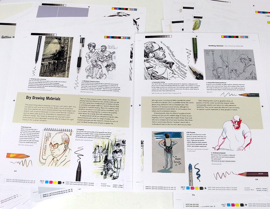
While I was in London with the publisher of my Sketching People book, we sorted out various other jobs, as well as photographing all the demos I showed you last time.
One task I had deliberately left until the end was selecting images to use for the chapter headers. Most of the pages in the book have 6 - 8 sketches per spread, but at the start of each chapter, I can have one sketch taking up a whole spread.
I'd created a shortlist and emailed it down in advance. It was tricky, because only landscape or square format sketches would work across the double-page spread, but an awful lot of my sketches are portrait format. Moira, my designer, printed my various suggestions out on mock layouts, to see how different possibilities might look:
It was a difficult decision, but easier with other people's input. In the end, none of the ones in the photo above made the grade. You'll have to wait and see what I chose!
There was also another photography job to get sorted. One early section of the book looks at which art materials are most suitable for location-sketching and give tips for travelling light. So, I took all my gear with me and Phil took photos of every single item in my sketching kit. I love this picture of my grubby paint palette:
It feels good to have such a monster project wrestled into submission.
I need a photo of me to go in my sketching book: I always think it's more friendly to be able to see the person who is 'talking' to you in a book of this kind. I have loads of publicity shots (I've never been a shrinking violet), but the more perceptive amongst you might have noticed that I changed my hairstyle about a year ago: my spikes have given way to a quiff. Which means older photos are not so good.
So, while I was visiting my publisher, all kitted out in my best frock and with photographer Phil Wilkins on hand, I suggested we take a picture of me 'in action' with my sketchbook. I thought we would do something in the street, but my designer thought the local cafe, where we had just had our lunch, might be fun.
Quarto's offices are 100 yards from Pentonville Prison and the cafe is literally opposite the prison's main gate, which is why it's called the Breakout:
We went just before closing, so we wouldn't be disturbing any punters, and I sat at a table in the window on the far right of this photo. We shot loads of subtle variations on the theme. We tried a serious 'I'm concentrating on sketching' pose:
...and an 'I'm just sketching whatever is outside this window' one:
We also of course did the standard 'smiling at the camera' pose:
At one point a man came rushing in from the street, said: 'Don't take my picture, I just escaped!' then ran off again.
I am not sure yet which picture we are going to use in the book. They are all nice (thanks Phil), but I think the last one is the most friendly and welcoming. What do you think?
In this last weekend before school starts back up, I will be spending lots of time planning. I think I'm finally to the point in my career where I won't worry about accounting for every single moment of every day. I have learned to appreciate what Robert Frost describes here:
Unharvestedby Robert Frost
A scent of ripeness from over a wall.
And come to leave the routine road
And look for what had made me stall,
There sure enough was an apple tree
That had eased itself of its summer load,
And of all but its trivial foliage free,
Now breathed as light as a lady's fan.
For there had been an apple fall
As complete as the apple had given man.
The ground was one circle of solid red.
May something go always unharvested!
May much stay out of our stated plan,
Apples or something forgotten and left,
So smelling their sweetness would be no theft.
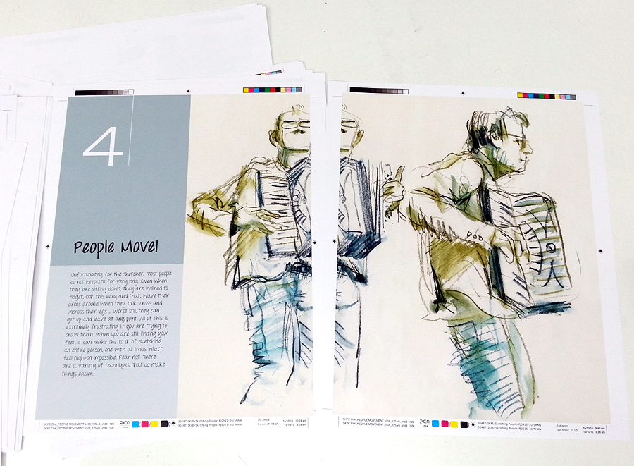
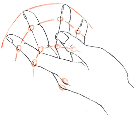
As regular readers will know, I am very close now to the deadline for my book, the full title of which is now decided: Sketching People, an Urban Sketchers Manual for Drawing Figures and Faces. All the scans from my archive of sketchbooks are done, as well as various additional drawings, created specifically for the book (like for how to draw hands and using colour as a framework instead of pencil).
But one BIG ELEMENT has been waiting until the end... the photographed sequences. These are needed to show how sketches are built up:
But that's really not something that can easily be done at home, so I took the train down to London and spent two days with my publisher and with Phil Wilkins, a freelance photographer.
To better explain how I draw different elements of people and how I tackle specific tricky situations, we wanted to show my sketches in stages. But for my style of working, where a sketch is done very fast, stopping at various stages was a problem. Which is why we got Phil to stand behind me, capturing the work in progress.
There was a bit of a spanner in the works too - a tube strike. This meant we had no models, so had to press-gang various people from the surrounding offices to come and sit for me. We started off by drawing the Senior Editor Kate. She was very unsure about the whole thing, but reassured when she saw it was just her hair I was focussing on:
I did someone's ear, as you can see at the top, then someone else's nose and mouth. We scoured the building for someone glam enough to be wearing high heels, then got her to clamber up on a table so I could draw her legs and feet:
The most scary sketch I had to do was left to day 2: to demonstrate a technique for drawing movement, by superimposing different elements over the top of one another. I thought a violinist would be a good option. Luckily, my editor Lily could play. Unluckily, the only violin we could lay our hands on was a child's one which had been gathering dust in someone's attic, so it's slightly smaller than it should be in the sketches. Hey ho. Probably nobody but another violinist would notice.
Once again, Phil set up over my shoulder so he could take pictures all the way through, from first marks to finished drawing. I did two different versions, first with my Koh-i-Noor rainbow pencil, so Lily ended up with lots of arms:
Then I tried again with my Inktense pencils, using different colours for the different overlaid arms. I think it's this one I like best as it's a more interesting teaching technique:
We finished off with a long pose. I wanted to do something on how to plan out a more complex situation, where you have more than one characters and a bit of background. We mocked up a meeting with Lily and one of the interns. I sketched a little thumbnail first, to plan the composition, which Phil photographed for the book, then I used this plan to create an under-drawing in my sketchbook, in lilac coloured pencil, before beginning in ink with my trusty Sailor pen:
Every minute or so I paused for a photo. It was really quite an odd way to sketch!
Once the line drawing was complete, I used watercolour to pull out the light and shade and give splashes of colour. It's not the way that I would normally work, but it's a good technique to demonstrate for beginners and so something that needed to be covered in the book:
The final sketch is not as exciting as I personally like - it's interesting how the more formalised approach made it harder for me to be expressive - but it will do the job. I gave it as a present to the intern, as a reminder of her time at Quarto, as she is heading home to new Zealand shortly. I also gave individuals the pictures of their ears, noses and legs etc.
We had some other jobs to do while I was in London, bit I'll talk about them next time, or we'll be here forever. See you in a few days...
The final, must-have-it-all-done deadline for my urban sketching people book is August 21st and I am delighted (and relieved) to say that everything is on track to be ready in plenty of time. Cue round of applause...
The whole timing thing has been a tad tricky though. I am used to the world of picture book publishing, where I can predict pretty accurately how long things will take me at each stage, but the planning, writing and illustration of this book has been totally different. With no previous experience, it was impossible to know how long I'd need for any of it, which has made it very hard for me to plan my time this year, particularly with weaving it around other projects.
All a wee bit stressful, especially as, I must confess, I am a bit of a control-freak (ask John).
One last-minute job I've just sorted, was to find some extra images from European sketchers. This is an interesting ploy by my publisher. Other sketchers who have done books will tell you that there is a big issue with having text on your drawings: it creates problems with foreign co-editions, because the handwritten text can't be translated. Now, if you know my work, you will know I use quite a lot of text...
The discussion started early on, when I wrote a section on how to add value to your drawings by writing snippets of overheard conversation, or any other elements which seem pertinent to the moment. I often like to record incidents (see above), sounds and smells (see below) as an intrinsic part of the image, to better conjure the slice of time, or the place I am recording.
It was obvious the text needed to stay in place for sketches in this chapter of the book, but then I realised that it would look slightly odd if, having recommended the technique, there was no hand-written text to be seen anywhere else.
My team at Quarto had a bit of a think. My editor said we might be able to get away with keeping English text on my sketches, if we also had lots of other work with handwritten text in a range of other languages. I had already included some foreign language text on the work of guest sketchers - one of my all-time favourite people-sketchers is Marina Grechanik from Israel, who uses loads of text:
But the foreign sales team said that the translation issue is more to do with Europe than anywhere else. So I went on the hunt. It was not easy: most urban sketchers don't feature people much and those who do, don't usually use text. I found several brilliant music ones from a website link someone sent me, like this one by Nicolas Barberon:
But I needed more variety of subject matter. In desperation, I put up messages on various Facebook groups. It worked!
The wonderful thing was that they came in from lots of sketchers who weren't necessarily well known outside their own country. From the outset, I wanted to feature less high-profile sketchers in the book, alongside the old favourites like Marc Holmes and Inma Serrano. The sketch above is by Enrique Flores, the one below is one by Juan Linares and the bottom one is by Ana Rafful.
The only remaining difficulty was finding space to fit these extra images in, when the book is already pretty much written and the sketches for inclusion already chosen. A bit of last-minute jiggery-pokery was needed.
Some of the European sketches have been substituted for guest ones I chose previously, some have been squeezed into relevant chapters. We also dropped an idea I was going to include and instead created a new spread, looking more generally at how urban sketching works, where I can talk about the brilliant way the movement has pulled together people from around the globe.
I am expecting another batch of layouts any day, the latest version of the whole book, which will help me to see any holes, where bits of text are needed, and give me the chance to make any amends before we go to proofing stage. I've seen most of it already, in bits and bobs, but this is the first time I have seen the whole thing together.
Things are moving on with my on-line workshop for Craftsy. I have now selected over 100 images from my archive of around 30 children's books, which I will be using to help explain various teaching points as we work our way through the 7 lessons. It's so incredibly useful to have that resource at my fingertips.
All the lessons are now planned in fine detail. The last thing I did was to time it all. I need to aim for each lesson to average out at 15 - 20 minutes. I can have some longer and some shorter: it's very flexible, but that's the target.
I had no idea how long they'd last to be honest. When I was planning, I just wrote down everything I could think of that I know about character design, then organised it all into 7 categories, and then organised that into logical sequences (each lesson is broken down into 3 sections, which helps a lot with planning).
So, timing... I set the stopwatch on my phone and got started. It takes a bit of getting used to, teaching thin air, but I've done it before, when rehearsing lectures. This time though, I had to draw as I went along, because I have to know how long it takes me to demo everything. I filled sheets and sheets of scrap paper with little characters:
I ran through each section 2 or 3 times (it gets quicker as you improve). Lesson lengths vary from 14 minutes to 26.
As always with my workshops, I could easily fill more time. I can continue to talk all the time I am doing the drawings, which helps, plus I am pretty quick with the sketches. The more demos a class has though, the more time it takes.
One way I can cut the time is to use pre-drawn sketches instead, though I much prefer to be scribbling away live. I think people like to see that too, watching the process and seeing things emerge. I have had the okay for the timings from my producer now though, so we are going to be fine.
Most of the sketches I'll be doing are quickies to explain a point, rather than proper drawings, as you can see from the sketch-sheets I created. There is a sneaky trick I can use if I need it though: my producer says, when it comes to more complex drawings which take a bit longer, we can always put in 'jumps', rather than watch the entire process. Clever thinking...
There are going to be 2 cameras filming at all times and I'm told the technical team have all sorts of clever tricks up their sleeve too. It will be so interesting. Getting quite excited now!
I have finally tackled the remaining teaching-drawings for the book. The publisher calls them step-by-steps and some of them are exactly that, like the one I did on using colour as a framework. There's also one on 3 stages of drawing eyes.
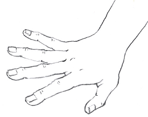
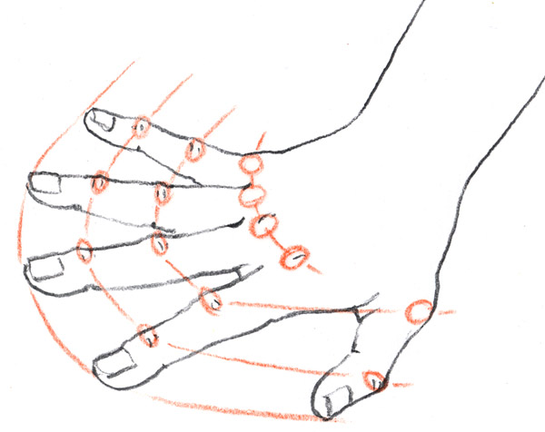
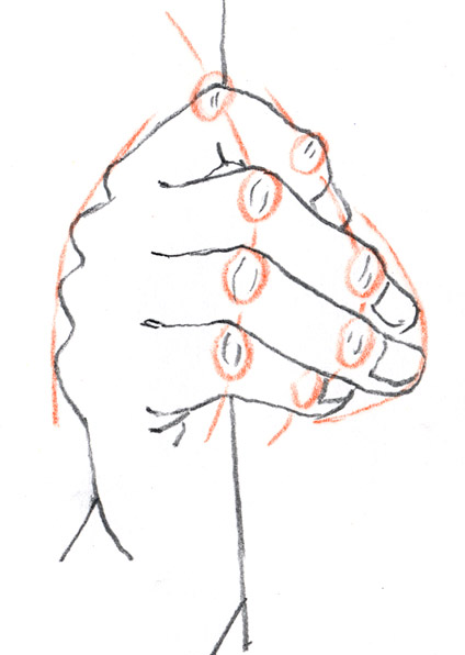
However, quite a few of the so-called step-by-steps are not actually a series of stages, but sets of little graphic features, to help explain how to draw certain aspects. Since hands are always so tricky, I thought I would do some teaching-drawings, looking at how you can use the position of the knuckles to help judge whether you are getting things right or not.
It's a trick I always use. Though the knuckles are staggered, rather than in line, the shape you get when you join them up is echoed in the next set of knuckles, as well as the finger ends. This helps you get finger length right - another thing that is easy to misjudge.
I sketched three line-drawings, (actually, I drew 5: the other 2 were a bit rubbish). I tried to get really different poses. Then I placed a bit of tracing paper over each sketch and circled the knuckles in a coloured pencil. As soon as I joined them up and then drew in the finger-end line, I knew the drawings would work really well.
I scanned both drawings and tracings, then put them together in Photoshop.
Job done.
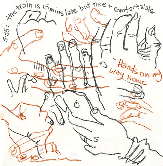
The rest of the spread on How to Sketch Hands uses drawings from my archive of sketchbooks to talk through some other ways of thinking about the various problems, including creating montage sheets, drawing just hands, over and over for practice. This is useful for stopping you getting frustrated when people move. It's also good for making the individual sketches seem less 'precious', so you are less inclined to worry if they go a bit skew-whiff here and there:
It's a great way to pass the time on a train. Try using a couple of different coloured pencils, to stop things getting too confused.
Goodness: the deadline for the book has suddenly jumped out of the bushes and is frantically waving its arms at me! I have until August 20th to get everything done. It's about a month, but counting only the free days I have to work on it, it's actually 3 weeks. Trouble is, that is also the only remaining time I have to prepare for filming the Craftsy class too - same deadline. Yikes.
I clearly need to get my skates on. I hate to be so busy when it's summer though. I spent last Sunday working at my computer with the blinds down, while other folks were prancing around in the sunshine. Sob.
I have gone through the design layouts for almost all the book now. There are about a dozen new images to scan, because of rejigging the content at the design stage, then I have to choose sketches I want to feature as full page images for each of my chapter-header pages. It's hard to do that without having a proper overview of the content, so Quarto are about to send me a definitive version of what we have done so far.
Once the final sketches are scanned, I will at last be able to get rid of all the sketchbooks piled around the studio. I'm really looking forward to a good tidy up.
There are still a few little bits of text that need doing: extra sections that have appeared as we have made changes (it has been very much a project that you have to allow to evolve as it goes along). That won't take long though. The main job left is all the step-by-step drawings dotted through the book.
I am going to do some of them live to camera, so we can choose stills from the film to use to illustrate stages of the process. It's a wee bit scary, to be honest. I am going down to London to sort that out in a fortnight. We have 1.5 days to work on the filming and sort any photography, like taking pictures of all the elements of my sketching kit for instance.
Right. Back to it...
View Next 25 Posts


