In between my residency sketching days, I have been working on the roughs for Class One Farmyard Fun, my new picture book. It's another one by the lovely Julia Jarman, our 6th collaboration. It is full of all the usual fun and mayhem which Julia writes so well.
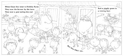
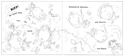
The action involves an escaped bull who moves around the farm, chasing various children and tossing then into the air. I tried to make a start, but was having trouble getting my head around the 'geography' of the story. I realised that I needed to create a map of the farm, so I could establish the layout and know which animals were where (ignore the 'flying' truck on the map by the way - that's me drawing a bit of reference off Google Images):
The map was instantly a great help. As I'm working my way through the drawings though, I am occasionally having to go back and make changes to the farm's layout, so that certain things will fall alongside others which are juxtaposed in the text.
For instance, I originally sited the whiffy muck-heap to the left of the bull, under the trees by the lake. The sheep had to be nearby, because Julia's text mentions them both on the same page:
They saw a lot of woolly sheep
And a cock on top of a whiffy muck-heap.
But they didn't see...
But this bit of text comes immediately after a page about the bull, so the two bits of the rhyme are on either side of a single spread. This is the first bit, about the bull:
...the bull in a strop.
They didn't see the big bull frown
Watching Class One walking round
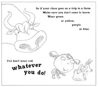
Some of them wearing red
Which makes bulls cross - or so it's said.
I started off drawing this spread as two single pages, but there was such a lot of text to work around on the bull page, I couldn't get it to work.
So I combined the two sets of drawings and turned it into a spread instead. Which meant going back to my map and moving the muck-heap and the field of sheep over to the right of the bull. Unfortunately, this change had a knock-on effect on an earlier page, but at least I had got things to work at last.
This is not the finished rough. It's early days. I get better as I go along, so often come back and re-draw the earlier spreads.
I have started my pastel artwork for The Jungle Grumble. I am only doing 2 pieces of artwork at this stage, to be taken to the Frankfurt Book Fair by my publisher. I have just enough time to get it done. Because things are tight, John has been helping me with jobs, like cutting my pastel paper to size:
I generally work larger than the actual size. On this book I am doing my drawings at 120%, although one of the 2 images the publisher has chosen for their Frankfurt presentation is the very complex 8th spread, so I'l be doing that at 140%, so I can manage the detail:
Another job is getting the prints-outs of the roughs ready for me to trace. We only have an A4 printer. By the time the line-work is enlarged to the scale I am going to work at, the image is pretty big, so we have to print it out in several bits and then stick them back together again. The image above was in 6 pieces! To get them to line up accurately, we use the light-box:
I then have the extremely tedious job of tracing the illustrations up onto my pastel paper, again on the lightbox. I have to turn out the lights and pull the blinds, to make it dark enough to see through the pink pastel paper, which is about as thick as watercolour paper. If you want to know why I use pink, read this post, from when I was at the same stage with Dragon's Dinner.
Hurrah - all done in time and emailed off to the publisher!
All those very tiny thumbnails I showed you earlier were scanned and enlarged in Photoshop to 75% of the actual book size:
I then used print-outs of these as a guide, to help me draw everything again, reworking the compositions and correcting mistakes where needed. You can just see the enlarged thumbnail showing through my layout paper:
It was also at this stage that I was adding the new characterisation to each animal, as I went along.
The finished pencil drawings were then re-scanned and enlarged to actual size, then taken back into Photoshop for last-minute tweaks and scale adjustments, as well as the fine-tuning of the text placement.
When I was doing the original thumbnails, this was the spread I was most nervous about. I left it to the very end, because there were so many animals to try and fit in it: not just the 10 featured ones, but sundry others to act as the audience:
I had to find a way, not just to squeeze everyone in, but also to show off their various 'swaps' in a way that let you see everything clearly, to avoid visual confusion (whilst still remembering not to put anyone's face anywhere near the page gutter). Nightmare! Only, actually, when it came to it, I managed okay. Maybe because I had warmed up on the rest of the book.
The one that was redrawn the most in the end, was this one, which at first glance looks the most straight-forward:
I'll tell you why next time - you'll just have to wait!
I thought it might be interesting to use my work on Jungle Grumble to talk about how I design around text. One common error made by would-be children's book illustrators, is forgetting that quite a lot of space needs to be created in your illustration for the words. This can be a challenge if the illustrations need to be busy. Though ideally the text is evenly spread through the book, this is not always possible, depending on the action. Some spreads can end up very 'text-heavy'. Others have lots of dialogue and all those new lines make the text expand down the page:
Before I put pencil to paper, I always ask my publishers to set the book's text in the chosen font, at actual size, so I know exactly how much space is needed. I then create blank templates for each spread in Photoshop (as above, with the gutter clearly marked), into which I place the text.
Obviously, until I have drawn the illustrations, nobody knows where the text needs to be positioned, so I am okay to move it around, as long as I follow basic design rules (like keeping an appropriate distance from the top / edges / gutter).
Mostly I keep the specified text on the particular spreads suggested by the publisher although, with Jungle Grumble, I did make a couple of changes. For instance, in my brief, this text at the very beginning of the story was split across 2 spreads:
Which seemed an unnecessarily slow start and, by combining both sets of text into one illustration, I freed up an extra spread for later in the book, which was very handy when we were in the thick of the action.
While doing the first thumbnails, I estimated the text area needed:
I then enlarged all the thumbnails and popped each into one of my Photoshop spread-templates. Dragging the bits of text into the positions my illustration idea demanded, I was able to see where more space was needed and rearrange the compositional elements accordingly.
Below is the spread that fits the template at the top of this post. You can see how I have divided the block of text into 3 sections, to make it more palatable to the reader and also easier to draw around. I have then placed the proper text in position on the enlarged thumbnail, replacing my estimated, hand-drawn text. This one fitted the actual text really well:
Using layout paper over the thumbnail print-out (which is translucent, allowing me to see enough of the thumbnail to guide me, but not too much, so no visual distraction as I redraw), I reworked the illustration, making sure I didn't get too close to the text.
My new drawing was re-united with the text when it was scanned and placed back into the Photoshop template, in place of the thumbnail:
Of course, the designer will now rework the text layout - mine is just a suggestion for how I think it best fits my illustrations. Sometimes it stays as is, other times they have ideas to make it funkier.
But I had yet another cause to put my pastel artwork on hold: a cover design was needed too. We often leave the cover design to the end - I am more familiar with the characters by then and it's easier to get a feel for what would work, once you can see the rest of the artwork.
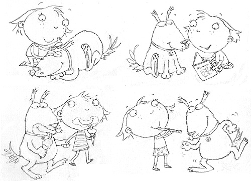
Anyway, I needed to come up with something in a hurry. I felt both characters needed to be on the front, but nothing much else (apart from the title etc, obviously), to keep it punchy. I did the sketch above as a starting point, but felt it needed more humour, so thought I could use the dog food problem to make things more funny. The ice-cream seemed to work well for Sparky and I tried out 3 alternative versions of Lucy:
One fundamental problem though, is that two characters side by side create a very landscape-format illustration, for what is a portrait-format cover. That means they would ultimately be quite small in the space.
My Art Director suggested I move them closer together, having them hugging, which would help the format and also make it a warmer relationship.
Trouble is, Lucy has a very wide head, so she can't easily get close without eclipsing Sparky, and his long nose has to face away from her, or they'd collide. Plus, his school uniform begins to disappear behind her and it all gets a bit visually confusing.
'We need a more graphic approach,' said my Art Director. So I played with having the characters poking in top and bottom, using blocks of colour to hold them in place and break up the space. John suggested the curly shape below and the idea that the title letters could swap colours with the background shapes, to echo the theme.
Then I had another go at bringing the two characters together, keeping the colour-swapping idea, but using hand-holding instead of hugging. I also tried a slightly simpler version of John's idea then sent these three designs back to the Art Director.
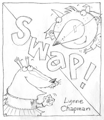
She liked the third, simpler one best, but said it needed more humour, rightly pointing out that, unless you've read the story, Sparky could be just another animal wearing clothes, as they so often do in picture books: people might not get the 'swapping' idea and so Lucy's nose would just be confusing. She also preferred Sparky's ballet outfit to the school uniform.
I had deliberately shied away from using the ballet costume on the cover, since I discovered Dogs Don't Do Ballet: Sara Ogilvie unfortunately uses a very similar outfit. But the ballet costume did offer more scope for extra humour. I managed to squeeze Sparky's foot, with Lucy's tiny shoe, into the picture then looked on Google for other children's ballet accessories and found the tiara. Just to be on the safe side, I gave Lucy a bone, to underpin the idea that she is supposed to be in a dog disguise:
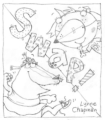
Both my Art Director and Editor loved it - hurrah!
The patchwork letters were another brain-wave of John's by the way, the idea being that they are another DIY activity, like the home-made nose. I think they make it really funky: well done John x
I abandoned John again last Tuesday. As we speak, I am in Santo Domingo, sketching my hand off at the Urban Sketchers symposium. In the meantime, I thought I'd leave you with this 2nd post about the changes I've been making to my roughs for SWAP?!?
You remember there were 2 major redraws needed, as a result of feedback from the publisher: Lucy and Sparky leaving ballet class, which we looked at recently, and the final spread.
At the end of the story, Sparky finds out that little girls have baths every night. At last he wants to swap back.
Originally I had Lucy enjoying the bubble bath Sparky didn't want to have, with him sitting on the loo beside her, reading 'Ballet for Dogs'. But the text has changed slightly since then. Now the same conversation flows across both pages, so it makes no sense for them to be in a different part of the house.
So in an earlier drawing, I introduced a window...
...through which Sparky could escape the bath, ending up in the back garden. I thought that would be quite funny:
I was telling you about having to redraw a couple of the spreads for my latest book.
The first one is this 'leaving ballet class' illustration (you can see the sketch work which lead to this drawing here):
The publisher's feedback was that there was not enough indication of where Lucy and Sparky were coming from and that it would be clearer if the ballet school was shown in the background: a good point. It's so interesting to get another pair of eyes on what I do! My art director also felt that the dogs in the foreground had too much prominence and the cat was laughing a bit too hysterically.
This is my rework. You can see it in context, with the page of Sparky's ballet efforts on the other side of the spread:
The difficulties were:
a) trying to leave space for the text -
I couldn't get Lucy and Sparky central or as big as I would have liked, because I felt the rather intimate bit of dialogue between them needed to be alongside the characters, rather than up i
My editor emailed me first, with a few, mostly minor, changes to the text: we have been tweaking it continually between us, getting it just right (hopefully!). You always worry, in case an editor suggests something you hate, but these are all good ideas that make the text stronger. Creating a picture book is very much a 'team effort'; as an author, you have to be open to other people's take on your project and able to welcome editorial input. It really helps though, when you feel you're in tune with the other members of the team, which I certainly do on this book.

The spreads in question are the two pictured. My art director felt that I needed to show the ballet school in the top image, to make it clear that this is where they are coming from (good point) and that we should probably lose the cat. She felt the final spread, which we looked at recently, lacks the necessary intimacy for the end of the story, where they are making up - also true. I'll show you the re-works when I've done them.
I promised to show you how I used the endpapers to finish off my story's narrative with a little visual joke.
In an original draft, I had the last spread taking place in the bathroom instead of the back garden, with Lucy enjoying the bubble bath that Sparky has narrowly avoided. I was going to draw Sparky sitting beside the bath reading Ballet for Dogs: a Ruff Guide (sorry). But they don't get near the bath any more: the action all stays downstairs.
So I thought I would end with Sparky, clearly delusional, thinking he was actually good at ballet, then show him and Lucy cavorting in their ballet gear on the endpapers. I originally envisaged him being dreadful, as he was in class, but then it occurred to me that it might be funnier if he did indeed manage to get good!
John sourced me lots of photos of ballet dancing couples, using Google Images, from which I did these very quick sketches, just to capture the basic poses:
Then I drew Lucy and Sparky in the same positions. It was a bit tricky here and there, since their body-shapes were very different from your average dancer, and a couple of them didn't work as well as the others, but it came together surprisingly quickly:
5 Comments on There's a Dog Dancing across the Endpapers!, last added: 6/17/2012
I've been working backwards in the story this week. As I discussed previously, I don't work through the roughs chronologically, but take them in the order in which they most interest me, so I 'get into' the book as quickly as possible.
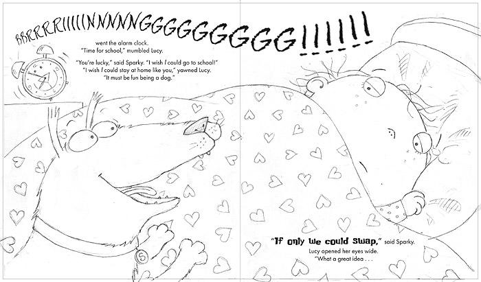
Now I am concentrating more on how the whole 'swapping places' idea is set up. Above is the first spread, where the idea is hatched. I'm really pleased with this one but, though it looks simple, it didn't come together quickly. I had trouble keeping both characters large but also out of the gutter, whilst keeping them close so their relationship was intimate enough. Below you can see all my tiny variations on the composition:
As you can see, I also tried out lots of alarm clock designs too: hard to make it fun without getting fussy. I love the big, curved BBBRRRRIIIIINNNNNNGGGGGGG!!! of the alarm that pulls the whole image together - I do hope Gullane let me keep it that way.
Above is the next spread: where Lucy and Sparky actually swap, and Mum and Dad are fooled. The two little drawings came toge
Yesterday was great - I had an entire, more or less uninterrupted day of working on the new roughs! It's really helped me to get properly warmed up with the characters and things are starting to take shape.
Remember on Tuesday I was thinking about what Sparky might get up to in his lessons? Well, that afternoon I had a go at drawing the 'Quiet Reading' class above and I'm really pleased with how it's looking. I drew the Music lesson properly too:
I originally sketched him with his head in a trumpet, but when I looked up the picture reference, the trumpet end wasn't really big enough, so I've gone for a French Horn instead, which is somehow funnier anyway.
Yesterday I mostly worked on re-drawing the lunchtime scene (which will sit on the opposite page to the two illustrations above), working up proper characters from my original sketch and making the ideas from that first visualisation fit the shape of the space.
<
This week I've started to look at the new book roughs. I'm still doing fairly rough sketches so far, trying to get a feel for how images might work in their allotted spaces. It takes a while to get your brain (and your drawing hand) back into gear, but by the end of the week I should be really up to speed.
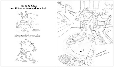
My story is about a little girl, Lucy, and her dog, Sparky. When her alarm goes off, Lucy thinks it's not fair that she has to get up and go to school, while Sparky stays home. Sparky would much rather go to school, as he thinks staying in is boring, so they take the only reasonable course of action...
...they swap places for the day! Sparky (who I decided should be a slightly fat, mongrel with an over-eager attitude to life), squeezes into Lucy's uniform, while she makes herself a doggy disguise. I had so much fun illustrating Sparky in Lucy's uniform.
2 Comments on 'Dogswap': Starting on the Roughs, last added: 5/4/2012
Any feedback you can give me on this would be welcome. I need a fresh perspective from you talented people then I can get started on the final version. Thanks in advance!

By:
Lynne Chapman,
on 12/13/2011
Blog:
An Illustrator's Life For Me!
(
Login to Add to MyJacketFlap)
JacketFlap tags:
children,
school,
talk,
workshop,
pencil,
sketchbook,
sketching,
roughs,
characterisation,
sketching on the train,
Big Bad Wolf is Good,
hot tips,
Add a tag
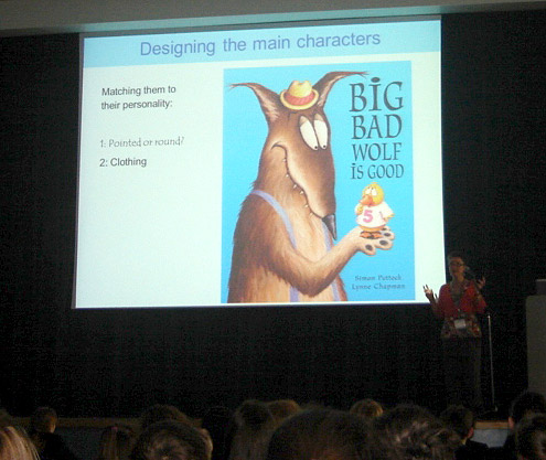
Last week, it made a nice change to work for 2 days in a secondary school. They are so BIG compared to primary schools!
I visited Becket School this time last year, but it took some doing: thick snow stopped all trains for a while. They invited me back this year and it did start to snow again, but fortunately we got away with it.
I was working the whole 2 days with Y7 students (1st years). We started with a lecture to them all - around 170. Above I am talking about characterisation: how you can use pointy or round shapes to suggest evil or vulnerable creatures, and how carefully chosen clothing can give hints to a character's personality.
5 Comments on Becket School: Workshops with Older Kids, last added: 12/14/2011
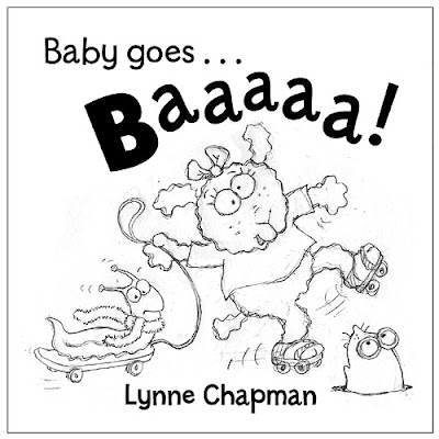
On Friday, I finally got the go-ahead for the cover for Baby Can Bounce.
When I was deciding on the title, I could have chosen any of the featured actions, but I wanted to keep the alliteration that I established with Baby Goes Baaaaa!, which narrowed it down. Ultimately, Baby Can Bounce! is catchy, plus it's a fun, slightly silly action for a cover.Inside the actual book, the 'Baby can bounce' page features the slug and snake:Though the idea of a slug on a cover makes me laugh, slug and snake are not desperately cute and might put some people off (especially those with slug or snake phobias!), but one of my fave characters is the baby croc from Baby can dig: What seems like months ago, Sarah, my designer at Egmont, sent me a basic cover layout, just to get the ball rolling and give me something to design around. That's really handy, as it gives me some idea how much space the title etc is going to need:
Hurrah - all my changes to the roughs are done and I have emailed them off to Egmont! I thought you might be interested to see some of my 'before' and 'after' drawings, to get an idea of why changes are requested and to see how they can improve on an illustrator's original idea.For those who've not been following the progress, the 1st book Baby Goes Baaaaa! is about baby having fun making sounds with Mum or Dad. It has a cast of 26 animal characters making the sounds for baby to copy. I wanted to re-use them all in the sequel, Baby Can Bounce!, which is this time about sharing simple actions.Each creature in turn demonstrates an action, which they share with a new character: a little spider, who appears on every page. These are my 'before' and 'after' drawings of the baby anteater, who is on the page Baby can... shake:The feedback from my publisher, when they saw the piggy-bank idea, was that it was an object that would mean more to a slightly older child, rather than the target 1 - 3 years. Fair point. They suggested the maracas, which I think work well:Note that I had to change anteater's stance, as you hold youself differently when you shake maracas.Another one that needed a substantial change was Baby can... tickle. The monkey triplets all appear together in book 1, so I felt all 3 needed to be here too. As you can see, in the original version, I had two of the monkeys giggling at the spider tickling no 3. Egmont
There's been so much going on throughout July that I'd almost forgotten I am in the middle of a couple of books! This week though we start a new month and I am back to real work with a vengeance.
On Monday morning, my friendly postman delivered a package - jiffy bags always mean something interesting... This one was no disappointment, as it contained the coloured layouts for Baby Goes Baaaaa!.
They are not the actual proofs, just print-outs, but the colours look pretty good. This is the first time I have seen how it all looks together, and not just as files on the computer.
It seems ages since I finished working on the scans. Things have been going on in the background though - it has already been shown to oversees publishers and to Waterstones for feedback.
I'm really pleased with how vibrant and fun they are looking. I also love what Peter and Sarah (my editor and designer at Egmont) have done with the 'extra spread' below:
I can't remember if I told you, but I did a fair bit of educational research into p
Over the past few weeks, in between my other adventures, I have been beavering away at my new book, the sequel to Baby Goes Baaaaa!, turning my big ideas sheets into proper drawings.
Book two is going to revolve around 'Baby Can...' rather than 'Baby Goes...' showing actions a baby is familiar with. I figured one of the most familiar actions for Baby is putting inappropriate things into its mouth, hence these early ideas for 'Baby can lick':
Without the alphabet to hang this set of illustrations on, I needed an idea to link the images together. I decided that the book would feature all the original characters from Baby Goes Baaaaa!, but I would introduce an additional tiny creature, who could wander through all the pages, interacting with the various animals.
My first sketches used a little caterpillar, who seems sufficiently cute.
Then I got the idea that he could change into a butterfly half way through the book, which would be fun and make the perfect illustration for 'Baby can point':
Now the artwork scans for Baby Goes Baaaaa! are out of my hair, I've been trying to work out what on earth I am going to draw for the sequel. Book 1 is about sounds, so I thought book 2 could be movement. Babies LOVE to imitate, so a series of simple actions, using the same cast of animals as Baby Goes Baaaaa!, should be good fun and just as interactive.
The idea started to crystalise a couple of weeks ago, but I had barely begun to think about it, when those pesky scans hit the doormat. But at last I have got away from the computer, picked up a real pencil and drawn on some actual paper.
I decided to try the big sheet of paper system again, to free my mind. Of course, starting something new is never easy and I immediately began sighing, finding displacement activities (like this) and wishing I could do something nice and mindless, like some digital tinkering...
It's going quite well by now though. Once that first, painful day is over, it always starts to flow again. So John has crept out from under cover!
(by the way, I think you can now click to enlarge my images - try it out for me!)
In February, I sent 3 possible designs for the cover of Baby Goes Baaaa! to Egmont. The various possibilities were talked through, not just by the Editorial and Design team, but also the guys in Sales, since they have direct and regular dealings with the booksellers, so it's felt that they have their fingers on the pulse of what will sell. The upshot was that this was the fave design:
 ...but that it needed tweaking.
  The process is very much a team thing, so it's interesting to get more eyes on my ideas. For instance, the meeting brought up the fact that the bow on the lamb's head made her obviously a girl, which would restrict sales for boy babies (precisely the same thought process that I had when choosing the hero of Bears on the Stairs).
 The publisher also thought that a baby-grow would be more clearly 'young' than my T-shirt. Plus they realised the towed slug on the skateboard was crying out to be stretched round onto the back, to create a 'wraparound' cover.

Above is the plan the designer sent back to me after their meeting. As you can see, they have swapped the skates for a scooter. They also liked my baby monkey from one of the alternative designs, and having the back gives us the chance to sneak him in!
This is my re-draw of their version:

I have finished my swinging duckling illustration:

This page sits opposite the illustration for 'R' - a baby tiger, trying out his roaring on a butterfly - the next piece I have decided to colour up. Below is the original rough I submitted to Egmont. Though there were minor changes to other illustrations at that stage, the tiger came back as an immediate green light, with no changes needed.
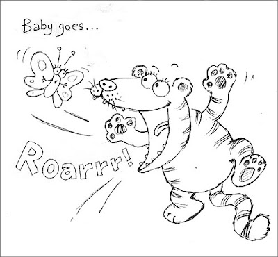
But later, taking a fresh look at the various roughs, I realised that the tiger would be more fun in a dressing-up outfit, like the squirrel, so I gave him a little superhero cape, and re-submitted the drawing to my editor.
 They pointed out that the cape was a bit minimal and so got a little lost. They suggested I give him a T-shirt as well, perhaps with some kind of superhero picture on the front. This seemed a good idea. I thought for a moment, then realised the simplest idea would be the Superman logo:

Even as I was drawing it, I worried about copyright - you have to be very careful how you use existing logos. But the design worked really well, so I decided to see if Egmont picked it up as an issue. They did. Ah well.
 Sarah, my designer on Baby Goes Baaaa! sent me this lovely tiger-superhero logo she designed herself, and asked me to give that a try. I took into Photoshop, shrunk it down and manipulated it so that it 'sat' on the rounded front of the shirt properly.


 5 Comments on Crocodile on a Trampoline!, last added: 9/28/2011


I'm encouraged to know that I'm not the only one combining sections of images manually and tracing the enlarged image on a lightbox. Thank you for sharing your process.
What a fascinating insight into the publishing process. I had no idea it was so fiddly and time consuming! I love your animal art it is so funny and cute.
Good to see your hard at work. I'm excited to see the end result. Stay active, best wishes,
Benjamin
It's great to see the publishing process:) What a great idea the pink paper,great post:)
Thank you. Glad to hear that the background information is still interesting.
:-)
That there's craft, that is!