

Summary: Volunteer work with a bike charity in Ohio, and the gift of a new logo illustration.
via Studio Bowes Art Blog at http://ift.tt/2h2X5mO
0 Comments on Holiday Cheer with Elves & More as of 12/21/2016 5:20:00 PM
Add a Comment

 By: Brian Bowes,
on 12/21/2016
By: Brian Bowes,
on 12/21/2016
Summary: Volunteer work with a bike charity in Ohio, and the gift of a new logo illustration.
via Studio Bowes Art Blog at http://ift.tt/2h2X5mO
 By: Lizzie Furey,
on 9/26/2016
By: Lizzie Furey,
on 9/26/2016
Judging a book by its cover has turned out to be a necessity in life. We've all perused book shops and been seduced by a particularly intriguing cover--perhaps we have even been convinced to buy a book because of its cover. And, truly, there is no shame in that. It takes skill and artistry to craft a successful book cover, and that should be acknowledged.
The post Five questions for Oxford World’s Classics cover designer Alex Walker appeared first on OUPblog.
 By: Jessica Holden,
on 1/17/2016
By: Jessica Holden,
on 1/17/2016


Zim & Zou are Lucie Thomas and Thibault Zimmermann, they are two french artists based in Nancy. They use handcrafted objects to make beautiful colourful installations. They studied graphic design for three years whilst at art school, but their studio works in a variety of multidisciplinary ways incorporating illustration, graphic design and paper sculptures. There favourite material to use is paper, making everything by hand.
To find out more visit their website and Behance.
By: Brian Bowes,
on 11/25/2015
Summary: I share some of my process creating a faux Rolling Stone magazine cover of the Ramones. Giclee prints of the image are also made available! One of the assignments for my MFA program is that we are asked to create an illustration by look back into illustration history and finding an artist whom we admire, then we […]
via Studio Bowes Art Blog at http://ift.tt/1XgS0ut
By: Chloe Baldwin,
on 11/3/2015
Post by Chloe


Daniel Arriaga is an illustrator based in the USA whose work often tells a narrative, depicting fun characters. He has worked in various departments at Pixar, and also Disney. He has helped to produce films such as Wall-E, Up!, and Wreck-It-Ralph. Arriaga combines digital art with a subtle painterly style to bring his work to life, and his clever colour palettes create a nice ambiance in all his work.
If you’d like to see more illustrations by Daniel Arriaga, please visit his portfolio.
By: Chloe Baldwin,
on 10/3/2015
Post by Chloe


Lea Taloc has combined her passion for the kitchen and illustration to create beautiful works which often appear in food blogs and magazines. Through her art and graphic design techniques she is able to convey emotions and add visual embellishments to every day life. Lea Taloc’s work has a bright and airy feel to it which is refreshing and cheerful.
If you would like to see more of Lea’s work, please visit her portfolio.
By: Chloe Baldwin,
on 9/13/2015
Post by Chloe


Saskia Rasink is an illustrator, based in Rotterdam, The Netherlands. Her work has a bold, graphic style and the warm, sophisticated colour palettes used gives her work a mid-century feel. She often depicts maps and architecture inspired by her passion for traveling. She is also inspired by Scandinavian design, interiors and nature.
If you would like to see more of Saskia’s work, please visit her portfolio.
By: Chloe Baldwin,
on 8/2/2015
Post by Chloe


Nick Bear is a professional artist with a passion for illustration. His style is bold, colourful and often full of character and humour. This has made him popular among game production companies and his illustrations have featured in some of the world’s most popular games such as Plants vs Zombies 2 and Bejeweled Blitz. If you would like to see more of Nick Bear’s graphic illustrations, please visit his portfolio.
By: Chloe Baldwin,
on 4/10/2015
By Chloe


Sticky Monster Lab is a multidisciplinary creative studio based in Korea. They cover various mediums from illustration to motion graphics, graphic design to product design. This wide spectrum helps make their work so unique and dynamic. Sticky Monster Lab have great wit and attention to detail which has allowed them to collaborate with Nike, Nissan and MTV.
If you’d like to see more work from Sticky Monster Lab, please visit their portfolio.
.jpeg?picon=3498) By: Cait,
on 3/31/2015
By: Cait,
on 3/31/2015
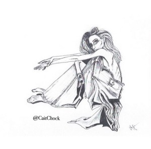
Black and White Ink
Shadows speaking louder than words.
Night and day lose meaning.
Whispers in the grey.
Hinting a secret.
White. Arresting.
A look.
A crease. A fold.
Casting sweet envelope
for emotion.
—
Black and white drawing first shared on my Instagram page HERE.
To order a print of this piece, or inquire for other commissions, send an email to: [email protected]
By: Chloe Baldwin,
on 3/21/2015
By Chloe


Miquel Tura Riamonti is an illustrator and designer from Barcelona. His work is colourful and fun with a great attention to detail. The isometric style has proved popular with his clients ranging from Samsung to Monocle Magazine. You can view more of his work here.
 Studio Spotlight :: DKNG
 “Designy Illustrator” Mikey Burton
 Illustrator & Gig Poster Designer Dan Stiles
 Typographer & Font Designer Drew Melton
 Illustrator and Hand-Letterer: Mary Kate McDevitt
 Sonia Kretschmar’s Old Modern Styling
 Illustrator Submission :: Jack Hudson
  Illustrator Submission :: Dean Gorissen
 Hand lettering Artist :: Linzie Hunter
 Artist Franco Spagnolo
 Alexis Anne Mackenzie
 Artist: Johanna Uhrman: Helsinki Meets Tokyo
By: Rachel Frankel,
on 11/30/2014
Artist: Johanna Uhrman: Helsinki Meets Tokyo
By: Rachel Frankel,
on 11/30/2014


While my color mood project is officially over, I haven’t stopped keeping an eye for effective uses of color and geometry in illustration and design. Because I happen to be a musician, I’ve also started creating gig posters for my band’s shows. The gig poster is an interesting format–you have to draw attention quickly and effectively, which typically means that it needs a striking illustration or eye-catching typography.
Dan Stiles is a cornerstone of the gig poster world, and has continued to surpass its limits with his incredible command of color and use of interacting shapes. He’s a Portland-based designer and illustrator with an award-winning track record, and has worked with clients such as Death Cab For Cutie, Feist, Nike, Birch Fabrics, MTV, and Wired Magazine.


Dan, originally from Ann Arbor, Michigan, got his footing in Portland during his college years. He gravitated towards design by falling into the role of rock-poster-maker at the University of Oregon. Interestingly enough, he got his start as a pen-and-ink artist rather than a digital pixel-pusher (which he expounds on in his interview with WeMake). As a punk DIY-er, he originally was avoidant of graphic design. It’s a relief to know that there were others who resisted digital illustration at first aside from me!
From there, he fell in love with the design process as well as the silkscreen process, which is often a principal element in many gig posters. His minimalist aesthetic and focus on the integrity of shape only lends itself to his chosen medium. As a gig poster designer, he often has complete creative control over the concept and execution of his designs.


Since those early days, Dan has branched out to advertising, branding/identity, surface design, packaging, and even creates his own books and merchandise. He’s worked with Birch Fabrics on their Marine Too and Mod Squad lines (the former of which was borne out of his design for an A.C. Newman poster). Dan cites his success as being dependent on his abundance of completed work.
“I look at it like the sorcerer’s apprentice. I’m Mickey Mouse, and every project I complete is another broomstick out in the world doing work for me. The more quality work I release, the wider my reach.” -Dan, from his interview with Birch Fabrics.


Follow along with Dan here:
 By: Kathy Temean,
on 9/12/2014
By: Kathy Temean,
on 9/12/2014
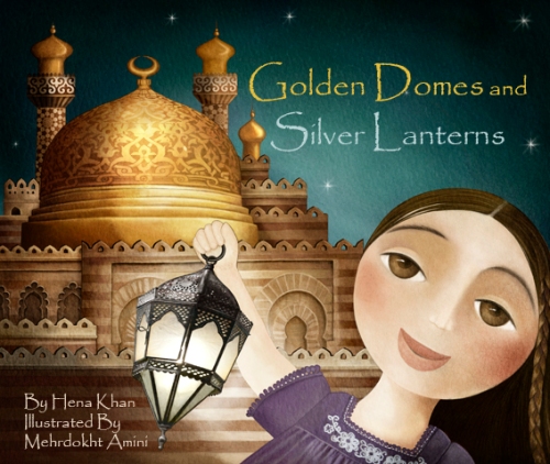
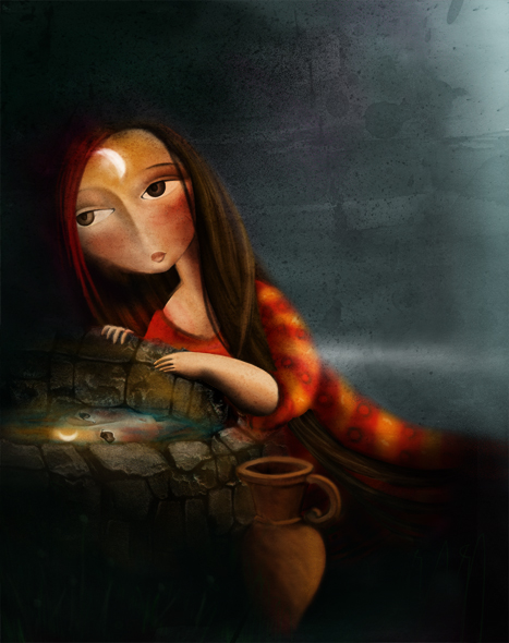
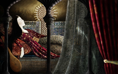
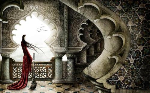
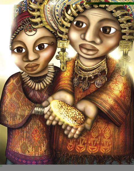
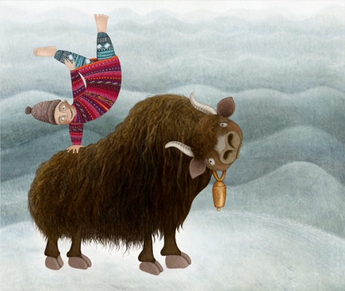
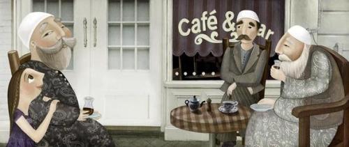
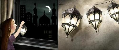
 Mehrdokht Amini has worked on many books for children. One of her latest picture book “Golden Domes And Silver Lanterns” in collaboration with” Hena Khan” has been highly praised and has been selected in the 2013 ALSC notable children’s booklist, which is a list of best of best in children’s book.
She lives in Surrey, England.
Below are her clients:
The British Museum Press,
Chronicle books
Random House
Stentor Publication
Harcourt Publishing
Overbrook Entertainment
Houghton Mifflin Harcourt
Here is Mehrdokht explaining her process:
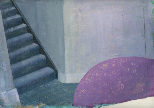
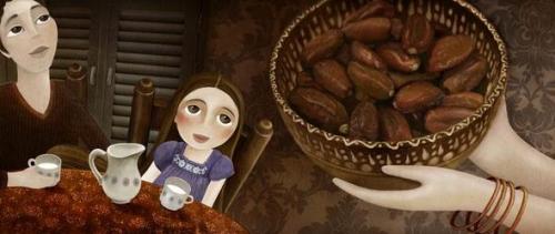
This is the step-by-step process of one of the illustrations of the book that I have written myself. At the moment I am working on some samples of this book to take to the publishers. The book is called “The day I met Poppito.”
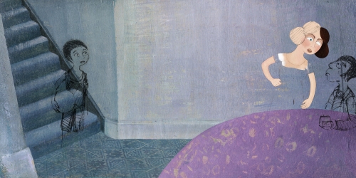
In this image, the main character of the book has come down for breakfast and sees that his parents are very annoyed by this news that a family of hippos have moved in next door to them. The mother is particularly not happy with the situation.
I start the project by first sketching the overall composition that I have in mind and a bit of character designing.
Gradually I delve into more details of the image .The character facial expressions are especially very important to convey the massage of the picture.
I scan all the sketches and save the files in tiff format to make sure all the details are kept as accurately as possible for next stages. Then I start to take photos for my image based on the composition. I might not use all the photos I take but at this stage I try to gather whatever material I think might come in handy in later stages of the work.
I might need the texture of a plastered wall.
Or details of a room because it is an indoor image.
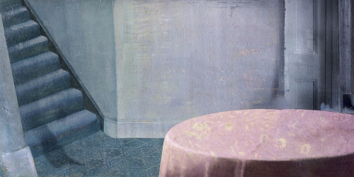
After the sketches are finished and I am done with taking photos. I start working on the background of the image.
I brush the surface of a watercolor paper with GOLDEN Molding Pastes a few times on intervals to get the desired texture and then I color the surface with Acrylics in layers. I put one layer of color, wait for it to get dry then repaint it again with another color. That’s because sometimes I scratch the surface to get to the layers underneath and have a more interesting surface.
I take then everything to Photoshop. Here the floor needs to be change so I make another surface for it.
I then fit it into its place in Photoshop in a separate layer. In the “Hue/Saturation” I bring down the saturation of the floor layer to zero and finally put it in the “soft light” mode so the layer beneath could be seen through.
There I arrange the sketches on the background in a different layer and change their mode on “intensity” to be able see through them. Then I start painting on them with the brush tool.
Using my photos I work a bit more on the texture of the wall and the staircase.

I feet the table perspective doesn’t really work this way so I change it too.
Eventually this is how the picture looks like when finished.
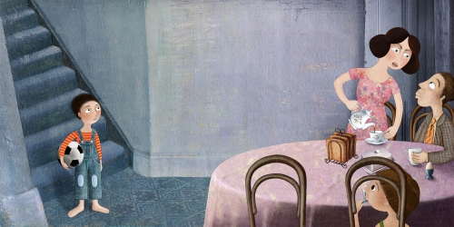
Finished image
Book Covers
Book covers
How long have you been illustrating?
I went to Secondary School of Creative Arts in Iran and I remember once a teacher asked us to choose a story and make illustrations based on that. I chose “The Red Shoes” by Hans Christian Anderson and it was the first time I tried to illustrate a book. I enjoyed the process so much that I decided then that I wanted to continue my career in that direction. What I enjoyed most and continue to take pleasure in was that for a short time it gives me the opportunity to live in an imaginary world and create my own characters and scenes and share them with others.
I see you attended Alzahra University in Tehran. How did you decide to study Graphic Design there?
After getting my Secondary school certificate in Art it was a natural thing for me to continue my higher education in the creative field. As there was no BA course available in illustration I decided to study in Graphic design. At the time it wasn’t a very well known subject to study in Iran and studying art was considered by many parents as something for the students who couldn’t do very well in scientific subjects. So I guess it was a brave act for my parents to go along with my desire to become an artist.
What were you favorite classes?
I enjoyed life-drawing classes partly because we used to laugh a lot during that course. The thing is, in Iran a lot of restrictions are imposed on art students. As ridiculous as it might sound, in life drawing classes no nudity was allowed. So we had to sketch the models all dressed up. We had to guess what was under the folds of clothes and so occasionally our sketches looked ridiculous. I also enjoyed photography courses. It was the pre -digital era and we had to develop and print our photos in the dark room. I loved the dark room anticipation of seeing the result of the work appearing gradually on the paper and the various techniques we could do with the developing materials on the photo papers.
Now that you live in the UK, do you think the Universities are different than the ones in Tehran?
They are totally different. Here the art students have the freedom of expressing their feeling with no boundaries whatsoever. It is an essential ingredient for an artist which some might take it for granted. Over there, there are many taboos and lines that could not be crossed.
Did you immediately decide you wanted to get your MA in Art Research or did you get a job right out of college?
I was still in college when I got my first commission to illustrate a book. It took me some years to go back to university to get my MA and the reason I chose Art research was because I felt a lack of enough theoretical knowledge in myself.
What types of things do you study when you go for a degree in Art Research?
I am not sure weather such a course is available here in MA degree or not. But over there it ranges from history and philosophy of art to critical thinking in art.
What was your most interest class while going for your MA?
For me it was a course during which we did lots of discussions on contemporary theories of art. We worked mostly on “A reader’s guide to contemporary literary theory” by Raman Seldon and Peter Widdowson. There I learned for the first time about the developments of modern art theories; A fascinating subject that change my point of view not only on art but also on life itself.
Did the School help you get work?
No, Unfortunately in Iran schools don’t feel any obligation to find work for the students.
Do you feel the classes you took in college have influenced you style?
No, I don’t think so. They help me a lot in term of having a better critical mind as an artist and choosing my path. But thankfully the professors didn’t try to influence our style. I think it is a catastrophe when the art teachers try to impose their ideas on students. They should probably just show the ways and let them decide.
What type of work did you do right after you graduated?
Apart from illustrating books I did occasional designing jobs here and there but I have always been freelance.
What was the first art related work that you were paid?
The book that I did for “Khane Adabiat” publication during my BA was my first paid job.
Do you have an agent or artist rep.? If so, who are you with? When did you join them and how did the two of you connect? If not, would you like to find representation?
Yes, I decided to find an agent for myself last year because I am not that good at representing myself.
At the moment I am working with “The Illustrators Agency“(www.theillustratorsagency.com) based in Australia. So far we have been connected only through emails. They have managed to find me two book commissions so far from “Cengage Learning” which is a global educational publisher and I am very happy to be able to work with them.
When and what was the first children’s book that you illustrated?
There is a very famous Iranian poet called “Ahmad Shamlou” who sadly passed away a few years ago. He has a few long poems, which in form are quite rhythmic and seem to be written for children but their contents occasionally have some political connotations.
One day when I was still studying for my BA I decided to work on one of these poems and as it was not very long for a whole book, I came up with this idea to illustrate it in a new format. Something like a big three folded brochure. It worked and subsequently I worked on other poems of the same writer and some other famous contemporary poets in the same format.
How did that contract come about?
I didn’t have any particular publishing house in mind at that time. The only thing I knew was that most of the publishing houses were clustered around a few avenues around Tehran University. So when I finished the draft of the work, I took in my portfolio case and started searching around in that area for a children’s book publisher. By chance I came to Khane Adabiat and the editor of the time liked the idea very much. Every thing started from there.
Do you consider that book to be your first big success?
I do. It was vey successful and after more than fifteen years copies of it is still selling in Iran. But it is greatly due to the fact that the poet is very famous in Iran and these series of his work were only published in collections and not individually -illustrated format. The new format of the book also made it stand out in the shelves of the bookshops. But if I could illustrate them again I would totally change the illustrations!
It looks like you did a large amount of books with Khane Adabiat Publications. Are they the big publishing house in Tehran?
At that time they weren’t huge but after some years they made a good name for themselves in children’s publishing industry in Iran.
Have you tried to write and illustrate a children’s book, yet?
This is my ultimate goal to be able to illustrate my own stories.
What made you move to the UK?
I guess it was destiny that brought me here!
After ten years of publishing with Khane Adabiat Publications, you get to do a picture book with a publisher in Poland and Harcourt in the US. How did those two books contract come about?
I came to live in UK ten years ago and at first I didn’t know how to continue my career here as an freelance illustrator so I decided to learn Photoshop and Corel draw and try to find a job as a Graphic designer. It took me 6 months to learn these two software and during the process of learning them I discover how powerful they could be as a tool for making illustrations. Eventually I did a few digital pieces and decided to have a website to showcase them. These were the ones, which gained me these two commissions.
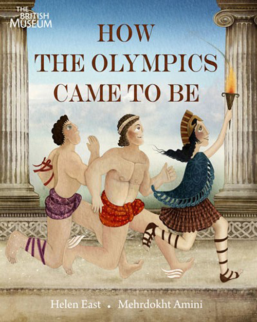
What was it like to illustrate a picture book for the British Museum in the UK? Did they have an editor or art director?
It was a great honor for me to work with the British museum. Apparently Helen East, the author of the book “How the Olympic came to be”, had spotted my website and recommended me as the illustrator for her upcoming book with The British museum. We had a few meetings with the editor of the time and discussed the sketches together. It was a really enjoying experience.
How did that come about?
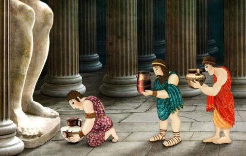
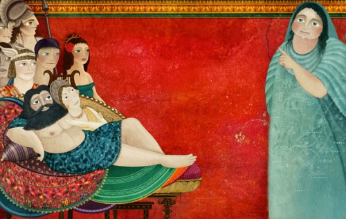
It was a year before the London Olympics and the book was the story of Olympics through Greeks myths and legends. I was supposed to get inspiration from the objects of British museum related to the story for my pictures. It was really fun because it gave me the opportunity to study the classical period of Greek art and learn more about Greek mythology. I particularly fell in love with their ancient potteries and all the delicate silhouettes painted on them, each telling different stories about Greek heroes and villains.
How did you hook up with Chronicle Books to illustrate GOLDEN DOMES AND SILVER LANTERNS?
They had found me through childrensillustrators.com and contacted me to see whether I was interested to work on the “Golden domes and silver lanterns”.
How did you connect with them?
Our contact was only through emails, which at the beginning created a bit of problem. We didn’t have the chance to discuss the pictures face to face and as a result my first round of sketches was almost completely rejected. I had imagined the settings to be depicted in an ancient time, whereas the editors and writer had a clear objective to have the story portrayed in a contemporary atmosphere.
I had to redo the sketches but I think eventually we were all happy with the final result.
Do you feel living in the UK has broaden your career as an illustrator?
Living here has lifted many obstacles in my career. I have more access to different sources of inspiration and could keep myself up to date. In Iran many Internet sites are blocked and young artist have limited way of displaying their work or connecting with the rest of the world.
What illustrating contract do feel really pushed you down the road to a successful career?
It is not one contract that helped me in my career but the whole portfolio of my work. Each piece has it’s own importance and has pushed me a bit forward. I am not completely satisfied with my early pieces and wish I had a chance redo them again but each had its own importance in my career.
Have you done illustrations for any children’s magazines?
When I was still in the university one of the teachers who was running a magazine for children asked me to do some illustrations for her but after that I didn’t have the chance to work for a children’s magazine any more.
What materials do you use to paint your color illustrations?
I usually make a background with the help of GOLDEN Molding Pastes and acrylics or whatever medium I think is appropriate. Sometimes I paint straight on this background or use other surfaces for different part of the illustration, then I scan all the materials and take everything to Photoshop and continue to work on the image from there.
What types of things do you do to find illustration work?
For some years now I have been subscribed to childrensillustrators.com and had some commissions coming from that site. Occasionally I send samples of my works to the publishers who accept unsolicited materials. Social medias is a powerful tool for getting noticed too but it is very time consuming and needs lots of dedication. Right now I am hoping that my agent will find me work so I could have more time for the creative side of work.
What is the one thing in your studio that you could not live without?
It is my digital pen.
Do you try to spend a specific amount of time working on your craft?
Not really. When I start to work on a piece I lose the track of time.
Do you take pictures or do any types of research before you start a project?
Yes, I do take pictures all the time and with the help of Photoshop might use them in my illustrations too.
The research phase is the first and one of the most important parts of the work for me. It helps me to have a more accurate picture of story in my mind. For example I had a commission few years ago to do a few pieces based on a short story that was related to Hispanic culture. I had to do a long research through photos, their art, history etc… to familiarize myself with the setting in that story.
Do you think the Internet has opened doors for you?
Most definitely. All my commissions are coming from the Internet. But the truth is that as much as Internet had made the life easier for illustrators, in my opinion, it has created the problems of its own.
The industry is really tough and the competition for getting a commission is really high.
Occasionally I am approached by clients who ask for a great amount of work in exchange for a ridiculously low fee. I usually say no because thankfully I’ve got other means to support myself, but I am sure there are illustrators in countries hit by economy crisis who might be happy to work with that amount of money. There are also graduate students who are willing to work for low fees just to have a published piece of work in their portfolio. So I guess it has created a bit of financial instability for illustrators too.
Do you use Photoshop or Corel Painter with your illustrations?
Yes, I work with Photoshop all the time but I try to use it carefully. The problem with digital work is that if you limit yourself to just drawing with a digital pen and nothing more, the end product would be something bland with no spontaneity in it. In manual works you often make mistakes, an unintentional drop of ink on the surface or a wrong stroke of the brush etc… that make the work even more interesting. So I try to have a mixture of manual and digital techniques in my works.
Do you own or have you used a Graphic Drawing Tablet in your illustrating?
Yes, it is many years now that I have one and I think it is one of the best tools that I have bought for myself so far.
Do you have any career dreams that you want to fulfill?
I wish that one day I get the chance to illustrate a collection of the “One thousand and one night”.
Many artists have tried it so far, among the best in my opinion is the one by Edmund Dulac but I think it still has a great potential for exploration and hope that one day the opportunity rises for me to do it too.
What are you working on now?
At the moment I’m working on a story that I have written myself called “The day I met Popito” I have finished the first draft of the story and I am working on some samples to take to publishers now. The story is about a family who one day finds out that a family of hippos has moved next door to them. They are not happy about having hippos as their neighbors at all but in time they learn to know and appreciate each other more.
I think the message in the story is probably appropriate for our time. More and more people come across a situation where they have to co-exist with people who might be different from them. Different in color of skin, nationality, religion etc… we have to find a way to harmoniously live together and accept our differences.
Do you have any material type tips you can share with us? Example: Paint or paper that you love – the best place to buy – a new product that you’ve tried – A how to tip, etc.
Recently I have bought this gadget from Wacom called “Inkling digital sketch pen”. While you sketch on paper with a ballpoint pen provided, it captures your sketches digitally and then you can transfer the files to your computer with a USB connection. It lacks a bit of smoothness and occasionally misses the lines if you don’t press your pen hard enough on paper but I found it a very interesting device to have for sketching digitally.
Any words of wisdom on how to become a successful writer or illustrator?
Once, one my college professors gave me a good piece of advice, which I still remember. She said” if you try, all your life, to perfectly imitate someone else’s work or style you might end up becoming very good in it but your work has really no artistic value and doesn’t take you anywhere Eventually you would be just a good imitator. But if you try to draw one straight line, it belongs to you and it has some originality of its own.”
Thank you Mehrdokht for taking the time to share your process and journey with us. We look forward to hearing about all your future successes.
To see more of Mehrdokht’s illustrations visit her at:
Website: http://www.myart2c.com
Please take a minute to leave a comment for Mehrdokht, I know she would love to heard from you and I always appreciate it. Thanks!
Talk tomorrow,
 By: Cait,
on 8/20/2014
By: Cait,
on 8/20/2014
NEW!! The Cotter Dandelion Tank
Exclusive design, quantities
will be limited…
don’t miss out!

Pre-Order NOW!
| Sizes |
![]()
So I have some REALLY exciting news for you today, let me introduce you to the NEWEST addition to the Ezzere brand line!
This gorgeous Cotter-inspired tank channels the freedom and whimsey of the dandelion. Make your wishes, but ultimately follow your heart.
Ezzere teams up with Cotter Crunch for this new design, we bring you a one-of-a-kind design on a chic technical tank top.
This tank is running/fitness specific in cut and material, soft and made vibrant by colors.

Pre-Order NOW!
• $38 + shipping
• Sweat wicking tech tee (90% poly/10% spandex blend)
• Sizes: small-large
| Sizes |
![]()
I also really love this latest design because I created it inspired by/for my amazing friend Lindsay of Cotter Crunch.
This begins my venture into adding more performance-based designs to the line. You already love the cozy, uber-soft Ezzere shirts that are great at wicking moisture…these sleek new shirts kick it up a notch. These babies are meant to REALLY do work…get you all the way to race day, toeing the line looking fierce and strong, motivate you to dig to the finish…then in true #SweatsintheCity style rock them the whole day after. ![]()
By: Rachel Frankel,
on 8/10/2014

Ok, I’ll save you the spiel about how deeply I’ve fallen in love with typography and lettering, as that should be fairly obvious by now. Drew Melton‘s work essentially speaks for itself. His deeply expressive fonts and lettering demonstrate the importance of hand-drawing into the design process. Even in the sharpest, finalized versions of his work, you’ll a spontaneity that’s unmistakably fun and energetic.


Drew is an L.A.-based graphic designer and typographer who’s worked with clients like McCann, Nike, Saatchi & Saatchi, and Penguin Books. He’s had quite the interesting journey to success in the lettering realm, some of which is marked by serious self-reflection and the ability to remain humble.

One of the things that hurled him into the design spotlight was his Phraseology project, started with a few other designers and developers in 2011. Very similar to Erik Marinovich’sFriends of Type blog, Phraseology offers the public a chance to submit any word or phrase to be designed by members of the team. Soon enough, Drew was being commissioned for some big-time typography work by notable clients.


Unfortunately, with that exciting attention also came some consequences. As much as I admire Drew’s hand at lettering, I might be even more enamored with his grace and honesty about his past mistakes.
In January 2013, Drew bravely posted a public apology on his blog to several typographic designers, including Jessica Hische, Jon Contino, Dana Tanamachi, and Darren Booth, for drawing inspiration from their styles in ways that were not entirely “okay.” He spoke openly about his guilt and sadness at realizing that his creative process had been built too closely upon the examples of his heroes, and that his heroes were now upset with him.

The topic of creative originality is probably one of the most sensitive. It’s something that is constantly under debate and argued by strong opinions. I’m a strong believer that nothing is purely unique, especially in this day and age. It’s the nature of craft and evolution to build upon an existing idea. But in an age when visual information is so widely accessible, when an illustrator or designer can essentially educate themselves by opening their web browser–it’s up to the creative to draw the line between inspiration and imitation.
It’s a testament to Drew’s work ethic and passion for the art of typography that he was still able to gain success after this admission. Even while he struggled to define his style in the beginnings of his career, it’s clear that he’s succeeded.


Drew is now focusing on font development in addition to personal design and typography. Some of my favorite fonts of his are Lastra, Handsome, and Magnifique.
I highly recommend Drew’s interview with the Australian Graphic Supply Company (a previous Art Crush feature), as well as his feature (along with this wife, stylist and co-creative Kelsey Zahn) on Rverie. Follow along with Drew here:
 By: Carter Higgins,
on 7/21/2014
By: Carter Higgins,
on 7/21/2014
 It’s been a busy few weeks around here. I’m still trying to figure out where the summer part of summer is!
But.
It’s all been fantastic things.
I taught a Photoshop and Graphic Design to kids in a Summer Session up at my school, and it was so much fun. Exhausting and crazy-making, but it was awesome to spend a couple weeks with kids who were creative, fearless, and super engaged.
That graphic at the top?
A fifth grader’s. She’d opened Photoshop for the first time in her life about twenty minutes earlier.  We studied Brian Won’s work (and his process post here!) for texture and shape, and I made them this guy as an example. He’s kinda cute, right?
 If you don’t know who these guys are, you’ve got to check out a student film (I think?) of Jon Klassen’s, An Eye for an Annai. The kid who made this said it if it had been a book it would be her very favorite of all time.
(My students dropping hyperbole on the glory of stories?! Are you shocked?!)
And for those story-crazed students and their story-crazed librarian, a huge expansion is in the works. I’ve always had the greatest job in the school, but now I’m going to have the most gorgeous spot in which to do it. Lucky. And ALA!
A few weeks ago, one of the highlights of my weekend was meeting my editor. Cause this book I wrote is happening, and I’m still pinching myself to make sure this is real life. Taylor is the most kismet-y match for this book, and I can’t wait to bring this thing into the world with her.  SUPER SQUEAL. I know.
And then somewhere along the way this blog picked up over 10,000 followers. Ten thousand! That’s a huge, humbling number, and I’m so so grateful for each of you.
So I looked up my top ten posts, and I’d like to give away these ten books. You made them popular, so perhaps you’d like one of your own?!
The Man Who Walked Between the Towers
Hello, Mr. Hulot![]() Also, I’m going to buy these books at Once Upon a Time in Montrose, CA. I love that bookstore anyway, but when they tweet you things like this:
Also, I’m going to buy these books at Once Upon a Time in Montrose, CA. I love that bookstore anyway, but when they tweet you things like this:
 … I’d pretty much like to buy one of everything from them forever and ever.
All you have to do is leave a comment here by Monday, July 28th at midnight PST. And if you tweet this link so more people can play, I’ll give you an extra entry.
To books, to art, and to making lots more!
(Note: I can only open this giveaway to the US and Canada, so if you are farther flung than that, I send my love to you anyway! Thank you so much for spending time here with me.)

PS: If you’re commenting for the first time, I’ll manually approve it. Don’t panic if it doesn’t show up right away. Thank you!
By: Rachel Frankel,
on 6/20/2014


Mary Kate McDevitt is one of the most successful hand-letterers and illustrators working today. A graduate of Tyler School of Art, Mary went on to work at a design studio in Lancaster, Pennsylvania. After 2 years, she moved out west to pursue a freelance illustration and design career in Portland, Oregon before ultimately settling in Brooklyn, New York, which is where she presently resides. While she previously imagined that she would work as an illustrator, dabbling in some lettering on the side–but it turned out to be quite the opposite. Her ever-growing client list includes Chronicle Books, CMYK Magazine, Fast Company, and the United States Postal Service.


She is specifically inspired by vintage type and techniques, including the ones of her own family. As a teenager, she discovered a plethora of handwritten letters that her mother and aunt wrote to her grandmother during college. She used this inspiration for her Your Handwritten Letters project, a daily hand-lettering exercise. Mary would hand-draw a letter of the alphabet and mail the original to a unique participant each day.

You can follow along with Mary Kate McDevitt on her website, blog, Instagram, Dribbble, and can also purchase prints through her Etsy shop. She also has two online classes on Skillshare that can be found here and here.
By: Cait,
on 5/5/2014
Today I will look a fear in the eye. I will not blink.
Today I will take a doubt and refute it. I will not hesitate.
I will look only forward, learning from what’s been behind. I will not criticize, belittle, disparage.
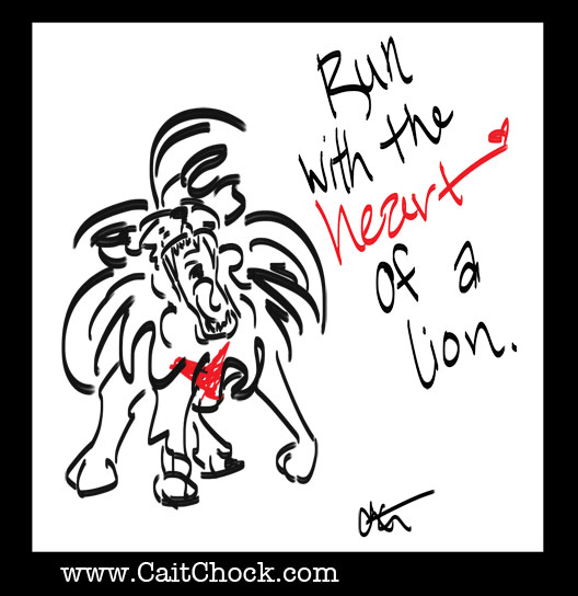
I will see only dreams and possibilities on the horizons. A future bright, no limits, goals big enough to scare.
But fear be d*mned.
I will run with the heart of a lion.
I will LIVE with the heart of a lion.
———
Speaking of lions, here is my latest Competitor article on THE lion himself: Meb Keflezighi
Celebrate your mother lion! Mother’s day is fast approaching…show your mother how she MOTIVATES and INSPIRES you with an Ezzere Tee. BUY NOW so it’ll get there by Sunday!
 By: Joy Chu,
on 6/18/2013
By: Joy Chu,
on 6/18/2013
Reblogged from UC San Diego Extension:

"Sure, it's simple, writing for kids...just as simple as bringing them up." - Ursula K. LeGuin
We recently had a chat with children's book illustrator and instructor Joy Chu about her taste in children's literature and for some advice on entering the field. Joy is teaching our first online children's book illustration course in Winter 2013 (the class opens for enrollment in October)!
 By: Jerry Beck,
on 4/2/2013
By: Jerry Beck,
on 4/2/2013
 Art of the Title, an addicting resource with dozens of high-def clips, recently posted their Title Design Finalists for the SXSW 2013 Film Awards. Of the animated title sequences, The Man Who Shook the Hand of Vicente Fernandez and ParaNorman are standouts: the first for its use of vintage woodblock typeface and spaghetti western aesthetic, and the latter for its 1950s horror-inspired design. Both sequences are richly nuanced, and imply an understanding of the history of typography and graphic poster design. This applied visual knowledge is the direct result of the collaboration between animators and designers.
Title sequence design has evolved since the days of Saul Bass, Maurice Binder and Pablo Ferro, some of the most recognized godfathers of the artform. More and more animators and graphic designers are building entire studio practices devoted to title sequence design. The first (or last) fifteen minutes of any film is increasingly crucial to the overall art direction, and often seen as an opportunity for experimentation.
I’ve spoken with several young animators who still treat title sequences as an after thought. Or, even worse, they just slap on the default fonts provided by Flash or After Effects. I’ve never understood this attitude. Think of it this way: you wouldn’t spend several months working on a cake recipe, bake it to perfection, just to cover it in store-bought icing. But for animation students just starting out, executing a thoughtful title sequence in addition to animating a film can be overwhelming. Fortunately, help is usually nearby in the graphic design department, where students will leap at the chance to assist in creating a title sequence.
One of the (many) ironies of higher education is that colleges attract hordes of bright, eager students, then isolate them into separate buildings, sometimes several city blocks or miles from each another. When I was a design student at the University of Texas, the animation students didn’t even realize my department existed—and vice versa. Unfortunately, animation and graphic design departments are rarely adjacent, and it’s up to students—not their teachers—to make these connections.
So if you’re an animation student, do yourself a favor: open up your university map, locate the graphic design school, then drop by and make introductions. Not every animated film, short or feature-length, needs a complex, typeset title sequence with bells and whistles. But building relationships with graphic designers, especially now that motion graphics is a required area of study in many design schools, could yield infinite possibilities with mutual benefits.
Add a Comment By: Mark Slater,
on 3/7/2013
By: Mark Slater,
on 3/7/2013
 By: Alice,
on 8/31/2012
By: Alice,
on 8/31/2012
After attending the “Because” event at the Wolff Olins office on July 4th, I was once again reminded of the big disconnect that lies between designers and their public. Wolff Olins is the firm that designed the London 2012 brand, a multifaceted design campaign that included much more than the London 2012 logo. Readers may remember the numerous complaints that the logo generated. As my research revealed, this was caused partly due to International Olympic Committee (IOC)’s restrictions and the corporate unwillingness to allow for the full application of what might be seen as a “no logo” campaign.
Wolff Olins proposed an open-source framework that would integrate the public by providing a design language that could be shaped into new forms and messages. The designers’ intention was to “hand over some tools that would allow people to make everything they wanted.” Design would be “off the podium, onto the streets.” But neither the public nor the broader designers’ community were ready to accept that the Wolff Olins team showed no compliance to the usual set of corporate instruction and that what they were trying to achieve lied beyond the creation of beautiful forms.

London 2012 event. Photo by Gary Etchell. Used with permission. All rights reserved. http://www.flickr.com/photos/gary8345/557769058/
The designers’ goal was to evoke an effect similar to that of the Mexico 1968 design: a visual language designed by Lance Wyman that was not only appropriated by the counter-Olympic movement, but also marked future visual languages developed by local designers in Mexico. In a way, Wolff Olins’ design succeeded in its adaptability, even though its multiple viral deconstructed versions that appeared on the streets and online were meant to primarily express conspiracy and protest, or even a disdain for the very visual language that the designers provided (and which these “dissidents” are now using).
But why would designers today strive for openness and participation? And why should IOC, London Organising Committee of the Olympic and Paralympic Games (LOCOG), or the general public be indifferent or even hostile to these intentions? After all, are there any designs that would meet the aspirations of all stakeholders: Olympic organizers, designers, and their multiple publics? The Olympics, as indeed most public events, are complex platforms that bring to the surface deep social conflicts and generate heated debates about the notion of public good. The new temporary or permanent configurations that are designed for the Olympics express these tensions and often become the targets of opposing voices.
Everyone today recognizes that the modern Olympics only partly concern sports. Few, though, are aware of the multiplicity of the design engagements that are mobilized for their realization. Being characterized as something between urban festivals and quasi-religious events, the Olympics have a strong ceremonial character that design generates. Hundreds of designers are mobilized to create a series of objects (logos, posters, uniforms, mascots, souvenirs) that are indispensable for the Olympic ensemble. This may seem to some a contemporary distortion to the original 19th century idea of the modern Olympics’ founder, Pierre De Coubertin, but Coubertin was keenly aware of the importance of design for the identity of the Games. He designed what has been credited as the most recognizable logo in the word, the Olympic rings, and spent considerable energy in prescribing the ceremonial characteristics of the event, with writings on subjects that ranged from attention to lighting and decoration, to specifications on the architecture of the venues.

Photograph in newspaper (unspecified) of Richard Beck working on the design for the Olympic poster. This proto-version differs from the final design, particularly in its typography. Collection: Powerhouse Museum, Sydney, 92/1256–1/4. Used with permission.
As it has become only too obvious with the current case of London, in late modernity the Olympics are also an opportunity for new infrastructure projects and major real estate enterprise, which leave a debatable legacy to the host-city. Planners, architects, and urbanists play a major role in this process, as well as those who sponsor, lease, or invest in the projects in the longue durée of the post-Olympic era. The design for the Mexico 1968 Olympics had significant ideological implications for the social segregation that marked the future of Mexico City. The architecture of the Athens 2004 Olympics is emblematic of ‘instant monumentality’ and a lack of legacy planning that has characterized many modern Olympics.
At the same time, the high visibility, budget, and scale of the Olympics have provided designers with opportunities to realize ambitions that are not possible through ordinary projects, and to envision ideas that are often too advanced for their times. Katsumi Masaru for instance insisted in compiling a design manual for the Tokyo 1964 Olympic Games (a set of prescriptions that would secure the unified application of the graphics, and thus a cohesive Olympic image), even though he knew too well that it could hardly be applied in the Tokyo Olympics per se. Indeed it was completed just before the start of the Games leaving nevertheless an important legacy for all forthcoming Olympics for which a design manual became a staple. Should we similarly expect that the “no logo” idea of the London 2012, with its openness and lack of corporate compliance, is signaling a new paradigm shift?
Jilly Traganou is Associate Professor in Spatial Design Studies at the School of Art and Design History and Theory, at Parsons The New School for Design in New York. She has published widely in academic journals, has authored The Tokaido Road: Traveling and Representation in Edo and Meiji Japan (Routledge, 2003) and co-edited Travel, Space, Architecture (Ashgate, 2009). She is currently working on a new book Designing the Olympics: (post-) National Identity in the Age of Globalization. Traganou has recently edited a special issue titled “Design Histories of the Olympic Games” for the Journal of Design History, where she also serves as Reviews Editor.
The new issue of the Journal of Design History titled “Design Histories of the Olympic Games” introduces the Olympics as a multifaceted design operation that generates diverse, often conflicting, agendas. Who creates the rhetorical framework of the Olympics, and how is this expressed or reshaped by design? What kind of ambitions do designers realize through their engagement with the Olympics? What overall purposes do the Olympics and their designs serve? ‘The Design Histories of the Olympic Games’ brings together writings by a new generation of scholars that cross the boundaries between traditional disciplines and domains of knowledge. Some of the articles look at the role of Olympic design (fashion design and graphic design) in representing national identity. Other articles look at the interconnected area of architecture, urbanism and infrastructure and the permanent legacy that these leave to the host city. You can view more on the Journal of Design History’s Design Histories of the Olympic Games Pinterest board too.
Subscribe to the OUPblog via email or RSS.
Subscribe to only art and architecture articles on the OUPblog via email or RSS.
Read more blog posts about the London 2012 Summer Olympic Games.
.jpeg?picon=3678) By: Janice Phelps Williams,
on 8/17/2012
By: Janice Phelps Williams,
on 8/17/2012
Today, I am the guest of Karen S. Elliott, The Word Shark, at her blog for writers and readers. I discuss my path to becoming a book designer and illustrator and list out the steps involved in creating illustrations for an author and/or publisher.
Here is the link:
http://karenselliott.wordpress.com/2012/08/16/kids-week-illustrator-book-designer-janice-phelps-williams/
Have a great weekend,
Janice
 By: Scott E Franson,
on 7/19/2012
By: Scott E Franson,
on 7/19/2012
A semester has just ended. Although there are always things that can be better it was a good semester. I had a discussion at lunch with Brian Memmott, a faculty colleague, about typography. My mantra for this semester has been, “Invite the reader into the content.” In the past my typographic mantra has been “You need to learn to see.” I still believe that students of typography need to “learn to see” but the statement itself is abstract and difficult for students to grab ahold of. All of them can get ahold of what attracts their attention and invites them to come in for a visit.
Invite readers to come in for a visit.
While the students are still in the beginning stages of learning about type, I am hopeful that observing typography from this new vantage point will invite and encourage them to learn to clearly communicate the content as they are learning to see.
 By: Ward Jenkins,
on 5/2/2012
By: Ward Jenkins,
on 5/2/2012
 When Andrea & I vacationed in Italy back in 1999, we checked out this cool flea market in Rome with lots of fun old stuff. Found this 45 record (above) in a record bin. Love the design. I've always cherished it.
 One of these days I'm gonna listen to this record. It's imperative that I do.

Good post. I learn something new and challenging on blogs I stumbleupon everyday.
It’s always exciting to read content from other authors and use a little something from other websites.
I adore Mehrdokht’s gorgeous work! I want to own her books. Thanks so much for this interview!
Reblogged this on SCBWI-MD/DE/WV Illustrators’ Blog and commented:
Take a look at the beautiful work of this illustrator!
beautiful!!
Interesting post and beautiful artwork! I tried clicking on the link, though, and it did not work!
Mehrdokht Amini has a new fan! I love her work!!
Thanks for pointing that out. I had the right web address, but there was a glitch in the code. First time that happen, so I appreciate you letting me know.
Absolutely awesome! I especially love Mehrdokht’s art for Ahmad Shamlou’s poetry. Even though I don’t always get around to popping over here (I have the email subscription and I read the posts just in my email sometimes), I just want to say how much joy the illustrator profiles bring to my Saturdays, not that I don’t learn much from your other posts. :)