* NOTE: The above is from an interview that was featured in UCSD Extension's Blog last fall, just before I began teaching the on-line version of my class, "Illustrating Books for Children"/Winter 2013 Quarter. — JC

On Monday, the Art Department took a field trip to see the AIGA’s 50 Books/50 Covers of 2009 exhibit. It was a worthwhile show to attend, but I had mixed feelings about it. For one, the non-traditional gallery presentation (above) brought both advantages and challenges. I loved the low bleacher set-up for books, because I could sit and relax while browsing heavier volumes. But the bleachers did the covers a huge disservice; not only did you have to bend down repeatedly to pick up each individual cover, you had to flip the card over to even see the image.
But the main reason that I left ambivalent over the 50/50 exhibit encompassed more of my greater feelings about design in general. Without a doubt, the books on display were creatively inspiring. I loved thumbing through the photos and art, the lavish paper stocks, and the 3-dimensionality of a beautifully-presented package. Books like these make me want to go home, stay up all night and make ART. It makes me feel a little inferior that I’m not doing that kind of work already.
At the same time, though, many of these books get right to the heart of one of my greatest pet peeves: design for design’s sake. Design should always serve a purpose, complement its material, and make content accessible to its consumer. I love design because it places equal importance on being functional AND visually pleasing. But many of the 50/50 books suggest the opposite. Type running into more type, or scattered across the page, or written in tiny Helvetica Bold . . . these things appeal to the hipster art-design community, but aren’t the best solution for the general reader. Go ahead and be as artsy as you want, but please, let it make sense.
That being said, I’ve composed some highlights of the exhibit to present my case. I’ll showcase my favorites, as well as some titles that really made my blood boil.
A perfect example to explain my point? Two books, no type on the cover:
Afrodesiac (AdHouse Books) – Perfectly captures the 1970s exploitation and comic book crazes. The interior contains pictures, not words. Generally all-around badass.
vs.
Manuale Zaphicum (Jerry Kelly LLC) – Yes, the letterpressed interior is absolutely gorgeous, but I found a blank cover for a book about a type designer to be annoying-ironic, not funny-ironic.
See what I mean? Okay, now on to some favorites:
 Pictorial Webster’s (Chronicle Books) – Gimme gimme gi

As I’ve mentioned before, this year is a great time to join the Penguin team – it’s the 75th anniversary of the classic paperback publisher. Since (of course!) I feel that Penguin’s greatest strength is its design and branding philosophy, I wasn’t going to miss the chance to hear about it from some of the best creative brains in the company at last Thursday’s AIGA panel.
First of all, can I just say that AIGA kicked off the event with some hilarious and heavily-accented (do those two things go together?) moderators! Board member Matteo Bologna, founder and president of Mucca Design Corporation, introduced Roberto de Vicq de Cumptich, an amazing book designer and creative director in his own right. You may know him as the creator of the children’s book Bembo’s Zoo (don’t miss the amazing online version!), which always reminds me of the best Type II project anyone could produce. I mean, it’s the same concept as your standard “play with letterforms” exercise, but blows every student out of the water.

Anyway, Bologna and de Cumptich got the crowd warmed up for what would continue to be a very witty discussion on the process of book cover design.
The featured guest of the evening was Paul Buckley, Executive VP and Creative Director of Penguin, not to mention editor of the featured Penguin 75 book. Aside from jokes about his former ’90s mullet and current “Penguin-esque” bald look, Buckley had some seriously enlightening things to say about the evolution of covers. Since Buckley was/is an illustrator as well (that’s his first love and original life plan), he’s passionate about integrating art and design, and pushing the limits of how the two can transform the surface of a book. Although he oversees hundreds of titles per year, you can still see his mark on the direction of new and old classics, such as the mind-blowingly AWESOME Penguin Ink series featuring tattoo artists.
 Bridget Jones’ Diary, illustrated by
0 Comments on Penguin 75: An AIGANY Panel as of 1/1/1900
Reblogged from UC San Diego Extension:


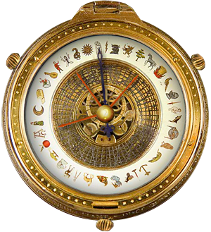
 I thought I was through with reports on the Golden Compass controversy. The movie comes out tomorrow and the time for hype is over. Then I visited the excellent children’s lit blog


Nice article! I wish I had had the opportunity to take your class way back when.
What a lovely thing to say, Anna! You are the perfect example of an author/artist who continues to absorb, learn, and apply new skills beautifully. You have so much to teach the rest of us, and yet you proceed as the eternal student. Look at how accomplished you are!