


"Willie was the only cheese maker in the land. In the shadows, a slow but unwavering rescue mission was underway."
0 Comments on Willie's rescue as of 1/1/1900
Add a Comment

 By: Christian Bocquee,
on 9/12/2016
By: Christian Bocquee,
on 9/12/2016
By: Christian Bocquee,
on 9/19/2015
 By: Andy Yates,
on 7/30/2015
By: Andy Yates,
on 7/30/2015


 ”
”


Quietly, one of the best current super-hero series being published is Nathan Edmondson & Phil Noto’s run on Black Widow. I first noticed Noto’s work on Marvel’s Uncanny X-Force, a few years back. His work brings a nice combination of fine art & design aesthetics to mainstream comic books. One of Noto’s earliest and most frequent collaborators was writing team extraordinaire Justin Gray and Jimmy Palmiotti; starting off with a number of issues on their classic Jonah Hex run in the mid-2000’s, then projects like Superman/Supergirl: Maelstrom and Trigger Girl 6 for Image’s Creator-Owned series.
Phil Noto and writer Gerry Duggan received an Eisner award nomination in 2011 for their original comic series The Infinite Horizon, which tells a post-apocalyptic war story inspired by Homer’s Odyssey.
Phil Noto has worked for Disney Animation, as well as a concept artist for video games, including the mega-hit BioShock. Noto continues to be one of the most sought after cover artists in comics. He recently created a series of classic magazine inspired covers for Marvel.
You can follow the latest Noto news and see the newest art on his tumblr site here.
For more comics related art, you can follow me on my website comicstavern.com – Andy Yates
 By: Anthony VanArsdale,
on 4/21/2015
By: Anthony VanArsdale,
on 4/8/2015
By: Anthony VanArsdale,
on 4/21/2015
By: Anthony VanArsdale,
on 4/8/2015
 By: Scott E Franson,
on 3/20/2015
By: Scott E Franson,
on 3/20/2015

Aboriginal Pointillism | I don’t know where this will go but it is really fun to do. Let me know if you like it.
 By: Christopher Denise,
on 12/2/2014
By: Christopher Denise,
on 12/2/2014
 By: Anthony VanArsdale,
on 11/13/2014
By: Scott E Franson,
on 10/8/2014
By: Anthony VanArsdale,
on 11/13/2014
By: Scott E Franson,
on 10/8/2014

Golden | It appears that I like orange.
By: Scott E Franson,
on 9/25/2014
By: Scott E Franson,
on 9/24/2014
 By: Mike Cressy,
on 3/27/2014
By: Mike Cressy,
on 3/27/2014

I'm working on a few different projects at the moment, all in progress, all squeezed in whenever I have a few minutes free. Here's where I was at the beginning of the week:
I'm glad to say that I'm pretty much done with the "I Choose to Fill Myself with Positive Energy" text design for the April free printable (for subscribers to the Floating Lemons monthly newsletter of course!), and I'll reveal all when the time comes. Meanwhile ...
I went a completely different direction with my Jelly assignment for MATS Bootcamp, and have managed to totally confuse myself. Should I go with something more along the lines of last weeks sketches, here, or stick to a slightly more geometric rendering of jelly moulds, as above? argh. We shall see. I may have to sketch a lot more jelly before deciding.
Meanwhile, here's the progress on a sketch I'm doing that will, perhaps, end up as a Thinking of You card up at the Two Smiles for HP (Hewlett-Packard) site.
I drew it, scanned it in and decided to experiment with some brand new digital pastel brushes that I purchased from Kyle T Webster. Oh my, I love them. Now that I've been deprived of Corel Painter (it just will not work since the last OS update and I don't want to invest and buy the upgrade only to discover that doesn't work either. I was, needless to say, hugely disappointed) these, along with his real watercolour brushes, are making digital painting a delight once more.
Here's a quick peek at what I've done so far ...
I'm using them exactly as I would my pencils on paper and there are layers and layers of colour being built up. Still have a way to go as yet, but I'm quite pleased with the way it's turning out so far.
Back to work! Wishing you a wonderful day loving what you do and doing what you love. Cheers.
By: Mike Cressy,
on 2/26/2014
 By: Scott E Franson,
on 9/12/2013
By: Scott E Franson,
on 9/12/2013
This is my submission for the Brigham Young University-Idaho Art Faculty Show (summer of 2013). 3 Inkjet prints, each print is 24 x 34 inches

detail

Diamond Point 1

Diamond Point 2

Diamond Point 3
By: Scott E Franson,
on 9/5/2013
Skoughtee Texture No.002 available September 9
 By: Mark G. Mitchell,
on 5/25/2013
By: Mark G. Mitchell,
on 5/25/2013
So what is musician-performer-dancer-composer Lindsey Stirling doing on this blog about children’s book illustration? She’s an artist but she works in a different medium. She hasn’t published a children’s picture book. (Not yet, anyway, but give her time.) I’m sharing this video of her 2011 tune Shadows, because twenty-two million YouTube viewers are not wrong […]![]()
By: Christian Bocquee,
on 2/28/2013

So. I'm in the middle of updating one of my older drawings. Well, a set of drawings ... three white ducks drawn, ATC-sized (that's 2.5"x3.5" to those who have no idea of what Artist Trading Cards are) on coloured backgrounds, all in coloured pencil. The originals are at this post: Ducks ATCs.
I decided to play with them a bit in Corel Painter and now I'm not sure of which ones I should put up on my cards and gifts online - the original drawn in coloured pencil, or the new digitally re-painted ones!
I'd love some help deciding, so here is the original:
And here's the 'painted' version:
To tell the truth, this isn't the first time I find myself stuck at having to make a choice. Am not too great at decision-making anyway, and when it comes to my art I think I get far too emotionally close, so it's difficult to stand back and be objective. I can get stuck for hours just trying to pick two different shades of the same colour! It's so not amusing that it's funny.
I'm seriously considering starting up a regular "dilemma" section where I ask for help picking out colours or different versions of a piece of art or illustration ... we shall see ...
As far as my Ducks are concerned, I do think I know which one I'm leaning more towards, but am still unsure and haven't made up my mind, so I'd love and appreciate any comments and help. Which one do you prefer?
By: Christopher Denise,
on 9/6/2012
 By: Christopher Denise,
on 8/24/2012
By: Christopher Denise,
on 8/24/2012
 By: Christopher Denise,
on 8/23/2012
By: Christopher Denise,
on 8/23/2012
 By: Hazel Mitchell,
on 7/20/2012
By: Hazel Mitchell,
on 7/20/2012

 By: John,
on 7/11/2012
By: John,
on 7/11/2012
And a bit of a progress GIF.
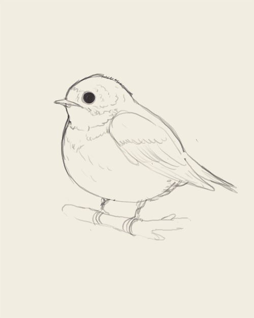
Mike Mitchell doesn’t need much introduction — he’s best known for his pop culture -inflected illustrations, but I’m really loving him flexing his digital painting chops on this series of fat birds. One of the things that sets him apart as an artist is his ability to maintain a throughline in his work, whether it’s an 80’s video game character or a fat barn swallow. Side bonus for followers of his Tumblr are his occasional astronomical photographs, like this one.
 By: JS Daniel,
on 5/27/2012
By: JS Daniel,
on 5/27/2012


Maybe instead of ‘ball’, I’ll do the same with the word ‘nut’… Also like the illustrations in Grandfather Gandhi – bold, but subtle in layered ways. Nice.
Mark, this is a wonderful post!! Thank you for the inspiration. AND how generous of you to share the other illustration courses. I have to add a plug for YOUR course which you humbly mentioned last. Mark’s course, Make Your Splashes; Make Your Marks!, was career and confidence changing for me! I feel so much more equipped to enter into the world of picture book publishing. Mark teaches a little history, as well as the craft itself and watercolor instruction that empowered me like never before. Reasonably priced and paced to your pocket book and schedule DO NOT MISS THIS excellent class. Mark is always encouraging and gives personal input and feedback. You will grow as an illustrator!