new posts in all blogs
Viewing: Blog Posts Tagged with: illustrator, Most Recent at Top [Help]
Results 51 - 75 of 489
How to use this Page
You are viewing the most recent posts tagged with the words: illustrator in the JacketFlap blog reader. What is a tag? Think of a tag as a keyword or category label. Tags can both help you find posts on JacketFlap.com as well as provide an easy way for you to "remember" and classify posts for later recall. Try adding a tag yourself by clicking "Add a tag" below a post's header. Scroll down through the list of Recent Posts in the left column and click on a post title that sounds interesting. You can view all posts from a specific blog by clicking the Blog name in the right column, or you can click a 'More Posts from this Blog' link in any individual post.
Post by Chloe


Clare Owen is a freelance illustrator based in Bristol who combines traditional media such as pen and ink with digital media to create charming illustrations. Her work has a feminine, pretty feel with added quirky touches. Clare Owen is inspired by films, flowers and food.
If you would like to view more of Clare Owen’s work please visit her portfolio.

By: Michelina Ouellette,
on 7/4/2015
Blog:
Michelle Can Draw
(
Login to Add to MyJacketFlap)
JacketFlap tags:
artist,
illustrator,
illustration,
cute,
dog,
photoshop,
painting,
pugs,
digital,
pug,
dogs of tumblr,
Add a tag

This is Florence- a commission I did for a lovely couple. Yay for pugs!
Most people point their cameras up when there taking photos. Lately I’ve been pointing mine down. I find the best textures live on or near the ground. I’m sure my neighbors think I’ve lost it when they see me taking pictures of my driveway but I don’t care because I know it’s going to make an excellent texture for my next piece of art.
There are lots of different ways to add visual interest to a digital file. I’ve been inspired by the some of the unique art I’ve been seeing on Instagram lately. Lots of textures and lots of originality. It seems as though the pendulum has begun to swing in the direction of a more organic look these days. Adding texture is a great way to great way to add visual interest and create a unique signature. The trick is figuring out how some of it is done and that’s the focus right now.
I’ve worked with adding simple textures in the past but I feel like I’ve barely scratched the surface when I look at some of the artists I’ve been following. This month I plan to dig in a little deeper and see if I can come up with some solutions of my own. At the same time I’ll be attempting to solve some of the problems I ran into earlier with my textures. I noticed some of the blending modes I used earlier made my art skew a little darker than I would have liked. I’d also like to see if I can find a way to add more vibrant colors to my textures at the same time.
My early attempts focused mainly on Photoshop but now I’m looking into Illustrator. The technique is slightly more complicated with Illustrator because, as you know, Photoshop offers the ease of using clipping masks where Illustrator does not. The art shown here involves two different textures placed on top of the original art using different blending mode for each. I’m pretty happy with whats going on in this illustration but for my next attempt I’d like to try and push the envelope a little further. Stay tuned for more updates.

This art was created in Adobe Illustrator using two different texture placed on top of the original image each with a different blending mode.
If you’d like to see a demo of the Photoshop techniques I use just check out this video:
The post Working with Textures in Adobe Illustrator appeared first on Bob Ostrom Studio - 919-809-6178.

By: Kim Sponaugle,
on 7/2/2015
Blog:
Illustrator Kim Sponaugle's Picture Kitchen Studio
(
Login to Add to MyJacketFlap)
JacketFlap tags:
illustrator,
children's book,
Kim Sponaugle,
books for kids,
Picture Kitchen Studio,
bully,
baby elephant,
getting along with others,
Laura Brigger,
preschooler picture book,
Add a tag
Rupert is acting very naughty at home and at school...
but one day someone new comes to class who is
even NAUGHTIER... has Rupert met his match?
For ages 4 and up!

Henri!, Character design concept.

By: Chloe Baldwin,
on 6/17/2015
Blog:
Illustration Friday Blog
(
Login to Add to MyJacketFlap)
JacketFlap tags:
lizzy,
illustrator,
illustration,
painting,
paint,
artists,
stewart,
traditional media,
editorial submissions,
pen/brush and ink,
Add a tag
By Chloe


Lizzy Stewart is an illustrator and artist currently based in London. She is inspired by writers such as Tove Janson and Doris Lessing, as well as museums and galleries. Her work is highly narrative and full of character. This is aided by her use of traditional media which gives Lizzy Stewart’s work a unique, quirky quality. If you’d like to find out more about Lizzy and her work please visit her portfolio here.
.jpg?picon=572)
By:
andrea joseph,
on 6/3/2015
Blog:
andrea joseph's sketchblog
(
Login to Add to MyJacketFlap)
JacketFlap tags:
illustrator,
illustration,
copyright,
sketch,
pen,
life drawing,
draw,
perseverance,
AJ,
andrea joseph,
persevere,
copyright 2015,
Add a tag
At the half time break, at life drawing this evening, I was ready to give up forever. I wanted to sneak out, go home and never pick up my pens again. My drawings were an embarrassment and why was I even at life drawing? I shouldn't be there. I didn't deserve to be there - not with what I was producing. I, obviously, was getting ideas above my station going to life drawing. But I finished my cuppa and went back in. I persevered and I'm glad I did. I pulled this one out of the bag. And now I can carry on drawing for a bit longer.
By:
andrea joseph,
on 5/22/2015
Blog:
andrea joseph's sketchblog
(
Login to Add to MyJacketFlap)
JacketFlap tags:
AJ,
upcycle,
illustrator for hire,
andrea joseph,
Andrea Joseph drawings,
Pilot pens,
vintage radio,
illustrator,
illustration,
ink,
radio,
retro,
sepia,
vintage,
Add a tag
As I may have already mentioned, I've been cleaning up my house recently. It fell into disrepair due to neglect (by me) and now I'm giving it some much needed attention. I've put a deadline on getting it done too; August. I have decided to do an Open House then, to show off all my hard work - decorating and drawing - and you're all invited. I need to, not only paint the whole place, but, get my work together to frame and hang. I came across this radio drawing whilst sorting through stuff. I made it, about six years ago, whilst in Italy. It was on that trip that I met
lapin for the first time too. I also drew his hat. But that hangs in his home.
Anyway, I decided I'd like this drawing to be at my Open House exhibition, so last night I played around with it a little. I upcycled this old radio, if you like. There were practical reasons for doing it; the brown pens I used back then (my beloved Pilot G-tec) are just not light fast, and so, as I wanted this radio hanging on my wall, in August, it too needed a little attention. I went over it all in brown light fast fine liners and added a little colour pencil. An improvement on the original? I don't know. That's all subjective.
Now, I haven't got time for all this. I've got walls to paint. AUGUST?! The whole house by August
By:
andrea joseph,
on 5/18/2015
Blog:
andrea joseph's sketchblog
(
Login to Add to MyJacketFlap)
JacketFlap tags:
illustrator,
illustration,
drawing,
book illustration,
colour pencil,
cork,
wine,
AJ,
illustrator for hire,
andrea joseph,
Bordeaux,
Andrea Joseph drawings,
corks,
red wine,
Add a tag
I've been cleaning up my house recently. And cleaning up my act. I've always kept stuff 'for drawing'. For that day when I finally sit down and draw my stamp, matchbox, buttons, receipts, doll's heads (really), cork collections. Amongst many others.
But, this isn't fitting in with my quest for minimalist living. So there's going to be a cull. Things are getting serious. But how can I get rid of these corks? They are thing of beauty. I've drawn them before (above and below) and I may want to draw them again. They all have their own characters and personalities. They're all slightly different. You can make rubber stamps out of them. They have sentimental.....
By:
andrea joseph,
on 5/14/2015
Blog:
andrea joseph's sketchblog
(
Login to Add to MyJacketFlap)
JacketFlap tags:
illustrator,
sketchbook,
sketchcrawl,
Urban Sketchers,
urban sketching,
AJ,
andrea joseph,
Andrea Joseph drawings,
Urban Sketchers Yorkshire,
event sketcher,
reportage sketcher,
Add a tag
Right, once again I haven't posted here in too long. So, here's a mega post. I won't bore you with words. I'll just show you in drawings and photos some of the things I've been doing (drawing) in all the gaps between posts.
I've been drawing in bars
and in antique showrooms
drawing bikes in galleries
and skeletons in museums,
drawing the guy at the bar of the brasserie
and the girl at the café,
the chip van
and at lunch with my niece
at the cricket with friends
more bones at another museum
whilst working at the gallery
at another bar
on the high street
at a transport museum
and another bike
at another pub
with a sharply dressed man
at a bus station
at a flea market
and at another museum.
Which all tells me that I like old things and spend a lot of time eating out in bars and cafes. Yep, I think that pretty much sums it up.
Have you signed up to
Sketchbook Skool yet? The course I teach on starts today. You too may end up drawing your life too if you do. Enrol on 'Seeing'
HERE.
By:
andrea joseph,
on 5/7/2015
Blog:
andrea joseph's sketchblog
(
Login to Add to MyJacketFlap)
JacketFlap tags:
illustrator,
tutorial,
DIY,
Etsy,
SALE,
for sale,
self published,
zine,
Molezine,
andrea joseph,
zines by Andrea Joseph,
zine making,
zinester,
illustrated zine,
ballpoint art,
DIY culture,
DIY self publishing,
Add a tag
Here's another of my passions folks. Zines. I am a fully fledged zine maker. A zinester, to use the technical term. What is it about making zines I love? Well, it is the whole process. But the main main thing is that it is DIY publishing which means you only answer to yourself. You write, draw, play, create whatever it is that you want to. Totally and utterly authentic. Nobody else has any say, influence or sway over what you want to produce. What can be better than that? Well, making money out of it would be nice. But, that's never the starting point. You'd be sorely disappointed if it was. They are a labour of love. No, the starting point is 'I'm going to make this because I want/need to'.
It does, however, mean that sometimes we have to flog our creations. So, here's
a bundle of my five current zines. Each has a run of 1000. No more no less. And, I've put a SALE on. Normally $50 but I've knocked 20% off so until the end of the week they're just $40.
This is the perfect inspiration kit for anyone who loves drawing or just loves to look at drawings.
Molezine 2
A collection of some of the drawings from my travel themed Moleskine sketchbook. Limited stock.
How To Draw Like a Loon
Created with nothing but a four colour ballpoint. This zine is all about drawing and handwriting. Filled with lots of exercise for you to try. Including how to make a zine! Very limited stock.
An Idle Daydream
A zine that reviews my favourite (and not so favourite) pens. Also includes some of my favourite blog images from the last eight years.
How to Draw Like a Barmpot
Another tutorial zine. This one focuses on drawing with your imaginations. Includes lots of little exercises to get your imagination working.
The Daily Tamp
A tiny cut-out-and-make newspaper full of stories, film reviews, classified ads and all the usual features of a big full sized newspaper but just tiny.
If you'd like to purchase, or read more about this zine bundle you can do so
HERE. You will be supporting an artist to create more publications that you won't find on the supermarket shelves.
Many thanks for listening.
By: Michelina Ouellette,
on 4/28/2015
Blog:
Michelle Can Draw
(
Login to Add to MyJacketFlap)
JacketFlap tags:
geek girls,
chunli,
chun li,
artist,
illustrator,
nintendo,
postcard,
fanart,
street fighter,
snes,
Add a tag
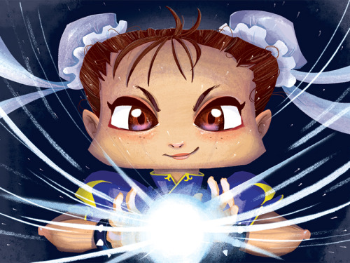
Check out the Chun-Li Artist Series Card I made for Fangamer: Also, don’t forget to take a peek at the other cards, they all turned out awesome! goo.gl/0aUSNm
By:
andrea joseph,
on 4/12/2015
Blog:
andrea joseph's sketchblog
(
Login to Add to MyJacketFlap)
JacketFlap tags:
AJ,
Oldham,
reportage,
AndreaJoseph,
reportage sketcher,
illustrator,
illustration,
drawing,
sketch,
sketchbook,
draw,
sketchcrawl,
Add a tag
Yesterday I went back to
Gallery Oldham where I'd previously done research for the Museum job that I've talked about in my last posts. This time though I returned for a little mini sketch meet up with some friends.
When I was there last time I made this sketch, below, of the guy who worked in the gallery's lovely
Naked Bean cafe. It was a sneaky sketch, I didn't show him but I did post the sketch on Twitter and the cafe saw it. They said that he loved it - even though i'd made him look pretty grumpy in it. Which he wasn't. He was the opposite to grumpy.
Anyway, yesterday, when I returned and with the knowledge he was happy with the sketch I took the opportunity to get a photo of him with it. He said "I've never been drawn before. It made my day. I put it on Facebook and everything".
I think the fear for all of us that sketch people is their response to it. Will they be offended? Will they hate it? I know it's my fear which is why I don't often show them. But his response made my day. This time it paid off.
By Chloe


Sticky Monster Lab is a multidisciplinary creative studio based in Korea. They cover various mediums from illustration to motion graphics, graphic design to product design. This wide spectrum helps make their work so unique and dynamic. Sticky Monster Lab have great wit and attention to detail which has allowed them to collaborate with Nike, Nissan and MTV.
If you’d like to see more work from Sticky Monster Lab, please visit their portfolio.
By:
andrea joseph,
on 4/6/2015
Blog:
andrea joseph's sketchblog
(
Login to Add to MyJacketFlap)
JacketFlap tags:
illustrator,
illustration,
copyright,
zines,
Etsy,
for sale,
miniature,
newspaper,
zine,
AJ,
andrea joseph,
zines by Andrea Joseph,
zine making,
The Tamp,
zinester,
illustrated zine,
Add a tag
My new zine, The Tamp, now has an advert. yes, I've hit the big time. This minature zine is not only a tiny newspaper but also a puzzle. The puzzle is putting the thing together and specifically getting the pages in the correct order. It'll only make sense if they are in the right order. I say 'make sense'...
The newspaper has a tiny comic strip, a tiny film and book review, tiny classified ads. So, as the man says 'READ ALL ABOUT IT!'. Limited print run, get your copy
HERE.
By:
andrea joseph,
on 4/5/2015
Blog:
andrea joseph's sketchblog
(
Login to Add to MyJacketFlap)
JacketFlap tags:
illustrator,
drawing,
mascara,
make up,
Buxton,
pub,
AJ,
illustrator for hire,
andrea joseph,
eyeliner,
pubcrawl,
sketchbook,
sketchcrawl,
Urban Sketchers,
urban sketching,
Add a tag
So, I'll be honest, this is basically a test post. For a long time my blog has just been chugging along. There was a time, way back when, when I would blog, religiously, a few times a week. Then social media happened.
Like many people, I suppose, I started 'blogging' there. It seemed easier. I'm not really interested in sharing the ins and outs of my life online, or social media, but sharing my artwork through those platforms seemed to make sense. Blogging suddenly seemed like much more of an effort. I mean you had to switch in the laptop and all that palaver.
I blamed blogging, and blogs, for that - for being behind the times. Not catching up with social media. But it was me that was behind the times and not keeping up with the technology. It hadn't even dawned in me to download the Blogger app. But now I have.
I took these photos on Friday. My friend and I, Kate of
Emily Pickle design (haven't worked out if it's possible to add a link when blogging on your phone. Anyone?) took her 'pencil case' out to the pub to draw. Her pencil case/make up bag is filled with all sorts of goodies I'd never have dreamtof using to draw with. The drawing above is made with glitter mascara, liquid eyeliner and Christmas wrapping tapes amongst other things. I loved experimenting with all this stuff. I'll never look at an old eyeliner in the same way again.
Right, I'm going to put the laptop on to see how this worked out....
Sannel Larson - The Total Picture

By:
andrea joseph,
on 3/22/2015
Blog:
andrea joseph's sketchblog
(
Login to Add to MyJacketFlap)
JacketFlap tags:
AJ,
illustrator for hire,
marker pens,
andrea joseph,
pen drawing,
Andrea Joseph drawings,
Urban Sketchers Yorkshire,
illustrator,
illustration,
journal,
drawings,
pen,
sketchbook,
sketchcrawl,
bike,
bicycle,
Add a tag
By:
andrea joseph,
on 3/21/2015
Blog:
andrea joseph's sketchblog
(
Login to Add to MyJacketFlap)
JacketFlap tags:
illustrator,
illustration,
dance,
poster,
Sheffield,
how to draw,
illustrator for hire,
andrea joseph,
Dr Sketchy,
Andrea Joseph fonts,
Dr Sketchy Sheffield,
poster artist,
Andrea Joseph posters,
Add a tag
Amongst all the other illustration work I do, I also co-run
Dr Sketchy Sheffield and, so, being the sketching half of the team (
my co-running partner is from the performance arts), I create the poster artwork. It's one of my favourite things to illustrate. Because it makes me feel closer to the poster artists, from days gone by, who's work I adore. I wish there were more call for poster artists. These days it's all done digitally so I like to buck that trend with purely illustrated posters (and I wouldn't have a clue how to do it digitally).
Now once we've set our theme for our Dr Sketchy event the idea for the poster image pretty much comes to me straight away. Sometimes without even having to think about it. Really, it's just there. I see it - the whole poster - fully formed. I then just need to put it onto paper.
Our next event (
next Saturday, at the Greystones, Sheffield!) will be a celebration of dance. We have performers from different genres of dance modelling and, erm, dancing for us. We have a belly dancer, a breakdancer, a bhangra dancer amongst others. So, already I knew I had to get that info into the drawing. The first and original thought was of the kind of drawing in the image above. I think it's important to go with that initial idea if it has presented itself to you. I love those 'consequences' drawings. I've heard them called other things and somebody once told me that they were known as 'exquisite cadaver' drawings. I think that's such a great name, which conjures up all sorts of weird and wonderful images, so I'll be sticking with that.
I made a few exquisite cadaver sketches, like the one above, to try it out. To see if it worked. I'll be honest with you, I think the trial run above is still my favourite. I guess that's because it was the most spontaneous. Then when I'd got one that I felt would work as a poster image I sketched it out onto a 'proper' bit of paper. I always add the image first, leaving room for the text. Sometimes I will play around with where I want to place the image. I did with this one - I tried her on both sides of the page and central before settling on this composition.
For the text I always quickly research (Google) posters or fonts until I find something that fits. For example, I'll Google
'Bollywood poster fonts' or some such thing. This one was a combination of various fonts because of the variety of dance genres. When I find a font I like I loosely copy it. I don't measure out the letters, nothing technical happens, I just copy it by eye (is that even a saying? It looks odd now it's typed out). I don't want it to look exactly like the fonts I find. I want it to be my own version of them.
Anyway, that's a little (ish) explanation of how I create my posters. Now anyone want a poster illustration? I'm for hire. I'm always for hire.
By:
andrea joseph,
on 3/19/2015
Blog:
andrea joseph's sketchblog
(
Login to Add to MyJacketFlap)
JacketFlap tags:
art zine,
ballpoint pen art,
bumper pack,
zinester,
illustrator,
illustration,
book,
zines,
Etsy,
bag,
badges,
for sale,
bags,
zine,
AJ,
andrea joseph,
Andrea's book,
Add a tag
Sorry to have to pedal my wares here, guys. But, believe me, I have to.
By:
andrea joseph,
on 3/15/2015
Blog:
andrea joseph's sketchblog
(
Login to Add to MyJacketFlap)
JacketFlap tags:
illustrator,
illustration,
car,
pencil drawing,
pencil,
4B,
AJ,
illustrator for hire,
marker pens,
andrea joseph,
Andrea Joseph drawings,
car drawing,
Jaguer E-type,
Add a tag
The Jaguar E-type has recently been voted Britain's favourite classic cars in
this poll. I was commissioned to produce a drawing of it. It's not surprising that it is in the number one spot as it really is a thing of beauty.
I used pencil (a soft thick 4B) and marker pens, to make this drawing, both of which are drawing materials that I've recently started using. I've never been much of a pencil girl. It doesn't really do it for me, but I kinda like these soft pencils now and again. The marker pen has been a revelation and I can't get enough of them these days. I did all the darker tones and areas with the markers, and it struck me that at one point I would have filled all that in with tiny cross hatched fine lines. Just the thought of doing that, now, brings me to tears.
You can see the rest of the list of Britain's favourite cars, and if you vote you can actually win this drawing
HERE.
By:
Bianca Schulze,
on 3/14/2015
Blog:
The Children's Book Review
(
Login to Add to MyJacketFlap)
JacketFlap tags:
Illustrator,
Ages 0-3,
Ages 4-8,
Picture Book,
Peace,
Picture Books,
Art,
Shaun Tan,
Maurice Sendak,
Richard Scarry,
featured,
Ezra Jack Keats,
Barbara Cooney,
Lane Smith,
Picture Books For Children,
Edward Gorey,
Arnold Lobel,
Book Illustrator,
Beatrice Alemagna,
Illustration Inspiration,
Cultural Wisdom,
Social Graces,
Stephanie Graegin,
Annette LeBox,
Add a tag
Stephanie Graegin spent her childhood drawing and collecting fauna. These days, she lives in Brooklyn, is still drawing, and has managed to keep her animal collection down to one orange cat.
By:
andrea joseph,
on 3/11/2015
Blog:
andrea joseph's sketchblog
(
Login to Add to MyJacketFlap)
JacketFlap tags:
self employed,
AJ,
illustrator for hire,
andrea joseph,
drawn by Andrea Joseph,
Andrea's book,
bleu,
illustrator,
illustration,
DIY,
cartoon,
comic,
Etsy,
blue,
French,
for sale,
self publishing,
shop local,
Add a tag
A little while back I was asked why
my book was more expensive in
my shop as opposed to on Amazon. It is a good question. It is a fair question. I tried to answer it in an illustration. How else?
It is an issue that faces all of us that run a small business. There's no way of competing with the big guys, no way at all, there is no point in trying. But we do have an advantage over them and that is the service we give.
I am not making big bucks off my book, hell, I forgot to even mention, in this illustration, that I have to buy my book off my publisher in the first place - as well as the currency conversion and bank charges that that entails too. That's before the, above, process even begins. No, I'm just scraping by. Always just scraping by.
But when you do buy from a small business or independent seller/artist you are also supporting them in creating their work. Thank you for that. I really don't mind where people buy my book from. It is an honour that they do buy it at all.
I'm glad I was asked this question. It's an important one and it gave me the chance to try and answer it. Quite coincidentally, I was chatting with my publisher, whilst I was in the middle of this drawing, about the price issue when he said "in French we say 'le pot de terre contre le pot de fer'. It's a kind of David and Goliath" and that's how this drawing got the title.
By Chloe


Dean Gorissen’s illustrations are packed with character. His warm colour palettes and subtle textures add depth to his work and give a slight retro feel. Dean Gorissen has worked for a large variety of editorial clients and has also illustrated several picture books.
You can see more of Dean Gorrisen’s work here.
View Next 25 Posts


