


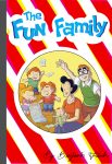
 Cartoonist Benjamin Frisch makes his graphic novel debut this summer with THE FUN FAMILY, a subversive look at the underbelly of the All-American family through the prism of Family Circus-esque Sunday morning comic strips. Frisch presents a surreal deconstruction of modern parenting, childhood nostalgia, and good old American narcissism. The book, which goes on sale […]
new posts in all blogs
 By: Heidi MacDonald,
on 7/7/2016
By: Heidi MacDonald,
on 7/7/2016
Blog: PW -The Beat (Login to Add to MyJacketFlap)
JacketFlap tags: Comics, Cartoonists, Indies, IDW, Benjamin Frisch, THE FUN FAMILY, Add a tag
By: Heidi MacDonald,
on 7/6/2016
Blog: PW -The Beat (Login to Add to MyJacketFlap)
JacketFlap tags: Small Presses, Books, Reviews, Graphic Novels, Comics, Webcomics, Kickstarter, Indie Comics, Crowdfunding, sophie campbell, Add a tag
By: Heidi MacDonald,
on 7/6/2016
Blog: PW -The Beat (Login to Add to MyJacketFlap)
JacketFlap tags: Interviews, Comics, Dark Horse, Dark Horse Comics, Briggs Land, Add a tag
By: Heidi MacDonald,
on 7/5/2016
Blog: PW -The Beat (Login to Add to MyJacketFlap)
JacketFlap tags: Interviews, Comics, Webcomics, Revival, E-publishing, Mike Norton, Battlepug, matt chats, Add a tag
By: Heidi MacDonald,
on 6/28/2016
Blog: PW -The Beat (Login to Add to MyJacketFlap)
JacketFlap tags: Small Presses, Reviews, Comics, Mini Comics, Indie Comics, Anne Emond, madeline flores, Laura Knetzger, Retrofit Comics, Sophie Franz, Yumi Sakugawa, Alabaster Pizzo, Kaeleigh Forsyth, Akino Kondah, Add a tag
By: Heidi MacDonald,
on 6/28/2016
Blog: PW -The Beat (Login to Add to MyJacketFlap)
JacketFlap tags: Interviews, Comics, Portland, Oni, welcome back, matt chats, chris sebela, heartthrob, robert wilson iv, Add a tag
By: Heidi MacDonald,
on 6/27/2016
Blog: PW -The Beat (Login to Add to MyJacketFlap)
JacketFlap tags: Small Presses, Reviews, Graphic Novels, Comics, Indie Comics, conundrum press, Rebecca Roher, Add a tag
By: Heidi MacDonald,
on 6/24/2016
Blog: PW -The Beat (Login to Add to MyJacketFlap)
JacketFlap tags: Comics, Indies, All Ages Comics, Monster Elementary, Space Goat Productions, Add a tag
By: Heidi MacDonald,
on 6/23/2016
Blog: PW -The Beat (Login to Add to MyJacketFlap)
JacketFlap tags: Comics, DC, Aspen Comics, DC Comics, Top News, Justice League, Add a tag
By: Heidi MacDonald,
on 6/21/2016
Blog: PW -The Beat (Login to Add to MyJacketFlap)
JacketFlap tags: Small Presses, Books, Reviews, Graphic Novels, Comics, Art Comix, Indie Comics, Literary Comics, Koyama Press, Patrick Kyle, Add a tag
By: Heidi MacDonald,
on 6/20/2016
Blog: PW -The Beat (Login to Add to MyJacketFlap)
JacketFlap tags: Comics, Marvel, Spider-Man, Michael Turner, Aspen Comics, Top News, #Marvel, Add a tag
By: Heidi MacDonald,
on 6/20/2016
Blog: PW -The Beat (Login to Add to MyJacketFlap)
JacketFlap tags: e3 2016, Comics, DC, Video Games, Batman, DC Comics, telltale games, Add a tag
By: Heidi MacDonald,
on 6/16/2016
Blog: PW -The Beat (Login to Add to MyJacketFlap)
JacketFlap tags: Top News, fight club 2, Interviews, Comics, Dark Horse, Chuck Palahniuk, Dark Horse Comics, Bait, Add a tag
By: Heidi MacDonald,
on 6/15/2016
Blog: PW -The Beat (Login to Add to MyJacketFlap)
JacketFlap tags: Joshua Hale Fialkov, matt chats, tony fleecs, jeff steinberg, Interviews, Comics, Oni, My Little Pony, Add a tag
By: Heidi MacDonald,
on 6/15/2016
Blog: PW -The Beat (Login to Add to MyJacketFlap)
JacketFlap tags: Comics, DC, Batman, DC Comics, Paul Dini, Add a tag
By: Heidi MacDonald,
on 6/14/2016
Blog: PW -The Beat (Login to Add to MyJacketFlap)
JacketFlap tags: Art Comix, Indie Comics, alternative comics, Malachi Ward, Small Presses, science fiction, Reviews, Comics, Add a tag
By: Heidi MacDonald,
on 6/13/2016
Blog: PW -The Beat (Login to Add to MyJacketFlap)
JacketFlap tags: Reviews, Graphic Novels, Comics, Fantagraphics, Art Comix, Literary Comics, Italian comics, Maneuele Fioe, Add a tag
.png.jpg?picon=3916) By: Heather Dixon,
on 6/13/2016
By: Heather Dixon,
on 6/13/2016
Blog: StoryMonster (Login to Add to MyJacketFlap)
JacketFlap tags: comics, comic, byu, ghosts, flash mob, MonsterBoards, Monstrosities, kiddie bikes, Add a tag
By: Heidi MacDonald,
on 6/10/2016
Blog: PW -The Beat (Login to Add to MyJacketFlap)
JacketFlap tags: End of the World, Lovecraft, The Show, nemo, Alan Moore, Dagon, Providence, Literary Comics, Heart of Ice, Top News, Top Comics, HPL, Thomas Ligotti, FHTAGN!, Jacen Burrows, Jimmy's End, Neonomicon, Nyarlathotep, Pärnu-Jaagupi, Robert Aickman, Interviews, Books, Uncategorized, Comics, Cthulhu, Avatar, Culture, Breaking News, Add a tag
By: Heidi MacDonald,
on 6/7/2016
Blog: PW -The Beat (Login to Add to MyJacketFlap)
JacketFlap tags: Small Presses, Reviews, Graphic Novels, Comics, Mini Comics, Art Comix, Indie Comics, Koyama Press, cathy g. johnson, Add a tag
By: Heidi MacDonald,
on 6/7/2016
Blog: PW -The Beat (Login to Add to MyJacketFlap)
JacketFlap tags: Interviews, Comics, Image, collaboration, lazarus, greg rucka, Michael Lark, Add a tag
By: Heidi MacDonald,
on 6/6/2016
Blog: PW -The Beat (Login to Add to MyJacketFlap)
JacketFlap tags: Comics, Fantagraphics, Indie Comics, Joshua W. Cotter, Books, science fiction, Reviews, Graphic Novels, Add a tag
By: Heidi MacDonald,
on 5/31/2016
Blog: PW -The Beat (Login to Add to MyJacketFlap)
JacketFlap tags: alternative comics, Oily Comics, Small Presses, Reviews, Comics, Kids' comics, Mini Comics, Indie Comics, Add a tag
By: Heather Dixon,
on 5/30/2016
Blog: StoryMonster (Login to Add to MyJacketFlap)
JacketFlap tags: comics, disney, Disneyland, MonsterBoards, Monstrosities, abandonedland, disneyland secrets, Add a tag
View Next 25 Posts
Viewing: Blog Posts Tagged with: COMICS, Most Recent at Top [Help]
Results 1 - 25 of 2,382
Blog: PW -The Beat (Login to Add to MyJacketFlap)
JacketFlap tags: Comics, Cartoonists, Indies, IDW, Benjamin Frisch, THE FUN FAMILY, Add a tag
Blog: PW -The Beat (Login to Add to MyJacketFlap)
JacketFlap tags: Small Presses, Books, Reviews, Graphic Novels, Comics, Webcomics, Kickstarter, Indie Comics, Crowdfunding, sophie campbell, Add a tag
It’s a rare occasion that you can use words like sweet, thoughtful, and gentle to describe a science fiction superhero story taking place in a brutal, dystopian urban battleground, but thanks to Sophie Campbell’s Shadoweyes from Iron Circus Comics, that day has arrived. Set in a cluttered and decaying city of the future, Dranac, Campbell introduces […]
Add a CommentBlog: PW -The Beat (Login to Add to MyJacketFlap)
JacketFlap tags: Interviews, Comics, Dark Horse, Dark Horse Comics, Briggs Land, Add a tag
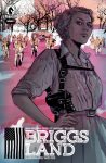 With so many new comics, TV shows, and films out there; it’s easy for even the most open readers to fall down a jaded hipster hole of “meh” when something comes along that tells a bold tale. Dark Horse Comics is set to launch a new crime drama series in August sure to grab even the […]
Blog: PW -The Beat (Login to Add to MyJacketFlap)
JacketFlap tags: Interviews, Comics, Webcomics, Revival, E-publishing, Mike Norton, Battlepug, matt chats, Add a tag
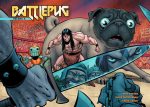 I talked with Mike once before about Battlepug, and was happy to do it again following its recent grande finale. I asked him more about the process for his webcomic, how he feels about ending it and his Image series Revival. Read on to learn how Mike’s grown as an artist and his experiences concurrently drawing […]
Blog: PW -The Beat (Login to Add to MyJacketFlap)
JacketFlap tags: Small Presses, Reviews, Comics, Mini Comics, Indie Comics, Anne Emond, madeline flores, Laura Knetzger, Retrofit Comics, Sophie Franz, Yumi Sakugawa, Alabaster Pizzo, Kaeleigh Forsyth, Akino Kondah, Add a tag
Bear, Bird, and Stag Were Arguing In The Forest and Other Stories by Madeline Flores Flores offers three philosophical shorter works that come together well in their examination of knowing yourself, living purposefully, understanding where you stand in the universe, seeing the potential in yourself, and lots of other good things, but without being heavy. Instead […]
Add a CommentBlog: PW -The Beat (Login to Add to MyJacketFlap)
JacketFlap tags: Small Presses, Reviews, Comics, Mini Comics, Indie Comics, Anne Emond, madeline flores, Laura Knetzger, Retrofit Comics, Sophie Franz, Yumi Sakugawa, Alabaster Pizzo, Kaeleigh Forsyth, Akino Kondah, Add a tag
Bear, Bird, and Stag Were Arguing In The Forest and Other Stories by Madeline Flores Flores offers three philosophical shorter works that come together well in their examination of knowing yourself, living purposefully, understanding where you stand in the universe, seeing the potential in yourself, and lots of other good things, but without being heavy. Instead […]
0 Comments on Review: Retrofit offers tons of excellent comics by women as of 7/2/2016 1:53:00 PM
Add a Comment
Blog: PW -The Beat (Login to Add to MyJacketFlap)
JacketFlap tags: Interviews, Comics, Portland, Oni, welcome back, matt chats, chris sebela, heartthrob, robert wilson iv, Add a tag
 Chris Sebela is everywhere. I first became aware of him thanks to the Everest crime thriller High Crimes from Monkey Brain, and since then he has worked with an array of publishers from Marvel to DC to Image to Dark Horse and, recently, with Oni Press and Boom! Studios for his latest creator-owned series. I talked to Chris about […]
0 Comments on MATT CHATS: Chris Sebela on Comics, Cross-Pollination and Portland as of 7/2/2016 1:25:00 PM
Add a Comment
Blog: PW -The Beat (Login to Add to MyJacketFlap)
JacketFlap tags: Small Presses, Reviews, Graphic Novels, Comics, Indie Comics, conundrum press, Rebecca Roher, Add a tag
For many people, the earliest experience of human loss that pierces their emotions and affects their everyday existence is the death of a grandparent, and that of a grandmother, I have found, anyway, seems to pack a particular wallop. Some grandmothers participate in a kid’s life as a kind of back-up parent, others as a […]
0 Comments on Review: Rebecca Roher’s tender family memories are a pleasing meditation on loss as of 7/1/2016 11:49:00 AM
Add a Comment
Blog: PW -The Beat (Login to Add to MyJacketFlap)
JacketFlap tags: Comics, Indies, All Ages Comics, Monster Elementary, Space Goat Productions, Add a tag
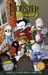 What’s your definition of all-ages comics? Often these book are mistakenly synonymous with kids comics. Yet there is a big difference between a book filed with drawings to catch the minimal attention spans kids have left and a book young children can read while not having themes or ideas diluted just to pander. Recently, Space Goat […]
0 Comments on INTERVIEW: The Monster Elementary Vol 1 collection might be your new favorite all-ages comic as of 6/28/2016 1:51:00 PM
Add a Comment
Blog: PW -The Beat (Login to Add to MyJacketFlap)
JacketFlap tags: Comics, DC, Aspen Comics, DC Comics, Top News, Justice League, Add a tag
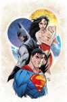 DC Comics Rebirth has renewed fans love affair with their stable of characters by bringing back much of what we missed about super hero comics. It’s also brought another group of fans out in full force; followers of the late Michael Turner, who passed away in 2008 after a long struggle with bone cancer. The artist […]
2 Comments on Justice League #1 Gets Aspen Store Michael Turner Variant, last added: 6/25/2016
Display Comments
Add a Comment
Blog: PW -The Beat (Login to Add to MyJacketFlap)
JacketFlap tags: Small Presses, Books, Reviews, Graphic Novels, Comics, Art Comix, Indie Comics, Literary Comics, Koyama Press, Patrick Kyle, Add a tag
Sometimes it’s better to just give yourself to something rather than to seek out its meaning. Not everything has to have one clear meaning, and in some cases, to bring concrete meaning to a work might mean imposing clarity on something that was not meant to have any. That imposition might actually come off as […]
2 Comments on Review: Patrick Kyle invites you to force your way into his work, last added: 6/24/2016
Display Comments
Add a Comment
Blog: PW -The Beat (Login to Add to MyJacketFlap)
JacketFlap tags: Comics, Marvel, Spider-Man, Michael Turner, Aspen Comics, Top News, #Marvel, Add a tag
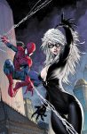 With the tremendous response to their recent Batman #1 variant, Aspen Comics is partnering with Marvel for an Amazing Spider-Man #15 variant cover. Much like their Batman cover, this Spidey cover will utilize art by renowned artist and Aspen Comics founder Michael Turner. Here’s the official word from Aspen Comics: Marvel Comics and Aspen Comics have […]
0 Comments on Amazing Spider-Man #15 Gets Michael Turner Variant Cover as of 6/20/2016 11:25:00 PM
Add a Comment
Blog: PW -The Beat (Login to Add to MyJacketFlap)
JacketFlap tags: e3 2016, Comics, DC, Video Games, Batman, DC Comics, telltale games, Add a tag
![]() Thursday at E3 Comics Beat got a behind closed doors look at the first 30 minutes of Batman: The Telltale Series. With the caped crusader appearing in three other games in the next 18 months (4 if you count Arkham remastered), it’s looking like Telltale is poised to tell the best story out of […]
Thursday at E3 Comics Beat got a behind closed doors look at the first 30 minutes of Batman: The Telltale Series. With the caped crusader appearing in three other games in the next 18 months (4 if you count Arkham remastered), it’s looking like Telltale is poised to tell the best story out of […]
0 Comments on E3 2016: What’s old is new again in BATMAN: THE TELLTALE SERIES as of 1/1/1900
Add a Comment
Blog: PW -The Beat (Login to Add to MyJacketFlap)
JacketFlap tags: Top News, fight club 2, Interviews, Comics, Dark Horse, Chuck Palahniuk, Dark Horse Comics, Bait, Add a tag
 It’s been quite a week for master purveyor of words and professional mind f**k*r Chuck Palahniuk. The off the wall comic book sequel Fight Club 2 has a collected edition in stores now. He’s in the final hours of a successful Kickstarter campaign to adapt his novel Lullaby to independent film. If that weren’t enough, he just announced a new […]
0 Comments on Interview: “intelligent ca ca”, Chuck Palahniuk talks about his current storm of creativity as of 6/16/2016 12:18:00 PM
Add a Comment
Blog: PW -The Beat (Login to Add to MyJacketFlap)
JacketFlap tags: Joshua Hale Fialkov, matt chats, tony fleecs, jeff steinberg, Interviews, Comics, Oni, My Little Pony, Add a tag
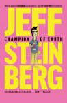 Tony Fleecs had been grinding as an indy cartoonist for years, but it was his work for the My Little Pony license at IDW that got him the most attention. Now, he’s returning to creator-owned with Jeff Steinberg: Champion of Earth, written by writer and friend Josh Fialkov, for Oni Press. I talked to Fleecs […]
1 Comments on MATT CHATS: Tony Fleecs Talks Ponies and Palling Around with Josh Fialkov on ‘Jeff Steinberg: Champion of Earth’, last added: 6/16/2016
Display Comments
Add a Comment
Blog: PW -The Beat (Login to Add to MyJacketFlap)
JacketFlap tags: Comics, DC, Batman, DC Comics, Paul Dini, Add a tag
 Few creators can claim to have a lasting legacy on just one aspect of the entertainment industry. Even fewer can say their legacy spans through different mediums. Paul Dini is one of the distinct few who have a storied body of work in comics and television. From his generation defining animation work on Tiny […]
2 Comments on The Story You Might Not Know About DARK KNIGHT: A TRUE BATMAN STORY, last added: 6/16/2016
Display Comments
Add a Comment
Blog: PW -The Beat (Login to Add to MyJacketFlap)
JacketFlap tags: Art Comix, Indie Comics, alternative comics, Malachi Ward, Small Presses, science fiction, Reviews, Comics, Add a tag
This collection of short works by Malachi Ward and published by Alternative Comics announces itself with a verbal joke — From Now On is another way of saying the future, after all. Ward’s stories reflect the sensibility of the title, presenting familiar scenarios, but presenting them in an unexpected way that challenges the tropes we’ve embraced […]
1 Comments on Review: Science fiction gets meta in ‘From Now On’, last added: 6/15/2016
Display Comments
Add a Comment
Blog: PW -The Beat (Login to Add to MyJacketFlap)
JacketFlap tags: Reviews, Graphic Novels, Comics, Fantagraphics, Art Comix, Literary Comics, Italian comics, Maneuele Fioe, Add a tag
In 2010 Grand Prize winner at the Angoulême Comics Festival in France and the Lucca Comics Festival in Italy 5,000 Km Per Second, Italian cartoonist Maneuele Fioe utilizes his strong watercolor skills to offer not the whole of a relationship, but slices, and leaves it up to the readers to fill in the spaces with the parts he […]
1 Comments on Review: ‘5,000 Kilometers Per Second’ untangles relationships with elegance, last added: 6/13/2016
Display Comments
Add a Comment
By: Heather Dixon,
on 6/13/2016
Blog: StoryMonster (Login to Add to MyJacketFlap)
JacketFlap tags: comics, comic, byu, ghosts, flash mob, MonsterBoards, Monstrosities, kiddie bikes, Add a tag
When I was in college, I worked an early morning custodial job.

Every morning, I’d wake up at 3:30 AM, get ready, head to the school, park in the Y lot (where students were allowed to park) and make my way across campus to the bookstore, where I cleaned toilets and mopped floors and replaced lights and was thrown in the dumpster by my coworkers. (They did it because they loved me.)
Not to brag or anything, but I’m still really good at cleaning toilets.
Anyway.
One morning, I was trekking across the long and lonely parking lots.

When the weirdest thing happened.

This is me, minding my own business:

And then…

GUYS ON BIKES.


Except they weren’t on regular bikes, they were riding little kid bikes. Like, green and pink and red ones. What??
Silently, they rode past, saying nothing. They looked at me, I looked at them.


As silently as a dream, they moved on.


And so did I.


3 hours later…


What had I just seen????????
Fast forward to years later. I’d never told anyone about this weird incident, because it was…weird. In fact, I’d been so sleepy, I half-wondered if it was a dream. But last week I was talking to a couple of friends…

Both of these girls go to BYU, and we were talking about flash mobs. So I told them the story.
ME: …It was, like, 4 in the morning and whole bunch of guys on bikes came riding past…
TRISH: Wait…were they riding kiddie bikes???
ME:
ME:
ME: …What?
TRISH: Because our friend was walking to her early morning custodial job, and she saw that exact same thing in that same parking lot!!!


Keep in mind, this is years after I saw them. YEARS.
WHO ARE THESE MYSTERIOUS BIKE RIDERS????

Who indeed…..
*cue twilight zone music*
The post Ghost Riders in the Parking Lot appeared first on Story Monster.
0 Comments on Ghost Riders in the Parking Lot as of 1/1/1900
Add a Comment
Blog: PW -The Beat (Login to Add to MyJacketFlap)
JacketFlap tags: End of the World, Lovecraft, The Show, nemo, Alan Moore, Dagon, Providence, Literary Comics, Heart of Ice, Top News, Top Comics, HPL, Thomas Ligotti, FHTAGN!, Jacen Burrows, Jimmy's End, Neonomicon, Nyarlathotep, Pärnu-Jaagupi, Robert Aickman, Interviews, Books, Uncategorized, Comics, Cthulhu, Avatar, Culture, Breaking News, Add a tag
 Somewhere deep in the bowels of the Internet, unbeknownst to all but the initiated, there’s an organisation that calls itself the Really Very Serious Alan Moore Scholars’ Group. Occasionally they get to actually communicate with the object of their adoration, The Great Moore himself. The most recent manifestation was in December 2015, when The Master […]
0 Comments on Alan Moore’s Secret Q&A Cult Exposed! Part I: You Won’t Believe What They Asked Him!! as of 6/10/2016 3:18:00 PM
Add a Comment
Blog: PW -The Beat (Login to Add to MyJacketFlap)
JacketFlap tags: Small Presses, Reviews, Graphic Novels, Comics, Mini Comics, Art Comix, Indie Comics, Koyama Press, cathy g. johnson, Add a tag
This short, spare, poetic, emotionally brutal piece from Cathy G. Johnson and Koyama Press captures the intersection of three lives, and the unlikely self realization that two of them enact on one. The story begins with two punks at a music show exhibiting destructive manners that disrupts the shows and gives them an opportunity for […]
1 Comments on Review: The darker beauty of Cathy G. Johnson’s ‘Gorgeous’, last added: 6/8/2016
Display Comments
Add a Comment
Blog: PW -The Beat (Login to Add to MyJacketFlap)
JacketFlap tags: Interviews, Comics, Image, collaboration, lazarus, greg rucka, Michael Lark, Add a tag
 Rucka and Lark have been one of my favorite pairings ever since the Half a Life arc in Gotham Central, and their work has only gotten stronger and more cohesive since that was first published. They’re now deep into their most ambitious collaboration to date, the Image Comics series Lazarus. With the freedom of creator-owned […]
0 Comments on Interview: Greg Rucka and Michael Lark on Lazarus and What Makes Them Click as of 1/1/1900
Add a Comment
Blog: PW -The Beat (Login to Add to MyJacketFlap)
JacketFlap tags: Comics, Fantagraphics, Indie Comics, Joshua W. Cotter, Books, science fiction, Reviews, Graphic Novels, Add a tag
The first in a projected seven-book science fiction series, Joshua W. Cotter’s Nod Away draws you in with the human drama, but keeps the science fiction elements of the story mostly at bay, creating a mysterious mist that hangs on people’s lives as they cope with the little moments, oblivious to the larger mysteries that are […]
2 Comments on Review: ‘Nod Away’ is human-level science fiction that looks to the big picture, last added: 6/7/2016
Display Comments
Add a Comment
Blog: PW -The Beat (Login to Add to MyJacketFlap)
JacketFlap tags: alternative comics, Oily Comics, Small Presses, Reviews, Comics, Kids' comics, Mini Comics, Indie Comics, Add a tag
Massachusetts cartoonist Melissa Mendes has a knack for comics that not only center on kids, but present the world from their points of view with an unromantic honesty. Her first major work, the Freddy Stories collection, and her most recent project, the serialized webcomic The Weight both show off her prowess, and Lou, a collection […]
0 Comments on Review: Melissa Mendes’ ‘Lou’ charts family dynamics in a charming, honest way as of 1/1/1900
Add a Comment
By: Heather Dixon,
on 5/30/2016
Blog: StoryMonster (Login to Add to MyJacketFlap)
JacketFlap tags: comics, disney, Disneyland, MonsterBoards, Monstrosities, abandonedland, disneyland secrets, Add a tag
You guys all know I’m a HUGE Disneyland fan.

I’d live there, if I could.

I’m not sure where, because there’s tons of people and security cameras everywhere. But it’s still one of my dreams. (Up there with inventing the foldable waterbed. I forsee very high market demand for that.)
Anyway, because it’s been on my mind, the last time I went to Disneyland, I decided to ask an INSIDER. An actual CAST MEMBER (!!!!)


THE TOONTOWN BACKDROP!!! OF COURSE!!
It makes perfect sense. No one ever goes to Toontown (or as I like to call it, Abandonedland) so logic says, there’d be even LESS people behind it!

The waiter said no one ever really goes back there, it’s just full of storage and old props that no one cares about anymore.
(I’m sorry to ruin the magic for you.)


I thanked the waiter profusely and told him he’d probably be seeing me a lot more often. Me, and my lice.
He was like:


ROAD TRIP! Grab a cardboard box and come along!
The post Disneyland Secret No. 1 appeared first on Story Monster.
0 Comments on Disneyland Secret No. 1 as of 1/1/1900
Add a Comment
View Next 25 Posts
I haven’t started reading this one but Wet Moon, also by Sophie, is an outstanding strange comics, unlike any other, quite addictive. And her last jobs on Glory and Jem and the Holograms are the more reasons to pick this one up.
I had the chance to interview her 5 years ago for an issue of my mag focused on the DC Minx line. She really impressed by both her kindness, her doubts but also by the strenght of her convictions. That was probably one of the best exchange I ever had with a comics creator. It made me want to look after her other work (I had since only read Water Baby at Minx) and I haven’t been disapointed in the slightest. :)