

 Another week, another round up!
0 Comments on DC Reborn Week Four– The Round Up and Buy Guide! as of 1/1/1900
Add a Comment

Another week, another round up!
Another week, another round up!
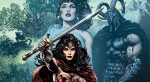
 Lastly, Alex Lu and Kyle Pinion debate the merits of this week's new beginning for Wonder Woman's latest volume
 Rucka and Lark have been one of my favorite pairings ever since the Half a Life arc in Gotham Central, and their work has only gotten stronger and more cohesive since that was first published. They’re now deep into their most ambitious collaboration to date, the Image Comics series Lazarus. With the freedom of creator-owned […]
 Greg Rucka has been on a tear lately. Not only has he written two Star Wars novels and a comic book series set post-Empire, he’s also been impressing in the creator-owned sphere. Lady Sabre, Lazarus and Stumptown continue running on all cylinders, and his newest series, Black Magick with Nicola Scott, recently launched to great acclaim. I […]
Nicola Scott is probably best known currently for her time drawing for DC Comics. Her smooth, sleek linework on titles such as Secret Six and Earth 2 was distinct but still fit in tonally with the rest of the DC Universe. Despite her success with that style, she switches up dramatically for her creator-owned Image title Black Magick, written by Greg […]
In some exciting news to close out this Tuesday, it was announced via The Hollywood Reporter that Legendary Television and producer Matt Tolmach (The Amazing Spider-Man franchise) have acquired the rights to Greg Rucka and Michael Lark‘s Eisner nominated Image series, Lazarus. The studio will be aiming to produce a new drama based on the popular dystopian series.
For those unfamilar, Lazarus centers on 16 familes that rule over all society in a futuristic world. Each family is protected by a genetically engineered being called a Lazarus, with one of these warriors, named Forever, acting as the central character of the series.
This won’t be the first Rucka property to get the live action treatment, as his series, Whiteout, was adapted into a film starring Kate Beckinsale. Additionally, Queen and Country is still in development, and is slated to star Ellen Page. Even some of their story elements from Rucka and Lark’s collaboration with Ed Brubaker, Gotham Central, wound up in Christopher Nolan‘s The Dark Knight.
Rucka will script the pilot and will executive produce along with Lark and Tolmach.
Angela Cheng Caplan of Cheng Caplan Company, Inc. sold Lazarus on behalf of lit agent David Hale Smith of Inkwell Management. Rucka and Lark are represented by Stone, Meyer.
I imagine the speculator market on those Lazarus back issues is about to run pretty wild.


Eric Trautmann is probably currently best known in the comics industry for his collaborations with comics author and novelist Greg Rucka, originally as an editor and sometimes co-writer. Most recently, though, he has been working with the co-creator of Lazarus and Lady Sabre as a graphic designer. Trainman flaunts his impressive design skills in the pages and back matter of Image series Lazarus, as well as on the Pocket Guide bonus reward from Rucka’s Lady Sabre Kickstarter. I spoke to Eric Trautmann to learn more about the role of design in comics and the man himself.

How did you first connect with Greg Rucka?
When I was still working at Microsoft, part of my job was creating a publishing program for the Perfect Dark franchise. I was a huge fan of Whiteout, Queen & Country and the Atticus Kodiak books that Greg had authored, and to my mind there was no one else better suited to the task of writing our near-future corporate war dystopia. So, when I was finally given the go-ahead to approach Greg about the work, I introduced myself at Emerald City Comic Con in Seattle, and he was definitely interested. (I wasn’t allowed to actually name Perfect Dark yet, because the title hadn’t been announced as an Xbox 360 launch title, but I hinted strongly, and he reacted with appropriate manic fervor.)
Of course, it took months for the agreement with the book publisher to be completed, and by that point, Greg assumed the project died.
At the same convention, my wife invited him as a guest signer at the comic shop she owns (Olympic Cards & Comics in Lacey, WA), so I re-introduced myself to him. By that point, the publishing contract was done, and we were off to the races.
His two Perfect Dark novels paved the way for me to con…I mean convince… my bosses I should be allowed to write a tie-in comic series, and I slotted it right between Greg’s two novels. Between my edits on his novel manuscripts and the work I did on the comic series — and the fact that we hit it off pretty well — he later asked for me to help co-write Checkmate with him at DC.
The rest, as they say, is history.
What kind of discussions did you have with him to understand the complex world of Lazarus?
I was pulled onto Lazarus fairly late in the game; issue one was basically done, and they just needed someone to handle basic book design chores—typesetting of the letter column, the indicia, the inside back cover, and so on. So, I read issue one and had a pretty good handle on the tone Greg and Michael were looking for.
But, by issue two, I didn’t have a lot of design sketches or material like that to play with as incidental art for the letter column. I came up with the idea of the timeline that ran in the margins, which in turn led to lots of face-to-face and phone meetings to decide what material would be included. As with most of my half-baked schemes, it became a rather massive undertaking. Greg and I work well together, so he’ll often call, Skype, e-mail, etc. and we’ll hash out whatever background or story concern he has. I’m sort of a part-time back-up developmental editor, on a fairly small scale.
What are top priorities when you’re designing the fake ads for Lazarus?
First, I want them to look authentic; I’ll research ad styles in various era/cultures to try to inject if not accuracy, then at lease verisimilitude. Then, I want them to underscore something about the setting, that edge of creeping corporate hegemony. And then, I try to inject just a little bit of black humor—slogans that sound just slightly over the top with latent villainy, for example. (That typically curdles a bit when you see or read something almost exactly like it in the real world.)
For the Hock ad, for example, they’re selling a visual acuity enhancer, and the list of side effects is long and horrible. It’s good for a bit of a laugh if you’re a bleak-minded fellow like me. Except, that list 99% culled from a list of actual side effects from contemporary visual acuity enhancements already on the market today.
That’s basically my “process” for the ads.
How do you effectively incorporate your design within the sequential pages themselves?For the interior art, my contribution is limited almost exclusively to computer screens, targeting reticles, and so on (with the odd signage for Hock thrown in). I whip the designs up based on Michael’s needs and the script’s descriptions, and Michael handles the actual integration on to the finished page.
I think it’s the dream of every world builder to have a map like the one in the Lazarus hardcover. How much work, and what kind, go into mapmaking?
Oh, lord, it took forever (no pun intended).
It started on Greg’s back porch, as we drank rye whiskey and used colored pencils and crayons to divide the world up on a photocopied map. After that, I brought the sketch into Adobe Illustrator, and began manipulating an old vector art map I’d purchased a decade ago, gradually building it into the final piece. It was fiddly work on a massive file, which I’m about to have to re-do again, if you’ve read issue 16.
Pardon the sobbing.
Is it satisfying seeing your designs in print form, like in the Lazarus comics and collections and with the patch?
Absolutely. I’m primarily a writer, but I periodically get the urge to make physical things. The hardcover was a massive undertaking, and I had to learn how to do a bunch of stuff I’d never done before—the spot gloss on the cover, the endpapers, and so forth. It was a bit of white-knuckle terror; I didn’t want to make some horrible mistake and cost us thousands of dollars, but it was also a lot of fun to learn some new skills.
(The patch, I should add, is actually Michael’s design. I did all the other Family crests, but they spring from his original template, the Carlyle family insigne.)
The worldbuilding and design is meant to be in service to the story. How specifically do you think your design work serves the story being told in the pages of Lazarus?
I’m probably a little too close to it to judge it fairly. I view what I do as something that should be, for the most part, as seamless and invisible as possible. My contribution should be seamless—if it looks tacked on or out of place, I probably over- or under-designed it. My job is to, in whatever way I can, serve Greg’s story and Michael’s art.
In terms of specifics, I think the best integration was in issue 10: all the Hock signage works really well with Michael’s pages, but they’re there to sell the mood, the tone, the grimness and general awfulness of living under Hock’s rule.
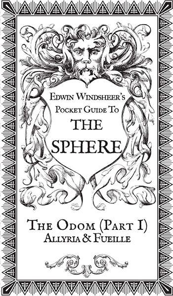
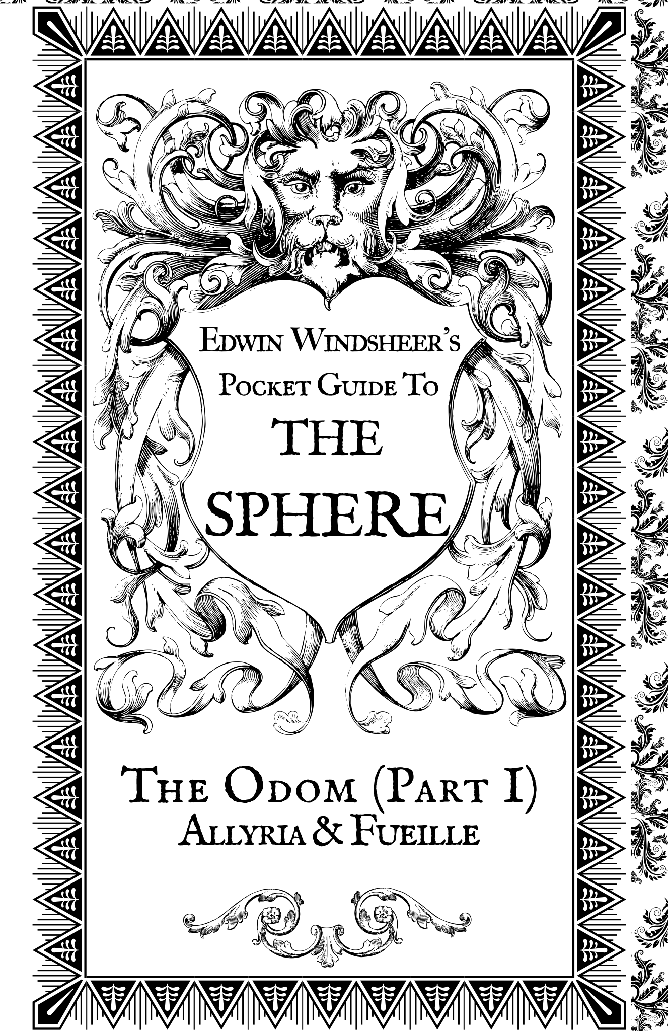
You also designed Edwin Windsheer’s Pocket Guide for Ruck’a Lady Sabre Kickstarter. What were the challenges of designing a book of such a compact size?
There were many. Readability was a big concern, since there was a lot of text and not a lot of space. Plus, using vintage typography has its own readability challenges. I spent a lot of time looking at scans of old British newspapers and an old Sherlock Holmes hardcover my parents gave me a long time ago; it reproduced some pages from the Strand magazine, and I took a lot of my cues from that.
What kind of research did you do to make sure the pocket guide was historically accurate?
Lots of looking at books in my personal library, lots of Google image searches, that kind of thing. As for accuracy, I wasn’t too concerned, since we’re dealing with a world where people zip around in flying boats.
Who are some of your biggest design influences, in and outside of comics?
Howard Chaykin, for sure. His page constructions are unassailably clean and clever, as is his use of type.
As for specific design influences, probably very few individuals, but I do love styles—Art Deco is a favorite of mine, as well as Art Nouveau.
What are your thoughts on the state of design in the comics industry?
It depends on where you’re looking. Big Two design has sort of calcified into a sort of lockstep “Logo up top, corporate brand upper left, UPC code down here” kind of template. There’s areas of individual excellence, for sure, but for the really interesting moves, Image Comics and Oni Press seem to be doing really neat things. The aesthetic on Saga is very clean and pretty (and had no small influence on our own approach on Lazarus); same for Low and Drifter. And the strongly graphic look of books like Letter 44‘s and The Fuse‘s trade paperbacks is just fantastic. The Fuse‘s TPB cover is more or less an infographic, something I couldn’t imagine on a Marvel or DC book, and it doesn’t just stand out on the shelf, it sings opera at you. Bitch Planet referencing old comics and grindhouse movie posters is another title that doesn’t really look like anything else out there while simultaneously managing to be totally familiar. That’s a hell of a trick.
And then look at ODY-C. Trippy, well-designed, ambitious. As a physical artifact, without reading a word of the story, it is gloriously eye-catching.
I love that. That’s exciting.

How would you like to improve as a graphic designer? Are there things you want to do in books like Lazarus and the Pocket Guide but don’t feel ready for?
(Laughs) I generally feel unqualified to do just about anything I’ve ever done.
I try to push a little bit past my default skill set on just about every project I do. For example, I had never done a spot varnish cover before, where varnish is applied to specific areas on the cover image to make them shiny, while leaving other parts of the image matte. When Greg and Michael mentioned, “Oh, yeah, we’re gonna do a spot varnish cover on the Lazarus hardcover,” I maybe — perhaps — panicked a little bit. But that’s part of the fun: learning how to do new stuff. I asked the Image guys a million questions, and probably drove them nuts, but I know how to do it now, and fortunately, I didn’t mess it up on that cover.
I don’t have any specifics about stuff I tried or wanted to do that didn’t make it to press. The closest was the “Family D’Souza” ad I did for Lazarus. It’s a late ’60s-early ’70s ad for a large South American meat producer/packager. I found some stock art of a steak, and digitally repainted it into a piece of stake in the shape of South America. There was a lot more manipulation of the image than I’d done before, and I was concerned that it wouldn’t play. Happily, it seemed to click with the rest of the team. But, yeah, that one was nerve-wracking.
You’re not just a designer of comics, you’re also a writer of them. What are you currently working on?
I just wrapped up some short pieces for Dynamite, contributing to their “#100″ issues for both Red Sonja and Vampirella, titles I’d done extended runs on; I’m also hard at work on a comics story with Greg Rucka, to be illustrated by Matthew Clark, but it’s probably too soon to talk much about that one.
You’ve been mainly employing your design skills in comics on Greg Rucka’s titles. Do you have any interest in using them to build your own worlds?
Most of what I’ve done thus far is work-for-hire. I did sneak some stuff into various DC projects. The “Code Zoo” in Checkmate/Final Crisis: Resist is a good example; the concept was that Checkmate, DC’s global espionage/peacekeeping organization had a repository for various rogue AIs, alien operating systems, and other harmful, aggressive code that they’d managed to scoop up over the years. To represent that, there were various icons/screens to show what was being stored—a Thanagarian navigation AI, a bit of Kryptonian “Eradicator” code, a Durlan communications program, and so on. I whipped up designs and included them with the script, and the art teams on those issues (Chris Samnee on Checkmate #17, Marco Rudy on Resist) incorporated them into the final art.
I’ve yet to tackle a creator owned series (knock wood, that’s later this year), and when I do, you can bet I’ll be handling a lot of that kind of work.
Over on ComiXology, our long-stalled digital comic, Frost: Rogue State (co-created with Brandon Jerwa and artist Giovanni Timpano) features a lot of the same kind of work I do on Lazarus: I designed the logo, lay out the covers and credits page, lay out the backmatter and so on.
The tl;dr answer is “Yes. Yes, I do have that interest.”
You can learn more about Eric Trautmann at his website and online portfolio, and follow him via social media on Twitter, Facebook and Tumblr.
While we were enjoying Comic Arts Brooklyn this year, my partner Marguerite Van Cook and I took a break from the excitement of promoting our new Fantagraphics Book The Late Child and Other Animals to go across the street to a little coffee bar and have a snack. The young counterperson noted the influx of odd personages hauling portfolios and piles of comics and asked, “is that a convention?”
I replied, “Well, a convention is more like one of those huge things with wrestlers, porn stars and superhero comics, all mixed together with a lot of cosplayers. This is more of a gathering of especially individualistic birds in the alt/lit comics scene. I guess you could call it a ‘murder’ of cartoonists.”
She laughed and asked about the origin of that phrase, which usually describes a flock of crows. But not to further elaborate that conversation, what follows is a review sampling of comics, many of them with poetical aspects, that I got at CAB and other recent releases. Note that I don’t actually try to kill my subjects, but rather to remark on their positive aspects, wherever possible.
____________________________________________________________
Jungle Book by Harvey Kurtzman (Kitchen Sink/Dark Horse, $24.99)

A rare solo effort by the auteuristic creator of E.C.’s two excellent war comics titles Two-Fisted Tales and Frontline Combat, working in the satiric mode he initiated for Mad. Now, I do very much like Kurtzman’s solo work; see Fantagraphics’ recent collection of most of his solo E.C. stories, Corpse on the Imjin (which also contains a smattering of his odd, briefer collaborations, like those with Alex Toth and Joe Kubert). His own drawings have a powerful thrust and direct emotionality that can be lost or greatly altered when filtered through the sensibilities of the artists charged to re-illustrate his layouts. In Jungle Book, which was originally released by Ballantine Books in 1959 as a dingy, downscale paperback, Kurtzman’s targets include a jazz/noir mashup, a TV western and most impressively, in “The Organization Man in the Grey Flannel Executive Suite”, a cutting sendup of the fierce sexism that polluted the offices of his former employer, ex-Marvel Comics owner Martin Goodman. This brilliant strip is nonetheless disparaged as “weak” by famed misogynist and Kurtzman discovery R. Crumb, in the afterthought conversation between the underground artist and Peter Poplaski that cabooses this otherwise beautifully-produced hardcover reprint volume.
____________________________________________________________
Andre the Giant: Life and Legend by Box Brown (First Second, $7.99)

Brown’s biography of wrestling star Andre Roussimoff joins a small group of comics masterpieces that deal with this most theatrical of sports, from Jaime Hernandez’s Whoa Nellie from 2000 to a series of tongue-in-cheek horror collaborations by Mike Mignola and Richard Corben in more recent years, including their 2011 graphic novella House of the Living Dead. Brown’s is a remarkably consistent effort with effective graphic sequences such as the one pictured above and I also admire his restrained handling of the heavily staged fight scenes, as well as his unusual architectural establishing shots. Brown’s stark, spare and precise cartooning create a unique mood, as they contextualize Andre’s success with a tragic acknowledgement of the unrelenting sense of otherness and diminished opportunities for social interaction that he experiences due to his exceedingly unusual scale; as well as his size’s harsh repercussions on his health.
__________________________________________________________
Fear My Dear: A Billy Dogma Experience by Dean Haspiel (Z2 Comics, $19.95)

The pair of poetic graphic stories in Fear, My Dear reflect Dino’s unfettered physicality and passionate persona. Since winning an Emmy award for his TV collaboration with Jonathan Ames, Bored to Death and The Alcoholic, their graphic novel from Vertigo, Haspiel has if anything become bolder and more exuberant. For this nicely produced hardcover from Josh Frankel’s new Z squared imprint, the artist uses a four-panels-per-page grid format and a monochromatic color scheme (red in the first piece, yellow and orange in the second, both with an elegant use of white for emphasis) to further define the relationship between his creator-owned characters Billy Dogma and Jane Legit. Their romance haunts post-apocalyptic urban rubble and breaks through to a star-crossed dreamscape, only to end up where they knew they must: together.
____________________________________________________________
How to Pool and Other Comics by Andrea Tsurumi (self-published, not priced)

Marguerite and I used to bask our way through the East Village dog days at the Pit Street Pool, and more recently as guests of the Miami Book Fair, we whiled away every spare moment by the steamy roof pool at our hotel. So, I can totally relate to the lead piece in Tsurumi’s new minicomic, wherein the artist collects a variety of witty graphic vignettes about group soakings in fluoridated waters, among other delicately drawn ironies and anthropomorphisms.
____________________________________________________________
Inkbrick #1 by Rothman, Sullivan, Kearney, Tunis, et al (Inkbrick, not priced)

This pocket-sized anthology of comics that incorporate, or are adapted from, poetry is made up of remarkable short stories done in a variety of mediums that range from full color to black & white. Immediate standouts for me are Paul K. Tunis’s watery montages for “Avenge Me, Eavesdropper,” Gary Sullivan’s oblique ink rendering of horrific Asian mythologies, “Black Magic”; Simone Kearney’s whimsically etched “Mobilization”; and editor Alexander Rothman’s “Keeping Time” (pictured above), a piece apparently finished in colored pencils that inventively expresses non-visual sensory impressions such as sound, smell and touch.
____________________________________________________________
The Graveyard Book, Volumes 1 and 2 by Neil Gaiman, P. Craig Russell et al (Harper Collins, $19.99 each)

Although The Graveyard Book continues Neil Gaiman’s anti-collaborative self-hype at the expense of his artist partners, I do appreciate P. Craig Russell’s adaptations of Gaiman’s stories into comics form. Russell’s elegant cartooning and storytelling are paced far better than if Gaiman had scripted; it worked beautifully for Murder Mysteries, Coraline and The Dream Hunters. Now, for Gaiman’s morbidly charming tale of a live boy shielded from a cabal of serial killers by the shades of the deceased occupants of a cemetery and raised by them to young adulthood, Russell acts artistically in a way similar to Kurtzman’s E.C. methodology: he adapts the text and does layouts; the finishing artists serve as illustrators. This makes for a surprisingly smooth and consistent read. I particularly admire the polished renderings of Kevin Nowlan (seen above), Scott Hampton, Jill Thompson and the Russell-miming Galen Showman; and although a somewhat discordant note is sounded by the grotesqueries of Tony Harris, the whole is unified by colorist Lovern Kindzierski and illuminator Rick Parker, who hand-lettered the text, for me a visual treat in these days of page-deadening digital fonts.
____________________________________________________________
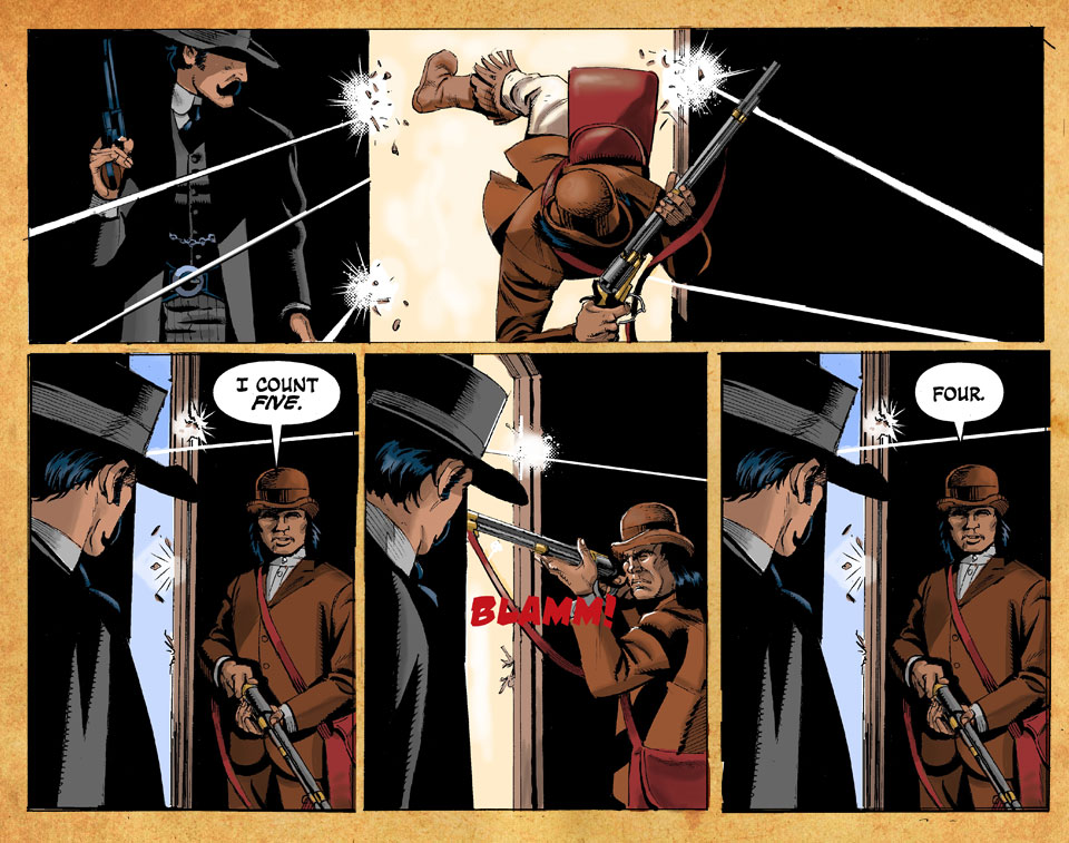
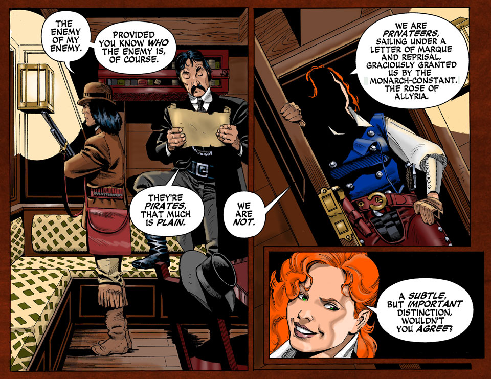
Lazarus #1-9 by Greg Rucka, Michael Lark and Santi Arcas (Image Comics, $2.99 each)

I drew one of Greg Rucka’s first comics stories (“Guts” in DC/Vertigo’s Flinch #8, 2000), but it seems to me that the writer doesn’t take as much advantage as he might of the properties that are unique to comics—almost everything he does might work just as well if not better as TV shows. In his 2012 collaboration with Matthew Southworth, Stumptown, it is Southworth’s expressive drawing that provides most of the interest and its most effective use of the medium is that the artist rendered Vol 2, #4 with a Toth-esque sideways, widescreen layout. For Lazarus, a story of a female assassin in a dystopian, nearly medieval America run by a select group of powerful families that is absorbing enough and has had some striking moments, but still often has a feeling of deja vu about it, a lot of the heavy lifting is provided by artist Michael Lark’s cinematic near-photorealism, accomplished in collaboration with Santi Arcas’ hi-tech color graphics.
____________________________________________________________
Thought Bubble #4 by Kot & Sampson, Lim & Rios, Starkings & Sale et al (Image Comics, $3.99)

This color tabloid is a showcase for the participants in the UK’s Leeds Comic Art Festival. My favorite piece is a sort of gentle advisory poem that in its course expresses a goal that many sensitive artists hold dear: that of “making things that help other people feel less alone.” It is the work of the writer of Image’s fascinating rotating-artist series Zero, Ales Kot, expressively drawn with upended, widescreen and oblique imagery by Alison Sampson, who just won a British Comic Award for emerging talent; and nicely colored by Jason Wordie. Also notable: a beautiful page by Hwei Lin and Emma Rios; and an Elephantmen strip written by Richard Starkings and elegantly rendered in ink washes by Tim Sale.
____________________________________________________________
Nightworld #s 1-4 by Adam McGovern, Paolo Leandri & Dominic Regan (Image Comics $3.99 each)

A tale of questing, embattled superhero-ish spirits, Nightworld manages to not only convey an approximation of the look of a Jack Kirby comic book, but it also comes closer than anything else I have seen to capturing something of the spirit of that master’s fierce and restless creativity. Artist Leandri hits a spot somewhere between majoring in Kirby, minoring in Steranko and echoing the early work of Barry Smith, back in the day when he was emulating Jack. Leandri’s spreads can look remarkably as if they were actually drawn by Kirby and his character designs and action passages likewise (see example above), without ever feeling as appropriated, or as forced, as those by some other artists who attempt to adhere as closely to the same model. These comics are colored by Regan with an oddly chosen palette that, again, is reminiscent of Kirby’s psychedelic experiments with Dr. Martin’s dyes. Moreover and significantly, writer McGovern’s poetic voice uniquely grasps a sort of post-traumatized and humane melancholy of narrative, the most tragic scenes of which are appropriately followed and leavened in a Shakespearean mode by bursts of frenetic humor, that can be seen in Kirby’s best writing.
____________________________________________________________
I'm glad the holidays are over and everyone is off their ass making back to making some comic books. Something's in the water or there just are some great project with a lot of heart and soul. We have some bright new faces, an industry favorite and a successful project manager looking for repeated success.
What have Image got to offer us? Y’know, on top of EVERYTHING ELSE they’ve been offering us this year? Here’s a look at the books announced tonight at their SDCC panel. I’ll throw some pictures at the bottom, but let’s just try and get a hang on just what’s being announced! They are announcing TONNES OF COMICS. I’ll re-update this with new pictures and info as soon as possible, folks.
So far we have:
Non-Humans - Whilce Portacio and Glen Brunswick
Nowhere Men – Eric Stephenson
Satellite Sam - Matt Fraction and Howard Chaykin.
A murder mystery set in the world of children’s television.

Pretty Deadly - KellySue DeConnick and Emma Rios
A spaghetti western in classic style
Multiple Warheads – Brandon Graham
Saviour - James Robinson and J. Bone
About an alien invasion of earth by shapeshifters, and a stoner’s attempts to stop them
Sex - Joe Casey and Piotr Kowalski
The Bounce – Joe Casey and David Messina

Lazarus – Greg Rucka and Michael Lark
Gritty sci-fi thriller set in a dystopian future

Reign – Chris Roberson and Paul Mayberry

Oliver – Darick Robertson and Gary Whitta
Point of Impact – Jay Faerber

Great Pacific – Joe Harris

Greg Rucka’s novel Alpha has just come out, and it’s the debut of a whole new thriller series for him. To promote it, he’s doing the rounds, including a chat with Brian Michael Bendis for publisher Mulholland Books. You really need to read the whole thing. It’s quite a relaxed and candid conversation:
BMB: Or just the entitlement. I’m here now. Congratulations to you—I’m here. We’ve now been in it long enough now to where we see people come and go. We’ve seen the crash and burn, and you can see the crash and burn coming down the street. The only thing shocking thing about it now is that it used to take a two year solid arc of crash and burn, right? Now it’s eight months and you’re out. With all this entitlement, sometimes our names are brought up in it. Why do they get this? Without any self-awareness of how obnoxious it is and stuff like that. But it’s fascinating to see. Whatever road we’re on is littered with the corpses of entitlement.
GR: That entitlement factor I think—you and I work very differently. I think one of the things that we recognize in each other, really from the first time we met—I remember when you came to Portland—you and I have always taken the craft very seriously. I sometimes feel in my more darker and self-aware moments, I wonder if I put too much stock in that faith in craft. But at the end of the day, it’s all I got because it’s the only thing you can control.
BRB: How do you monetize it?
GR: I have no idea. It’s totally unfamiliar territory to me, and honestly, as a writer, I’ve always been sort of dangerously uninformed about the business side of things. I understand contracting and I understand the sales. But I don’t tend to follow it and I don’t tend to track it on my own work, certainly, and, in this instance, we’re all sort of figuring this out as we go. How are we going to do this? What’s it going to look like? How are we going to fund the trade? How are we going to sell the trade? Do we go to a publisher and say, hey, would you like to publish this trade? Or do we sell it on a website first, sell it by hand at shows? There’s a piece of me that wants to do that, just wants to let it be what it is. I don’t want to try to turn it into something else, if that makes sense. Right now it’s our indie-Webcomic-pulp-serial-let’s-have-some-fun-with-it thing, and I don’t want to try to make it into something that it’s not. It should be a form of entertainment and pretty and joyful and fun. And in the main it’s free. If people would turn around and give us some money for ancillary things, that would be great. We launched in July of last year. I’m hoping by July of this year we’ll be able to offer things that people will buy that we’ll be able to return to the investment that we put into it. But nobody’s looking to get rich off this.
BMB: I’m curious of the business m
4 Comments on Rucka and Bendis sitting around rapping, last added: 5/25/2012Display Comments Add a Comment
“Having been told to read Lazarus by multitudes of people who say it’s one of the best comics ever and failing to get past the second volume” – What?! It’s a dense book, and honestly hard to keep track of at times, but it’s an amazingly great book!
With that said, I was so unimpressed with the Wonder Woman Rebirth issue. The entire thing was just WW walking around saying “The story keeps changing.” 96 times. I was like “Wait, is this the same guy that’s writing Lazarus? Given his past with DC, did he take this book on as an inside joke to see how long it would take the upper management to notice?” I thought it was just badly written…. but maybe with this issue it gets better.
If you have no basis of her 75 years of history and iterations, maybe at least read some wikis before coming in clueless and “reviewing” a #1 issue? Is it really too much to ask that someone use the internet to inform his or herself before critiquing a new book about a really old character?
Thank you for your comment, London! I don’t know if this is necessarily the “best” argument, but I want to pose another question to your question: is it really expected for a new reader to do research before they jump on to a FIRST issue, regardless of how old the lead character of that series is? When I first started reading comics, I was hesitant to dive into anything too heavily based in continuity because I knew I wouldn’t understand it and it seemed strange to me that I should have to read through wikipedia summaries of 75 year histories before reading a single story. Compare that to a series of films or more aptly, TV Shows. Sure if you’re diving into season 6 of Game of Thrones you should know what happened in the previous five seasons before doing so, but that’s not how Wonder Woman #1 or other DC Rebirth books are being sold to us. They are being sold as starting points…hence number 1. If your START requires research, you have to ask: is this book really going to attract new readers?