


 Because of this blog, I am becoming naturally more attuned to cover design and especially to typeface choices, which can make or break a cover. Take, for example this book, Between the Deep Blue Sea and Me (Kamehameha Publishing, 2008) highlighted by L. over at Jacket Whys. I agree with L.'s analysis. It's a gorgeous image, and I also agree that it's a toss-up over whether teens will be attracted to it. I don't know about you, but the typeface is off-putting to me. Doesn't it make you think of a book of essays, or a textbook, or one of those literary criticisms you were required to buy for a class? I had to look to make sure it didn't say Harold Bloom at the bottom. Sorry: Fail.
Now here's a book that's not due out until May, but it shows quite well what happens when the typeface fits the book:
This is Folly (Wendy Lamb Books, May 11, 2010), a historical fiction for teens (Yay!). It takes place in Victorian England, with a description that sounds as if the novel is full of joys and sorrows. Certainly, the cover suggests the sorrows. Note how the scratched ceramic surface of the girl's skin fits with the scratchy font, yet there's also a bit of joy in the slanting serifs and those curly "l"s and "y"s. Double-plus like.
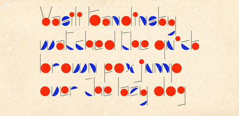
Now more really neat-o title fonts for your viewing pleasure:
Seems like everyone but me has probably already read Beautiful Creatures, a gothic fantasy by Kami Garcia and Margaret Stohl. The actual cover, like many YA books out now, has fabulous embossed lettering. And what elaborate lettering it is.
Newsgirl by Liza Ketchum (Viking, 2009) is a middle grade historical (Yay!) in which the main character hawks papers on a street corner. Hence the well chosen, printerly font.
Viewing: Blog Posts Tagged with: fonts, Most Recent at Top [Help]
Results 26 - 49 of 49
Blog: JACKET KNACK (Login to Add to MyJacketFlap)
JacketFlap tags: Bad Covers, jacket whys, Young Adult, fonts, middle grade, typefaces, Add a tag


Blog: JACKET KNACK (Login to Add to MyJacketFlap)
JacketFlap tags: picture book, Young Adult, fonts, typefaces, angels, Add a tag
For your viewing pleasure we present some recent releases that have pretty neat-o typefaces on the cover:
An Eye for Color, a picture book about Josef Albers (Henry Holt, 2009). Clever.
Next, we have Fallen, a young adult thriller/dark romance about good ol' fallen angels (Doubleday, 2009). The typeface has just enough of a romantic feel, no?
Incarceron (Penguin, 2010) is a dystopian thriller. Unlike some people out there, I'm still not over steampunk. Love the clockwork lettering.
The Rock and the River (S&S, 2009). Not an unusual typeface, yet it's clean and fresh here.
Ellen Hopkins' Tricks (S&S, 2009). Edgy and dangerous.
See also this pretty neat-o post about a documentary coming out this month about a typeface museum. Really.


 By: Erica Olsen,
on 1/10/2010
By: Erica Olsen,
on 1/10/2010
Blog: Librarian Avengers (Login to Add to MyJacketFlap)
JacketFlap tags: fonts, Humor, advertising, typography, packaging, Graphic Design, media, enviroment, Favorite Posts, greenwashing, design, Music, Videos, Add a tag
 nstead of watching House episodes all day like a normal person, I spent one of my vacation days making a video about the media practice of greenwashing.
According to the world’s only remaining viable encyclopedia, greenwashing is the “practice of companies disingenuously spinning their products and policies as environmentally friendly.”
I’m interested in the graphic design motifs that seem to pop up whenever a product wants to advertise itself as Good for the Environment. I was inspired by my hilarious friend Gus’s Media Show episode on greenwashing, and I started thinking about all the sans-serif fonts and burlap lining the shelves of my local organic grocery store.*
This is my first video, and I was a bit nervous. I used iMovie to do the editing, and I slapped the whole thing together in an afternoon with the help of some coffee and a misplaced sense of social justice.
I’d like to do more of this. If you guys have any suggestions for other ornery Librarian Avenger topics, I’d love to hear them.
* I live in San Francisco. I patronize an organic grocery store. I don’t own a car or a tv. Live the stereotype!
** That’s Sister Rosetta Tharpe playing in the background, who is the boss of you.
 By: John,
on 11/18/2009
By: John,
on 11/18/2009
Blog: DRAWN! (Login to Add to MyJacketFlap)
JacketFlap tags: Illustration, fonts, video, Typography, movies, Add a tag
A convincing argument that the Trajan font has somehow come to dominate movie posters of the world.
Also see: Helvetica is the movie font.
Posted by Matt Forsythe on Drawn! The Illustration and Cartooning Blog |
Permalink |
No comments
Tags: fonts
Blog: Jacket Whys (Login to Add to MyJacketFlap)
JacketFlap tags: fonts, color, book spines, Add a tag
I find book spines to be much more difficult to critique than the book faceout. It’s harder to define elements that attract, when space is so limited and so much has to fit.
So what elements can we consider here? I can identify a few.
1) Background color – looking at shelves of books in my library, I found that color was a great attractor. But there’s a trick that cannot be controlled by the designer: it matters what other books surround. I saw hot pink books that jumped right out at me – and hot pink books that disappeared in a crowd of other brightly colored spines. Metallic stands out – but only if there are not too many metallic inks nearby.
2) Fonts, their color and orientation – If the title is horizontal, the font may have to be smaller and more compact (unless it’s a very short title, or a very thick book). I would have said the only other choice is vertical, usually running from top to bottom. But (see bottom photo) this past weekend I was visiting my father, an avid reader. There was a stack of books near his TV that kept drawing my eye over and over. Eventually it occurred to me that the reason why was because one of them had a feature I’d never seen on a book spine before – a diagonal title. Very difficult to do – but this works!
3) Graphic elements – A photo, a drawing, a design, lines – just something in addition to the author and title text that is there to assist in drawing attention to the book.
4) Multiples – I don’t know how else to say it. Multiple copies of a title on the shelf just catches my eye. I can’t explain it. Along with that, however, is the series effect. Series books will differ from book to book, but there’s a format that helps it to have that repeating effect.


With these defined elements in mind, I snapped a few pictures of spines that I thought succeeded in jumping out and saying “look at me!”
The McKay books above, Forever Rose, Indigo’s Star and Permanent Rose have an element that works every time for me. There’s something about a face (or just an eye) looking out from a spine. I can’t ignore it in a sea of letters and words.
The Crossley-Holland books really have that series effect, and the drawings almost do the eye/face thing.
I include Godless because the starring effect around the title, combined with the fact that there were four of them on the shelf… worked like a marquee.

The Septimus Heap series by Angie Sage has a lot to work with because the books are so fat! But the designer did a lot with the faux old book look, foiled fonts, graphic elements and standout background colors. Love these!
And below, my father’s pile of books. I just love the diagonal look here. It’s so different and the slant is bound to attract any shelf-browsing eye. I have not seen any YA books that do this (hint, hint).


 By: Debbie Ridpath Ohi,
on 8/30/2009
By: Debbie Ridpath Ohi,
on 8/30/2009
Blog: Inkygirl: Daily Diversions For Writers (Login to Add to MyJacketFlap)
JacketFlap tags: fonts, poll, twitter, Comics for writers, Add a tag

I recently asked writers on Twitter what font they used to write. Here are some of the responses:
@jmSapereAude: Times New Roman 12pt.
@LitchicInk: I’m partial to Palatino. Also like Garamond. Courier=Nostalgia.
@danamhuff: I am a boring Times New Roman size 12 nerd. You can’t beat the English teacher out of my writing.
@estherschindler: Default in text editor.
@taralazar: Earwig Factory for anonymous notes, Sybil Green for party invites, Planet Benson 2 for graffiti. Times New Roman for manuscripts
@onelowerlight: Times New Roman, size 12, double spaced, 1″ margins. No exceptions.
@RuthanneReid: I use Courier 12 pt. font because it’s “proper” and I don’t want to have to change it later. ![]() ->*lazy*
->*lazy*
@blognerd: Garamond, baby. Garamond.
@LynThorneAlder: Centaur for #Addergoole. Garamond elsewise
Dawn and Sean posted their answer on my blog:
Dawn Herring: Very well done. LOL. Love the artwork. I use 12 pt Times New Roman in case you wanted to know.;)
Sean O’Mordha: Times New Roman or Nimbus Roman No9 L. Times is Windows. Nimbus is Linux. They are the same. This seem to be a very common font the eye is used to seeing, thus not distracting. Nothing worse than a distracted editor.
Blog: Bit by Bit (Login to Add to MyJacketFlap)
JacketFlap tags: fonts, typography, text design, typography design, go green, hand drawn, turn over a new leaf, Add a tag
I've just noticed that my Go Green Leaf design is featured in a post called "Beautiful Hand Drawn Typography" over at Smashing Magazine! Am extremely proud and gobsmacked as some of the font designers included in the post of 40 creations using hand draw type, are wonderful. It's definitely a 'wow' moment for me :)
I'm also featured over at http://thedesigninspiration.com/fonts/go-green-leaf/ under the 'Font Inspiration' section ... also among some brilliant type designers so I'm in a bit of a state of amazement here ... am going into speechless mode now ...
Here's the design that both sites are featuring:
Blog: inspiration from vintage kids books and timeless modern graphic design (Login to Add to MyJacketFlap)
JacketFlap tags: fonts, Typography, Off our book shelves, 1950s, Denmark, Add a tag
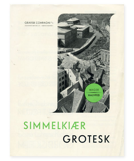
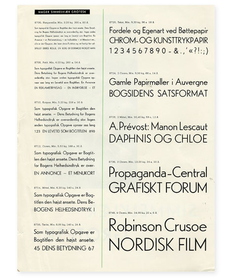
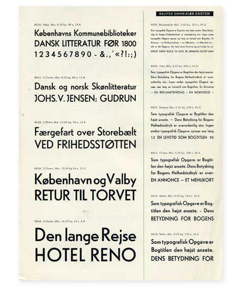
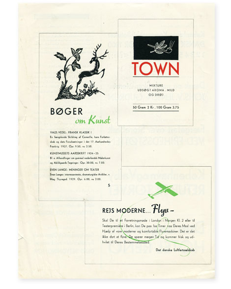
Simmelkiaer Grotesk - Grafisk Compagni
I found this type specimen sheet when I was digging through a printer’s collection last summer. Anyone have any info on Simmelkiaer Grotesk or Grafisk Compagni?
———————-
Also worth Checking: Vette Annonce type specimen sheet, Plakat Schriften, Aldo Novarese - Recta
Not signed up for the Grain Edit RSS Feed yet? Give it a try. Its free and yummy.
———————-
No Tags©2009 Grain Edit
By: Debbie Ridpath Ohi,
on 7/11/2009
Blog: Inkygirl: Daily Diversions For Writers (Login to Add to MyJacketFlap)
JacketFlap tags: Comics for writers, fonts, Add a tag

Blog: inspiration from vintage kids books and timeless modern graphic design (Login to Add to MyJacketFlap)
JacketFlap tags: grahpic-design, fonts, Typography, Designers, contemporary, Found design, Add a tag

Si Scott’s Hunter
HypeForType is looking good. It’s a best of, it’s a who’s who, it’s a one stop typographic super shop featuring lots of inspired designers and typographers making great looking type.
Under the supervision of Alex Haigh (of Thinkdust), HypeForType brings together type designers and gives them a unique spot to showcase their work.
In Exclusive Faces Volume 01, HypeForType brought together the talented Alex Trochut, Si Scott, Jon Burgerman, Hellohikimori, and Luke Lucas. Can’t wait to see what’s coming next.
On Twitter: @hypefortype.
Official Classic’s Solaria
Neutura’s Ne-Deuce
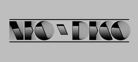
Alex Trochut’s Neo Deco
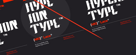
HelloHikimori’s Lace
Jon Burgerman’s Burgerman
©2009 Grain Edit
Blog: inspiration from vintage kids books and timeless modern graphic design (Login to Add to MyJacketFlap)
JacketFlap tags: illustration, fonts, Typography, contemporary, Found design, graphic-design, Add a tag
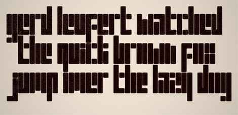
Rodrigo Fuenzalida is a designer, illustrator, and typographer from Caracas, Venezuela. His work has a great balance between being nostalgic, experimental, and fun.
In addition to being super talented, Rodrigo is also generous. Upon the momentous occasion of his site reaching 5,000 hits, he is giving away three (3!) of his fonts. The three are quite awesome, and happen to be
GERD, K5 and LINE_A.
Thanks Rodrigo!
You can download the fonts here.
©2009 Grain Edit
Blog: inspiration from vintage kids books and timeless modern graphic design (Login to Add to MyJacketFlap)
JacketFlap tags: fonts, Typography, Off our book shelves, vintage, 1960s, USA, rare, Add a tag
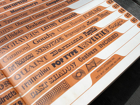
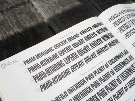
Photo Lettering website
Photo-Lettering was a mainstay of the advertising and design industry in New York City from 1936 to 1997. PLINC, as it was affectionately known to art directors, was one of the earliest and most successful type houses to utilize photo technology in the production of commercial typography and lettering. It employed such design luminaries as Ed Benguiat and sold type drawn by the likes of Herb Lubalin, Milton Glaser and Seymour Chwast as well as countless other unsung lettering greats. The company is best known by most of today’s graphic designers for its ubiquitous type catalogs.
House Industries purchased the entire physical assets of Photo-Lettering and is carefully digitizing select alphabets from the collection and plans to offer them through the new Photo Lettering website.
To celebrate, I thought it would be nice to dig up one my Photo Lettering catalogs. Here for your viewing pleasure is Alphabet Thesaurus Vol.2
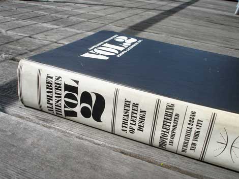
Alphabet Thesaurus Vol 2 - A Treasury of Letter Design
©2009 Grain Edit
Blog: Jacket Whys (Login to Add to MyJacketFlap)
JacketFlap tags: color, shapes, book covers, symbols, fonts, Add a tag
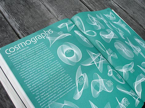
I wanted to say Catching Fire Catches Fire. But Publisher’s Weekly already said that…
At BEA Friday, the ARCs were hard to come by, but I was lucky. I’m taking a break at the moment, a third of the way through this book which has, so far proved worth the buzz… YES, you gotta read this! (Yesterday!)
My purpose here, however, is to talk about the covers, not what’s between the them.


I loved the cover of Suzanne Collins‘ The Hunger Games (Scholastic 2008). It isn’t drastically different from the crowd, but it embraces a few of the conventions I’ve noted. Most particularly what I pointed out a couple of months ago in my post about what Liza Gilbert’s teens liked. “A real focal object, and a mysterious atmospheric quality. Mostly good type treatment… Good hooks.”
The Hunger Games: Focal object? CHECK. Mysterious atmospheric quality? You could say that. CHECK. Type treatment? Yeah – looks very futuristic. Probably a good hook. CHECK.
The way I interpret book #1’s jacket, which is to say, I think it fits the story (another CHECK), is this: There’s darkness in the land. Each circle marks one of the 12 districts (here linked, but with walls? blocking the links?). And there’s hope. A golden mockingjay pin marks the spot.
And here’s Catching Fire (Scholastic, 9/2009). Some brightness radiating out, with more light coming from District 12. No walls. The arrow has disappeared. Does that mean something?
And… what’s that? The mockingjay has come alive! Here’s another assessment of the symbols.
I love this cover, and I hope Scholastic sticks with this for the paperbacks (I beg you, Scholastic, do not put people on the paperback issues). I strongly dislike the UK (Australian?) Hunger Games cover. I’m not at all convinced that making the book look like 90% of the other books out there will hook readers. Here’s hoping that they stick with BUZZ and a great matching cover for the third book.
If you’re not as convinced as I am that this was a good choice, what do you think of the UK cover of Catching Fire? And do they really need Stephenie Meyer’s name to boost sales? (Caveat: Amazon UK shows the U.S. cover so I’m not sure this is what they’re really releasing?).
Don’t miss this article at Publisher’s Weekly that flashes Hunger Games book jackets from around the globe.
Hunger Games: In a future North America, where the rulers of Panem maintain control through an annual televised survival competition pitting young people from each of the twelve districts against one another, sixteen-year-old Katniss’s skills are put to the test when she voluntarily takes her younger sister’s place. (CIP) Ages 12+. Reviews: 1, 2, 3, 4, 5. Trailer. Videos of Collins talking about the Hunger Games.
Catching Fire: By winning the annual Hunger Games, District 12 tributes Katniss Everdeen and Peeta Mellark have secured a life of safety and plenty for themselves and their families, but because they won by defying the rules, they unwittingly become the faces of an impending rebellion. (CIP) Ages 12+. Reviews: 1, 2.


Blog: inspiration from vintage kids books and timeless modern graphic design (Login to Add to MyJacketFlap)
JacketFlap tags: fonts, Typography, Off our book shelves, vintage, netherlands, 1960s, dutch, type-specimens, rare, Add a tag
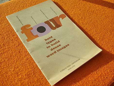
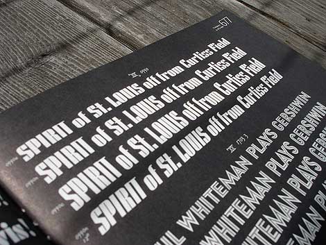
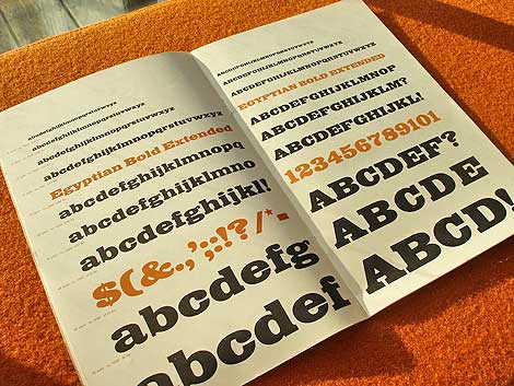
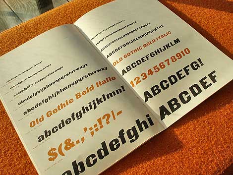
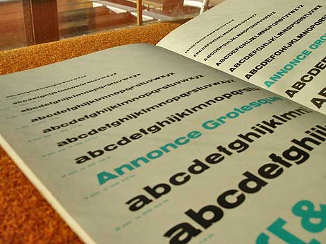
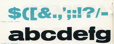
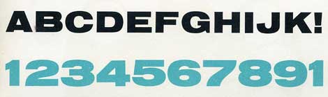
Four bold types to build dense word images c. early 60s?
Beautiful type specimen booklet produced by Typefoundry Amsterdam and imported by Amsterdam Continental. Includes samples of Egyptian Bold Extended, Annonce Grotesque, Egyptian Bold Condensed and Old Gothic Bold Italic.
From the intro of the Booklet:
In this specimen booklet, we have grouped four bold, decisive display type faces. Based on design modes which became classics of the midnineteenth century style, they have in common the power to create a dense , highly integrated word image, with the effect of a broad band or ribbon. A wide diversity is offered within this overall unity of effect: Egyptian and Gothic, roman and italic, condensed and extended. Where strong impact is required, these faces achieve dramatic solutions. They create an advanced, modern accent when maxium contrast with the even tone of text material is the designer’s aim.


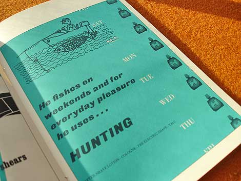
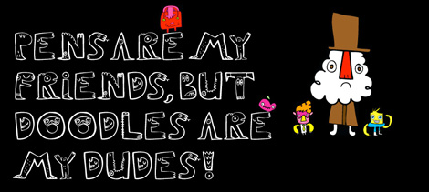
Who writes this stuff? This is great. He fishes on weekends and for everyday pleasure he uses hunting. Killing furry meat in the week and doodle socking on the weekend.. nice!
*Note-I googled fishing slang. I’m not actually this cool.
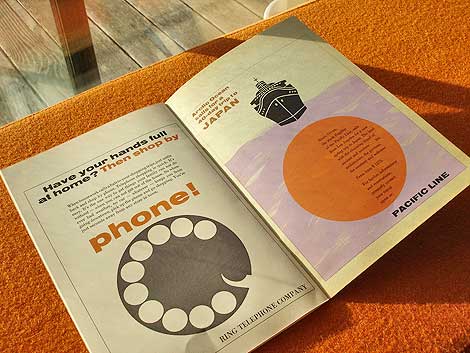
Ring telephone company..clever.

Also worth checking: Vette Annonce
Not signed up for the Grain Edit RSS yet? Give it a try. Its free and yummy.
No Tags
Grand Prize goes to Tim Kim - 1st pick of the 4 prize options goes to Vertigo Andy - 2nd pick of prizes goes to Jory Dayne- 3rd pick of prizes goes to Tim Kim - 4th prize goes to Celiajoy our winner from twitter - We will contact all of you directly.
©2009 Grain Edit
 By: Chad W. Beckerman,
on 3/30/2009
By: Chad W. Beckerman,
on 3/30/2009
Blog: Mishaps and Adventures (Login to Add to MyJacketFlap)
JacketFlap tags: design, fonts, Abrams logo, Add a tag
ABRAMS

Our goal was to modernize, simplify and still remain faithful to our history.
Here is the final and new ABRAMS logo I worked up.
 The display font is Gotham
The logo tagline is set in AT Sackers
In addition to a refreshed and modern design, our website has many new features including an improved search engine, navigation by subject and enhanced product pages that include image galleries, “look inside” previews and social bookmarks. Social bookmarks on each product page will enable viewers to easily share our titles with friends on Facebook.com, Digg.com, Stumbleupon.com, Myspace.com, Delicious.com, and Google.com. This will be a great way for our books to be marketed virtually. The new website also has an area to spotlight featured authors, an events calendar, an integrated newsletter system and the ability to create discounts and coupon codes for marketing and sales campaigns.
I hope you’ll take some time to explore the new site and forward the link to all of your contacts and friends:
brand new Facebook fan page for ABRAMS:
If you are Facebook member, click on the “become a fan” link on the left side of the page and please share the page with your friends on Facebook by posting it to your profile page by clicking on the “Share +” button on the left side of the page as well. Let me know if you need any assistance or if you have any questions, comments or suggestions.
By: Debbie Ridpath Ohi,
on 3/18/2009
Blog: Inkygirl: Daily Diversions For Writers (Login to Add to MyJacketFlap)
JacketFlap tags: fonts, Comics for writers, Add a tag
Blog: Jacket Whys (Login to Add to MyJacketFlap)
JacketFlap tags: fonts, trends, book covers, Add a tag
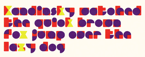
I’m wondering if this is going to be a new thing - title writ large, up or down and sprawled out to the borders (or close). I am sure it’s been done before on teen books, but this is three coming out within three months of one another. It seems new - for now.
I love the transition of dark to light in the letters, and the reverse in the background on Bait by Alex Sanchez (Simon & Schuster June 2009). Caveat here - the only place I could find this cover was on Sanchez’s website, so it may not be the final cover. Of the three, I like this one the best, so I hope S&S decides to keep it.
On Blade: Playing Dead by Tim Bowler (Philomel May 2009), the big type is the series name rather than the book title. Freaked by J. T. Dutton (HarperTeen March 2009) isn’t quite expanded into the frame, but still effective.
This effect could be overused. Let’s hope it, as well as any other recognizeable cover trend, won’t be.


Bait: Diego keeps getting into trouble because of his explosive temper until he finally finds a probation officer who helps him get to the root of his anger so that he can stop running from his past. Ages 12+.
Blade: A fourteen-year-old British street person with extraordinary powers of observation and self-control must face murderous thugs connected with a past he has tried to forget, when his skills with a knife earned him the nickname, Blade. Ages 14+. Reviews, 1, 2, 3.
Freaked: In the mid-1990s, Grateful Dead fan Scotty Loveletter must wade through the privileged world of his East Coast prep school while dealing with his absent mother, a famous sex therapist. Ages 14+. Jacket design by Alison Klapthor. Jacket art by Sean Freeman. Interesting background info.


Blog: inspiration from vintage kids books and timeless modern graphic design (Login to Add to MyJacketFlap)
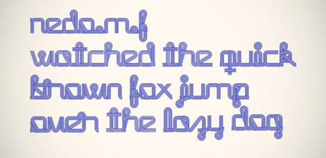
JacketFlap tags: fonts, Typography, contemporary, Found design, Norway, Add a tag

The last time we mentioned Bolda Display on Grain Edit we were drooling over its eventual release. Well now its available for purchase. I gave it a test run and I have to say, I love this font. I can’t get enough of those lowercase bubbly round slabs. Definitely one of my faves over the past year. It comes in two styles, regular and outline. This has to be the best (and only) font to be inspired by 1970s ping pong fashion.
You can buy Bolda Display here.


Not signed up for the Grain Edit RSS yet? Give it a try. Its free and yummy.
©2008 Grain Edit
By: Debbie Ridpath Ohi,
on 9/30/2008
Blog: Inkygirl: Daily Diversions For Writers (Login to Add to MyJacketFlap)
JacketFlap tags: Community, fonts, Add a tag
A question came up in my critique group which I thought I’d post as a poll here on Inkygirl. In your manuscripts, do you use underlining to indicate italicized text, or do you just italicize whatever typeface you’re using. And what typeface DO you use for your standard manuscripts when printing them out for submission?
According to the MLA, underlining to indicate italics is not as common as it used to be. I’ve been underlining but am considering changing.
What about the rest of you?
Blog: inspiration from vintage kids books and timeless modern graphic design (Login to Add to MyJacketFlap)
JacketFlap tags: fonts, Typography, typefaces, stamps, contemporary, 1970s, Found design, Add a tag
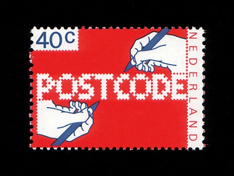
Top: Postcode typeface designed by Christophe Stoll 2008- Bottom: POSTCODE stamp designed by Gert Dumbar in 1978.
Christophe Stoll recently emailed to let me know of a cool typeface he designed called Postcode which is based off a stamp in the Iain Follett Stamp collection we featured. Check out Christophe’s website to hear the story behind Postcode and to download the typeface for FREE.
After you download the typeface, put some time aside to browse Iain Follett’s amazing stamp collection on Flickr.
No Tags By: Kathy Weller,
on 7/11/2008
By: Kathy Weller,
on 7/11/2008
Blog: wellerwishes (Login to Add to MyJacketFlap)
JacketFlap tags: Books, Events, Fonts, fashion, Plug, Add a tag

I am SO excited about the release of "You Lost Him At Hello" by Jess McCann (HCI Books). I designed and illustrated the cover, and it is my first published mass-produced fashion illustration work. I am also SO thrilled to have my work wrapped around such a witty and energetic, hilarious and ultimately VERY HELPFUL book! This book will make you laugh and nod! It's all about the laughing and the nodding... seriously. No matter if you are single and looking or married, off the market and remembering what it was like in the scary shark-infested waters of singledom, LOL!! It's a KICK! It's a big dose of very funny tough-love for single ladies who really need a friend to be objective, honest and straight with them -- but it DELIVERS the goods. Ways to improve the situation, ways to be successful at your goal!
But in all honesty, the book works on so many levels -- it's written from a salesperson's perspective and a ot of the points which are established here are really applicable to many areas of my life! SO I am reading it as written, but I am thinking about how these excellent ideas apply to my business life as well. GREAT WORK, Jess!!! I am proud to have been a part of this wonderful book and I cheer on your success!! You go, girl!!! ;)
Blog: inspiration from vintage kids books and timeless modern graphic design (Login to Add to MyJacketFlap)
JacketFlap tags: fonts, Typography, contemporary, Found design, USA, Add a tag
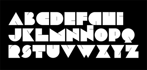
Antonio over at Aisleone just released a great new typeface called Enotmik. It’s a two weight display font that pays homage to Helvetica and Avant Garde.
You can buy the font here.
contemporary, fonts, Typography, USA By: Ysabeau Wilce,
on 3/1/2007
By: Ysabeau Wilce,
on 3/1/2007
Blog: The Califa Police Gazette (Login to Add to MyJacketFlap)
JacketFlap tags: Publishing, Writing, fonts, Add a tag
I love fonts and typefaces. It's so cool to be able to a typesetter without having to be able to spell words backwards. I have a hard enough time spelling words forwards...
Anyway, I love to collect fonts to use in my Bilskinir Press projects, and my latest find is Walden Fonts. They have several super cool old timey font sets, including the Civil War Press, so you can make your recruiting posters non-farby: Magick, so you can make your nomicons super boo-spooky; or Divers Handes, so your handes can look very divers.
So order up a few fonts from Walden, and put your cyper print devil to work!
 By: Amy C. Moreno,
on 1/20/2007
By: Amy C. Moreno,
on 1/20/2007
Blog: Cachibachis (Login to Add to MyJacketFlap)
JacketFlap tags: Dieter Steffmann, Fontplay, typOasis, fonts, Add a tag
Go to TypOasis. It's very addictive if you're into fonts. I'm searching the site to find out how to order some.
Here's another font designer connected with TypOasis, Dieter Steffmann.
You'll also find lots of fonts at FontPlay.com
I love the Haida-looking art for the Deep Blue Sea Book, and that font really ruins it. I hate to say it, but you know what face would look good for that style? Neuland...
I thought that, too! But even something with a bit of curl or wave would have worked.
Hmmm...for me, the font for Between the Deep Blue Sea and Me doesn't look academic, it just looks straight-forward and clean - it works beautifully. I want to look at the swirls in the design of the dolphin (killer whale?), and I wouldn't want the font competing for my attention with its own waves or curls. In a way, the font used on the book looks clean-washed - appropriate for a tale about the sea. And Neuland, well, for me that font always feels pre-Columbia; it's supposed to be kind of Aztec-ish - and this story is set in Hawaii, right? Nope - I like the font plain. I don't know about whether teens will like it - it's true, teens like a bit of drama, but doesn't the design behind the font provide that?