


While going through the slush mail today, I came across a pair of standout illustrators in a pile of recent UArts grads. Jim Tierney and Sara Wood, a young Brooklyn couple, have a fantastic approach to book cover design. Their masterful combination of type, hand-lettering and drawing makes both of their portfolios equally impressive.

 I put the cards up on the “Wall Of Stuff I Like” in my cube, right next to our other favorite hand-drawn type designer, Kristine Lombardi. Lombardi’s cards have been up on our wall for ages. While her cards have more of a feminine, fashion style (although I do like her Kids page!), they are the first thing that designers walking by are ALWAYS drawn to. Check out a great interview (including the below image of her promo card) here.
 These designers got me to thinking: where’s the place for hand-lettered type in children’s books? Before the age of thousands of freebie fonts on the internet (hey, it wasn’t that long ago!), hand-lettered display type was commissioned for book covers all the time. I recently worked on the anniversary edition for Jacqueline Woodson’s The Other Side, and I was so impressed to discover that the handsome title was calligraphed by the original in-house designer.
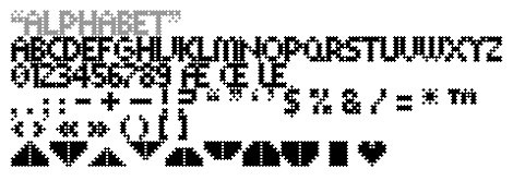
 And while I’m sure it took a lot more effort than downloading a font, there’s something careful, purposeful and yet whimsical to hand-drawn type. So it’s no surprise that it is experiencing a rebirth of magnificently hip proportions. Now, type everywhere looks like this:
Blog: JACKET KNACK (Login to Add to MyJacketFlap)
JacketFlap tags: fonts, typefaces, titles, Best Covers, Bad Covers, Add a tag
Once again, for your consideration we present the following covers with title fonts that stand out as particularly interesting, or that function extra well as part of the design.

 |
| The Firefly Letters by Margarita Engle (Holt, 2010) |
 |
| Frozen Secrets: Antarctica Revealed by Sally M. Walker (CarolRhoda, coming October, 2010) |
 |
| Lulu and the Brontosaurus by Judith Viorst, illustrated by Lane Smith (Atheneum, 2010) |
 |
| Wild Things by Clay Carmichael (Boyds Mills/Front Street, 2009) |
Blog: JACKET KNACK (Login to Add to MyJacketFlap)
JacketFlap tags: fonts, typefaces, titles, Add a tag
Ran across these covers recently and was taken with the title typeface choices:
Rosie and Skate by Beth Ann Bauman (Random House, 2009). A young adult novel about two sisters living on the Jersey shore during the off-season. So 1950s diner-ish. Love the whole cover, actually.
Layla, Queen of Hearts by Glenda Millard, illus. by Patrice Bowman (FSG, release date April, 2010). A middle-grade novel about a girl's friendship with a senior citizen. The red lettering is inviting (for girls, anyway) and the curly style promises a heartwarming story within.
Can an Old Dog Learn New Tricks? And Other Questions about Animals by Buffy Silverman, illus. by Colin W. Thompson (Lerner, 2010). A non-fiction book which examines common sayings about animals and whether they're really true or not. The typeface is energetic, like a comic book; it promises juicy good fun inside. I think boys would think it's rough and tough enough.
I wonder if there are other typefaces that could be sorted into "best for girl books" and "best for boy books" categories.
Blog: JACKET KNACK (Login to Add to MyJacketFlap)
JacketFlap tags: Bad Covers, jacket whys, Young Adult, fonts, middle grade, typefaces, Add a tag
 Because of this blog, I am becoming naturally more attuned to cover design and especially to typeface choices, which can make or break a cover. Take, for example this book, Between the Deep Blue Sea and Me (Kamehameha Publishing, 2008) highlighted by L. over at Jacket Whys. I agree with L.'s analysis. It's a gorgeous image, and I also agree that it's a toss-up over whether teens will be attracted to it. I don't know about you, but the typeface is off-putting to me. Doesn't it make you think of a book of essays, or a textbook, or one of those literary criticisms you were required to buy for a class? I had to look to make sure it didn't say Harold Bloom at the bottom. Sorry: Fail.
Now here's a book that's not due out until May, but it shows quite well what happens when the typeface fits the book:
This is Folly (Wendy Lamb Books, May 11, 2010), a historical fiction for teens (Yay!). It takes place in Victorian England, with a description that sounds as if the novel is full of joys and sorrows. Certainly, the cover suggests the sorrows. Note how the scratched ceramic surface of the girl's skin fits with the scratchy font, yet there's also a bit of joy in the slanting serifs and those curly "l"s and "y"s. Double-plus like.
Now more really neat-o title fonts for your viewing pleasure:
Seems like everyone but me has probably already read Beautiful Creatures, a gothic fantasy by Kami Garcia and Margaret Stohl. The actual cover, like many YA books out now, has fabulous embossed lettering. And what elaborate lettering it is.
Newsgirl by Liza Ketchum (Viking, 2009) is a middle grade historical (Yay!) in which the main character hawks papers on a street corner. Hence the well chosen, printerly font.


Carol, I am a sucker for fonts. I love the LULU cover because of the script with the curled uprights of the letters. And I agree--THE FIREFLY LETTERS does look like it could be fantasy. The fireflies look like eyeballs in her hair. Kind of disappointed that it's not a fantasy. Nice choices this week!
Yes, I had assumed it was a fantasy. Never occurred to me that it could be another genre until I read the summary.