new posts in all blogs
Viewing: Blog Posts Tagged with: composition, Most Recent at Top [Help]
Results 1 - 25 of 118
How to use this Page
You are viewing the most recent posts tagged with the words: composition in the JacketFlap blog reader. What is a tag? Think of a tag as a keyword or category label. Tags can both help you find posts on JacketFlap.com as well as provide an easy way for you to "remember" and classify posts for later recall. Try adding a tag yourself by clicking "Add a tag" below a post's header. Scroll down through the list of Recent Posts in the left column and click on a post title that sounds interesting. You can view all posts from a specific blog by clicking the Blog name in the right column, or you can click a 'More Posts from this Blog' link in any individual post.

By: Alice,
on 4/7/2016
Blog:
OUPblog
(
Login to Add to MyJacketFlap)
JacketFlap tags:
composition,
composer,
sheet music,
*Featured,
olivier messiaen,
igor stravinsky,
Johann Sebastian Bach,
printed music,
Carl Nielsen,
Luciano Berio,
Millennium Scenes,
Reinbert de Leeuw,
Richard Causton,
The Flight Vocal Score,
Music,
Add a tag
Richard Causton’s studies took him from the University of York via the Royal College of Music and the Scuola Civica in Milan, to King’s College, Cambridge where he is Lecturer in Composition. In addition to composition, Causton writes and lectures on Italian contemporary music and regularly broadcasts for Italian radio. In our occasional series, in which we ask Oxford composers questions based around their musical likes and dislikes, influences, and challenges, we spoke with Richard Causton about his writing, new music, and his desert island playlist.
The post Composer Richard Causton in 10 questions appeared first on OUPblog.

by Keith Negley (Flying Eye Books, 2015)
Heads up, email subscribers: my blog took a bit of a tumble so I’m reposting what was lost in the shuffle. Apologies, and thank you for reading!
The kind folks at Flying Eye sent over a preview of this book, thinking it was right up my alley.
It’s right up my alley.
The theme: yes. The design: yes. The snappy, bold, in-your-face look at tough guys plus the snappy, bold, in-your-face look at feelings: yes.
I chatted with Keith Negley, and learned a lot about this debut effort. I hope there’s more from him, and I hope you enjoy this peek into the brain of a picture book creator.


Hi Keith! Can you talk about where this story came from? And what the process was like for its creation?
It all started when my son Parker who was 6 at the time stole a soccer ball from a friend during soccer practice and his friend got upset and they fought over it. Parker was angry at first, but then felt embarrassed and ashamed because he knew he did something wrong. I could tell he was struggling with how to handle all these new emotions that were happening to him at the same time. He walked away from the group and sat down to be by himself because he didn’t want anyone to see him cry. Later that night, I explained to him that it was totally natural to cry and that everybody does it. I told him sometimes even I cried, and he looked up at me and asked, “grown ups cry too?”
It blew his mind that even adults cried because he thought it was something only kids did. I wished I had a book I could read to him that let him know that frustration and crying is a natural thing not to be ashamed of. The next day the idea for the book popped into my head.
You’ve done a lot of editorial illustration, but this is your first children’s book. Can you tell us the how and why you got into books?
I always liked the idea of making picture books for children, but it wasn’t until I became a parent and started reading a ton of picture books to my son did I realize there was a lack of the kind of books we enjoyed. Honestly the books I’ve been working on were born out of necessity because I wanted to read them and no one else had made them yet.
Your tumblr tag line is spectacular: part man, part negative space. Can you explain where that came from and why it represents you so well?
Ha, I find tragedy to be the greatest muse. The subjects I enjoy working with the most are the ones that break my heart. It’s cathartic somehow, and I feel like I really get to put a piece of me into the work. What ends up happening is I have a portfolio of rather depressing subject matter. But I’m always striving to create beautiful images with it. That juxtaposition is challenging and rewarding for me.
Add to that I tend to utilize negative space as a compositional tool fairly often and so I thought it tied the content in with the image making nature of the blog.
 Who are some of your story heroes?
I’ve been a huge fan of Lane Smith for years and years. Jon Scieszka is another one. Ezra Jack Keats. Jack Kent’s Socks For Supper is one of my all time favorites as a kid and it still holds up today.
What do you remember about picture books from your childhood?
I remember my mom reading them to me and how she would make different voices for all the characters. I try to do that for Parker but he’s not into it at all unfortunately.

What is your favorite piece of art hanging in your home or studio?
Not sure if this counts, but I like to make music in my spare time and I’m a huge nerd for vintage synthesizers. I currently have a 1979 Korg 770 sitting in my studio and just looking at it makes me very happy. I consider them works of art.
What’s next for you?
Trying to schedule some reading events for the fall/winter and I’m in the middle of working on my second book for Flying Eye which should be out in time for Father’s Day next year!

Thank you, Keith! And vintage synthesizers totally count as works of art.
PS: Congratulations to the winner of the The Story of Diva and Flea giveaway, Ashley! And thanks to Flying Eye for the images used in this post.


By: Carter Higgins,
on 10/21/2015
Blog:
Design of the Picture Book
(
Login to Add to MyJacketFlap)
JacketFlap tags:
keith negley,
design,
color,
balance,
scale,
composition,
shape,
white space,
flying eye books,
Add a tag
by Keith Negley (Flying Eye Books, 2015)
The kind folks at Flying Eye sent over a preview of this book, thinking it was right up my alley.
It’s right up my alley.
The theme: yes. The design: yes. The snappy, bold, in-your-face look at tough guys plus the snappy, bold, in-your-face look at feelings: yes.
I chatted with Keith Negley, and learned a lot about this debut effort. I hope there’s more from him, and I hope you enjoy this peek into the brain of a picture book creator.
Hi Keith! Can you talk about where this story came from? And what the process was like for its creation?
It all started when my son Parker who was 6 at the time stole a soccer ball from a friend during soccer practice and his friend got upset and they fought over it. Parker was angry at first, but then felt embarrassed and ashamed because he knew he did something wrong. I could tell he was struggling with how to handle all these new emotions that were happening to him at the same time. He walked away from the group and sat down to be by himself because he didn’t want anyone to see him cry. Later that night, I explained to him that it was totally natural to cry and that everybody does it. I told him sometimes even I cried, and he looked up at me and asked, “grown ups cry too?”
It blew his mind that even adults cried because he thought it was something only kids did. I wished I had a book I could read to him that let him know that frustration and crying is a natural thing not to be ashamed of. The next day the idea for the book popped into my head.
You’ve done a lot of editorial illustration, but this is your first children’s book. Can you tell us the how and why you got into books?
I always liked the idea of making picture books for children, but it wasn’t until I became a parent and started reading a ton of picture books to my son did I realize there was a lack of the kind of books we enjoyed. Honestly the books I’ve been working on were born out of necessity because I wanted to read them and no one else had made them yet.
Your tumblr tag line is spectacular: part man, part negative space. Can you explain where that came from and why it represents you so well?
Ha, I find tragedy to be the greatest muse. The subjects I enjoy working with the most are the ones that break my heart. It’s cathartic somehow, and I feel like I really get to put a piece of me into the work. What ends up happening is I have a portfolio of rather depressing subject matter. But I’m always striving to create beautiful images with it. That juxtaposition is challenging and rewarding for me.
Add to that I tend to utilize negative space as a compositional tool fairly often and so I thought it tied the content in with the image making nature of the blog.
Who are some of your story heroes?
I’ve been a huge fan of Lane Smith for years and years. Jon Scieszka is another one. Ezra Jack Keats. Jack Kent’s Socks For Supper is one of my all time favorites as a kid and it still holds up today.
What do you remember about picture books from your childhood?
I remember my mom reading them to me and how she would make different voices for all the characters. I try to do that for Parker but he’s not into it at all unfortunately.
What is your favorite piece of art hanging in your home or studio?
Not sure if this counts, but I like to make music in my spare time and I’m a huge nerd for vintage synthesizers. I currently have a 1979 Korg 770 sitting in my studio and just looking at it makes me very happy. I consider them works of art.
What’s next for you?
Trying to schedule some reading events for the fall/winter and I’m in the middle of working on my second book for Flying Eye which should be out in time for Father’s Day next year!
Thank you, Keith! And vintage synthesizers totally count as works of art.
PS: Congratulations to the winner of the The Story of Diva and Flea giveaway, Ashley! And thanks to Flying Eye for the images used in this post.
Let’s talk about COMPOSITION! Yeah!
Have you ever noticed that some compositions feel awkward, while others just seem to flow? There are many strategies for creating interesting and easy-to-read compositions. In order to keep from writing a super long, rambling post, I’ll stick to discussing only one method for today. When a composition really isn’t working, sometimes I like to turn to math: the Golden Ratio.
The Golden Ratio is a geometric relationship that you probably learned about in high school, where the ratio of two quantities to each other is the same as the larger quantity’s ratio to the sum of the two quantities. That can sound a bit confusing when you write it out in English words, but it’s actually incredibly simple when you see it drawn. I’ll refer you to this informative Ted Talk about Fibonacci numbers. If you create a sequence of boxes using the Golden ratio, you get a spiral:

Image via the Wikimedia Commons
The Golden Ratio/Golden Spiral is ubiquitous in nature: it shows up in sunflowers, shells, the shape of your ears, the proportions of your body, and the form of galaxies and hurricanes. I could go on and on. The Golden Spiral also happens be a handy tool for creating interesting compositions. Sometimes all it takes are a few tweaks–moving something to the left, lining a few key elements up, to take your composition from “meh” to “aah.” This isn’t a new concept. Artists have been using the golden ratio pretty much ever since it was discovered.

As much fun as I have playing with the composition of my illustrations, I also have to remember that each image is NOT a work of art in and of itself. The book needed to work as a whole, so it was also important to find harmony between the pages as well. This is where my editor and art director were invaluable, never losing sight of the project in its entirety, and keeping me from getting too attached to compositions that were not quite right for the flow of the story. (And also making sure I kept enough space for the text to be placed.) I made several physical dummy books myself so that I could experience the page turn and see the images together in sequence.
If you have another favorite method for finding interesting compositions, I want to hear! Let me know in the comments.
Coming up next: The Devil’s in the Details
Other posts in the series:
- Part 1 – Getting Started
- Part 2 – Finding Harmony
- Part 3 – Devil’s in the Details
- Part 4 – Adding the Magic
- Part 5 – Painting with Guts
By: Carter Higgins,
on 9/29/2015
Blog:
Design of the Picture Book
(
Login to Add to MyJacketFlap)
JacketFlap tags:
beyond the pond,
joseph kuefler,
blazer and bray,
design,
music,
trailers,
texture,
composition,
movement,
line,
banksy,
short film,
Add a tag

by Joseph Kuefler (Balzer + Bray, 2015)
Settle in for snippets of story so goosebumpy you’ll think the pages just paper-sliced your soul in two. It is an honor to introduce you to Joseph Kuefler and his gorgeous debut, Beyond the Pond. I love every single word he’s spilled out to us here.
Enjoy!
Can you talk about where this book came from?

My dearest childhood friend lived across the street from a picturesque pond — one of those charming bodies of water with just the right mix of long grass, cattails and critters. Early mornings almost always found its surface blanketed in a magical fog. In winter months, we would skate on its surface. That pond filled me with such wonder as a boy.
So many years later, the wonder of ponds came back to me when I found myself telling my son, Jonah, stories each morning as I drove him to school. Our route took us past a smaller but no-less-magical pond, sandwiched between a row of houses, almost as if it was forced there, like it didn’t belong. We both imagined what fantastical creatures lived beneath its surface. And so, an idea for a picture book was born.
In hindsight, I absolutely see the connection between these moments of inspiration in my life.
And what was your process like for creating it? How did you turn an idea for a story into a completed picture book?
One advantage of being an author/illustrator is that my words and images can reveal themselves together. I begin with a loose story skeleton and single completed illustration that captures the atmosphere of the book. Small thumbnails get created as I’m improving and iterating on the story. Sometimes a posture or scene in my thumbnails will inspire a change to the text, sometimes it’s the other way around. Once the story is tight, I return to my thumbnails and create much tighter pencils, focusing more on composition and type placement.


 When it comes to final art, I work digitally, more out of necessity than choice. At the moment, picture books aren’t my day job, so I need to work from anywhere and everywhere. I was traveling a lot for work in the early stages of illustrating POND. Much of the book was illustrated from airplane seats and hotel rooms, cramped rides on bus benches and stolen moments in the office.
As someone formally trained at art school, I long for the day I can rely solely on traditional materials. In some ways I still feel like I need to apologize for using a computer, which is silly, I suppose, because digital doesn’t save me time and is no less difficult. The only thing it affords me is more mobility and greater access to my creative process.


I read on your website all about Hum, and I’m so interested in that. Not so much as a musician myself, but because I think picture books function the same way a song does, as a complete and full narrative that can transcend that small space. What do you think?
I love this question because I absolutely agree. Prior to moving into my career as a creative director, I spent years working as a serious musician playing in an indie rock band. Songwriting and record producing is core to who I am and informs so much of all of my creative processes, both personal and professional.
Writing a great song begins with two questions: What do I want them to know? And how do I want them to feel? Nostalgia? Fear? Melancholy? Vulnerability? Defining the emotional arch predetermines so much about your palette—key, tuning, scale, effects, chord progressions, even mixing decisions. Once that’s defined, you need to reduce all of it, your whole vision, into between three and five minutes of music. It’s such a challenge.
This is true of great books. The books we love tell us a story, but they also tell us feeling. They teach us, adults and children alike, what it feels like to experience something, and they do it in 32 pages, give or take. A songwriter has chords. A picture book maker has paints and pencils. A songwriter has a small collection of seconds or minutes. A picture book maker has pages. Both artists curate their palettes to breathe the right mix of mood into whatever it is they are making.
More than any other mediums I’ve explored, children’s books and songs are the most related.
Like you suggest, great songs and picture books transcend their small spaces. They live on in your mind and heart and come to mean or represent so much more long after the final chord has rung and last page has turned.
Reviews have called this debut reminiscient of Maurice Sendak, Jon Klassen, and Wes Anderson, all huge story heroes. Who are your own story heroes?


I know this is a picture book blog, but my greatest passion is cinema. I love movies and have my whole life. My dad encouraged me to explore the classics, with a particular emphasis on the defining films of the 60s and 70s. Many of my story heroes are filmmakers. I am a huge fan of Jean-Pierre Melville because he found a way to steal the best parts of Hitchcock and blend it with that kind cool only the French possess.
As a child, I loved Spielberg and the wonderful films Amblin would produce because they seemed to understand children in a way few other films did. I do love Wes Anderson for his vision and wit but also for the expert way he handles melancholy. When I begin a new picture book, I typically dive into the films that I feel share a similar atmosphere or message. It’s intentionally obvious I’ve included a few homages to Anderson’s films and style in POND—I wanted to thank him for inspiring me, and I wanted to give moms and dads something of their own to discover within the book.
Animation is also a huge source of inspiration for me. Words can’t describe how much Miyazaki inspires me. His films are somehow massive in scope and incredibly intimate and personal.


I can’t say that I have any specific story heroes in the picture book space. I love the Steads and Klassen and Jeffers and all of the other usual suspects, but I don’t look to picture books to inform my own work as much as I do film or literature, even photography. I’m not trying to suggest that other picture books don’t influence my work—they most certainly do. They’re just not my primary source and I typically look to them much later in the process to help me work through a very specific problem.
I would, however, be remiss if I didn’t mention JK Rowling. Sometimes I close my eyes and hope that when I open them I will have somehow grown a scar on my forehead and transformed into Harry Potter. Rowling succeeded in revealing a hidden magic in our own world, something tucked away just around the bend, something you hadn’t realized was there all along. I love that so much about those books. Turning a pond into a portal seemed to transform the everyday and reveal a hidden magic in a similar way.
Can you tell us a little about the trailer for Beyond the Pond and how you created it? It’s such a perfect piece, and I always think trailers that feel like short films are some of the best!
Thank you for the compliments. I am a creative director who has spent many years in the branding and marketing industries working for clients we all know and love. Making films and telling their stories is a skill I’ve developed over time. When I began considering my own trailer, I knew it needed to feel a little more like a movie trailer than a “book” trailer. It was the only way I felt I could capture the spirit and scope of the book in such a short period of time.
Some are surprised to learn that the voice actor is me. The trailer simply HAD to be narrated by an old, English gentleman because, well, old, English gentlemen are the most magical of men. I didn’t have any on hand, so I put on my Dumbledore hat and effected one.
I love animating. It’s something I don’t get to do as often now, but I was thrilled to be able to dig back into After Effects for this little piece and am pretty happy with how it turned out, all things considered.
What do you remember about picture books from your childhood?
I remember my school library and, Ms. Geese, the world’s crabbiest librarian (if you’re reading this, Ms. Geese, I’m sorry, but you really were frightening). She demanded that we extract library books from the shelves with such expert precision you’d think they were Fabergé eggs. But since we were all so afraid of her, we would hide away in corners with our books. In some ways, her terror forced us to have a more intimate relationship with our books, and for that I am grateful.
I remember the pictures and wishing I could draw like those artists. Like all boys, I was so in love with WHERE THE WILD THINGS ARE. I would try to replicate the wild things over and over and wondered how in the world anyone could ever draw like that. All these years later, I am still left wondering.
What is your favorite piece of art hanging in your home or studio?

I have two favorite walls in my home. One is a quiet corner of my house filled with family photos and texture studies I made over this last year. The family photos feature some of our favorite memories and experiences. It’s something we will continue to grow and add on to over the years.

The second is a Banksy print hanging in my dining room. It’s big and bold and probably doesn’t belong in a space where people are meant to enjoy meals, but I like that about it.
What’s next for you?
A nap. Honestly. Between my day job, working to support POND’s release, welcoming our third child, Augustine, into the world four months ago, and breathing life into a new picture book, this year has been full, so incredibly, exhaustingly full. But it’s been a good kind of full.
Alessandra Balzer and Balzer + Bray were kind enough to buy two more books from me immediately after we finished POND. By the time this feature runs on your blog, I will have just completed final art for my next book. Then, it will be onto the third. I’m also developing a middle grade book and young reader series.
Beyond that, what’s next is experiencing what it feels like to release my very own picture book into the world. This whole thing continues to be so surreal. One of my lifelong dreams is in a state of becoming, and I couldn’t be happier.

—
That story about Ms. Geese is one of the greatest library stories I’ve ever heard! Joseph, thanks for the music and the glimpse at the pond and beyond it all.
A big thank you to Joseph Kuefler for the images in this post.
By: Carter Higgins,
on 9/24/2015
Blog:
Design of the Picture Book
(
Login to Add to MyJacketFlap)
JacketFlap tags:
art,
color,
space,
filmmaking,
composition,
museums,
line,
shape,
MoMA,
Frank Viva,
Add a tag

by Frank Viva (MoMA Publications, 2015)
So this is a super cool book. It’s part MoMA history, part this funky young visionary’s story. Look at her camera perched by her side! Her confident gaze directly into the reader’s eye! A nearly animated cover where the bittiest blocks of color almost blink!

One of the things that I always look for in books for kids are stories that honor their realness. Their hopes and dreams and fears and feelings that sometimes grownups have forgotten all about. Charlotte always carries that slim smile, even when the nun tells her none of that. I’d imagine this isn’t the only place she’s heard that she might be a bit unusual.

That’s because Charlotte prefers black and white to color, and when kids have a preference, it’s usually a pretty strong one. Kids don’t generally go around only sort of caring about something.

And here’s a beautiful example of that. Charlotte’s safe world is black and white, a stark contrast to that of her parents. To the left of the gutter, a home, and to the right, something unfamiliar and loud.
But her parents know this and they understand.
On Friday nights they take her to see black and white movies. And Charlotte is happy.
And on Sundays, they go to the Museum of Modern Art. And Charlotte is happy.

That’s where Charlotte meets Scarlett, an aficionado of black and white too, and how it clears away the clutter. And that’s where Charlotte’s smile returns.
Here’s a kid, wholly in love with something that might seem unconventional. But she has parents who get it, a trip to an art museum that seals it, and a cat who is always willing to play a part.
So that’s what Charlotte does: makes a film in black and white. Scarlet calls it dazzling and genius, but the colorful people?

Only that was their reaction at the beginning, before Young Charlotte, Filmmaker had finished telling her story.
Be sure to check out Young Frank, Architect as well. These two are a perfect pair.
PS: Over on Instagram, a bunch of us teamed up to share one book on a particular theme each month. This was Michelle‘s brilliant idea, and we’d love it if you followed along. Check out #littlelitbookseries! Janssen of Everyday Reading shared another favorite Frank Viva book as part of that series, which is the same one that I wrote about once upon a time for Design Mom!
And thanks to Frank Viva for the images in this post!
By: Celine Aenlle-Rocha,
on 9/17/2015
Blog:
OUPblog
(
Login to Add to MyJacketFlap)
JacketFlap tags:
music education,
lincoln center,
*Featured,
Bruce Adolphe,
Exercises for Improving the Musical Imagination,
Juilliard,
Mind's Ear,
music performance,
music students and emotion,
Books,
Music,
composition,
emotion,
composer,
acting,
Add a tag
Even though I recently turned sixty and have taught at colleges and conservatories, when I hear the words “back to school,” the image that springs to mind is of my teenage self as a Juilliard student in the 1970s. If I ask that self what my main educational breakthrough from those years was, the answer surprises me: discovering what actors learn. Actors study their own emotions.
The post Beyond the page: music students and emotion appeared first on OUPblog.

by Bijou Le Tord (Four Winds Press, 1984)
Did you know I am a school librarian? I’m in my third year, at my second school, and have done it for about a decade with a break for graphics in between. Hashtag old.
And speaking of old, that’s what my current school is. That’s great for things like traditions and history, but it’s really great for things like stories. I’ve had a bit of a triage situation on my hands, and the thing that has taken the biggest chunk of time is massive weeding and collection development. (And undoing the work of the packiest rat that ever packed.)
I’ve been brutal in nonfiction and biographies because poor old Pluto has had better days and a 1970 biography of Peggy Fleming isn’t triple-lutz-ing off the shelves. But then there are picture books. And I haven’t tossed a single one. I need to, for reasons of both space and sanity. But when your library is old, there’s a lot that sparkles under all that dust. And I want to be careful because of things like early, early editions of the Nutshell Library.
Here’s one I found that I’d never heard of before, and wow. If you can get your hands on a copy, it would be a great pair with The Little Gardener.


This is the story of a rabbit, a gentle, shaky, line of a thing.
And it’s the story of his garden. He bids adieu to the snow and ice, and welcomes the warming sun.
These beginning spreads are so simple, so uncluttered, so spare. Those black lines on white, framed by spring’s pastels.
And the words! So unfussy. So beautiful.

When the day cools, he waters his seeds. The sun and the earth begin their work.

He patiently waits, and watches for a first ripple or a crack on the ground.

He patiently sits, until the first seedlings shoot up.
That last spread has a surprising detail, one that fits perfectly into the rabbit’s world but one that is unusual for this particular sequence of images: that star. The sun has been a small circle, hovering over the garden, doing its work. But while the rabbit waits, a star. It must be night. He’s taken his picnic basket and he’s patiently sat, and when the sun dropped, the star showed up.
The seasons take over, as they do, and soon it’s time to welcome back winter. The last time we see the rabbit, he is happy. His work is done.
This rabbit and his work are both sweet and slow and dear, and this book is a quiet little wonder.


by Sonia Goldie and Marc Boutavant (Enchanted Lion, 2013)
If you listened to my conversation with Matthew Winner and Julie Falatko on the Let’s Get Busy podcast this week, you might have heard me say something like, “the books keep coming.”
It’s true, and this book is a perfect example of that. I’m a big fan of the books Enchanted Lion makes, and this one is two years old in America, and I just stumbled across it recently. Better late than never, right?
So, these ghosts.
The front endpapers here show a small spot illustration of a sheeted, ball-and-chained spook. On the title page, another ghost confronts him with disbelief in his ghost-ness, and the story is off. The two, a self-proclaimed ghost and a maybe-ghost, star in a series of pictures where the real ghost explains the reality of ghosts.
They don’t only inhabit creepy places, and they don’t drag around the old ball and chain.
And they definitely don’t go around saying, “Boo…Boo…Boo” all day.
No.
These ghosts are different.

They live in your kitchen. See the name of this ghost, spelled out by the items on the shelf? The Ghost of the Kitchen is clumsy, spilling poofs of flour and traipsing through spilled milk. And he really likes angel food cake and creamed rice. He’s up there on your light, judging you as you snap some peas.

This one wakes at night, scatters your clothes around, and makes your toys sing. He’ll slither into your teams and nightmares, and disappear in the morning.
 The Ghost of the Parents’ Bedroom does not like messes as much as his nighttime friend. But I don’t think he’s as intimidating or successful either.
(Also, I do think that’s a dirty magazine under the bed, no?! Maybe something worth hiring a ghost to protect? Maybe the first I’ve ever seen in a picture book!)

 The Ghosts of the Attic and Gray Days are my favorites. The one in the attic is ‘wrinkly yet twinkly’ and ‘likes to spend his time remembering the good old days.’ He smokes a ghost pipe, reads old newspapers, and listens to scratched records. He scares spiders away by wearing silvery scarves.
And the Ghost of Gray Days is a lumbering fellow, joined by a driving slug and an elephant carrying a plate for an umbrella. Of course.
The details in these pictures is astounding. Each spread has quirky spooks and spooky quirks, and each of these ghosts has enough character to erase that old, boring ball and chain.
Perfect for anyone who likes mini-stories, visual feasts, and the fun of being scared.

I can’t stop thinking about the line Emily left us with yesterday, this one:
They are stories coming from a place of trying to understand, rather than a place where it is understood.
Right?
Welcome back, Emily! Hope you enjoy the rest of our conversation. (And a reminder, click to enlarge any images.)


Can you tell us about the design of the art and the text? I love that your pictures don’t have text on them anywhere, and the page turn with the flower is the only time there’s text away from the bottom. What went into those decisions?
There wasn’t much decision making- that was the problem! Often times I like to work with only a bit of text because type is a whole other ball-park in terms of aesthetics. I have a hard time compromising my space for words- text and fonts and size, all that jazz has to mesh in with the artwork, and it’s hard finding the right voice to match the looks.
My work gets pretty dense, so I find it a lot more difficult to find something that is legible, but still yields to the art. In university I preferred to keep my lines simple and punchy and give a whole page of text to one image- it makes you read everything slower, more thoughtfully. However in the world of big print-run publishing, it is a luxury to use up so much paper! I work on the pacing, but the designers at Flying Eye made a lot of the technical decisions and all the book designing- I think they’ve done beautifully.


What is your favorite piece of art hanging in your home or studio?
I work at home, and my favourite art piece is this ceramic self-portrait bust my Dad made when he was a kid in school. It’s got hair that looks like it was squeezed through a garlic presser- he forgot a bit of hair on the back though, and he made his nostrils with a pencil eraser. It’s a bit creepy, bit primitive cool. Very seventies. Still trying to find the best place to display it.
What are some of your favorite picture books? Both for writing and text and whatever inspires? What is your favorite picture book from childhood?
My favourite old school book is Munro Leaf’s Ferdinand. It is a beauty in text and image- what a fantastic story about the happily peaceful bull. Didn’t want to fight, didn’t want the fame, just wanted the simple pleasures of everyday life. You come across the message of being unique quite a bit in children’s books. Oftentimes it’s a feeling of ‘you’re different’ therefore special, therefore better. I don’t get that passive aggression or hypocrisy with Ferdinand.
For modern, I love Michael Rosen/Quentin Blake’s Sad Book. It isn’t sappy or over the top, it is perfect. No melodrama or silver-linings, just honest. The book feels like it is quietly listening to it’s readers own blues. It brought me real comfort. It is really a gem.


In terms of illustration, I love everything that is Blair Lent. Dreamy.
What’s next for you?
Lots of good things in store at the moment! I have finished a bunch of projects recently, and am still catching my breath.
I just finished A Brave Bear with Walker Books, and Brilliant with Abrams, and I’m now moving on to a book series with Chronicle for easy readers called Charlie and Mouse which is written by Laurel Snyder.
Oh, and did I mention the ever lovely Everything you Need for a Treehouse by THE Carter Higgins?
I am excited about it all, and slowly getting better at juggling everything- at the moment I am trying to doodle personal work (if you don’t maintain this, everything goes bad, you don’t evolve!), little brothers, and treehouses. For boys, I’ve been creeping around my high street and local parks to get inspiration, for tree houses I fondly think of the ones my neighbours and I repeatedly built unsuccessfully. Now I can build one without the necessary requirements of having lumber readily available, knowing how to saw wood, and basic physics!
Exciting, busy, new!
—
Thanks, Emily! It was such an honor to have you here, and I am so, so excited about our future!
Huge thanks to both Emily and Tucker Stone at Flying Eye Books for the images in this post!
By: Carter Higgins,
on 8/25/2015
Blog:
Design of the Picture Book
(
Login to Add to MyJacketFlap)
JacketFlap tags:
interview,
storytelling,
Uncategorized,
creative process,
balance,
pacing,
composition,
perspective,
color palette,
white space,
emily hughes,
everything you need for a treehouse,
flying eye,
Add a tag
 by Emily Hughes (Flying Eye Books, 2015)
Friends, I am beyond awe with this conversation with Emily Hughes. If you aren’t familiar with her work yet, I guarantee you will fall in love with it, with her, with a storytelling brilliance that is out of this world. Here, she lets us know both where stories come from and why they do.
And a note, you’ll definitely want to click on all of these images to enjoy them at their full resolution.
Enjoy!

 Can you talk about where this book came from? And what the process was like for its creation?
Lots of things were swimming around in my head when The Little Gardener was being made.
I was back home rereading a book I love, The Growth of the Soil, about a simple self-sufficient man dealing with societal pressures that seem unnecessary. He was the symbol of The Little Gardener, he’s not the personality powerhouse Wild is, he is really just a symbol for the everyman, the underdog, you, me, (my brother thinks the 3rd world) our place as a human. It’s not about him, it’s about his vision, his hopes.
There are a lot more nuances to that, but that is what it is in a very small nutshell.
The process for Gardener was an outpouring, I drew and drew and drew. Because the images are so dense it was a meditative book to make- almost like making a mandala. The story process took a while, but with the images I worked on steadily through, and luckily they worked out with little drafting. That isn’t the usual, but this one felt natural to make, intuitive.


Why do you think your stories are best suited to the form of the picture book? What can you do in this form that you might not be able to in another?
If you look at my bedroom, my backpack, my email inbox, my general manner, you would be able to figure out a good deal about me. Totally scatter-brained.
It is an affliction that makes it tricky to get work done in general. What makes children’s books an appealing medium for me is that there is text to dance with. There is the written skeleton to adhere to- oftentimes my stories have layers that I have built up depending on where I am or what I’ve been thinking of while I work. There is not just one story being told in The Little Gardener. Having text keeps my brain focused when there are other ideas floating about. Because I also draw, I am able to tell the other story lines as well- they are quieter, but are still present for others to interpret if they have patience. It is a good compromise for me.
Narrative has always been an interest, I think telling stories is what I like to do- so the things I’d compare it to would be film, theater, animation, etc. I like doing illustrations for picture books because it’s 2D and doesn’t move. However, if you are really invested you can move them within your head and expand it’s boundaries to a world you truly are interacting with.
One of my favorite things is the cola can that says MADE IN HILO, HI on it. I know that’s where your roots are, and I wonder how that home has shown up in the work that you do? Or if there are other easter-egg-y things that you stick in your work?
Good spotting! Hawaii is always present in my work. I left home for university in England when I was 17, and at that time I was eager for new experiences. Nevertheless, absence makes the heart grow fonder, and I miss the Big Island always. Drawing things from home is indulgent for me- it is time spent reminiscing, it is a means for me to keep connected, grounded.
The cola can was initially modelled after a local company- Hawaiian Sun. The label looks nothing like the original (and I used the non-existent ‘cola’ because I thought it would be easier to translate), but the sun made a symbolic appearance. Those cans are always around- refreshments after soccer games, trips to the beach, the park with cousins. It reminds me of happy outings. I’ll add this bit to my advertising resume…
The house that the humans live in is based on my family home. It’s a plantation-style house that my Grandmother grew up in, as my siblings and I have also done. It’s a special place.

In the scene where the gardener is chasing away the snails, there’s a ‘rubber slipper’ (you guys would call it ‘flip flop’- Hawaii’s preferred footwear of choice) strewn about. It even has the ‘Locals’ tag on it which is the same kind you get at the grocery store. There’s lots of little things from home hidden. I like having the sentimentality there, even if it’s for my own benefit.
It seems like the girl in Wild and this little gardener have some sensibilities in common, like the hope and comfort in this un-tapped-into nature. Are there big-picture-stories you are drawn to creating, both in text and in art?
There are a lot of stories I’d like to tell. I think I start off with a general character and theme and it evolves- the writing is the last part, I think the feeling needs to be understood first.
In my journal these are a few themes I’d written that I want to explore:
Does ‘evil’ exist? Really?
You can, will, should feel every horrible emotion and that’s fine
Kindness trumps all
Looks vs Expectations
It’s all chance for me I think- I might read something, or watch something, or sit blankly staring at the wall even, and most times it is nothing but a murmur. But once in a good while something speaks up.
As for Wild and Gardener, nature serves as a backdrop because it is an ideal to be in sync within our most natural of habitats. Something we all still strive for- a place where we’re needed. Wild is about acceptance and tolerance, issues I was trying to practice myself. Gardener was about keeping hope alive when I was faltering with my own.
They are stories coming from a place of trying to understand, rather than a place where it is understood.

—
Carter, here.
You guys. I keep reading these answers over and over and feel like it’s such a gift to get this glimpse into a storyteller’s heart. Because Emily is fascinating and brilliant and our conversation gave me so much to wrestle with and enjoy, there’s more! Come back tomorrow for the second part. More pictures, more process, more book love.
Whatever you do, get your hands on this book as soon as you can, for hope and home and heart.
Huge thanks to both Emily and Tucker Stone at Flying Eye Books for the images in this post!

by Andrew Kolb (Nancy Paulsen Books, an imprint of Penguin, 2015)
A book cover nodding to old travel postcards feels like a good place to end up, right? Also, study that thing closely as you read, because I’m pretty sure you’ll find each of those locations in the letters inside the book.
There’s a moment in this book where Edmund’s parents reel him in and roll him up, and I relate so much to this right now. I’m about to bounce over to the other coast, from vacation and back to school, and I feel like my tangles are going to take a lot of reeling and rolling.
But like this book says, the end is actually a beginning, and like Edmund, I’ll try my best to keep it together.
This little ball of joy, Edmund, is yarn. And when Edmund grow bigger, he can sally forth to farther spots.
(click any images in this post to see them larger.)


This book’s shape is expertly constructed in order to explore what happens when the edge of Edmund is far from where his heart is, and a rectangle is perfect to fit so much of that journey. Note all the horizontal lines and the compositions that highlight that stretch.
And the shapes within that shape are simple, but tell such story. The cats are particular favorites of mine, how the slightest line adjustment for eyebrows soaks story into those black circles. Do you see?


A tomato pincushion! A bust! An unfolded map and some modern art, all made up of shapes.
This book is bouncy and cheery and playful and brave, but it’s tender and bittersweet too. There are two sides to adventures: the one who leaves and the one who’s left behind.

 And here, even the endpapers make us feel that. On my first read, I thought, “Oh, Edmund is heading into this book, into the pictures.” And at the end, he’s going back towards the book, back towards his travels. Perhaps this is what the team behind this story intended, but isn’t it also about going forward and returning home? There’s something especially beautiful here about the tug of home pulling you back.
Heading off to college soon? Get this for your parents. They might unravel a little at the sight of it.
This is Andrew Kolb’s first picture book. I hope he makes more.
PS: Speaking of yarn, have you heard about The Yarn, a new podcast from Travis Jonker and Colby Sharp? They are in the middle of an 8-episode season right now, investigating Sunny Side Up from the many hands who made it possible. Check it out!
And thanks to Penguin and Andrew Kolb for the images in this post!
By: Carter Higgins,
on 7/9/2015
Blog:
Design of the Picture Book
(
Login to Add to MyJacketFlap)
JacketFlap tags:
color,
trailers,
composition,
color palette,
pixar,
shape,
size,
disney-hyperion,
disney animation,
case cover,
mike wu,
Add a tag
 by Mike Wu (Disney Hyperion, 2015)
Before anything else, this (full screen!):
Ellie’s endpapers start us off like this: long and lonely and barren.

 There she is, a little hint of her. And if you want another one, take the dust jacket off to reveal the case cover.
 Ok.
Ok.
We learn quickly why the zoo was so sullen and gray. Because the story happened visually, to start, we don’t need to linger in introductions and routines and the way of this world.
We know.


 Heartbroken.
Home.
Hope.
 Ellie, and a hint again, carrying something with her trunk, wishing and wanting to help.
But a small elephant isn’t a tall giraffe or a burly gorilla.
She’s just Ellie.
 But in that curlicue grip, that same hope.
Does she see it? Do you?
Linked by color and purpose and quite possibly definition, this happens next:
 Does she notice? I don’t know. I’d like to think she did.
Watching and waiting, a wise little elephant.
 This is the first spread without Ellie in it, without her sweet, sad eyes.
But now we get to see through them, and I’d bet a reader’s eyes do the same awe-pop that hers must be doing right now. That’s something I’m sure is true.

 Turns out, Ellie found her thing.
And here’s where I’d recommend finding a copy of this yourself, because the final spreads are something you should see and feel through your own eyes. But be sure to notice the back endpapers and their stark difference to the front. The progress is literally told in colors.
This book is rectangular, and so open, it’s an expanse. That trim size gives the zoo a little room to breathe, to extend, to become the physicality of Ellie’s journey. There’s space in that shape, space in the story.
Mike Wu’s film background (did you notice the zookeeper’s name?) may have influenced that trim size. What we call trim size they call aspect ratio, and aspect ratios in film are far from the standard definition of once upon a time.
Maybe? I don’t know. But I’d guarantee a visual storyteller thinks of those things, and it’s for us to appreciate, to wonder about, and to call beautiful.
 Ok.
Ok.
I received a review copy of Ellie directly from the author, but all opinions are my own.

by Mac Barnett and Patrick McDonnell (Roaring Brook Press, 2015)
The Skunk is a book I’ve been wanting for ages but I had no idea that I was.
I’m going to spoil this podcast interview for you, and you should still listen to it anyway, but when asked where he got the idea for this book, Mac said it was a writing prompt on an old poster in a school library:
A skunk won’t stop following you.
A fun thing is knowing Mac, and hearing his booming and contagious laugh, and picturing his long, lean self hunched over a desk with eight-year-olds hunched over their desks, writing about a skunk who won’t stop following you. I think Mac would love that too, because there’s a thing that resonates in all of his work for kids, which is a true and uncanny understanding of kid-ness, and a willingness to give them stories that grownups can’t observe in their own natural habitats.
(Sidenote: I wrote a whole thing about this recently, about honesty as a necessary thing in picture book writing and a necessary part of understanding the audience. Check it out here!)
I’m also going to spoil a big design piece of this book, so if you like to read things untainted, unspoiled, and fresh, bow out now. You’ve been warned!
But: the skunk and his man. A story you didn’t know you were dying for.
Mac Barnett and Patrick McDonnell didn’t collaborate on this book; rather, in publishing’s traditional sense, Mac did words and Patrick did pictures, and they didn’t speak of it until it was finished. In that same podcast, you’ll hear them speak of what an honor it was to work with lumps of clay the other had thrown down.
That, of course, is the very nature of a picture book. The text is incomplete without pictures; both parts are needed for the dance. 100
Here’s how I read a book.
First the endpapers.
 Then the case cover. (Have I told you how angry my students get when a book does not have a secret underneath?! Also, see Travis Jonker’s latest post on this for more. A treat for sure.)
 And the title page.
 This is so interesting to me, this differently styled skunk here. His etched-ness gives me pause, and is a little bit dizzying. Because here’s the thing: this small moment gives the whole story true plausibility. This skunk, this real skunk, did all of the things in this book. But I’m seeing it through an artist’s lens who might have represented it in a way that I can understand, that I can see.
Curious.

 The color palette here is a smart choice. It maintains this noir experience, but also serves to connect the duo physically: the skunk’s red nose, the man’s red bowtie. The skunk’s black and white tail, the man’s tuxedo tails. (Both of those with a flip and a flourish.)
There is no other color, save for a muted peach, a brightness in the shadows.
Soon, the man understands what’s really happening. His eyes speak fear.

 This standoff is one of my favorite parts. The offerings here–an apple, a saucer of milk, a pocket watch–are of no interest to a skunk. But it’s a moment of connection, the first time the man has turned to face his follower. That’s some bravery.
 Then things get dire and the pace quickens, and if you haven’t felt it by now, we’re talking some serious Twilight Zone stuff.
This man moves to a different part of the city, buys new things, and perhaps breathes a bit easier.

 The man misses the skunk, because things like that worm and weasel and skunk their way into your routine, and all of a sudden, the missing it part is very real.
And here’s what else you probably noticed. The color!
Without the skunk, in a new house, with new things, the man is different. Transformed? Suddenly aware? What’s happening?

As he searches for his skunk, the colors mute. The world returns to whatever that normal was before.
My skunk.
And the endpapers again. Bookends, that duo.

There’s a thing that happens with books when your eyebrow wrinkles and you’re not quite sure where you are anymore. Those are the best kinds of stories–the honest and the daring ones and the ones that make you look at your own world with a mix of wonder and skepticism.
Thanks to Mary Van Akin at Macmillan for the images!
On the GJ Book Club, we're looking at Chapter 12: "Rhythm, Variety of Line" Harold Speed's 1917 classic
The Practice and Science of Drawing. The following numbered paragraphs cite key points in boldface, followed by a brief remark of my own. If you would like to respond to a specific point, please precede your comment by the corresponding number.
At Roberto's suggestion, we're dividing this gigantic chapter into two.
1. When groups of lines in a picture occur parallel to each other they produce an accentuation of the particular quality the line may contain.Speed uses the parallel outstretched arms in the William Blake as an example (lower right). Building the metaphor on Walter Pater's suggestion that "painting aspires to the condition of music," Speed talks about such parallelism being like a chord in music.
Personally, I believe the metaphor of design = music begins to break down when you start talking about chords vs. staccato (I think he actually means arpeggio, actually. Musically speaking, staccato is the opposite of legato.)
2. All objects with which one associates the look of strength will be found to have straight lines in their composition....These lines possess other qualities, due to their maximum amount of unity, that give them great power in a composition; and where the expression of sublimity or any of the deeper and more profound sentiments are in evidence, they are often to be found.
For these points he brings in architectural examples, discussing the severe and dignified vertical columns of the Greek cathedrals.
3.
The horizontal and the vertical are two very important lines, the horizontal being associated with calm and contemplation and the vertical with a feeling of elevation.
He continues, "their relation to the sides of the composition to which they are parallel in rectangular pictures is of great importance in uniting the subject to its bounding lines and giving it a well-knit look, conveying a feeling of great stability to a picture."
I think these points are pretty familiar to most readers here, so I'm not going to make too much of them.
Speed presents the above diagrams to show how to introduce variety and curvature, breaking up the absolute severity of horizontals and verticals. As we get to the bottom examples in each series of three, there's a suggestion of unsettling wind and a loss of repose.
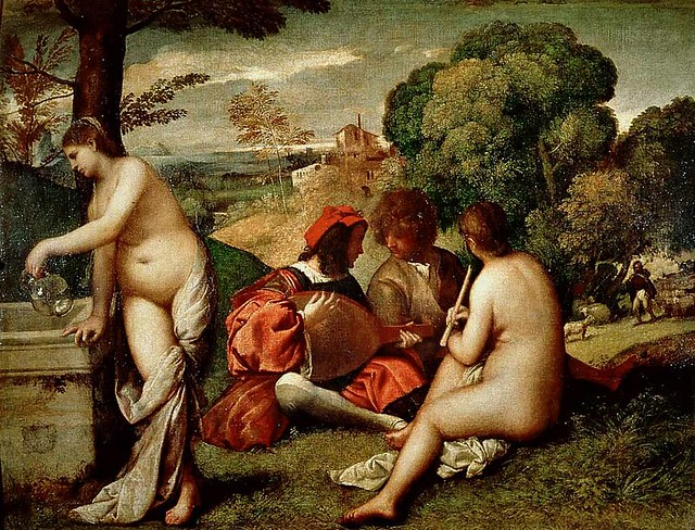
4. Giorgioni's Fête Champêtre.
Speed uses a couple of old master paintings to illustrate his points, so I'll just add them here in color.
5. Titian Bacchus and Ariadne
6. G. F. Watts, Love and DeathIt's worth noting that Watts did several versions of this composition.
There's another one here that doesn't have the flowers strewn across the steps.
7. Diego Velazquez, Surrender at Breda
8. The combination of the vertical with the horizontal produces one of the strongest and most arresting 156chords that you can make.Speed continues: "and it will be found to exist in most pictures and drawings where there is the expression of dramatic power. The [Christian] cross is the typical example of this. It is a combination of lines that instantly rivets the attention, and has probably a more powerful effect upon the mind—quite apart from anything symbolised by it—than any other simple combinations that could have been devised."9. Other lines that possess a direct relation to a rectangular shape are the diagonals. Speed identifies parallel diagonals and alignments in the Velazquez.10. Superimposed structuresHere's my thought about all these Old Master examples. We may never know whether Titian or Velazquez or Giorgioni consciously used such devices in their compositions. At least I'm not aware of any of their writings that address the effects that they may have intended by their use of horizontals, verticals, rhythm or unity. So I'm just a little bit skeptical about the kind of post-facto analysis that Speed is doing here. We've all sat through art history lectures that show fanciful invisible hidden structures in old master paintings. I even endured one lecture where the presenter turned paintings upside down and discovered sinister faces hidden in the branches of the trees!
Without knowing what the artist thought, you never really know whether the structure exists solely in the mind of the analyst or truly in the artist who created the picture.
So I thought I'd finish up this post showing some examples of artists after Speed's time who were conscious of these devices, because they wrote about them.

Norman Rockwell using diagonals to convey action. In
Rockwell on Rockwell: How I Make a Picture
he talks about diagonals.
Andrew Loomis uses verticals to suggest dignity and reverence. He also talks about verticals and diagonals in
Creative Illustration —
—but that's another book for another book club.
We'll continue with part 2 of the chapter, about curved lines, in next Friday's post.
-----
GJ Book Club on
Pinterest (Thanks, Carolyn Kasper)


by Jo Empson (Child’s Play, 2012)
Here’s a book that’s deceptively simple in text, in color, in motion.
An average rabbit, doing average rabbity things. White space, dark spot illustrations. Calm and steady.


But then. The page turn is the miraculous pacing tool for the picture book, and this one is a masterpiece. Swiftly, from the expected to the unexpected, from straightforward rabbityness to the unusual.
And the beautiful. And the wild and the wonderful.


Jo Empson’s art is a storyteller to follow. It unfolds visually, deftly, magically.
Desperately.

Because one day, Rabbit is gone. So is the color and the movement and the life.
“All that Rabbit had left was a hole.”
But, much like the art, Rabbit was a storyteller to follow.


And the color returns.
It’s a story about making a mark that leaves a legacy. It’s about telling a story and remembering one. It’s for anyone who is daring enough to leave drips of unrabbityness, and anyone brave enough to chase them.
By: Carter Higgins,
on 5/26/2015
Blog:
Design of the Picture Book
(
Login to Add to MyJacketFlap)
JacketFlap tags:
scale,
composition,
movement,
perspective,
layout,
Phaidon,
size,
Uncategorized,
point of view,
voice,
Add a tag

by Stella Gurney and Natsko Seki (Phaidon, 2013)
Do kids’ books have room for one more smart pigeon? You’ll be glad you let this one in, because Speck Lee Tailfeather is another flier with a healthy confidence and a chatty nature.


Speck’s mission is world travel, focusing on buildings from a bird’s point of view. He sees things differently.
His words are a travel journal of sorts to his pigeon friends. To his love, Elsie. And to us.


There’s a lot to look at, from speech bubbles to side bars to fascinating tidbits. The layout and voice are both unusual in the very best way. And if you just shake off what you expect from picture books and settle in, your flight from city to sky and back will be worth it.
Your tour guide, after all, is an expert in the unusual.


This one is for treasure hunters, trivia fanatics, architecture buffs, or anyone hungry for some off-the-wall-pigeon-fare. You never know.
Pair it with A Lion in Paris. Speck travels farther than France, but matching up the Parisian buildings (not to mention the books’ head-to-head size battle and their animal points of view) would be a fun thing for storytime.
 by Ruth Krauss and Margot Tomes (Four Winds Press, 1973)

I’m not a real wild-and-crazy kind of person.
Last Saturday I took a Pilates class at 3:30, and the teacher said it’s always such a weird time because most people like to spend their afternoons at the beach or the ballpark. Or perhaps they have to get ready for their evening cocktail hour, and finishing close to 5:00 doesn’t work. But I told her that it’s my favorite time, because then I can be home in pajamas having sort-of-flat champagne before it’s even dark out.
She looked at me funny.
But on some of those pajamas and champagne Saturday nights, I go vintage book shopping online and find things like this.
I love this book.
I love Ruth Krauss.
I love the way her words describe the bizarre and complex world of kids’ heads. And their perfectly simple and sensible world. It’s kind of all wrapped up together for kids anyway, which is strange and endearing and other-worldly.


Each spread has one line, a bright orange to the illustrations’ muted browns. The only other color is the blue on the cover.
And the page turn acts as a sort of puzzle: the last bit from the page before starts the new thought.


Each thing is little. Each thing snuggles up right under the towering mushroom. Each thing is so firmly kid.


The tiny stories ramble on underneath, in those playful monologues that might seem like nonsense. This is where kids are experts.
Grownups, consider this. You might not understand. You might not have any use for a little potato. But, as the girl with the bow in her hair promises, “Little potatoes are especially nice.”

It’s weird. It’s wonderful. And if it fits under a mushroom, it’s fair game.
By: Carter Higgins,
on 4/28/2015
Blog:
Design of the Picture Book
(
Login to Add to MyJacketFlap)
JacketFlap tags:
joohee yoon,
paper weight,
spot colors,
color,
printmaking,
paper,
composition,
color theory,
color palette,
shape,
binding,
enchanted lion,
pantone,
Add a tag

by JooHee Yoon (Enchanted Lion, 2015)


(click to enlarge)
This book is something. A mashup of poetry and pictures, washes of color and words.


(click to enlarge; this is an example of a spread that folds out to reveal an entirely new and more expansive illustration.)
Some thoughts from JooHee on the art and creation of Beastly Verse:
I wanted to create a book that not only tells wonderful stories, but one that is beautiful to behold. For me, the design of the book is just as important as its content; they are inseparably linked. I believe all elements of a book–its paper, binding, size and weight–create an atmosphere that plays an important role in the experience of reading.
The printing process fascinates me. Not only traditional printmaking, but also industrial processes as well, since these are just a further development of the old printmaking techniques. I have always been drawn to printmaking, and rather than mixing colors on a palette and putting them on paper, I enjoy working with flat color layers overlapping one another to create the secondary colors. My experience with printmaking informs almost all of my artwork today. I wanted to take advantage of the industrial printing process so the printer is not just reproducing the image I make, but in a sense creating the image itself.


This book has been printed using just three colors. The areas where the main colors overlap create secondary colors, resulting in a book that seems very colorful even though only a limited palette was used. Seen alone, each layer is a meaningless collection of shapes, but when overlapped, these sets of shapes are magically transformed into the intended image. To me the process of creating these images is like doing a puzzle, figuring out what color goes where to make a readable image.
I am very inspired by books from the early 1900s – 1950, when artists were forced to work with spot colors since reproduction methods weren’t as developed as they are today. It is amazing what some artists could do with just two or three colors, and this is exactly the same process I am using, but one from choice rather than necessity. There is a luminous brilliant quality to the colors when images are reproduced this way that I love.


(click to enlarge; this is an example of a spread that folds out to reveal an entirely new and more expansive illustration.)
It’s fascinating to pull the curtains back on an illustrator’s process, and I’m thankful to JooHee for her words here. Her explanation of something so simple, so exquisite, and so complex is as brilliant as those colors she creates.
And the book itself is definitely a work of art. Uncoated, thick pages. Slightly oversized. There’s a non-uniform feeling to the ends that isn’t quite a deckled edge, but a bit more raw and tactile. Hand-crafted almost.

(click to enlarge)
Beastly Verse’s dedication reads simply, For the Reader.
Here, the reader is also the design enthusiast, the art collector, and the wordsmith. A book for book lovers.
Huge thanks to Claudia Bedrick at Enchanted Lion for the images in this post.
The following numbered paragraphs cite key points in italics, followed by a brief remark of my own. If you would like to respond to a specific point, please precede your comment by the corresponding number.
 |
| John White Alexander (American, 1856–1915) Oil on canvas; 52 1/4 x 63 5/8 in. |
1. Attention to line can give a work an "innocence and imaginative appeal" that is often lost in work that is concentrating on "the more complete realization of later schools."
Harold Speed will give us a later chapter on the practicalities of line drawing, but for this short chapter he concentrates on the aesthetics of line. He associates line with the sense of touch, but also with more primitive and stylized perception, and that's the core of what he's exploring here.
He makes reference to Botticelli and other early artists who used line predominantly. In the centuries that followed, chiaroscuro and form modeling came to dominate the thinking and made people forget about the power of line.
Artists in Asia were not as obsessed with chiaroscuro in the photographic / impressionist side of things. I was reading a book about the history of photography
(Photography: The Definitive Visual History)
, and it said that when photographs were first introduced in Japan, people didn't like them because they thought they missed the essential truth of what they saw. Now, with the ubiquity of photos, we tend to regard a photograph as a true and complete representation of our vision, but people in Japan and China didn't think so.
2. The eye only sees what it is on the look-out for.
Speed makes this point only in passing, but it's something that I think about a lot. We see what we want to see. This was the theme of an episode in
Dinotopia: The World Beneath (see previous post on
Pareidolia and Apophenia).
 |
Detail from Titian's "Three Ages of Man"
|
3. All through the work of the men who used this light and shade...the outline basis remained. Leonardo, Raphael, Michael Angelo, Titian, and the Venetians were all faithful to it as the means of holding their pictures together; although the Venetians, by fusing the edges of their outline masses, got very near the visual method to be introduced later by Velasquez.
Line and tonal modeling aren't mutually exclusive, nor must one use a hard edge throughout a picture to have a good sense of line. The Titian above combines a fine sense of line with a sophisticated feeling for edges.
4. The accumulation of the details of visual observation in art is liable eventually to obscure the main idea and disturb the larger sense of design.
The problem, according to Speed, comes not only from losing a sense of the contour, but also adding so many small details and textures that the larger shapes are lost.
Speed's cautions about the late 19th century obsession with naturalism, and he points to a time in the academies when line drawing fell out of fashion. He says the use of the stump for blending charcoal added to the problem. Does someone out there know why Speed was so negative about the stump? He doesn't really explain his reasons for disliking it.
5. Art, like life, is apt to languish if it gets too far away from primitive conditions.
It's notable that the
Fauvists and other neo-primitive movements were becoming active in Western art as he was writing this a hundred years ago. European and American artists were also appreciating the currents of art coming from China, Japan, and India.
Speed says that if you're going to study past movements, "to study the early rather than the late work of the different schools, so as to get in touch with the simple conditions of design on which good work is built."
6. No wonder a period of artistic dyspepsia is upon us.Perhaps even truer now than it was in Speed's day!
 |
| Animation model sheet of Disney's Bambi by Milt Kahl |
7. Line as contour vs. line of action
One last thought that I had in reading the chapter is that Speed seems to be talking about line mainly as the outer contour, but I think it's equally important to think of the line of action, the central gesture traveling through the center of all the forms. The great animators carried Speed's ideas forward into a whole new art form, and it is probably in the realm of animation that the art of line was most perfectly developed in the 20th century.
I look forward to your thoughts, and I enjoyed the discussion last week.
-----
The Practice and Science of Drawing is available in various formats:
1.
Inexpensive softcover edition from Dover, (by far the majority of you are reading it in this format)
2.
Fully illustrated and formatted for Kindle.
3. Free online
Archive.org edition.
4.
Project Gutenberg versionArticles on Harold Speed in the Studio Magazine The Studio, Volume 15, "The Work of Harold Speed" by A. L. Baldry. (XV. No. 69. — December, 1898.) page 151.and
The Windsor Magazine, Volume 25, "The Art of Mr. Harold Speed" by Austin Chester, page 335. (thanks, अर्जुन)
------
GJ Book Club Facebook page (Thanks, Keita Hopkinson)
Pinterest (Thanks, Carolyn Kasper)
Original blog post
Announcing the GJ Book Club

by Claire Keane (Dial Books, 2015)
Here’s one to hand to any kid that still can’t get enough of Frozen. And when you do, give them a little wink-nudge that this book’s creator worked on what Elsa and Anna’s world looked like. And she worked on Tangled. And then they will see the lush purple cover anyway, and sometimes that’s all it takes.

(click to enlarge)
Meet Celeste. She wants the perfect gift for her mom. Big eyes. Big dreams. (Sweet bear expression. And do you see those little shoes she’s kicked off? Even sweeter.)
Celeste is stumped. When she’s about to fall asleep, the Wind carries her away.
She sparkles with the Stars and then meets the Moon and the Sun.

 (click to enlarge)
There’s something musical about the pace of the pictures here. Sweeping and epic and enchanting. The colors wash over Celeste’s celestial quest, slowly spinning one into another.
And then, she’s home again. But her heart is new and her eyes are fresh, and the same things that have always been there shine a bit more than they did before once upon a cloud.
Simple in story. Arresting in art.

Review copy sent by the publisher.
By: Carter Higgins,
on 4/17/2015
Blog:
Design of the Picture Book
(
Login to Add to MyJacketFlap)
JacketFlap tags:
design,
chronicle books,
blog tour,
texture,
composition,
color palette,
guest post,
elsa mora,
shape,
papercuts,
k.e. ormsbee,
the water and the wild,
Add a tag

by K.E. Ormsbee, illustrated by Elsa Mora (Chronicle Books, 2015)
From the publisher:
A green apple tree grows in the heart of Thirsby Square, and tangled up in its magical roots is the story of Lottie Fiske. For as long as Lottie can remember, the only people who seem to care about her are her best friend, Eliot, and the mysterious letter writer who sends her birthday gifts. But now strange things are happening on the island Lottie calls home, and Eliot’s getting sicker, with a disease the doctors have given up trying to cure. Lottie is helpless, useless, powerless—until a door opens in the apple tree. Follow Lottie down through the roots to another world in pursuit of the impossible: a cure for the incurable, a use for the useless, and protection against the pain of loss.

I’m so excited to be a stop on the blog tour celebrating the release of The Water and the Wild, which includes a chance for you to win a copy of this beautiful (literally and figuratively!) book.
First, let’s hear from K.E. herself. Welcome, K.E.!

Visualizing Limn: The Real-World Inspirations Behind Lottie Fiske’s World.
In The Water and the Wild, twelve-year-old Lottie Fiske travels through the roots of an apple tree into the magic-soaked world of Limn—a land filled with bustling cities, dense woods, magical yew trees, and giant spider webs. World building Limn was one of the most fun and challenging aspects of writing The Water and the Wild, and my inspiration for the look and feel of the fantasy landscape came from very real places.
Today, I’d like to share some of those inspirations and take a moment to gush about just how perfectly artist Elsa Mora captured the magic of Limn in her cover art and illustrations.
New Kemble – York, England
I’m a huge anglophile, and one of my favorite places in all of England is York. The city is rich with layer upon layer of history, as evidenced in its walls, its giant cathedral, and its winding streets. I remember first setting foot in The Shambles and feeling certain that something ancient and magical was at work there.
When I first drafted The Water and the Wild, the story actually took place in York. Over time and a number of subsequent revisions, York became New Kemble, a fictional island town off the coast of Massachusetts. But the inspiration for New Kemble remained thoroughly English. I still envision The Barmy Badger—home of Lottie’s best friend Eliot—on a street similar to The Shambles. And Lottie’s home in the boardinghouse on Thirsby Square is based on the real St. Paul’s Square in York.

Iris Gate – The Biltmore Estate
When Lottie first arrives in Limn, she stays at the home of the Wilfers—an old money family with royal connections and a fair share of secrets. The Wilfer family home is called Iris Gate, and Lottie is overwhelmed by the size and grandeur of the place. When describing Iris Gate, I tried to capture the intimidation I felt upon first walking into the Biltmore Estate in Asheville, North Carolina.
The Biltmore is an imposing mansion even to full-grown adults, and I was ten when my family visited. I remember gaping at the soaring ceilings, ornate decorations, and sprawling gardens. Though Iris Gate is nowhere near as extensive as the Biltmore, its architecture and landscaping were written to resemble that of the Biltmore Estate.

Wisp Territory – Springtime in my childhood neighborhood
I grew up in Lexington, Kentucky. The city is surrounded by rolling green hills, black fences, and horse farms. It experiences four distinct seasons, and the springtimes there are lovely. In my neighborhood, there were many dogwoods, magnolias, and Bradford pear trees. When all of those trees were in bloom, white petals would blow loose into the wind, and everywhere I turned the world seemed awash in white. I called it my Warm Winter.
I never shook those springtime images, and when I was creating Wisp Territory—home to the mysterious will o’ the wisps—I wanted to convey a similar aesthetic. The world of the wisps is, by and large, colorless. The grass, the trees, and the leaves are all white. The royal home is made entirely of glass. This wintry appearance does not vary with the seasons, and it’s my homage to the Warm Winters I experienced as a kid.
* * *
Clearly, I have some very distinct ideas about how the world of Limn looks. What I was most nervous and excited about during the publication process was seeing how an artist would render a world that had for so long existed only in my imagination. As it turns out, I had absolutely nothing to worry about. When Melissa Manlove, my fabulous editor at Chronicle Books, first gave me Elsa Mora’s name, I of course went straight to Google to do some major image stalking. After only a minute, I knew I was in the best of hands.
Elsa’s papercuts are pure magic. There is so much detail, care, and whimsy in each of her creations. The cover of The Water and the Wild conveys not only the fantasticalness, but also the danger of Lottie’s journey. The way in which the characters and their natural surroundings blend so effortlessly captures my own attempt to make the world around Lottie as much a character as she is.
Inside the book, you’ll find a papercut plant accompanying each chapter heading. These illustrations reinforce the importance of the natural world throughout the book. And, you know, they just so happen to be GORGEOUS.
It’s been almost seven years since I first wrote down the image of a magical green apple tree. Now, as Lottie Fiske’s story officially hits bookshelves, I couldn’t be happier with the way that image and others came to be realized in the art and text of The Water and the Wild.
——–
If you’re anything like me, you’re dying to read more about Lottie and Limn. So! Tweet this post anyway you’d like on Twitter, and include the hashtag #dpb for a chance to win a copy! I’ll be in touch with a winner in a week.
Check out The Water and the Wild’s teacher guide here, and a sneak peek at its beginning here.
And be sure to check out tomorrow’s stop on the tour at Green Bean Teen Queen, where K.E. talks libraries!
 by Morgan Morano (Race Point Publishing, 2015)
And now for a little something different. And delicious.
Last week we spent a bit of time in Paris, so won’t you join me in Italy? It’s only a hop, skip, and a spoon away.
I’m not the only author in this family. Our cousin Morgan is a superstar in the gelato world, and her debut book holds all of her sweet secrets. She’s a traditionalist. A purist. An artist.

Forbes called her gelato the best in America, so you don’t just have to take my word for it.
Take a look.


(click to enlarge)
Morgan’s expertise and love of this art form are fingerprinted here. And for someone who just learned how to make pancakes (me!), she’s an encouraging teacher.
And it’s beautiful. Hard not to make such a confection look so lovely, but the attention to composition and warmth in these pictures is a real treat.

 (click to enlarge)
We’ve been pushing the mid-90s here in southern California, but for those of you still under winter’s freeze, the thaw is coming. And it looks delicious.
You can pre-order The Art of Making Gelato here or here.
And why not pair it with Olivia Goes to Venice? Or grab one of M. Sasek’s sharp and simple classics This is Rome or This is Venice.
That’s some tasty reading!
PS: Thanks for all of the Cat Says Meow support! Congrats to our giveaway winner, Clark Haaland!

by Greg Pizzoli (Viking, 2015)
I’ve read lots and lots and lots of books for kids. I’ve read lots of questionable ones and I’ve read lots of spectacular ones. And then I’ve read a handful that are simultaneously spectacular and fresh and inventive and completely honor how smart kids are.
This is one of those.
You might know Greg from that burping crocodile or the hound with a need for speed, but did you know a book about an impossible con is exactly what the world of kids’ books needed? Meet this Greg.
Actually, meet Robert Miller.

(click to enlarge)
A normal kid, one who leaves home to become an artist despite his parents’ best efforts. A normal kid with a penchant for billiards, poker, and gin.
A grifter known as Count Victor Lustig.

(click to enlarge)
This liqour induced pow-wow below the Totally Legit delivery truck might be one of my favorite moments in this thing. It’s accompanied by a sidebar of Totally Legit information about the Prohibition. This blend of grit and truth and history hangs right in the suspense of Vic’s story. It feels like Saul Bass made one of those The More You Know PSAs right there on the page.

(click to enlarge)
One of the greatest tricks in this whole book is how we see the silly, unsuspecting faces of Vic’s marks, but never his. Only a thumprint. Both the clearest and fuzziest identification.
Mixed-media collage always yields great texture, just by its very nature. But Greg adds custom-made rubber stamps, actual photo texture from the floor of the Eiffel Tower, and like we’ve already seen, his very own thumbprint. This approach is as layered and grungy as Vic himself. This book can’t be slick and clean and soft–it needs depth and dirt and intrigue. That’s what it’s got.
That’s no con.
Check out these endpapers. Brick wall, posted bills, danger, and suspense.

(click to enlarge)
Why does that not look like the full width of the book, you ask?
Because then there’s this:
 In the best of places, that sneaky space under the dust jacket, where unsuspecting grownups don’t dare peek. Kids do. They know where the good stuff is. And this is the good stuff: The Ten Commandments for Con Artists by our hero.
I think 8 is my favorite. Or 5. Or 10.
And now, don’t miss Greg and Julie’s chat about this book over at Seven Impossible Things. Lots to digest. Commandment 2 will be an impossibility.
I received a copy of Tricky Vic from Viking, but the comments are all my own. And speaking of Viking, huge kudos to the publicity team that sent the book like so:

Have a look at this picture, and try to self-monitor how you experience it.
The editors of the
Famous Artists Course
included this illustration by Robert Fawcett (1903-1967) along with an explanatory diagram to demonstrate some design principles. They say: "The scroll is the important point of interest in this picture. Robert Fawcett has skillfully used lines to direct our eye to it. The line formed by the arm of the foreground figure draws our attention almost irresistibly across the upper right of the picture, down to the scroll, and finally to the head of the king. Notice how we are forced to look back and forth from the king's head to the scroll."
I think it's a successful composition, but I don't agree with their analysis of why it works. To me the driving force of the picture's abstract design is the contrast between clutter and emptiness. At first I saw the busy detail surrounding the blank space, and I thought the empty space was a 2D shape left for design reasons.
A split second later, I realized that it was a piece of paper being held up by a soldier in chain mail, and that I was looking at the back of the paper. Once I saw the angry face of the seated figure, and I understood that he was a king, it dawned on me that he was being faced with a challenge by the knight, perhaps showing the Magna Carta to King John.
With the story in mind, my eyes scanned the picture driven by its human premise. I looked at the ecclesiastical figure, whose characterization isn't very well developed. I checked out the face of the soldier, and couldn't get much from him either. My eye then went to the various weapons on display to see if there was a foreshadowing of violent action.
Although I'd need to see an eye-tracking scanpath study to be certain, I'm quite sure my eyes never followed the pathways diagrammed by the FAC's editors, and I never spent much time in parts of the picture that had no story purpose.
My point is that I don't believe it when composition teachers suggest that my eyes are passively moving through a picture, led purely by design considerations. Design does play a role, but if there are faces and a human story, the viewer is operating on a much higher and more active level.
Your experience of the picture may have been totally different from mine, and I'd be interested to hear from you in the comments.
-----
Books: Robert Fawcett: The Illustrator's Illustrator Famous Artists CoursePreviously on GJ: Eyetracking and CompositionEyetracking and Composition, part 1Eyetracking and Composition, part 2Eyetracking and Composition part 3

View Next 25 Posts


.jpg?picon=1009)


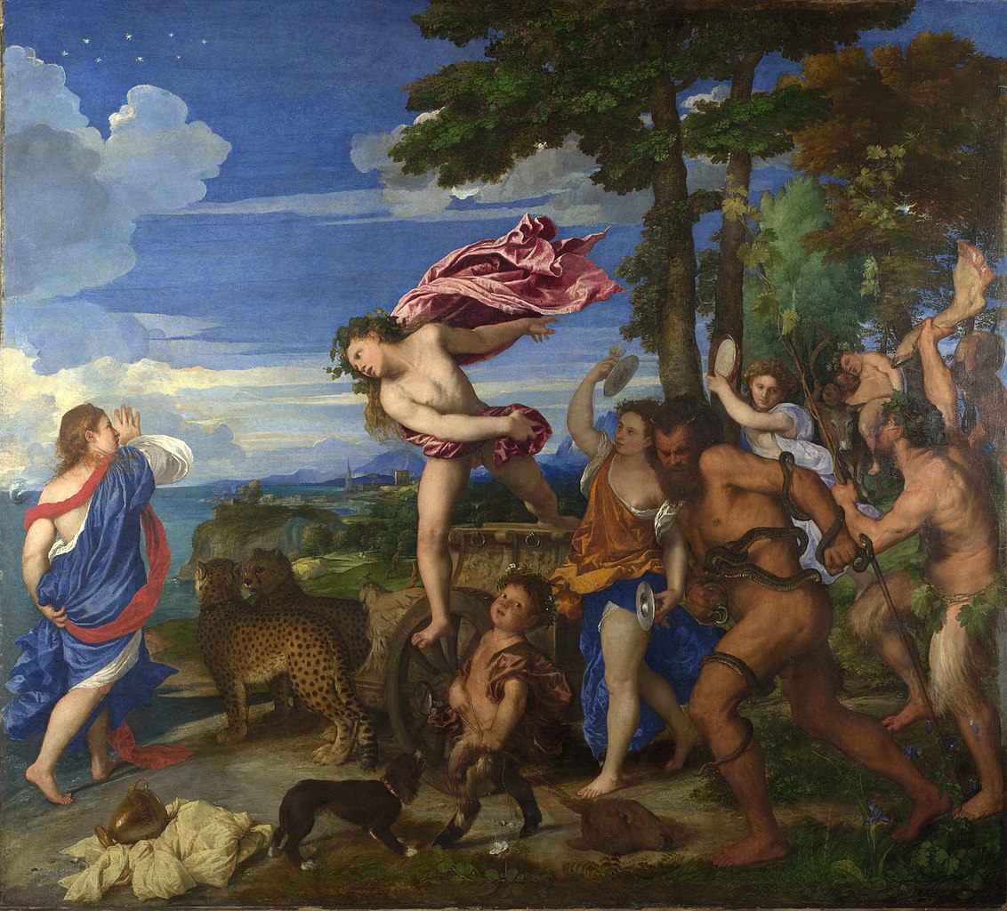

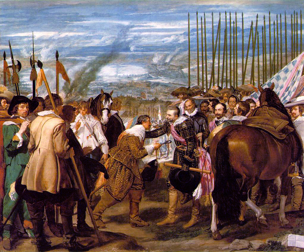


