JacketFlap connects you to the work of more than 200,000 authors, illustrators, publishers and other creators of books for Children and Young Adults. The site is updated daily with information about every book, author, illustrator, and publisher in the children's / young adult book industry. Members include published authors and illustrators, librarians, agents, editors, publicists, booksellers, publishers and fans. Join now (it's free).
Login or Register for free to create your own customized page of blog posts from your favorite blogs. You can also add blogs by clicking the "Add to MyJacketFlap" links next to the blog name in each post.
Blog Posts by Tag
In the past 7 days
Blog Posts by Date
Click days in this calendar to see posts by day or month
Viewing: Blog Posts Tagged with: illustration process, Most Recent at Top [Help]
Results 1 - 25 of 90
How to use this Page
You are viewing the most recent posts tagged with the words: illustration process in the JacketFlap blog reader. What is a tag? Think of a tag as a keyword or category label. Tags can both help you find posts on JacketFlap.com as well as provide an easy way for you to "remember" and classify posts for later recall. Try adding a tag yourself by clicking "Add a tag" below a post's header. Scroll down through the list of Recent Posts in the left column and click on a post title that sounds interesting. You can view all posts from a specific blog by clicking the Blog name in the right column, or you can click a 'More Posts from this Blog' link in any individual post.
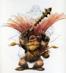
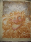
Seems I've developed a habit of drawing Santa puppies each year.
Last year, we adopted a gorgeous puppy from the RSPCA and my brain had turned to puppy pulp from adoration. So, it was only natural I would draw a Santa puppy.
This year, I'm illustrating a picture book, featuring the cute fur-character above. Everyone else was wearing Santa hats and I didn't want the puppy to feel left out. This sweet, heartwarming Christmas story, written by Lili Wilkinson, will be published in time for Christmas 2017 by Allen and Unwin.
I'm currently up to the exciting colour stage of the picture book and have spent this week preparing and experimenting. Ignorant onlookers may call this part of the process, procrastination.
I've been working out my character colour palette, making my own texture brushes using pastel, pencil and watercolour, and experimenting with some new brushes I recently purchased from Kyle T Webster. I'm having so much fun procrast... I mean, preparing.
The deadline is fast approaching, so I'll be busy working on this book for the entire school holidays. My children have had to make their own fun at home so far. The inside of our house has turned into a paper jungle of lanterns, snowflakes and streamers dangling from windows, ceilings and fans. My husband and I pretty much have to crawl around on our hands and knees, so that we don't tangle ourselves up in it all. FYI - children design Christmassy lands for child height people only.
Our house is feeling festive at least.
Merry Christmas!
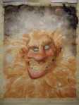
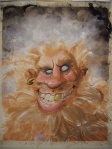
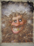
A small section of some final drawings from the book.
A small section of my children's paper jungle.
3 Comments on Merry Christmas!, last added: 12/29/2016
cute puppy! I can see why your pup ends up in your art. My art is inspired by things in my world. Thank you for stopping by so that I could see your charming art. Wishing you the best with your project.
This video shows my illustration process in fast forward. I scanned my pencil drawing and greyscale watercolour washes, then coloured in photoshop.
I originally illustrated this for the cover of, Take Ted Instead, a picture book written by Cassandra Webb (New Frontier Publishing, 2016). However, I had to change the orientation layout of the boy and Ted to standing position, so the illustration would fit nicely around the words.
0 Comments on Hiding with Ted - Illustration process as of 6/17/2016 1:22:00 AM
Released last fall from LEE & LOW BOOKS, The Story I’ll Tellis a gentle and moving story of adoption and parental love that is sure to touch the hearts of readers everywhere, no matter how they came to be a family. It has received starred reviews from Booklist and Publishers Weekly, which called it “an unabashed love letter, one that many families will treasure.”
We asked illustrator Jessica Lanan to take us behind the scenes of her art process bringing The Story I’ll Tell to life:
The process for illustrating The Story I’ll Tell started with research and brainstorming. I read books about adoption and collected evocative images from magazines and the internet that I thought might be useful references. There were a lot of questions to investigate as I tried to piece together the identity of the characters and the overall look and feel of the artwork.
As I researched, I also began sketching thumbnails. My art director and editor provided feedback on these, and through several rounds of revisions we worked to get the concept and flow of the art just right. The thumbnail sketches were also essential in order to work out the composition of each page. For each round of revisions I made a printed dummy in order to simulate the flow of the book.
After the thumbnails were ready, I worked on more detailed drawings, using reference images and models as needed. Here you can see a rough clay model that I used as a reference image for one of the drawings:
Once the drawings had been approved, it was time to move on to the final art. I was using watercolor for this book, which is a rather unforgiving medium, so, I made a miniature version of each painting first in order to get all the mistakes out of the way. Then I transferred my drawing to the watercolor paper and started painting!
Each final piece was done with watercolor and colored pencil on 300lb watercolor paper.
Jessica Lanan has been in love with illustrated books since an early age. Besides The Story I’ll Tell, she has also illustrated Good Fortune in a Wrapping Cloth from the Shen’s Books imprint of LEE & LOW BOOKS. She currently lives in Boulder, Colorado, where she enjoys thunderstorms, crunching autumn leaves beneath her feet, and leaving footprints in freshly fallen snow.
You can purchase a copy of The Story I’ll Tell on our website here.
0 Comments on Illustrator Jessica Lanan Takes Us Behind the Art of The Story I’ll Tell as of 1/1/1900
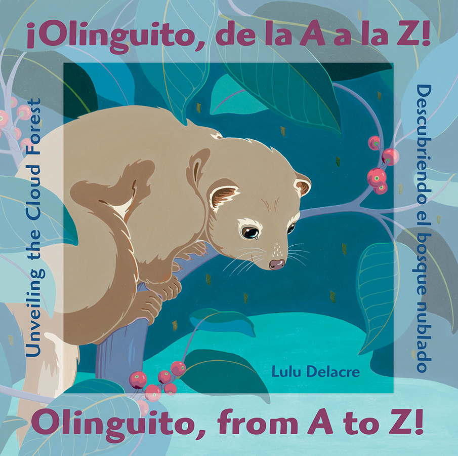
Alto, allá arriba en los Andes brilla un bosque bordado de bromelias… High up in the Andes blooms a brilliant forest embroidered with bromeliads . . .
Set to be released this spring, ¡Olinguito, de la A a la Z! / Olinguito, from A to Z! : Descubriendo el bosque nublado / Unveiling the Cloud Foresttakes readers into the magical world of a cloud forest in the Andes of Ecuador. We discover the bounty of plants, animals, and other organisms that live there as we help a zoologist look for the elusive olinguito, the first new mammal species identified in the Americas since 1978. It has received starred reviews from Publishers Weekly, School Library Journal, and Kirkus Reviews, which called it “a breath of fresh air in the too-often-contrived world of bilingual books.”
We asked Lulu to take us behind the scenes of her exquisite art process to make the cloud forest come alive:
I spent an average of ten days working from eight to ten hours per day creating each spread.
Click for larger image
The first thing I did was to transfer the sketch to the Arches watercolor paper. Then I decided which areas would be collaged printed patterns and which would be painted in flat acrylic colors.
I prepared the patterned backgrounds pressing leaves gathered in the cloud forest dipped in ink and stamped onto rice paper.
Click for larger image
With an X-Acto knife I cut out the shapes of texturized paper and pasted them into the background. I used archival glue and micro tweezers to affix the collage elements in their precise positions.
Click for larger image
Next I prepared all the shades of acrylics that I would need for the spread and stored them in small clear jars. Each section of a color required several thin coats to achieve the rich look I was looking for.
Click for larger image
Once the spread was entirely painted I had fun selecting pressed ferns from the forest to affix to the art. This was a delicate process as some of the pressed leaves and ferns are paper thin.
Click for larger image
The last thing was to create the letters for the spread. I wanted a layered look, recreating the natural layers of flora in the forest, so I drew the letters on vellum paper and cut out them out. I taped the letters onto a vellum square and with careful precision affixed the letter in the spot it was intended to be.
You can purchase a copy of ¡Olinguito, de la A a la Z! / Olinguito, from A to Z! : Descubriendo el bosque nublado / Unveiling the Cloud Forest on our website here.
1 Comments on Author/Illustrator Lulu Delacre Take Us Behind the Art of ¡Olinguito, de la A a la Z! / Olinguito, from A to Z! : Descubriendo el bosque nublado / Unveiling the Cloud Forest, last added: 2/3/2016
Last week I had a chance to go see the Norman Rockwell Exhibit at the BYU museum of art. I went with friends from my critique group. It’s so much fun to go to things like this with other artists. We had a great time analyzing the paintings together. This post is about some of the things I learned by staring at the awesome art.
Norman Rockwell was great at using lost edges.
Triple Self-Portrait
For example if you look at this painting called Triple Self-Portrait you can see how the man’s trousers are the same color as the canvas. In the original painting there isn’t a line to distinguish the two elements. Your brain fills that line in all on it’s own. Pretty cool.
Norman Rockwell used color grouping. (and you can paint a white dress against a white background too.)
Christmas Homecoming
See in that image how the three jackets are all the same color. Tan, tan, and tan. They are three separate elements but since the value/tone and color are similar your brain can read them as one. This is a busy picture full of lots of people and things. The color grouping really helps lead your eye through the image.
Here is another example of color grouping.
After The Prom
Another thing Norman Rockwell did all the time is harder for me to explain, but this image illustrates it very well.
Brass Merchant
See how that lady has a white dress on. See how the background is white. If I was painting this painting I probably would have made her dress purple or blue. White would have been out of the question. I would have been too afraid of her blending into the background and the image being out of balance. But Norman did it here and I think it’s working. I’m excited to start trying to do more of this type of thing in my paintings.
Norman Rockwell painted a ridiculous amount of studies and took tons of photos.
Soda Jerk
To see more of his photos into paintings you can check out this blog post.
But it wasn’t just that he took a lot of photos. He did drawings and color studies and more drawings and more color studies until he got what he needed.
Norman Rockwell Painted big paintings.
Checkers
This is one of my all time Norman Rockwell Favorites. It is 35×39″, and is typical of many of the paintings I saw at the museum. It’s not a mural by any means but it’s much bigger than the sizes I usually work at. He was able to get a lot of detail into the art at this size. I’ve been working the size of my scanner. I think I’m going to try some larger stuff so I can get more of the effects that I want.
Released this month, Amazing Places is a collection of original poems hand-picked by acclaimed anthologist Lee Bennett Hopkins that celebrates some of the amazingly diverse places in our nation. It has received starred reviews from Kirkus Reviews and Publishers Weekly, which calls it “a broadly appealing testament to the American landscape and people.”
The gorgeous illustrations in Amazing Places are a uniquecollaboration between artist Chris Soentpiet, who created the rough sketches, and Christy Hale, who brought those sketches to life by adding color and detail. We asked Christy to take us behind the scenes and show us her process for working with Chris Soentpiet’s illustrations to make Amazing Places come to life:
Christy: I have selected the longhouse piece to show the art process used for creating the art for Amazing Places:
1. Chris Soentpiet’s rough sketch
2. The editor and art director requested modifications. Below is Chris’s tight sketch reflecting those changes.
3. The printer scanned Chris’s sketches and then I received the digital files and my work on the art began. I made some additional changes to the original sketch based on editorial suggestions.
4. I changed the pencil line to sepia to give it some richness.
5. To add color to the art I needed some reference for longhouses. I did some image research. Here are two of many pictures I found.
6. I added colors in transparent layers in Photoshop. I wanted to simulate the beautiful watercolor effects Chris is known for. Each layer was a different color. Sometimes there were multiple layers of the same color in varying transparencies for more subtle effects.
Below you see the sepia line with one color added.
7. Here is the sepia line with seven colors added.
8. Here is a screen shot showing the many layers in the Photoshop file.
9. Here is the final image with all the colors. For each piece in the book I worked with a limited palette. In the long house piece there are many, many different neutral colors in varying values. I used color value, intensity, and hue to help direct the eye in each composition.
–
Christy Hale is the author and illustrator of The East-West House: Noguchi’s Childhood in Japan, a Kirkus Reviews Best Books of the Year selection, and Dreaming Up: A Celebration of Building, winner of a Boston Globe-Horn Book Award Honor. As an art educator, Hale has written about artists for Instructor magazine’s Masterpiece of the Month feature and workshops. Hale lives with her family in Palo Alto, California. Visit her online at christyhale.com.
I went to the thrift store and found some fun picture frames. This one is one of my favorites. It’s just so darn cool looking, despite the fact that it’s actually made of plastic. The red velvet was a little worn but some fabric paint took care of that.
Painting The Fairy
Then I took some time and painted this blue wing fairy to fit in the frame. I’m really pleased with the result.
Here’s a video of my painting process.
Selling the Art
I plan on selling the original art with the frame at a Christmas Gift and Craft show in a few weeks. Hopefully I’ll have some more fun framed art to share with you then as well. In the meantime if you really like this painting you can buy a print of it in my shop.
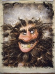
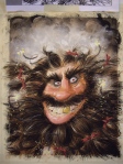
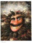
This interview on one fantastic week with J.A.W. Cooper was really inspiring to me, and from what I’ve seen on the facebook group I wasn’t the only person inspired. They talked about being deliberate about choosing your influences. Even to the point of keeping a written record of who they are and why. I have many artists whose work I admire, and many who I choose to inspire my work but I’ve never thought about making deliberate choices about this.
Joseph Zbukvic
Lately I’ve been paying closer attention to how I draw hands and feet because Wylie Beckert does such an amazing job with this, and I’ve been trying to keep my watercolor looser like Joseph Zbukvic. I know I am doing this but I haven’t thought about where allowing these influence in would take me, and if I want to go there.
I think it’s time to focus on this a little bit more.
As I said in that post I put this project aside after I finished the first painting to work on my Siren’s Song illustration. I knew the image wasn’t working yet, and I needed time to think on it. It worked. One day I realized one of the biggest problems with the composition was that the girl was looking down. The reason that’s a problem is that the point in the story was the happy part. Down= sad. Up= happy. I wanted the image to feel like victory. Not like we were still fighting a battle.
Thumbnails Again
Determined to get things right I started thumbnailing again. Here they are.
After getting close with my pen I scanned that last thumbnail and messed with it in photoshop until I knew I had something that was working.
From there I went on to my new sketches.
Sketching Again
This first sketch I did on paper using a large print out of the thumbnail for a guide.
At this point I got it critiqued again, and I made some small changes to the characters, and worked out the anatomy a little better. Here is the next drawing. I drew it on the computer over a scan of the first drawing.
And then I did it again. Just fixing a few things here and there.
Finally! A sketch we are going to keep.
Painting Round 2
From here I did my value and color studies again and came up with these.
They Look pretty good so I went onto the next painting.
I had a hard time at this point. I was trying to keep my watercolors nice and free and get the light right. In the story this scene is happening at sunrise, and I really wanted it to show in the lighting.
Overall it’s not bad but there are a few things that just weren’t working, like how saturated the background buildings are, and how I painted the wall behind the guards. (It looks too close.) And most important it just didn’t have the lighting effect that I wanted.
One More Time!
Why not try one more time? There was no deadline, and I had already come this far, so I value and color studied again.
And then I painted it again. That painting is the keeper.
I made this video showing my painting process for all three paintings. I tried to photograph each step. Sometimes I forgot to take the images before moving on, but I think it pretty well shows my watercolor process.
Here is the that final painting. I added just a few touches of colored pencil for some detail.
Ok Guys, this postis about failing over and over… and over. Hopefully you will learn some stuff from what I share. I know I learned so, so much from all my failed attempts.
My struggle to make the illustration for the short story The Six Swans started with a goal.
My mindset when I started this illustration was two fold, I needed to make an illustration for my next short story, and I wanted to paint smoke with watercolors that looked like this.
Joseph Zbukvic
Amazing Right!
I’ve talked about the artist Joseph Zbukvic before in my post about watercolor tutorials. Go there and watch him paint in the video link provided. It’s so so awesome. I keep watching the video and getting smarter every time.
Watercolors can do neat-o things other paints can’t, but I don’t see illustrators using watercolors in this way very often. Those fine art watercolorists have got the neat-o-ness of watercolors down, but us illustrators tend to keep things more controlled maybe even a little fussy. I don’t know how many times I’ve worked on a watercolor painting and been pleased with the lighting and composition but disappointed I didn’t let the paint fly free. ( Go fly watercolor! You’re free ! You’re free!)
So with this painting my goal was to let the paint free but still get the lighting and details I needed to tell the story.
Beginning the Illustration
I had my story ready and I started my thumbnails. I pretty much always start with thumbnails even before I do character design. Here they are. (Click here to learn more about thumbnails)
I started out with a few ideas for this story but settled on the image of the girl and the birds.
If you’re smarter than me you might see that I already have a problem. Which is… I only did three thumbnails! Really, I don’t know what I was thinking. (Actually yes I do, I was thinking about how excited I was to paint smoke with my watercolors) If I had taken the time to make sure the image was working small at the beginning it would have saved me a lot of work, but I forgot about that truth, and I moved forward, blissfully unaware of my impending doom.
Here are some of the character sketches I did. I focused some of these drawings on how the character would look, and some the pose of the character.
This big one in the middle is one of my favorite drawings. It gave me another goal. To get the essence of whatever is in that drawing into my illustration.
My First Failed Sketch Attempt
From character sketches I moved onto my first sketch.
I drew it. Did a messy value study. Did some color studies. But it wasn’t working. Finally asked for a critique from my trusted illustration friends. I got comments about the composition, shapes, and the character. Then I made changes.
My Second Failed Sketch Attempt
Here is my next try.
The character is more defined. The people in the background help ground the image. Over all the shapes are a little better but I don’t think it has the action feel the first sketch has, and I was still running into problems. I got it critiqued again. (Critique groups people! They are the greatest.) My friend Shawna mentioned I needed to work on the movement of the image, and the character’s silhouette, so I went back to the drawing board. (literally)
First I put my image in Photoshop and rearranged some things using math, also called the golden ratio. (Don’t worry the computer did the math for me)
My Third Failed Sketch Attempt + First Failed Painting Attempt
And off I went again.
This one is better. There is a lot of action. The shapes are good. The arrangement is better. Her expression is pretty good. You can tell she’s holding shirts and putting them on a swan. Things were looking good. So I did more color and value studies and I painted it.
From here I intended to add detail with prismacolor or Photoshop but I couldn’t do it because I hated this painting. I knew I could do better. So I scrapped it, and set this whole project aside to stew in my brain while I painted the Siren’s Song Illustration.
Tune in next time to see how I went from this point to my finished Swans illustration. In the mean time watch this video of Milton Glaser talking. It’s really good and will make you feel pretty happy about failing.
Have you failed creating art recently? (Good for you!) Did you learn anything cool because of the failure?
It's been a very long dry spell with my being able to sit down and draw or paint. A form of this doodle has been in my sketchbook for a while now… I think it's finally time to bring it to life.Here is the first rough sketch. It is a work in progress.
0 Comments on It's been a very long dry spell... as of 1/9/2015 12:27:00 PM
Here she is: Piper the elf from jacket art for Escape from Netherworld—about a group of role-playing gamers who are somehow transformed into their characters and transported into an alternate realm: Netherworld.
My pal, the extraordinarily talented Gina Datres, is the book’s designer and she called me in to illustrate the jacket. After some discussion and rough sketches back & forth we hit on the idea of 3 individual images of the gamers going through their transformation. For the 2 guys, Twiggy and Borhai, I drew the gamers in pencil but fully rendered their characters in paint. I work with watercolor (gouache), so I traced some of the drawing with a wax candle. Since watercolor won’t stick to wax, you can see the drawing of the gamer ‘through’ the painting of the character. Piper, the elf-girl, doesn’t change in size enough to make that idea work so I made her hair a magical element that swirls around her as it grows.
If you’d like to buy a copy of Escape from Netherworld just click here.
Author: David Kuklis
Designer: Gina Datres
Illustrator: John Manders
Editor: Nan Newell
Published and Printed by:
Word Association Publishers
Tarentum, PA 15084
ISBN: 978 1 59571 994 2 Available for purchase: wordassociation.com — 1 800 827 7903 barnesandnoble.com
amazon.com
As usual, here are the rough sketches, tight sketches, color study and final painting.
0 Comments on Escape from Netherworld—Piper as of 1/1/1900
More jacket art for Escape from Netherworld—it’s about a group of role-playing gamers who are somehow transformed into their characters and transported into an alternate realm: Netherworld. Yesterday I showed you Twiggy the dwarf. Here’s Borhai the warrior who starts out as a regular gaming guy named Dave.
My pal, the extraordinarily talented Gina Datres, is the book’s designer and she called me in to illustrate the jacket. After some discussion and rough sketches back & forth we hit on the idea of 3 individual images of the gamers going through their transformation. For the 2 guys, I drew the gamers in pencil but fully rendered their characters in paint. I work with watercolor (gouache), so I traced some of the drawing with a wax candle. Since watercolor won’t stick to wax, you can see the drawing of the gamer ‘through’ the painting of the character. Piper, the elf-girl, doesn’t change in size enough to make that idea work so I made her hair a magical element that swirls around her as it grows.
If you’d like to buy a copy of Escape from Netherworld just click here.
Author: David Kuklis
Designer: Gina Datres
Illustrator: John Manders
Editor: Nan Newell
Published and Printed by:
Word Association Publishers
Tarentum, PA 15084
ISBN: 978 1 59571 994 2 Available for purchase: wordassociation.com — 1 800 827 7903 barnesandnoble.com
amazon.com
As usual, here are the rough sketch, tight sketch, color study and final painting.
0 Comments on Escape from Netherworld—Borhai as of 10/28/2014 1:11:00 PM
Hey, gang! Sorry for the interruption in posts—I spent most of last week in New York City visiting art directors, editors and creative directors. Now I’m back and I want to show you something I worked on this summer.
Here is jacket art for Escape from Netherworld—it’s about a group of role-playing gamers who are somehow transformed into their characters and transported into an alternate realm: Netherworld.
My pal, the extraordinarily talented Gina Datres, is the book’s designer and she called me in to illustrate the jacket. After some discussion and rough sketches back & forth we hit on the idea of 3 individual images of the gamers going through their transformation. For the 2 guys, I drew the gamers in pencil but fully rendered their characters in paint. I work with watercolor (gouache), so I traced some of the drawing with a wax candle. Since watercolor won’t stick to wax, you can see the drawing of the gamer ‘through’ the painting of the character. Piper, the elf-girl, doesn’t change in size enough to make that idea work so I made her hair a magical element that swirls around her as it grows.
If you’d like to buy a copy of Escape from Netherworld just click here.
Author: David Kuklis
Designer: Gina Datres
Illustrator: John Manders
Editor: Nan Newell
Published and Printed by:
Word Association Publishers, Tarentum, PA 15084
ISBN: 978 1 59571 994 2 Available for purchase: wordassociation.com — 1 800 827 7903 barnesandnoble.com
amazon.com
Let’s start with Twiggy the dwarf. As usual, here are the rough sketches, tight sketches, color studies and final paintings.
2 Comments on Escape from Netherworld—Twiggy the dwarf, last added: 10/27/2014
Sarah Ford Rossborough said, on 10/27/2014 8:29:00 AM
I can’t wait until January, so that I can have the time to be able to pick up this book and really get into it! Looks like it’s going to be lots of fun! Your work looks gorgeous (as usual!) John. The technique is so cool!
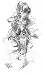
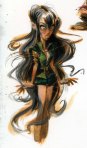
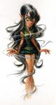
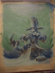
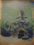
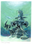
My latest short story Midnight Ghost (it’s being released Oct 24th) required me to draw a glowing ghost. This is something you can struggle with if you don’t know the rules but once you do, drawing and painting glow is very easy.
It’s impossible to get anything lighter than the paper or white paint you are using, so how to make something look like its lit up? The secret is in the contrast. If you want something to look like light you need to put dark around it. The contrast between light and dark is what makes it look like it’s glowing.
Here is the image I did of the Ghost in my new story. She needed to look like she was glowing so I added the dark area to the background and ta-daa! Glowing ghost. This image was all done with pencil. Since there is no color you can see the contrast in values easier, but it works with color too.
Here’s video of me doing the same thing with watercolor so you can see it in action.
Color can blind us. Sometimes we try to make something look like light by adding yellow, after all, the sun is yellow so it should work right? Nope. Next time approach the problem as something that needs to be lighter or darker rather than a different color. I bet you’ll be pleased with the results.
If you know what your are doing you can get some really great effects and textures with watercolor. These are great for painting dragons. Below are four tips you can use for your next dragon illustration (or any type of painting really).
Save Your Lights
Value/tone is probably the most important things to pay attention to when creating any kind of art. With watercolor if you aren’t paying attention and you paint something too dark you’ll have a hard time making it lighter. When your painting your dragon make sure you know where your light source(s) are so you know what to keep light and where to put your shadows.
Use the Drys
Controlling watercolor is all about what is wet and what it dry on your paper. Be patient and let the paint dry between steps. Blowdryers are great for hurrying the process along.
Use the Wets
One of the most fabulous things about watercolor is the amazing textures the paint produces all on it’s own. Don’t be afraid to get your paper wet and let it do it’s thing.
Use Salt
Salt is one of my favorite ways to create watercolor texture and it’s great for dragon scales. You’ve probably tried it before but if not watch the video for tips on how to use it.
I recently used these techniques to create the illustration for my short story Princess and Dragon. Look for the short story and mini ebook coming October 9, 2014.
Do you have a favorite watercolor technique? Comment below and tell me what it is.
When I set out to create and illustration for written text I always start with the text. This seems obvious but it’s amazing how many times I’ve been asked to come up with ideas before I’ve seen the text or when the story is not finished. Even when I write my own stories I make sure the text is finished before I start sketching.
Once you get your text, read it. Seriously. If don’t know what’s in the story how can you create the images. If your a visual person like I am, (You don’t have to be an artist to fit into this category) you probably see the images in your head as you are reading. When I read a word, I don’t see the word, I see the image. I’m pretty sure this is why I failed miserably at spelling when I was in grade school. If only spelling bees could have been drawing bees I would have had at least two less traumatic experiences in grade school.
But I digress. Back to illustration.
As I read the text I see images in my mind. I can see what the characters are doing and how they are acting and parts of the setting. This is my starting point. There are usually scenes that feel like they would be more fun to draw than others. I make note about those scenes and then I start to thumbnail my images. Learn more about thumbnails in this post I wrote a few years ago. The thumbnail stage is where I really nail down what part of the image I’m going to create.
Here are the thumbnails I created for my Hans My Hedgehog story. They are just scribbly but you can see my thought process. The story is short and as I wrote it I had two images in mind. The first was Hans the hedgehog entering town and the other was his wedding to the princess who is telling the story. While I wrote, I ended up taking out the wedding scene so I started thumbnailing the first scene.
You can see my thought process in the thumbnails as I experimented with different points of view until I found one I liked. Then I carried that one idea forward until I thought I had a composition that worked well. The last thumbnail is the one I used for my first sketch.
As artists or illustrators how do you decide what part of the story you illustrate? Is your process similar to mine?
More from P is for Pirate as we count down to Talk Like a Pirate Day, September 19th! I’ll be presenting a pirate program at Adams Memorial Library in Latrobe, PA, Friday & Saturday September 19th & 20th.
Here is D is for Davy Jones from sketch to final painting. Sorry about the color in my progress shots—must’ve been at night and I forgot to switch the flash on. You can see I based my version of Davy Jones on an 1892 ink drawing by John Tenniel from the British humor magazine, Punch. Tenniel is the guy who drew the famous illustrations for Alice In Wonderland.
Sarah Ford Rossborough said, on 9/2/2014 11:18:00 AM
So much fun! Love the details, and especially the colors! Feel like I’m on the beach in the Caribbean! Still get mixed up with the pronunciation of that. Thought I had it all straight and then the “Pirates” movie trilogy came out and now I’m all confused!
We’re still celebrating the release of P is for Pirate and the countdown to Talk Like A Pirate Day (September 19th).
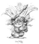
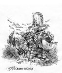
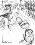
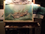
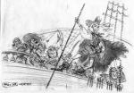
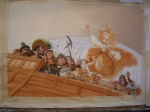
Today I’ve got sketches and a few work-in-progress photos of Captain William Kidd. Kidd wasn’t a particularly good pirate—as Eve Bunting says: “Captain William Kidd spilled less blood and captured less booty than any other well-known pirate of his time”. Apparently he didn’t get along well with his crew. Our shot of Kidd shows the scene where he infamously brained the ship’s gunner with a bucket.
You’ll notice in the color sketch and early work on the painting the ship’s woodwork is a mustardy yellow. Once I was into the painting I found it too cheerful a color—it didn’t help convey the mood of the action at all. So I changed it to gray. Much better!
0 Comments on Captain Kidd’s ice bucket challenge as of 8/25/2014 4:55:00 PM
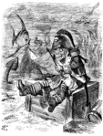
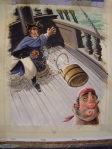
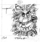
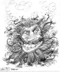
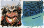
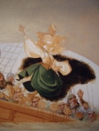
As a follow-up to my last post about Queen Anne’s Revenge, here is the man himself—the terrible Edward ‘Blackbeard’ Teach. I show him in close-up so you can see the slow-match fuses he used to weave into his whiskers and set alight before attacking a ship. You can find him in P is for Pirate, now available in bookstores—or drop me a line in the comments for an autographed copy.
Pirate captains were elected by their crews and could be voted out. To keep his crew in line, Blackbeard constantly showed himself to be more fierce, more outrageous than anyone else on board. Seated with his rogues during dinner, Blackbeard fired a pistol underneath the table and wounded one of the crew, just to remind them who he was.
Blackbeard had to be mindful of his crew’s appetite for liquor—for rum, an ardent spirit distilled from molasses. Without rum, a crew would mutiny, as this excerpt from Blackbeard’s log attests:
‘Such a Day, Rum all out: – Our Company somewhat sober: – A Damned Confusion amongst us! – Rogues a plotting; – great Talk of Separation. – So I looked sharp for a Prize; – such a Day took one, with a great deal of Liquor on Board, so kept the Company hot, damned hot, then all Things went well again.’
0 Comments on Edward Teach as of 8/20/2014 6:21:00 PM
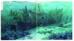
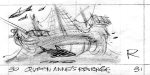
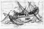
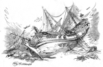
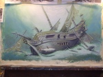
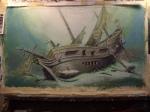
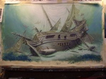
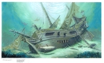
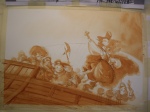
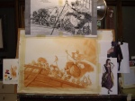
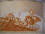
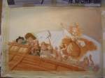
Queen Anne’s Revenge, that is. Queen Anne’s Revenge is the name of Blackbeard Teach’s flagship—though I have to admit I don’t know why he chose that name. Queen Anne ruled Great Britain & Ireland while Blackbeard was alive, so maybe he considered himself to be a privateer on behalf of the Crown? Was he not happy with the War of the Spanish Succession? I’d like it if, in the comments, someone could offer a better reason behind Teach’s name for his ship. Writers Alexander Pope, Jonathan Swift & pirate aficionado Daniel Defoe flourished under Queen Anne, so maybe her reign really was culture’s balmiest day—but why did she need to be avenged?
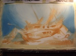
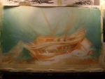
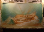
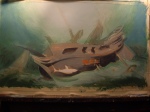
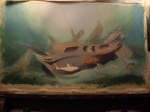
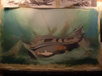
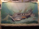
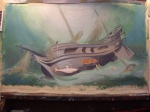
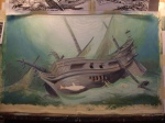
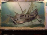
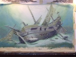
Anyway, he only captained Queen Anne’s Revenge for 3 years before she sunk off North Carolina. And so I had the wonderful opportunity to paint a sunken pirate ship for Eve Bunting’s new book, P is for Pirate. It was also a chance to pay tribute to fantastic illustrator Lloyd K. Townsend. When I say ‘pay tribute to’, of course I mean ‘steal shamelessly from’. I’ve admired Townsend since I was a wee lad, seeing his paintings in National Geographic. One in particular, from 1979, shows the sunken Spanish treasure ship Tolosa. This was my—cough—inspiration for R is for Revenge. Hey, at least I turned the ship around to face the other way!
Herewith, work in progress:
4 Comments on R is for Revenge, last added: 8/18/2014
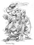
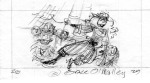
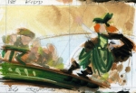
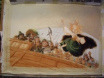
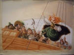
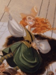
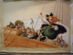
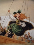
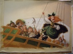
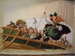
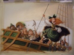
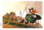
Here is one of my favorites from P is for Pirate, the notorious Grace O’Malley—Irish queen & pirate captain. She was a contemporary of Queen Elizabeth I and reportedly had an interview with Gloriana (who, after all, had a soft spot for buccaneers).
Queen Grace has been the subject of songs, at least one play and even a musical. So far as I know the swashbuckling Maureen O’Hara never played her in a movie, but what perfect casting that would have been!
I show Queen Grace in an Errol Flynn pose with her ruffians behind her. In the sketch I thoughtlessly drew a baroque-looking ship like we’re used to seeing from piracy’s golden age. In the final painting I used the Mayflower—much closer in style to a ship from Queen Grace’s time—as reference. Same deal with the costumes: they’re Elizabethan. I first drew her in men’s clothes but thought she looks much cuter in a dress.
0 Comments on Q is for Queen as of 8/13/2014 3:02:00 PM


 Released this month,
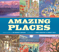


.jpg?picon=1083)


 My latest short story Midnight Ghost (it’s being released Oct 24th) required me to draw a glowing ghost. This is something you can struggle with if you don’t know the rules but once you do, drawing and painting glow is very easy.
 Here are the thumbnails I created for my


cute puppy!
I can see why your pup ends up in your art. My art is inspired by things in my world.
Thank you for stopping by so that I could see your charming art.
Wishing you the best with your project.
Thanks Tammie Lee :)
Hope you've had a wonderful Christmas! Thank you for popping in my cosy blog. x