new posts in all blogs
Viewing: Blog Posts Tagged with: swap, Most Recent at Top [Help]
Results 1 - 24 of 24
How to use this Page
You are viewing the most recent posts tagged with the words: swap in the JacketFlap blog reader. What is a tag? Think of a tag as a keyword or category label. Tags can both help you find posts on JacketFlap.com as well as provide an easy way for you to "remember" and classify posts for later recall. Try adding a tag yourself by clicking "Add a tag" below a post's header. Scroll down through the list of Recent Posts in the left column and click on a post title that sounds interesting. You can view all posts from a specific blog by clicking the Blog name in the right column, or you can click a 'More Posts from this Blog' link in any individual post.
I just went to my YouTube channel to reply to a lovely comment about one of my films and discovered that the filmed demo I did of me drawing a piece of artwork from Swap! has recently gone over 20,000 views. How exciting is that?! It's kind of weird too, to think that 20,000 people, probably all over the world, have watched me drawing.
If you haven't seen the demo already, here it is again:
Do 'like' or 'share', if you find it interesting - every little helps in this business!
Since we did this film, John and I shot another demo film in the studio: this time it's me creating some artwork from Jungle Grumble. It's a larger illustration and so, when it's ready, it will be a longer film. We recorded pretty much the whole way through the illustration, from first marks to completion, which means lots of footage, so it needs quite a bit of time spending on editing, to get it down to a manageable length. That's a tricky business, as I am talking about process all the time, so we need to cut big sections, without losing too much that's interesting.
Trouble is, things have been so busy ever since we filmed it, there has not been time to finish the editing process yet. We are about a third of the way through, I reckon.
It's another thing on the 'to-do' list. Life is quieting down though, now we are out of the main school-visits season, so hopefully it won't be too long before I can share the new demo with you. In the meantime, here are a couple of films we made of me talking through how I drew the roughs for Jungle Grumble. If you haven't watched them already, you might find them interesting:

By:
Lynne Chapman,
on 4/17/2013
Blog:
An Illustrator's Life For Me!
(
Login to Add to MyJacketFlap)
JacketFlap tags:
Photoshop,
digital,
Corel Painter,
Swap,
artwork,
scans,
text overlays,
hot tips,
illustration,
Add a tag
When it comes to the digital 'finishing' work on my books, it's the cutting out that's the real chore but, once that's done, I feel as though I have finished. Not so! There's the final, fussy job of doing the text overlays. Sigh...
All text has to be created separately from the main artwork, because of translations: you can't have English words embedded in the illustration and then hope to sell the book for foreign editions. This goes for all wording, but I am not talking about the regular text you can see above, but the little, incidental details: can you see the word 'DOG' on the bowl?
There are quite a few more on the spread below:
Most illustrators don't have to worry about the text overlays - the design team at the publishers sort out all that, when they place the other text. However, because I am daft enough to create my artwork in pastels, the bits of text which are intrinsic to the images don't work very well if they too are not in pastels: the wording sort of floats above the illustration.
It's not practical to do the text overlays in actual pastels, so I do it digitally, in 'pretend' pastels, using an old version on Corel Painter, which does a pretty good job of emulating the marks of my pastels, particularly after I have scanned in a sample of the actual paper I draw onto, so the texture matches. This is the text from the classroom door.
It's a boring and fiddly job, but looks much better. Of course, when it comes to the foreign translations, I have no control, so they just bung on ordinary text. Hey-ho - there are times when you just have to let go...
For the children's dance studio below, I've done the whole sign as an overlay, including the little drawings of the kids, because foreign translations can take up more space than English text. This way, it allows for the little figures to be removed if necessary, to fit in a more wordy name - clever eh?!
Anyway, I am now done, done, done (hurrah!) and a DVD of all the finished artwork has been sent back to my Art Director, who will be busy this week, dropping all the text into its final position and sorting out the final bits of design work (spine, title page, dedications, blurb, bar codes...).
The next stage should be the colour proof. That's the truly exciting bit, when it all looks real!
I finished off all the digital finishing-work, on the inside illustrations and on the cover for Swap! before the Easter holidays. It felt like I was nearly done. I thought I would be able to rattle off the endpapers and be ready to send it all off to the publisher pretty soon after getting back to work this week.
I don't know why I thought that: it was very silly.
 |
| front endpaper illustrations |
I wasn't really taking into account the fact that, not only are the illustrations different on the front and back endpapers, but there are six independent illustrations on each, every one of which is fiddly. Also every illustration features Lucy, whose head is a very similar pink to the pink of the paper I use, making it a bit of a technical nightmare to cut free.
 |
| back endpaper illustrations |
The illustrations will be put into a spot repeat pattern across the double spread of each endpaper:
I thought that, because the illustrations needed to be different - a sort of 'before and after' - I would use the same lilac coloured background for them both, to give some unity.
You can follow the progress of
Swap! (as well as
Baby Goes Baaaaa! and
Bears on the Stairs) from my first sketches and plotting sheets, through pitching the idea to publishers, creating artwork, as well as all the miriad issues that have arisen during the book's life so far, by clicking the
Swap! label, or other relevant label, on the right of the posts.
You can watch me create a piece of the original pastel artwork from
Swap! in a short film
here.
The diagonal line through the illustration is there because I wanted to use two different colours, partly to assist the design, but also to underline the idea of there being two sides, like the two sides in the story, which are going to swap over.
To help to make the cover as punchy as possible, I didn't want the two background colours to be drawn in pastels but to be
dropped in digitally. However, even at the point when I was
colouring the final pastel artwork, I didn't have much idea of which colour combination I wanted to use for the background.
But this week, once I had cut away the pastel paper in Photoshop, I suddenly had to decide. I wanted to stick to the colour palette from the inside illustrations, so I tried out some alternatives. My first thought was the pink and blue above. It's nice and rich, but felt a little heavy. The yellow and turquoise below seemed more lively and threw the characters and text forwards more:
I ran both alternatives by my Designer at the publisher. Luckily she agreed with me, so yellow and turquoise it is (
at least for now...).
Part of the Photoshop work I have been doing recently on Swap!, has involved designing the colours for the book. Some pages have fully illustrated backgrounds, but the ones that don't - the ones I have been cutting out - need my pastel paper replacing with a bold, flat colour.
To give the book an overall feeling of unity, the designer and I have to decide upon a colour palette: a limited range of colours to which I then restrict myself:
The trick is to distribute these colour backgrounds reasonably evenly throughout the book, whilst still making sure that each illustration has the best colour behind it, a colour that shows it off to best effect, but that also compliments any illustration on the opposite side of the page.
Quite often in this book, I have used two different colours to suggest a room, without actually illustrating one, as with this spread of the ballet class:
I like the contrast the technique creates between the textured pastel work of the characters and the smooth, bold colour behind.
This week I am glued to my computer, doing the Photoshop work on the 2nd DVD of scans of my Swap! artwork, cutting away the pink paper backgrounds, as you can see on the illustration below, and also creating text overlays where needed. I know, it's AGES since I worked on it last - I bet you thought it was all done and dusted.
 |
| Raw scan before any work |
You might recall, there was a rush to get my book mocked up for the Frankfurt Book Fair in October so, in early September, I sent about 2/3rds of my pastel artwork away to be scanned, then carried on, rushing to finish the rest in time for my publisher to take that to the fair as well.
A DVD of scans from that first batch of artwork came back to me with just a few days to do all the Photoshop work by the deadline, ready for the publisher to create the mock-up. It was all very last minute, as is often the case around the big book fairs.
 |
| Finished illustration: pink paper replaced by yellow ground |
But - DISASTER - there was something wrong with the scans! They were very dingy and I wasn't happy, but I had no chance to even tell anyone, as it was the weekend and I had to work on them straight away or I would miss the deadline. So I did all the usual computer work then also used Photoshop to fiddle around with various settings, until I thought they looked better.
It all went to Frankfurt OK and I explained about the duff scans. My publisher said they would talk to the repro people, but were happy for batch 1 to use my tinkered-with versions. So, I was expecting to get a DVD with the 2nd batch of scans sometime in November, once the fuss of the show was over. But nothing arrived. It turned out the delay was to do with worries about the dingy problem. Christmas came and went. Then my publisher had a bit of trouble and went down to a skeleton staff, which delayed things further.
So, here we are in March. Actually, the new DVD arrived a few weeks ago, but I had to get all my school visits out of the way before I could do anything about it. Apart from whitening-up the children's shirts a bit, I haven't tinkered with the values in the image above and I think it looks OK, so they seem to have got the problem sorted.
If you want to read more detail about how I cut away the pink paper background, check out this post from when I was doing Baby Goes Baaaaa!
All the pastel artwork for my latest book Swap! is now done. Hurrah! The last pieces, which I finished this week, were the front endpapers:
These little images will be shrunk down still further and used to create a repeat pattern in the front of the book. I think perhaps this is my favourite one:

These illustrations show Lucy and Sparky before they swap places. The
back endpapers, after their little adventure, are rather different!
John mounted everything up for me, but my final task, before sending this 2nd batch off to my publisher, was a continuity check. It would be so easy to miss off Sparky's whiskers, or Lucy's sock tail, or get her mud splots in the wrong places. I have already spotted a discrepancy in Sparky's markings and had to make changes. As half the artwork has
already been scanned, I had to change the new pieces to fit the first batch.
To try and get an overview, we laid out all the artwork so I could see as much as possible at once. But there were too many illustrations (or insufficient surfaces) to get it all out at once, so I did it in a couple of batches.
I did spot a couple of things, so good job I checked!
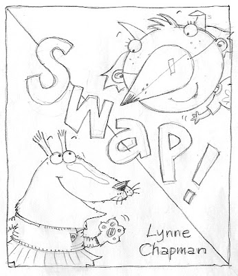
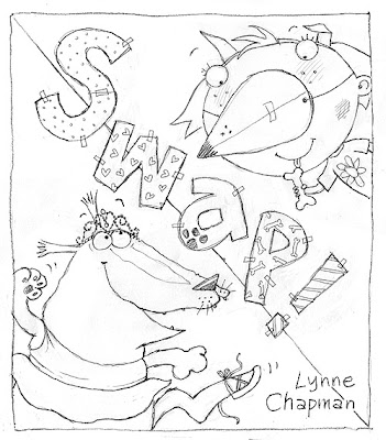
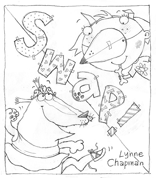
Yes, I have coloured Swap!'s front cover! Do you remember I talked you through the process of designing the cover a while back? The winning rough was this one:
I left the pastelling until virtually the end (I still have the
front endpapers to do), so I could be sure I was truly warmed up to the characters and properly motoring. I'm so pleased I was allowed colour for the text on this one, as I think it makes a real difference. Often the title text is black: it's been that way on quite a few of
my other books. That's to save money on translations (all the translated text goes on together, throughout the book, in a single black, which is cheaper than paying for extra colours).

There's a massive bleed on this piece of artwork: you can see I have extended the illustration on the two sides and bottom. I always provide a 5mm bleed on my illustrations, which is standard to aid the printer, but covers always need more like 30mm. I'm not 100% sure why (perhaps to allow for the larger paper jacket the US editions sometimes employ). It will be cropped back, on the UK edition at least, more or less to what you see on the rough. The background 'triangles' will be created in Photoshop once it's scanned.
Right, those endpapers next...
Today I am out doing a school visit in Nottingham, but for all the rest of this week, I have been working away on my Swap! artwork. On Wednesday morning I finished off the school room illustration I was half way through last time we met:

Since Wednesday was a nasty, overcast day (hence the slightly dingy-looking photo), I pulled the blinds and set-to at my light box, tracing up the last two pages I've yet to do. Of course that doesn't include the cover artwork and the front endpapers (which you remember are different from the back ones on this book, which I already coloured, just before the first batch of artwork went off to Frankfurt). At last the end of the actual story is in sight though.
I decided to tackle the other 'school chaos' illustration next, as I could use the image above as reference. It's so tricky making sure the various kids remain constant across the different spreads - who has teeth showing, who has freckles, which child has which hair colour, which hairstyle, which hair slides...

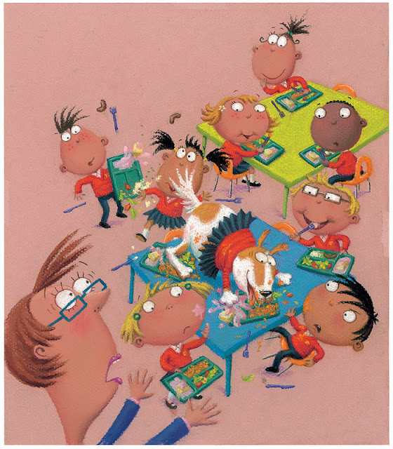
I got it finished by mid-afternoon yesterday. This is Sparky's favourite part of the school day: the lunch hour. The publisher asked me not to make the food too obviously English, so I gave them a choice of pasta or good old sausages and mash. I don't know if you can make the food out - the light was bad again, so it's a wee bit fuzzy:
Before the end of the day, I just had time to sort out all my gear, ready for today's visit to Ambleside Primary School, where I will have a whole day with a single Y3 class, which is quite unusual. We'll start with an illustration workshop in the morning, then use the images we create to weave stories for a creative writing workshop in the afternoon. That's the plan anyway - wish me luck!
Finishing this spread seemed to take forever: sometimes I lose momentum if I stop half way and it takes a while to get things up to speed again. Anyway, I finally got it done by Wednesday afternoon:
The next one I tackled was Sparky's first go at being Lucy:
I'll be honest: I chickened out at the start of doing the Swap! artwork and pastelled all the easier bits first. Unfortunately, that means I have some really tricky, complicated pieces to finish off with. This kind of heavily detailed illustration is really not what pastels were designed for, but with patience I'll get through it. I find listening to stories while I work is very calming.
I made a good start on the classroom spread on Thursday, so I'm hoping another day might be enough.
But I had yet another cause to put my pastel artwork on hold: a cover design was needed too. We often leave the cover design to the end - I am more familiar with the characters by then and it's easier to get a feel for what would work, once you can see the rest of the artwork.
Anyway, I needed to come up with something in a hurry. I felt both characters needed to be on the front, but nothing much else (apart from the title etc, obviously), to keep it punchy. I did the sketch above as a starting point, but felt it needed more humour, so thought I could use the dog food problem to make things more funny. The ice-cream seemed to work well for Sparky and I tried out 3 alternative versions of Lucy:
One fundamental problem though, is that two characters side by side create a very landscape-format illustration, for what is a portrait-format cover. That means they would ultimately be quite small in the space.
My Art Director suggested I move them closer together, having them hugging, which would help the format and also make it a warmer relationship.
Trouble is, Lucy has a very wide head, so she can't easily get close without eclipsing Sparky, and his long nose has to face away from her, or they'd collide. Plus, his school uniform begins to disappear behind her and it all gets a bit visually confusing.
'We need a more graphic approach,' said my Art Director. So I played with having the characters poking in top and bottom, using blocks of colour to hold them in place and break up the space. John suggested the curly shape below and the idea that the title letters could swap colours with the background shapes, to echo the theme.
Then I had another go at bringing the two characters together, keeping the colour-swapping idea, but using hand-holding instead of hugging. I also tried a slightly simpler version of John's idea then sent these three designs back to the Art Director.
She liked the third, simpler one best, but said it needed more humour, rightly pointing out that, unless you've read the story, Sparky could be just another animal wearing clothes, as they so often do in picture books: people might not get the 'swapping' idea and so Lucy's nose would just be confusing. She also preferred Sparky's ballet outfit to the school uniform.
I had deliberately shied away from using the ballet costume on the cover, since I discovered Dogs Don't Do Ballet: Sara Ogilvie unfortunately uses a very similar outfit. But the ballet costume did offer more scope for extra humour. I managed to squeeze Sparky's foot, with Lucy's tiny shoe, into the picture then looked on Google for other children's ballet accessories and found the tiara. Just to be on the safe side, I gave Lucy a bone, to underpin the idea that she is supposed to be in a dog disguise:
Both my Art Director and Editor loved it - hurrah!
The patchwork letters were another brain-wave of John's by the way, the idea being that they are another DIY activity, like the home-made nose. I think they make it really funky: well done John x
It's been going well and slightly faster than I expected, which is of course FANTASTIC news. Especially given the major set-back I had on Monday. As I was beavering away, about 10.30am, my computer suddenly snapped itself off, mid illustration. NNNNNOOOOOOOOOO!!!!!!
It turned out, by my extraordinary bad luck, that there was a fire in our electrical sub-station, so the power in the whole of my area of Sheffield was cut off for several hours. I had to sit and read a book as the time ticked by. Thank goodness they sorted it out eventually.
By:
Lynne Chapman,
on 9/24/2012
Blog:
An Illustrator's Life For Me!
(
Login to Add to MyJacketFlap)
JacketFlap tags:
drawing,
digital,
sketchbook,
Swap,
artwork,
pastels,
watercolour pencils,
scans,
illustration,
Photoshop,
Add a tag
I try not to work weekends. Self employment is inclined to gobble up your private life if you're not careful. But things are really full-on at the moment. My latest deadline in Thursday first thing, so my Sunday had to be sacrificed to Swap!. At least I got Saturday. It was a gloriously sunny day again and, since each one could be our last, we drove out to Chatsworth, to spend the day in the gardens, looking at the Barry Flanagan sculpture exhibition. I did some sketching towards the end of the afternoon. Thought I'd experiment with a crazy colour hare, after my Colour Games workshop.
I was about to attempt the drawing below, the same hare from the back, when a couple of children came over to ask what I was doing. I explained, showing them what I'd done so far. Their two friends came over and joined in. They were curious about my pencils, so I gave them a quick demo-scribble in the back of my sketchbook.
I asked if they wanted to try. Well, that was it. They got so excited, especially about the water brush, that they all set-to in a huddle while I chatted to their parents (who kindly offered to leave them with me for an hour or so...). They created this spread together:
We rounded off the day watching some cricket, which I know nothing about, but it was a good excuse for sitting on the grass just a bit longer.
But Sunday it was down to work: the scans have come back from that first batch of artwork I sent off a couple of weeks ago. Now the rush is to get them all cut-out in Photoshop by Wednesday night. I need to get rid of the pink paper backgrounds and replace them with flat digital colour, like the illustration at the top and below.
You can see the rough of this illustration and my pastel artwork before the cut-out job here.
My previous books with Gullane have had colour backgrounds on the covers, but been cut away to white on the inside, but I feel this one is calling out to be more funky. I'm having fun seeing how they look on the colours - it makes them really come together.
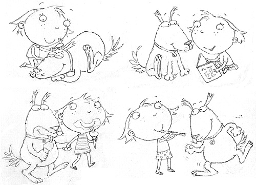
Do you ever have a task that you just can't seem to quite get finished? That's how I've been feeling about the two illustrations I've been working on for the last week.
Perhaps it's partly because I've had only the limited reference of the little dancing endpaper vignettes stuck to my desk, but I suppose it's mostly because they are both a bit fiddly.
The illustration above is Sparky telling Lucy that he won't swap back yet - he wants to have a go at ballet class (although clearly he's going to have trouble with those tiny shoes!). This is the rough I had a bit of trouble getting right. The publisher decided they liked this layout best.
The illustration below comes slightly later, after Sparky has been humiliated in class. Lucy is expecting him to want to swap back now (but she's in for a nasty surprise). If you're interested, I explained earlier on how I designed the drawing for this image.

I decided to work on the two pieces together, like earlier, as they featured the same characters, so it made it easier to keep them consistent, but also helped me to choose the colours of people's outfits, hair colour etc, having both contexts in front of me (I wanted to get a nice even balance of colours across both pictures).
At last I finished both illustrations on Monday, at 6.30pm - I was determined not to stop work until I had done. Still, after John mounted them up for me this morning, I noticed I had missed off Lucy's sock tail on the smaller piece, so had to quickly pop it on and I have just this minute noticed that Lucy's eyebrows are missing - she doesn't look smug enough without them!
Both these illustrations of Lucy also need some mud, from the earlier incident where she is digging holes in the garden, but I want to wait until the earlier pieces of artwork come back from the publishers, to make absolutely sure I put all the mud splodges in the right place.
On Thursday morning, I discovered that the deadline for getting my Swap! artwork to my publisher, in time for them to prepare it for presentation at the Frankfurt Book Fair, was today. Yikes! I thought I had a little longer, and have been trying to get as much done as possible but, come Friday afternoon, I had to stop and post what I'd done to date.
It's not too bad: I've completed over 7 spreads, so enough to get a good flavour of how the finished book will look.
Luckily, with John to help me, I was relieved of the task of cutting all the mounts, labelling all the artwork and packaging everything up, (which seems to take ages), so I was able to continue with the artwork up to the last minute. By Thursday evening I'd finished the spread I started that morning, the final spread of the book, and wasn't sure how best to spend my final day.
It's always a problem when half my artwork is sent on ahead - I'm left with no colour reference for the rest of the illustrations, so have to down-tools until it's returned. So, I hatched a cunning plan... I decided to spend my last day colouring something I wouldn't send with the rest:
I worked on the vignettes for the back endpapers, doing all 6 together, since they are so similar. Sparky is in lots of positions, so I get all his markings recorded, plus the ballet costume colours, ready to do the ballet spread next.
I have finished the two pieces of artwork I showed you last time, which were left half done on Friday afternoon. Sparky is enjoying tucking into Lucy's dinner (while she gets his dog food), when Mum calls out that it's Lucy's bath time. I am really pleased with this batch in particular. A big thanks to John for the suggestion of the yellow table, which really throws the other colours forwards.
Yesterday I finished a third piece from this part of the book, which actually comes before the other two: when Lucy looks at how much fun Sparky is having being her, suddenly realising she is going to have to remain as the dog forever!
This morning I have been tracing up a new one to begin work on this afternoon: the final spread of the book (the rough has been slightly re-worked again since you last saw it, to help sort out the gutter position a little).
I have to make yet another small change before the artwork though - my publisher is not keen on the chip being extracted from Sparky's nose.
Unfortunately though this is the last spread of the book, it is far from the final piece of artwork I have left to do. The pastel artwork will keep me busy for the rest of the month. No more days off in the sunshine for me! Best get on...
I'm a bit behind with my 'Swap! artwork, so no more time for filming: it's head down this week.
This was my desk on Friday night. I decided to treat myself to some bigger, bolder bits of artwork, having focussed on vignettes for quite a few days now, which are so fiddly. The joy of these bigger, simpler images is that you cover vast areas of the paper really quickly, so get a great sense of achievement.
The joy of these bigger, simpler images is that you cover vast areas of the paper really quickly, so get a great sense of achievement. Of course, I still have to slow down this morning and fill in all the detail, but at least I have the sensation of having got lots under my belt.
I'm working on two at once as well: it helps to speed things up when the images contain similar content. Right, gotta get on...
Well, my Art Director rightly pointed out that we can't very well use the same design for the endpapers at the beginning of the book, because a) it will spoil the joke and b) nobody will understand what it's all about yet.
So I set about thinking up other, more normal activities that Sparky and Lucy could share. It took a while, as I wanted them to be either cute or funny or both. I also needed situations that didn't require either backgrounds or large props: making sandcastles at the beach was out, as was playing on the swings. I did adapt both the beach idea and the park though:
These are the others I've come up with. I had 6 ballet poses, so I thought it would be good to match that with 6 normal poses, to put into a spot-repeat, just the same as at the back.
I haven't yet got the final go-ahead on those last few redraws, because my art director has been on holiday, but most of the illustrations for Swap! are ready to go. So last week I finally gave in and started tracing-up on the light box. It's such a tedious task, tracing each illustration onto my pink pastel paper, and I have to do it in the dark too, despite the sunshine outside (groan), as the pastel paper is too thick to see through otherwise.
It was great to get stuck into colour though. I started with the first spread of the book, not because I like to work through in the correct order, but because I had clear ideas about the colours things needed to be (pretty much pink, pink, pink), so it was a safe place to begin.
It was also a comfortable way to find the main characters, as they are very large on the page. I was imagining Lucy blond, but concerned that might not jump out of the page as much as brunette, especially as I am rather fond of soft, pastel coloured backgrounds (which we will drop in later, digitally).
I wasn't sure what colour to do Sparky. Black would be tricky for showing details, white a little boring, brown a bit dingy and dull... I wanted him to stand out from the backgrounds too, so
I chose white with tan bits, to make it more interesting and colourful.Which spread to tackle next..?
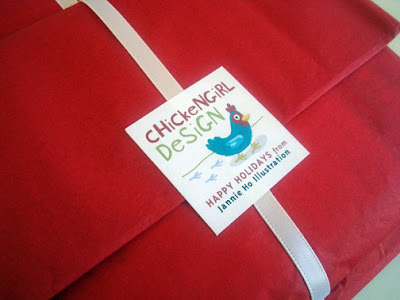
I participated in The Reading Zone’s Back-to-S-C-H-O-O-L Swap. My partner was Lori from Morning Glories and Moonflowers. Here’s what I sent her:
Here’s the awesome package she sent to me:
Isn’t Lori creative? Check out her Etsy Shop to see the rest of her creative creations.
[...]
Thanks, Gis, for also awarding me the You Make My Day Award. (We are afterall bird-related, check out her cute birdies!) Here is a wonderful opportunity to give some shout outs to all the blogger friends I 've made and some recent goodies I've received over the mail:
A package from Zari- I was so blown away with the personalized notebook (I love that chicken with my initials on it!) and all the other goodies! Her work is even more amazing to look at in real life. Thank you so much for your thoughtfulness, Zari:
 I wish I had more time to participate over at Monday Artday ATC, but I was still getting some wonderful ATCs. Some recent ones:
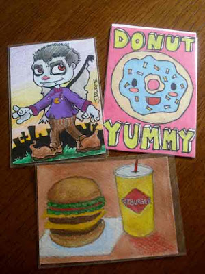 Top left: A Halloween Cutie from Jeff Brame- He is incredible with making so many great ATCs to trade! Thanks, Jeff!
Top Right: Bearuh sent this as a surprise, a kawaii donut, whats not to love?
Bottom: Fatburger and Shake from JC, she did this one especially for me since I told her I loved drawings of food!
Thank you guys! Cluck Cluck!
Happy 2008! Wishing everyone a wonderfully creative new year.
Might seem a bit late here but I wanted to show some of the goodies I made for a secret santa swap over at Monday Artday ATC (and I hope all my recipients got their packages?!):
I love cello sleeves. Its so much fun making your own little packaging.
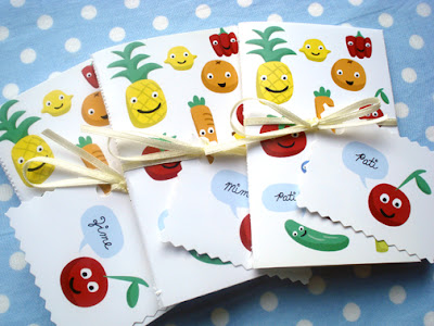
And fruity notebooks made from an
Illustration friday entry.
Next up, some new year's resolutions, so many things I would like to accomplish this year!
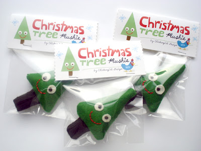
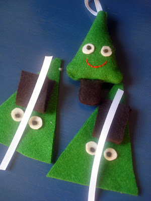 I participated in a secret santa Christmas swap, I can't wait to show some of the stuff I made here but I don't want to spoil it for the recipients. So I will wait till after Christmas. But above is a sneak peek of some Christmas tree plushies work-in-progress.
 Anyways, its time for me to take a break from the blog and enjoy the holiday goodness, but also really to catch up on some work. Have a good holiday, everyone! Chickeny wishes to all.
A Family for Old Mill Farm
by Shutta Crum; illustrated by Niki Daly
The lease on our 15th-floor shoebox will expire long after my patience, and I find myself wistful about someday owning another home. Where should it be? In a funky, ethnic urban neighborhood? In the suburbs, where we could spread out some? Or out in the country, where Brett could live his dream of growing organic veggies?
My son has all the answers, fortunately. He thinks we should move in with the bunnies and duckies in this story. He falls completely for the raccoon realtor's sales pitch as he woos different animal families with the charms of a rundown farm:
At Old Mill Farm,
beneath branches hanging low
there's a shimmering pool
with a dragonfly show.
Raise your babies here,
where the water lillies grow.
I'm sold! Move me in tomorrow.
Of course, there's also a human family, and their hunt for the perfect home alternates with that wily raccoon, who has a human counterpart in a real estate agent (in a matching orange coat). The human real estate agent's in rare form as she shows off all kinds of outrageous properties, including a lighthouse and a mountaintop manse that gives pregnant Mom the woosies.
No thanks, Dad keeps telling realtor lady. "Perfect!" Say all the animal Moms and Dads. I bet you know where this is headed: toward the farmhouse on Happy Ending Lane. You're right! Daly's watercolors make it clear that these nicey-nice folk don't belong anywhere but the countryside: they look like they jumped from a Land's End catalog, complete with earnest expressions and a floral print dress.
Crum alternates quattrains and couplets, which keeps the meter flowing evenly without becoming tedious, and even the family's growing exasperation is expressed as poetic longing for the open meadow. The lyrical quality makes for a singsong reading, and the frolicsome little boy in the story drove home the point that this could, someday soon, be my son.
Rating: *\*\*\


.jpg?picon=479)


great job :)
your work is just lovely...what an inspiration you are. Thanks for sharing x
Hello Lynne!
Wow! What a great talent you have! Your illustrations are absolutely amazing but I guess you already know that. You have also managed to make this blog a very good platform for your work - its a good read. Anyway, I think I could help to further increase your readership (yes, I do realise that you already have a pretty big following - and rightfully so).
I am looking for quality blogs to include into our community of bloggers - glipho.com
Please check us out and drop me a line at [email protected] for any questions.
Best!
Hubert
That is fascinating. So your old Corel continues to work on an updated computer?
So far. .. :-]
Nice explanation Lynne! I've had similar issues too in the past. I really don't like the way text tends to hover over artwork, so whenever possible I avoid using text within the artwork. Shop signs are an inevitable exception though. Well treated!
Looks amazing! Do we have a publishing date yet?
Remember I mentioned a while back about hoping to have my own picture book published soon? Well, that is about to come true in the next few months! A picture book I illustrated is to be published end of summer :)
Congratulations Louise! That's great news - well done. You are going to beat me to it big-style, as 'Swap!' is unfortunately not going to be around for some time yet. The new publication date is August 2014, simultaneously in the UK, US and Australia.