JacketFlap connects you to the work of more than 200,000 authors, illustrators, publishers and other creators of books for Children and Young Adults. The site is updated daily with information about every book, author, illustrator, and publisher in the children's / young adult book industry. Members include published authors and illustrators, librarians, agents, editors, publicists, booksellers, publishers and fans. Join now (it's free).
Login or Register for free to create your own customized page of blog posts from your favorite blogs. You can also add blogs by clicking the "Add to MyJacketFlap" links next to the blog name in each post.
Blog Posts by Tag
In the past 7 days
Blog Posts by Date
Click days in this calendar to see posts by day or month
Viewing: Blog Posts Tagged with: Nick Green, Most Recent at Top [Help]
Results 26 - 50 of 60
How to use this Page
You are viewing the most recent posts tagged with the words: Nick Green in the JacketFlap blog reader. What is a tag? Think of a tag as a keyword or category label. Tags can both help you find posts on JacketFlap.com as well as provide an easy way for you to "remember" and classify posts for later recall. Try adding a tag yourself by clicking "Add a tag" below a post's header. Scroll down through the list of Recent Posts in the left column and click on a post title that sounds interesting. You can view all posts from a specific blog by clicking the Blog name in the right column, or you can click a 'More Posts from this Blog' link in any individual post.
I'm back to work on my Baby Goes Baaaa! artwork this morning, so you'll have to wait until tomorrow to see the 2nd half of my SketchCrawl sketchbook. I've got to crack on as I'm nearing my deadline - I have to get as much done as I can before all my March school visits kick in.
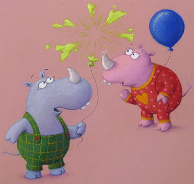
Things are still going well though. On Thursday I finished off the 'Uh-Oh!' hippos which I was half way through last time you looked in:
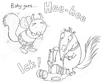
Then I began work on the letters H, I and J. These involve 3 different pieces of artwork, but the first two are linked and appear on the same page. As you can see on the roughs, 'H' if for Hee-Hee: a baby squirrel is a fit of giggles because of what is happening with the letter 'I', illustrated with a baby anteater, who has had an accident with a tub of treacle:
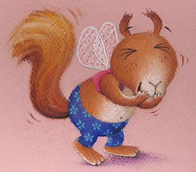
I got the squirrel finished first. I went for a red squirrel, rather than the greys that are common in England, partly because I like the sweet, sticky-up ears, but mostly because of their rich, orange colour. I illustrated baby squirrel in cute, dressing-up fairy-wings, since I notice these are a favourite with the small children of my friends:
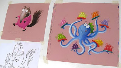
By the end of Friday, I was still half way through the anteater (I'll be finishing her off today) but I'd also got most of the letter 'J' done. As previously, I worked on several pieces together, since they will all appear on the same spread, so the colours have to balance properly. This is how my desk looked on Friday evening:
As you may have worked out, 'J' is for 'Jiggle Joggle'. I just have to draw the suckers on the birthday party octopus and I'm done. Right, down to work...
2 Comments on The Start of Another Week..., last added: 3/3/2011
Oops sorry, I left a comment whilst my daughter was signed in and it came up in her name - hence the deleted post from Jules!
So, from me - your Rhinos are such characters! Well, they all are really - I think the anteater looks great and I love the colours going on in your octopus illustration! I must get me a copy of your book when published!
It's really great seeing the progress of these illustrations, thanks ever so much for taking the effort to document it all, I'm really enjoying it. Lovely pictures too, I really like the rich colours in the shading, they all look really nice and satisfyingly solid :)
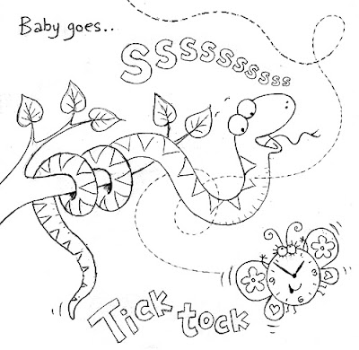
I have been working on a page that illustrates the letters S & T.
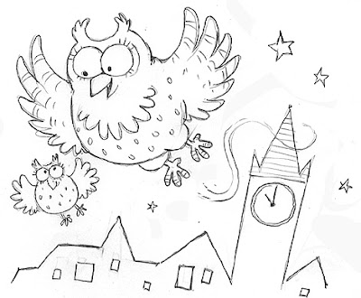
When I was originally thinking up the various alphabetical ideas for Baby Goes Baaaa!, a snake seemed the obvious choice for 'S', but 'T' was more tricky. I first drew owls, thinking of Too-Wit Too-Woo!, but realised it's too complicated a sound for Baby to get it's mouth round.
As you can see, I was also toying with Tock Tock, a sound toddlers are used to from singing Three Blind Mice, but a clock is not an animal, so doesn't fit. I sketched animals wearing watches, but a watch is a very adult item.
So, in the end, I decided to give myself a little artistic licence. After all, in a baby's world, a clock with a face is not so different to a teddy. I gave it wings as well than combined it with the snake to create one image, to keep things compact:
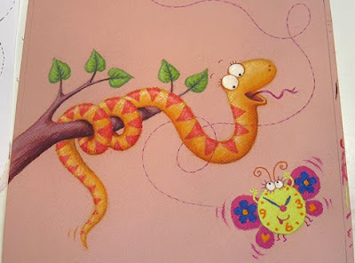
This is how the artwork looks (I seem to have a bit of a thing for red and yellow snakes...):
The 'S & T' page sits opposite the letter 'U' (for Uh-Oh! - a sound I've noticed that babies love, for its intrinsic humour), so I have begun work on that page next, so I can keep an eye on how the two pages work visually together. I played with various ideas for minor accidents at the roughs stage, but plumped for a burst balloon, for its colour and drama, without any actual hurt:
1 Comments on Snakes, Hippos and Flying Clocks!, last added: 2/25/2011
It is wonderful that you're given such free-range with your ideas for the illustrations because that's when the best things are thought of! I love the owls, even though you're not using them. And the rhinos with the baloon (which I assume popped on his horn!) is really funny!!
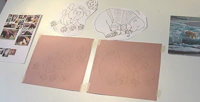
My feedback came through from Egmont on Tuesday, so I spent that day on the very boring task of enlarging my drawings on the computer, printing them out and tracing them up onto my pink pastel paper.
Now, it's a bit nerve-racking, deciding where to begin on a new book. I dithered for a while, then plumped for the lamb on skates and the polar bears I showed you last month:
My main reason: they are both principally white animals, so that was one colour I wouldn't have to make a decision on, and so would ease me in gently. Plus, I love the way white is made up of so many reflected colours and how pastels allows you to play with that, building it up gently:
I worked on both pieces side by side, because it's quicker to work on 2 similar illustrations at the same time - always handy when things are running behind schedule.
I based my polar bear drawing on this lovely photo I found on Google (ahhh...).
I used bold colours for their clothes, so they'll stand out against the white and also show up on whatever coloured background we drop in later. You see, none of the characters will have illustrated backgrounds: every page is going to have a different, flat colour dropped in later, in Photoshop.
The effect will be similar to my earlier baby book, When You're Not Looking! - simple and bold (ideal for this younger age group), although I think it will be slightly less zingy, without moving as far away as pastels.
This is how things stood on my desk come Thursday morni
5 Comments on All Systems Are Go!!, last added: 2/14/2011
These are wonderful! The depth of colour and the texture you create are just beautiful. And I LOVE those jumpers - you can practically feel the chunky wool. It is so interesting and inspiring to see your process - thanks so much for sharing it with us.
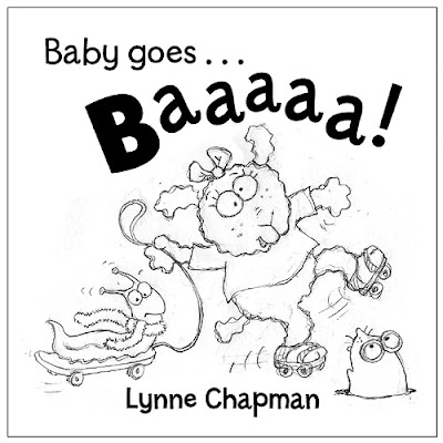
I'm due to get my feedback on the roughs for Baby Goes Baaaa! some time today. While I've been waiting for the final go-ahead, I've been taking another look at the cover design I began thinking about last week.
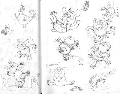
Sarah sent me some title text we could possible use, to help me get a feel for what space I had to play with, and I worked up the little sketch I showed you last time into this:
I then had a play around with some other thoughts, incorporating different characters from inside the book. My editor said he was very keen on the bears, and so I woke up the sleepy, baby polar bear I showed you before, and gave him a go:
Another fave of my editor, is a little mole I've drawn for one of the spreads (P is for Pee-Bo!). I'm also quite keen on the silliness of the slug on the skateboard (who you might remember, was originally a dog, and then a hedgehog...), so I tried them in a third idea:
Not sure which I like best, so I'll see what the guys at Egmont say. Any thoughts?
I usually have a policy of never presenting more than one alternative rough. This dates back to my days in editorial illustration, when I discovered that, if ever I presented two alternatives, the art director would say something like, "Mmm, I like this from this one, but that from the other... Could we please combine them?" And I would end up having to draw a third.
I'll let you know if it happens again!
8 Comments on Cover Rough for 'Baby Goes Baaa!', last added: 2/8/2011
I'm really in to 'silly' and a lamb on roller skates is silly, but not as sillyly silly as a slug on a skate board! I love this 'Mole in a hole' cover best I think. Unless you have something sillier :0)
I like the monkey one because there is a difference in size between the two and it is simpler (not too much going on which could be confusing). The third is just so much fun too... totally unexpected (but maybe better on the inside.... it would be fun to continue her skating journey through the inside of the front cover and into the book! I think you probably instinctually knew the first one worked the best because that's what you created first. The problem lies in that all of your drawings are just so good... it's really hard to choose!!!
Ooo... now that's a really interesting idea Bethany. Don't know if we have endpapers or not (being younger,it's a 24 page picture book, so sometimes it's tighter), but that would be such fun. She could be skating in through the endpapers and then out the endpapers at the other end of the book, interacting with various characters as she goes. You're a genious!
All nice, however, I like the composition of the first, just the way the shapes all fit together. the third is a bit busy, the second too plain (i sound like Goldilocks).
Amazing work as always! Will be sending my niece a copy when it comes out. I love the monkey as a cover due to its simplicity. But I adore the idea of a book about an active exercising healthy slug (perhaps taking over the veggie patch) and agree with Tim that the slug deserves a book of his own. Love the idea about the endpapers too. Despite having read thousands, I'd never realised how much went into creating a children's book even after reading Mem Fox's comments on the same. Good luck with the publishers! I'm sure they'll love all of them.
I have sent off all my Baby Goes Baaaa! reworks to my publisher and, while I'm waiting for the verdict, I've been thinking about the cover. My editor says the cover illustration needs to be bold and simple, with a really strong character, who is very appealing: cute, whilst at the same time funny...
'Easy-peasy' I hear you say (!!)
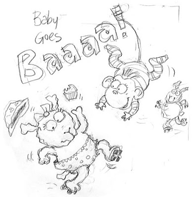
I started with these sketches. It seems pretty obvious that the cover needs to feature the lamb, to ensure the title makes sense, but possibly another character too, if there's space.
It's a square format though which, once you've got the title in across the top, makes things tighter. I think there's a possible idea here (evolved from the little sketch in the top right above):
I just knocked a mug of coffee all over the computer desk, which hasn't helped progress. Luckily it's only ruined a pack of blank paper and, at least in mopping it up I've got rid of some of the dust and grime round the back of the computer and underneath my printer!
6 Comments on Designing a Front Cover, last added: 2/1/2011
My UNIQUELY styled Wallpapers. During some ten years, I have developed an extremely complex and unimitable technique that should carry some interest of anyone pursuing a serious artistic ambition and expertise. And it's quantity as well: by now close to 3 000 wallpapers, all created by me. Why not tune in on my rapidly growing art blog? Its Copyright Anyone, as it SHOULD be for this genre!
There's much in the world that you can't explain. It's revealed for you to remember by the whispering voice of a distant train or a midnight rain in november.
Horizon within! You can always find the keys to Enigma. Let's mention one basic Truth: of spirited Mind Is Nature naught but extension.
Internal expanses! In dreams, ridden by fear and longing you roam that deep Southeast in your soul hidden ...on your random journey back home.
We need a new analysis of probability. My hypothesis is that disorder is as constant as energy, since increasing material disorder, entropy, is counterbalanced by increasing structural regularity, symmetry. I tell you the Law of Entropy and the Law of Symmetry, ruling approximatively equal universal validity derive through bifurcation of the still more basic Law of Probability, that is, math, and rather simple math at that. Can you dig this?
Thanks for posting this, I always find it really interesting seeing people's ideas and working out. I agree, I think there's a cover in the last sketch, cool having the monkey hanging off the letters :)
They are so endearing!! I love your sketches. I love seeing the process you go through and I have an even greater appreciation now when I see your books! That monkey is adorable and the little muffin flying up from the sweet lamb's hand! I can hear the "gasp" that must have happened when the coffee spilled...yikes!!!
Ah well, the holidays are most definitely over, so this week I've started to get stuck in.
One of the first things on the agenda is tweaking a few of my roughs for the Baby Goes Baaaa!project that I'm working on with Egmont Children's Books. I need to get motoring on it, as ideally the artwork needs to be finished by the end of next month, before the main school-visits season in March.
However, while I'm waiting for the specific details from the Art Director, I've been doing that dread task: the annual accounts. At least I already did half of it a while ago, so it's not been as bad as it might be.
Actually, this sounds a bit sad but, though the thought of ordering and entering all those receipts is a bit intimidating, once I get going, I almost enjoy the repetitive, mundane nature of the task. I have the satisfaction of getting a job done, but there's no pressure to be clever, or creative, or witty, or original. Yep - definitely a saddo.
Back to all that clever-clever stuff next week...
4 Comments on Starting Work Again, last added: 1/8/2011
Hi there, I have just found your blog, what a great read it is!! I shall come back again over the weekend to have another browse. I love your style,such characters! Kind regards, Happy New Year. Jane
I want to quickly pass on a couple of great tips I picked up at the SCBWI conference over the weekend (and take the chance to show you a couple of the sketches I did on my way there).
The first tip comes from Tim Hopgood, another picture book illustrator / author, who I first met at the Northern Children's Book Festival earlier in the week.
We were at the same hotel for 3 days, so had dinner together each night, along with other folks like David Bedford, Joan Lennon and Alan Durant. That's one of the lovely things about the NCBF: you catch up with people you've not seen in ages and keep adding new friends each year.
Tim and I got on like a house on fire, so I was especially pleased to run into him a few days later at the conference. He was giving a talk on how his book ideas evolve.
He's an understated, but very funny guy, and the talk was really interesting. We all did lots of giggling and one of many things that amused us was when Tim shared a bit of his working practice: every day, before he starts work, he turns up the music good and loud, and spends a whole hour dancing around the studio, all by himself! This is an illustration from his gorgeous book Here Comes Frankie!, that seems rather apt...
So anyway, yesterday, after I had waded through my back e-mails for the week I've been away, I decided to try it. I couldn't afford an hour, as it was already about 11 o'clock, but I jumped and bopped for a good 10 minutes, and found that Tim's right: it's really good for clearing your head.
Out of breath and slightly sweaty (must get more exercise...) I starting in on the re-planning I need to do for a text that's been buzzing around for a while. Gullane are showing initial signs of interest, but are right that the idea needs some re-thinking.
3 Comments on Fresh Tips Put Into Action!, last added: 11/17/2010
Thanks for sharing these, Lynne!! I use the back of giftwrap to make big-paper-ideas-maps. (I find that because it's cheap I don't mind writing all the waffle from my head onto the page, and there's LOADS of it, so I can waffle as much as I like).
Here is the 2nd part of the interview I did recently about illustrating picture books.
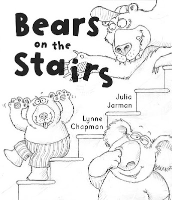
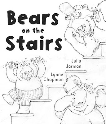
In this film I talk about how I plan a book and I look in detail at some of the specific challenges presented by my latest picture book, Bears on the Stairs. I also talk about how I am paid, explaining what 'advances' are and how they work.
(if you missed the first half of the interview, click here)
If you found this video interesting or helpful, there are two further filmed interviews coming up, about how I became an illustrator and about keeping a sketchbook.
Wonderful - really liked this. Your blog has so much useful info - thank you so much! Will you ever do an e course in children's book illustration, I wonder? If you do, I'll sign up!
I don't know where I first found the link to you blog yesterday, but thank you for sharing your knowledge and experience! Your two videos are wonderful.
I wasn't able to dedicate as much time putting pencil to paper as I would have liked on this years drawing day, but I did get a few sketches completed.
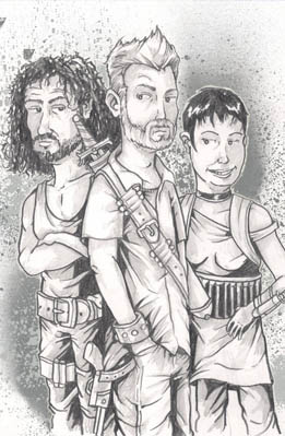
The first is of Me, Sayid from Lost and Liza Minnelli as a dangerous trio of rebels roaming a post apocalyptic wasteland in search of the scarcest resource of all - our humanity. It's all very deep and meaningful.
The second is a sketch of a Beaker plush doll in my office. Why Beaker? Why not?
In the world of "Forts" there are a hundred doorways leading to a hundred different worlds. While I won't be able to visit them all over the course of the three books, I thought it might be fun to add to the mythology by sketching up a few alien races on the spot.
Here's the second in the series.
Steve
1 Comments on 100 Worlds - 100 Creatures Episode 2, last added: 3/3/2010
I had the usual day of pulling teeth before getting back into my animal characters last week, but by Weds I was motoring again, and got on pretty well. I have the first half of this week too, before my next big batch of school visits kicks in.
It's been a very stop-start affair: I began sketching my initial drawings way back before my last book commission and, because this is a self-generated project, with no enforced deadlines, I've found it dreadfully difficult to keep momentum and enthusiasm up.
So, before I have to stop yet again, I'd like to get the sketches to a stage where they are at least ready to show to publishers for feedback.
It's probably better that I keep the roughs under wraps for the moment, which is why all I have to show you today is another oil-pastel self portrait, from Friday evening. Sorry about that! As usual, John says I have made myself far too severe...
3 Comments on Motoring At Last..., last added: 2/22/2010
I am finding your blog dizzingly energetic - it'sgreat. With regard to the self portrait, maybe you have been a little unkind to yourself? The top half (eyes et cetera) are good, but the lower half is not as flattering and smiley as your picture.
I know, but I am indeed that grim-chinned creature when I'm concentrating - you just can't keep up a smile for 40 minutes without it becoming a weird kind of grimace.
It's an interesting lesson though, in how much all our faces light up when we smile. All power to smiling!
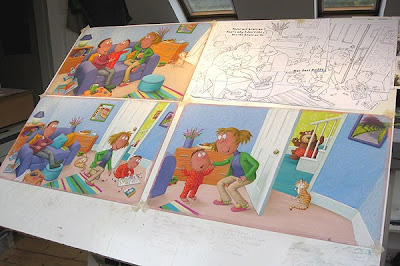
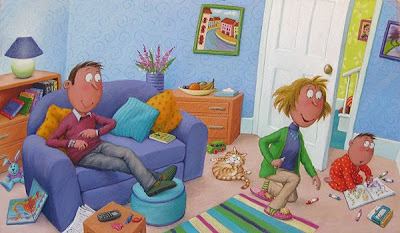
Hurrah! I actually did meet my target yesterday. Here's my desk shot last night:
I got all three living-room spreads finished, and before 6pm - just in time to qualify for watering the garden duties (actually a relief to be outside for a bit). All the spreads are sporting a full set of eyeballs:
I could almost hear the mieow of relief!
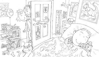
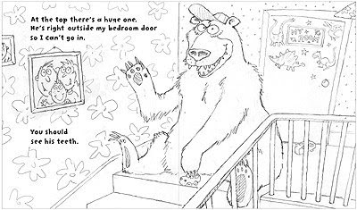
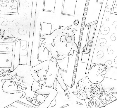
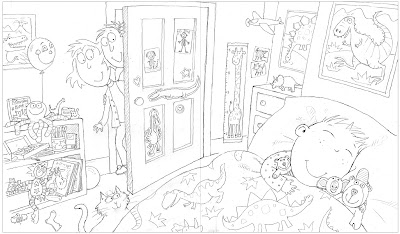
I felt the need to really push on today, so finishing the left-overs of the 'chasing' artwork can wait a while longer: I'm tackling another new room, the little boy's bedroom. I'm not sure I ever showed you this rough. It's the extra spread we invented for the end of the book, to bring things to a happier conclusion than Julia wrote originally for the text.
Spot the 3 stair-bears...
It's probably the most complex spread of the book, with all those toys, posters and patterns. When I drew it, I knew it would be a nightmare to colour in pastels, which are, to be honest, a totally unsuitable medium for such levels of detail.
But it felt important that the bedroom be especially cosy and comforting, given the previous scary spread, so what's a girl to do?
I've allowed myself 2 days in my schedule. This is how things are looking come lunchtime. Wish me luck: I may well need it!
9 Comments on Pushing On Upstairs, last added: 9/19/2009
Thanks so much for sharing your process. I love your work. It's color, concept and composition. How on earth do you get such a level of detail with pastels? I enjoy seeing the pictures of your workspace. I like how you work with several spreads up. Is the primary reason for that to maintain color accuracy and flow throughout the book? I love the image of the family cat, especially the one in the spread where he's casually bathing. Having two fat, fluffy felines myself, it's a familiar scene.
It makes perfect sense to "gang" your work on the board for speed and consistency. How smart!
I love the richness and smooth color transitions pastels afford, but leaning more toward line in my work vs. form, I've never excelled at them. They just make me crazy (and an absolute mess!).
I absolutely adore the what you have planned for the bedroom spread. A lot of work but from what I see so far, totally worth the effort. Kids and parents alike are just going to love picking out all the little details in this one.
This tracing business has just gone on and on! Luckily, unlike the gorgeous weekend (hurrah) it's been a wet and horrid day today, so it's not such a tragedy, being stuck in the dark.
I've been knuckling down and trying to get it all finished, so I can get on with the fun bit of working with colour, but I can't concentrate for very long, and keep taking breaks to do other less dull and tiring things. Listening to the Radio 4 and sucking sweeties helps me keep my head down, but they make me thirsty, so I have to keep breaking for cups of tea...
It's a hard life, this illustrating lark.
But, I've just finished the last spread - phew. So, let raise those blinds and raise a cheer. Yahoo!
5 Comments on Still Tracing..., last added: 8/11/2009
Hi Lynne, I've been finding this a fascinating and educating process, thankyou for sharing it! It's making me think, Hmmm a light box looks very useful!! I love your sketches, can't wait to see them in colour! Carrie...
good stuff, Lady! Still not quite sure I understand all this tracing lark, despite your previous post- you'll have to explain to me further when I see you.
Was wondering what the best station was to get to your show? No worries if you don't know. Will do my homework properly tomorrow. Tickets look great, btw. Ta muchly. cxxx
... so I now understand why illustrators set their prices the way the do. The process is very time consuming. And tedious. But worth the results when flipping through the colorful pages. I have a new respect for picture books after seeing your process.
Well, what a relief! The response to my Bear on the Stairs roughs has been really good: hardly any changes at all. Hurrah!!
Both Rona, the Editor at Anderson Press, and Julia Jarman, the author, were very complimentary and feel I have got things pretty much right. This is brilliant news, as it's quite a tight artwork deadline, so no major redraws will save a bit of time.
Julia liked that cat idea and suggested introducing him into as many spreads as possible, so I'll sort that out, like above, which is from the page where he tries to bribe the biggest bear.
Both Rona and Julia prefer the versions without the little vignettes, so we'll be going with the boy looking through the banisters at koala instead (now with added cat in arms):
And just the big bear on his own in the spread that comes next, rather than as previously:
Julia made other interesting suggestions. Unfortunately many weren't practical to draw without creating new problems. For instance, for the page above, Julia suggested looking up the stairs from the bottom, over the boy's head, to the bear looming at the top, his big shadow up the wall.
This sounds good, but of course we'd then see the other two bears, which would be confusing.
Also, you may remember some of the difficulties I had getting the big bear large enough on the page. I sat him down in the spread above, because standing forced him to be much smaller in a landscape spread. In Julia's idea, looking up the stairs with Bear at the top, perspective will make him a great deal smaller still.
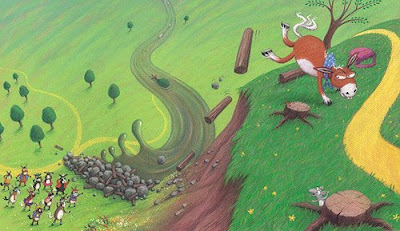
Being smaller also diffuses Big Bear's ability to 'loom'. I hit this issue once before, drawing the Mule School image above. The text originally had Stomper's friends peering up at him 'looming' down from the cliff above.
We had to change the wording and rework the whole page, because it is impossible to 'loom' at a distance.
I enjoyed drawing the boy holding the cat above, but was frustrated that you couldn't see most of it, as it looked really cute. So I've done this one too, which hopefully we can use somewhere, maybe on the back cover.
5 Comments on My Bears Feedback is Here!, last added: 8/3/2009
Thanks for the insight. It is nice to get a glimpse of the 'dance' between the author, editor and artist to achieve a perfect balance. Thanks for sharing.
Thanks so much for sharing this process with us! At this stage of the game (after tights re pretty much approved) how long do you generally have to complete the final colors? If I may ask.
Welcome back Granny G. Yes, the cat is staying now - these are pretty much the final drawings.
M Kwan: I generally allow around 6 weeks to complete the artwork. This book has to be done by end of September LATEST, which would be fine, except I am losing a bit of time for things like hanging my exhibition and various events like Edinburgh Festival.
I have been working on the cover, end-papers and title page for Bears on the Stairs, while I wait for my feedback on the rest of the roughs.
This was my first idea for the cover. The Editor liked the two lower bears, but wasn't keen on the big one 'batting' the title text. This is my re-draw:
For the endpapers, I though one big picture might be fun, rather than the little spot repeats of characters that I often do. I don't know yet whether we will have full colour or just single colour, but this is my idea:
If it's single colour, I think just the linear drawing would work quite well, maybe reversed out, as white line onto a strong colour.
6 Comments on Bears on the Stairs Cover Ideas, last added: 7/31/2009
Hi! I stumbled into this website while googling a song I heard on the radio tonight by an obscure band, "The Fastest Group Alive", and their song about bears. There's a part about "bears on the stairs". You should give it a listen, it's hilarious! I haven't been able to find much on them, but this link to their song is a gem:
I love the first book cover, but I can see why and editor would want something less edgy. Great alternative with option two...and a great idea for the end. Thanks for sharing your process. I'm really enjoying every post.
They look like very cheeky bears!!!! The upstairs bear in the second rough could be doing something or dangling something above the one pickin his nose??? I love em, they;re brill. I met you a couple of times in North Wales on your school tours, and enjoyed it more than the kids I think!!!! I was doing a childrens illustrator degree at the time, and you were very helpful, thanks.
Today I emailed my finished drawings for Bears on the Stairs to the Editor at Anderson Press. Hurray!!
This was the last one left to draw (although confusingly for you guys, it's from the middle of the story):
Once the spreads were all designed, I went back through them, redrawing, tidying them up and tweaking details. For instance, here are 'before and after' versions of spread 5 (that I initially talked abouta while ago):
The team at Anderson will also forward everything to Julia Jarman, the author. Feedback can take anything from a week to 3 weeks. Sometimes there are only tweakings to be done, sometimes radical changes. I'll let you know what they say. Cross fingers...
I will have a think about ideas for the front cover of the book while I wait to hear.
2 Comments on Yahoo! The Roughs Are Done!, last added: 7/23/2009
It's looking great Lynne. Very interesting to see you doing a book with people (though of course the class 2 and 3 books had people in didn;t they). That Jarman woman is keeping you busy isn't she - I'll have to pull my finger out. Much love to you both... x
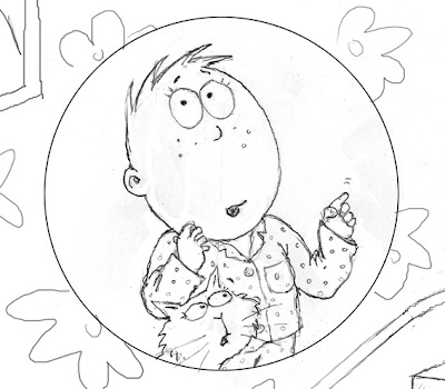
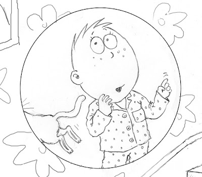
Fellow illustrator Cassia Thomas made a suggestion after a recent post, which sounded good fun, so I have tried out a new version of the vignette where the child introduces us to the big bear. This was my original drawing with him and the cat together:
This is the new one that Cassia suggested, with the cat running off:
As the previous page's vignette shows the child and cat stood together, I think this added humour works much better. To make it credible, I felt I needed to make puss look slightly more scared in the earlier one though:
Thanks Cassia!
It'll be interesting to see what the publisher makes of the vignette system - I'm presenting them with both options.
1 Comments on Thanks Cassia!, last added: 7/18/2009
I shall put those dates to my fabulous dogsitter chums and see if any come out shining!I have informed Faye that I shall be surgically extracting her from her desk and packing her in a suitcase to come along also! xxx
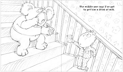
I've just drawn Bears On the Stairs spread 6: where the child bribes his way past the nose-picking koala with a glass of milk:
I like the simplicity of not having the doors showing through the banisters, so I'm wondering whether I can get away with just the floral wallpaper or, probably better, cutting the background altogether and having plain colour. We'll see.
It wasn't until I posted the illustration here that I realised the stairs were way too steep, so I've rotated everything a little (which has given me room to enlarge things slightly too - always good!):
A minor thing, but I'm wondering if Julia might consider changing 'get' to 'give', which would makes slightly better sense with the image...
3 Comments on Finally Getting Past the Koala!, last added: 7/16/2009
I've been lurking here for a long time, but just wanted to say how much I've enjoyed it, and how glad I am that you're sharing the illustration process. It's fascinating to watch as this book takes shape.
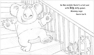
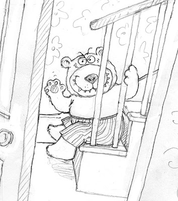
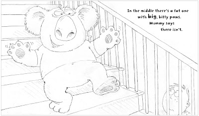
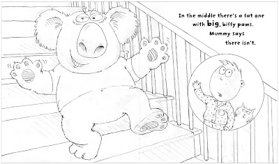
Going back to start work on spread 3 (where we get to meet the fat koalafor the first time) I've hit a new problem... Julia's text goes: 'In the middle there's a fat one with big, biffy paws. Mummy says there isn't.' so I was busy sketching the child and koala together on the stairs, much like this following page (only still half way up, where koala lives).
Then suddenly it struck me - how did the child get past the little bear we have just seen on the previous page, commandeering the bottom step?
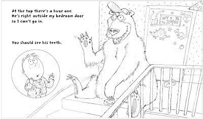
And I realised it wasn't just a problem for spread 3 - how did he get past the koala to be in the following image (the one at the top) meeting Big Bear? Uh-oh. We discover how he bribes the bearslater, but don't know that yet.
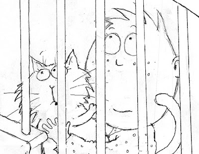
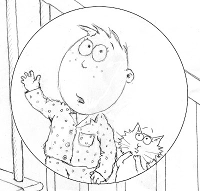
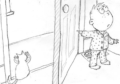
I had a thought: perhaps the child could be peering through the banisters, so he hasn't had to pass little bear at all:
But now it makes even less sense that he would suddenly find himself at the top of the stairs for spread 4!
I could leave the child out of spread 4 altogether, but the bear won't easily fill the space, unless perhaps I lay him down. Another possibility is to include the child as a little vignette within the spread, telling the reader about the bears without actually being there: sort of 'reportage':
If I do this for the big bear page, I think I'll have to do it for koala too, otherwise it would be too weird, but there's plenty of space under the text...
What do you think? I rather like the vignettes, but will show Anderson Press both ideas, and let them decide which works best.
8 Comments on Another Tricky One With the Bears..., last added: 7/15/2009
I'm never sure how much artistic license to take with these problems- especially those times when the non-realist version looks better compositionally. However, I like both your sets.
As an aside, if you do go for vignette, could you have the cat in both vignettes? Looking shocked, paws over eyes typed thing, and then his rear end vannishes as he runs away in the second vignette?
I think the 'reportage' idea works really well, but if you are going to distance the child from the bears by placing him in a vingnette, why not pull the bears as well out of the comfort zone of the stairs and do something completely different. So much of the story is set on and around the staircase that it would be nice to step away from there for a few spreads. My first thought was of the bears all lined up in some sort of police line up, as in 'the usual suspects'. The boy would be distanced from the bears by either the vignette device or the two way mirror and he could then take the time to describe the various bear's paws, teeth etc. It would be a nice way of hinting at the bear's criminality without having to face the problems you have previously had whereby the bears have to be a bit mean, and the best way to show this is by them making direct threats towards the child, but at the same time not presenting a book which is too scary for the kids.
I like the idea of the police line-up Claud. It could look really funny.
Unfortunately I have to stick to the text, which means we have to meet them one at a time. Also, as this is the first time we see them and the stairs, I think it would be a bit confusing for a very small child if they were described as being on the stairs, but shown elsewhere.
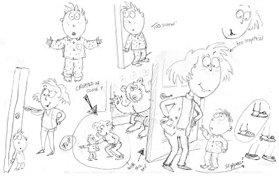
I like the child looking through the banisters! How about for spread 4 if the boy was looking from the hallway up (in the air) - and the bear was looking over the landing/banisters at him (outside the bedroom door) That way the boy could observe all the bears from below (and know he'll have trouble getting to bed) but won't have the problem of how he got past them all? The boy could even be standing on a chair in the hall or something if you wanted him to be closer to the bear, or you could have a good perspective shot up from the boy to the bear?!
Nice idea Joanna, but I'm not sure I could draw it in the spread format: it's almost impossible to do vertical images and retain any dynamism, as everything gets so small trying to fit them in!
I could perhaps get the bear down low enough, looking out from the landing floor, but then we'd lose sight of the bedroom door and he'd lose all impact too. The first time we meet him, I think we need to see him pretty clearly.
I don't know why but I don't like the circle with the boy inside... I think is you can't do Joanna's suggestion... then do the bear at the top without the boy at all (like the bear sitting on the bottom stair).. and maybe do as much perspective of looking from below as you can... maybe even include just the top of the middle bear's head, to give the idea the boy is looking over that bear to the bear at the top.
What about the perspective the other way?? From the top of the landing so the bear is huge and scary, and the boy looks little and scared down below, looking up at him? hmm - guess you can't see the bedroom door like that, but I suppose the reader would assume it was up there behind him??
Get what you are saying about the size issue though.
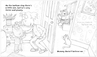
Remember how Joanna's feedback helped me to see my doors weren't working? Well, turns out that re-hanging the door in spread 1 had a major knock-on effect for spread 2...
Julia's text here says: 'Onthe bottom step there's a little one, but he's very fierce and growly. Mummy doesn't believe me.'
Ages ago, when I first looked through the project, I did the above sketch sheet of ideas for this page. A bit later on, I worked it up to this drawing:
I didn't want to take us out into the hall too early: I wanted a transition spread with the child still with Mum, telling her about the bear, which we now see properly.
The touble was, I could find no way to fit this drawing into the layout, without the composition being very one-sided, or the gutter running through the characters and losing any workable space for the text. But, once I rehung the door the other way, it all fell into place:
So thank you Joanna again!
As you can see, the cat fits quite neatly into the picture. Not sure of the best position for the text on the right - the publisher can decide.
1 Comments on Joanna Saves the Day Again!, last added: 7/13/2009
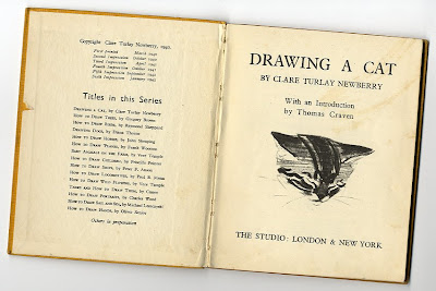
Unfortunately, by the time I decided to include a family cat in Bears on the Stairs, Maddy had gone back home. Drat!
Fortunately I remembered a wonderful old book I have had since I was a teenager, called Drawing A Cat. It was printed in 1945 (!) and was a present from my Dad to my Mum, who also loved to draw, when they were young. Mum gave it to me when I showed real interest in drawing.
It is stuffed with wonderful observational sketches of cats in all manner of positions, so was the perfect reference. I sketched from the sketches to create this crib sheet to work from.
Thanks Mum, and artist Clare Turlay Newberry, wherever you are...
7 Comments on Drawing A Cat, last added: 7/10/2009
what wonderful sketches... nice seeing the variety of poses for this lovely cat.... my favorite's are the "cleaning" shots - isn't it amazing the contortions those animals can create? =)
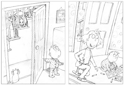
When I showed you the kitchen spread, Joanna left me a comment, that the doors from the kitchen and sitting room appeared to have the same view of the stairs:
I thought it was ok, with a bit of artistic licence - one looks onto the bottom step, the other onto the middle.
Living with it though, I think Joanna was right. I worried this meant a major redraw (as the little bear's foot has to be visible through the crack in the open sitting room door) until I realised I could hang the sitting room door the other way, pushing the bottom of the stairs further down the hall:
You can still see the little bear's foot, and now it's better, as Dad couldn't possible notice it this way round. It's created a perfect spot for the cat too. Thanks Joanna!
Please people, do feel free to leave critical feedback - sometimes, being so close to a project, I miss things, so you are my fresh pairs of eyes.
5 Comments on Taking Your Comments on Board, last added: 7/19/2009
Sorry! didn't want to cause artistic trouble - but perception wise it works in my head now, as the door (and stairs) are now so much closer to the corner of the room, and I can imagine that the kitchen is now right next door (behind that wall) :)
Argh! me again - just realised (looking through the spread) that if you changed the door hinges - you'll need to do so also on the picture you showed on the blog post 'bribery doesn't always work'
Looks like you already changed it in the 'they get them on the way down!' pics.
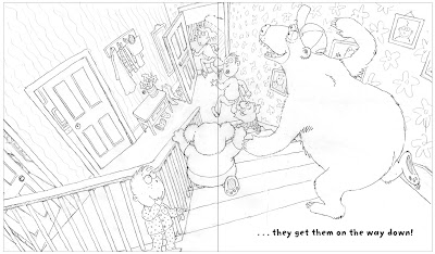
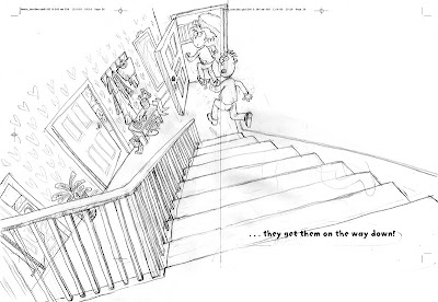
Remember Julia's last line: '...but they get them on the way down!' This is a rework of that spread:
Note the cat's now in, plus pictures on the wall and a narrower staircase to before:
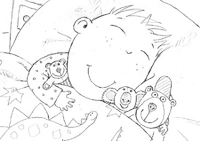
But though a funny punchline, we've decided it's just too scary a note to end on: we don't want kids having nightmares.
What to do? Julia suggested combining two earlier spreads to free up an extra page, allowing me space for an additional final picture, to bring things to a happier conclusion.
I toyed with the child rescuing Mum and Dad: a happy end plus a conquering of fears. But though easy to do given 2 images, it wasn't really possible to get from the image above to happiness and safety in just one picture.
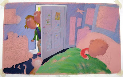
So we decided to finish with the child tucked up in bed, now the bears are gone, as above, with his 3 teddies: obviously the same three bears.
It does still save the parents, since the imaginary bears disappear once they reappear as real teddies. I thought I'd show Mum and Dad looking round the door though, just to reassure the reader that everyone is fine!
I thought the cat would likely be thinking about joining in on the comfort...
5 Comments on A Tricky Dilemma to Tackle..., last added: 7/10/2009
Lynne, I've so enjoyed seeing your sketches and layouts and hearing your thought process through the whole book. Thank you for taking the time to post these - it's quite appreciated. Your compositions have so much energy and childish fun. Can't wait to see the book!
It'll be really interesting for me to look back on too, when the book's out. It takes such a long time in between that I forget a lot of the thinking that went into things.
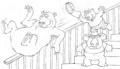
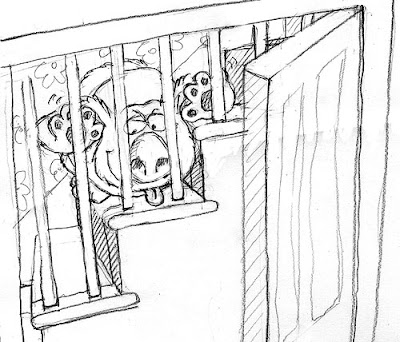
At the end of Bears on the Stairs, Mum and Dad get their come-uppence for not believing their child. As you saw last time, the bears hide when Mum and Dad take the child up to bed, but the bears 'get them on the way down!'.
I had a choice of drawing this scene from various viewpoints, but the bears' perspective, looking down the stairs to Mum and Dad fleeing, seemed the most dramatic:
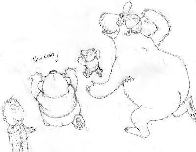
Because the stairs were so complicated, I decided to do the background with parents first, and put the bears on separately. I used layout paper do draw the bears on a layer on top. (I did this drawing early on, before I had changed fatty-bear to a koala):
It was too much to ask that it all fitted the layout perfectly, so I scanned both parts into Photoshop, put them together and messed around with positioning. It was important to move Dad's head out of the gutter (the centre of the spread).
I'm deliberately taking liberties with perspective to add drama and quirkiness. I'm trying to retain this feel throughout.
Like all the other laid-out drawings I've shown you so far, I've printed this spread off. When I have the whole book drawn to this level, I go back through them, redrawing each, tweaking and tidying up as I go. It's important to wait until the end, because things change and evolve (like the koala here and the pet cat idea).
2 Comments on Bears Get Parents!, last added: 7/4/2009
I'm really enjoying this process (watching you do it I mean!) I really admire people who draw perspective with meticulous accuracy but what I admire much more are people who bend the rules of perspective and make it look even better - like you have!x
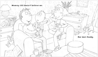
We're a good way through the story by this stage. Mum and Dad refuse to believe about the Bears on the Stairs. Julia Jarman's text for this spread is: 'Mummy says it's my imagination. Have you cleaned your teeth? It's past your bedtime. Go on. Upstairs.'
Since the first two spreads of the book take place in the living room, I thought for visual variety I would take Mum into the kitchen, to make a drink for her and Dad.
As you might have noticed, I'm also considering introducing a family cat (Maddy's influence?):
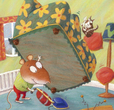
A pet provides another form of interaction with the bears. I invented a cat in Mr Strongmouse and the Baby:
He was handy for sort of representing our eyes on the action, reacting to events in our stead, and so adding another dimension, as well as something for children to spot:
In the Bears spread, in an echo of page 1, I originally had the koala through the open door making faces at the child, but because the door is between them, the child couldn't appreciate it. The cat on the other hand works fine.
The banisters are proving to be a real pain though.
They are always getting in the way. It took ages to get the koala visible enough through the gaps for his position to be readable.
8 Comments on Nobody Believes Me!, last added: 7/19/2009
Love the cat! and love that the pictures have a story all by themselves (from lounge to kitchen to make tea) flows really well.
One thing though! - the view of the stairs from the kitchen is the same as the view from the lounge - impossible?! What if the lounge was opposite the kitchen - so the stairs would be reversed in one of the pics?
Wowzerloof! Things are progressing at a right old pace Lynne! And it's all so fabulous - you are so clever; it's my wildest dream to illustrate a children's book, but I don't know if could! Seeing how you so expertly arrange all the elements on the pages - genius!
Your work is so clean. Soft pastels are so messy...I love them but It is very difficult for me to draw something without contaminate the other areas. A few days ago I saw one pastel drawing of yours in which you explain step by step, but even like this, I can't achieve the same cleanness in my drawings! Can you give me a tip or something?. By the way, I want to thank you because you helped me to feel so inspired again!! Best regards,
Joanna - the kitchen and living room are next door to each other, so the idea is the living room door looks onto the bottom step, the kitchen to half way up the stairs.
Carolina - make sure you are working as large as you can - A2 minimum. Work from the background forward and fix as you go along to stop getting 'muddy'. Good luck!
Anonymous said, on 7/3/2009 7:54:00 AM
Hi Lynne Very funny characters you have on your blog / in your books (I think you need a tv series made of them)
Ha, ha. I would be tempted to make a model of this house. Stairs are impossible to draw and so are hands playing musical instuments. I enjoy your thought processes as you work.


 I then had a play around with some other thoughts, incorporating different characters from inside the book. My editor said he was very keen on the bears, and so I woke up the sleepy, baby polar bear I showed you
 The first tip comes from


 I like the simplicity of not having the doors showing through the banisters, so I'm wondering whether I can get away with just the floral wallpaper or, probably better, cutting the background altogether and having plain colour. We'll see.
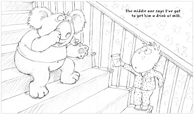 A minor thing, but I'm wondering if Julia might consider changing 'get' to 'give', which would makes slightly better sense with the image...
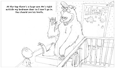
 Ages ago, when I first looked through the project, I did the above sketch sheet of ideas for this page. A bit later on, I worked it up to this drawing:
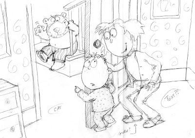

 I thought it was ok, with a bit of artistic licence - one looks onto the bottom step, the other onto the middle.
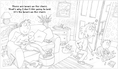
 Note the cat's now in, plus pictures on the wall and a narrower staircase to

 It was too much to ask that it all fitted the layout perfectly, so I scanned both parts into Photoshop, put them together and messed around with positioning. It was important to move Dad's head out of the gutter (the centre of the spread).
  I'm deliberately taking liberties with perspective to add drama and quirkiness. I'm trying to retain this feel throughout.
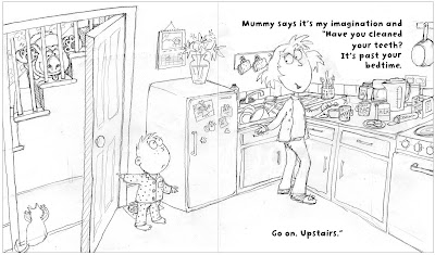
Oops sorry, I left a comment whilst my daughter was signed in and it came up in her name - hence the deleted post from Jules!
So, from me - your Rhinos are such characters! Well, they all are really - I think the anteater looks great and I love the colours going on in your octopus illustration! I must get me a copy of your book when published!
It's really great seeing the progress of these illustrations, thanks ever so much for taking the effort to document it all, I'm really enjoying it.
Lovely pictures too, I really like the rich colours in the shading, they all look really nice and satisfyingly solid :)