new posts in all blogs
Viewing: Blog Posts Tagged with: Composition, Most Recent at Top [Help]
Results 26 - 50 of 118
How to use this Page
You are viewing the most recent posts tagged with the words: Composition in the JacketFlap blog reader. What is a tag? Think of a tag as a keyword or category label. Tags can both help you find posts on JacketFlap.com as well as provide an easy way for you to "remember" and classify posts for later recall. Try adding a tag yourself by clicking "Add a tag" below a post's header. Scroll down through the list of Recent Posts in the left column and click on a post title that sounds interesting. You can view all posts from a specific blog by clicking the Blog name in the right column, or you can click a 'More Posts from this Blog' link in any individual post.

by Connah Brecon (Philomel, 2014)
I fell hard for this book. Heart-itching, squeal-worthy, big time bulging-eyeballs-love.
The title is perfect, right? An ode to the impossibility of putting all of the teensy intricacies of a crush into words.

A girl. A hunt. But she doesn’t really know how to grasp this thing.
Because it’s all . . .
and . . .
Picture sparkles streaming out of a bottle and a warm kitty snuggle. Impossible for words. Only colorful bursts of feeling.
 (click to enlarge)
I love her green dress/red hair combo. Strong complementary colors for a stronger girl. She says she’s not brave, but she’s doing just the opposite.
She leaves a trail of crumbs. Sets a trap. And waits.
It doesn’t work.
 (click to enlarge)
 (click to enlarge)
Good question, little girl. (I love that her love parade is marching down Hope Street.)
So when the rain drips down the sign and the marching band has marched on, she is sad. So sad.
I really want to share my heart but I just can’t find the right way to open it.
The thing is, she had. She did. This whole time. And that’s worth a bang-up ending. You’ll see.
Here’s a fun look at Connah and his creative process, and if you haven’t given the Let’s Get Busy podcast yet, start here.
This is a perfect thing for any Valentine of your very own.


by Yann and Gwendal Le Bec (Flying Eye Books, 2015)
I’m a big fan of Flying Eye Books. They put out a list that’s so unique and unusual and weird and beautiful. This guy comes out in April of this year, and I tend to not write about things before you can get them at your local bookstore or library, but I had to make an exception here. I’m eyeballing an upcoming dental appointment with cringing and gnashing of teeth. (Ha.)
But here’s a story that’s oddly comforting.

Danny’s expression is so full of joy and naiveté and hope, which is hilarious. A two-toothed hippopotamus antsy for a good scrub? Even funnier. And a school of cleaner fish to get the job done? Of course!
The setup here is so weird and wonderful.
And then.
Danny overhears the cleaner fish worry he may have a lisp, on account of that massive gap in his teeth. He doesn’t, of course, but that darn dentist fish’s comment spirals him into self-doubt and worry. The snakes he turns to for comfort do agree that he speaks strangely, but Danny doesn’t know they were a terrible choice for speech comparison.
To the city.

I love this spread. It reminds me of Richard Scarry or The Little House and this color palette is so perfect. The browns of the marsh yield to the yellows and oranges of the city. Danny looks comfortable up in that double decker bus but he’s obviously going to an unfamiliar place. Also, any book with a pink limousine can stick around for a while.
This lithe and lanky dentist gets right to work fitting Danny with some braces for that massive gap. (His office gear is so perfect here: funky wall art, oversized tooth models, and a bookshelf probably more for show than for reading.)
And then:

Now here’s a huge shift in pacing, in main character, and in drama. And it works. Danny settles back into marsh life, the snakes assure him his speech is back to better, and the crocodile heads off to the city for his own newfangled tooth-contraption.
Except:


It’s a picture book about the horrors of dentistry. And not really, of course, but for a dent-o-phobe like me, this story about a tooth doctor and his comeuppance is absurdly satisfying.
Danny is not without its translation quirks, but because the French are so bizarre anyway a clunk here or there is pas trop grove. (And since I Google Translated that, mine might be a bit clunky too. No matter.)
Look for Danny. You’ll smile. But maybe try that without showing your teeth.
Available April 2015. I received a review copy from the publisher, but all thoughts are my own.

by Philip Stead (Roaring Book Press, 2014)
This boy. This book.


We know Philip Stead can tell a story. Even his Number Five Bus interview series (with wife and creative partner Erin and ‘potentially interesting interactions with fellow book people’) is like a bowl of chicken noodle soup and a blanket.
Here’s what I love about this book.
That the copyright page tells us the art was made with pastels, oil paints, and pressed charcoal. Those things make your hands dirty and rub all the story off with it. There’s a feeling of grit there that I can’t quite figure out, but somehow these drawings feel loose and messy and full of both turbulence and elegance. The color is both rich and muted, deep and spare.

This red bird, that shows up on every single page. A constant companion to Sebastian’s wandering. A comfort.

That Philip Stead varies his compositions throughout, so that sometimes you are intimate with this cast, and sometimes you are pulling back for a wide shot of their world. That sometimes you are bobbing along with them and that sometimes you are floating free. That you feel the magnitude of this balloon trip, that you go with the wind too.

This leafless tree that gets the lumpiest-in-my-throat moment when it returns in glorious color. It was hard not to show you what I mean, but if you haven’t seen this part, then see this part. I won’t wreck the magic.

That the closest Sebastian comes to a smile is in sharing pickle sandwiches with his friends.

The way this milky gray fog is drawn. Moody and slightly scary and a barrier between the reader and the page. You can’t warn them about the pop because they couldn’t hear you through its thickness. They have to endure the danger.

That each character’s face is solemn and expressionless, but full of understanding. For each other, for pressing on, for seeing something. The tension there is the curiosity and the hope that they are finding comfort in their journey.


These sisters. Because.
###
This ramshackle roller coaster. Both “the most perfect roller coaster they would ever see” and chipped and faded and bent and broken and overrun with pigeons. And the pigeons, for where they go next.

That Sebastian thought to bring a boat and a ball of yarn.
And that I have a love/hate relationship with Caldecott speculation, but that big moon and patchwork balloon would look especially nice with a third round thing on the cover.
P.S. – Did I tell you about my spin on the Let’s Get Busy podcast with Matthew Winner and Kelly Light? That’s here if you want a listen. This book love guilt thing is no joke, because I keep thinking of other 2014 favorites that didn’t make our list, like this one. Huge thanks to book people for making great things. Don’t slow down. Also, here’s a super conversation between Philip and Jules at Seven Impossible Things Before Breakfast. More art! Not to miss.

By: Carter Higgins,
on 12/16/2014
Blog:
Design of the Picture Book
(
Login to Add to MyJacketFlap)
JacketFlap tags:
shape,
white space,
paul rand,
ann rand,
case cover,
design,
harmony,
color,
space,
balance,
concept,
composition,
endpapers,
color theory,
modernism,
Add a tag

by Ann and Paul Rand (Chronicle Books, 2009; originially published in 1956.)


You might remember how much I love this pair’s Sparkle and Spin, and this one is just as playful and just as true. That case cover surprise is an a delight, and complementary-colored endpapers start this book with a bang.


Paul Rand’s graphic genius is so well-matched by the simple and spare words of his wife, Ann. The text and the pictures both glide through that magical reality of childhood. Things that might seem daunting to someone bested by time are small and accessible. Things that may seem obvious or forgettable are ripe for play and adventure.


It’s a reminder to slow down, listen, and watch. The world is built of wonderful things. The big picture is as beautiful as the details.

Here, the sentiment is the whole of this person. I’m not sure there’s an ending more perfect, not for kids or their grownups. There’s so much more to know, but what you carry with you can stay.

by Isao Sasaki (Viking, 1982)

I’m not too sure if this book is still in print or not, but I snagged it at a used bookstore in Seattle once upon a long time ago. It was the best six bucks I spent in the entire city. Maybe the best six bucks ever.
This book felt familiar, and I’m sure I’ve buried some memories of reading it as a kid somewhere deep inside my book-person-soul. Opening the pages again to a story both calm and busy was also the only way to experience any snow in these parts.
And so, Snow.


The book itself is a square. It’s the soft gray of winter skies. Each illustration is framed within a border of a lighter shade of that barely gray. Maybe it’s its 1982-ness, but it also feels like looking at a slide. Remember those?
Because of this bit of framing, this story is told in snippets like snapshots—of a day, of a season, of a bustling platform, but it also feels like we’re watching from a distance, remembering something that was so simple and sweet.
And at the same time, Snow is intimate. All of the action happens in the foreground. That’s where the train rumbles and the station agent shovels.
Once upon another long time ago I wrote about the rule of thirds, and that’s beautifully at work here.
We’re looking in from the outside, thanks to the white space, but we’re right there with them, thanks to the foreground action. It’s a balance, a push and pull, and some inviting tension in the quietest of stories.

Only one spread has an illustration that takes up the entire page. A wide rectangle becomes a perfect track for rolling in. (Or is it out? But does it matter?) A wide rectangle becomes the perfect break in the pace of this book.
Much like the snow, falling heavier at times, lighter at others. Much like the light of the day, changing from dawn to dark.


At CTN Animation Expo I bought a copy of Robh Ruppel's new art book
Graphic L.A.
, and want to share it with you.
Robh is one of those rare artists whose work spans imaginative and observational painting. He has worked as a designer for video games and films, and has taught at Art Center. He has also been a leader in digital plein-air painting.
While the book contains some landscapes, the bulk of the images are urban scenes. What I like most about his work is his ability to find beauty in commonplace scenes.
The book includes a mix of finished paintings, thumbnail sketches and step-by-step sequences. The sketches are in tone, most often in marker, while the colored finished paintings appear to be all digital.
The sense of color and light in many of the painting is extremely evocative.
Accompanying the images are helpful chunks of advice, such as "Reduce, refine, interpret."
Before he commences a painting, he always explores the possibilities of the subject in two or three tones. "Good value design," he says, "is the clear simple arrangement of a few tones."
He says, "Searching out the composition should take as long as rendering the image. Ultimately, the staging is what tells the story."
The book is 144 pages, about 8x8 inches.

 by Karina Schaapman (Dial, 2014; originally published in the Netherlands in 2011.)
This book.
This book is massive and mini all at once.
Its press release calls it Beatrix Potter meets I Spy. A fitting description, that one, but I might call it George and Martha meets The Ultimate Alphabet meets a craftier Cardboard Challenge.
This is the Mouse Mansion. Karina Schaapman spent years creating this architectural wonder, dreaming up more than 100 rooms and passageways and outdoor spots to explore.
She also dreamed up Sam and Julia, the teensy mice who live in its walls. Here they are. (Click to enlarge.) The Mouse Mansion is oversized and so is its book. It holds the best of treasures to look at and imagine. Sam and Julia have seventeen chapters of adventures together. They are small stories with big trouble, small creatures with big heart.
Sam and Julia don’t have enough pennies for the white chocolate with rice bubbles, so they buy broken cookies.
They smile about it.
Sam plays the violin and gives Julia the shivers.
But she’d never tell him how terrible he is.
They burn pancakes and make powdered sugared messes, but agree that pancake day is the very best day. That’s what best friends do.
My favorite of all of their escapades is their interaction with Sam’s grandpa, down at the fish market. Julia is shocked to see the pictures of an anchor on his arm and a pirate on his tummy.
Julia is very curious. “Why do you have all those drawings?” she asks. “What are they?”
Grandpa smiles. “They are not drawings,” he says. “They’re tattoos. And each one tells a story.”
Yes, you do. You need this treasure chest of a picture book. You need to see these two critters overload the washing machine and hoist barrels of lemonade up to the loft.
Just try not to squeal too loudly. The triplets are sleeping.
For more pictures of the Mouse Mansion’s bitty charm, check out this post by Julie Danielson at the smorgasbord that is Seven Imp.
Thanks to Amanda and Caitlin at Penguin for the images and a review copy of the book. Thoughts my own.
By: Carter Higgins,
on 10/28/2014
Blog:
Design of the Picture Book
(
Login to Add to MyJacketFlap)
JacketFlap tags:
design,
color,
early readers,
concept,
board books,
composition,
shape,
size,
home grown books,
Add a tag
 by Cecile Dyer and Kyla Ryman (Home Grown Books, 2014)

 I’ve written before about how I’m a sucker for board books, but this new-to-me publisher has raised the board book bar. These books are both meaningful and beautiful, which is a touch balance to strike in a book so seemingly simple. This one, Dress Up, shows a series of cats with killer expressions donning all sorts of odds and ends. A fancy cat fastens a bow to one side, a dapper cat sports a vest. Mask! Scarf! Glasses! Cats with style, for sure.
 This board book is a second edition reprint, because it originally showed up in teensy paperback form as part of a 9-book Little Reader series, The Play Book Set.

 See Dress Up up there with the orange cover? The insides are similar, but the pictures are bordered with white space holding the words.
Nothing in these books is too cutesy, too precious, or too simple. The art is sophisticated, accessible, and challenges a little brain’s wonderings.

 Kids need good art, and Home Grown Books is doing a bang up job fitting that bill. (Plus, any sax-playing hen is fine by me.)
Clever packaging includes tips on how to read with the bittiest in your family. Talk about the pictures! Make connections! Everyday concepts meet rich art. It’s a lovely thing.


Eco-friendly and recycled paper to boot! Lots to love about these new books on the block. Find a babe, stat.
Here’s illustrator Cecile Dyer talking about watching the world, interacting with young readers and artists, and of course, these these tiny, book-shaped treasures.
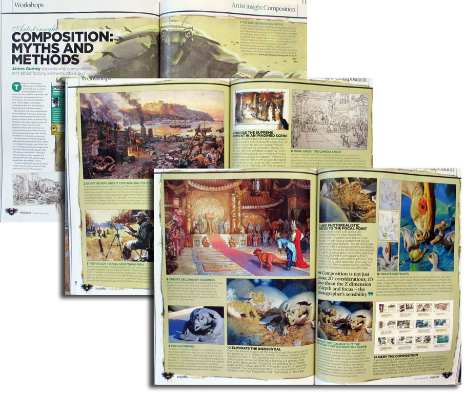
The new issue of
ImagineFX magazine, coming to newsstands soon, has an article that I wrote about composition.
It begins by resisting the usual approaches to composition, which typically lay out systems of geometric grids, or talk about controlling the eye, or present a series of design prohibitions.
But wait! If you take away those elegant systems, what's left? I struggled a bit with this because, like my hero Howard Pyle, I'm suspicious of rules on this subject, and I believe composition is best taught on a case-by-case, picture-by-picture basis.
In the end, I decided to approach the topic from a completely different direction. I thought the best place to start is by identifying the core emotion or idea of the piece. Then I offer some basic aesthetic tools to help get that idea across to the viewer. My topics include:
• You've got to feel something first.
• Do lots of thumbnails.
• Choose the supreme moment.
• Think about the viewpoint and eye level.
• Simplify extraneous details.
• Downplay the secondary areas.
• Push extremes.
• Eliminate the inessential.
• Add photorealistic focus to the focal point.
• Make the color suit the emotion.
• Create contrasts.
• In a sequential work, vary the compositions.

By: Carter Higgins,
on 10/7/2014
Blog:
Design of the Picture Book
(
Login to Add to MyJacketFlap)
JacketFlap tags:
harmony,
color,
balance,
composition,
movement,
line,
motion,
shape,
penguin young readers,
christopher myers,
form,
misty copeland,
firebird,
Add a tag
 by Misty Copeland and Christopher Myers (Penguin Young Readers Group, 2014)

When you open a book to sweeping, fiery endpapers, it’s almost as if you can hear the symphony begin. The author, Misty Copeland, is a principal dancer with the American Ballet Theater. The illustrator, Christopher Myers, is a Caldecott Honoree for Harlem and the son of the legendary Walter Dean Myers.
We are in stellar storytelling hands.

(image here // Copeland dancing the Firebird)

(image here // Copeland dancing the Firebird)

Christopher Myers’s art captures the lines and shapes of a dancer’s movement. Intricate, suspended, and dizzying.

Misty Copeland’s words are fire and poetry to a timid youngster’s soul.


I adore the anticipation in this spread, the dancer waiting for the curtain to rise, and I imagine a lump in her throat and a belly full of as many swoops as the folds in the curtain.


Each page turn reveals a composition that is even more striking than the last. This is a pairing of musicality, movement, and a jaw-dropping array of colors and feelings. The way her words and his pictures create an animated harmony is exactly how music and movement do the same in the ballerina’s world.
A perfect pas de deux.

For more on Misty Copeland, take a look at this. She is a lovely storyteller, both in her books and with her body.

Review copy provided by the publisher.
By: Carter Higgins,
on 8/18/2014
Blog:
Design of the Picture Book
(
Login to Add to MyJacketFlap)
JacketFlap tags:
design,
printing,
color,
composition,
color palette,
dahlov ipcar,
CMYK,
lithographs,
remastering,
flying eye books,
Add a tag
 (image here.)
by Dahlov Ipcar (Flying Eye Books, 2014; originally published 1958.)
The great folks at Flying Eye sent me this book a while back, and I’ve been staring at it for weeks. Months. It’s enchanting. And simple. And complex. And a huge restoration effort, which was a bit mind-blowing to understand. That’s why I consulted the experts.
But if you don’t know Dahlov Ipcar and her bright body of work, check this out first:

Because her original plates were lost long ago, Flying Eye figured out a way to bring this story to many new readers. It’s remarkable. Here’s my conversation with Sam Arthur, Flying Eye’s Managing Director. And of course, some really beautiful art. (Click any of the images to enlarge.)

Can you describe the original way the art was created? I understand it to be color separated plates, but is that the best way to describe it? Sort of like a silkscreen process?
The original separations would have been created on drafting film or trace paper. In this way the process is very similar to preparing artwork for a silkscreen process. The main difference being that offset lithography allows for subtler more detailed textures than most screen printing processes as the ‘screen’ (meaning dots that make up the image – also known as half tone) is made up with smaller dots. I think Dahlov made her original artwork using mixed media, collage, pastel brush and wash.
So the original art was unavailable, I assume? Can you describe the steps in the process to remaster the work?
The original artwork had been lost over the years, so our challenge was to recreate the new book using artwork from finished books that were from the original print runs (printed in the early 60s). All of the information we required was in these books. Most publishers would have simply scanned the images and printed them using standard CMYK reproduction (a composite image made up of dots using cyan, magenta, yellow and black). Our intentions were different, we wanted to produce the book in the same way as the original, which used 4 different special spot colours (or Pantone colours as they are now called).
In order to reproduce the book using the original printing technique, we had to recreate the original separations from the flattened, printed artwork. That was the tricky bit, we had to scan the artwork at very high resolution and then using photoshop un-pick the colours and put them into separate layers. The difficult thing is where the colours overlap each other, sometimes it’s difficult to see and it helps to have the original book to hand. So in the end the process uses photoshop selection tools, but also hand retouching. It’s a skilled job. 

How many people worked on this? How long did it take and how long was it in the works?
The first book we did was The Wonderful Egg and it took 5 weeks to complete all of the images. There were two of us working on it, but we had a tight schedule and when it came to working on I Like Animals we had to call on three others to help us meet our deadline.
Was the way color was printed in the 1950s and 1960s drastically different from today? How?
In the 50s and 60s most of children’s books that were illustrated were printed using separations created by the illustrator. As time went on and technology improved illustrator’s artwork would be photographed and translated into CMYK separations using a photographic process. In the early days presumably this process was more expensive than simply asking illustrators to provide their own separations. Many children’s books also had a 4/2 colour scheme – meaning half of the book would include 4 colour images and the other half would have 2 colour images. This would save money in the printing process and also give the illustrator slightly less work to do on the 2 colour images. It does give these books a nice rhythm as you turn the pages. It was a practical consideration that has fed into the aesthetic, that’s quite interesting in itself.
(image here.)
I’m curious if you got any backlash for republishing something with incorrect factual information? As a reader (and a librarian!) I love the choice, and see such value in preserving a particularly lovely era in picture books, but I wonder if you received any negative feedback. (Hope not.)
We have had a few comments, not really negative ones, more observations of the change in thought on the origin of dinosaurs etc. I think most people realise quickly that it’s an old title, so there is different kind of appeal when reading it. Also as I stated above the key story behind the egg, is still relevant in today’s thinking.

Why did you all decide to remaster this book, and are there plans for others as well? (We are thankful and we are hopeful, too!)
We decided to remaster this book as it felt quite contemporary in it’s treatment of the subject matter even though knowledge of the subject has changed, but the key message is still widely accepted in palaeontology. The illustrations are beautiful and we wanted to Dahlov’s this work to a new generation. This year we also released her book I Like Animals, next year we will be re-publishing Black & White and Wild & Tame Animals also by Dahlov Ipcar.
Cool, right? What a legacy! Big thanks to Flying Eye for gathering us all around the campfire in celebration of great stories.
And speaking of color separations, check out this post at Seven Impossible Things for a look at how Jonathan Bean is doing the same thing in a contemporary picture book. Unreal. But very real, which is the great news.

Thanks to the folks at Flying Eye (Tucker, Sam, and Emily!) for the images in this post. I received a copy of The Wonderful Egg, but all thoughts are my own.
Tagged:
CMYK,
color,
dahlov ipcar,
flying eye books,
lithographs,
printing,
remastering 
By: Carter Higgins,
on 8/5/2014
Blog:
Design of the Picture Book
(
Login to Add to MyJacketFlap)
JacketFlap tags:
color,
space,
composition,
color theory,
color palette,
shape,
size,
helen stephens,
complementary colors,
how to hide a lion,
Add a tag

How to Hide a Lion (Henry Holt, 2013. Originally published 2012 in the UK.)
by Helen Stephens
One hot day, a lion strolled into town to buy a hat.
Of course he did. That frilly blue thing in the window is pretty fancy after all. This beast only has eyes for that bonnet, and bypassed the bakery without even a side eye. But while the beast has eyes for the bonnet, the townspeople have eyes for safety and decorum. They chase him out.
And like any smart wild animal, he finds refuge in a kid. A kid who was not scared of him in the least. A kid who saw a problem that needed solving. A kid who saw her world differently. She knows he needs hiding, and I think that’s such a beautiful example of what it must be like to be a kid. You have this vague awareness of things that are problems for grownups, and yet you attack them as if those grownups are absurd.
That’s kid truth. That’s a great thing for this lion.
There’s smushing behind the shower curtain, there’s lounging on the limb of a tree, and there’s plenty of bed-jumping. And still, when he overhears Iris’s parents saying there’s no such thing as a kind lion, there’s sadness.
But.

The way Helen Stephens is using color in this book is both sweet and striking to me. This lion, large and yellow, takes up a lot of space on pages of close ups. And his girl, Iris, matches him a bit with her yellow arms and brown mane. That’s sweet. That’s friends who can see themselves in each other.
But the blues. Loose complements to the wild yellow of the beast, the wild brown of Iris’s hair. Ever notice when a book is cracked open, the edges of the cover frame it a bit? This one is blue, a lovely turquoise. The endpapers are a shade of sky and a deep navy. Those pages and that cover peek around the story itself.
A little touch of blue, giving this lion a hug.
Just like Iris. 

These vignettes! The gag is a an unhide-able lion, right? It’s an impossibility that’s highlighted with the use of these orange-yellows and blues.
After the lion escapes his Iris-refuge, he blends in to his surroundings. A camouflaged cat, if you will. He holds his breath between two marble-sculpted friends. I don’t want to show you the spread, cause Big Things Happen, but take a look at the colors of that page. His hiding is a success. No need for blues to offset his presence.
Also, I love how this book is pretty big. That’s obviously not a very technical or artistic term to to reference trim size, but it’s true. A lion is tricky to hide, and the physical space this book takes up is the gentlest nod to the absurdity of that task. Besides, a lion wouldn’t fit in a smaller book, right?
He’d be much harder to hide that way.
PS: Be sure to visit this post from Danielle at This Picture Book Life. There’s some secret-spoiler-y-easter-egg things on the pages of this book, and her post is the coolest.
Tagged:
color,
color theory,
complementary colors,
helen stephens,
how to hide a lion,
shape,
size 

The Story of Frog Belly Rat Bone (Candlewick, 2003)
by Timothy Basil Ering
I have a feeling this is one of those books that you either adore to hyperbolic proportions or is completely off your radar.
I’m in the hyperbolic proportions camp, but it’s still a book I forget about. And then when I remember, I wonder how I forgot?!
So this is an origin story, one that starts in Cementland and ends in gritty beauty.
The first spread is so perfect. A wide shot of Cementland, described as a dull, gray, endless place. A boy, arms open and striped in red, stands at your attention in the midst of all that gray. All of the lines and the stress and the mess lead you right to him.
This red-striped fellow believes treasure hides among the heaps of junk in Cementland, and in a triumphant moment finds a box bursting with color. Bright colored packages, but filled only with tiny gray specks. Hundreds of them. Not wondrous riches.
He plants anyway. And after two or three minutes, nothing happens.
While he’s gone, thieves root and loot the plot. So this boy–this treasure hunter, gathers smelly socks, scraggly wires, and of course, a crown, and dubs his creation Frog Belly Rat Bone, the monster who will protect the specks.
They are a duo with a mission and a patched together friendship that pays big rewards.
That’s why Timothy Basil Ering’s use of texture is the only possibility for this type of storytelling. The art is the story. It’s stitched up. It’s not slick. It’s piled up and layered and cobbled together just like Frog Belly Rat Bone himself. There’s warmth in the mess and intention in the scatter. It’s as beautiful as that treasure that the red-striped boy finds. And creates.
“…[W]hen I first made the dummy book for Frog Belly Rat Bone, naturally, I beat up some wood and sewed it all together. It gave it that nostalgic, cobbled-together look that’s just plain interesting to me. I wanted it to look like it was made the same way the little boy in the story makes Frog Belly, with just raw hand-stitching and splashes of paint.”
(That’s from here, which is a great read!)
It’s definitely one I want to share early in the year with our fourth graders who are the school’s expert gardeners. It would pair well with The Curious Garden (for obvious reasons) but also classic unlikely friendship stories. Isn’t a trash-made monster-thing with picky underwear a pretty unlikely friend? I’m thinking about Amos and Boris and Leonardo the Terrible Monster.
Giveaway Update: Thanks for playing! I’ve picked the winners, but I’m going to wait until my order comes in from the bookstore to share the spoils. We had to special order a few titles. Did you know your local indie will do that for you?! And then you get to go back. Stay tuned!
Tagged:
candlewick,
color,
texture,
timothy basil ering 
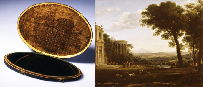
For over three hundred years, people have tried to identify ideal landscapes in terms of paintings.
A landscape would be called picturesque if it resembled a painting by
Claude Lorrain (1600-1682) or Nicolas Poussin. A tourist would travel with a darkened mirror called a '
Claude glass' or 'Lorrain mirror' to see a reflection that reminded them of a familiar landscape painting.
Scholars have debated what aesthetic factors qualify a scene as picturesque, and it usually boils down to a scene that satisfies the human instinct for beauty and the sublime. Others have said that there needs to be an element of roughness or variation, or a pleasing distribution of masses of trees or ruins.
The notion of what is picturesque has evolved as our taste for images has changed. If you google the term 'picturesque' all by itself, you don't get paintings; you get a lot of
HDR photos of nature scenes with mountains and water features, and occasionally a domestic human structure integrated into the landscape. Our collective visual imagination is probably influenced as much by calendar photos and computer screen savers as it is by gallery paintings.
What do you think of when you hear the word "picturesque?"
------
Previously on GurneyJourney:
Lorrain mirrorPicturesque in Wikipedia
By: Carter Higgins,
on 6/16/2014
Blog:
Design of the Picture Book
(
Login to Add to MyJacketFlap)
JacketFlap tags:
process,
concept,
rhythm,
little brown,
composition,
thumbnails,
guest post,
tom lichtenheld,
richard t. morris,
this is a moose,
design,
sketches,
Add a tag
 Remember Moose and his motley crew? He’s hard to forget with that superhuman (supermoosian?) determination and antlers tuned toward mischief. Let me turn the reigns over to Tom Lichtenheld himself, so he can give you a look at his process, sketches, and creative problem solving. It’s a fascinating look at how an illustrator responds to an author’s manuscript, and a glimpse at the evolution of a picture book.
Welcome back, Tom! When I receive a manuscript and like it, the first thing I do is start doodling. That initial moment of inspiration only comes once, so I try to capture the first images that pop into my head.
 Then I start refining and exploring options.
 The director was initially a raccoon, but a duck felt more manic.
 I spent a lot of time on film sets during my career in advertising, so I know it’s a lot of hurry-up-and-wait.
 No, giraffe don’t live in the woods, but I like to draw them, so a giraffe it is.


 Lots of gags get left on the cutting-room floor, but it’s all part of the process.
 Boom!
Boom! An idea revealing that the movie was actually made, which makes no sense.
 First crack at a title page.
  (click to enlarge)
First version of the opening scene. The narrator was a monkey, and part of the scene. We quickly realized that the director had to be “off-camera” until the end. First version of the spread where Director Duck realizes none of the animals are playing by the rules. I liked the simplicity of having only his eyes move, but it was a bit too subtle, so I changed it to his entire head looking from side to side.
 (click to enlarge)
The Moosenest
Turning this marvelously manic manuscript into a logical sequence of pictures required complete immersion, so I made a foamcore enclosure around my desk, with only Moose material within my sight lines, and dubbed it The Moosenest. It sounds like a joke, but there’s a point in sketching out a book where you need to have the entire book suspended in your mind at once, so you can mentally move the pieces around without losing sight of any elements. It’s challenging, but one of my favorite parts of the process and I don’t think I could have done it for This Is A Moose without The Moosenest.
A marvelously manic manuscript with mayhem in the pictures. Thanks for letting us in to The Moosenest, Tom!
(I love that moose-like alien. I’m glad he got his day here.)
Tagged:
composition,
little brown,
process,
richard t. morris,
sketches,
this is a moose,
thumbnails,
tom lichtenheld 
By: Carter Higgins,
on 6/3/2014
Blog:
Design of the Picture Book
(
Login to Add to MyJacketFlap)
JacketFlap tags:
scbwi,
design,
illustration,
picture book,
typography,
color,
lego,
rhythm,
trailers,
character sketch,
composition,
rubin pfeffer,
movement,
thumbnails,
teenage mutant ninja turtles,
motion,
white space,
short film,
arree chung,
ninja!,
Add a tag
 by Arree Chung
published June 2014 by Henry Holt and Company, an imprint of Macmillan.
Friends, I’m so excited to have Arree Chung in this corner of the internet today. I met Arree last summer at SCBWI in Los Angeles, and am humbled every time I think about how we share an agent and a friendship. He’s an expert storyteller with a bright, animated style and a fresh perspective. Ninja! is his debut picture book, and it will be far from his last.
First, you should watch this short film. And here’s my confession. Arree sent this to me a number of weeks ago with the caveat that it was unreleased and not to share. Except: it was too awesome not to. So I showed it to my students, because single-digit-aged kids are pretty good at secrets and don’t have Twitter accounts anyway.
They loved it. And I mean L O V E D I T. Each class, without fail, asked to watch it many, many times in a row. So we did.
Meet Maxwell, and then meet Arree.
What has been the most surprising thing about this whole debut picture book thing?
The most surprising thing about the publishing process is how long it takes to actually bring a book to market (1.5 – 2 years). My background is in games, where companies can publish with the click of a button and make updates via the internet. The process gives me appreciation for the care that goes into the publishing process. It also helps to have a great team of people to work with. Everyone from your agent, publisher, editor and art director in making the book and then there’s publicity, marketing and sales folks that help in getting the book out. An early cover design.
 revision notes.
I’m fortunate to have a supportive publisher in Macmillan. They have a great team of experts. Each one helps you with a specific aspect of the publishing process. I’ve learned so much. I’m so grateful I’ve been in good hands. I’ve worked hard to hold up my end of the deal and make something special. With Ninja it was easy, because I loved it so much.
Who are your creative and/or literary heroes?
Oh, so many!
Authors:
Roald Dahl
E.B. White
Jack Gantos
Judy Blume
Jeff Kinney
Illustrators:
Russell Patterson
Chris Ware
Yuko Shimitzo
Author/Illustrators:
Shel Silverstien
Wolf Erlbruch
William Steig
Mo Willems
Peter Brown
Leo Lionni
Maurice Sendak
Ian Falconer
Jon Klassen
David Shannon
Bill Peet
Calef Brown
Comics:
Jim Lee
Scott McFarlane
Jeffrey Brown
Bill Watterson
Jim Davis
Charles Schulz
Animation/Film:
Brad Bird
John Lassetter
Guillermo Del Toro
Chris Sanders
Danny Boyle
Tim Burton
Nick Park (Wallace & Gromit)
Steven Spielberg
Hayao Miyazaki
Can you talk about the similarities and differences in animation and the picture book form?
I love both mediums for different reasons. Both mediums can transport the reader into new worlds. I love it when a book or movie captures my imagination and I am completely immersed in a world that has been built. The world is invented but it feels familiar and the story resonates with honesty. I hate it when a story is force feeding me a message and it feels like an infomercial or when a story rambles without a focus. Storytelling is magical when it has both the imagination and heart and speaks to you directly and honestly. A great story is so exhilarating. There’s nothing in the world that feels like it. I love both animation and picture books because they have the ability to create magic.
How they are different? Well, I think the main difference is that film tends to be a passive experience. The viewer is in a dream like state that watches the story unfold. It’s like being suspended in a time capsule and you watch everything that happens. You take the story in a more subliminal kind of way.
 Books on the other hand I think are active experiences. You as the reader actively interact with the words and pictures. It’s like your brain is the film projector and is working to play the story. Because of this, I think books are much more intimate experiences. You go at your own pace. You stop, question and wonder. Sometimes you’re so engaged, you speed all the way through and sometimes you like to read slowly just because. Readers engage books with their imaginations and a lot of the story is told in-between the words, the page turns and the illustrations whereas films are full experiences that use all the arts of composition, acting, music and visuals to put you in a state of suspension.
Both are magical and I love doing both so much.
Can you give us any behind-the-scenes information on how you created the short film? Did you get to know Maxwell differently in that format?
Yeah! It was so thrilling to bring Maxwell to life. I had a pretty good idea of who he is as a character after creating the book but actually seeing him move and casting Taylor Wong as Maxwell brought another whole dimension.
As for production, here’s a quick behind the scenes look of what it took to make the short film. I plan on doing a much more in-depth look in a separate blog post.
We used 4 software tools: Photoshop, Flash, After Effects and Final Cut Pro. The process was a highly collaborative effort between folks at MacMillan, myself and David Shovlin, the animator. It was a ton of work to do but a ton of fun as well.
In all, it took about 5 weeks of work. David and I worked really hard on it and I’m really proud of what we created in a relatively short period of time. Where did Ninja! come from?
It’s been my dream to make my own picture books for a long time. The first conception of Ninja came when I was in art school. I jotted down “A boy goes creeping around the house dressed as a Ninja and causes trouble.” That was probably in 2007 or so.


 Early Ninja! thumbnails and character sketches.
In 2012, I decided to do the Illustrator Intensive at the SCBWI Summer Conference. We were given an assignment to submit a story along with a manuscript, thumbnails, character sketches, and a finished illustration. Up to that point, I had been writing stories for years but was stuck on many of them. For the workshop we had to write down answers to the following questions:
WHO
WHAT is the dilemma?
WHERE does it take place?
HOW is the problem solved?
This really helped me a lot. Previous to this, many of my stories didn’t have focus and wandered a lot. Ninja was a big break through for me as a storyteller and I had lots of people who helped guide me through it. I’m so thankful for Rubin, my agent, and Kate, my editor. The more I worked on it, the more the world and character took shape and gained depth. It was so much fun to make.
Do you remember any art you made as a kid? What was it?!
Yeah, I made a lot of ninja stars and origami. I was also obsessed with Legos. I loved to build cruiser space ships and large fortresses armed to the teeth. Whenever my uncle bought us Legos, we would make the thing we were supposed to make and then tear it apart and then make what we wanted to make. Making your own thing was much more fun.
I was a huge comic book reader and collector as well. I bought all of the X-men, Spiderman, Spider-ham, Batman and Spawn comics. I still buy comics.
I also really love the Teenage Mutant Ninja Turtles. I used to record all of the episodes. In fact, I used to press pause on the VCR and trace drawings of the Ninja Turtles by overlaying paper onto the TV. At school, everyone thought I was the best drawer, but I never told anyone my technique til now! Eventually I copied so many drawings I could draw it out of memory. I tried to do the same technique with Transformers but that wasn’t nearly as successful because I didn’t understand perspective as at 12 year old.
And now what’s next for you? I’ve got a lot of things I’m working on. I have lots of Ninja stories to tell with Maxwell. (I’m so excited about all of them!) One of them involves an old Chinese folktale involving ghosts!
I’m also illustrating two Potty Training books for kids that are hilarious. illustrations from How to Pee
I have lots of picture book stories I’m developing and I’m also writing a middle grade novel titled Ming Lee, All American. Ming Lee chronicles my experiences growing up as an ABC (American Born Chinese). It’s deeply personal and is funny in that Louis CK, embarrassing but honest kind of way. I would describe it as Judy Blume meets Diary of a Wimpy Kid. Of course, it is its own thing that I am figuring out. I have a sense of what I want it to be but you never know what it will be until you get there.


A huge thanks to Arree for this peek into the mind of a master craftsman. Be sure to get your hands on Ninja! this week!
Tagged:
arree chung,
character sketch,
design,
illustration,
lego,
ninja!,
picture book,
rubin pfeffer,
scbwi,
teenage mutant ninja turtles,
thumbnails,
typography 
By: Carter Higgins,
on 5/27/2014
Blog:
Design of the Picture Book
(
Login to Add to MyJacketFlap)
JacketFlap tags:
design,
space,
book trailer,
concept,
rhythm,
giveaway,
scale,
penguin,
trailers,
sophie blackall,
composition,
spot illustrations,
white space,
proportion,
nancy paulsen books,
full bleed,
the baby tree,
Add a tag
 by Sophie Blackall
published 2014 by Nancy Paulsen Books, at Penguin Kids About a year ago, I heard Sophie Blackall give a keynote at SCBWI Western Washington. She wears great tights and shoes and is a total riot. She had this effervescent spirit that had the whole room in stitches. It felt like watching one of her illustrations bounce right off the page and into the room.
See, I’m a big fan. Ivy and Bean are soul sisters. I gushed about The Crows of Pearblossom and The Mighty Lalouche over at Design Mom, and still stand by this tweet from the end of 2013.
Her work has sprinkles of fairy dust or something in it – something enchanting and mysterious and compelling and darn beautiful.
And this, her latest offering, is both calming and humorous, sweet and sassy. It’s a bound and beautiful answer to the dreaded where do babies come from?
She’s so in tune with the vast (and sometimes creepy!) imagination of a youngster, and look at how that plays out in this art. Real life is a spot illustration, surrounded by white space and unknowns. But the what if bleeds to the edge of the page, filling every millimeter with color and wonder and possibility. Not only is it stunning to see, it’s intentional storytelling.
 Hat tip, always, to Jules at Seven Impossible Things Before Breakfast for the interview that revealed that delicious tidbit. Check out her interview (and more art!) with Sophie here.
Sophie works in Brooklyn with other illustrators Brian Floca, Ed Hemingway, John Bemelmans Marciano, and Sergio Ruzzier. Can you even imagine spending an hour in that studio, soaking it all up and trying not to faint and fall in it? Dream field trip, for sure. Their kinship and support of one another has always been so apparent. Look here, and here, and here to see what I mean.
But also, look inside The Baby Tree for a glimpse at their love and support of one another. What’s our pajama-clad wonderer reading with Mom and Dad, all cozied up in bed? I won’t spoil it for you, cause it was a gasp-moment for me. If you’ll bust without knowing, check out Danielle’s post over at This Picture Book Life about allusions in picture books. (And stay there a while even once you see what I’m talking about, cause how brilliant is that?!)
You’d like a copy, right? Penguin has two to give away to you! (And you!) Just leave a comment on this post by Monday at noon PST, June 2nd. I’ll pick two, and have the stork deliver The Baby Tree right to your doorstep. Good luck!

Review copy provided by the publisher, all thoughts and love my own.
Tagged:
book trailer,
composition,
full bleed,
giveaway,
nancy paulsen books,
penguin,
sophie blackall,
spot illustrations,
the baby tree,
white space 
By: Carter Higgins,
on 5/13/2014
Blog:
Design of the Picture Book
(
Login to Add to MyJacketFlap)
JacketFlap tags:
design,
illustration,
typography,
book trailers,
color,
balance,
trailers,
composition,
movement,
color theory,
color palette,
CMYK,
shape,
greg pizzoli,
disney-hyperion,
spot color,
Add a tag
 by Greg Pizzoli
published 2014 by Disney-Hyperion
I’m honored and thrilled to have Greg Pizzoli back to the blog this week. About a year ago we talked about Kroc and The Watermelon Seed, and in the many weeks since, that thing (and Greg!) won the Geisel Award! My kindergarteners call him ‘the BURRRRPPP man’ which I’m pretty sure is the highest praise any mere mortal can achieve.
But today! Today is the birthday of Greg’s latest and greatest, Number One Sam. This is my favorite tweet about it: (And side note, you should follow Matt Roeser at Candlewick cause he has impeccable taste and eyeballs.)
And this (!) is the trailer:
Greg chatted with me about process and art and picture books, and I’ve read these answers about a billion times and am still learning. Enjoy!
Your spot color. Wow! Can you talk about why such a stripped-down design with a limited color palette is such a powerful visual device?
Great question!
To be honest, I’m not sure. But, I think it comes down
to working from an intention, and just having a plan, or restrictions
set in place from the beginning. You can’t just grab another color
from somewhere – when it comes time to make final art, we’ve done
rounds of pantone tests and paper tests, and the limitations and
possibilities are in place, so nothing is casual. Maybe it makes you
consider things in a way that is unique to working in that way?
I know for me, if I’m doing a book that is printed in a limited color
palette, it can feel restrictive in one sense, but there is a real
freedom within the limitations, if you know what I mean. There’s not
endless guessing the way there might be with a CMYK book. Obviously we
do lots of tests and make sure we get the base colors right for the
book, but once that is done, I can start carving out the drawings and
not worry too much about the colors, because we’ve done so much work
on the front end. It’s a challenge I enjoy.
Here’s a photo of a spot color test proof.
Why do you think your stories are best suited to the form of the picture
book. What can you do in this form that you might not be able to in another?
This is a tough one, Carter. Boy, I come to your blog looking to have
a good time, maybe show a video or something, and you slam me with
this “why picture books” stuff. Sheesh. “Gotcha blogging” right here.
But that’s fine, I’ll play along.
I’m kidding, of course. But, it is a tough one. I guess it’s not all
that complicated for me. I’ve always loved picture books and I think
it’s because there are so many possible ways to solve the problem of
telling a story with text and images. It’s a cliche I think, but you
really can do anything in a picture book. But here again, I like the
restrictions. As much as I might complain to my editor that I “just
need one more spread” to tell the story, it’s actually nice to have a
structure where you have to fit a complete world, with a character, a
problem, and (maybe?) a solution to that problem in only 40 (or so)
pages.
There’s something about how deliberate every decision has to be
that is super appealing to me. I’ve been working on writing a longer
thing recently, a series, and it’s not as though I’m not deliberate
when working on it, but I’ll admit that it feels as though not as much
is hinging on each line or picture in the same way. With picture
books, you don’t have room for anything to feel arbitrary. I like
that.
Also, I thought you might want to see these. Sam started out as a
print of a weird dog (top) and then I made a print of another
(cuter) dog, and he kept coming up in my sketchbooks until he became
Number One Sam (bottom).

What do you think are the most important considerations when creating a book trailer?
How do you think through compressing an already spare narrative into a short
animation? Are there aspects to animation you wish you had access to in
picture book art or vice versa? (I guess mostly I’m curious about how book
trailers share storytelling space with picture books and what they can do
differently. Does that make sense?!)
Ya know, it’s a complicated thing this book trailer business. I am
really happy with the two we’ve done so far, but I definitely can’t
take all the credit. Jimmy Simpson, directed and animated both the
trailer for The Watermelon Seed and for Number One Sam, and he is
pretty incredible to work with. Both times we started working, I had
already finished the book, and I had a very basic sense of what I
wanted the trailer to be, but he figures out all of the transitions
and added all of the touches that make them work as well as I think
they do. For example, the “wink” shot from the Number One Sam trailer –
that’s all Jimmy. And of course, he does all of the animation.
I draw the stuff, which is somewhat complicated because you have to
keep everything separated, meaning draw the arm on a different layer
from the body, and the hand on a different layer than the arm, and the
ear on it’s own layer, etc. Basically everything needs to move
independently of everything else, but my characters are pretty simple,
so it’s not too big a deal.
And the music is key. My buddy Christopher Sean Powell composed the
music special for both trailers. What a talent, right? He plays in the
band Man Man, and has his solo music project called Spaceship Aloha,
and was a part of a pretty seminal band from these parts called Need
New Body. I’m thrilled we get to work together on this stuff.
But, to your actual question, I see the trailer and the book as
completely separate things. They have their own pacing, and their own
objectives. With the book, you want everything to feel complete, and
have an emotional pay off of some kind. And you have the narrative arc
to keep things together. With the trailer, it’s more of a tease. You
don’t want to give it all away. And I guess our objective is to just
make them fun and unique.
Book trailers have become more popular, and there is a sort of
template for how they are done that we have tried to stay away from.
We just want them to feel different enough to maybe stand out. It’s a
super small community in some ways, and my book trailers certainly
aren’t racking up millions of views or anything, but we enjoy making
them for their own sake, partly I think because we all just like
working together. If other people dig them, and check out the book on
top of that, that’s icing.
What types of trophies do you have lining your shelves? What kind do you
wish you had? Side note: What would a book called Number One Greg be about?
Beyond my published books, which I kind of think of as trophies in a
way, there are a couple. Last year when I finished the art for Number
One Sam, my editor Rotem sent me a trophy that I keep on my bookcase.
And recently I was looking through some old family photos and found a
first place ribbon that I had won for a school wide art contest in
the 1st grade. My family moved around a ton when I was little, so the
actual winning piece was lost. I remember it though! It was a big
piece of yellow poster board with a marker drawing of outer space.
Maybe it’s time to do a space book?
 And now for some art from Number One Sam. Thank you, Greg! (Click to make any of them larger.)


Tagged:
book trailers,
CMYK,
disney-hyperion,
greg pizzoli,
illustration,
spot color 
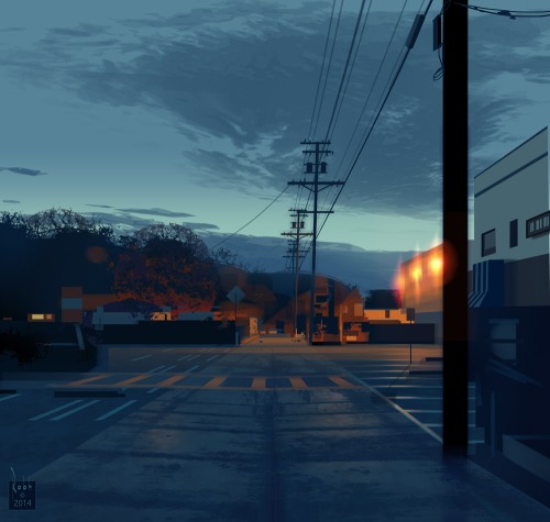
On the newsstands now is a special collector's edition about dinosaurs from Scientific American. The cover image is the running Giganotosaurus that I painted a while back. (Thanks, Gene)
Note that this is the cloudless version of the image. A later state of the painting (below) includes cirrus clouds and a flock of pterosaurs.
For this picture I used a compositional device called a "Dutch angle," where the camera is tilted off its vertical axis to lend a sense of unease, tension, or impending danger.
The term
Dutch angle (also called Dutch tilt, canted angle, oblique angle or German angle) comes from the movie world, where it was pioneered in the 1919 German film
The Cabinet of Dr. Caligari.
It was also often used by illustrators doing movie posters and paperback covers in the 1970s and 1960s.

This poster by Frank McCarthy has it all: guns, girls, explosions, bright colors, and a Dutch angle.
And John Berkey used it in this hydro ship, which would have looked more static if the horizon had been level.

By: Carter Higgins,
on 4/30/2014
Blog:
Design of the Picture Book
(
Login to Add to MyJacketFlap)
JacketFlap tags:
color,
space,
balance,
light,
negative space,
composition,
color palette,
abrams,
layout,
nikki mcclure,
white space,
paper cut,
contrast,
collect raindrops,
design,
Add a tag

by Nikki McClure
published 2014 by Abrams Books (reissue)
Every soul who has seen Nikki McClure’s art has loved it. I’m sure there are studies and statistics on that, trust me. It looks as elegant on an iPhone case as it does on a gift tag or greeting card.
But then there are books, and thank goodness she makes them. This edition of Collect Raindrops has been reissued in an expanded form and a new format. It’s based on her ongoing calendar series, and begs to take up permanent residence on your coffee or bedside table. Don’t just stick it on the shelf. You’ll want this one at easy reach. It’s gorgeous to touch, to see, and to behold.

 Here, her pictures are gathered by their season, each introduced with love letters to their very time and place.
“Some people just need help to see the obvious. And that’s what artists are for.”
That sentiment comes from this short film that demystifies her process but reveals a lot of magic. She calls it corny, but I call it lovely:
She says her paper cuts are like lace, and everything is connected. Before it’s in a book, can’t you picture what that art looks like held up against a light? Physically, the paper that remains envelops the paper that is gone. Like knots, or filaments, or branches. How beautiful then, that her subject is often community. Shared memories and experiences.

 The contrast is what connects us. As much story lives in what’s been carved away as what sticks behind. But by simple definition, contrast means difference, and in design, your brain is searching for dominant elements. This art contrasts light and dark, filled and white space, and in those separations paints a portrait of community.

 And then there’s the case cover itself. A web, a symbol itself of creativity and connection, binds the pages together.
 Isn’t that remarkable?
Tagged: abrams, collect raindrops, contrast, light, negative space, nikki mcclure, paper cut 
By: Carter Higgins,
on 4/21/2014
Blog:
Design of the Picture Book
(
Login to Add to MyJacketFlap)
JacketFlap tags:
balance,
etsy,
rhythm,
penguin,
texture,
composition,
color palette,
kit chase,
oliver's tree,
Add a tag
 written and illustrated by Kit Chase
published 2014, by G.P. Putnam’s Sons, an imprint of Penguin I’ve always had a soft spot for elephants, ever since I had a sweet stuffed one as a kid. He played ‘You Are My Sunshine,’ so of course, Sunshine was his name. And I don’t know who I’m kidding with the kid thing, cause Sunshine still lives with me. He’s a dear.
And lately, I’ve had a tender thing towards trees and how much they give us. Some are big enough to hug, and some snap at the landing of a songbird. All are homes.
 Add a little Beatrix Potter-esque art, and a story that stays endearing without dipping into the saccharine side, and I’m completely charmed. The dust jacket says it best: ‘there’s a reason we don’t see elephants in trees.’
I love this elephant, Oliver. I love that when all he sees is despair, he takes a nap. Spectacular coping skill, Oliver! Thank goodness that his friends aren’t defeated, and they get to work searching and gathering.
 I’m adding the spread below to my inner rolodex of perfect picture book spreads. The words and the illustrations balance each other and don’t compete for attention. It slows down the action, builds suspense, and gives the reader a chance to predict what happens on the other side of the page turn. And the twig frames are just plain lovely. So: pretty perfect.
 I hope this isn’t the only story Kit Chase is brewing with Oliver, Charlie, and Lulu. I feel like they have a lot to say and share.
Want to see more of her art? A dash of dear and a pinch of perfect? All of the pieces below are in her Etsy shop, trafalgar’s square. Huge thanks to Kit for sharing these with us!


Review copy provided by G.P. Putnam’s Sons.
Tagged:
etsy,
kit chase,
oliver's tree,
penguin 
By: Carter Higgins,
on 3/31/2014
Blog:
Design of the Picture Book
(
Login to Add to MyJacketFlap)
JacketFlap tags:
balance,
pattern,
rhythm,
black and white,
value,
texture,
composition,
line,
repetition,
perception,
contrast,
who needs donuts?,
mark allen stamaty,
design,
color,
Add a tag
 By Mark Alan Stamaty
Published 1973 by Dial Press, reprinted 2003 by Alfred A. Knopf, an imprint of Random House Children’s Books.
At first glance, the answer to this book’s title is pretty clear. Because, everybody. But do you know this book? When I mention it to someone, I either hear about their favorite jelly donut (the one with strawberry), or they lose their sprinkles over the magnificence of this screwy tale.
The simplicity of the setup:
Sam lived with his family in a nice house.
He had a big yard and lots of friends.
But he wanted donuts, not just a few but hundreds and thousands and millions — more donuts than his mother and father could ever buy him.
Finally one day he hopped on his tricycle and rode away to a big city to look for donuts.
The scattered spectacle of the scene, a commotion in black and white. On those initial pages alone:
A bird in swim trunks
A roof-mowing man
A chimney blowing ribbons
A man in the window reading a newspaper with the headline, Person Opens Picture Book Tries to Read the Fineprint
Two donuts
And a cinematic, get-ready-for-your-close-up page turn. (Be sure to look closely in the blades of grass.) There’s almost a calm in the chaos. It’s regular and rhythmic and pandemonium and patterned all at once. Perfect for a story that’s a little bit bonkers and a whole lot of comfort.
So. Then what? The relative calm of Sam’s neighborhood yields to an even madder and mayhem-ier sight.

 Then Mr. Bikferd and his wagon of donuts shows up.
And a Sad Old Woman. And Pretzel Annie.
Sam continues to collect donuts. Stocks and piles of donuts.
 A wagon breaks. A repairman helps. A love story. Abandonment.
(A fried orange vendor. A bathing zebra. Rollerskates. A Sad Old Woman.)
Who needs donuts when you’ve got love? When Sam rides home, the words that began his story are on the sidewalk. I get the shivers about that.
The starts of stories are carved in concrete.
P.S. – These pictures remind me a little of what I’m seeing for Steve Light’s new book, Have You Seen My Dragon? Check out this review where Betsy Bird notices the same, and this post at Seven Impossible Things Before Breakfast, because it’s always a treat. I also think of the hours I’d spend as a kid studying each square centimeter of The Ultimate Alphabet. Like Waldo, but weirder.
Tagged:
black and white,
color,
line,
mark allen stamaty,
pattern,
repetition,
rhythm,
texture,
who needs donuts? 
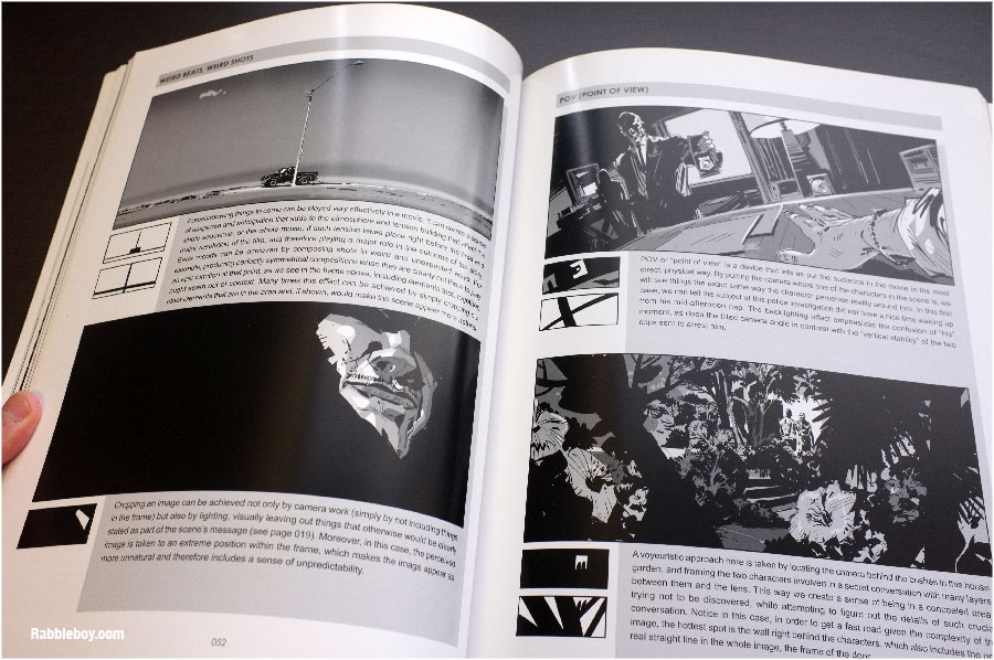
There's an old rule that animators keep in mind: "Put it where you can see it."
It's true for illustrators, too. When you're designing a picture, the parts of the pose that are important to the story should be in clear view, while the less important parts can be concealed.
For this illustration in
Dinotopia: The World Beneath
, I wanted to show Arthur Denison helping a young Giganotosaurus free his foot, which was trapped between some fallen logs. While I was planning the picture, I thought about what things I needed to show to explain what was going on: Arthur's face and hand, the dinosaur's face and the tip of his tail, his ankle, and the logs.
I didn't need to show the dinosaur's hands, Arthur's feet, or the details of plants on the ground, so those parts could be hidden or blurred. The greenish brown background tone helps to disguise unimportant edges at the bottom of the picture.
Because Arthur's face was especially important, I contrived a lot of lines to radiate out from it, a compositional technique called "
spokewheeling."
Read More


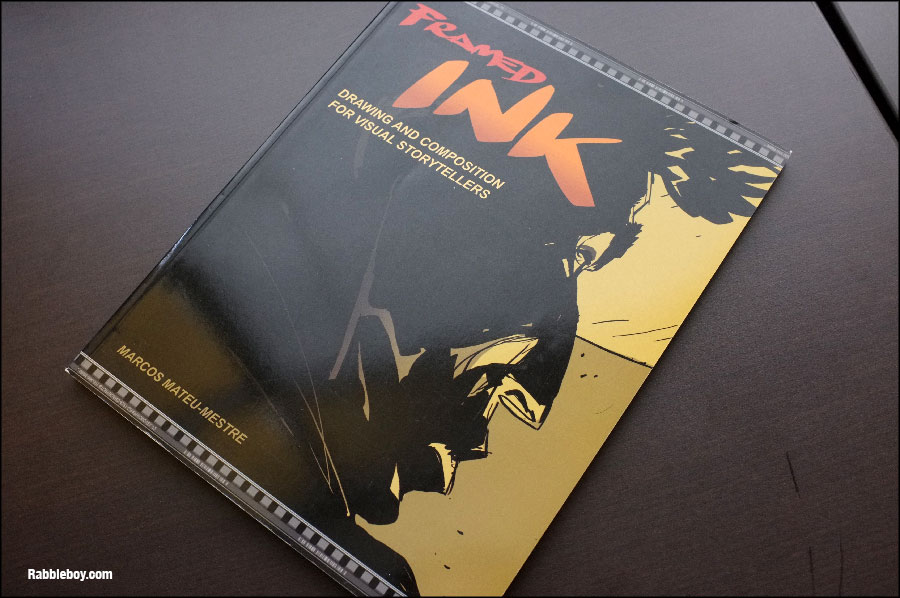
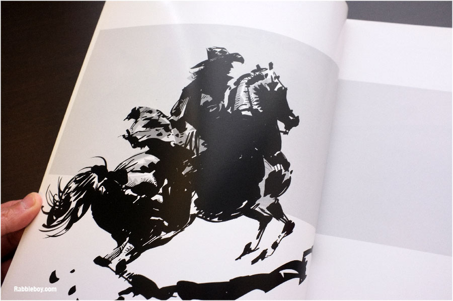
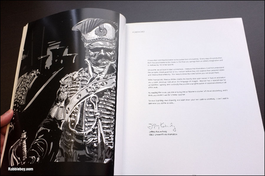
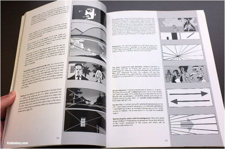
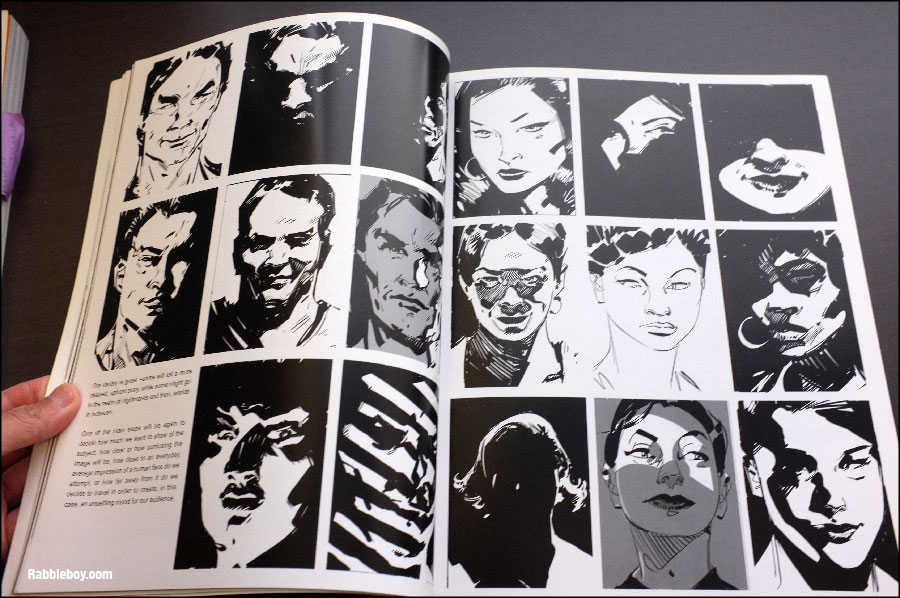
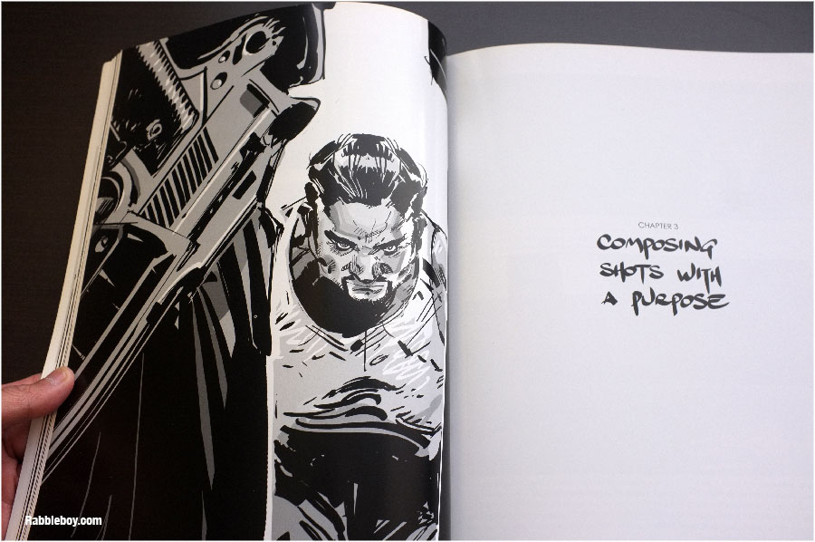
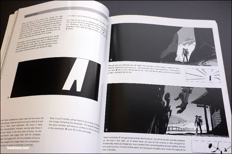
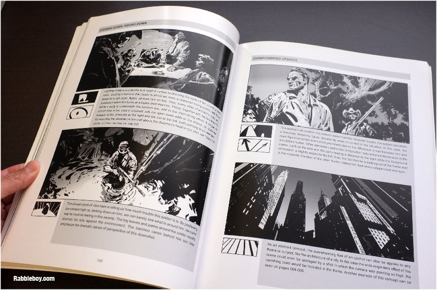
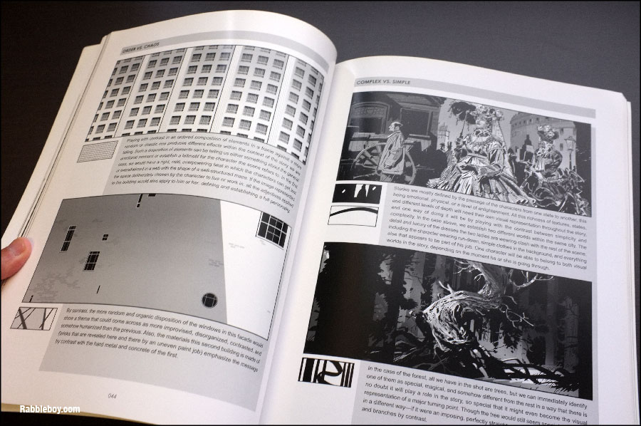
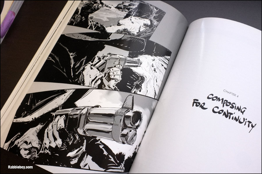
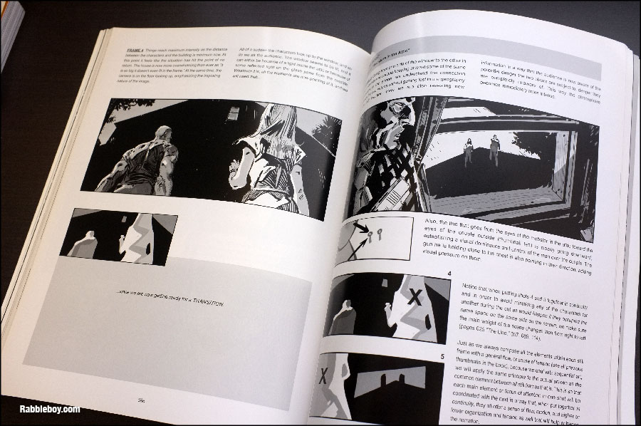
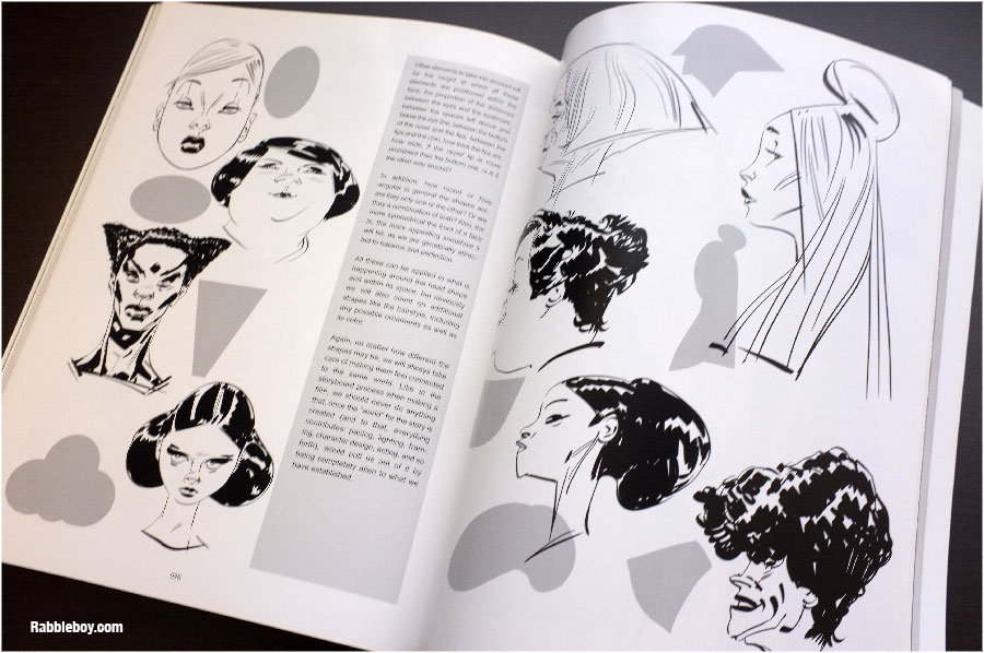
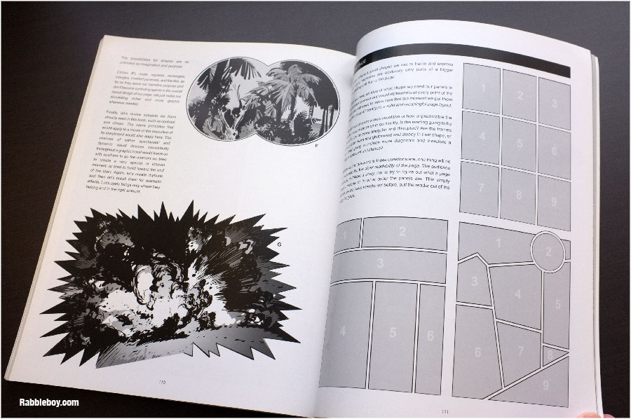
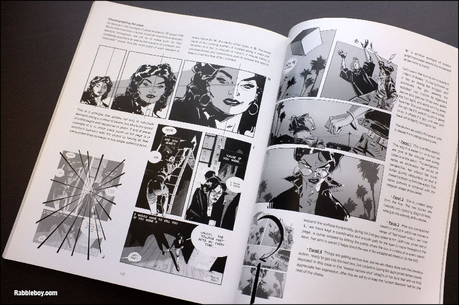
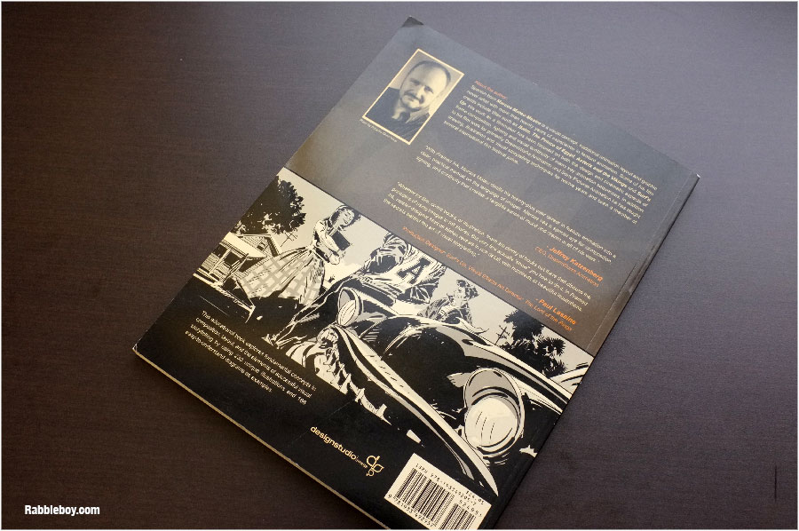
By: Kenneth Kit Lamug,
on 2/28/2014
Blog:
RabbleBoy
(
Login to Add to MyJacketFlap)
JacketFlap tags:
Storyboarding,
Framed,
Jeffrey Katzenberg,
rabbleboy,
Marcos Mateu-Mestre,
Composition for film,
Drawing comics,
how composition works,
how to compose,
Book Reviews,
Graphic novels,
ink,
composition,
Add a tag
By: Carter Higgins,
on 10/22/2013
Blog:
Design of the Picture Book
(
Login to Add to MyJacketFlap)
JacketFlap tags:
design,
color,
balance,
pattern,
texture,
composition,
layout,
paul thurlby,
unity,
Add a tag
 by Paul Thurlby
{published 2013, by Templar}
You know you have a book problem when you forget what lives in your piles. I bought this book when it pubbed back in March, and that tiger’s binocular’d glare stared me down the other day. I snatched it from the pile with the furious preying eyes of the creatures bound in this book.
(Dramatic? Sorry. You must not have heard Carmina Burana playing in the background of my opening monologue. Do you hear it now?!) In the early days of this blog (almost two years ago!), I wrote about Paul Thurlby’s Alphabet. I made lame jokes about Thanksgiving (‘if you’re stuffed, feast your eyes on this!’), so as you can see my wit and humor hasn’t improved much since.
Good thing Paul Thurlby has.  And that statement is a stretch as commentary on his genius, but I do think I might like this one even more than his last. This is a mashup of pictures and words in the most clever of ways.
 Each page shows us an animal bursting with personality. Look at that rat! (Reminds me of these rodents a little bit!) And each is captioned with a quirky fact which explains just what the heck is happening in the illustration. Here, it’s:
Keeping their skin moist by showering is important for elephants’ health.
and
Rats spend a third of their lives washing themselves.
Dolphins sleep with one eye open, while resting one half of their brain at a time.
Lions hunt at night, thanks to their ability to see well in the dark.
 Because the factoids lean toward kooky, the pictures’ silliness both shine and remain surprising.
 When I talked about Paul Thurlby before, I mentioned unity. Still holds. Still a package wrapped up in perfect pictures and words. But what I am most drawn to in his work are his textures.
  The grid, the distressed edges, the scratches, tape, and imperfections – all of those design decisions add a layer of warmth and grit to a bunch of terrifying but desperately adorable creatures.
Watch out for giraffes if you’re on stilts and run across them in the wild. They have 21-inch tongues!
Tagged:
color,
paul thurlby,
texture 
View Next 25 Posts


 (click to enlarge)
 (click to enlarge)


.jpg?picon=1009)