new posts in all blogs
Viewing: Blog Posts Tagged with: negative space, Most Recent at Top [Help]
Results 1 - 9 of 9
How to use this Page
You are viewing the most recent posts tagged with the words: negative space in the JacketFlap blog reader. What is a tag? Think of a tag as a keyword or category label. Tags can both help you find posts on JacketFlap.com as well as provide an easy way for you to "remember" and classify posts for later recall. Try adding a tag yourself by clicking "Add a tag" below a post's header. Scroll down through the list of Recent Posts in the left column and click on a post title that sounds interesting. You can view all posts from a specific blog by clicking the Blog name in the right column, or you can click a 'More Posts from this Blog' link in any individual post.

By: Carter Higgins,
on 8/11/2015
Blog:
Design of the Picture Book
(
Login to Add to MyJacketFlap)
JacketFlap tags:
chronicle books,
balance,
wordless,
negative space,
wordless picture books,
color palette,
line,
white space,
jihyeon lee,
Add a tag

by JiHyeon Lee (Chronicle Books, 2015)
Hello to you! And you! And you!
Here I am, ready to flip my g o n e f i s h i n g sign back around.
First, have you had a nice summer? I have been away from the grind, sitting on a deck, writing books and reading them, and it’s been so very nice to be off the grid for a while. But I do miss my books.
You might have seen today’s floating around this summer, and I can’t think of a better one to celebrate the season.
Pool. The word itself conjures up both serenity and splashing chaos, and both of those things exist inside this book.
At its heart, this is a tale of a friendship. Even as grownups there’s a dance to the early moments of togetherness, and this story is that thing in book form.
A boy at the edge of a pool, all the hope of his day before him. A crowd, scary with its wacky floats and almost-tentacles.

(click to enlarge)
That’s when he dives, under it all and to the quiet, and that’s when he meets his friend. And that’s when things get weird. Isn’t that how it is with friendship? You see new things together, you name the new things together, you create a new kind of community together. The fish and plants and the world under the crazies is bizarre to us, but is it to them? Perhaps not.

(click to enlarge)
That’s the beauty of finding a friend in the quiet places, whether or not you were looking.
And at the end, when the crowd is exiting to the left, the friends leave to the right. Those two, going forward. Together.

(click to enlarge)
This is one of those books that I fell in love with when I first saw the cover. And it’s worth wondering why.
I love that the face could belong to either the girl or the boy. I like to think it’s after the magic, both because of the sweet smile and the still-dreamy fish, reflected and real. And I love that by staring at us, it’s almost an invitation. To play, to swim, to step away from the crowd at the edge of the pool.

Can’t get enough of this book? Me either! Here are some other places I loved reading about it. Danielle at This Picture Book Life paired it with the most adorable pool floats (ice cream sandwich!), and there’s still enough summer left to make that dream a reality! JiHyeon Lee is over at Picturebook Makers talking about the story behind the story and shares some process pictures, which I can’t ever get enough. And you can download some free Pool wallpapers at Chronicle’s happy home online. Enjoy the swim!
Thanks to Chronicle for the images in this post!
 by Michael Arndt (Chronicle Books, 2014)
This book won me over when I saw it last year, and it’s one that is fun to peek into again and again. And how is that the case with something so simple, but so sophisticated? So spare, but so complex? That’s the best truth of design.
Here’s what’s happening. Each spread shows an animal and its sound. And each animal is mostly made up of the letters of that sound.
It’s a fun puzzle to unlock. The portraits are bold and saturated in color, often different than we’d see them in the wild.
But here they are, wild anyway.


I do love an animal book that goes beyond the usual suspects, don’t you? A mosquito! Not my favorite friend by any means, but he looks good and menacing here.


This small volume is a perfect primer on both typography and onomatopoeia.
And it’s got killer endpapers.

A portion of proceeds from Cat Says Meow goes to support animal rescue organizations, including the ones from where Michael’s dog (Clooney!) and cat (Aiden!) were rescued.
And for more type fun, play this kerning game and see how your eye stacks up to a designer’s. Or this one on letter forms, which is a bezier curve bonanza.
Would you like a signed copy? And these one of a kind bookmarks and vinyl stickers! You do, yes. Leave a comment here or share this post on Twitter before midnight on March 8st, PST. Good luck!


All images are © 2014 Michael Arndt. Thanks to the artist for sharing them (and an awesome giveaway!) here. And be sure to check out his Instagram if you love all things type, animal, and lovely. It’s a great one!
By: Carter Higgins,
on 9/30/2014
Blog:
Design of the Picture Book
(
Login to Add to MyJacketFlap)
JacketFlap tags:
candlewick press,
balance,
pacing,
negative space,
perspective,
line,
layout,
jon klassen,
mac barnett,
sam and dave dig a hole,
design,
Add a tag

by Mac Barnett and Jon Klassen (Candlewick Press, 2014)
You know Mac and Jon. You love Mac and Jon. Now meet Sam and Dave. You’ll love Sam and Dave.
Don’t rush into the pages just yet. This is one of the best covers I’ve seen in a long while. If we weren’t so aware that Jon Klassen (that insta-recognizable style!) is a contemporary illustrator, I would wholeheartedly presume that it was some vintage thing in a used bookstore. A find to gloat about, a find that makes you wonder just how you got so lucky.
The hole. The space left over. The words, stacked deeper and deeper. The apple tree whose tippy top is hidden. Two chaps, two caps, two shovels. One understanding dog.
Speaking of two chaps, two caps, and two shovels, check out the trailer.
(I’ll wait if you need to watch that about five more times.)
The start of their hole is shallow, and they are proud. But they have only just started. Sam asks Dave when they should stop, and this is Dave’s reply:
“We won’t stop digging until we find something spectacular.”
Dave’s voice of reason is so comforting to any young adventurer. It’s validating that your goal is something spectacular. (Do we forget this as grownups? To search for somthing spectacular? I think we do.)
Perhaps the pooch is the true voice of reason here, though he doesn’t ever let out a bark or a grumble. Those eyes, the scent, the hunt. He knows.

(click to enlarge)
And this is where Sam and Dave Dig a Hole treads the waters of picture book perfection. The treasure, this spectacular something, is just beyond the Sam and Dave’s reality. The reader gets the treat where Sam and Dave are stumped. Do you want to sit back and sigh about their unfortunate luck? Do you want to holler at them to just go this way or that way or pay attention to your brilliant dog? Do you root for them? Do you keep your secret?
The text placement on each page is sublime. If Sam and Dave plant themselves at the bottom of the page, so does the text. If the hole is deep and skinny, the text block mirrors its length. This design choice is a spectacular something. It’s subtle. It’s meaningful. It’s thoughtful and inevitable all at once.

(click to enlarge)
And then – then! Something spectacular. The text switches sides. The boys fall down. Through? Into? Under? Did the boys reach the other side? Are they where they started? Is this real life? Their homecoming is the same, but different. Where there was a this, now there is a that. Where there was a hmm, now there is an ahhh.
Spectacular indeed.
I like to think that the impossible journey here is a nod to Ruth Krauss and Maurice Sendak’s collaboration, A Hole is to Dig. That’s what holes are for. That’s what the dirt asks of you. It’s not something you do alone or without a plan or without hope. Sam and Dave operate in this truth. They need to dig. There’s not another choice.

(image here // a first edition, first printing!)
Sidenote: I’m pretty thrilled that these scribbles live in my ARC.

Look for this one on October 14th.
SAM AND DAVE DIG A HOLE. Text copyright © 2014 by Mac Barnett. Illustrations copyright © 2014 by Jon Klassen.Reproduced by permission of the publisher, Candlewick Press, Somerville, MA.
By: Carter Higgins,
on 8/13/2014
Blog:
Design of the Picture Book
(
Login to Add to MyJacketFlap)
JacketFlap tags:
color,
chronicle books,
concept,
negative space,
color palette,
shape,
flashlight,
contrast,
die cut,
lizi boyd,
inside outside,
Add a tag

by Lizi Boyd (Chronicle Books, 2014.)
I really love Lizi Boyd’s work. It’s this perfect mix of oh, of course and oh, I never. Once upon a time I wrote about Inside Outside over on Design Mom, and I’ve been looking forward to this new book for a good while. It’s a great thing to have room for more.
And can you stop looking at that cover? I can’t. It’s beckoning, it’s comforting, it’s hurry-up-and-get-adventuring.
So I was lucky enough to have a chat with Lizi Boyd about creating books, the sound of picture books, her process, and her dogs. Thanks for welcoming your book to the world with us this way, Lizi.
(Click any of the images to enlarge.) Can you talk about where this book came from? Was it always in the pipeline along with Inside Outside, or did working in that form spark the idea for Flashlight?
One night when I was working on Inside Outside I realized the dogs had been out for a long time. It was very dark and I took a flashlight to look for them. I heard noises in the field and when I flashed the light suddenly there was color; their eyes, collars, the apples and grasses. It was so cool! And then I thought, oh, a book. I couldn’t wait to get inside and google around to see if it had been done. It seemed so utterly simple and wonderful. I began the sketches for it the next day. So, yes, Inside Outside influenced the idea because in working on that book it was utterly quiet and still in my studio and that encouraged the idea for Flashlight. How do you know when something is working, and how do you know when something is overworked?
When it’s a wordless book I need to just go along with a very quiet head and allow the idea to tell itself. I actually have to ‘see’, by making the drawings, where it’s going to take me. And I need a completely empty house because my studio is in our house.
Mostly I know when to pause and wait it out or take the dogs for a good long walk and think about what I’m working on. That being said I just filled up a box with sketches for other projects that are little beginnings and seem not to be ready to tell me what they’re about and where they’d like to go.
Why do you think your stories are best suited to the form of the picture book? And specifically in Flashlight, I feel like a sensibility exists with the excitement and adventure of something so seemingly dangerous: the night, the dark, the strange creatures. Can you talk to that a bit?
It hadn’t occurred to me until I was making Inside Outside that a book and its story could belong to the readers ‘telling of the story’ not just the one the author is writing and illustrating. Picture books are all about this but I want to see how far I can stretch this idea. So I’ll surprise you by saying that the nighttime element; the dark, the strange creatures, a sense of danger was never part of my thinking. My sons weren’t afraid of the dark. The notebook I kept while working on Flashlight has these words; story + imagination + silence. Sound/elemental. A book one can ear if one really listens. (One does ‘hear’ books!) Can you talk about the physical design of the book? The paper, the ink, how you got such lush blacks (which I think is difficult!) and how you engineered the peeks and surprises of the die cuts? Did the design of the book drive what had to happen in the story or vice versa?
I tried out several shades of gray / black papers and settled on the blackest one. I loved the way the beam of the light popped and the colors too, all of which needed to be painted over several times to get their finished strength. The die cuts were made with templates so on the finished illustrations there weren’t any holes just a tracing of where the cuts would be made. This part was difficult and there were quite a few changes done by Sarah Gillingham, art director, with her brilliant eye and computer skills! Many of the die cuts surprised us.
What are some of your favorite books and/or art from childhood? What is your favorite piece of art hanging in your home or studio?
I grew up in an artistic, visually inspired house. Our mother was a mid-century potter who moved her studio from NYC to VT. There were lots of books every kind; art, nature, children’s books and interesting objects of design all around us.
I love primitive masks and have a few real beauties. (A man recently came with his five-year-old son and said, “Do these masks frighten you?” – something that hadn’t occurred to me. His son was so busy with his iPad that I don’t think he noticed them. Maybe they could have frightened him away from his iPad for a moment?) What modern picture books do you look to for inspiration and encouragement?
I have a stack of picture books in the studio. My friends, far and wide, send me books from everywhere; France, Italy, Germany. And I have some new ones from Chronicle, all exquisite; the printing, the paper and the design. Flashlight became the book it is because of Chronicle’s eye, care and hand in the myriad production details.And take a look at this lovely trailer for more of a sense of Flashlight’s magic.
To all of our boxes of little beginnings!

Thanks to Chronicle Books for the images, a review copy of the book, and connecting me to Lizi Boyd. Thoughts and opinions my own.
Tagged:
chronicle books,
color,
contrast,
die cut,
flashlight,
inside outside,
lizi boyd,
shape 
By: Carter Higgins,
on 4/30/2014
Blog:
Design of the Picture Book
(
Login to Add to MyJacketFlap)
JacketFlap tags:
color,
space,
balance,
light,
negative space,
composition,
color palette,
abrams,
layout,
nikki mcclure,
white space,
paper cut,
contrast,
collect raindrops,
design,
Add a tag

by Nikki McClure
published 2014 by Abrams Books (reissue)
Every soul who has seen Nikki McClure’s art has loved it. I’m sure there are studies and statistics on that, trust me. It looks as elegant on an iPhone case as it does on a gift tag or greeting card.
But then there are books, and thank goodness she makes them. This edition of Collect Raindrops has been reissued in an expanded form and a new format. It’s based on her ongoing calendar series, and begs to take up permanent residence on your coffee or bedside table. Don’t just stick it on the shelf. You’ll want this one at easy reach. It’s gorgeous to touch, to see, and to behold.

 Here, her pictures are gathered by their season, each introduced with love letters to their very time and place.
“Some people just need help to see the obvious. And that’s what artists are for.”
That sentiment comes from this short film that demystifies her process but reveals a lot of magic. She calls it corny, but I call it lovely:
She says her paper cuts are like lace, and everything is connected. Before it’s in a book, can’t you picture what that art looks like held up against a light? Physically, the paper that remains envelops the paper that is gone. Like knots, or filaments, or branches. How beautiful then, that her subject is often community. Shared memories and experiences.

 The contrast is what connects us. As much story lives in what’s been carved away as what sticks behind. But by simple definition, contrast means difference, and in design, your brain is searching for dominant elements. This art contrasts light and dark, filled and white space, and in those separations paints a portrait of community.

 And then there’s the case cover itself. A web, a symbol itself of creativity and connection, binds the pages together.
 Isn’t that remarkable?
Tagged: abrams, collect raindrops, contrast, light, negative space, nikki mcclure, paper cut 
By: Carter Higgins,
on 10/15/2013
Blog:
Design of the Picture Book
(
Login to Add to MyJacketFlap)
JacketFlap tags:
delphine chedru,
color,
color palette,
design,
illustration,
space,
pattern,
concept,
trailers,
negative space,
composition,
perception,
shape,
Add a tag
 by Delphine Chedru
{published 2013 (in English), by Tate Publishing}
I’ve been thinking a lot about visual storytelling lately. Well, I pretty much am always thinking about visual storytelling. And that’s why I was so tickled and touched by this book. Thanks to Rebecca at Sturdy for Common Things for introducing me to this lovely find!
I bought it because of that cover. I didn’t know I’d open page after page of wow. Instantly, I was drawn to the simplicity of each layout. A spare white page on the left, graced only with one line of text. And on the right, a richly colored illustration to match the text. On this very first spread, you get a clear sense of Delphine Chedru’s suggested shapes and mastery of negative space. It’s graphic and bold and beautiful.
So what does the text say?
What happens when my balloon floats up, out of the zoo . . . ?
And then, this: Rather than turning the page, you unfold it. The text is still there to remind you of the story that gurgled up out of that wonder. Do you see your red balloon?
 The pages that follow are just as curious, and just as surprising. It’s impossible to not create a scenario for each posed question, and then be awed by the illustrator’s solution.
 And to my bucket when I leave it behind on the beach . . . ?
 What you might not be able to see in that picture is a WANTED sign for the shark, and a tiny red fish with a sheriff’s hat leading his capture, all with that bucket that you left on the beach. Adore.
And wouldn’t it be fun to create your own pages like this? Or respond to these pictures in writing? Isn’t all creativity answering ‘What if?’ What happens when my left sock slips behind the radiator . . . ?
Well? What happens to Teddy when I leave him behind . . . ?
That bird on the boing-boing horse is just too much. Makes me laugh every time.
And then, a big, huge, monster question: What happens to stories once a book is closed . . . ?
This last page doesn’t unfold. This answer is up to you.
I am so under the spell of this weighty book with the lighthearted illustrations. I’m not sure how to answer that last question, and sitting with the ‘What if?’ is both challenging and satisfying, isn’t it?Want more Delphine Chedru? Me too. I found this book trailer, and although I can’t understand the words, I can read the pictures. So charmed.
Tagged:
color,
delphine chedru,
illustration,
negative space,
shape 
By: Carter Higgins,
on 9/17/2013
Blog:
Design of the Picture Book
(
Login to Add to MyJacketFlap)
JacketFlap tags:
die cut,
complementary colors,
orange and blue,
waterloo and trafalgar,
design,
color,
movie posters,
balance,
trailers,
negative space,
composition,
color theory,
color palette,
olivier tallec,
Add a tag
Tonight was for writing this post and watching some football and thinking about orange and blue. And then this commercial comes on TV. (Well, this one is a few years old. Same flavor, though.)
Remember this. It means something in a bit. I promise I don’t care where you buy your life insurance.
by Olivier Tallec
{published 2012, by Enchanted Lion Books}
Waterloo & Trafalgar is at once spare and very much not. It’s a book about unnecessary fighting and the two stubborn sides who forget why they are even at odds. They are suspicious, bored, but always staid. Until. A snail, a bird, a different perspective. Different looks a little bit the same after all. Tallec’s goofy little men end up as a charming shout for peace. They are absurd. They are us.
Waterloo. Blue. Trafalgar. Orange. Opposites. Enemies.
 There they are, as far from one another on the color wheel as possible. Direct opposites. Complementary colors.
Orange and blue are a combination of dominance, because each is competing for the attention of your eye. One cool, one warm, constant attention-grabbers. Because of their stark contrast, each truly shouts. That’s why it’s a duo you see in a lot of advertising for banks, credit cards, and other Important Things. Would that Northwestern Mutual commercial be as strong if it were in a different color palette? Probably not. They want to imply strength, power, and – well, life.
And, ahem. I’m a fan of these two colors. Note my blog header and the rest of this thing’s design. Those design decisions were intentional, and since you are reading this and hanging out here with me, it might just be working. Perfect choices for Waterloo and Trafalgar, right? It wouldn’t make sense for those two ridiculous little men to be represented by closer together hues. Their orange and blues are a tenuous balance.
Besides a color scheme that works, that sings, and that smacks you in the gut, this is just a darn beautiful book. The paper is thick and rich to the touch, and some split pages inside extend the stories and heighten the division at hand. I love the die cuts on the cover – those clever windows reveal these two nuts and their telescopes at the ready. And the endpapers’ narrative is subtle as it holds the story in place. The carved out holes close up by the end, and the stream of blue and orange smash right up against each other.
 Still different, still far apart on that wheel. Transformed into something lovely together.
Ok, ok. One more orange and blue moment I love is the opening title sequence to the James Bond flick, Quantum of Solace.
(These titles are created by a studio whose motion design work is just spectacular, MK12. They are the creative minds behind the visuals in Stranger Than Fiction and the gorgeous end titles of The Kite Runner. By the way, notice the colors in the first minute of that one!)
And! A whole slew of orange and blue on movie posters. You won’t un-see this color palette once you start noticing it. That’s a promise prefaced with a slight apology! Here’s just one:
Tagged:
balance,
color palette,
color theory,
complementary colors,
movie posters,
olivier tallec,
orange and blue,
trailers,
waterloo and trafalgar 

The concept of negative space might be as useful to writing as it is to art. I was thinking about this while trying to make a watercolor painting come alive. It involves some of the same challenges as making a scene in fiction writing come alive.
In a certain style of painting a nude figure in watercolor, we might start with a pencil drawing on a white sheet of paper, paint a light value color wash over the entire paper, following with a flesh color wash that covers and extends out from the nude drawing. Before these washes are fully dry, another light value wash might be brushed over the figure and surrounding areas. All of the hues and values are now established, but it’s a hodgepodge of color without any real focus. Perhaps like a scene in the beginning of a story, where several characters, objects, or activities may be vying equally on the page for the reader's attention.
Let's return to the painting. To "pop" the figure forward, I can apply a medium value (darker) color to the "negative space" outside the nude figure. The lighter, flesh-colored figure begins to emerge and draws the viewer's attention. But perhaps the effect is too strong, and the figure now seems too remote from the background. So, I wash over part of the figure with the same, medium value color. The lighter, flesh tone of the figure can still be seen through the darker wash, but that covered part of the figure is now partly subsumed into the background. My painting has become more integrated, but I'm concerned that I've lost some needed focus where I've washed over the figure. I go back in and apply a still darker value to the negative space outside selected parts of the subsumed figure. That's better; more of the figure emerges. The figure has become the main focus of the painting, and the related flow of washes surrounding the figure adds to the viewing experience.
To explore this idea, here's the opening to a story:
Geronimo and Corky, shirtless and wearing sweatbands, edge toward the red brick wall, pounding a handball against it as they advance.
Pocketa-pocketa-pocketa
Greg, a slender, dark-haired boy sits on the sidewalk with his back against the wall and watches the game. He's wearing a frame without any lenses, and a burnt cork mustache. He turns and looks as a city bus hisses to a stop at the corner curb. Luke gets off the bus, gripping a backpack over one shoulder, and walks over to stand and watch the game.
Okay, we've got some initial light color washes over the complete scene; a couple of areas of interest, perhaps, but nothing too compelling. Let's pop a main character forward by brushing some dark washes in the negative space around him. Luke is our man.
Corky hits the ball to the sweet spot in the corner, and it rolls back across the sidewalk, unplayable. Point and game—Corky throws up his arms and lets out a whoop. Geronimo pulls off his sweatband, curses, then squats beside Greg and flings an arm around his shoulder. He holds the struggling Greg in an arm lock, kisses him on the forehead, and looks up at Luke.
"He's mine; go get one of your own," Geronimo says, smiling. "I hear they got loads of these little darlings up at that school of yours?"
"Yeah, ease up on him; Greg's a little strange, but not that strange," Luke says. "He grew up with Corky and me and you don't think about that, but you should."
Well, that darkens the surrounding negative space, but I don't want Luke to pop too glaringly out of his background. I'll brush some of the darker wash from the negative space over part of Luke, and make him relate more to the background.
"Maybe you're not one of us anymore," Geronimo says. "Maybe you've gotten too good for us?"
"Nah," Corky says, sweeping up a gray tee-shirt from the sidewalk to mop sweat from his face and torso. "As long as the cops are still looking for who did the kid in the Grover Heights rumble, we've all got to stick together. Luke is in it as much as any of us. We're each other's alibi."
Well, that's enough of an exercise for now. Luke is shown as part of the darker background, but pops forward to a point of greater interest as character qualities of education and sensitivity are suggested.
Two art forms, writing and painting, and each may have similar scene management techniques.
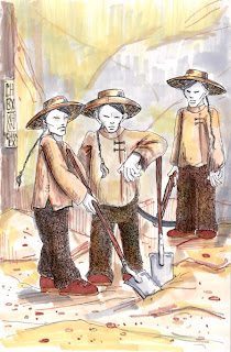
This week's word(s) at another illustration blog (that almost kicked me off) is "old west". The heyday of the American "Old West" was roughly the time between the years 1865 to 1890. These times bring to mind romantic stories of cowboys and gunfights, of John Wayne and Roy Rogers, of saloon dancers and wagon trains. But this is a Hollywood version of the "Old West". There is another "Old West" that this country would rather forget.
The Transcontinental Railroad was completed in 1869. It was the beginning of a nation-wide linking of railways. It was a major factor in the building and strengthening of the United States. Because it was such a massive undertaking, laborers were scarce. Thousands of Chinese immigrants, who came to the US during the Gold Rush in 1849 and had a reputation as hard workers, were recruited by the railroad companies to build the railroads. The Chinese were hired to keep labor costs down, as they were paid about one-third of white laborers' salary. Plus, they had to provide their own food and pay for their own living expenses, benefits that were covered for the white workers by the railroad companies.
Thirteen thousand Chinese workers dug tunnels and laid track for half of the Transcontinental Railroad. In photos and illustrations depicting the "Golden Spike" ceremony at Promontory Point, Utah, the site of the joining of the East and West railroad, the Chinese are conspicuously absent.
As a reward and thanks for Chinese efforts, the United States passed the Chinese Exclusion Act of 1882. This act outlawed all Chinese immigration to the United States and denied citizenship to those already settled in the country. Official discrimination extended to the highest levels of the U.S. government: in 1888, U.S. President Grover Cleveland, who supported the Chinese Exclusion Act, proclaimed the Chinese "an element ignorant of our constitution and laws, impossible of assimilation with our people and dangerous to our peace and welfare."
Sing it, Lee Greenwood.


Wow, you sure are Mr. Happy, huh? LOL! You know a lot about historical "stuff"...interesting, and I'd hope that now-a-days, we'd be much more enlightened about our fellow humans. But I'm not holding my breath...nice tribute to the overlooked and underpaid. Want to do one on teachers??? :)
While I appreciate the impact that teachers have had on society, my personal experience has been less than stellar. I don't think you would embrace the "josh pincus is crying" take. Thanks for the praise, though.
Hey, maybe I can convince you of the wonderful job I'M doing as a teacher! Somehow I knew your take on teachers would be that way...that's what I get for setting myself up by asking that question. :)