In this next-to-last video demo of my Party Animals painting contribution, I show you one way that I like to use metallic paint. I also give tips on adding texture to your painting, and how a little shading can help elevate your work.
> Enter my Party Animals book giveaway
Viewing: Blog Posts Tagged with: tutorials, Most Recent at Top [Help]
Results 26 - 40 of 40
Blog: wellerwishes (Login to Add to MyJacketFlap)
JacketFlap tags: Tutorials, Painting, Watercolor, Trade Publishers, original art for sale, dog art, Video Demo, dogs rule, sisterhood of pet portrait artists, party animals, Party Animals Week, Add a tag
Blog: wellerwishes (Login to Add to MyJacketFlap)
JacketFlap tags: Party Animals Week, Tutorials, pet portraits, Video Demo, sisterhood of pet portrait artists, party animals, Add a tag
Monday (today) through Friday is Party Animals Week here on my blog! First up are the final two video demos of the painting I created especially for the Party Animals book project. This one focuses on how to get colors to harmonize well together in a small composition. I offer a tip and a trick or two to help you to wiggle your favorite colors into a painting even if the colors might not seem to "go together" at first. Hope you enjoy!
>See all of the video demos here.
Blog: DRAWN! (Login to Add to MyJacketFlap)
JacketFlap tags: Illustration, tutorials, lessons, disney, How-To, figure drawing, 3D, perspective, Add a tag
 Focal Press have given us permission to reprint a few lessons from their great new book, Drawn to Life: 20 Golden Years of Disney Master Classes, Volume 2: The Walt Stanchfield Lectures. Check out the first lesson on Perspective Drawing here. Here’s the second lesson on figure drawing in perspective… Enjoy!
Walt Stanchfield:

Isn’t this a beauty! Of course, you’d have to go out of your way to draw something so third dimensionally screwed up. Even a non-artist could come closer to reality than that, because a box is a relatively simple form.
A box takes place in space, and as we draw it, it’s easy to think of it as occupying space, especially with the help of some elementary perspective.

The human (or animal) shape exists also in space and, though much more complicated, the idea of it displacing space is the same. However, quite often when drawing from a model we switch into a different mode than when drawing a box. With a box, it’s easy to see the space inside and around the shape, but with the more complicated human figure that aspect is not so obvious.
Let’s try to establish a clear concept of seeing the figure in space by using what might be called the “shock treatment.” Here is a screen with a 2-dimensional shadow of a figure cast on it.

Now the screen is suddenly pulled away and there before us, without 3D glasses, is the same figure in glorious 3D. (Drawing by 3D advocate, Mike Swofford; modeled by third dimensional Allison Mosa.)
Look from drawing to drawing and you can see it happen. That gratifying and fascinating realization of 3D that overwhelms you — which should be your normal realization at all times while drawing.
Superimposing the box onto the figure illustrates how they both relate to space in a similar way.

Also of interest:
Download the rest of this tutorial (PDF)
20 Golden Years of Disney Master Classes, Volume 2: The Walt Stanchfield Lectures (Amazon)
Perspective Drawing Lesson by Walt Stanchfield
Blog: Sparky Firepants Art Blog (Login to Add to MyJacketFlap)
JacketFlap tags: tips, tutorials, how-to, pen, WACOM, digital illustration, tablet, Add a tag
The first time I ever sat down at a computer was in my dad’s office, deep inside a secure area of O’Hare Int’l (try that now, kids). It was a green-screen airline reservations terminal which also had (I think) BASIC on it.
My first thought was this is just like Star Wars.
My second thought was how can I make art with this thing?
My sister and I made pictures by typing out patterns of numbers and printing them on the dot matrix. Sorry about using up all that paper, Dad. We thought it was a continuous stream from the basement.
Skip ahead a few years and see me struggle in Microsoft Paint, using a mouse. That was some horrible art. I think I actually hurt some people’s feelings.
These days, I have wised up considerably. My paper-wasting days are over and I no longer arch my wrist in a foppish Oscar Wilde pose while using a little plastic box to make my digital art.
Now I use a tablet and digital pen. Ahhhh, now that’s like it oughta be. In fact, I’ve been using the same tablet for almost ten years. We’re pals.
If you’ve never used one of these little pieces of heaven before, check out the most popular brand (my brand) at the WACOM site.
They aren’t complicated, I promise. It does take a little getting used to, but once you get into the rhythm of the tablet you’ll probably start using it as your mouse for other stuff, too.
For most of my work, I don’t create the drawing in the computer with the tablet and pen. Some digital artists do this and are just incredibly skilled at it. It ain’t my thang, but I do admire it. Typically I start by scanning a completed drawing and trace that. That’s the short version, my process is a little more involved – for now it’ll do.
However, one thing I love to do with the pen is create brush strokes right in the computer. Depending on your application, you can adjust pressure settings on the tablet pen and brush tool to “paint” in the computer. It’s almost like the real thing. It’s less messy, anyway.
I trained as a traditional artist and creating illustration in the computer wasn’t fun when I first tried it out. I hated it.
Now, every piece if artwork I deliver to my clients is digital. Even if it starts out on paper, the final art is electronic. So, when the apocalypse comes, I’ll have to start over. Thankfully I still have those cave drawing skills to fall back on.
If you’re wondering about these tablet thingies but don’t know what (or if) to buy, give me a shout. I’m happy to help you choose the right thing.
Just send me an e-mail and tell me about what kind of art you’re doing and what you’d like to do. I’ll reply with something hopefully witty and at least a little bit helpful.
Blog: wellerwishes (Login to Add to MyJacketFlap)
JacketFlap tags: Tutorials, Inspiration, Process, Children's Art, Technique, Resources + Reference, Flash, Vector Art, black line, Add a tag
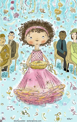 "Ring Bearer" above: Black-line work done in Flash
and exported as .ai file. Painting done in Photoshop.
Well, recently I read a great tutorial about how Flash works as a vector drawing tool by illustrator Bob Flynn. I use Flash at my day job, and, though I illustrate in Flash all the time, I never knew that you could export your work as an .ai file (Adobe Illustrator's native working file) and have absolutely no loss of line quality. Up until now, when I have worked between Illustrator and Flash, I'd always had a loss of quality in the vector art, as I'd move to and fro. Why?? I was cutting and pasting. NOT exporting. An "A-ha" moment, for sure, but I just never expected something as simple (and as useful!) as "Export > Export Image... to Adobe Illustator" to be an option in a product which is primarily used for screen resolution only. Live and learn!
Read the Flash Tutorial here
Blog: Sparky Firepants Art Blog (Login to Add to MyJacketFlap)
JacketFlap tags: author, authors, publishing, tutorials, lessons, how-to, book dummy, children's book, concept, dummy, sparkyfirepants, road trip with rabboit and squash, road trip with rabbit and squash, Add a tag
In the world of children’s publishing, there’s a certain methodology to creating a new book. Chronologically, it goes something like this:
- Author writes a book.
- Author mails book to agents and publishers.
- Author files rejection slips.
- Author passes out from shock during phone call from interested party.
- Publisher selects illustrator that fits the manuscript; Author fights for 10-year old niece to do the pictures in crayon and loses.
- Illustrator gnaws hand off during anxiety attack, wondering if he/she is up to the challenge.
- Illustrator makes a dummy.
A dum – wha?
Before the illustrator makes the pretty pictures, he or she makes a preliminary mock-up of the book, called a dummy. Working with the editor, the artist breaks down the manuscript into pages and sketches concepts for possible illustrations. It’s much simpler to sum up in a sentence than it is to do. Humongous thoughts go into the process of creating a book dummy. There are considerations of color, overall tone, character development, logical text breakdown, flow and pace… it’s a huge task.
In fact, to read more about the process, I highly recommend “How to Write, Illustrate, and Design Children’s Books” by Frieda Gates. It’s a comprehensive textbook-style guide to the whole business of creating books for children.
When I created “Road Trip with Rabbit and Squash,” the whole process from idea to completion was about two years (not counting a huge gap year where the MS sat neglected on my Mac). When I got to the point of creating the dummy, I took a very large breath.

Who's the dummy?
I love creating dummies. When I worked on storyboards for TV, I loved breaking down the script into bite-sized chunks and creating the images to go with them. It’s a craft, similar to woodworking or knitting. It’s one of the things I do where I don’t think I would rather be surfing.
My process is very simple and very pre-school. I re-format the manuscript in the computer to manageable chunks of paragraphs. Once I print it out, I cut those sections up and try not to knock them off the desk. Order is good. Part of the process is deciding how many pages you will have, which pages will spread across the gutter (that middle part), and where that last page will go (by itself? hmm…).
I created a small booklet stapling and folding regular copy paper. I knew what size the book and pages would be, so I marked off the pages to the correct scale. From there, I start arranging the cut-out chunks of text across the pages, developing a flow and nice progression through the book. It’s a living process that keeps changing as I work out concepts and adjust the flow. I think about how it will be read both silently and aloud. Does it make sense? Can I put a little cliffhanger in here? Does this page even need text on it or can the picture stand alone? It’s a process that only a slightly insane person would enjoy. And yes, I do. Am. Whatever.
It’s a complex process of thought and impossible to explain. Hey – sort of like writing.
When I was setting up my new studio/office recently, I came across the first dummy copy I made of “Road Trip.” It was buried under a pile of demo reels and chunks of plasticine. I guess I had moved on when I got to the next phase. It was really freaky to see how the first few pages had changed throughout the course of developing the dummy. In the end, I could see why I had made certain choices and I still question others. The photos below give you a tiny glimpse into my secret dummy world:

Pre-school skills come into play. I knew they would come in handy someday.

Here's page 1 as it's published. How did I get here from there? Lots of coffee.
If you want to see more images from the book, they are posted here. If you ask me how I created those concepts, I might even remember.
Blog: Gratz Industries (Login to Add to MyJacketFlap)
JacketFlap tags: books, Wendi, crafting, Fun With Children's Books, tutorials, Add a tag
 I love to make things out of the still-good pages of damaged children's books. I've been making some necklaces lately to give as gifts (tutorial to come this weekend) and I wanted to come up with some cute matching packaging. And here you have it! These were so much fun to do that I made lots of extras - including some for everyday occasions.
 They're great for holding candy too.
 And I was absurdly excited when I found out they were just the right size for a gift card.
 Want to make your own? They're really easy. I used Altoids-sized hinged tins (you can buy them here), spray adhesive (I use this), and some great papers. You can use scraps of holiday wrap, pretty scrapbook papers, your child's art - anything really. If you want to use children's book pages you can get assorted packs in my shop.
You can buy whole books yourself, of course. But then you end up with a ton of art from a particular book and, unless you're doing themed party favors and want them all to match, you're going to have a lot of leftovers. And you'll want some variety so you'll likely end up with a whole shelf of badly damaged children's books - not that I'm speaking from experience or anything.
I have two assortments available in my shop - one everyday. . . and one holiday. . .
 Each assortment will have a nice variety of pages - some famous characters, some not famous but nice vintage style. No two pages will come from the same book so you'll get a good mix.
I'll be posting lots of fun things you can make with these papers in the coming months. Wait until you see my kitchen canisters!
Have fun!
Blog: Gratz Industries (Login to Add to MyJacketFlap)
JacketFlap tags: tutorials, Wendi, sewing, crafting, free, Add a tag
Here's a fun and easy felt ornament you can make for the holidays. It takes less than an hour, you can use up old scraps, and kids can make them too.
The only stitch it uses is whipstitch. If you've never done that before there's a tutorial here.
Have fun!
Blog: Gratz Industries (Login to Add to MyJacketFlap)
JacketFlap tags: tutorials, Wendi, sewing, Add a tag
Another tutorial? Already? Yes - that's right folks. I have big plans to get a kit listed by tomorrow too - and then it's at least one free pattern or tutorial every week until the new year when I launch my new and improved website. Alan asked if my intern was going to do all this. Since my intern is imaginary it's unlikely that she'll be very helpful. I'm hoping that putting this goal out there in writing means I actually get it done.
So here's the new tutorial. This time I'm showing you how to sew a split stitch - my favorite stitch for embroidering lines. I used it on this dress. I like that it has some texture to it - when it's done it looks kind of like a little braid on the surface of the fabric. Nice. It's also substantial enough to cover any marking lines on the fabric.
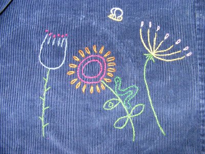 One note - I'm not using an embroidery hoop in the tutorial. That's because I'm working on felt and felt is sturdy enough not to need a hoop - just be careful not to draw your stitches too tight. If you're doing this stitch on regular fabric - use a hoop.
If you'd rather view the tutorial on Flickr the link is here.
Blog: wellerwishes (Login to Add to MyJacketFlap)
JacketFlap tags: Tutorials, Process, Sketch, Children's Art, Resources + Reference, From Sketch To Final, Add a tag
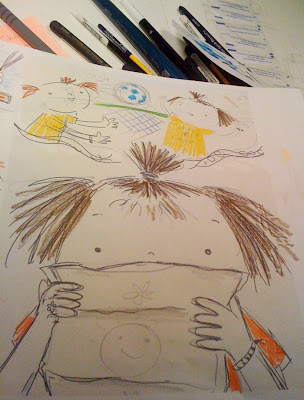
Here's the next step -- a color study. Look at how rough this is. Sometimes I skip this step, but it is really important to do some color planning -- even if it is super rough, and even if it's just helping me to figure out what I don't want to do. (Sometimes I do it in my head, but I think that doing it on paper helps more, even though it never seems to mimic the finished product at all.) This is one step that's never not helpful.
This is just done on the print out from the rough rough initial sketch. See, it's totally non-fancy -- a very useful scribble. (You will see that this little color study helped me figure out what I did not end up doing.)
Blog: wellerwishes (Login to Add to MyJacketFlap)
JacketFlap tags: Tutorials, Process, Children's Art, Resources + Reference, From Sketch To Final, Add a tag
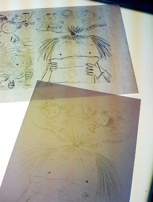
Here is the final sketch (the bottom paper on the lightbox). It's now on watercolor paper, ready to be inked.
When I trace from a sketch on the lightbox, I use the under-sketch as a rough guide. I like to have room for 'happy accidents'. I'm not someone who works incredibly tight from start to finish. I don't do too many preliminary sketches of a given illustration before diving in because for me, it dilutes the final product. I do as much preliminary as I feel is necessary for me to have a very good handle on the general composition and all the elements within it, but I do no more than I need to. I think it affects the life, excitement and energy in it. I build but i don't like to over-build, because I feel that beats it down. The law of diminishing returns is definitely in effect when it comes to my own philosophy about my sketching process. Too much is not a good thing, too little is not a good thing. Just enough is perfect!!
Blog: wellerwishes (Login to Add to MyJacketFlap)
JacketFlap tags: Tutorials, Process, Children's Art, Revisions, Resources + Reference, From Sketch To Final, Add a tag
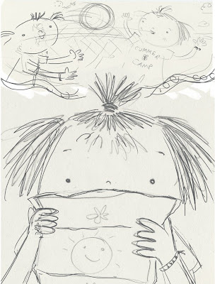
I then scan the rough sketch, and then revise the composition in photoshop. I love to create the rough sketch traditionally; I like the line quality and the life in it. But I like to collage pieces of the sketch together, moving things around, to create a well-balanced composition to move forward with.
This is still super-loose, but I know where I need to go from here, and I plan to fill in the blanks
during the pencil sketch phase.
Blog: Gratz Industries (Login to Add to MyJacketFlap)
JacketFlap tags: tutorials, Wendi, crafting, Add a tag
 I bought this fabulous hat at a store called The Spotted Goose on my last trip to Cincinnati. Jo immediately asked if we could make one just like it for her. I happen to own a copy of The Saturday Night Hat, but I've only made fabric hats from the book - nothing felted. Yet. In the meantime I thought we could be inspired by my new hat and make some snazzy dots for Jo's crocs.
Here's how we did it. You'll need some felt, 3/8" snap fasteners (available at any fabric store), a hammer, and a thread spool. I hear there's a tool that can replace the thread spool, but I don't have that and the snap police haven't come after me yet.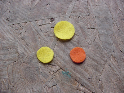 Cut out three circles of felt. The big yellow one is the size of a quarter. The two smaller ones are the size of a dime.
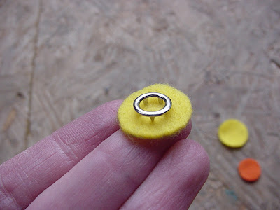 Each half of the snap pair uses two pieces - the end with the points goes on the right side of the fabric and holds the male or female snap bit in place. Center this on the smaller yellow circle.
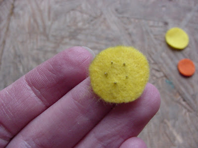 Flip it over and make sure the points are poking through.
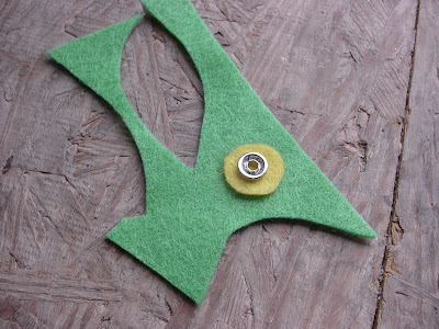 Lay it down on a bit of scrap felt (for cushion) and lay the female half of the snap over it. The yellow felt circle will be sandwiched between the two halves of the snap.
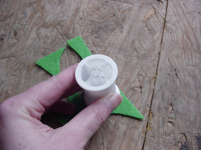 Place a thread spool over the whole thing and whack it with a hammer to join the two snap pieces. You could use a small bit of wood but the spool is nice when you're attaching the male end because you can center the hole in the spool over the male . . . um . . . part so you don't smash it flat when you hammer. Ouch!
Congratulations - you just made the inside part of your crocodot. Now for the pretty top half. Basically, you'll do everything you did for the first part, except instead of sandwiching one circle of felt between the two snap pieces, you'll use two stacked circles of felt. And you'll use the male half of the snap.
Now put the small yellow circle inside the shoe and hold the snap part up to one of the holes in the shoe. Snap the pretty yellow and orange dots to the bit inside the shoe. This will take some work because crocs are pretty fat, but it will work. See?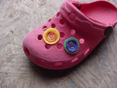 And voila! Cute little crocodots to jazz up your crocs! These are just made out of cheap craft felt and I'm not sure how they'll hold up to weather, playground sand, etc. But I love the look of them and I want to make more. Next I'll try vinylizing (is that a word?) some fabric and making the outer dots out of that. I'll keep nice soft felt on the inside, though.
Blog: Gratz Industries (Login to Add to MyJacketFlap)
JacketFlap tags: tutorials, Wendi, Jo, sewing, Add a tag
Jo and I cleaned out her closet a few weeks ago and I've been working through the pile of outgrown clothes deciding what to keep, what to donate, and what to cut apart and reuse. I came to one of my favorite things I've ever made for Jo.
I loved the icy blue paired with the black and white polka-dot skirt, and the penguin button was just perfect.
It was really easy to make so I'm going to share a mini-tutorial here. I made this a couple of years ago and didn't take pictures, but I really don't think you'll need them. It's that easy.
Start with a store-bought shirt. This was a summer dress so I used a tank top, but you could easily use a long-sleeved T-shirt for winter.
Measure around the bottom of the shirt. Double that length and add 1 inch for seam allowance. That will be the length of your rectangle.
Measure from the bottom of the shirt to the length you want the finished dress. Add whatever you like to use for the hem allowance. I like to use 1 1/2 inches. I turn it up 1/2 inch and then 1 inch for the hem.
Sew the short sides of the rectangle together to make a big circle. Gather around the top until it's the same size as the bottom of the shirt. Sew it to the bottom of the shirt.
Hem the bottom. Add a button if you want - to decorate the shirt and pull in the colors from the skirt. You're done.
I've made a several of these for Jo and there is one tricky thing to look for. Some T-shirts and tanks tend to twist off grain, so wash the shirt first and make sure it looks like it's not going to be a twisty one. You can wear a twisty, off-grain shirt, but if you attach a skirt to it, it makes the whole thing hang funny.
Blog: wellerwishes (Login to Add to MyJacketFlap)
JacketFlap tags: Tutorials, Resources + Reference, Painter, Add a tag
After being positively stymied by some issues I've been experiencing in Painter X, I went to the best online Painter forum I've found thus far, ConceptArt, and asked some questions there. In less than 12 hours I got a response from a Painter ninja. The Painter ninja also has her own web site for Painter people, PixelAlley.com. I've yet to fully investigate it, but on first look it lookslike one of the best Painter resource sites I've found (maybe it will turn out to be THE best one).


Kathy, what a fantastic drawing. I am so impressed that came out of Flash. Live and learn, and you never seem to stop learning!
Thanks!! The black line came from Flash. The color was photoshop. Flash is an AWESOME drawing tool, I am discovering. I knew it always was, for the WEB, but it's a cool and more natural alternative to AI (in my opinion). YAY! :)
This is adorable!
Love this illustration and what a great tip! I had not idea you could do that either. Thanks for sharing.
Thanks for the shout-out, Kathy! Just a bit of advice...exporting to EPS works a little better than AI because it preserves the color palette (RGB). The AI export usually dulls the colors.
It's weird that you can't copy and paste from Flash to Illustrator, but you CAN copy and paste from Illustrator to Flash.