new posts in all blogs
Viewing: Blog Posts Tagged with: Simple Things, Most Recent at Top [Help]
Results 1 - 25 of 70
How to use this Page
You are viewing the most recent posts tagged with the words: Simple Things in the JacketFlap blog reader. What is a tag? Think of a tag as a keyword or category label. Tags can both help you find posts on JacketFlap.com as well as provide an easy way for you to "remember" and classify posts for later recall. Try adding a tag yourself by clicking "Add a tag" below a post's header. Scroll down through the list of Recent Posts in the left column and click on a post title that sounds interesting. You can view all posts from a specific blog by clicking the Blog name in the right column, or you can click a 'More Posts from this Blog' link in any individual post.
Lisa Jones has released a new range of gift wrap which includes this fun animal design. Lisa describes the new collection as 100% cheerful and 100% recycled. Sold in sheets of two they are locally printed Lisa's hometown of Lewes in East Sussex and use vegetable based inks. Scroll down to see more, including the clever 'Apartment' wrapping paper. along with some more of Lisa Jones' designs on
Sir John Leighton, the Director-General of the Scottish National Gallery, served as both painter's model and keynote speaker at the Portrait Society's annual conference yesterday.
 |
| Sir John Leighton by James Gurney, black and white gouache, 3 x 3 inches |
He was on the grand ballroom stage posing for a demo by
Michael Shane Neal. I was far back in the audience watching the demo, looking at a video image projected on a big screen. Above is a 30-minute gouache sketch I did from my seat.
Mr. Neal lit him with a
two-source lighting scheme inspired by
Anders Zorn (Swedish, 1860-1920). The lighting scheme produces a shadow core in the center of the form and often puts the eyes in shadow.
In the case of this Zorn, those dark accents in the face float in the middle of a sea of creamy white, the reverse of the usual tonal scheme of a portrait.
Watch a 15-second video clip of my sketch in context on my
Instagram,
Twitter, or
Facebook page.
-----
Related posts:
Zorn's
Two-Source LightingSplit lighting
These cute design are all from the Dutch based 'A Little Lovely Company'. The business was founded in 2013 by designers Judith de Ruijter & Nikki Hateley, and it has become known for it's fashionable lightbox lamps which use typography to create messages, names and slogans. Their philosophy is to design products that can make life a little more lovely and their current range includes toys,
Whether you call it lens flare (what happens in a camera when you look at the sun) or color corona (a similar phenomenon that happens in your eye), it's a powerful effect that's popular in photography and video these days, but it's also something that has fascinated painters for a long time.
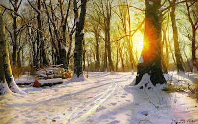 |
| Peder Mønsted, A Winter's Day |
The painting above was done in 1918, before color photography would have been in common use, so it's almost surely based on the effect that you can observe with your eyes. However, I don't recommend looking directly at the sun, which can damage your eyes.
The effect comes from light scattered by water vapor and dust in the air between you and the sun. The light is further scattered by your eyelashes when you squint, and then by the
aqueous humor and
vitreous fluid of the eye. The effect is best observed when you glimpse a setting sun through trees or when you see a streetlight at night.
Try squinting hard at a streetlight and tilting your head to see how the rays tilt with you. Also, try walking through the forest where the sun is mostly blocked by branches and glance up toward the sun as you walk to see how the corona comes and goes.
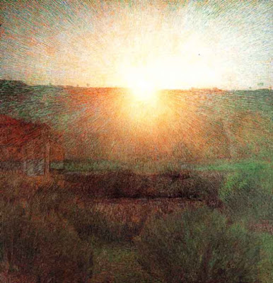 |
| Giuseppe Pellizza (Italian, 1868-1907) Volpedo, The Sun, 1904 |
Both Mønsted and Pellizza show the corona with lines radiating from the sun. They also observe a shift from yellow into red. Pellizza breaks the effect into particles of varied color. Note how simply and softly he paints the foreground areas.
Lens flare is
easy for digital artists to add, and a little harder for physical painters, depending on the technique. As a photographic effect, it has origins in camera optics. Its artistic use—and overuse—in film, television, and photography is well explained in this Vox video (
link to YouTube). Thanks,
Dan.
--------
Related GurneyJourney posts:
Color CoronaHow to Get a Feeling of Misty LightPractical LightsLight SpillMore of this kind of stuff in my book
Color and Light: A Guide for the Realist Painter

In
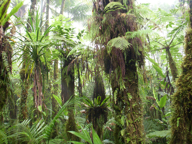
indirect light, foliage tends to be lightest at its outer and upper edges, and darkest at its base or its core.
This is true at the level of individual leaves or fronds, such as these leaves in a rain forest. Note the gradations within each leaf, with the lightest values at the tips of the leaves and the darkest values at their bases where they attach.
With
transmitted light, this darkening at the proximal end is a consequence of both the greater material thickness at the base, and the lesser amount of light arriving at the top surface due to
occlusion from nearby forms.
In this painting from
Dinotopia: First Flight, I was conscious of varying the color and value of the leaves and making them lighter at the tips, especially when we see them illuminated by the yellow-green transmitted light.
The principle is also true on a larger scale, not just at the level of a leaf, but also at the level of entire trees when you look at them in indirect light.
In this 12x16 inch oil study by
James Perry Wilson (1889-1976), note how each tree silhouette gradates from darkest at the base of each tree or bush to lightest at the outer and upper edges.
----
Previously:

.jpg?picon=1009)
By: James Gurney,
on 10/28/2015
Blog:
Gurney Journey
(
Login to Add to MyJacketFlap)
JacketFlap tags:
Lighting,
Add a tag
I'll be doing a public presentation tomorrow (October 29) from 1 - 2:30 pm at the Levitt Auditorium at the University of the Arts in Philadelphia with a reception following from 3 - 4 pm at the Von Hess Gallery in Anderson Hall in connection with "The Art of James Gurney" exhibition of original art.
I wrote an article appearing in the current (November) issue of ImagineFX magazine about painting bizarre lighting on location. The article opens: "Who says you have to copy mundane reality when you're outside plein-air painting?"
I'll share more about the making of this painting on the blog in November. It will be one of the subjects of an upcoming tutorial video called "Fantasy in the Wild."

.jpg?picon=3687)
By: Bowie Style,
on 10/27/2015
Blog:
print & pattern
(
Login to Add to MyJacketFlap)
JacketFlap tags:
Lighting,
Add a tag
This week we are looking at an 80s-esque designs inspired by the Memphis Milano design movement. We begin today with these bold graphic designs from Davide G.Aquini. Called 'The Macarons' they are wooden table lamps with patterned lampshades produced by Progetti in Luce. Davide is a freelance designer and lecturer from Venice who studied Graphic Design but now works on furniture and lighting
Alison Ellerbrook of 'Hunky Dory Home' has just released her first design collection called 'Retro Flowers'. This is the first time Alison has produced her own fabric rather than using designer prints to create lampshades and cushions. The designs reflect her love of playful, vintage style and bright colour and says they were created to ooze nostalgia! The lamps retail for £75.00 including
By: James Gurney,
on 10/10/2015
Blog:
Gurney Journey
(
Login to Add to MyJacketFlap)
JacketFlap tags:
Lighting,
Add a tag
Start with uniformly colored objects set up in window light. Then, later, you can put the same objects outdoors in the sun "to acquaint you with the vitality of outdoor light."
In this demonstration example, he sets up a simple paperboard box with light coming from the left. One of the first questions to ask is which is the lightest plane (E) and which is the darkest (A and F). You can hold up a piece of cardboard of the same color next to the object and turn it in various angles to the light to see how the tones change to match those of the subject.
Even a single plane can vary a lot in tone. He notes that (a) is darker than (b) because of the falloff of the reflected light coming from the right.
In this study, Guptill says, "interesting reflected lights have crept into the shadow tone at (A) Note how the inside corner (e) has been sacrificed to express depth and detachment."
After doing a few of these studies, it will be much easier to paint a more complex or dynamic subject, such as a building, a figure, a portrait, or an animal.
----
From Arthur Guptill's book
Color in Sketching and Rendering.
If you like this post, you'll also like:
Arthur Guptill Renders a WindowGuptill's Right and Wrong MethodsSepia Wash DrawingCast Shadow in the Foreground
By: James Gurney,
on 10/8/2015
Blog:
Gurney Journey
(
Login to Add to MyJacketFlap)
JacketFlap tags:
Lighting,
Add a tag
 |
| Picture by John VanHouten |
Blog reader John VanHouten asks:
"Hey James,
I know you say on your website that you don't give personal art advice but this question is about light. Specifically, the phrase about the lightest darks being darker than the darkest lights. I'm working on a painting and I'm not sure if darkening the shadow area of the skeleton will make it lose its local color of yellowish off-white, because it would be darker than the lightest part of the dark cloak. Is the phrase about darkest lights and lightest darks just applied to only one object at a time or is it applied to a whole image like the skeleton AND the robe? What do you think?
Thanks, John"
Hi, John,
There are kind of two different principles at work here, and those principles sound similar, so they can be a little confusing.
1. One is that
the darkest values on the lit side of a given object are almost always lighter than the lightest values of the same object in shadow. This is assuming that the object is of a fairly constant local color and a fairly matte surface, such as a skull, fabric, or skin. It would not apply to something patterned, glossy, or highly reflective. It's also assuming we're talking about sunlight or any strong light source with normal surfaces bouncing the light back into the shadow. Given those constraints, this one is nearly always true. You seem to be adhering to the principle in your picture.

2. The other principle is that in
a black object lit by direct sunlight can often be lighter than a white object in shadow. You have also got that working in your picture, as the light side of the black cloak (left swatch) is a little lighter than the shadow side of the skull (right swatch). In my observation, this one only holds true under
ideal conditions. Outdoors, you need to have a cloudless sky and not too much reflected light coming into the shadow side.
So as you guessed, the first rule applies
to one object at a time and the second rule applies to the whole picture. These principles come up because students tend to underestimate the depth of shadows. They also tend to introduce too much tonal variation within the lights and too much tonal variation in the shadows. This happens because our visual brains use context cues to override the luminance information that our retinas actually receive.
You also mentioned a concern about maintaining the appearance of the local color of the skull as it moves from light into shadow. A white object can move through a wild range of colors as it absorbs different influences around it. I'm guessing that reflected light from the yellow tassel would spread a vertical glowing band of warm light—thought too light in value—to the area of the shadowed skull just to the left of the tassel.
One more thing: Can you get that student on a better meal plan?
----
Previously:
Black is Light, White is DarkMore in my book:
Color and Light: A Guide for the Realist Painter
 |
| Khasra by Moonlight by James Gurney, 12 x 18 inches, oil on board |
1. Set up an overall temperature contrast between the orange torchlight and the cool blue-green moonlight.
2. Keep the chroma in the moonlight low--not too intense of a blue-green. Hint of blue in far distance.
3. Put a slight warm halo around the moon and edge-light the adjacent clouds.
4. Keep the key of the painting relatively high.
5. Suppress all detail in the shadows and put some texture and variety in the lights.
6. Introduce a gradual stepping back of value, lightening as it goes back to the far minaret.
Here's the quick (45 minute) maquette that I built for lighting reference. It didn't need to be beautiful at all, just any old blobs of modeling clay were all I needed.
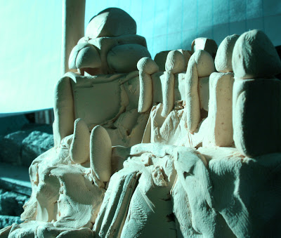
I quickly discovered that I had to move the actual lighting position quite far to the left, much farther to the left than the position of the moon in the painting.
After taking a digital photo of the maquette, in Photoshop I shifted the key toward blue-green, and I desaturated it slightly. The photo shows a lot of reflected light in the shadows, which I largely ignored. I would have played up that reflected light had I wanted to evoke daylight effects, where I might want to amplify the relatively weak reflected light.
-----
Resources
"The Art of James Gurney" at the Richard Hess Museum at the University of the Arts in Philadelphia will be on view through November 16, and I will do a public presentation on October 29.

Jessica Hayman established Rose & Clara Designs in 2013. Previously working as a lawyer she decided to return to her first love : design. Jessica creates her cheerful patterns and illustrations, which are based on hand drawn images, from her studio in London. Her prints are showcased on her range of British-made homewares, gifts and stationery, which are available from selected retail
Martha and Hepsie are two sisters who design and sell illustrated homewares, stationery and gifts with pops of colour and character that are all made in Britain. Under the label Martha & Hepsie Ltd their current product portfolio includes lampshades, cushions, ceramics, prints, notebooks, gift tape and greetings cards. Martha graduated with a BA (Hons) in Textile Design and Hepsie in Fashion
The 'Home' show was co-located with Top Drawer this week at London Olympia. One of the highlights was the launch of Mini Moderns three new Hinterland prints. The fourth wallpaper in the range was 'Gulls' which was launched alongside 'Pluto' and 'Equinox' to complete the collection which was shown in it's entirety for the first time. See more about all their products including bedding, paint
Scott Robertson recently released his new book
How to Render: The Fundamentals of Light, Shadow, and Reflectivity
, and he sent me a copy to take a look at.
It's a followup to his previous book
How to Draw, which
I reviewed last year. Once you know how to draw the outlines of an object in perspective, the next thing is how to to use light and shade to bring out the form, and how various surfaces will look in different conditions. That's what this book concentrates on.
Scott has plenty of experience as a teacher. He has taught at art schools, seminars, and workshops, and has produced a lot of DVDs for Gnomon. He also shares regular videos on
his YouTube channel.
He brings all that experience to his organization of the book. The book is divided into two main sections: 1. The physics and the perspective of light and shadow, and 2. The physics of reflectivity.

The book opens with a presentation of drawing tools, and then dives into a discussion of the kinds of light and the elements of form. He uses as examples both ideal geometric forms and photos of real objects (such as sculpture and architecture).
In one section of the book, Scott guides the reader through various practical systems for constructing shadows in perspective using geometric forms. That section feels a bit like a math textbook, but that's the only way to learn it, especially if you're creating imaginary forms.
The second half of the book analyzes reflective surfaces and their specific properties: including the Fresnel effect, reflection flipping, reflection pools, reflections over graphics, and cast shadows on reflective surfaces. He also goes through a catalog of examples of specific materials, such as glass, plastic, chrome, gold, wood, leather, and cloth, as well as examples of photographic effects such as motion blur and depth of field.

Scott does some rendering demos using both digital and physical techniques, so they will be of universal value from a technical perspective. Although there is some limited coverage of organic, natural forms (such as portraits, plants, animals, and landscapes) and passing references to atmospheric effects, the chief focus of the book is on transportation design—such things as cars, airplanes and robots.
The book was created by Robertson's own publishing company
Design Studio Press. It is large (9x11 inches), thick (272 pages), and printed on heavy opaque paper. The book also provides the reader with special access to dozens of supplementary online videos.
How to Render: The Fundamentals of Light, Shadow, and Reflectivity is a rigorous book that covers the subject comprehensively and authoritatively, and it should become a useful textbook for many years to come.

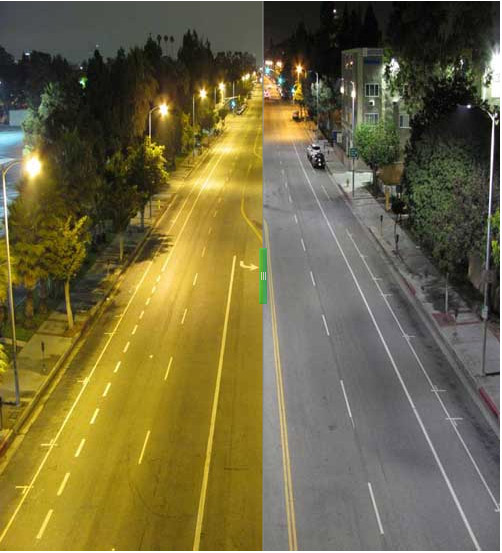 |
LA Streetlights, before (left half) and after (right half)
c/o LA Curbed and LA Bureau of Street Lighting |
Los Angeles is in the midst of a major street light replacement program. They are changing out the sodium vapor lights (left) and replacing them with LED lights (right).
They're making the change because the new LED lights run far more efficiently and last longer. But an additional consequence of the change is a different visual appearance to nightscapes, which affects nocturnal on-the-spot painters, filmmakers, or anyone who is sensitive to the qualities of light.
 |
LA Streetlights, before (left half) and after (right half) c/o LA Curbed
|
The most obvious difference is that the light has an overall cooler appearance compared to the distinctly orange colored sodium vapor lights, which are the most common street lights these days.
That older sodium vapor light is almost a monochromatic orange, as you can see from the solitary spike on the spectral power distribution chart at the lower left, which charts wavelength against output.
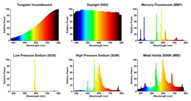 |
| Spectral Power Distribution of various light sources c/o NoFilmSchool |
Even the improved high pressure sodium lamps (bottom center) are still not very good on reds or blues. Incandescent light (upper left) is warm, but it contains some of all the wavelengths, which means you can correct it with a colored gel. Metal halide (lower right) is a whitish street light that's used in a lot of big-box parking lots.
Natural daylight (center top) is the standard, with all the colors well represented.
 |
| Spectral Power Distribution for a Philips Lumileds LED |
Here's a chart for an LED light, but it's not one of the street-light LEDs that they're using in LA. LEDs can vary quite a lot in the quality of light they deliver, but the bottom line is that the light will be cooler and more natural than the creepy-zombie effect of sodium vapor lights.
It's also good news because the best
best portable work lights
for outdoor painters are the small LED lights, and the more you can match your work light to the subject's light, the more likely you'll choose the right colors for the painting.
----
More in my book about light and color for painters:
Color and Light: A Guide for the Realist PainterRead more online:
No Film School: "Why Hollywood Will Never Look the Same Again"LA's New LED Streetlights Will Change the Way Movies LookThanks, Angela

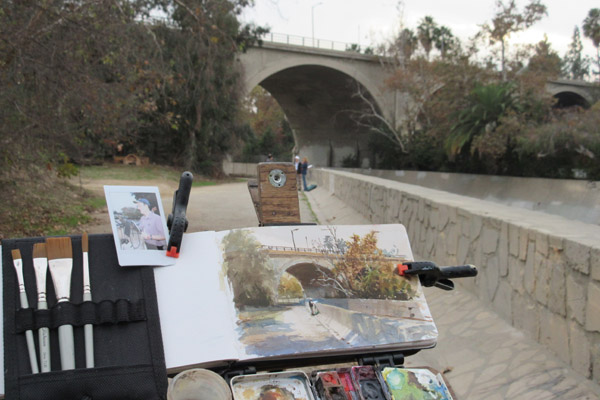
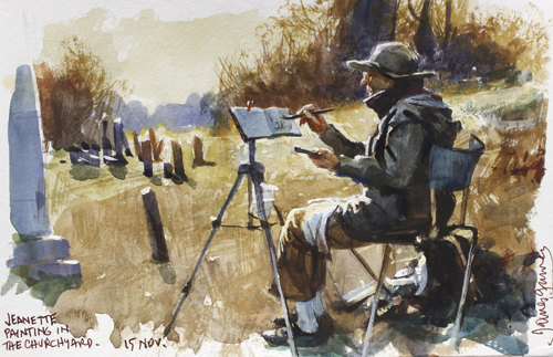
I painted a watercolor demo during a daylong visit to
Favilli Studio, a multidisciplinary design group in South Pasadena.
I walked down to the Arroyo with a group of designers and chose this view toward the York Avenue Bridge. I wanted to paint the forms—arch bridge, trees, and embankment—as realistically as I could.
But the light was overcast the whole time, so I decided to invent some light and shadow effects.
I figured that I could make the planes of the retaining wall much more clear if I cast a foliage shadow across it, with the dappled spots of light following the vertical, horizontal, and diagonal planes.
The cast shadow serves two purposes. It invites the viewer to move from the dappled foreground shadow, where they seem to be standing, into the brightly lit middle ground, where Jeanette is standing.
The foliage shadow also helps to define the plane changes as the ground slants up and over the embankment wall.
-----
Previous posts:
------

The new animated film Big Hero 6 uses a new rendering system developed at Disney Animation Studios that simulates the effect of light on surfaces with much more subtlety and nuance than in previous CGI animated films.
The rendering system, called Hyperion, manages the huge computational volume required for
ray tracing. In a ray-traced image, the graphics system tracks the behavior of light rays that interact with various kinds of surfaces before passing through the picture plane.
Any given light ray may bounce as many as 10 times, creating all sorts of secondary shadows, reflected light, or subsurface scattering. The inflatable robot character called Baymax is a perfect proof-of-concept for the rendering system because of all the internal scattering inside the vinyl skin.
Although the designers could have used this system for a photo-real image, they were very conscious of keeping to the stylized character of the animated world.
The film is set in an alternate universe of "
San Fransokyo." It not only had to combine design elements of east and west, but also had to be extremely detailed and layered to allow for some fly-through sequences.
The geometry was connected to an actual street grid of San Francisco, and the assets can be reused for future films and games.
Both the rendering software and the architectural generator put immense demands on the Disney supercomputers. Tech supervisor Andy Hendrickson said "This movie is more computationally complex than our last three movies combined."
In this video, Norm from Tested interviews Mr. Hendrickson about the techniques and challenges. (
link to video).
Book:
The Art of Big Hero 6 Ray tracing on Wikipedia
All images ©Disney 2014
Speaking of animation, I'll be a speaker at CTN Animation Expo at Burbank in less than two weeks,
giving presentations about Color and Light and Imaginative Realism. Hope to meet you there.

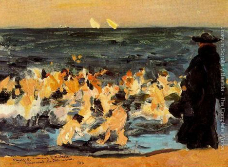
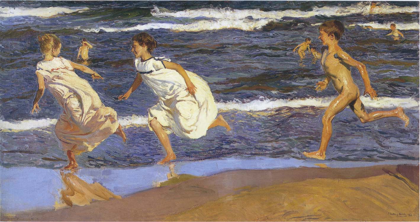
Blog reader Haden asks: "Everyone is familiar with the rule - the darkest light in the light has to be lighter than the lightest dark in the shadow. Keep the light and dark tonal ranges separate to show realistic form. But I've seen a lot of paintings when an object with a dark local value is pretty dark even though it's in the light."
Haden continues: "Take for instance the Sorolla (painting above). The coat and the kids flesh are very different local values. According to that rule, the coat in the light should be lighter than the shadows on the kids (reflected light would be lightening their shadow sides a touch). But still the coat in the light is almost black, shouldn't it be a mid-grey?"
"If the answer is paint it as you see it, then it's not really a rule, is it? Isn't it more just a general guideline for scenes with objects similar in local value? "
Reply: Haden, you are very observant to notice that the Sorolla painting breaks the rule. I believe you are right. If this scene were actually staged outdoors in front of the sea with real people, the monk's cloak would be much lighter in the sunlight and the sea would be lighter and bluer.
I found an alternate scan of the image which I would suppose is closer to the original, but even in this scan, the values of the cloak and the sea are still very dark.
The best answer I can give is that rules are made to be broken. The rule should be understood first, and then ignored whenever the story demands. Here, because the form of the monk is not as important as those of the children, a simple dark shape suffices.
This is what Andrew Wyeth and other artists describe as "going beyond the facts." The painting "Sad Inheritance" is about the frailty of the human condition, the triumph of the spirit, and the gift of compassion. These are all fairly sober themes, calling for a sober palette of color and value.
Sorolla tells a very different story in this painting of children running along the beach. It communicates pure exuberance and energy. Like the other painting, the figures are front-lit, with the sea behind them. But (assuming these scans are accurate) here the blue colors are stronger, and the foam is purer white, creating a more carefree mood.
 |
| Sorolla's first sketch for "Sad Inheritance" |
This is why it's so important to allow a composition to grow in the imagination or the memory before facing facts, regardless of whether those facts come from observation or photography.
----

By: Bowie Style,
on 10/16/2014
Blog:
print & pattern
(
Login to Add to MyJacketFlap)
JacketFlap tags:
Lighting,
Add a tag
Atomic Doris creator Katie Ramsden has been researching, developing and perfecting the process of her unique silhouette lampshades for over two years in her Northampton based studio. Each shade is composed of cut vinyl designs hidden underneath FSC accredited lining paper. The lampshades are plain when off but patterned when on due to their unique design process. With a range of prints, colours
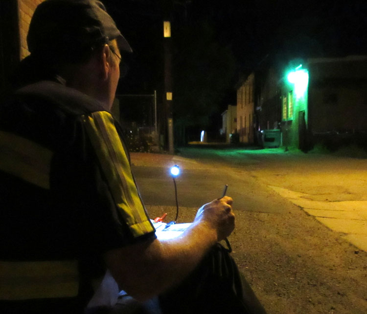
Night sketching in alleys opens up new worlds of light and color.
Streetlights come in a variety of color casts: the yellow of sodium vapor, the green of mercury vapor, the red of neon, and the blue-white of metal halide. Our eyes can see variations in these light colors that elude the camera.
This casein sketch is about the size of a baseball card. In the semi-darkness, it's difficult to distinguish subtle color differences on the palette, so I take a basic palette of about seven colors.
I take a variety of compact LED lamps with me in order to match the illumination on my sketchbook with the levels and colors in the scene. Clockwise from upper left is a
single head book light
, a
Mighty Bright "Hammerhead" light
, and a
Petzl Headlamp
(customized with a nylon diffuser and a 1/4" 20 nut held on with
Sugru
as a tripod attachment point). I also sometimes use an
Artist's Road Night-Light Cap.
The lights are clipped to my newest sketchbook, titled "Hitting the Whiskers," following my custom of lifting
a line from the first page of the sketchbook.

A garbage collector's shirt or uniform is helpful, too, because you want night vehicles to see you. You can pick up these uniforms used at a uniform store. Or you can get a
reflective safety vest
online.
----
Previously:
Multi-Colored StreetlightsVintage Streetlight CollectionMore light colors in my book Color and Light
Here's an unusual effect in Indiana where the sun is setting directly behind us due west on the Solstice, and the light bounces back from all the signs lined up due east.

Arbi asks: "Could you please explain about 'complementary shadows?' Some attribute complementary shadows to the Impressionist habit of painting the reflected color of blue sky in shadows, and others attribute it to simultaneous-contrast. Is it real? Do you use it in your painting, and how do you implement it?"
 |
| Maxfield Parrish |
Arbi, it's a little of both. In most sunny conditions, shadows really are in a complementary color range compared to the sunlit surfaces because they're lit by the relatively blue skylight.
By contrast, the sunlit surfaces are lit by the sum of the sunlight and the skylight, with the sunlight dominating. It's easy to demonstrate this with a camera that is color balanced to sunlit white paper. When you take the same white paper and photograph it again in shadow, it's clearly bluer.
The effect is heightened late in the day as the sun is lower in the sky. More of the short-wavelength is scattered out of the sunlight, leaving more orange or red light, and making the color contrast between light and shadow more obvious.
(A brief caution on the above: the shadow side of any object receives not only skylight, but also reflected light from other sources, so if those sources of reflected light are very warm, and the sky is blocked by trees or clouds, the shadow might be very warm, too.)
 |
| These are all from the shadow side of a white building. From the post "A White Building in Shadow" |
At the same time, our visual system is set up in such a way that exposure to any color causes adjacent colors to appear complementary, so a yellow square next to a gray square will make the gray square look bluer.
This is an effect I like to use a lot, not only to simulate the "Golden Hour" time of day, but also in small ways, to alternate relatively warm and cool colors throughout a picture.
-----
Previously on GJ:
Golden HourInduced ColorWarm and Cool ColorsA White Building in ShadowColor and Light: A Guide for the Realist Painter on Amazon

I'd like to wrap up our extended Watercolor Workshop Week by talking a little more about a light effect that I mentioned on the video "Watercolor in the Wild."
While I was painting this carriage house on location, I tried to convey the feeling that the sky was both very blue and very bright. I wanted to simulate an effect that I have noticed in photography, where a bright sky bleaches out the camera's receptors and then spills over into small forms, making them take on the blue of the sky.
I painted a very light cool wash in the sky, and then laid in the turrets, tree trunks, and branches with a mid-range blue. I also used a blue-gray watercolor pencil for the branches.
The scene didn't actually look this way to my eye—the sky actually looked like a light to mid-range high-chroma blue, and the branches looked extremely dark. I had to consciously override what I was perceiving and paint an effect that I was imagining.
While I was painting the picture, I took a photo to see if the camera actually did see it that way, and sure enough, the small forms turned quite blue.
I used the same basic idea of colorizing small forms against a bright sky when I painted "Churchyard," the final demo on the video. This time, though, I wanted the sky to look warm, so I laid down a very light yellow-ochre wash and then drybrushed the branches using a dull orange watercolor.
----

 |
| The Bath, (Baño or Jávea), 1905 by Joaquín Sorolla y Bastida (Spanish, 1863–1923) |
This ebullient painting by Joaquín Sorolla is an example of the common principle:
In the shadow, up-facing planes are cool and down-facing planes are warm.
The shift from warm to cool occurs both in the figure in the foreground and in the rocks in the background. The reason for the shift in color temperature is that the up-facing planes pick up more of the sky color and the down-facing planes receive more of the ground color. The actual color mixture is a combination of the surface color of the skin and the color of the light striking it.
One last thing to note is that the warm/cool shifts in the shadow planes can occur at nearly equal value, and it's often very effective to paint them that way.
------
Oil on canvas; 35 1/2 x 50 1/2 in. (90.2 x 128.3 cm)

View Next 25 Posts


