new posts in all blogs
Viewing: Blog Posts Tagged with: Logos, Most Recent at Top [Help]
Results 1 - 25 of 42
How to use this Page
You are viewing the most recent posts tagged with the words: Logos in the JacketFlap blog reader. What is a tag? Think of a tag as a keyword or category label. Tags can both help you find posts on JacketFlap.com as well as provide an easy way for you to "remember" and classify posts for later recall. Try adding a tag yourself by clicking "Add a tag" below a post's header. Scroll down through the list of Recent Posts in the left column and click on a post title that sounds interesting. You can view all posts from a specific blog by clicking the Blog name in the right column, or you can click a 'More Posts from this Blog' link in any individual post.
As we told you on Tuesday, DC Entertainment unveiled a brand new logo for all its branding across all platforms. It's more of a "print" type throwback logo, designed by Pentagram, specifically partner Emily Oberman, just in time to give DC a "rebirth" to its older, more hopeful and optimistic self.
Just as it did with The New 52, DC is ushering in a new logo for its new Rebirth era. The logo, which was designed by the design team Pentagram, will debut on next week’s DC Universe: Rebirth Special #1’ by Geoff Johns but will imediately be seen on all DC websites, social media channels, […]
 There's a post about my position as Literacy Evangelist for the Cybils up on the Cybils blog today. I must admit that I do MUCH less work for the Cybils than the category organizers do. But I am always prepared to jump up and down and spread the word about the wonderfulness that is the Children's and Young Adult Bloggers' Literary Awards.
 Also on the Cybils blog this week, in addition to profiles of the other organizers (this year's blog editor Ms. Yingling is posting those two per day), a timeless black and white version of our logo (created by the talented Sarah Stevenson). This was created in response to a request for a version without a year displayed, so that people wouldn't have to update their blogs so frequently. If you are a fan of the Cybils, feel free to display this (and perhaps link to the Cybils blog), to show your support. Updated Cafe Press Cybils bling will be coming soon.


I really love Jeremy Pruitt’s (aka Thinkmule) contribution to the AIGA Bordo Bello event. The skateboard art show, which runs now through July 3 features a gaggle of hot design talent and celebrates the Colorado lifestyle. Jeremy’s deck features seventeen custom logos, each loosely paying homage to a different aspect of Colorado’s rich and vibrant history. To see all the boards, visit the Bordo Bello website.
Also, be sure to check out Jeremy’s portfolio. Recently updated, the site hosts a curated collection of personal illustration and lettering work.


——————–
Also worth viewing…
Allan Peters
Missy Austin
Brad Surcey
Not signed up for the Grain Edit RSS Feed yet? Give it a try. Its free and yummy.
Share This
A Huge thanks to UncommonGoods for sponsoring this week’s RSS Feed!


Two Times Elliot is a London-based studio, whose focus centers around print, identity and web. Their style is a mix of typographic elements, clean lines and bold color palettes, bringing each design to life with its own personality. I’m also impressed by their ability to incorporate mixed media into their work without disrupting the flow of the design.


——————–
Also worth viewing…
Typographische Monatsblatter
Visual Language of Herbert Matter
Hans Hartmann
Not signed up for the Grain Edit RSS Feed yet? Give it a try. Its free and yummy.
Share This
Featured Book:
Irving Harper: Works in Paper.
A Huge thanks to Squarespace for sponsoring this week’s RSS Feed!


Nick Brue is a graphic designer out of Minneapolis. In addition to his impressive work for Cue, an established branding firm in Minnesota, he has produced several intriguing designs on his own time. This includes his own wedding save-the-dates and invitations, and multiple identity projects. Though his designs are to the point, he does a great job of utilizing interesting color and texture to keep it fresh.


Check out more of Nick’s work on his site and Dribble.
——————–
Also worth viewing:
Allan Peters
Tim Boelaars
Recent Books
Not signed up for the Grain Edit RSS Feed yet? Give it a try. Its free and yummy.
Share This
Featured Book:
Irving Harper: Works in Paper.
A Huge thanks to Squarespace for sponsoring this week’s RSS Feed!


Will Miller is the creative director and lead designer of Firebelly design studio in Chicago, IL. Miller takes creativity to another level, and doesn’t rule out any possibilities when it comes to his design process. Taking no shortcuts, his passion is evident in his work.


————
Also worth viewing…
Typographische Monatsblatter
Visual Language of Herbert Matter
Hans Hartmann
Like what you see?
Sign up for our Grain Edit RSS feed. It’s free an yummy!
Share This
Featured Book:
Matte Stephens: Selected Works.
A Huge thanks to Boxshot for sponsoring this week’s RSS Feed!


Brad Surcey is the designer director of Zeus Jones in Minneapolis. His projects include packaging and identity pieces, all possessing an air of elegant simplicity and functionality. His attention to detail is what takes his designs to the next level.


—–
Also worth viewing:
Mark Weaver
Ken Leung Interview
Carl DeTorres
Not signed up for the Grain Edit RSS Feed yet? Give it a try. Its free and yummy.
Share This
Featured Book:
Matte Stephens: Selected Works.
A Huge thanks to Squarespace for sponsoring this week’s RSS Feed!


Kendrick Kidd is a freelance designer out of Jacksonville, Florida, whose work spans type, identity, packaging and editorial. His work is playful and fun, yet skillfully executed.

In his most recent collaboration with the Texas Monthly, Kidd creates beautiful, custom seals for each major Texan city.


Check out Kidd’s work on his site and dribble.
—–
Also worth viewing:
Tad Carpenter Interview
Albert + Marie
Lab Partners
Not signed up for the Grain Edit RSS Feed yet? Give it a try. Its free and yummy.
Share This
Featured Book:
Matte Stephens: Selected Works.
A Huge thanks to Squarespace for sponsoring this week’s RSS Feed!

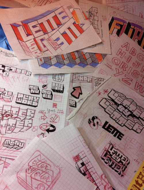
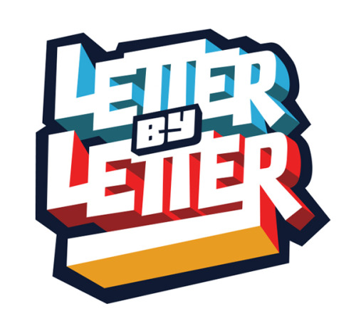
Chris Gardner, who drew our beautiful Drawn logo, shows some sketches and preliminary work for a logo he drew for a new iOS word game called Letter by Letter that launches today.
I’ve been playing a closed beta of the game for the past few weeks, and I’m complete addict. Its the perfect mix of Scrabble, Boggle, and Risk with short, but challenging turns that require some crafty strategy and a healthy vocabulary.


Off Book is a web-original series from PBS Arts that explores cutting edge arts and the artists that make it. In the latest episode they explore the world of logos that surround us with design luminaries such as Stephen Heller, Kelli Anderson, Gerard Huerta and Sagi Haviv. See the full episode here.
——————–
Also worth viewing:
Herb Lubalin for PBS
Saul Bass: A Life of Design
Stefan Kanchev
Not signed up for the Grain Edit RSS Feed yet? Give it a try. Its free and yummy.
Share This
Grain Edit recommends: Wondering Around Wandering: Work-So-Far by Mike Perry. Check it out here.
©2012 Grain Edit - catch us on Facebook and twitter

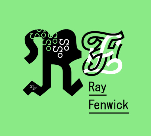
Help Ray Fenwick inch further towards having infinite variations on his logo (examples).
lemoatjuice:
Will you help me make more variations of my logo?
Hello? Will you help me reach my target of “near infinity” logos? Will you help me populate image searches with these, my perfect language? It is starting to seem as though I may never realize this dream alone.
If you can use illustrator, and have 15 minutes to pump out a variation (examples) , I will send you a postcard in thanks. Then I will post your variation with credit.
E-mail hello AT rayfenwick.ca if interested. I will send you a template file with “instructions”.
Yrs infinitely,
Ray

Even though I still had to go to their (not updated since 2008) website to figure exactly what the Juice Agency does, I liked this clever promo that uses playful iterations of their (I’m guessing new) logo.


Tony Dispigna may be a very influential craftsman to today’s “throwback” design connoisseurs without many realizing. In 1969, shortly after graduating from Pratt, Tony joined forces at the legendary Lubalin Smith & Carnase. He has worked to produce notable classic typefaces like Lubalin Graph and Serif Gothic. Tony is currently a professor at Pratt and the New York Institute of Technology, and has also taught at SVA. Although much of Tony’s work is based on type, he also has a really good sense for creating wonderful logos, as you will see below.


Many thanks to GE regular Jeremy Pettis, who provided these scans on his flickr of a great article he found.
Also for your viewing pleasure:
Louis Swart — Dutch Packaging
Harry Murphy & Friends
Jeremy Pettis
Like what you see?
Sign up for our Grain Edit RSS feed. It’s free and yummy!
No Tags
Share This
Grain Edit recommends: Eli No! by Katie Kirk. Check it out here.
©2011 Grain Edit - catch us on Facebook and twitter

By: Kirsty,
on 10/3/2011
Blog:
OUPblog
(
Login to Add to MyJacketFlap)
JacketFlap tags:
vinci,
martin kemp,
swastika,
kemp,
channel_video_title,
mona lisa,
christ,
martin,
leonardo,
Editor's Picks,
*Featured,
Art & Architecture,
Arts & Leisure,
christ to coke,
coca-cola bottle,
Videos,
art,
icons,
art history,
Media,
branding,
Multimedia,
logos,
leonardo da vinci,
coca-cola,
coke,
Add a tag
Image, branding, and logos are obsessions of our age. Iconic images dominate the media. In his new book, Christ to Coke, art historian Professor Martin Kemp examines eleven mega-famous examples of icons, including the American flag, the image of Christ's face, the double helix of DNA, and the heart.


Here’s a special treat for Valentine’s Day. The BBC has just released a 30-minute radio documentary entitled I Heart Milton Glaser. The program includes audio snippets of Glaser as well as his contemporaries as they discuss the history and impact of the now iconic I ♥ NY design.
——————–

Milton Glaser
1976. Ink and tape on paper envelope, 2 7/8 x 3 5/8″ (7.3 x 9.2 cm). The Museum of Modern Art, New York.
(view the Container List)
——————–
Also worth viewing:
Handbook of Pictorial Symbols
Stefan Kanchev: Logo Designer
American Trademark Designs
Related Books & DVDs:
Milton Glaser: To Inform & Delight
Milton Glaser: Art is Work
Milton Glaser: Graphic Design
Not signed up for the Grain Edit RSS Feed yet? Give it a try. Its free and yummy.
——————–
No Tags
Share This
Grain Edit recommends: Karel Martens: Printed Matter. Check it out here.
©2009 Grain Edit - catch us on Facebook and twitter
Since graduating from the University of California, Davis in 1990, Steven Noble has mastered a wide range of detail and style within the scratchboard medium and has become internationally recognized for his work from clients as far away as Japan and Europe.
Over the years, Steven has become equally adept in the woodcut, pen and ink, traditional engraving and steel engraving styles, as well as a variety of stylized scratchboard techniques. His highly disciplined and complex line work is based on over 15 years of experience. To create the intricate details of his work, Steven carves very fine line strokes into pre-inked clay boards using X-Acto precision knives. He applies his labor intensive technique to a variety of medium, from bold woodcuts to very fine traditional 19 century steel engravings.

For my first post here at Grain Edit I’m going to share with you one of my favorite design books from my bookshelf: American Trademark Designs. Published in 1976 by Dover Books; Written and compiled by Barbara Baer Capitman. This book is chock full of 732 delicious black, bold, and inky vintage logos. My favorite aspect of this book is that it showcases extremely recognizable logos that have been stamped into the back of our eyelids (IBM, Mr. Peanut, Pepsi-Cola, Playboy) right alongside rarely seen identities created by tiny firms for tiny companies. Some marks are also showcased next to their former, replaced versions, displaying the brand’s evolution.
I’ve scanned some of my favorite graphics to share with you. A portion of this book is also available for view in Google Books, but it’s much more interesting on paper.
(Sunset Villas, luxury condominiums, a development of the International Group. Design by Robert Myitray of Michael Sehack Advertising)

(Irwin Memorial Blood Bank. Designed in 1970 by Walter Landor Associates.)

(Rohm and Haas, chemicals. Original wavy line and monogram used from 1917 to 1965)

(Vita Food Products, Brown & Williamson Company. Designed in 1969 by Gould & Associates.)

(Matlaws Food Products. Designed in 1971 by Gregory Fossella Associates.)

(Channels 8 & 9, closed-circuit television in Miami. Designed in 1963 by The Brothers Bogusky.)
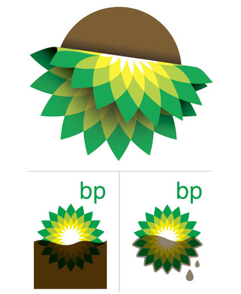
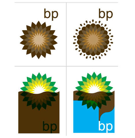
Draplin takes on the BP (British Petroleum) logo with some quick redesigns.
I can’t watch the news now. I’m in shock every time I see footage of the Gulf. When is BP going to contain this mess?
——————–
Also worth checking: Aaron Draplin: Design Work & Motel Signs
Not signed up for the Grain Edit RSS Feed yet? Give it a try. Its free and yummy.
——————–
No Tags
Share This
Vintage kids book Mi Diccionario is in the Grain Edit Shop
Grain Edit recommends Colo Pro A font designed by Font Fabric. Check it out here.
©2009 Grain Edit - catch us on Facebook and twitter

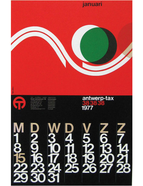
Calendar for Antwerp-tax designed by Paul Ibou
Iconofgraphics has a great post on the work of Belgian designer Paul Vermeersch (a.k.a. Paul Ibou).
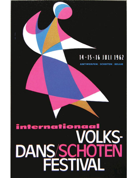
Volksdansfestival Schoten -
Poster for Folk Dance Festival
1962
Various logos
Paul Ibou circa 1970s
Owls greeting card from 1965
—–
Also worth checking: Otto Treumann Poster
Jim Brair - Modern Dutch Poster
Enjoy this story? Sign up for our tasty free grain edit RSS feed.
—–
No Tags
Share This
Vintage kids book Mi Diccionario is in the Grain Edit Shop
Grain Edit recommends Colo Pro A font designed by Font Fabric. Check it out here.
©2009 Grain Edit - catch us on Facebook and twitter
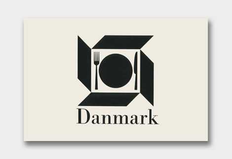
Danish Giftparcels | Denmark |
Some of you might remember when World of Logotypes made the rounds on the design blog circuit last year. If you missed out, Amy over at the excellent Aqua-Velvet blog has highlighted a few of her favorite logos from the book. View Part 1, Part 2, Part 3.
You can pick up a copy of World of Logotypes at Alibris.
Warsaw Agency | USA | Designed by Anita Soos
Quirra S.p.A. | Milano, Italy | Designed by Patrizia Pattacini
Leidschenhge | Holland | Designed by Benno Wissing
Uniforms Unlimited Inc. | USA | Designed by Thomas A. Rigsby
(via the Silver Lining)
———–
Also worth checking: Scandinavian Logos of the 1960s + 70s
Stefan Kanchev Logos
Not signed up for the Grain Edit RSS Feed yet? Give it a try. Its free and yummy.
———–
No Tags
Share This
Vintage kids book Mi Diccionario is in the Grain Edit Shop
Grain Edit recommends Colo Pro A font designed by Font Fabric. Check it out here.
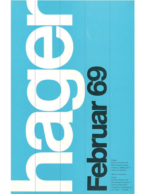
Design work for Hagar -1969
Robert Sessler was born in the Swiss city of Bern in 1914. Robert first began experimenting with design during his late 20s at the Zurich School of Arts where he was trained under the Bauhaus instructor, Johannes Itten. In 1942 he left school to open his own studio and become a member of the Swiss Werkbund. He maintained his studio until 1953 when he was offered a position as the head of the graphic design department at the Saarbrucken School of Art in Germany. He continued to teach at Saarbrucken and later at the University of Saarland until his retirement in 1979.
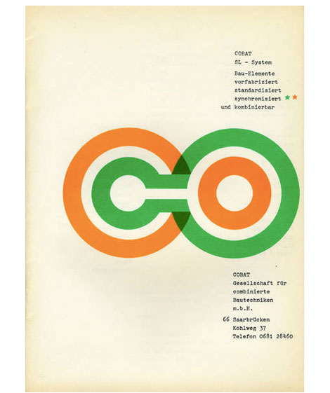
Brochure for Cobalt / Sl-System 1961 - Designed by Robert Sessler
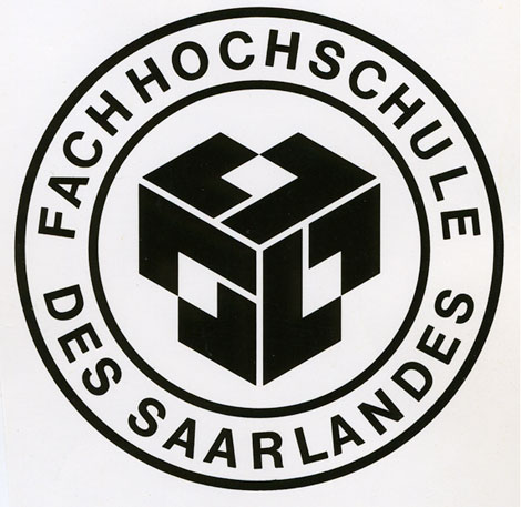
Logo for the University of Saarland - 1959
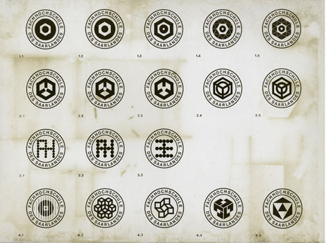
Logos for the University of Saarland - 1959
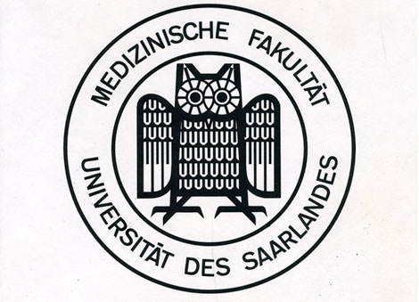
Logo for the University of Saarland - 1959
———–
Also worth checking:
Herbert Kapitzki
Swiss Graphic Design by Geigy
Not signed up for the Grain Edit RSS Feed yet? Give it a try. Its free and yummy.
———–
No Tags
Share This
Vintage kids book Mi Diccionario is in the Grain Edit Shop
Grain Edit recommends Colo Pro A font designed by Font Fabric. Check it out here.
©2009 Grain Edit - catch us on Facebook and twitter

Brand New offers up a look at the most relevant identity work of the decade. Not simply a best-of list, this look at the last ten years of corporate branding includes the good, the bad, and the ugly. I’m looking at you, Pepsi.
Posted by John Martz on Drawn! The Illustration and Cartooning Blog |
Permalink |
No comments
Tags: branding, Design, logos


Searching for some retro logo inspiration, I stumbled upon Depression Press’s Flickr stream, which has retro logos in spades along with other old printed goodies, including plenty of illustration:

Posted by John Martz on Drawn! The Illustration and Cartooning Blog |
Permalink |
No comments
Tags: Design, ephemera, logos, retro

View Next 16 Posts


 As we told you on Tuesday, DC Entertainment unveiled a brand new logo for all its branding across all platforms. It's more of a "print" type throwback logo, designed by Pentagram, specifically partner Emily Oberman, just in time to give DC a "rebirth" to its older, more hopeful and optimistic self.


The Marvel logo of the 90s was better than most of the comics.
The one where they fire Eddie Berganza, Jim Lee, DiDio and rehire Karen Berger is the logo that will work. It’s all just lipstick on a pig until then.
Also: put back the OVERSHORTS.
PS: Clearly Milton Glaser needs to be called in to update Milton Glaser’s design. It’s not like Chip Kidd wouldn’t jump at the chance to take it on either.
Hire Kate Willaert yesterday. That’s a winner
The one with the 200 logos; last full line, third from the right. But then not on a slant.
The wonky, wobbly C of the new logo really hurts my aesthetic eye.
Also, I just tightened up Matt Krotzer’s version some more – Removed the nick in the C and made the bottom of the hole in the D square, so that the D and the C mirror each other diagonally more.
http://imgur.com/EMSKElH
I think the 5th deckchair from the smoking room window on the Titanic looks the best!
The DC logo used from 1949 to 1970, with the words “Superman” and “National Comics,” was the best. They should bring that back, along with the go-go checks.
http://comicsalliance.com/dc-comics-logo-history/
George:
https://imgur.com/7SX5mzj
Kate: I love it! Maybe that would spark a full-scale ’60s revival, with DC’s chief rival calling themselves “Marvel Pop-Art Productions” again.
Logo redesigns come and go. Surely the real news is that they might change their name to “DG Comics.” Bold move after all these years.