new posts in all blogs
Viewing: Blog Posts Tagged with: Flying Eye Books, Most Recent at Top [Help]
Results 1 - 10 of 10
How to use this Page
You are viewing the most recent posts tagged with the words: Flying Eye Books in the JacketFlap blog reader. What is a tag? Think of a tag as a keyword or category label. Tags can both help you find posts on JacketFlap.com as well as provide an easy way for you to "remember" and classify posts for later recall. Try adding a tag yourself by clicking "Add a tag" below a post's header. Scroll down through the list of Recent Posts in the left column and click on a post title that sounds interesting. You can view all posts from a specific blog by clicking the Blog name in the right column, or you can click a 'More Posts from this Blog' link in any individual post.

by Keith Negley (Flying Eye Books, 2015)
Heads up, email subscribers: my blog took a bit of a tumble so I’m reposting what was lost in the shuffle. Apologies, and thank you for reading!
The kind folks at Flying Eye sent over a preview of this book, thinking it was right up my alley.
It’s right up my alley.
The theme: yes. The design: yes. The snappy, bold, in-your-face look at tough guys plus the snappy, bold, in-your-face look at feelings: yes.
I chatted with Keith Negley, and learned a lot about this debut effort. I hope there’s more from him, and I hope you enjoy this peek into the brain of a picture book creator.


Hi Keith! Can you talk about where this story came from? And what the process was like for its creation?
It all started when my son Parker who was 6 at the time stole a soccer ball from a friend during soccer practice and his friend got upset and they fought over it. Parker was angry at first, but then felt embarrassed and ashamed because he knew he did something wrong. I could tell he was struggling with how to handle all these new emotions that were happening to him at the same time. He walked away from the group and sat down to be by himself because he didn’t want anyone to see him cry. Later that night, I explained to him that it was totally natural to cry and that everybody does it. I told him sometimes even I cried, and he looked up at me and asked, “grown ups cry too?”
It blew his mind that even adults cried because he thought it was something only kids did. I wished I had a book I could read to him that let him know that frustration and crying is a natural thing not to be ashamed of. The next day the idea for the book popped into my head.
You’ve done a lot of editorial illustration, but this is your first children’s book. Can you tell us the how and why you got into books?
I always liked the idea of making picture books for children, but it wasn’t until I became a parent and started reading a ton of picture books to my son did I realize there was a lack of the kind of books we enjoyed. Honestly the books I’ve been working on were born out of necessity because I wanted to read them and no one else had made them yet.
Your tumblr tag line is spectacular: part man, part negative space. Can you explain where that came from and why it represents you so well?
Ha, I find tragedy to be the greatest muse. The subjects I enjoy working with the most are the ones that break my heart. It’s cathartic somehow, and I feel like I really get to put a piece of me into the work. What ends up happening is I have a portfolio of rather depressing subject matter. But I’m always striving to create beautiful images with it. That juxtaposition is challenging and rewarding for me.
Add to that I tend to utilize negative space as a compositional tool fairly often and so I thought it tied the content in with the image making nature of the blog.
 Who are some of your story heroes?
I’ve been a huge fan of Lane Smith for years and years. Jon Scieszka is another one. Ezra Jack Keats. Jack Kent’s Socks For Supper is one of my all time favorites as a kid and it still holds up today.
What do you remember about picture books from your childhood?
I remember my mom reading them to me and how she would make different voices for all the characters. I try to do that for Parker but he’s not into it at all unfortunately.

What is your favorite piece of art hanging in your home or studio?
Not sure if this counts, but I like to make music in my spare time and I’m a huge nerd for vintage synthesizers. I currently have a 1979 Korg 770 sitting in my studio and just looking at it makes me very happy. I consider them works of art.
What’s next for you?
Trying to schedule some reading events for the fall/winter and I’m in the middle of working on my second book for Flying Eye which should be out in time for Father’s Day next year!

Thank you, Keith! And vintage synthesizers totally count as works of art.
PS: Congratulations to the winner of the The Story of Diva and Flea giveaway, Ashley! And thanks to Flying Eye for the images used in this post.


By: Carter Higgins,
on 10/21/2015
Blog:
Design of the Picture Book
(
Login to Add to MyJacketFlap)
JacketFlap tags:
keith negley,
design,
color,
balance,
scale,
composition,
shape,
white space,
flying eye books,
Add a tag

by Keith Negley (Flying Eye Books, 2015)
The kind folks at Flying Eye sent over a preview of this book, thinking it was right up my alley.
It’s right up my alley.
The theme: yes. The design: yes. The snappy, bold, in-your-face look at tough guys plus the snappy, bold, in-your-face look at feelings: yes.
I chatted with Keith Negley, and learned a lot about this debut effort. I hope there’s more from him, and I hope you enjoy this peek into the brain of a picture book creator.

 Hi Keith! Can you talk about where this story came from? And what the process was like for its creation?
It all started when my son Parker who was 6 at the time stole a soccer ball from a friend during soccer practice and his friend got upset and they fought over it. Parker was angry at first, but then felt embarrassed and ashamed because he knew he did something wrong. I could tell he was struggling with how to handle all these new emotions that were happening to him at the same time. He walked away from the group and sat down to be by himself because he didn’t want anyone to see him cry. Later that night, I explained to him that it was totally natural to cry and that everybody does it. I told him sometimes even I cried, and he looked up at me and asked, “grown ups cry too?”
It blew his mind that even adults cried because he thought it was something only kids did. I wished I had a book I could read to him that let him know that frustration and crying is a natural thing not to be ashamed of. The next day the idea for the book popped into my head.
You’ve done a lot of editorial illustration, but this is your first children’s book. Can you tell us the how and why you got into books?
I always liked the idea of making picture books for children, but it wasn’t until I became a parent and started reading a ton of picture books to my son did I realize there was a lack of the kind of books we enjoyed. Honestly the books I’ve been working on were born out of necessity because I wanted to read them and no one else had made them yet.
Your tumblr tag line is spectacular: part man, part negative space. Can you explain where that came from and why it represents you so well?
Ha, I find tragedy to be the greatest muse. The subjects I enjoy working with the most are the ones that break my heart. It’s cathartic somehow, and I feel like I really get to put a piece of me into the work. What ends up happening is I have a portfolio of rather depressing subject matter. But I’m always striving to create beautiful images with it. That juxtaposition is challenging and rewarding for me.
Add to that I tend to utilize negative space as a compositional tool fairly often and so I thought it tied the content in with the image making nature of the blog.
 Who are some of your story heroes?
I’ve been a huge fan of Lane Smith for years and years. Jon Scieszka is another one. Ezra Jack Keats. Jack Kent’s Socks For Supper is one of my all time favorites as a kid and it still holds up today.
What do you remember about picture books from your childhood?
I remember my mom reading them to me and how she would make different voices for all the characters. I try to do that for Parker but he’s not into it at all unfortunately.

What is your favorite piece of art hanging in your home or studio?
Not sure if this counts, but I like to make music in my spare time and I’m a huge nerd for vintage synthesizers. I currently have a 1979 Korg 770 sitting in my studio and just looking at it makes me very happy. I consider them works of art.
What’s next for you?
Trying to schedule some reading events for the fall/winter and I’m in the middle of working on my second book for Flying Eye which should be out in time for Father’s Day next year!

Thank you, Keith! And vintage synthesizers totally count as works of art.

PS: Congratulations to the winner of the The Story of Diva and Flea giveaway, Ashley! And thanks to Flying Eye for the images used in this post.

I can’t stop thinking about the line Emily left us with yesterday, this one:
They are stories coming from a place of trying to understand, rather than a place where it is understood.
Right?
Welcome back, Emily! Hope you enjoy the rest of our conversation. (And a reminder, click to enlarge any images.)


Can you tell us about the design of the art and the text? I love that your pictures don’t have text on them anywhere, and the page turn with the flower is the only time there’s text away from the bottom. What went into those decisions?
There wasn’t much decision making- that was the problem! Often times I like to work with only a bit of text because type is a whole other ball-park in terms of aesthetics. I have a hard time compromising my space for words- text and fonts and size, all that jazz has to mesh in with the artwork, and it’s hard finding the right voice to match the looks.
My work gets pretty dense, so I find it a lot more difficult to find something that is legible, but still yields to the art. In university I preferred to keep my lines simple and punchy and give a whole page of text to one image- it makes you read everything slower, more thoughtfully. However in the world of big print-run publishing, it is a luxury to use up so much paper! I work on the pacing, but the designers at Flying Eye made a lot of the technical decisions and all the book designing- I think they’ve done beautifully.


What is your favorite piece of art hanging in your home or studio?
I work at home, and my favourite art piece is this ceramic self-portrait bust my Dad made when he was a kid in school. It’s got hair that looks like it was squeezed through a garlic presser- he forgot a bit of hair on the back though, and he made his nostrils with a pencil eraser. It’s a bit creepy, bit primitive cool. Very seventies. Still trying to find the best place to display it.
What are some of your favorite picture books? Both for writing and text and whatever inspires? What is your favorite picture book from childhood?
My favourite old school book is Munro Leaf’s Ferdinand. It is a beauty in text and image- what a fantastic story about the happily peaceful bull. Didn’t want to fight, didn’t want the fame, just wanted the simple pleasures of everyday life. You come across the message of being unique quite a bit in children’s books. Oftentimes it’s a feeling of ‘you’re different’ therefore special, therefore better. I don’t get that passive aggression or hypocrisy with Ferdinand.
For modern, I love Michael Rosen/Quentin Blake’s Sad Book. It isn’t sappy or over the top, it is perfect. No melodrama or silver-linings, just honest. The book feels like it is quietly listening to it’s readers own blues. It brought me real comfort. It is really a gem.


In terms of illustration, I love everything that is Blair Lent. Dreamy.
What’s next for you?
Lots of good things in store at the moment! I have finished a bunch of projects recently, and am still catching my breath.
I just finished A Brave Bear with Walker Books, and Brilliant with Abrams, and I’m now moving on to a book series with Chronicle for easy readers called Charlie and Mouse which is written by Laurel Snyder.
Oh, and did I mention the ever lovely Everything you Need for a Treehouse by THE Carter Higgins?
I am excited about it all, and slowly getting better at juggling everything- at the moment I am trying to doodle personal work (if you don’t maintain this, everything goes bad, you don’t evolve!), little brothers, and treehouses. For boys, I’ve been creeping around my high street and local parks to get inspiration, for tree houses I fondly think of the ones my neighbours and I repeatedly built unsuccessfully. Now I can build one without the necessary requirements of having lumber readily available, knowing how to saw wood, and basic physics!
Exciting, busy, new!
—
Thanks, Emily! It was such an honor to have you here, and I am so, so excited about our future!
Huge thanks to both Emily and Tucker Stone at Flying Eye Books for the images in this post!


by Yann and Gwendal Le Bec (Flying Eye Books, 2015)
I’m a big fan of Flying Eye Books. They put out a list that’s so unique and unusual and weird and beautiful. This guy comes out in April of this year, and I tend to not write about things before you can get them at your local bookstore or library, but I had to make an exception here. I’m eyeballing an upcoming dental appointment with cringing and gnashing of teeth. (Ha.)
But here’s a story that’s oddly comforting.

Danny’s expression is so full of joy and naiveté and hope, which is hilarious. A two-toothed hippopotamus antsy for a good scrub? Even funnier. And a school of cleaner fish to get the job done? Of course!
The setup here is so weird and wonderful.
And then.
Danny overhears the cleaner fish worry he may have a lisp, on account of that massive gap in his teeth. He doesn’t, of course, but that darn dentist fish’s comment spirals him into self-doubt and worry. The snakes he turns to for comfort do agree that he speaks strangely, but Danny doesn’t know they were a terrible choice for speech comparison.
To the city.

I love this spread. It reminds me of Richard Scarry or The Little House and this color palette is so perfect. The browns of the marsh yield to the yellows and oranges of the city. Danny looks comfortable up in that double decker bus but he’s obviously going to an unfamiliar place. Also, any book with a pink limousine can stick around for a while.
This lithe and lanky dentist gets right to work fitting Danny with some braces for that massive gap. (His office gear is so perfect here: funky wall art, oversized tooth models, and a bookshelf probably more for show than for reading.)
And then:

Now here’s a huge shift in pacing, in main character, and in drama. And it works. Danny settles back into marsh life, the snakes assure him his speech is back to better, and the crocodile heads off to the city for his own newfangled tooth-contraption.
Except:


It’s a picture book about the horrors of dentistry. And not really, of course, but for a dent-o-phobe like me, this story about a tooth doctor and his comeuppance is absurdly satisfying.
Danny is not without its translation quirks, but because the French are so bizarre anyway a clunk here or there is pas trop grove. (And since I Google Translated that, mine might be a bit clunky too. No matter.)
Look for Danny. You’ll smile. But maybe try that without showing your teeth.

Available April 2015. I received a review copy from the publisher, but all thoughts are my own.

By: Carter Higgins,
on 8/18/2014
Blog:
Design of the Picture Book
(
Login to Add to MyJacketFlap)
JacketFlap tags:
design,
printing,
color,
composition,
color palette,
dahlov ipcar,
CMYK,
lithographs,
remastering,
flying eye books,
Add a tag
 (image here.)
by Dahlov Ipcar (Flying Eye Books, 2014; originally published 1958.)
The great folks at Flying Eye sent me this book a while back, and I’ve been staring at it for weeks. Months. It’s enchanting. And simple. And complex. And a huge restoration effort, which was a bit mind-blowing to understand. That’s why I consulted the experts.
But if you don’t know Dahlov Ipcar and her bright body of work, check this out first:

Because her original plates were lost long ago, Flying Eye figured out a way to bring this story to many new readers. It’s remarkable. Here’s my conversation with Sam Arthur, Flying Eye’s Managing Director. And of course, some really beautiful art. (Click any of the images to enlarge.)

Can you describe the original way the art was created? I understand it to be color separated plates, but is that the best way to describe it? Sort of like a silkscreen process?
The original separations would have been created on drafting film or trace paper. In this way the process is very similar to preparing artwork for a silkscreen process. The main difference being that offset lithography allows for subtler more detailed textures than most screen printing processes as the ‘screen’ (meaning dots that make up the image – also known as half tone) is made up with smaller dots. I think Dahlov made her original artwork using mixed media, collage, pastel brush and wash.
So the original art was unavailable, I assume? Can you describe the steps in the process to remaster the work?
The original artwork had been lost over the years, so our challenge was to recreate the new book using artwork from finished books that were from the original print runs (printed in the early 60s). All of the information we required was in these books. Most publishers would have simply scanned the images and printed them using standard CMYK reproduction (a composite image made up of dots using cyan, magenta, yellow and black). Our intentions were different, we wanted to produce the book in the same way as the original, which used 4 different special spot colours (or Pantone colours as they are now called).
In order to reproduce the book using the original printing technique, we had to recreate the original separations from the flattened, printed artwork. That was the tricky bit, we had to scan the artwork at very high resolution and then using photoshop un-pick the colours and put them into separate layers. The difficult thing is where the colours overlap each other, sometimes it’s difficult to see and it helps to have the original book to hand. So in the end the process uses photoshop selection tools, but also hand retouching. It’s a skilled job. 

How many people worked on this? How long did it take and how long was it in the works?
The first book we did was The Wonderful Egg and it took 5 weeks to complete all of the images. There were two of us working on it, but we had a tight schedule and when it came to working on I Like Animals we had to call on three others to help us meet our deadline.
Was the way color was printed in the 1950s and 1960s drastically different from today? How?
In the 50s and 60s most of children’s books that were illustrated were printed using separations created by the illustrator. As time went on and technology improved illustrator’s artwork would be photographed and translated into CMYK separations using a photographic process. In the early days presumably this process was more expensive than simply asking illustrators to provide their own separations. Many children’s books also had a 4/2 colour scheme – meaning half of the book would include 4 colour images and the other half would have 2 colour images. This would save money in the printing process and also give the illustrator slightly less work to do on the 2 colour images. It does give these books a nice rhythm as you turn the pages. It was a practical consideration that has fed into the aesthetic, that’s quite interesting in itself.
(image here.)
I’m curious if you got any backlash for republishing something with incorrect factual information? As a reader (and a librarian!) I love the choice, and see such value in preserving a particularly lovely era in picture books, but I wonder if you received any negative feedback. (Hope not.)
We have had a few comments, not really negative ones, more observations of the change in thought on the origin of dinosaurs etc. I think most people realise quickly that it’s an old title, so there is different kind of appeal when reading it. Also as I stated above the key story behind the egg, is still relevant in today’s thinking.

Why did you all decide to remaster this book, and are there plans for others as well? (We are thankful and we are hopeful, too!)
We decided to remaster this book as it felt quite contemporary in it’s treatment of the subject matter even though knowledge of the subject has changed, but the key message is still widely accepted in palaeontology. The illustrations are beautiful and we wanted to Dahlov’s this work to a new generation. This year we also released her book I Like Animals, next year we will be re-publishing Black & White and Wild & Tame Animals also by Dahlov Ipcar.

Cool, right? What a legacy! Big thanks to Flying Eye for gathering us all around the campfire in celebration of great stories.
And speaking of color separations, check out this post at Seven Impossible Things for a look at how Jonathan Bean is doing the same thing in a contemporary picture book. Unreal. But very real, which is the great news.

Thanks to the folks at Flying Eye (Tucker, Sam, and Emily!) for the images in this post. I received a copy of The Wonderful Egg, but all thoughts are my own.
Tagged:
CMYK,
color,
dahlov ipcar,
flying eye books,
lithographs,
printing,
remastering 

By: Carter Higgins,
on 5/5/2014
Blog:
Design of the Picture Book
(
Login to Add to MyJacketFlap)
JacketFlap tags:
color,
space,
pattern,
color theory,
size,
flying eye books,
design,
complementary color scheme,
spot color,
Add a tag
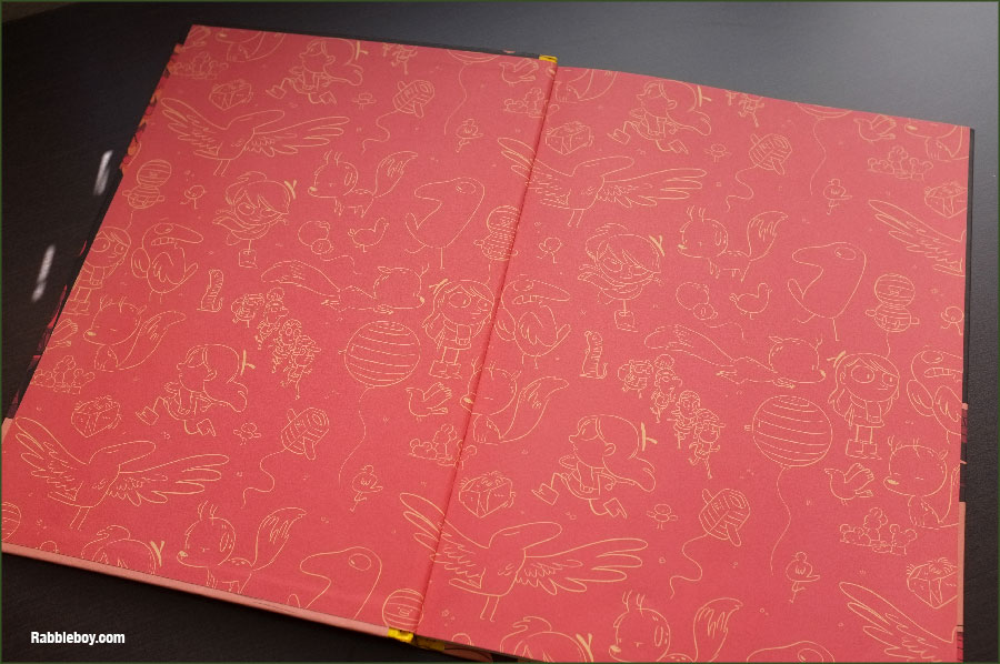
 by Magali Bardos
published 2014 by Flying Eye Books Let me introduce you to Flying Eye Books, if you aren’t already pals with them. Their books are fairly new to me, but are consistently striking and interesting and a different sort of fare than some more commercial offerings.
Case in point: this post by Danielle Davis over at This Picture Book Life (you know her, right? Her posts are a work of art and always a celebration of the picture book form. I’m lucky to know her in real life, not just on the internet.) and this look at their current season (and an interview!) by Travis Jonker.  100 Bears is a counting book with some actual narrative to it. The pace starts off sweetly but then 9 gunshots and an escape leads to a madhouse of 23 knocked over chairs and 37 or 38 bits of confetti. Such trouble a few bears can get into! Some teensy text flaws swim around in that lost-in-translation sea, but there is some real satisfaction in a circular counting story with 100 moving parts. The smile you’ll get from the first and last pages alone is one of the true joys of story.
 A design technique shown off so spectacularly here is spot color. That’s when a single color is printed at a time, and so the process gets layered (and tricky!) by rolling down the building blocks of a print on the same lithograph. You won’t see gradients or blended color, just blocks of hue. (Here’s a little more about the process, from author/illustrator Greg Pizzoli.)
And why does the cover catch your eye? It’s more than a circus style balancing act of big old bears and their blocky numbers. It’s that complementary color scheme. Blue and orange. With a splash of pink for some oh, yes.
And so what is this thing? I’m not too sure, and I don’t really care! It’s like a coffee table book for the sippy cup set. Enjoy it, for sure. P.S. – Crazy for spot color? Stay tuned and hear again from the master himself, Greg Pizzoli. Coming up soon on Design of the Picture Book!
Tagged:
color theory,
complementary color scheme,
flying eye books,
spot color 

By: Kenneth Kit Lamug,
on 3/8/2014
Blog:
RabbleBoy
(
Login to Add to MyJacketFlap)
JacketFlap tags:
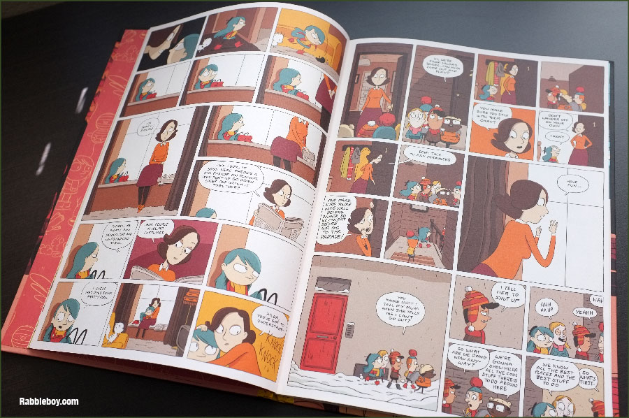
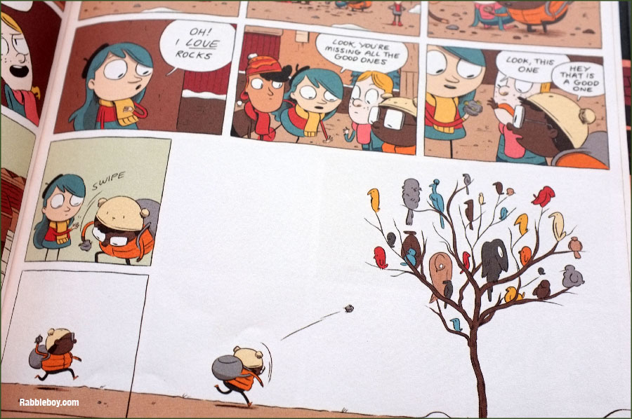
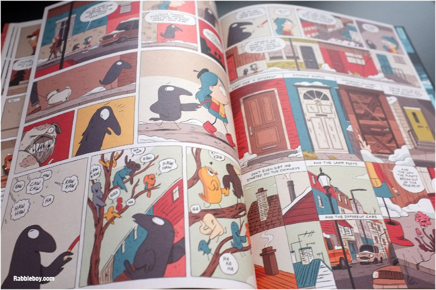
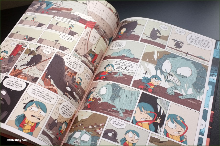
graphic novel,
book review,
comics,
Luke Pearson,
comic art,
Kids comics,
Hildafolk,
Hilda,
Flying Eye Books,
Bird Parade,
screen shot,
Book Reviews,
illustration,
all ages,
Add a tag

By:
Betsy Bird,
on 12/26/2013
Blog:
A Fuse #8 Production
(
Login to Add to MyJacketFlap)
JacketFlap tags:
Best Books,
2013 Caldecott contender,
Best Books of 2013,
Reviews 2013,
2013 picture books,
Flying Eye Books,
Reviews,
Emily Hughes,
picture book review,
Add a tag
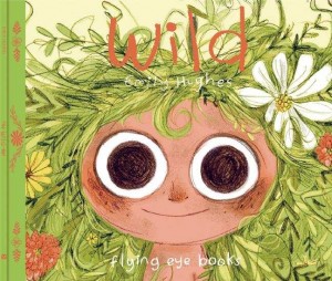 Wild
Wild
By Emily Hughes
Flying Eye Books
$16.95
ISBN: 978-1-909263-08-6
Ages 3-7
On shelves now.
There lives in every child an animal. A wild, untamable creature that will emerge without fail at the worst possible moments, rendering its parents helpless and hopeless all in one swoop. There also exist in this world picture books that touch on this restrained/free duality. You might even argue that the BEST children’s books touch on this in some way (Where the Wild Things Are being the most obvious example). In 2013 alone we saw Peter Brown’s Mr. Tiger Goes Wild talk about the need in every child for order as well as wild uninhibited freedom. Wild, in contrast, is a simpler story. Following just one girl from her path from nature to the city and back again, it has a different lesson in mind. It is all well and good for some to find a happy medium between chaos and order but for some kids chaos is clearly MUCH more appealing!
“No one remembered how she came to the woods, but all knew it was right.” A green-haired baby smiles contentedly on a forest floor as a bear, bird, and fox look on. Over the years the bird teaches her to speak, the bear to eat, and the fox to play. Unfortunately a hunter’s trap catches the child by her foliage-like hair and a pair of baffled hunters takes her back with them to civilization. There the child is forced to reside in the home of a well-meaning psychiatrist and his wife. Attempts to normalize her fail resoundingly and at last she flees back to the wild, the family dog and cat in tow. After all, “you cannot tame something so happily wild.”
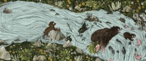
A British/Hawaiian author/illustrator, Emily Hughes’ art is fascinating to look at, partly because it’s so incredibly European. It’s something about the eyes, I think. Or maybe just the way the landscape and the animals intertwine. The bears, for example, reminded me of nothing so much as the ones found in The Bear’s Song by Benjamin Chaud (a Frenchman). The heroine herself is somehow big-eyed without devolving into preciousness (a delicate balance). Her plant-like hair almost looks like it might be sentient at times. People in general are rendered with a fine hand. My favorite shot is of the wild child being brought to civilization by the two clearly shell-shocked hunters. As the men, and even their dog, drive in the rain, their eyes ringed with worry, the child sits on the front seat with only her eyes visible over the dash. She is clearly silent and livid.
It’s interesting to look at the settings and colors in the book as well. As the girl is raised there isn’t a white page to be seen until the last fateful line of “And she understood, and was happy.” Then, when humanity intervenes, the white pages begin to proliferate. Interior spreads are either grey/green or peach/brown and nothing else. It’s as much a relief to the reader’s eye as it is the child’s spirit when she escapes again into the wild. I was particularly pleased too with the two-page wordless humanless spread displaying only the child’s wanton path of destruction. As for the wild itself, here we have a utopian Eden, where animals might eat the occasional fish but never a green-haired baby child. Or, for that matter, one another.
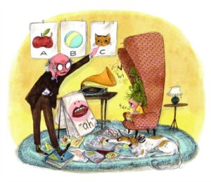 One quibble I have with the book is the final line. It ends on an ellipsis, you see. Now I’m as big a fan of your average everyday ellipses as the next gal. And I understand that there must have been long editorial discussions with the author/illustrator that justified its presence on the last page. I just have absolutely no idea what those justifications could possibly be. The line reads, “Because you cannot tame something so happily wild…” Maybe the dot dot dot is there to suggest that this isn’t the end of the story? I haven’t a better idea.
Oh, they’ll tag this as an eco-centric morality tale, I’m sure. Wild/nature = good, civilization/standardization = bad. That sort of thing. Honestly, I think it has a lot more to say about the inner life of a young child than any overt messagey message about Mother Earth. But there aren’t any rules governing how you use a book, so go on! Use it to talk to kids about nature and the outdoors. Use it to talk about acceptable and non-acceptable behavior and when those rules break down. Use it to discuss tropes most common in European vs. American books, or what makes this book a stand out in its field. Talk about it any old way you like, but make sure you talk about it. A surprisingly lovely little piece that bears similarities to hundreds of pictures books out there, but isn’t really like a single one. One of a kind.
On shelves now.
Source: Final copy sent from publisher for review.
Like This? Then Try:
Other Blog Reviews:
Misc:

Creative Review posted a lovely introduction to Flying Eye Books, the new NoBrow Children's book imprint - including a bunch of pictures from "Welcome To Your Awesome Robot".
Go have a look!
By the way, if you do buy the book (and it can be ordered from bookshops now, or even
directly from Flying Eye) and make an Awesome Robot, please send me pictures, it will make me extremely happy and also we'll stick them on the Awesome Robot Tumblr (coming soon)!

By: Kathy Temean,
on 2/13/2013
Blog:
Writing and Illustrating
(
Login to Add to MyJacketFlap)
JacketFlap tags:
Enslow Publishers,
authors and illustrators,
opportunity,
Places to sumit,
New Imprint,
Amazon Children's Publishing,
Speeding Star,
Skyscape,
Flying Eye Books,
Capstone Young Readers Trade Imprint,
Two Lions,
Add a tag
Happy Valentine’s Day
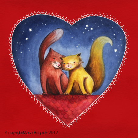
Illustration by Maria Bogade Maria was featured last week on Illustrator Saturday. Here is the link: http://wp.me/pss2W-68h
Amazon Launches Two Lions and Skyscape YA Imprints
 Roughly a year after the Amazon Children’s Publishing division launched, it has announced two new imprints. Two Lions will be home to picture books, chapter books and middle-grade fiction, and Skyscape will be devoted to titles for young adults, encompassing works from both established authors and new voices. Margery Cuyler is editorial manager for Two Lions, and Tim Ditlow is editorial manager for Skyscape. Amazon Children’s Publishing’s general manager is Amy Hosford; Larry Kirshbaum, publisher for Amazon Publishing, oversees the editorial leadership for the company’s Seattle and New York adult imprints, as well as Amazon Children’s Publishing.
Amazon wants to take advantage of one of the hottest segments in the publishing world with these two new youth imprints, which is a great thing for all of us. They will publish established and new authors for these books.
In the next four months there will be a number of launch titles being issued. According to Publishers Weekly, Two Lions is slatted to release Gandhi: A March to the Sea by Alice B. McGinty, a biography written in free-verse; and Poco Loco, a debut picture book about a mouse inventor by J.R. Krause. Titles under the Skyscape umbrella include You Know What You Have to Do by Bonnie Shimko, about a 15-year-old girl who hears voices in her head telling her to kill people; and Reason to Breathe, the first book in the Breathing Series trilogy by Rebecca Donovan, an initially self-published title that has already earned a dedicated readership.
These new imprints will play into the new Kindle Freetime Unlimited program that allows parents to subscribe to the new Amazon service, and get as many kids books they want a month. It is very likely that a number of these titles will appear between Freetime and Amazon Prime. Have you taken advantage of this new program? Don’t miss out.
 Nobrow Press to Launch Children’s Imprint in 2013
U.K.-based indie graphic novel publisher Nobrow Press is launching Flying Eye Books, a children’s book imprint that will debut in the U.K. in February and in March in the U.S. Flying Eye Books will release 12 titles in the first year including comics, picture books, activity books, fiction, and nonfiction for kids aged 4-11 years old.

Speeding Star is a new trade imprint from Enslow Publishers, Inc., esteemed for its high-quality nonfiction and fiction materials for the educational market. Beginning in the Fall 2013, Speeding Star will release easy-to-read fiction and informational titles. This content will be suitable for boys and young men from third grade to high school. Each title will be either 48, 64 or 96 pages, on topics ranging from zombie mysteries to profiles of today’s greatest sports stars. Available in both hardcover trade and paperback bindings, as well as through all major e-book outlets, our titles will keep boys reading!
 Capstone Publishing Group, which has been aggressively expanding beyond the school and library markets with the launch six months ago of its Capstone Young Readers trade imprint, is adding picture books to the list this spring. Thirteen picture books in print format will be released initially under the CYR imprint; after the first list, the imprint will release four to six picture books each year.
Capstone Publishing Group has previously published picture books for the educational and trade markets under its Picture Window imprint and will continue to do so; this is the first time the company is publishing picture books under the CYR imprint. Thus far, board books, chapter books, and hobbies and crafts books have been published under the CYR imprint, which is overseen by senior product manager John Rahm and editorial directors Michael Dahl and Nick Healy.
In May Capstone will launch a Web site to promote its new CYR line, www.capstoneyoungreaders.com. CYR titles will be available in digital formats as well as in print. While only select Capstone Publishing titles for the educational market are available in digital formats, beginning in fall 2012, all of Capstone’s trade titles will be available in both print and e-book formats.
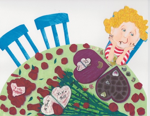
Valentine’s Illustration by Barbara Eveleth Barbara was featured on Illustrator Saturday, Nove. 11th, 2010. Here’s the link: http://wp.me/pss2W-1ZX
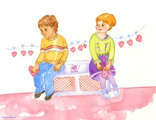
This Valentine’s Day illustration was sent in by Michelle Kogan. Michelle is a Chicago illustrator, instructor, painter and writer. She’s working on a picture book called Through A Sunflower. You can view some of the illustrations for this book and read more about Michelle in the article: Journey with an Illustrator, Painter and Writer, in the January 2013 The Prairie Wind, the Newsletter of the Illinois Chapter of the SCBWI, where Michelle is the Illustrator in the Spotlight, http://www.scbwi-illinois.org/pdf/PrairieWind-Winter2013.pdf
View more of Michelle’s work at her website http://www.michellekogan.com
Talk soon,
Kathy
Filed under:
authors and illustrators,
New Imprint,
opportunity,
Places to sumit Tagged:
Amazon Children's Publishing,
Capstone Young Readers Trade Imprint,
Enslow Publishers,
Flying Eye Books,
Skyscape,
Speeding Star,
Two Lions 

 Who are some of your story heroes?









 Roughly a year after the Amazon Children’s Publishing division launched, it has announced two new imprints. Two Lions will be home to picture books, chapter books and middle-grade fiction, and Skyscape will be devoted to titles for young adults, encompassing works from both established authors and new voices. Margery Cuyler is editorial manager for Two Lions, and Tim Ditlow is editorial manager for Skyscape. Amazon Children’s Publishing’s general manager is Amy Hosford; Larry Kirshbaum, publisher for Amazon Publishing, oversees the editorial leadership for the company’s Seattle and New York adult imprints, as well as Amazon Children’s Publishing.
 Nobrow Press to Launch Children’s Imprint in 2013
 Capstone Publishing Group, which has been aggressively expanding beyond the school and library markets with the launch six months ago of its

For slightly older children (second grade up) Mordicai Gerstein’s THE WILD BOY offers a sympathetic and nuanced portrait of Victor, the Wild Boy of Aveyron. It’s a fabulous book for class discussions, because it shows a poetic appreciation for Victor’s wildness, but also conveys his isolation and vulnerability. Teachers can use this book to talk about what it is to be human, and what is the nature of culture and civilization. I remember asking a class of children if Victor ever became civilized, and one of them said, “He became civilized when he learned to play a game” while the others nodded and chorused agreement. I loved it that participating in a game was their touchstone for civilization.
I adore this connection! My sole regret is that I’ve not heard of the Gerstein book before. To the library!
Mary Losure also has a new book from Candlewick: Wild Boy The Real Life of the Savage of Aveyron. It’s not a picture book but it is illustrated.
Ah, THAT I have read. Liked it too (I’m a Losure fan) though I was disappointed with the number of the suppositions. The second half was much stronger than the first.