After three years of running the
Illustration Pages blog, the time has come for this final post. I've decided to close the site. Believe me when I say, the decision was not an easy one. I've been thinking about it for a while now. When I take into consideration all of the projects I have going on and some new avenues I'd like to explore, I realize I just don't have the time anymore to give
Illustration Pages the attention it deserves.
I'd like to thank everyone who has contributed to
Illustration Pages, especially
Melissa Kojima,
Owen Schumacher,
Lydia Gnau and
Ron Rae. I'd also like to thank all the talented artists that have submitted their great work, allowing us to peek into their creative worlds. And of course, thank you to all the wonderful artists that took the time out of their busy schedules to
interview with Illustration Pages.
There is a lot of useful content on
Illustration Pages so I'm going to keep the site live for a while.
In my humble opinion
Illustration Pages has been a very successful site and I'd like to end it on a high note. If you take the time to peruse the site I'm sure you'll agree. I've had the pleasure of getting to know many talented artists because of
Illustration Pages and I'm thankful for the experience. To me, the community aspect of the site has been the biggest and most important success of all.
I'm open to the idea of writing for other blogs or being a part of other collaborative projects.You'll find my contact information below. And of course, I always welcome a simple hello. Also, keep an eye out for other projects with my name on them.
Thanks again for the experience. I hope you've had as much fun as I have over the past three years.
Lou Simeone[email protected]
Introduction by Lou Simeone
Today it is my pleasure to present the autobiography and artwork of illustrator, Ken Graning. Ken Graning's impressive career as an illustrator spans an astonishing forty six years. Below is just a fraction of the art he has created during that time. As you read through his bio you will be utterly impressed by this artist's work. Ken Graning's traditional work alone is impressive but wait until you see what he creates digitally. His digital paintings, The Persistence of Gingivitis and Galactic Landscape #1, are nothing short of brilliant. Take your time - relax - and enjoy Illustration Pages' latest piece, Illustrator Ken Granning: Multiple Personalities of an Illustration Master.

There are six or seven different artists living in my body. It has always been this way. I have no idea why. I began to paint and draw pictures at a very early age. When I was four or five years old my parents took me to the cinema and the movie was preceded by an early Mickey Mouse cartoon. I was transfixed by the little rodent and bonded with Mickey on sight. That moment changed my life. That was around 1945 or so.
 |
I painted this historical image of a group of Native Americans assembled in a Southwestern landscape with gouache on illustration board around 1982. In 1985 I entered this painting in a national art competition called "Arts in the Parks" which was sponsored by the National Parks Association based in Jackson Hole Wyoming. It was accepted as a finalist and later finished in the top 100, out of about 2,500 entries. |
We lived in Sioux City, Iowa where I was born. We lived there for the first ten years of my life. In 1950 my father took a job in Los Angeles, California and moved the family into a small rented bungalow in Altadena, California. I started drawing cartoons, many of which contained images of Mickey. In high school I was a shy reclusive nerd and spent most of my time in my room drawing pictures. After high school I joined the Air Force and was sent to Bitburg AFB in Germany where I worked in the supply room for three years. In my spare time I painted portraits of some of my fellow airmen on the sides of German beer steins to earn a little extra cash. In 1961 after leaving the Air Force I returned to my parents home and took a job as a clerk in the blueprint department of an electronic corporation in San Gabriel. I met a young lady there and we got married.
 |
This was painted with oils on canvas. Most of the paint was applied with a palette knife because I wanted a lot of surface texture. The subject matter is the country fields and grazing horses in the Lewis and Clark recreation area just outside of Crofton Nebraska, where I visited from time to time to see my parents who lived there. |
The clerical job looked like a dead end to me and I decided to get serious about my art. I learned that there was an art school in Los Angeles called Chouinard Art Institute and that Walt Disney trained his animators there in the film department. I submitted a portfolio and was accepted into the foundation program where I began to take classes in drawing, painting, and design, as well as academic classes that were required because Chouinard was an accredited school and awarded degrees.
 |
This is a classic Wurlitzer "Peacock" jukebox that I painted with gouache, airbrushed on marbleized hand made paper using a masking system that I devised which allowed me to paint the swirling white lines with an airbrush so they were transparent. This painting was used in 1976 as a graduation poster for the Center of Creative Studies in Detroit, where I taught illustration as an adjunct for 25 years. |
 |
This piece is a digital collage comprised of a number of separate images that were created separately and then combined on one board to make the final image. The substrate was masonite which was coated with a layer of gesso that was applied with a palette knife to build up a thick textural base. After it dried it was colorized with acrylic paint in multiple layers. After one layer dried it was lightly sanded to allow the white gesso base to resad through in spots. Then more paint was applied and the process was repeated until I had achieved the translucent effect That I was after. The central image of the a tree was derived from a photograph that I took and then scanned and colorized in Photoshop. The leaf images were scanned directly into the computer. All of the images were printed and then applied to the board one piece at a time using acrylic matt medium. The brown border was created by cutting textured paper into strips and glued to the board also with acrylic matt medium. The final size is 35" x 45". |
When I walked into the door of Chouinard I thought that I had died and gone to heaven. This was a magical world for me and I loved going there. Being at Chouinard opened my eyes to the wider world of art. Chouinard had a bohemian vibe. Many of the students were wild eyed, long haired, paint covered hippies and the hallways were permeated by the aroma of oil paint and turpentine. Chouinard was considered one of the premier fine art institutes in southern California at the time and many of the students were there to study painting, sculpture, and ceramics. There was also a very respectable illustration department and I was impressed by the illustration work that I would see displayed in the hallways and classrooms in that area of the school.
 |
I painted this rather stylized image of a rainforest under attack by a bulldozer around 1985. I used gouache on illustration board and the technique was a combination of airbrush and the rub off technique to give it a textural effect. |
 |
One of the artists living in my body is a cartoonist. This is an example of his work. This image which depicts a politically incorrect version of the Garden of Eden was created in Adobe Illustrator. |
Walt Disney was a board member and could occasionally be seen wandering the halls of the school when he was there for evening board meetings. Even though my goal was to major in animation and ultimately get a job as an animator at Disney studios in Burbank, I began to rethink this plan when I saw what was being done in the illustration department. I made the decision to switch to a major in illustration and graduated with a BFA and a very avant garde illustration portfolio which contained some rather experimental illustration styles and a couple of fashion drawings. The fashion drawings were a concession to one of my instructors who taught boy-girl romantic editorial illustration which was popular in magazines like
Ladies Home Journal,
Cosmopolitan,
Woman's Day,
Saturday Evening Post, and others. His last word to me after looking at my graduation portfolio were, “Ken..you have got to learn to draw a pretty girl”.
 |
This illustration was done for a Christian rock group and was used as the cover of an audio tape box of their music. The medium was gouache on illustration board with some airbrush but mostly applied as a "rub off' technique. A rub off technique involves applying layers of paint to the surface of the board, which after drying, is removed in sections by applying water over the dried paint to soften the colors. You then blot the paint to remove it. This reveals the white board underneath and creates a luminosity to the colors. |
After graduating, my wife, who was originally from Michigan, and I set out for New York as this was considered to be the Mecca for illustrators at the time. On the way we decided to stop in Detroit where she had lived so she could visit with her parents and friends. Out of curiosity I did some research and discovered that there were a number of sizable art studios in town so I decided to take my book around to a few of them and get some reactions. What I got was three job offers after visiting five studios.
I decided New York could wait for a year or two while I got some actual working experience and improved my portfolio. It really needed it. People that I showed my book to were impressed by the experimental styles that I was working in at the time which were very different from the work that was being done at the time in Detroit, but in reality this work was not very sellable in the Detroit advertising market, which was primarily geared to automotive advertising, especially the car catalogs which at this time were a major market for illustrators and retouchers.
 |
Videotape box cover illustrations. The art director on this project was Ron Rae. The medium was Prismacolor pencils on airbrush backgrounds. |
In the spring of 1966 I took one of the job offers and began my illustration career at Graphic House Inc. A relatively small downtown studio with a staff of four Illustrators, two retouchers, three car illustrators, two graphic designers, a couple of keyliners a few mat room apprentices who cut mats and prepped the jobs for delivery. There were also four or five salesmen who called on the local agencies and brought in the work.
 |
I painted this group of highly stylized folks fawning over a vintage Chevrolet around 1986. The medium was gouache on illustration board using mostly airbrush over a pre-textured background. |
I set about reinventing myself. The paying jobs that the salesmen would bring me were primarily editorial which were fun to do but did not pay as well as advertising work. If one of the salesmen had asked me to paint a pretty girl standing next to a car I would have been in trouble. I guess I should have paid closer attention to my art school instructor who scolded me for not being able to do that. I earned my keep the first couple of years by cranking out T.V. storyboards. There was a never ending supply of these and they were profitable for the studio but the deadlines were brutal. I spent many a weekends and holidays working nonstop day and night to meet a Monday morning deadline.
 |
This is an illustration of a 1939 Packard. |
I started thinking, "Hey Ken...you didn’t go to art school to learn to do story boards", so I started focusing on more realistic styles and even dabbled with car painting. All of the work in my art school portfolio was painted in acrylics which worked well with my experimental styles but the consistency of the paint did not feel right to me when I tried to paint realistically so I switched to gouache. I liked the feel of gouache but gouache takes some practice because it is opaque water color and it’s easy to overwork, and it also dries down to a slightly different value than it appears on the palette when its wet, so you have to anticipate what it will look like on the board when its dry.
 |
| The concept for this piece was to design an exterior mural of my choice on a landmark building. The mural would never actually be applied to the building but instead I was provided with a photograph, which I rendered my prospective design on. I envisioned a matched set of Claes Oldenbergesque animatronic quivering assemblies mounted on top of the building with their spouts coughing out pollutants and gasping for air. They would be constructed of auto seat vinyl to achieve a shiny wet look. |
 |
| This piece was one of my early airbrush illustrations. I was still learning how to use this tool at the time. Looking back it seems rather unfinished to me now, and lacks polish, but it got the point across and was well received by the editor and art director of the magazine. |
In addition to my studio work I had cultivated a freelance client,
Detroit Magazine, which was a supplemental magazine that was printed by the Detroit Free Press and distributed with the Sunday news. The work was editorial and didn’t pay much but the exposure offset the low prices and people started to take notice of my work. One day I got a phone call from the studio manager of McNamara Studio, a direct competitor to Graphic House and a considerably larger studio. He inquired if I would be interested in taking a position at McNamaras as a staff illustrator. I told him I might be interested and he made me an offer I couldn’t refuse. A bidding war ensued when I told my boss at Graphic House that I had an offer to change studios. After going back and forth for about a week, McNamara won the war and I made the move.
 |
This illustration was done for the 1987 Detroit Grand Prix poster. This is a very stylized depiction of a Grand Prix race car speeding along the streets of Detroit with the Renaissance Center looming in the background. The medium is airbrush gouache on illustration board. The art director on this project was Emile Safford and the agency was McCann Erickson. |
 |
Double page spread illustration for the May 1972 issue of Playboy Magazine. The concept was to illustrate the recent setting of a land speed record set by Craig Breedlove in his rocket powered race car. Craig Breedlove was a famous daredevil of his time and he raced his car over the Mojave Desert in pursuit of this record. The art director on this project was Art Paul. The medium used was airbrush gouache on illustration board. |
McNamara had a much larger sales staff which improved my position in the market place and I began to attract higher profile jobs, including a series of illustrations that I did in 1972 for
Playboy Magazine. At this point I was becoming a player in the local illustration industry. The pace at McNamara was hectic and exciting, but after a couple of years I decided that I missed the intimacy of the smaller studio and returned to Graphic House. I had left on good terms and they were happy to have me back. I stayed at Graphic House for four more years and then decided that if I was ever going to make any serious money I would need to go freelance. I had developed relationships with a number of local art reps and felt that I would be able to attract enough work to stay busy on my own.
In 1976 I hung out my shingle and set up a studio in my home. I also cultivated relationships with out of town reps to broaden my base and with this network I was able to keep busy for the remainder of my illustration career. Also in 1976 I received a phone call from the head of the Graphic Communication Department at what was then called the Center for Creative Studies in Detroit. He asked if I would have any interest in teaching illustration as a member of the adjunct faculty at C.C.S. With some trepidation (I wasn’t trained for that) I accepted. I began teaching experimental illustration, two classes per week, and after a period of time discovered that I enjoyed doing that so I continued teaching for the next 25 years.
 |
This somewhat stylized panorama of African animals was painted with gouache on black museum board. I seed black board because I wanted to achieve a luminous effect by working from dark to light out of black. |
 |
This is an example of one of my rather impressionistic landscape paintings. The technique was a gouache on museum board. The reference material that I used for this painting was a photograph of an Amish farm that I took from the window of my moving car as I was driving on the Pennsylvania turnpike returning from a weekend art festival that I exhibited my work in. |
In the mid 1980s the business began to change. Powerful computers began to appear in art studios and ad agencies. These machines could paint and draw pictures and ad agencies began to hire artists who could run these computers thus eliminating the necessity to farm out a lot of the work to outside studios and freelancers. My client base began to erode and the volume of work began to decline dramatically. For some time, in addition to my illustration work, I had been painting non commercial work such as landscapes, animal themes and other subject matter that interested me and was directed at the gallery fine art market. I stepped up the pace and made the decision to slowly phase out of illustration and into the fine arts.
 |
In this piece I wanted to morph together two of the most important entities of the 20th century, Mickey Mouse and Adolf Hitler. This is the result. I've never attempted to market this image in any way because I was concerned about Disney copyright infringement issues. I don't think mothers would buy a t-shirt for their kids with this image anyway - unless they were members of a Neo-Nazi group. |
I also made an important transition in my illustration work at about this same time. When the computers started taking over the business I viewed them with suspicion. Actually I was in total denial. It was a machine! I don’t get along well with machines and I was intimidated by the learning curve involved in going digital. At Center for Creative studies, classrooms began to appear that were full of computers. The students sitting in front of these computers appeared to be in a catatonic state, but the images on the monitors began to interest me. There was an evening class being offered in the extension department that involved creating art elements traditionally with paint, pencils and brushes and then scanning these elements into computers and manipulating them in Photoshop - I signed up.
 |
These are multiple views of the same structure. This stylized still life was created digitally using Adobe Dimensions. Dimensions allows me to create an image that can be viewed in three dimensional space from any angle. I am intrigued by the crisp shapes and the dimensionality of the objects. |
It was as if someone handed Emeril Lagasse the master key to the Food Giant supermarket chain. I bonded immediately. I bought a Mac and began creating images using Photoshop as a painting and photo manipulation tool. I also taught myself Adobe Illustrator, Quark Express, which I have since replaced with InDesign, Adobe Dimensions and Fractal Painter. Later I added Adobe Go Live so that I could design and publish my own websites.
 |
This image was rendered in Photoshop. It began as a pencil sketch of the lion which was scanned into Photoshop and placed on its own layer. A pattern of leaves was placed on another layer above that and set at 50% opacity. The leaf pattern was created by scanning real leaves arranged in a pattern. Using distortion filters I distorted the leaf pattern to conform to the lion sketch. When completed the lion sketch layer was discarded leaving the image you see here. |
 |
If you look closely you can see that the landscape is constructed of dental tooth molds, toothbrushes, and other types of dental equipment which I scanned into my computer and manipulated in Photoshop. The title of this piece is "Persistence of Gingivitis". It's one of ten images I created in a series of "dental images". These have proven to be very popular with dentists who buy them to decorate their offices. I've sold many of them as digital prints to dentists all over the world. |
This is the ultimate example of the law of unexpected consequences. In the 12 or so years since I went digital I have created several bodies of digital work that are distinctly different from my traditional painting work, although when viewed as a whole I believe there are common threads that connect it all together. The foundation of my work such as basic drawing skills, how I design and compose graphic elements and shapes, (I had an instructor at Chouinard who used to scream at me “shape..Graning..shape!) my color palette, and my basic concepts, apply equally to my digital work and traditional painting.
 |
This is another example of the work of cartoonist Ken Graning. I have an extensive series of cartoon images dealing with animal subject matter as well as the human condition in general. They are all digital images created in Illustrator. I market them on a website I created specifically for these images, catcartoons.com. I also have them on merchandise which I sell on cafepress.com and etsy.com. |
 |
This is a galactic landscape painted digitally in Photoshop. I have always been fascinated by inter stellar images such as those taken by the Hubble space telescope. The painting was created entirely out of my imagination with no visual reference material. It's one of a series of several similar paintings that I sell as digital prints on the internet. |
I am now in the 46th year of my art career. My body wants to slow down but my mind won’t let it, so I drag myself out of bed (its a bit like unfolding a rusty lawn chair that needs a lot of WD40 to get it going) and go to my studio. Sometimes people ask me if I think about retiring. I’m reminded of a quote that I saw on the wall of a friends studio one day. “Old artists never retire, they just loose their perspective”.
...........................................................................................
A special thank you to Ken Graning from
Illustration Pages for taking us through this wonderful journey of his work. Please be sure to visit Ken Graning's websites to see more of his art.
Ken Graning's WebsiteKen Graning on EtsyKen Graning on CafepressKen Graning on Art ExchangeAlso a special thank you to
Ron Rae who is an invaluable contributor to
Illustration Pages.
Over the past few months I've been corresponding with Ed Fella via email. Back in September I had the pleasure of speaking to him on the phone. We spoke for about an hour and a half discussing design and illustration. Ed told me of his philosophies on the subject and how his work became popular and accepted as influential in the design community. A modest man, he didn't pin point specific reasons why his work has garnered so many accolades and recognition. He spoke of it as being merely a "quirkiness" in the quality of his work. He identified that same "quirky" quality in the work of other professionals he admires, such as illustrator and designer Ron Rae. During our conversation he explained to me how the work that "took off" for him wasn't initially done for paying clients. It was more personal work than not. He agreed to create some brochures for a non profit client if he could incorporate his "personal" typographic style into the piece. The deal was made and the project completed. It was circulated, picked up and featured in a design publication, and the rest, as they say, is history.
Ed Fella is one of the most famous graphic designers of our time and as you can imagine, there is a lot of information covered in a conversation with him. My talk with him was very inspiring and I came away wanting to pursue even more of my own personal work in addition to what I do for paying clients. Ever since we spoke I've been getting back to basics - stretching the boundaries of my imagination and pushing beyond the limitations of my skills.
Below Ed Fella has put together a partial auto biography, philosophy and history lesson. It ends rather abruptly but Ed has promised more for us in the near future. Below he has accompanied his writings with some of his art, which he explained to me, either hasn't been seen before, or has made rare appearances here and there. This is a proud moment for me and Illustration Pages. I hope you enjoy what Ed Fella has put together for us here today.
Introduction by Lou Simeone
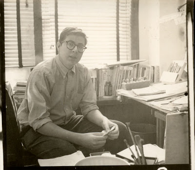
Here I am in 1960 at my drawing board at LeBeau Studios, on the 37th floor of a Detroit high-rise,
which, for all I know, could now be one of those abandoned city sky-scrapers.
Ed Fella - Artist, Designer, Typographer and EducatorContributed to
Illustration Pages by Ed Fella
I worked in Detroit as a commercial artist from 1957 to about 1987, which makes for a good 30 years. We were called "Commercial Artists" in the 50s and 60s even though we did illustration, lettering, typography, and layout (now called graphic design). Somehow the term fell on hard times by the mid 60s and we were reluctant to use it (except to our mothers) and we all eventually became either Graphic Designers or Illustrators. What many of us did could also be called “Design Illustration”, since we frequently combined all the categories in our projects. I think at the time, Push Pin Studios in New York set these practices into the forefront: we all were part of that subset between strictly literal or realistic illustrators and pure graphic designers who combined text with images and occasionally did a logotype. We were also known as "Decorative Illustrators". I like the use of precise terms as it helps define and contextualiz


 By: Lou Simeone,
on 5/4/2013
By: Lou Simeone,
on 5/4/2013
 By: Lou Simeone,
on 1/14/2013
By: Lou Simeone,
on 1/14/2013


 By: Jennifer Thermes,
on 5/13/2010
By: Jennifer Thermes,
on 5/13/2010
 By: Julie Fortenberry,
on 5/11/2010
By: Julie Fortenberry,
on 5/11/2010
 0 Comments on Vectorlicious Artwork - Round 3 as of 1/1/1900
I'm so sad to have to see IP close. =( Thank you for sharing all your kind and wonderful tributes to artists, as well as all the valuable references you have given us throughout these past three years. Wishing you much luck with all your endeavors, Lou!
Thank you, Genevieve.
These post is final post for Illustration Pages. This is sad news. But we got a new one that is the very excellent and tremendous idea for us. Thanks a lot for this post and share with us.