new posts in all blogs
Viewing: Blog Posts Tagged with: rare, Most Recent at Top [Help]
Results 1 - 17 of 17
How to use this Page
You are viewing the most recent posts tagged with the words: rare in the JacketFlap blog reader. What is a tag? Think of a tag as a keyword or category label. Tags can both help you find posts on JacketFlap.com as well as provide an easy way for you to "remember" and classify posts for later recall. Try adding a tag yourself by clicking "Add a tag" below a post's header. Scroll down through the list of Recent Posts in the left column and click on a post title that sounds interesting. You can view all posts from a specific blog by clicking the Blog name in the right column, or you can click a 'More Posts from this Blog' link in any individual post.
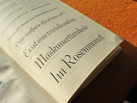
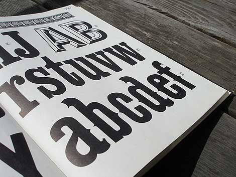
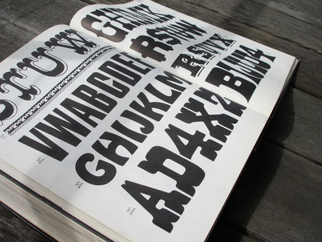
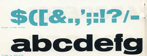
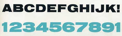
Schriftenkatalog der n.v. Lettergieterij Amsterdam voorheen N. Tetterode
I rarely find cool type catalogs, but this one is a real goldmine. The catalog seen above was produced by the Amsterdam Foundry (formerly N. Tetterode) and appears to date back to the mid-1960s. It’s filled with beautiful specimens including Nobel, Mercator and Aigrette all lovingly laid out in a simple yet elegant manner. If this sparks your interest, I suggest taking a quick glance at the Vette Annonce type specimen sheet we posted back in 2008 as well.
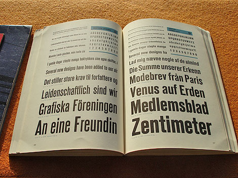
Grotesk in different weights
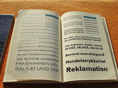
Karten & Grotesk Breitt Fett
Aigrette
—–
Also worth checking: Simmelkiaer Grotesk Type Specimen
Enjoy this story? Sign up for our tasty free grain edit RSS feed.
—–
No Tags
Share This
Vintage kids book Mi Diccionario is in the Grain Edit Shop
Grain Edit recommends Colo Pro A font designed by Font Fabric. Check it out here.
©2009 Grain Edit - catch us on Facebook and twitter

By: Joanna,
on 12/2/2009
Blog:
OUPblog
(
Login to Add to MyJacketFlap)
JacketFlap tags:
Reference,
A-Featured,
Oxford Etymologist,
Lexicography,
etymology,
anatoly liberman,
rare,
infrequent,
underdone,
Add a tag

By Anatoly Liberman
At the end of the 19th century, rare “underdone” had so little currency in the British Standard (“Queen’s English”) that educated speakers labeled it as an Americanism, though language historians, Skeat among them, knew better than that. He wrote in 1868: “…a very common old English and provincial English word” (the low case o in old indicates that older periods were meant; otherwise, Skeat would have said Anglo-Saxon). About fifteen years later, the London-based periodical The Academy asked the readers to send information about their familiarity with rare and was astounded to learn that the word was in use practically everywhere. In England, the more common form is rear or rere; as a rule, rare appears in British dictionaries with the reference: see rear. This fact alone is enough to show that rare “underdone” and rare “infrequent; unusual; precious” go back to different sources; they are homonyms. Rare, rhyming with “beyond compare,” poses no problems: it is an adjective English took over from French, while in French it is from Latin. By contrast, rare “underdone” is obscure.
Throughout its history, rare has been applied not only to meat but also to eggs. Moreover, it seems that, as far as references go, eggs were roasted rare or rarely (that is, with their white still fluid) more often than meat (the pun on rare/often is unintentional). In 1868 Skeat, already an experienced editor of Middle English texts, was a novice in matters etymological and attacked some hard questions with more vigor than prudence. He cited “two cognate” Old English forms (both having long vowels)—hrere and hreaw: “from the first…comes rere, and from the second raw. There is little difference in shape, and apparently none in meaning.” Alas, the meanings, as we will see, are not fully compatible, and “the difference in shape,” far from being little, is wide as a gulf, for long e and ea cannot alternate in one and the same root of an Old English word (in older Indo-European, vowels formed series that resembled trains, each of which was allowed to move along its own track and prohibited from encroaching on the track of its neighbor). In the first edition of his dictionary (1882), Skeat said that although a connection between rear/rare and raw had been suggested, it is “very doubtful.” Also in 1882, in a letter to The Academy, he derived long e in Old Engl. hrere from long o (a legitimate procedure) and compared hror with the Germanic verb for “stir.” Its reflexes have continued into Dutch (roeren), German, and all the modern Scandinavian languages. In English, the only cognate of hrere can perhaps be seen in reremouse “bat” (with rere- from hrere-). This is a reasonable conjecture in light of German Fledermaus (as in the title of the famous opera), a cognate of Engl. flittermouse “bat,” that is, a mouse with flittering, fluttering wings. (By the way, flatter belongs here too: a flatterer “flits around” the person whose vanity is to be gratified.) Later Skeat did not venture any hypothesis on the origin of rare “underdone” and confined himself to citing the Old English form.
The reason for this diffidence is clear. The editors of the OED doubted that rere- in reremouse should be connected with the verb for stirring and looked upon Old Engl. hreremus as a folk etymological alternation of hreathemus (modernized spelling), another word for “ba
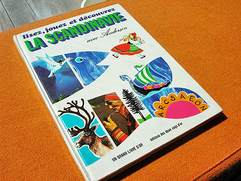
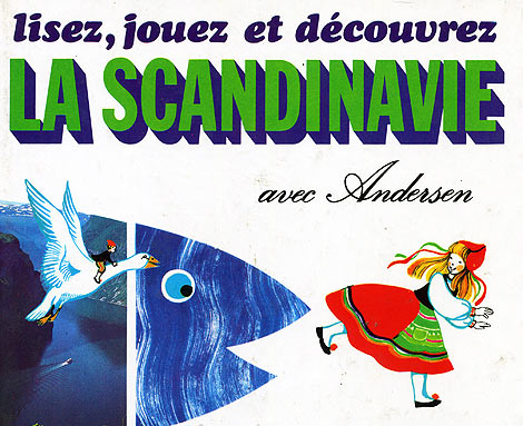
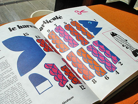
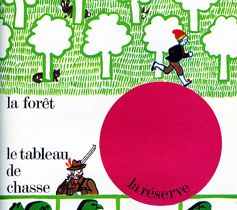
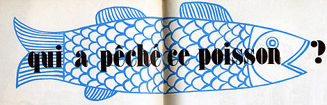
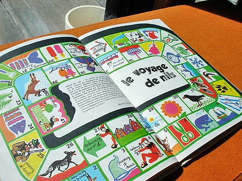
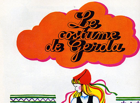
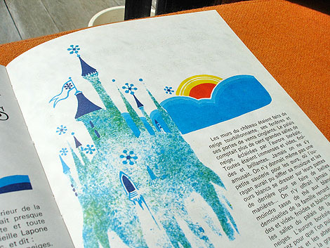
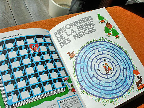
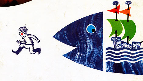
lisez, jouez et decouvrez La Scandinavie avec Andersen -by Paul de Roujoux, Pamela Labonnelie and Mireille Ballero. Illustrations by Martine Bourre c1975 editions des deux coqs d’or
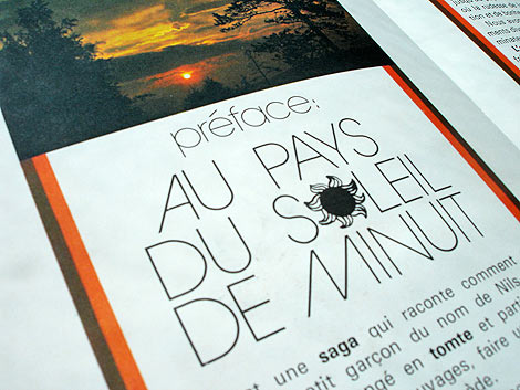
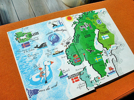
La Scandinavie avec Andersen is a beautiful children’s book about Scandinavian culture. The book is filled with stories, games and activities. Just think, your child could be making his/her very own Nils Holgersson costume right now! For the budding young history buff, there’s a section on the Drakkars and Vikings. If your child is too scared to look at tough guys with helmets, head straight to the fuzzy Nordic animals in chapter one. Have a four year old that’s into logging? No problem, this book has you covered. There’s a section on the Scandinavian timber industry in the middle of the book. Soon your young one will be able to turn raw material into fine Danish furniture!
More pictures after the jump.
——————–
Also worth checking: Alain Gree - L’Electricite.
Not signed up for the Grain Edit RSS Feed yet? Give it a try. Its free and yummy.
——————–
No Tags
Share This
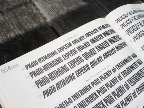
Congrats to B. Rane! She is the winner in the Photo-Lettering giveaway.
Grain Edit recommended reading: A Russian Diary
©2009 Grain Edit - catch us on Facebook and twitter

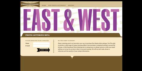
Photo Lettering website
Photo-Lettering was a mainstay of the advertising and design industry in New York City from 1936 to 1997. PLINC, as it was affectionately known to art directors, was one of the earliest and most successful type houses to utilize photo technology in the production of commercial typography and lettering. It employed such design luminaries as Ed Benguiat and sold type drawn by the likes of Herb Lubalin, Milton Glaser and Seymour Chwast as well as countless other unsung lettering greats. The company is best known by most of today’s graphic designers for its ubiquitous type catalogs.
House Industries purchased the entire physical assets of Photo-Lettering and is carefully digitizing select alphabets from the collection and plans to offer them through the new Photo Lettering website.
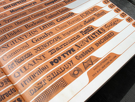
To celebrate, I thought it would be nice to dig up one my Photo Lettering catalogs. Here for your viewing pleasure is Alphabet Thesaurus Vol.2
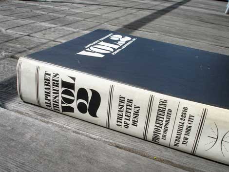
Alphabet Thesaurus Vol 2 - A Treasury of Letter Design
No Tags
Share This
Congrats to our two winners in the Human Empire/Andreas Samuelsson t-shirt giveaway. 1st place winner jessicat - 2nd place winner - Hamsterfish
©2009 Grain Edit

By: Dave,
on 5/21/2009
Blog:
inspiration from vintage kids books and timeless modern graphic design
(
Login to Add to MyJacketFlap)
JacketFlap tags:
magazines,
Typography,
1950s,
vintage,
1960s,
Found design,
swiss,
switzerland,
rare,
Add a tag
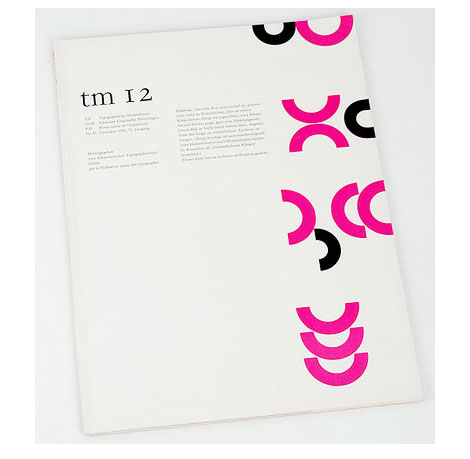
TM Nr. 12, 1956, 75. Jahrgang
Typografische Monatsblätter is a Swiss magazine that focuses on typography and photography. Over the years the magazine has played host to an all star cast of contributors including: Herbert Matter, Emil Ruder, Max Caflisch, Wolfgang Weingart, Jan Tschichold, Adrian Frutiger, Jost Hochuli, Walter Cyliax, Helmut Schmidt, Atelier Eidenbenz, Hans Rudolf Lutz and many others. Flickr user Berlintypes has assembled an amazing collection of these magazines from the 1950s -1990s. Enjoy them all here.
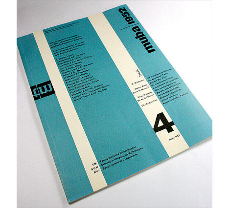
Typografische Monatsblätter-Schweizer Graphische Mitteilungen-Revue suisse de l’Imprimerie
Nr. 4, 1952, 71. Jahrgang
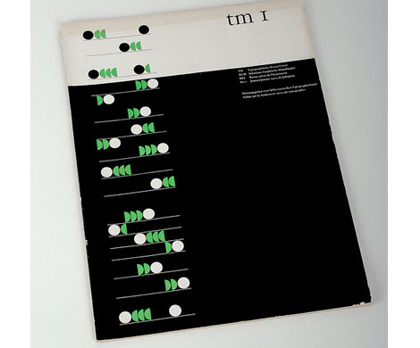
TM Nr. 1, 1957, 76. Cover design by Albert Gomm, Basel
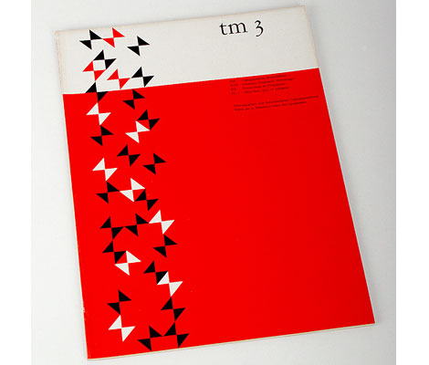
TM Nr. 3, 1957, 76. Jahrgang Cover design by Albert Gomm, Basel
(via I love typography)
No Tags
Share This
Join us on Twitter @grainedit .
Join us on Facebook
©2009 Grain Edit

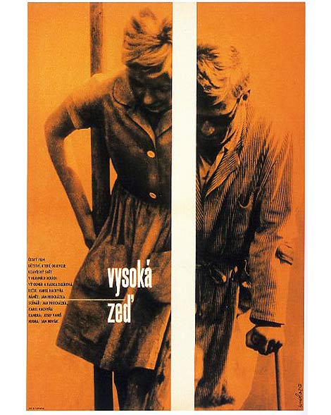
Poster for Vysoka Zed’ (The High Wall) c1964 Directed by Karel Kachyna
Stunning posters from the Czechoslovakian designer Zdenek Ziegler.
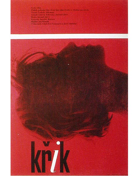
Poster for Krik (The Cry) c1963 Directed by Jaromil Jires
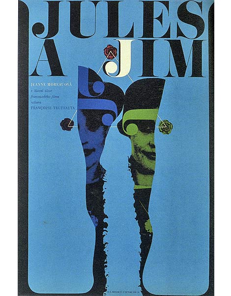
Poster for Jules and Jim c1967 Directed by Francois Truffaut
No Tags
Share This
Congrats to our winners in the Alexander Girard/ House Industries Giveaway!.
Grand Prize goes to MidcenturyMaude 2nd Prize goes to Abby S
©2009 Grain Edit

By: Dave,
on 4/2/2009
Blog:
inspiration from vintage kids books and timeless modern graphic design
(
Login to Add to MyJacketFlap)
JacketFlap tags:
fonts,
Typography,
Off our book shelves,
vintage,
netherlands,
1960s,
dutch,
type-specimens,
rare,
Add a tag
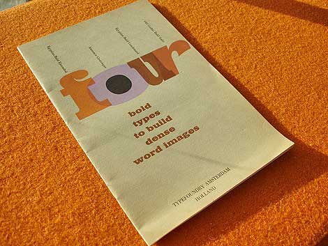
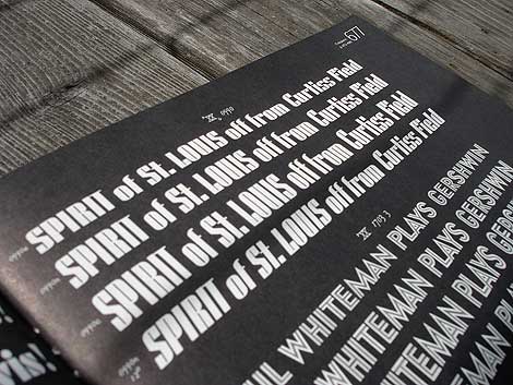
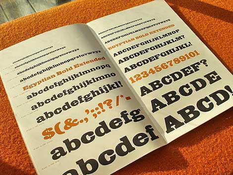
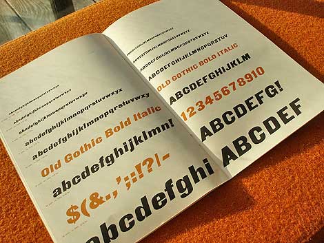
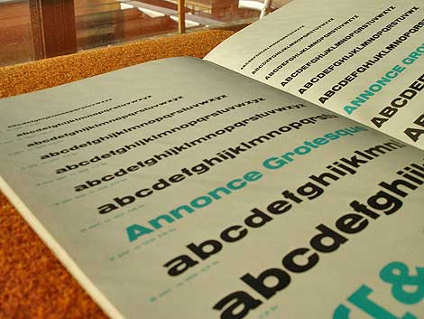
Four bold types to build dense word images c. early 60s?
Beautiful type specimen booklet produced by Typefoundry Amsterdam and imported by Amsterdam Continental. Includes samples of Egyptian Bold Extended, Annonce Grotesque, Egyptian Bold Condensed and Old Gothic Bold Italic.
From the intro of the Booklet:
In this specimen booklet, we have grouped four bold, decisive display type faces. Based on design modes which became classics of the midnineteenth century style, they have in common the power to create a dense , highly integrated word image, with the effect of a broad band or ribbon. A wide diversity is offered within this overall unity of effect: Egyptian and Gothic, roman and italic, condensed and extended. Where strong impact is required, these faces achieve dramatic solutions. They create an advanced, modern accent when maxium contrast with the even tone of text material is the designer’s aim.


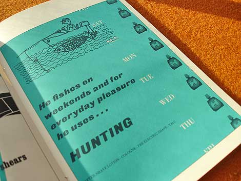
Who writes this stuff? This is great. He fishes on weekends and for everyday pleasure he uses hunting. Killing furry meat in the week and doodle socking on the weekend.. nice!
*Note-I googled fishing slang. I’m not actually this cool.
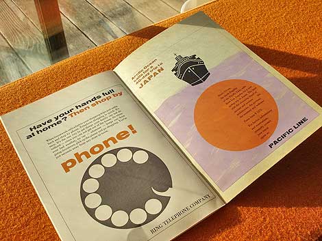
Ring telephone company..clever.

Also worth checking: Vette Annonce
Not signed up for the Grain Edit RSS yet? Give it a try. Its free and yummy.
No Tags
Share This
Congratulations to our winners in the Grain Edit Design Stimulus Giveaway!.
Grand Prize goes to Tim Kim - 1st pick of the 4 prize options goes to Vertigo Andy - 2nd pick of prizes goes to Jory Dayne- 3rd pick of prizes goes to Tim Kim - 4th prize goes to Celiajoy our winner from twitter - We will contact all of you directly.
©2009 Grain Edit


Beautiful Cityscapes designed and illustrated by the German couple Sigrid and Hans Lammle. These illustrations were for a calendar published in 1957. Really amazing details and the colors are super bright and saturated. I need more of this! Any guesses as to what city this might be?


also worth checking: Miroslav Sasek- This is the United Nations
Not signed up for the Grain Edit RSS yet? Give it a try. Its free and yummy.
No Tags
Share This
Join our new Grain Edit Fan Page on Face Book©2008 Grain Edit


Recently dug up this deck of El Al Israel Airlines playing cards. El Al commissioned Israeli artist and designer Jean David to design the set which portrays the Kings, Queens and heroes of Israel’s past. Love the design of the joker. He looks like some crazy elf with danish modern candle holders on his head and a speed bump for an arm.


also worth checking: Dan Reisinger: graphic designer
Not signed up for the Grain Edit RSS yet? Give it a try. Its free and yummy.
No Tags
Share This
Join our new Grain Edit Fan Page on Face Book©2008 Grain Edit


I stopped by the The 42nd California International Antiquarian Book Fair in San Francisco this past weekend and saw some really nice books. This is the largest antiquarian book fair in the U.S. and features booksellers from around the world. I saw lots of great pieces by Piet Zwart, Bruno Munari and a ton of rare children’s books. I was really surprised by the prices though. Many of the books were overpriced, especially considering the current economy. Anyone else get a chance to go? Thoughts?


No Tags
Share This
Join our new Grain Edit Fan Page on Face Book©2008 Grain Edit

By: Dave,
on 2/2/2009
Blog:
inspiration from vintage kids books and timeless modern graphic design
(
Login to Add to MyJacketFlap)
JacketFlap tags:
labels,
germany,
Off our book shelves,
vintage,
1960s,
ephemera,
memorabilia,
rare,
luggage-labels,
Add a tag

Hotel deutschland, Leipzig, Germany luggage label
Check the bird in the logo. Very similar to the Braniff Airlines logo designed by Alexander Girard.
also worth checking:
Hotel Rigi Luggage label
No Tags
Share This
New giveaways coming soon at Grain Edit ©2008 Grain Edit


Rad luggage label for Hotel Filser which is located in Oberstdorf, Germany. The mountains in the back would be the Bavarian Alps. Anyone know what typeface “Filser” is set in? Is it Hand-drawn?
No Tags
Share This
New giveaways coming soon at Grain Edit ©2008 Grain Edit


Beautiful hotel luggage label via the consistently good Inspiration Resource.
No Tags
Share This
New giveaways coming soon at Grain Edit ©2008 Grain Edit

By: Dave,
on 11/3/2008
Blog:
inspiration from vintage kids books and timeless modern graphic design
(
Login to Add to MyJacketFlap)
JacketFlap tags:
Off our book shelves,
menus,
SAS,
illustration,
Uncategorized,
1950s,
modern,
airlines,
ephemera,
sweden,
memorabilia,
rare,
Add a tag

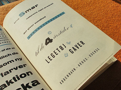
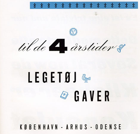
SAS Airlines dinner menu 1958
Dinner Menu celebrating the 1st Anniversary of the Scandinavian Airlines North Pole Route from Copenhagen to Tokyo.


No Tags
Share This
New giveaways coming soon at Grain Edit ©2008 Grain Edit

By: Dave,
on 10/3/2008
Blog:
inspiration from vintage kids books and timeless modern graphic design
(
Login to Add to MyJacketFlap)
JacketFlap tags:
japan,
birds,
out-of-print,
Off our book shelves,
posters,
1970s,
graphic-design,
rare,
illustration,
Add a tag
This is every cat’s nightmare.
Very similar in style to this 70s Japanese poster. Has to be the same designer.

Can someone translate this?

Is this the designers name?
Also worth checking:
1960s Japanese graphic design magazine
No Tags
Share This
Drop a comment and enter to win lots of cool prizes in the Grain Edit 1 Year Anniversary Giveaway Shindig thing! ©2008 Grain Edit

By: Dave,
on 9/8/2008
Blog:
inspiration from vintage kids books and timeless modern graphic design
(
Login to Add to MyJacketFlap)
JacketFlap tags:
1950s,
retro,
vintage,
posters,
1960s,
Found design,
ephemera,
memorabilia,
rare,
archive,
travel,
UK,
Add a tag
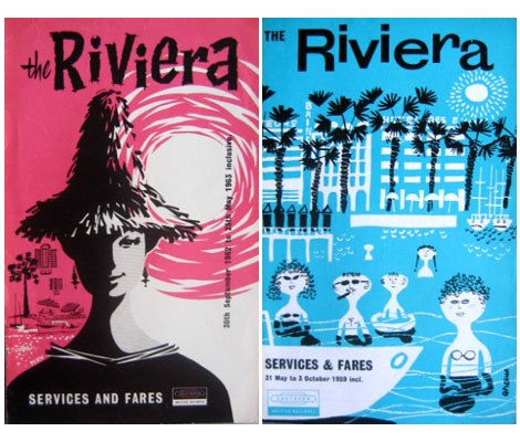
British Railways Services and Fares booklets for the Riviera (L) Sept 1962 (R) May 1959
Tony Hillman has put together an amazing collection of British Railways publicity material. His site features posters, menus, booklets, brochures, tickets, timetables and commercials. Put some time aside because there is plenty of good stuff too look at here.
(Huge round of thanks goes to Tika Viker-Bloss for sending this my way)
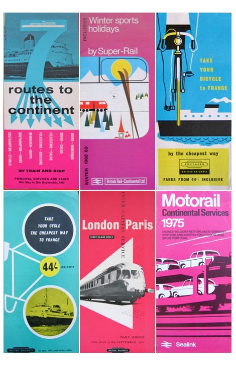
British Railways logo designed by Design Research Unit
Also worth checking:
British Airways Playing Cards.
No Tags
Share This
Congrats to JAN D you won the Raymond Savignac poster. Please email us to claim your prize. ©2008 -Visit us at Grain Edit.com for more goodies.

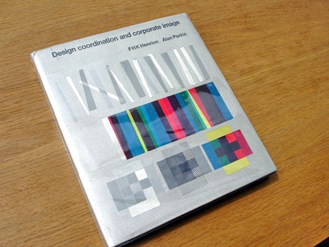
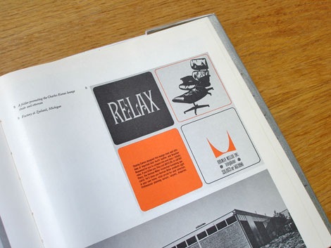
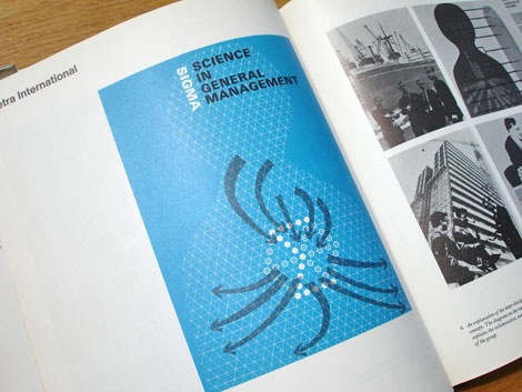
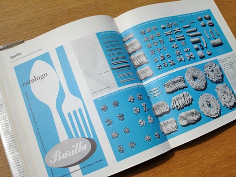
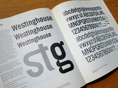
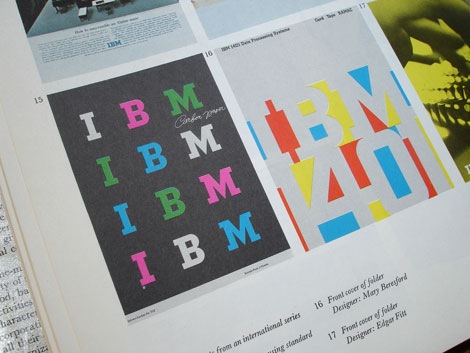
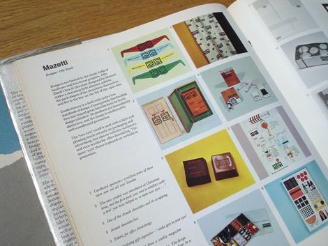
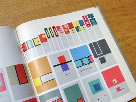
Design Coordination and corporate image - FHK Henrion + Alan Parkin c1967
This is an excellent book on the subject of corporate identity. All the big design guns are in here. The best part, for each case study the designer explains the problems he encountered and his thoughts behind the design etc.
Includes case studies by Dick Merricks, Metra International, KLM Royal Dutch Airlines, Barilla, BTR Industries, Watneys, Braun, IBM, Westinghouse, PAM, Olivetti, Celanese Corporation, Olympic Games Tokyo 1964, Clydesdale Bank, Mazetti, Pirelli, London Transport, Therma, Italsider, British Rail, Rohm and Haas, Herman Miller, Anker Bier, Lunch Bier, British Traffic Signs, Sainsburys, Steendrukkerij de Jong
Designers Include: Otl Aicher, Saul Bass, Lester Beall, Erberto Carboni, Eugenio Carmi, Wim Crouwel, Design Research Unit, Crosby, Fletcher, Forbes, Charles Eames, Olle Eksell, FHK Henrion, Yusaku Kamekura, George Nelson, Paul Rand, Willelm Sandberg, Giovanni Pintori and more.

Also worth checking:
List of Corporate Identity Projects
No Tags
Share This
Congrats to JAN D you won the Raymond Savignac poster. Please email us to claim your prize. ©2008 -Visit us at Grain Edit.com for more goodies.