Login or Register for free to create your own customized page of blog posts from your favorite blogs. You can also add blogs by clicking the "Add to MyJacketFlap" links next to the blog name in each post.
Blog Posts by Tag
In the past 7 days
Blog Posts by Date
Click days in this calendar to see posts by day or month
Viewing: Blog Posts Tagged with: 1960s, Most Recent at Top [Help]
Results 1 - 12 of 12
How to use this Page
You are viewing the most recent posts tagged with the words: 1960s in the JacketFlap blog reader. What is a tag? Think of a tag as a keyword or category label. Tags can both help you find posts on JacketFlap.com as well as provide an easy way for you to "remember" and classify posts for later recall. Try adding a tag yourself by clicking "Add a tag" below a post's header. Scroll down through the list of Recent Posts in the left column and click on a post title that sounds interesting. You can view all posts from a specific blog by clicking the Blog name in the right column, or you can click a 'More Posts from this Blog' link in any individual post.
The characters - Head Monkey Grey Goosie Wise Monkey Custard The Great Stabber (unseen and unheard, but definitely there) anda rather grumpy bottle of beer who becomes more subdued as the scene progresses.
The scene - A Sunday cricket match in a rather chilly June. We are near the boundary, listening to the assorted shouts of exasperated bowlers and cheering team mates. The dying sun casts long shadows across the field as the match draws to a close. If we listen carefully, we can just hear a whispered conversation coming from a small group of friends...
Custard - 'Is that our chap out there bowling?' Wise Monkey - 'I think so - hard to tell from here, they look the same from a distance, and all dressed in white.'
Grey Goosie - 'Can someone tell me who I am, where am I and why I am please? I'm only two hours old.' Head Monkey - 'You are a mere babe! We saw you being created by the Great Stabber. You are at a cricket match and your name is Grey Goosie.' Grey Goosie 'What is cricket? Who is the Great Stabber? Why? How? When?'
(momentary distraction as attention reverts to the match)
Head Monkey - 'Oh good running sir!' Custard - 'I wish I could run like that, but alas, I am legless' Bottle of Beer 'Well don't blame me! I didn't ask you to stick your great yellow snout into my neck!' Wise Monkey - 'Calm down, Beer, he meant legless as in legless, not as in legless. But then, you are a rather fine specimen of Fiddler's Elbow, so you must expect to bedrunk, if you pardon the pun.'
(The bottle of beer subsides, grumbling, then squeaks as it is plucked from its resting place. When it returns, it is somewhat quieter).
Grey Goosie - 'So why are we here? What are we doing? Who are you all?' Custard - 'Well I am waiting for my legs, then I will be going to my new home. I have heard that she is a lovely, gentle lady who lives in a magical palace filled with wondrous materials and treasures.' Head Monkey - 'I have been waiting for the rest of my body for weeks...I am destined to travel far across the ocean to sunny climes' (he shivers as a breeze cuts across the field) 'and not before time - this country is far too cold for a monkey. I have heard that my new mistress is a talented artist who creates delightful books for children. I am to be her special toy, all her own. I would jump for joy, except I am only a head...' Wise Monkey - 'And you have been made in my image. I belong to the Great Stabber. Before that I belonged to her father, and he brought me from a far hotter country than you are destined for. Although I too am missing some limbs, I am very old, and one of her prized possessions.' Grey Goosie (breaking in impetuously) - 'What about me? What about me? Where am I going? Who will love ME? More importantly, why haven't I got a proper grown-up beak?'
(There is a startled gasp from the beer bottle as yet again it is lifted from the table top, to a mysterious Somewhere high above their heads).
Wise Monkey - 'Oh impatient youth! Barely three hours old and already seeking the answer to everything. For every creature there is a home. It is written in the stars' Custard - 'We have heard tell of Mavis, who stayed on the toy shelf for many weeks, but at last found a home and flew hundreds of miles to live with a fairy artist. She even laid an egg on her journey. You will find your Someone, one day. When there's a bit more of you.' Head Monkey (grumpily) - 'I wish there was a bit more of ME!' Wise Monkey - Now hush, my children, the sun is sinking and the wind is gathering...let us snuggle into our basket and I will tell you stories of toys who were found, and we will dream...'
(As the curtain descends on the drowsy scene, the beer bottle is heard gurgling emptily off-stage, before silence falls, disturbed only by tiny snores emanating from the sewing basket).
25 Comments on Overheard at the boundary, last added: 7/4/2008
This is fabulous, I enjoyed it ever so much. Much welcome lifting break from writing student evaluations;-)...!!!!!! Back to work laughing ( guess that would be BTWL). Oh, love looking at your work in progress.....
Awww what a lovely story... And great creations. I didn't realize how big they are until now. It must have costed a lot of effort to felt so nicely such big pieces.
This is my first read of a children's story that has beer as a character! I loved it. How goes the illustrations? I see you are still finding time for stabbing! Jen
Oh, Gretel..I just love this story, a lovely mix of funny and sweet and winsome. I definitely would leave the beer in. What a great way for me to start my day. Thanks.
Oh the joys of the full moon and what it does to people. And toys. I like the sound of that beer, Fiddler's Elbow, looks like one we haven't tried yet! :D
Oh I do love your stories Gretel :) You write them so well... How about some bendy wire in these fellows so that they can be stop-frame animated into a little series?! It is a rather chilly June isn't it? Hugs xx
What a great story!! So, what do they do next? And does Grey Goosie ever achieve enlightenment? And, and, and what's the Wise Monkey's tale? Eh? What do you mean it's ended? :-o
Waaaaaaahhhhhhhh! Wanna 'notha story! Sniff...
Thanks for another wonderful day brightener, Gretel. Your stories are lovely.
The Wise Monkey's silhouette and long shadow in the first picture set an almost melancholy tone for the metaphysical musings of your wonderfully-named creations. I realize that your imagination plays a large part in the design and creation of your critters, and now I see that they all take on bits of their creator's personality. The Great Stabber is the best name of all!
I agree, these characters would be lovely in a childrens book, I think photographed rather than illustrated. I hope you are getting on well with your commercial work. P.x
Ah, this was great fun to read. I love the Wise Monkey - the beer bottle made some hilarious comments... lucky little people who get to go to new homes. Poor grey goose ... reminded me of the goslings in the park. A few weeks ago they were tiny little yellow balls and now they are getting huge.
This really would make a wonderful children's story!
I think you need to write as well as all your other talents! I'm loving custard - even without his legs! I just posted a new tale of felting disaster ... I tried that wet felting ... it was a M-E-S-S! I think I will try just the needles next time! I hope you are well - Rachael x
Pino Tovaglia book - The rule that corrects emotion
In addition to this blog, I own a small design bookstore. As a bookseller, I find it hard to find publishers that consistently produce quality titles. Italian publisher Edizioni Corraini is one of a few publishers that I look forward to their new releases each year. If you own or have seen any Bruno Munari books, you are most likely familiar with their work. They have reproduced dozens of Munari’s books, many of which I own in my personal collection. In addition to the Munari collection, they have produced books on or by Martí Guixé, Enzo Mari, Aoi Huber-Kono (Max Huber’s wife),Taro Miura, Albe Steiner and many others. With this in mind, I was delighted when I received an email from them mentioning that they had been reading Grain Edit and that they would like to send a package my way.
I will cover the contents of the package in several posts. The first being the Pino Tavaglia book seen above.
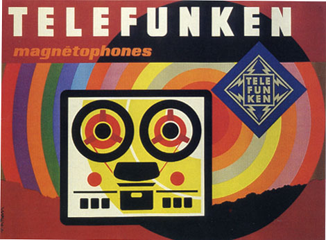
The piece above is one of a series of posters that paris based designer Jacques Nathan Garamond produced for Telefunken. I just wish I could cut out that Telefunken logo. It kind of kills the vibe of this poster. You have all these round edges on the type and the reel to reel player and theres this crazy sharp edge ninja star with lightning bolts.
During the 1950-1960s Garamond began deconstructing objects into geometric shapes. This is evident in the print above as well as his poster work for Air France. I’ll try to scan in some of the Air France posters when I get a chance.
Giant Golden Book of Biology - An Introduction to the Science of Life c1961
Text by Gerald Ames and Rose Wyler - Illustrated by Charley Harper
It doesn’t get much better then this. This is Charley in his prime.
“In a style he called “minimal realism”, Charley Harper captured the essence of his subjects with the fewest possible visual elements. When asked to describe his unique visual style, Charley responded:
When I look at a wildlife or nature subject, I don’t see the feathers in the wings, I just count the wings. I see exciting shapes, color combinations, patterns, textures, fascinating behavior and endless possibilities for making interesting pictures. I regard the picture as an ecosystem in which all the elements are interrelated, interdependent, perfectly balanced, without trimming or unutilized parts; and herein lies the lure of painting; in a world of chaos, the picture is one small rectangle in which the artist can create an ordered universe.[cite this quote]
He contrasted his nature-oriented artwork with the realism of John James Audubon, drawing influence from Cubism, Minimalism, Einsteinian physics and countless other developments in Modern art and science. His style distilled and simplified complex organisms and natural subjects, yet they are often arranged in a complex fashion. On the subject of his simplified forms, Harper noted:
I don’t think there was much resistance to the way I simplified things. I think everybody understood that. Some people liked it and others didn’t care for it. There’s some who want to count all the feathers in the wings and then others who never think about counting the feathers, like me.”
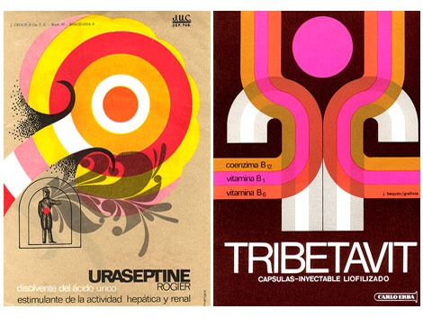
Flickr user ex.novo has posted some amazing examples of spanish modern design in advertising from the 1950s, 60s and 70s. The ads are taken from magazines/ journals titled “Clínica Rural” and “Glosa”. Anyone know anything about these journals? Most of the advertisements seem to be related to pharmaceutical products so it’s a great follow up to my previous post on Swiss modern design in the chemical industry.
Big ups to Mike from Burlesque for dropping this gem on me.
Publicity and graphic design in the chemical industry - Hans Neuburg 1967 Contributions by Josef Muller Brockmann
Clap your hands if you love swiss design.
This is got to be one of the best books on graphic design in the chemical industry. Ha! this probably the only book on graphic design in the chemical industry. Most of the design work in the book is for pharmaceutical companies. Companies include J R Geigy and Ciba Aktiengesellschaft, both located in Basel, Switzerland.
The index in the back reads like the whos who of Swiss design. Designers include:Karl Gerstner, Herbert Leupin, Siegfried Odermatt, Hans Erni, Max Schmid, Fred Troller and Kurt Wirth amongst others.
Just look at the pictures above, the work is incredible. Anyone have any nominations for pharmaceutical/ chemical companies that have great design? Maybe we should put together a top 5 list. For example, the always fun top 5 favorite poisonous gas logos.
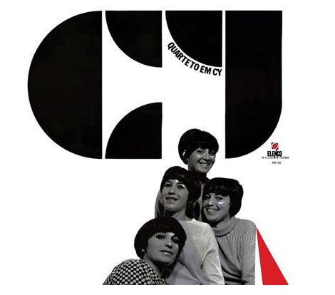
Quarteto em Cy - Quarteto em Cy (1966), for Elenco
Dynamite record cover for this female vocal group from Brazil. This is a great album. I highly recommend their 1972 Self titled lp as well.
Heres a video of Quarteto em Cy on the Andy Williams show with Marcos Valle. You might recognize the vocals at the beginning of the song. I believe Nicola Conte sampled it.
Alain Gree - l’electricitie c1969 vintage kids book Published by Casterman as part of the Cadet-Rama Collection
Woah! Pastel overload! Someone went crazy with the pink crayons. I love it though. Alain Gree’s illustrations are great. I can’t get enough of the bubble heads, mod clothes, pop colors and psychedelic scenery. In this book, Alain looks at electricity and how its used. It’s filled with teal buses, pink trolleys and mustard colored sewing machines.
On a related note, I have to give a birthday shout out to my friend Sean. Sean introduced me to Alain’s work so this post seemed fitting for today.
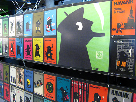
The recent excitement over Penguin covers has resulted in a renewed interest in paperback book cover design. I’m starting to see discussion groups popping up as well as new books being published on the subject. Several titles come immediately to mind; Seven Hundred Penguins and World Paperback design. In future posts I’ll discuss both of these books as well the as the book covers of dutch designer Dick Bruna. For now enjoy the pieces above.


This is fabulous, I enjoyed it ever so much. Much welcome lifting break from writing student evaluations;-)...!!!!!! Back to work laughing ( guess that would be BTWL). Oh, love looking at your work in progress.....
That was so much fun. I was seriously getting into it and then it ended. Very well written and the animals are adorable.
Awww what a lovely story... And great creations. I didn't realize how big they are until now. It must have costed a lot of effort to felt so nicely such big pieces.
Omitting the beer that's a children's story itself.How lovely!
I guess you're still busy then?Any thoughts on doing both writing and illustrating?
Monkey head!! THE monkey head?? *big grin*
I can't stop smiling!
This is my first read of a children's story that has beer as a character! I loved it. How goes the illustrations? I see you are still finding time for stabbing! Jen
Oh, Gretel..I just love this story, a lovely mix of funny and sweet and winsome. I definitely would leave the beer in. What a great way for me to start my day. Thanks.
Oh the joys of the full moon and what it does to people. And toys. I like the sound of that beer, Fiddler's Elbow, looks like one we haven't tried yet! :D
Oh I do love your stories Gretel :)
You write them so well...
How about some bendy wire in these fellows so that they can be stop-frame animated into a little series?!
It is a rather chilly June isn't it?
Hugs xx
What a great story!! So, what do they do next? And does Grey Goosie ever achieve enlightenment? And, and, and what's the Wise Monkey's tale? Eh? What do you mean it's ended? :-o
Waaaaaaahhhhhhhh! Wanna 'notha story! Sniff...
Thanks for another wonderful day brightener, Gretel. Your stories are lovely.
Cheers,
Marianne
The Wise Monkey's silhouette and long shadow in the first picture set an almost melancholy tone for the metaphysical musings of your wonderfully-named creations. I realize that your imagination plays a large part in the design and creation of your critters, and now I see that they all take on bits of their creator's personality. The Great Stabber is the best name of all!
Lovely post. That conversation so needs to be a children's book or something!
:)
i love your stabby creatures and yes! this would make a great childrens book
Gorgeous and the idea of you as the great stabber is lovely!
also fascinated by your post below on children's books and illustration.
I agree, these characters would be lovely in a childrens book, I think photographed rather than illustrated.
I hope you are getting on well with your commercial work.
P.x
Gorgeous! Love your characterful animals. And a perfect English country cricket scene.
Aaaw! I could just snuggle up and go to sleep now, lovely, thanks!
Cx
Almost a children's book! Loads of fun.
Ah, this was great fun to read. I love the Wise Monkey - the beer bottle made some hilarious comments... lucky little people who get to go to new homes. Poor grey goose ... reminded me of the goslings in the park. A few weeks ago they were tiny little yellow balls and now they are getting huge.
This really would make a wonderful children's story!
I think you need to write as well as all your other talents! I'm loving custard - even without his legs! I just posted a new tale of felting disaster ... I tried that wet felting ... it was a M-E-S-S! I think I will try just the needles next time! I hope you are well - Rachael x
hello gretel. your story about your felt friends and the beer bottle was so nice to read. dx.
Delightful, never have I enjoyed a cricket match so much!
You crack me up. (And Mavis says hello, btw. She's glad to know she is still remembered and spoken of :-).
Ohhhhh look it's Custard! I can't wait to meet him, he sounds, and looks sooooo sweet!