


Wilmer Murillo has updated his portfolio with some new personal work. Check it out!
0 Comments on New work by Wilmer Murillo as of 1/1/1900
Add a Comment

 By: Wilmer M.,
on 9/3/2010
By: Wilmer M.,
on 9/3/2010
By: rodhunt,
on 8/7/2009
The new
Bigger, brighter, more colourful! You can check it out here
Rod Hunt is a London based Illustrator who has built a reputation for retro tinged illustrations & detailed character filled landscapes. With UK & international clients spanning publishing, design, advertising & new media, he's created works for everything from book covers to advertising campaigns, theme park maps & even the odd large scale installation too!
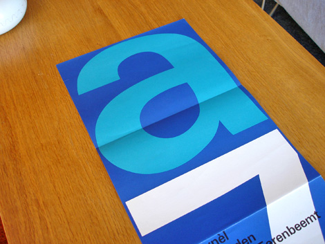
Stedelijk Museum program / poster c1970 - Wim Crouwel - designer
Total Design was responsible for designing many of the catalogs/ programs for the Stedelijk Museum in Amsterdam during the late 1960s and early 1970s. The program above was created by Wim Crouwel and Jolijn van de Wouw (of Total Design) for an exhibition in 1970. The program folds out to a full size poster that reveals a huge letter “A” and the number “7″ which stands for Atelier 7. Atelier translates to “work shop” in English so, this might be referencing a gallery number or possibly the name of the exhibition. On the other side of the poster, it lists the artists and their artwork featured in the gallery.
1970s, dutch, netherlands, out of print, posters, Typography, Wim crouwel
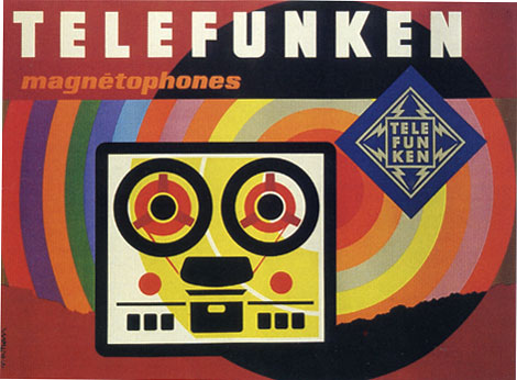
Poster for Telefunken c1965
The piece above is one of a series of posters that paris based designer Jacques Nathan Garamond produced for Telefunken. I just wish I could cut out that Telefunken logo. It kind of kills the vibe of this poster. You have all these round edges on the type and the reel to reel player and theres this crazy sharp edge ninja star with lightning bolts.
During the 1950-1960s Garamond began deconstructing objects into geometric shapes. This is evident in the print above as well as his poster work for Air France. I’ll try to scan in some of the Air France posters when I get a chance.
1960s, electronics, France, out of print, posters
Giant Golden Book of Biology - An Introduction to the Science of Life c1961
Text by Gerald Ames and Rose Wyler - Illustrated by Charley Harper
It doesn’t get much better then this. This is Charley in his prime.
“In a style he called “minimal realism”, Charley Harper captured the essence of his subjects with the fewest possible visual elements. When asked to describe his unique visual style, Charley responded:
When I look at a wildlife or nature subject, I don’t see the feathers in the wings, I just count the wings. I see exciting shapes, color combinations, patterns, textures, fascinating behavior and endless possibilities for making interesting pictures. I regard the picture as an ecosystem in which all the elements are interrelated, interdependent, perfectly balanced, without trimming or unutilized parts; and herein lies the lure of painting; in a world of chaos, the picture is one small rectangle in which the artist can create an ordered universe.[cite this quote]
He contrasted his nature-oriented artwork with the realism of John James Audubon, drawing influence from Cubism, Minimalism, Einsteinian physics and countless other developments in Modern art and science. His style distilled and simplified complex organisms and natural subjects, yet they are often arranged in a complex fashion. On the subject of his simplified forms, Harper noted:
I don’t think there was much resistance to the way I simplified things. I think everybody understood that. Some people liked it and others didn’t care for it. There’s some who want to count all the feathers in the wings and then others who never think about counting the feathers, like me.”
- Wikipedia
For those interested, I’ve posted a copy of the Giant Golden book of biology for sale on Ebay.
1960s, animals, ART, BOOKS, Charles Harper, graphic design, illustrations, kids books, Mid century, modern, out of print, USA
Map of the Battlefields of Arrnhem and Oosterbeek
The battlefields of Arnhem and Oosterbeek in the Netherlands never looked so good as they do in Pink and Teal. The battles were part of Operation Market Garden. It was here that the famous “First Airborne Divison” consisting of more then 8000 men, under the command of Major-General Urquhart, glided down to earth on the morning of Sunday September 17, 1944.
The scaley, snake looking trail in the lower half of the map represents the Rhine River. The battlefields can be seen as the solid patches of brown. I really appreciate how the map designer cut away the airplane and parachute icons from that mass of brown. Simple, effective and creates some interesting shapes within the negative space.
You can read more about Operation Market Garden at wikipedia.
On a sidenote, watched “King of Kong” this weekend. Great flick. Definitely biased in its presentation but none the less Billy still comes off like a really sorry bob. After all the talk of competitive gaming and playing in front of people, I was surprised that he didn’t step up to the challenge at the Guinness event in Florida. Thoughts?
dutch, graphic design, maps, netherlands, out of print
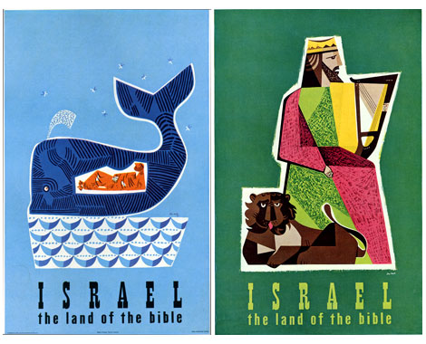
Israel -the land of the Bible Tourism posters by Jean David (L) c1954 (r) 195?
produced for the State of Israel Tourist Centre
My Knowledge of Jean David (Sometimes referred to as Jan David) is limited. However, what work I’ve seen from him has been nothing less that stellar. Just look at the posters above. I could easily see someone slanging these at a Flatstock poster convention. Dang, I totally nerd out when I see this stuff. Its just so good.
Looks like the whale is riding a boat of waves. Meanwhile, Jonah is relaxing after downing a keg of Vitamen C. Just look at all that orange!
1950s, graphic design, israel, Mid century, modern, out of print, posters, tourism, travel
Publicity and graphic design in the chemical industry - Hans Neuburg 1967
Contributions by Josef Muller Brockmann
Clap your hands if you love swiss design.
This is got to be one of the best books on graphic design in the chemical industry. Ha! this probably the only book on graphic design in the chemical industry. Most of the design work in the book is for pharmaceutical companies. Companies include J R Geigy and Ciba Aktiengesellschaft, both located in Basel, Switzerland.
The index in the back reads like the whos who of Swiss design. Designers include:Karl Gerstner, Herbert Leupin, Siegfried Odermatt, Hans Erni, Max Schmid, Fred Troller and Kurt Wirth amongst others.
Just look at the pictures above, the work is incredible. Anyone have any nominations for pharmaceutical/ chemical companies that have great design? Maybe we should put together a top 5 list. For example, the always fun top 5 favorite poisonous gas logos.
1950s, 1960s, BOOKS, graphic design, modern, out of print, swiss, switzerland
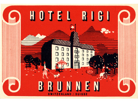
Hotel Rigi - Brunnen, Switzerland
Dynamite vintage label design from the Swiss.
1960s, hotels, labels, luggage labels, Mid century, modern, out of print, swiss, switzerland
Westvaco Inspirations #210 c1958
Westvaco Inspirations was a promotional journal produced by the Westvaco Corporation, formerly known as the West Virginia Pulp and Paper Company. The purpose of the journal was to highlight the printing processes and quality of paper achieved by the Westvaco paper Mills. Bradbury Thompson (1911-1995) served as designer and editor for over fifty issues of this publication including the issue featured above.
1950s, brochures, graphic design, Mid century, modern, out of print, promotional, Typography, USA
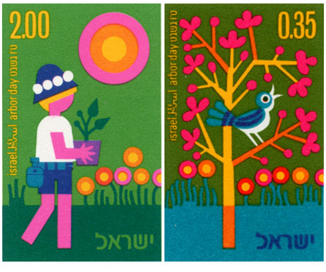
Vintage modern stamps from Israel - 1975 Arbor day collection
Ok we’re back. I hope everyone had a great weekend. Pretty chill one here. Watched Dial M for murder by Hitchcock. Tonight it’s either Stray Dog by Akira Kurosawa or Brute force by Jules Dassin.
Now onto the stamps….
Great stuff going on here. Johnny blue bird is eating cherry nugs off a psychedelic tree. Meanwhile on the left, rectangle legs is rolling deep in lollipop marsh.
Alain Gree - l’electricitie c1969 vintage kids book
Published by Casterman as part of the Cadet-Rama Collection
Woah! Pastel overload! Someone went crazy with the pink crayons. I love it though. Alain Gree’s illustrations are great. I can’t get enough of the bubble heads, mod clothes, pop colors and psychedelic scenery. In this book, Alain looks at electricity and how its used. It’s filled with teal buses, pink trolleys and mustard colored sewing machines.
On a related note, I have to give a birthday shout out to my friend Sean. Sean introduced me to Alain’s work so this post seemed fitting for today.
1960s, electricity, France, illustration, kids books, Mid century, modern
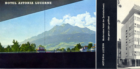
Hotel Astoria Lucerne was located in Luzern, Switzerland. As they claim in their promotional material, they were the “most modern Hotel of Central Switzerland”. After looking at this I brochure, I believe them. I’m not sure if the hotel still exists. I was able to find some information on a Hotel Astoria Lucerne designed by Herzog & De Meuron but, I’m not sure if bears any relation. I realize Herzog & De Meuron are modern day architects, but possibly they renovated the existing structure? Anyone have any info on this?
brochures, ephemera, graphic design, hotels, Mid century, modern, swiss, switzerland