


Well, mercifully, this post shouldn't be as long as the last couple. Sorry 'bout that. Suffice it to say, there's a lot that goes into these goofy little films we make. What I posted yesterday? That was about a fraction of the hijinx that happened on the set of good ol' FutureSand.
SUNDAY
When we last left our heroes...
I got up bright and early after a couple hours of sleep. (Total sleep for the weekend? 5 HOURS) I headed back to Jason's work to be with the core group, which includes Dirty, Brian, Jason and me. We needed to get the edit tip-top and have it all ready for Jason who was in charge of putting all the sound effects and what-not together.
The other cool thing? Michael Heagle, who did our visual effects stuff, was going to bring us the green screen stuff and also do some cool stuff with the 2 pound sandwich (forgot about that, didn't ya?). Also, my favorite thing...he was going to add some little muzzle flashes to the guns our heroes use. Dang. If I could figure out how to do that, I'd be making movies every weekend.
But, alas. I'm only useful for stories and for getting actors to do cool stuff on film.
So, by now we're all beat, slow-moving and Jason looks like he's fallen off a truck. He hasn't showered, slept much, and we're really starting to feel the crunch. He played some of the music Sherbetty (the band) recorded for us and I'm FLOORED.
I'll admit to not being too blown away when I left the night before. Again, I was cranky and I sort of thought the music was a little too sci-fi. But, I'll eat my words. These dudes made High School Drifter sing and they delivered the goods for FutureSand. The boys recorded a THEME SONG for the movie, complete with lyrics. We heard it and all of were instantly like:
"Man, I want this for my ring-tone."
"I need this on my iPod!"
I couldn't wait to see where it fit in. I already knew that we needed a piece of it for our opening sequence, which (if I may say so) worked PERFECTLY. The end credits begged to fit all the corny lyrics in as the insanely cool 'sandy' effects rolled by.
Dirty whipped up a quality edit and I was able to sit in with a list of things I hoped to tweak before we turned it in at 7:30pm. The clock was ticking. At 7:30, we all turned into pumpkins, our film isn't eligible to compete and it's sort of a bummer. Alas, it's never happened to us, but many a team has fallen in the last hour or two. Computers crash, footage is lost, you name it.
I found a couple continuity errors and some things that didn't work. Dirty did an insane job with the fight scene and we were pretty dang close to 'picture lock.' That means, we're not going to mess with it anymore and we give it to Jason, who will do his sound stuff to it. Add music, sound effects, clean up stuff like (ahem) the director yelling: "Oh, that's BAD-ASS!" over a take. You know. He was stressed, as some of his time was eaten away. The rest of us got to sit and wait.
Now you may be wondering: Thomas, what the heck are you doing there? Your part is over, right? You directed it and wrote the dumb thing. Now it's up to post-production to deliver the goods.
Nah. I like to be there for as much of it as I can. I need to still sort of direct, even if I'm not directly in charge of the different aspects of post-production. I gotta be the 2nd set of eyes and ears on something. We're all sort of part of this big ol' mess and it's up to all of us to make sure the thing makes sense, and most importantly, comes in at 7 minutes or less. Anything over that, and we're disqualified.
Well, to cut to the chase, Jason had us come in and watch the film with the music, sound effects and everything else added. To say I nearly watered the front of my pants is an understatement. I was laughing so hard I thought I was going to be hoarse. Now, I must warn you, I find it incredibly funny to see something as dumb as the script I wrote go through all these hoops and end up being a servicable movie. I'm laughing more at how well it all came together and how great some of the shots turned out. Plus, the fight scene? I just love that crap. It's campy, over-the-top and our actors were BRILLIANT. Also, hats off to Michael Anderson for putting together a rockin' fight with little time to prepare.
So...I know I'm setting myself up for people to go 'Eh...' but I was REALLY pleased with how it turned out. I think we all sort of thought we'd outdone ourselves from last year's High School Drifter. And remember kids, HSD won the audience favorite for our night. Essentially landing us in the top 13 of almost 90 films. Not bad for a group that doesn't do this ALL the time.
With my work done and a family who missed having me around, I left around 6:00pm. entrusting the delivery of the movie to Jason, Brian and Dirty. We high-fived, (not really) and talked about doing something again soon and I was off.
Cut to 7:32pm...
I get a phone call from Jason. He says we might be screwed. Apparently as they were burning the DVD, the picture got all screwy. We shot it in letterbox (because that's awesome) and it made our picture look squished and unwatchable. He said they were at the drop off point and made it there with 2 minutes to spare(!!!). On the way, Dirty had to burn a new DVD with some different settings and were playing it on the laptop while they were in line to turn it in.
I was literally ready to weep openly like a little baby. Jason gave me the play-by-play.
"Okay, it's loading up...okay, it's...it's..."
I closed my eyes tight like this was a bad dream.
"It's all good. It's working."
With that, they turned it in and we were set. We made the deadline and FutureSand was in the competition!!!
TUESDAY NIGHT 7:00pm
FutureSand was set to screen on the first night of the festival @ 7:00pm along with 12 other films. We all met up at the theater and I can't say I wasn't just a little nervous. Heck, my parents were actually coming out to see this thing. I looked at the voting sheet and was pleased to see we were the last film of the group. Not a bad place to be. You definitely don't want to be first, and last sort of lingers with people longer.
The movies began after a lot of er, crap, at the beginning. The guy who runs it sort of doesn't know when to just get on with it. He explained how all the movies had to have the same prop (sandwich), character (Kathleen or Kevin Schnaebel: Expert) and the same line of dialogue ("I hope they decide soon.") I looked around and was pretty well blown away by how many people were there. Probably 250, maybe 300 peeps.
There were some decent ones at the start, along with some that were, um, not so good. I know our early stuff wasn't spectacular and it's just great to see people getting out there and getting behind the camera. Still, I can't help but wonder what stories they would tell about what happened. I saw one film that had almost 8 people as the writer of the script. I'm not sure how that works. I think that's 7 people too many. I've never been good at writing with someone sitting in the shotgun seat, so hats off to people who can do it.
Anyway, we were all feeling pretty good about our chances when the movie right before ours, called 'Fragile' played. It was a Ghost Story and it had two little kids as the stars. And you know what? The kids were REALLY good. The story was dark and really pretty sad. It was about a little girl who finds a gun and she and her brother are grab-assing with it and the guns goes off. It's tricky because you think someone got killed, but both kids are still there.
SPOILER ALERT: The little girl got killed and we see her ghost.
Needless to say, we weren't thrilled having to follow that movie. Our is/was a buddy movie and sort of funny and a little over-the-top. It played and got a pretty favorable reaction, but there were parts (especially toward the end) where people didn't laugh. I don't want to blame the movie before ours, but it's pretty hard to laugh when you just watched a little girl eat a bullet.
We all voted, put in our ballots and hoped for the best.
Afterwards, in front of the theater and stood in the rain and talked about how the screening went. My parents got to meet most of the actors and they took some pictures (which I'm too lazy to post tonight). A big ol' group of us went to a bar called 'Busters' and tipped a few back. It was great. Everyone told us how much fun they had working on it, especially the actors. They all said they'd love to work on something with us again in the near future.
I gotta say, that's a huge deal to me. Maybe it's just me, but I want to make sure everyone is having fun when we're working on this kind of stuff. Seriously. No one is getting paid, the day is long, and we put them through some crazy antics. Heck, Kathy had to lay on the floor for like 3 hours. Still, she was a trooper, as were the rest of the gang and they all told me what a great experience it was. Not to say High School Drifter wasn't fun, but this group really gelled. Everyone got along and there were no attitudes or anything to deal with. The whole thing rocked. I decided then and there that I didn't care if we won or lost. The important thing was this: We made a pretty cool little film and that's all that mattered.
We'd find out our fate the next day.
Sadly...we were beaten by 'Fragile' for Audience Favorite by 19 votes. So, they're going on to the 'Best of' show and we have to wait until tomorrow to see if the judges (who pick seperately) liked ours enough to have us in the running.
Soo...it's not over until the morbidly obese female busts out a showtune.
(TO BE CONCLUDED...TOMORROW)
The conclusion??? I'll have FutureSand available for you to see both here at Tappity Tappity and on my dumb ol' Facebook page on Tuesday, one week after it screened at the Riverview Theater.
Thanks for reading and cross your fingers for us!!!
Viewing: Blog Posts Tagged with: graphic design, Most Recent at Top [Help]
Results 1 - 25 of 29
.jpg?picon=1233) By: Thomas Kingsley Troupe,
on 6/22/2009
By: Thomas Kingsley Troupe,
on 6/22/2009
Blog: Tappity Tappity (Login to Add to MyJacketFlap)
JacketFlap tags: filmmaking, 48 hour film project, directing, moviemaking, FutureSand, Add a tag
By: Thomas Kingsley Troupe,
on 6/12/2008
Blog: Tappity Tappity (Login to Add to MyJacketFlap)
JacketFlap tags: concerts, filmmaking, 48 hour film project, moviemaking, there might be ninjas, Add a tag
Hey there. You still hanging around this joint? Yeah? Well, let me slap your hand. Thanks for being there for me. Seriously, if you come to my house...Pancake Puffs. All you can eat.
And yes...I'm the worst. I've yet to show you the magic of P-Squared, but I assure you, once I make it through this coming weekend, all shall be revealed. And there's video and there's some pictures. I'm even sticking a chocolate chip Pancake Puff in my mouth with my bed hair fully intact. You won't want to miss it. I see that as a jacket flap picture.
Maybe.
Anyway, I'm writing to let you know I'm heading into the beginning of a very fun and very taxing weekend. That's right, doctor. This weekend is the Minneapolis/St. Paul weekend for the 48 Hour Film Project. It's going to be 23 kinds of awesome in an edible shell.
TKT, I'm too lazy to click the link. What's the low-down?
Oh, you. You always were one of those types. Well, here's the quick n' dirty version of it. We have exactly 48 hours to make a 7 minute film/video. We don't even get to work ahead of time. That's not COMPLETELY true. We get to find a location and get some actors lined up (check & check!) but we don't know if we're doing a drama, a comedy, a western, musical, etc... It's all decided tomorrow night at 7:00. We also find out three elements that must be included in our film and ALL the other films in the running. They'll be:
- A piece of dialogue (a couple years ago it was: 'Do you have a breath mint?'
- A prop (we had to have a balloon that said 'Congratulations' on it)
- A character (a few years prior it was D. Poe - Former Runway Model)
So, we've got a great cast, some crazy ideas that we'll try to bend around whatever genre we pick and then it's a race to the finish. My family (Travis & Laura) are heading south to stay with the in-laws for the weekend. My dog Nigel is going to the 'puppy hotel' and I get to be a real live movie director for the weekend.
Heck, I get to write the thing too!
Anyway, just wanted you all to know what's been consuming me for the past week. My friend Big J and I are going to take home 48 Hour Film Project gold!!!
(here's where you applaud and get out of your seat)
P.S. I saw the Kanye West/Rhianna/N.E.R.D./Lupe Fiasco concert last night. Cra-zy.
Blog: inspiration from vintage kids books and timeless modern graphic design (Login to Add to MyJacketFlap)
JacketFlap tags: Typography, italy, posters, logos, 1970s, graphic design, 1960s, Product Reviews, graphic design, posters, Product Reviews, 1960s, 1970s, italy, logos, BOOKS, reviews, Add a tag
Pino Tovaglia book - The rule that corrects emotion
In addition to this blog, I own a small design bookstore. As a bookseller, I find it hard to find publishers that consistently produce quality titles. Italian publisher Edizioni Corraini is one of a few publishers that I look forward to their new releases each year. If you own or have seen any Bruno Munari books, you are most likely familiar with their work. They have reproduced dozens of Munari’s books, many of which I own in my personal collection. In addition to the Munari collection, they have produced books on or by Martí Guixé, Enzo Mari, Aoi Huber-Kono (Max Huber’s wife),Taro Miura, Albe Steiner and many others. With this in mind, I was delighted when I received an email from them mentioning that they had been reading Grain Edit and that they would like to send a package my way.
I will cover the contents of the package in several posts. The first being the Pino Tavaglia book seen above.
1960s, 1970s, BOOKS, graphic design, italy, logos, posters, reviews, TypographyBlog: inspiration from vintage kids books and timeless modern graphic design (Login to Add to MyJacketFlap)
JacketFlap tags: illustration, Typography, Designers, USA, contemporary, graphic design, Found design, graphic design, contemporary, Found design, USA, Add a tag
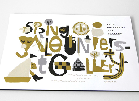
Cover illustration/typography for the Yale University Art Gallery spring catalog
Garrett Morin does great work. He draws lots of type and makes people happy. You may have seen his works in the likes of Mike Perry’s Hand Job book. If you click on over to his site, you’ll find lots of happy characters, t-shirt graphics, corn-cob pipes, animated GIFs, skateboard graphics, magazine covers, and a great animated spot for Death Cab for Cutie / MTV.
Garrett’s also a member of the Rad Mountain collective, which recently did some yummy illustrations for Good Magazine. Check it.
contemporary, Designers, graphic design, illustration, Typography, USABlog: inspiration from vintage kids books and timeless modern graphic design (Login to Add to MyJacketFlap)
JacketFlap tags: graphic design, out of print, posters, Found design, USA, electronics, IBM, posters, out of print, USA, graphic design, Found design, IBM, electronics, Add a tag
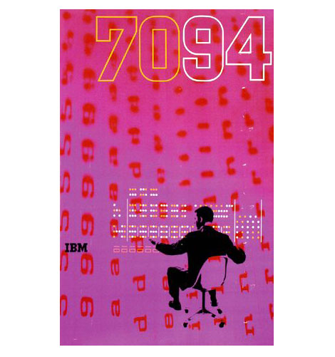
1960s IBM 7094 poster - Designed by Clarence Lee
Clarence Lee graduated from Yale in 1958 and went on to work for the uber graphic designer Lester Beall. In 1962 Clarence left Beall’s firm to work for IBM. During his time at IBM he designed the poster above for the IBM 7094 Data Processing System. The 7094 was released in 1962 and was built for large-scale scientific computing.
During the late 1950s - early 1960s, Paul Rand, Charles Eames ,Marcel Breuer and Eliot Noyes were involved in design work for IBM. It would be interesting to find out if Clarence had any interaction with these designers.
electronics, graphic design, IBM, out of print, posters, USABlog: inspiration from vintage kids books and timeless modern graphic design (Login to Add to MyJacketFlap)
JacketFlap tags: graphic design, contemporary, Found design, USA, illustration, Designers, USA, contemporary, graphic design, Found design, Add a tag
Jesse Kaczmarek is a one-man, super-clean design shop located in NYC. His clients include BMW, Sony, Pepsi, HBO, and on and on. The work remains consistently clean, sophisticated and fun — all at once! Just look at those happy families in their Hertz rental cars!
Also, bonus points for a super slick website.
contemporary, Designers, graphic design, illustration, USABlog: inspiration from vintage kids books and timeless modern graphic design (Login to Add to MyJacketFlap)
JacketFlap tags: posters, graphic design, Found design, illustration, contemporary, Typography, USA, graphic design, contemporary, posters, Found design, USA, Add a tag
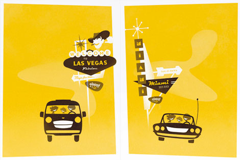
Silkscreen Print for a Drama magazine sponsored show at Nonesuch Gallery
Cool design work from Wyeth Hansen (Casual Aesthetics). His website includes t-shirts, posters, type faces as well some motion design. I’m loving the type work above.
(Via Wrong distance)
contemporary, graphic design, illustration, posters, Typography, USABlog: inspiration from vintage kids books and timeless modern graphic design (Login to Add to MyJacketFlap)
JacketFlap tags: BOOKS, Canada, illustrations, out of print, modern, graphic design, Mid century, 1960s, Found design, graphic design, modern, out of print, 1960s, Found design, Mid century, Add a tag
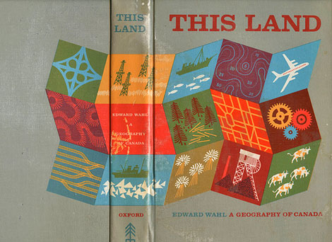
This Land - A Geography of Canada by Edward Wahl c1961
Hans Kleefeld cover designer
Great book discovery by Rosemary Travale.
Hans also designed the original logo for the Toronto Zoo.
Blog: inspiration from vintage kids books and timeless modern graphic design (Login to Add to MyJacketFlap)
JacketFlap tags: BOOKS, ART, illustrations, animals, out of print, USA, kids books, modern, graphic design, Mid century, 1960s, Off our book shelves, Charles Harper, Add a tag
Giant Golden Book of Biology - An Introduction to the Science of Life c1961
Text by Gerald Ames and Rose Wyler - Illustrated by Charley Harper
It doesn’t get much better then this. This is Charley in his prime.
“In a style he called “minimal realism”, Charley Harper captured the essence of his subjects with the fewest possible visual elements. When asked to describe his unique visual style, Charley responded:
When I look at a wildlife or nature subject, I don’t see the feathers in the wings, I just count the wings. I see exciting shapes, color combinations, patterns, textures, fascinating behavior and endless possibilities for making interesting pictures. I regard the picture as an ecosystem in which all the elements are interrelated, interdependent, perfectly balanced, without trimming or unutilized parts; and herein lies the lure of painting; in a world of chaos, the picture is one small rectangle in which the artist can create an ordered universe.[cite this quote]
He contrasted his nature-oriented artwork with the realism of John James Audubon, drawing influence from Cubism, Minimalism, Einsteinian physics and countless other developments in Modern art and science. His style distilled and simplified complex organisms and natural subjects, yet they are often arranged in a complex fashion. On the subject of his simplified forms, Harper noted:
I don’t think there was much resistance to the way I simplified things. I think everybody understood that. Some people liked it and others didn’t care for it. There’s some who want to count all the feathers in the wings and then others who never think about counting the feathers, like me.”
- Wikipedia
For those interested, I’ve posted a copy of the Giant Golden book of biology for sale on Ebay.
1960s, animals, ART, BOOKS, Charles Harper, graphic design, illustrations, kids books, Mid century, modern, out of print, USABlog: inspiration from vintage kids books and timeless modern graphic design (Login to Add to MyJacketFlap)
JacketFlap tags: Designers, USA, contemporary, graphic design, Found design, Add a tag
Luke Williams is a third year graphic design student at the Maryland Institute College of Art. While making sweet calendar-meets-packaging cubes, he is also working for Abbott Miller/Pentagram in Baltimore. From magazine and book layouts to posters and self-initiated work, Luke’s work is fresh. It’s nice to see a large body of work with this much variety, attention to detail, and experimentation with other mediums.
contemporary, Designers, graphic design, USABlog: inspiration from vintage kids books and timeless modern graphic design (Login to Add to MyJacketFlap)
JacketFlap tags: stamps, USA, ephemera, contemporary, graphic design, Found design, Add a tag
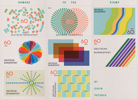
Portland based designer Gavin Potenza (Exploratory Design) has cooked up a series of sweet stamps. The series which was inspired by the work of Otl Aicher is entitled Homage to the Stamp.
contemporary, ephemera, graphic design, stamps, USABlog: inspiration from vintage kids books and timeless modern graphic design (Login to Add to MyJacketFlap)
JacketFlap tags: maps, out of print, dutch, netherlands, graphic design, Off our book shelves, Add a tag
Map of the Battlefields of Arrnhem and Oosterbeek
The battlefields of Arnhem and Oosterbeek in the Netherlands never looked so good as they do in Pink and Teal. The battles were part of Operation Market Garden. It was here that the famous “First Airborne Divison” consisting of more then 8000 men, under the command of Major-General Urquhart, glided down to earth on the morning of Sunday September 17, 1944.
The scaley, snake looking trail in the lower half of the map represents the Rhine River. The battlefields can be seen as the solid patches of brown. I really appreciate how the map designer cut away the airplane and parachute icons from that mass of brown. Simple, effective and creates some interesting shapes within the negative space.
You can read more about Operation Market Garden at wikipedia.
On a sidenote, watched “King of Kong” this weekend. Great flick. Definitely biased in its presentation but none the less Billy still comes off like a really sorry bob. After all the talk of competitive gaming and playing in front of people, I was surprised that he didn’t step up to the challenge at the Guinness event in Florida. Thoughts?
dutch, graphic design, maps, netherlands, out of printBlog: inspiration from vintage kids books and timeless modern graphic design (Login to Add to MyJacketFlap)
JacketFlap tags: travel, posters, 1950s, out of print, tourism, israel, modern, graphic design, Mid century, Off our book shelves, Add a tag
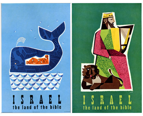
Israel -the land of the Bible Tourism posters by Jean David (L) c1954 (r) 195?
produced for the State of Israel Tourist Centre
My Knowledge of Jean David (Sometimes referred to as Jan David) is limited. However, what work I’ve seen from him has been nothing less that stellar. Just look at the posters above. I could easily see someone slanging these at a Flatstock poster convention. Dang, I totally nerd out when I see this stuff. Its just so good.
Looks like the whale is riding a boat of waves. Meanwhile, Jonah is relaxing after downing a keg of Vitamen C. Just look at all that orange!
1950s, graphic design, israel, Mid century, modern, out of print, posters, tourism, travelBlog: inspiration from vintage kids books and timeless modern graphic design (Login to Add to MyJacketFlap)
JacketFlap tags: magazines, advertising, spain, modern, graphic design, Mid century, 1960s, Found design, Add a tag
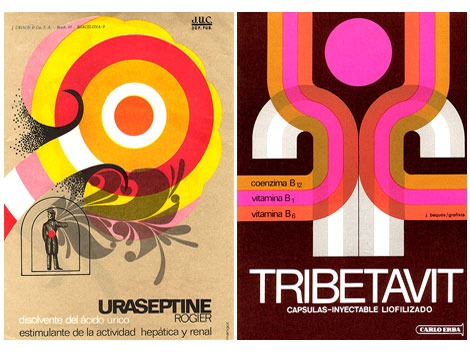
Flickr user ex.novo has posted some amazing examples of spanish modern design in advertising from the 1950s, 60s and 70s. The ads are taken from magazines/ journals titled “Clínica Rural” and “Glosa”. Anyone know anything about these journals? Most of the advertisements seem to be related to pharmaceutical products so it’s a great follow up to my previous post on Swiss modern design in the chemical industry.
Big ups to Mike from Burlesque for dropping this gem on me.
1960s, advertising, graphic design, magazines, Mid century, modern, spainBlog: inspiration from vintage kids books and timeless modern graphic design (Login to Add to MyJacketFlap)
JacketFlap tags: BOOKS, 1950s, out of print, modern, switzerland, graphic design, 1960s, swiss, Off our book shelves, Add a tag
Publicity and graphic design in the chemical industry - Hans Neuburg 1967
Contributions by Josef Muller Brockmann
Clap your hands if you love swiss design.
This is got to be one of the best books on graphic design in the chemical industry. Ha! this probably the only book on graphic design in the chemical industry. Most of the design work in the book is for pharmaceutical companies. Companies include J R Geigy and Ciba Aktiengesellschaft, both located in Basel, Switzerland.
The index in the back reads like the whos who of Swiss design. Designers include:Karl Gerstner, Herbert Leupin, Siegfried Odermatt, Hans Erni, Max Schmid, Fred Troller and Kurt Wirth amongst others.
Just look at the pictures above, the work is incredible. Anyone have any nominations for pharmaceutical/ chemical companies that have great design? Maybe we should put together a top 5 list. For example, the always fun top 5 favorite poisonous gas logos.
1950s, 1960s, BOOKS, graphic design, modern, out of print, swiss, switzerlandBlog: inspiration from vintage kids books and timeless modern graphic design (Login to Add to MyJacketFlap)
JacketFlap tags: charity, posters, contemporary, graphic design, Found design, Add a tag
Poster by John Foster / fuszion
Great posters for a better cause.
Donated by designers and artists around the globe, posters sold at the So-Cal Fire Poster Project raise funds for victims of the wildfires that devastated Los Angeles, Orange, Riverside, and San Diego Counties. All proceeds will be given to the Salvation Army, for the 2007 California Wildfire fund.
Posters by: Paul Frank / Park La Fun, Hatch Design,Wink, Modern Dog, Micah Smith, John Foster / fuszion, Josh Higgins / Mike Carnevale, Robert Palmer, Barretto & Co., Frank Chimero, Buchanan Design, Lanny Sommese, Jason Gomez, Madeleine, Ryan Russell Design, Chaz Russo/The Graphic Soul, Nick McPherson, MiresBall, Bernie Tiano and Shepard Fairey.
Get some here
charity, contemporary, graphic design, postersBlog: inspiration from vintage kids books and timeless modern graphic design (Login to Add to MyJacketFlap)
JacketFlap tags: Typography, promotional, 1950s, out of print, USA, modern, graphic design, Mid century, brochures, Off our book shelves, Add a tag
Westvaco Inspirations #210 c1958
Westvaco Inspirations was a promotional journal produced by the Westvaco Corporation, formerly known as the West Virginia Pulp and Paper Company. The purpose of the journal was to highlight the printing processes and quality of paper achieved by the Westvaco paper Mills. Bradbury Thompson (1911-1995) served as designer and editor for over fifty issues of this publication including the issue featured above.
1950s, brochures, graphic design, Mid century, modern, out of print, promotional, Typography, USABlog: inspiration from vintage kids books and timeless modern graphic design (Login to Add to MyJacketFlap)
JacketFlap tags: illustration, Designers, USA, contemporary, graphic design, Found design, Add a tag
Christopher David Ryan is a “Brooklyn-based graphic artist, daydreamer, pseudo-scientist, wanna-be astronaut and untrained intellectual.” His work shows a similar range of experimentation — photography, collage, illustration, found images, etc. Why! He even makes pillows! On his personal website, Ryan is posting at least one image of his work per day for every day of the year. Busy, busy.
Designers, graphic design, illustrationBlog: inspiration from vintage kids books and timeless modern graphic design (Login to Add to MyJacketFlap)
JacketFlap tags: BOOKS, illustration, book covers, netherlands, graphic design, Mid century, 1960s, Found design, out of print books, Add a tag
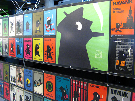
Some great book covers in the Dick Bruna Flickr group.
(image via onno de wit)
1960s, book covers, BOOKS, graphic design, illustration, Mid century, netherlands, out of print booksBlog: inspiration from vintage kids books and timeless modern graphic design (Login to Add to MyJacketFlap)
JacketFlap tags: ART, Typography, packaging, logos, Minneapolis, brochures, interviews, branding, posters, USA, Features, contemporary, graphic design, Add a tag
My first introduction to Wink Design was four or five years ago when their packaging for Sunmilk was making the rounds in the design magazines and annuals. Since then, I’ve tried to keep an eye on their work. What has impressed me the most about Wink has been their ability to consistently produce top notch work.
contemporary, graphic design, interviews, postersBlog: inspiration from vintage kids books and timeless modern graphic design (Login to Add to MyJacketFlap)
JacketFlap tags: BOOKS, Gallery, book covers, penguin, modern, Seen Elsewhere, graphic design, Mid century, Add a tag
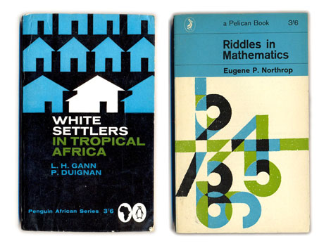
1960s penguin book covers
Things magazine..wheew sweet mother! They have put together a kick butt gallery of penguin book covers. Includes beautiful covers overseen by Jan Tschichold as well as the late typographer Hans Schmoller. My favorite years are between 1961-1972 when Italian art director Germano Facetti was in charge of design. Facetti enlisted Polish graphic designer Romek Marber to redesign the look of the Penguin series and the rest is history.
Side note: Watched Jules Dassin’s Brute force last night. Great Flick. I also recommend Riffifi which was directed by Dassin as well.
(via Ace jet 170)
book covers, BOOKS, Gallery, graphic design, Mid century, modern, penguinBlog: inspiration from vintage kids books and timeless modern graphic design (Login to Add to MyJacketFlap)
JacketFlap tags: birds, stamps, ephemera, israel, 1970s, graphic design, Off our book shelves, Add a tag
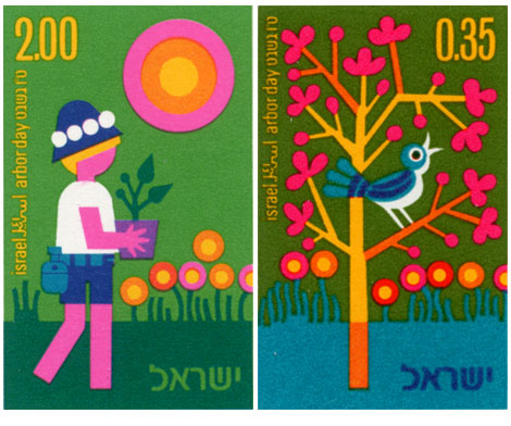
Vintage modern stamps from Israel - 1975 Arbor day collection
Ok we’re back. I hope everyone had a great weekend. Pretty chill one here. Watched Dial M for murder by Hitchcock. Tonight it’s either Stray Dog by Akira Kurosawa or Brute force by Jules Dassin.
Now onto the stamps….
Great stuff going on here. Johnny blue bird is eating cherry nugs off a psychedelic tree. Meanwhile on the left, rectangle legs is rolling deep in lollipop marsh.
Blog: inspiration from vintage kids books and timeless modern graphic design (Login to Add to MyJacketFlap)
JacketFlap tags: music, video, brazil, graphic design, 1960s, Found design, MPB, record covers, Add a tag
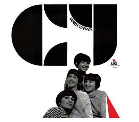
Quarteto em Cy - Quarteto em Cy (1966), for Elenco
Dynamite record cover for this female vocal group from Brazil. This is a great album. I highly recommend their 1972 Self titled lp as well.
Heres a video of Quarteto em Cy on the Andy Williams show with Marcos Valle. You might recognize the vocals at the beginning of the song. I believe Nicola Conte sampled it.
(via the excellent Loronix)
1960s, brazil, graphic design, MPB, music, record covers, videoBlog: inspiration from vintage kids books and timeless modern graphic design (Login to Add to MyJacketFlap)
JacketFlap tags: Argentina, contemporary, Found, graphic design, information design, Found design, Add a tag
I found this great example of information design in ilusiones_design’s flickr photostream. Can anyone translate the text?
Argentina, contemporary, graphic design, information designBlog: inspiration from vintage kids books and timeless modern graphic design (Login to Add to MyJacketFlap)
JacketFlap tags: Off our book shelves, brochures, swiss, ephemera, modern, hotels, switzerland, graphic design, Off our shelves, Mid century, Add a tag
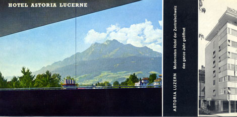
Hotel Astoria Lucerne was located in Luzern, Switzerland. As they claim in their promotional material, they were the “most modern Hotel of Central Switzerland”. After looking at this I brochure, I believe them. I’m not sure if the hotel still exists. I was able to find some information on a Hotel Astoria Lucerne designed by Herzog & De Meuron but, I’m not sure if bears any relation. I realize Herzog & De Meuron are modern day architects, but possibly they renovated the existing structure? Anyone have any info on this?
brochures, ephemera, graphic design, hotels, Mid century, modern, swiss, switzerlandView Next 3 Posts
My fingers are crossed for you!
Wow, those tense moments around the 7:30 deadline. I'm so glad you guys made it, and now I really can't wait to see the film. Congrats!!
I've been reading your posts with great interest--PLEASE let us know if you make it in the running, and good luck! I can't wait to watch your movie!
You are so cool--is there anything you can't do?! I think it would be a BLAST to do a movie like you did.
Late to this entry! Dangit! But oh my God, I am imagining getting so far into the 48 hour Film Project and having a computer crash or something. I'd never considered that. HORRIFYING. Glad that wasn't the case here (although acck and oh em gee, standing in line to see if the DVD worked!!!), but I did have to take a minute of silence for the poor participants who have befallen that fate, past, present and future. Also, now that I have seen the amazingness of FS, I totes revisited your initial entries about making it and it was even COOLER. Sucks about having to follow up such a heavy film, but as I said--you think people would appreciate a little levity after watching Fragile! Congrats on all the accolades FS got--they def. deserved 'em.