new posts in all blogs
Viewing: Blog Posts Tagged with: out of print, Most Recent at Top [Help]
Results 26 - 37 of 37
How to use this Page
You are viewing the most recent posts tagged with the words: out of print in the JacketFlap blog reader. What is a tag? Think of a tag as a keyword or category label. Tags can both help you find posts on JacketFlap.com as well as provide an easy way for you to "remember" and classify posts for later recall. Try adding a tag yourself by clicking "Add a tag" below a post's header. Scroll down through the list of Recent Posts in the left column and click on a post title that sounds interesting. You can view all posts from a specific blog by clicking the Blog name in the right column, or you can click a 'More Posts from this Blog' link in any individual post.
original version
upadated version by Daniel Knef
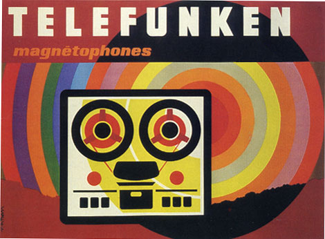
Several weeks ago I posted a Jacques Nathan Garamond Telefunken poster. One of my comments was the poster would look better if Jacques killed the telefunken logo located to the right of the reel to reel. Grain Edit reader Daniel Knef was nice enough to send us a modified version of the poster minus the logo (see above). I realize this poster would not of been possible without the client and obviously their branding is going to be part of the design. However, its nice to see the design without any distractions.
Many thanks to Daniel for sending us the updated version. Be sure to check out his electronic music compositions at his website
1960s,
electronics,
France,
graphic design,
out of print,
postersShare This
©2007 -Visit us at Grain Edit.com for more goodies. 
By: Dave,
on 3/11/2008
Blog:
inspiration from vintage kids books and timeless modern graphic design
(
Login to Add to MyJacketFlap)
JacketFlap tags:
graphic design,
out of print,
information design,
swiss,
switzerland,
1950s,
Found design,
brochures,
ephemera,
Add a tag
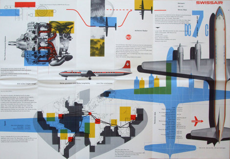
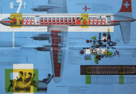
Swiss Air pamphlet - designer: Kurt wirth and Paul Beer c1950s
SwissAir has a rich history with some of Switzerland’s finest designers. Over the last 60 years the Airline has worked with Karl Gerstner, Kurt Wirth, Donald Brun, Fritz Buhler and Siegfried Odermatt just to name a few. The pamphlet above is one of many brilliant pieces to result from this relationship.
It appears to be some sort of promotional piece for the Douglas DC 7 which was produced in 1956. I love how Kurt Wirth laid out the information.
You can see the rest of the pamphlet at Ace Jet 170. Many thanks to Richard for posting this gem.
Be sure to check out our other posts related to SwissAir design.
1950s,
brochures,
ephemera,
graphic design,
information design,
out of print,
swiss,
switzerlandShare This
©2007 -Visit us at Grain Edit.com for more goodies. 
By: Dave,
on 3/5/2008
Blog:
inspiration from vintage kids books and timeless modern graphic design
(
Login to Add to MyJacketFlap)
JacketFlap tags:
Off our book shelves,
out of print,
posters,
netherlands,
1970s,
dutch,
Wim crouwel,
Typography,
posters,
out of print,
dutch,
netherlands,
1970s,
Off our book shelves,
Wim crouwel,
Add a tag
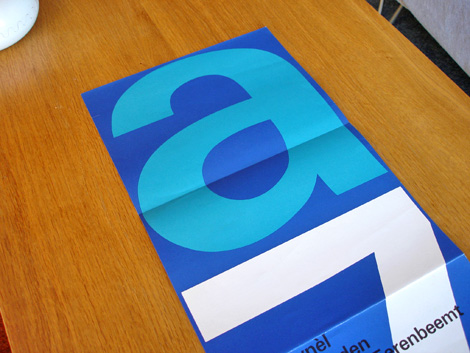
Stedelijk Museum program / poster c1970 - Wim Crouwel - designer
Total Design was responsible for designing many of the catalogs/ programs for the Stedelijk Museum in Amsterdam during the late 1960s and early 1970s. The program above was created by Wim Crouwel and Jolijn van de Wouw (of Total Design) for an exhibition in 1970. The program folds out to a full size poster that reveals a huge letter “A” and the number “7″ which stands for Atelier 7. Atelier translates to “work shop” in English so, this might be referencing a gallery number or possibly the name of the exhibition. On the other side of the poster, it lists the artists and their artwork featured in the gallery.
(more…)
1970s,
dutch,
netherlands,
out of print,
posters,
Typography,
Wim crouwelShare This
©2007 -Visit us at Grain Edit.com for more goodies. 
By: Dave,
on 3/4/2008
Blog:
inspiration from vintage kids books and timeless modern graphic design
(
Login to Add to MyJacketFlap)
JacketFlap tags:
graphic design,
out of print,
posters,
Found design,
USA,
electronics,
IBM,
posters,
out of print,
USA,
graphic design,
Found design,
IBM,
electronics,
Add a tag
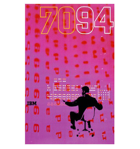
1960s IBM 7094 poster - Designed by Clarence Lee
Clarence Lee graduated from Yale in 1958 and went on to work for the uber graphic designer Lester Beall. In 1962 Clarence left Beall’s firm to work for IBM. During his time at IBM he designed the poster above for the IBM 7094 Data Processing System. The 7094 was released in 1962 and was built for large-scale scientific computing.
During the late 1950s - early 1960s, Paul Rand, Charles Eames ,Marcel Breuer and Eliot Noyes were involved in design work for IBM. It would be interesting to find out if Clarence had any interaction with these designers.
electronics,
graphic design,
IBM,
out of print,
posters,
USAShare This
©2007 -Visit us at Grain Edit.com for more goodies. 
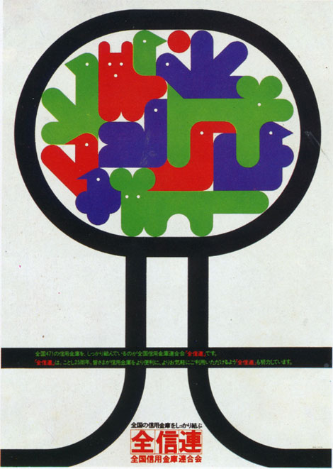
I wish I could tell you more about this one. I pulled this out of a book I have on 70s + 80s Japanese graphic design. All the text is in Japanese so, I have no clue on who designed this. Anyone recognize this work? I have no idea why theres a gaggle of balloon animals chillin in a tree. If someone could translate the text below the animals, that would be great.
1970s,
animals,
graphic design,
japan,
out of print,
posters,
treesShare This
©2007 -Visit us at Grain Edit.com for more goodies. 
By: Dave,
on 2/28/2008
Blog:
inspiration from vintage kids books and timeless modern graphic design
(
Login to Add to MyJacketFlap)
JacketFlap tags:
Off our book shelves,
out of print,
posters,
1960s,
electronics,
France,
posters,
out of print,
1960s,
Off our book shelves,
electronics,
Add a tag
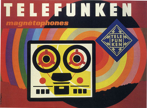
Poster for Telefunken c1965
The piece above is one of a series of posters that paris based designer Jacques Nathan Garamond produced for Telefunken. I just wish I could cut out that Telefunken logo. It kind of kills the vibe of this poster. You have all these round edges on the type and the reel to reel player and theres this crazy sharp edge ninja star with lightning bolts.
During the 1950-1960s Garamond began deconstructing objects into geometric shapes. This is evident in the print above as well as his poster work for Air France. I’ll try to scan in some of the Air France posters when I get a chance.
1960s,
electronics,
France,
out of print,
postersShare This
©2007 -Visit us at Grain Edit.com for more goodies. 
By: Dave,
on 2/26/2008
Blog:
inspiration from vintage kids books and timeless modern graphic design
(
Login to Add to MyJacketFlap)
JacketFlap tags:
BOOKS,
Canada,
illustrations,
out of print,
modern,
graphic design,
Mid century,
1960s,
Found design,
graphic design,
modern,
out of print,
1960s,
Found design,
Mid century,
Add a tag

This Land - A Geography of Canada by Edward Wahl c1961
Hans Kleefeld cover designer
Great book discovery by Rosemary Travale.
Hans also designed the original logo for the Toronto Zoo.
1960s,
BOOKS,
Canada,
graphic design,
illustrations,
Mid century,
modern,
out of printShare This
©2007 -Visit us at Grain Edit.com for more goodies. 
Dear Miss Snark:
My day job is transcription. When we are busy (which it has been ever since I was hired) I spend 10 to 12 hours on the computer every day, only taking time to cook dinner and kiss my spouse-creature hello when he gets home from work.
As you well know, every agent out there requires everything to be typed up in a specific way and frankly, I don't really do any writing on my computer any more. With all the computer work I do during the day, I simply cannot bring myself to write my novels on the computer. I write long hand with a special fountain pen that provides extremely fluid, stress free writing to my work-weary fingers and wrists. I figure this is better than never writing at all.
Have you any advice for someone like me who would love to become a published author but hand writes all her work? Are those days of sending in handwritten manuscripts gone with the wind? Is there any way to explain my predicament to an agent without sounding like I'm whining and begging for sympathy? Am I a hopeless nitwit in want of a clue gun smack upside the head?
I look forward to your answer. The pain will take my mind off the soreness of my digits. Must go sink them in ice now. Or maybe I should go soak my head.
The only people who get a pass on "must be typewritten" are the boys down at the city jail. Some of them even send in typed stuff via wives/girlfriends/clever poodles...the usual roster of amanuenses (and before you wave your Latin dic at me, that's the PLURAL form of amanuensis)
There are people who will type up your words for you. They are called typists. They'll charge you for it. Others are called sweethearts. They won't charge you for it, but you're better off paying for it up front rather than hashing it out in divorce court after you're rich and famous.
This is pretty much a non-negotiable condition these days. Someone has to type this up and I can tell you it's not going to be me. You can talk to Killer Yapp about it but he's in the amenuensis union and I think his rates include cigars, walkies, and no mention of squirrels in the book.
1. Colored paper. When was the last time you received a serious business letter on colored paper? I'm not talking ivory, beige or jellyfishbelly white either. This color could be pea soup but more it's more charitibly called shale. It's stupid to do this. Don't.
2. Telling me your novel is really about teaching people about something. This is a kiss of death as far as I'm concerned. Sales wise it's a non starter. People buy novels for the stories. If they learn something, it's cause you wrote a compelling story. I get so turned off by "this novel will help people understand the joys of Rabbitania" that I barely skim the pages. That means you have to have BLISTERING good writing to survive the slush. Give your writing a fighting chance. Don't saddle it with a teaching credential.
3. Right hand justified margins and page layout to make it "look like a book". I read books; I know what they look like. This isn't a book, it's sample pages. There is a universal industry standard for ragged right margins on manuscript pages.
I’ve heard that traditionally any italics in a manuscript should be indicated, instead, with an underline. In this modern day and age with computer programs and all, is that still expected. Or, at the very least, does it indicate unprofessionalism on my part if I persist in using italics since it’s the way I hope to read it one day in published form.
A very small point, I know, and, honestly, I’m not obsessing about it. But, in terms of putting your best foot forward . . .
When you query, use italics.
When your book sells, and you are preparing page proofs, the publisher has a style book and they will tell you what form they use. You'll follow that form, at that time.
My sense is that underlining for italic is formatting from the days of manual typewriters, but like double spaces after periods, that has changed with the arrival of new technology.
The bottom line though is that it won't hurt you even if you get it "wrong". If you write well enough you can send it handwritten on the back of a Sardis napkin and I'll read it. Trouble is, most people who think they write that well, don't and most people who do write that well have invested in paper and a printer.
For those among us who are:
A. Control freaks
B. Savvy enough to use a more readable font than Times Roman (Century Schoolbook rocks and you couldn't tell the difference with the possible exception of noting less eye strain upon your completion of my partial, thank you very much)
C. Compulsive listmakers
Would the Snark bristle at receiving a .PDF file, with all the formatting cemented in place, fonts embedded, and all the mysteries of the Mac/PC WYSIWYG universe self-contained?
If I wanted you to send a PDF I'd ask you to send a PDF.
I think we need clue music so you can remember FOLLOW THE DAMN DIRECTIONS with the same word for word perfection as "two all beef patties, special sauce, lettuce, cheese pickle on a sushi roll"
Hello, oh most Snarkly one.
What do you think of the idea of sending a perfect-bound, perfectly legible copy of a manuscript to an agent who requests a full? I've recently had some experience with Lulu.com, and I have to say I'm impressed with the product. I've never been able to imagine that carting around that big ole' 8.5x11x4 (or 5 or 6) manuscript could be easy for agents and editor, nor that any would actually enjoy it; I figured that it was just the best means to an end when a better option is unvailable.
So my question, basically, is, if you requested a full, what would your reaction be if you received a 6x9 perfect-bound copy in otherwise-traditional manuscript format (i.e., Courier, 12 pt, double-spaced?). Or even perfect-bound 8.5x11, if the size actually matters (although we all actually know it doesn't; it's how you use your words).
I'd know you are a nitwit.
Here are the first three things that happen when I read a full:
1. cut and paste text that needs fixing and send to you;
2. run through xerox machine/or
3. send electronically for people for opinions, second reads etc.
None of that can be done with a ms in "book" form.
There's a reason agents and editors don't want staples, paper clips or binder clips let alone bound versions of mss, and it's not cause we're short sighted technophobes.


Voice recognition software has come a long way; this writer could also read the work aloud into the computer...
...although the process of typing a handwritten draft in oneself is a GREAT opportunity for the first revision, one I wouldn't miss.
This person types for pay ... and needs to be told that there are people out there who type for pay? Oy.
*gives a sheepish look in the direction of her Latin dictionaries*
Writer's Digest (in spite of all my issues about their full-page ads for the pay-to-publish industry) has lists of ads in the back for people who type manuscripts. The rates vary, but will usually run a couple of bucks per page.
Some scanning programs are able to recognize handwritten words and transcribe them into typed Word documents. Do your research, you might be able to find one of these beauties. You could write to your heart's content and have your spouse-creature feed the pages whilst you cook. Best wishes!
Would KY object if there are squirrel ghosts ?
If you can't type your book without injuring yourself, then you'll have to manage your schedule or find some other means ... but unfortunately, your health is not something that the agents will be prepared to break that important a rule for. Unfamiliar handwriting is just not that easy to read - especially for a whole book's worth of material: eighty thousand words or more in handwriting is enough to give anyone a headache, even if the handwriting is perfectly nice.
I fear it's a contest between your sore hands and the agent's sore eyes, and agents being only human, it's their own pain that will carry the day.
Let's hope you sell the book for millions and can quit the transcription job, but in the meantime, don't give yourself such bad RSI that you can't even hold a pen, and good luck in finding a solution.
Just out of idle curiosity, do you really think that writing a dozen or so fulls by hand is easier than typing it all up once?
Elektra, I was wondering that, too!
If you've worked your way up to ice at night, that pain in your hands is not just typist's cramp; it's repetitive strain injury, of which carpal tunnel is the best known but surprisingly the least-common form for writers. You need a diagnosis and treatment before you end up with the inability to work full time. The Irving J. Selikoff Clinic at Mt. Sinai in New York is particularly good. Any physical therapist or chiropractor trained in Active Release Technique can also probably do a world of good (you can find one by going to the Active Release Technique website). You might drop in on an RSI (repetitive stress syndrome) support group; these are people who tend to do to a lot of research about their condition. Sorry to be alarmist, but ice is not a treatment, and nerve damage doesn't go away if you keep hitting your fingertips against a keyboard without changing anything else. The good news is you often CAN reverse it.
Suck it up and/or bite the bullet, dear writer.
No one gets out of this one.
Try hammering your million words of drek and first three novels out on a K-Mart portable with white out and carbons the way I did. You'll regard the click of a keyboard as music for the rest of your life.
This is the silliest question, I've read to date. I can't believe this wasn't a nitwit alert here. Come on! You type other people's work for a living and think it is ok to find someone out there who is going to take your handwritten manscript to print? WTF?!
As the poster of this question, I have a few details that I left out that may answer some comments.
I'm poor. I can't afford to pay anybody else for anything. I can't afford any extra software. All my money goes to basic daily survival.
Beacause of how many hours a day I spend typing, writing by hand is actually a relief, especially with this fantastic fountain pen I received as a gift. Also, I can't spend more than half an hour writing a day anyway.
I do the best I can with the situation at hand (pun intended). I was mourning the by-gone days of when all manuscripts were handwritten and wanted to see if there was any other choice besides getting a new job.
Sigh. It's hard being a nitwit...
Then again, there's that hand written submission by Frank McCourt that ended up in the hands of the legendary Molly Friedrich.
I wouldn't risk it. The odds are stacked against you.
I was going to suggest taking a vacation to type up your ms, but since you can barely pay the bills working full-blast, that option's probably out.
Any kind-hearted friends/family members who'd be willing to help you out?
Any chance of getting a new job with better pay and less typing?
Have you tried give-away organisations like Freecycle? If you keep your eyes on them, you might be able to get hold of a free scanner or some software, which might save your poor suffering hands. Or possibly some hand braces, which will support your hands while you type, and reduce the damage.
Do read up about RSI and do the exercises; I know more than one person who's got it, and one of them literally became unable to hold a book open. Full-blown RSI is awful. You need to take care of yourself.
Beg or borrow, sweet-talk friends into typing for you, copy-type with two fingers, but don't risk disabling yourself. You want to be able to keep writing for a very long time.
On the plus side, many people believe that there are artistic advantages to writing out a first draft longhand, so maybe some good will come of this early disadvantage.
Oh, and I don't know if it works this way in the States, but in the UK you can often get cheaper treatment for things like RSI if you go to an osteopath's or physiotherapist's training college and let the students work on you under supervision. Hopefully things won't get that bad, but just in case they do, it's a way to save money...
OP, get out of the victim mode and into solutions. You're working doing transcriptions all day but you call yourself poor. Go ask for a raise or get a better job. Are you missing the irony that you type for a living but say you can't afford to pay someone to type your manuscript? What about a trade?
If you are in pain, the best thing that could happen to you is you realize this may not be the best job for you. Your health is everything.
a lot of RSI experts don't like to see wrist braces worn while typing; it's just propping up weak muscles instead of strengthening them. for the same reason they often don't like wrist rests: ideally one should be strong enough to hold up one's own arms and keep the wrists in neutral position. better to get into the gym and strengthen the arm and back muscles, plus abs, for posture. try wearing wrist braces while you sleep -- often that helps a great deal. there's a lot of difference of opinion in this field, obviously. feel better! Oh--if you have trouble holding books or turning pages (yeah, it can get that bad), any doctor or physical therapist can certify you to get free books on tape from the Braille Library. Amazing.
For people who have wrist pain while typing, I always recommend two things that have helped me a lot.
(1) Buy a split (ergonomic) keyboard. They're not that expensive, and they'll put your hands into a much more comfortable position.
(2) Learn Dvorak, an alternate typing method. You can set your existing QWERTY keyboard for Dvorak input and switch back and forth at will. Sure, it takes work to learn a new layout, but not all that much work. It took me 15 minutes a day for a month or two, while typing QWERTY most of the rest of the time; you can do it in weeks if you switch cold turkey.
I used to get sore wrists all the time, even with the split keyboard. Not anymore!