Viewing: Blog Posts Tagged with: cn13, Most Recent at Top [Help]
Results 1 - 5 of 5
How to use this Page
You are viewing the most recent posts tagged with the words: cn13 in the JacketFlap blog reader. What is a tag? Think of a tag as a keyword or category label. Tags can both help you find posts on JacketFlap.com as well as provide an easy way for you to "remember" and classify posts for later recall. Try adding a tag yourself by clicking "Add a tag" below a post's header. Scroll down through the list of Recent Posts in the left column and click on a post title that sounds interesting. You can view all posts from a specific blog by clicking the Blog name in the right column, or you can click a 'More Posts from this Blog' link in any individual post.
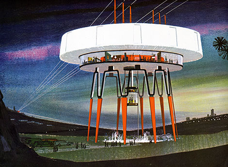
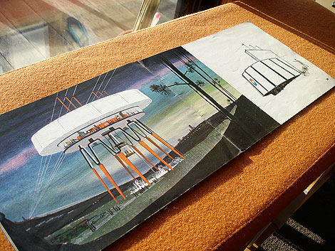
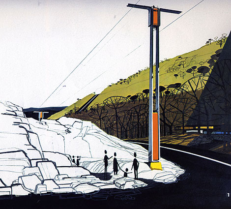
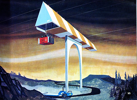
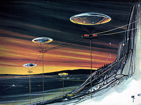
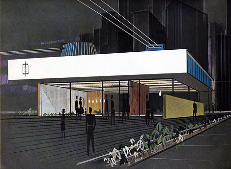
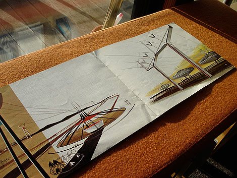
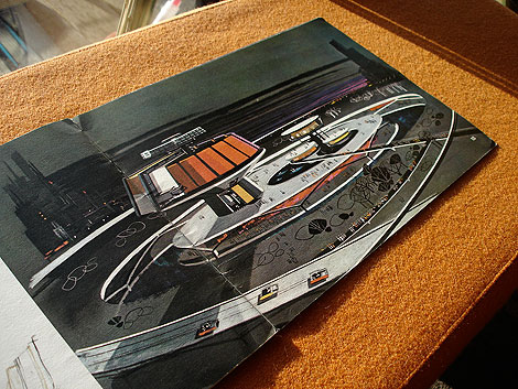
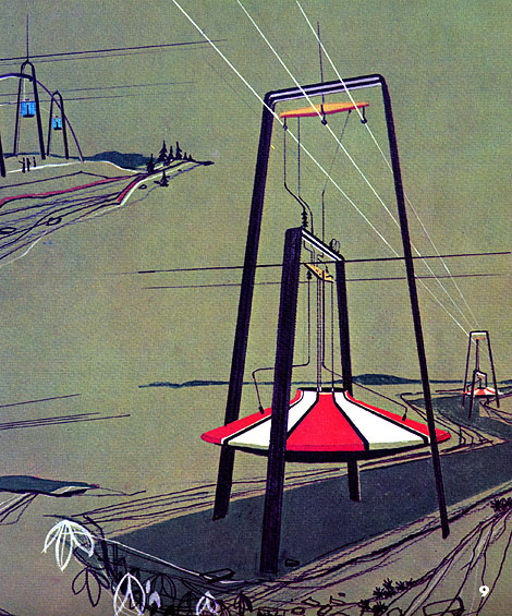
In 1964 United States Steel called upon the nation’s electric utility companies to reconsider the current look of our power stations and transmission towers to be both functional and beautiful. Two years later, Henry Dreyfuss and Associates were commissioned to investigate possible design alternatives, and I believe they were documented in a book entitled “Power Styling” which was produced by United States Steel in the mid-to-late 1960s. I discovered a copy not long ago, and the inside illustrations are absolutely amazing. Unfortunately, there is very little information listed, so I can’t say for sure if the concepts belong to Henry Dreyfuss and his team. I contacted the office of Syd Mead, who did several illustration projects for US Steel, to confirm the artwork, and sadly he was unfamiliar with this piece. If anyone has information on the Power Stylings project or the mysterious illustrator, please drop a note in the comments.
More images after the jump. Don’t miss this one!
This could double as a giant floor lamp. I’d buy one!

I want this chair! It was designed by Jupp Ernst and manufactured by Polstermobelfabrik Eugen Schmidt Gmbh during the 1950s. If the chair wasn’t cool enough, Helmut Lortz nailed it on the design of the AD. Someone needs to buy me this chair along with a Robin Day Form Unit Sofa. Please?

also worth checking Hans Hartmann: Swiss Graphic Designer.
Not signed up for the Grain Edit RSS yet? Give it a try. Its free and yummy.
No Tags
Share This
Enter the Grain Edit Design Stimulus Giveaway! featuring goodies from Steven Harrington, Aesthetic Apparatus, 2K Gingham and many more! We're giving away over $1000 worth of goods. Enter now!©2009 Grain Edit

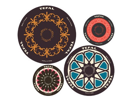
Bottom of Tefal pans designed by Doshi Levien
This makes me ashamed to look at my crappy IKEA pans.
(via the awesome orange you lucky!)
No Tags
Share This
©2007 -Visit us at Grain Edit.com for more goodies. 
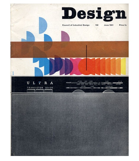
Design Magazine June 1961
Ken Garland served as art editor for UK based Design Magazine for six years. This is just one of many amazing covers that was conceived during his tenure.
also worth checking:
10 years of Vendre Magazine cover design
No Tags
Share This
©2007 -Visit us at Grain Edit.com for more goodies. 

By: Rebecca,
on 2/28/2008
Blog:
OUPblog
(
Login to Add to MyJacketFlap)
JacketFlap tags:
trib,
salim,
checkup,
unequal,
cn13,
insipient,
incipient,
A-Featured,
Lexicography,
Dictionaries,
Add a tag
Insipient writers often throw in big words like insipient/incipient at incipient stages of their careers. Say that five times fast! To learn how to use these words properly keep reading. If you liked this usage tip check out Garner’s Modern American Usage. To subscribe to his daily tips click here.
incipient; insipient.
The former means “beginning, in an initial stage”; the latter is an obsolete word meaning “unwise, foolish.” But “incipient” is often misspelled with an “-s-” — e.g.: (more…)
Share This


