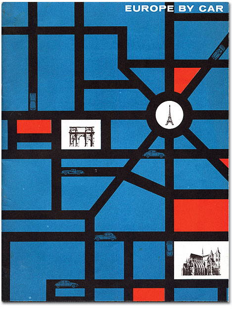
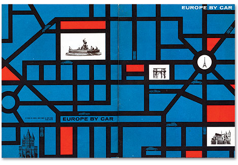
I love the cover of this Europe by Car brochure. The roads make for a nice grid structure and give the piece a Mondrian-esque quality. The business model for the company was pretty interesting as well. Europe by Car offered services for Americans interested in traveling around Europe for extended periods of time. Using their services you could purchase a European car to use on your travels. At the end of your vacation, Europe by Car would also help ship your new car back to the U.S.
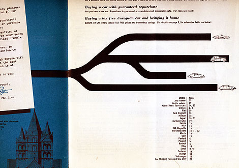
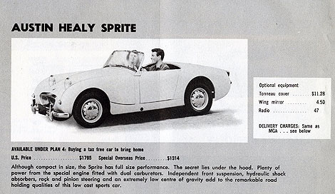
The brochure includes prices for cars from Porsche, Austin Healy, Citroen, Jaguar etc. I just wish their price sheet was still valid. A Porsche for $3700? sign me up!
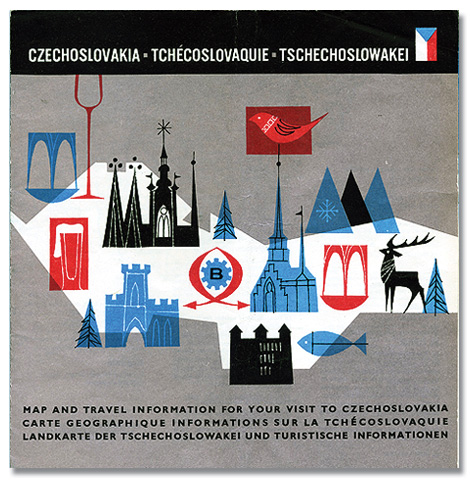
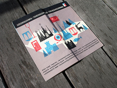
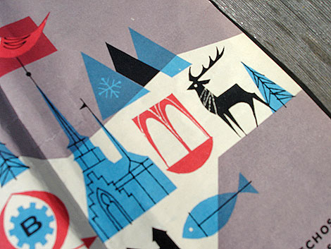
Beautiful tourist map from Czechoslovakia (now the Czech Republic) dating back 1966. I love the bold colors and simple line work. I’m guessing that the illustration inside the red square on the left side is a beer. Look at that foamy top! Sweet mother of beverages!
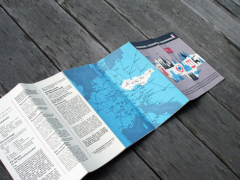
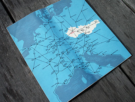
The inside of the map includes info on transportation, Czechoslovak Travel Bureau (CEDOK), natural resources and mountain ranges. No info on that giant beer though.
This post was inspired by a post I found at Amy Cartwright’s awesome Stickers and Stuff blog. She found an image of this map in Bonito club’s wonderful Flickr account. The post was missing images of the inside of the map, so I decided to grab some photos from the copy I own.
——————–
Also worth checking: Czech street map & Designers bookshelf with Amy Cartwright.
Not signed up for the Grain Edit RSS Feed yet? Give it a try. Its free and yummy.
——————–
No Tags
Share This
Congrats to B. Rane! She is the winner in the Photo-Lettering giveaway.
Grain Edit recommends Annonce. A font designed by Canada Type. Check it out here.
©2009 Grain Edit - catch us on Facebook and twitter

![]()
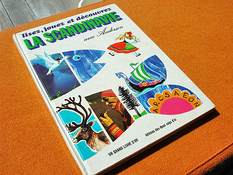
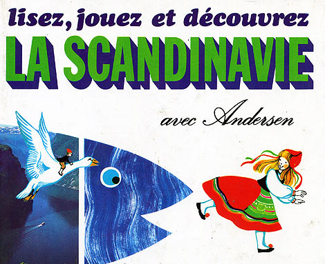
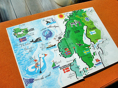
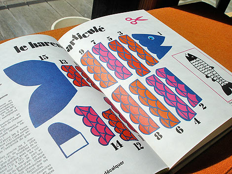
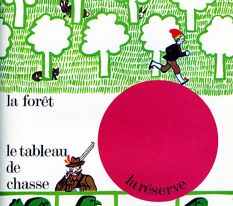
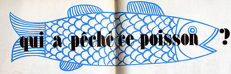
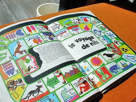
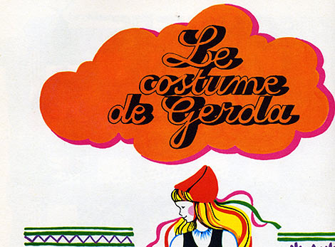
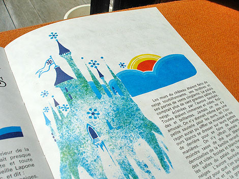
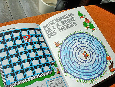
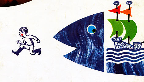
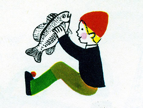
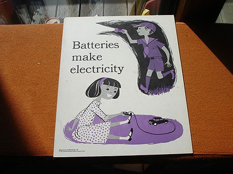
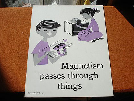
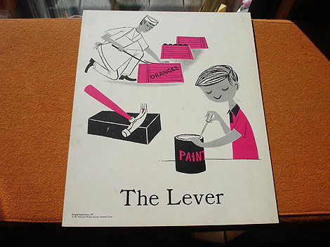
lisez, jouez et decouvrez La Scandinavie avec Andersen -by Paul de Roujoux, Pamela Labonnelie and Mireille Ballero. Illustrations by Martine Bourre c1975 editions des deux coqs d’or
La Scandinavie avec Andersen is a beautiful children’s book about Scandinavian culture. The book is filled with stories, games and activities. Just think, your child could be making his/her very own Nils Holgersson costume right now! For the budding young history buff, there’s a section on the Drakkars and Vikings. If your child is too scared to look at tough guys with helmets, head straight to the fuzzy Nordic animals in chapter one. Have a four year old that’s into logging? No problem, this book has you covered. There’s a section on the Scandinavian timber industry in the middle of the book. Soon your young one will be able to turn raw material into fine Danish furniture!
More pictures after the jump.
——————–
Also worth checking: Alain Gree - L’Electricite.
Not signed up for the Grain Edit RSS Feed yet? Give it a try. Its free and yummy.
——————–
No Tags
Share This
Congrats to B. Rane! She is the winner in the Photo-Lettering giveaway.
Grain Edit recommended reading: A Russian Diary
©2009 Grain Edit - catch us on Facebook and twitter

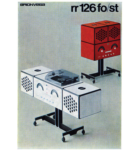
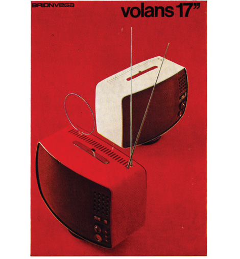
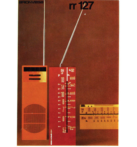
Brionvega rr126 Turntable/ radio brochure c1970
Beautiful brochure covers for the Milan based electronic company Brionvega. Design by Bob Noorda.
——————–
Also worth checking: music concrete booklet.
Not signed up for the Grain Edit RSS Feed yet? Give it a try. Its free and yummy.
——————–
No Tags
Share This
Congrats to B. Rane! She is the winner in the Photo-Lettering giveaway.
Grain Edit recommended reading: A Russian Diary
©2009 Grain Edit - catch us on Facebook and twitter

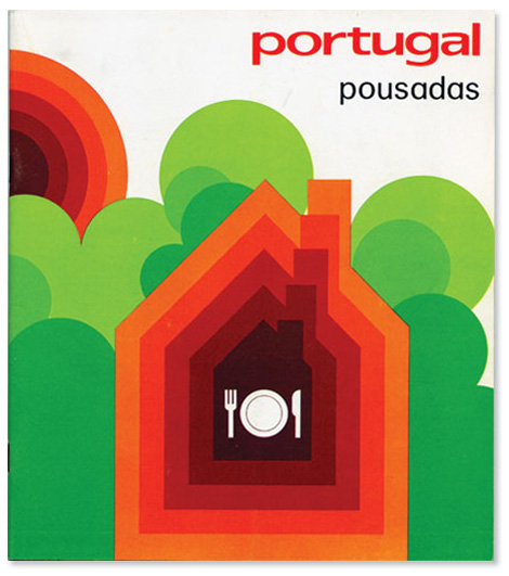
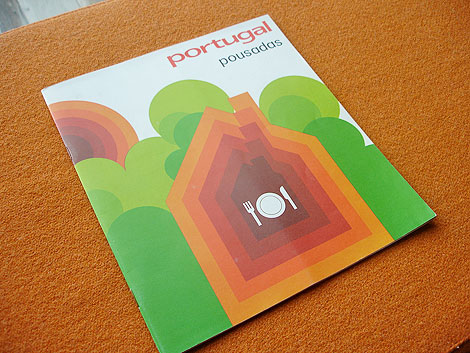
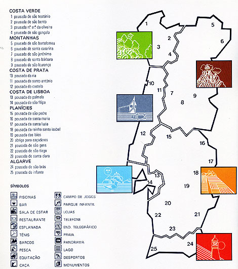
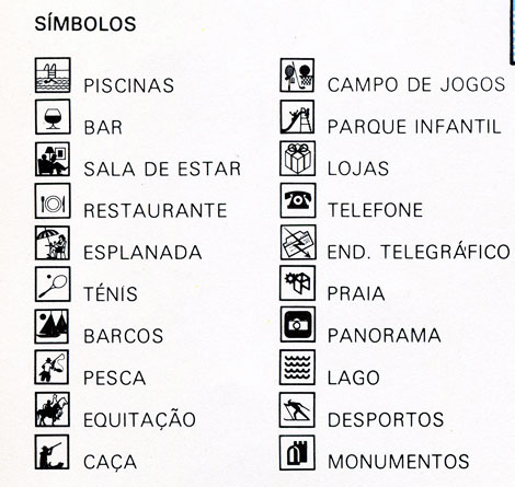
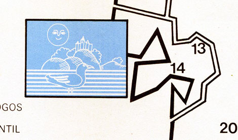
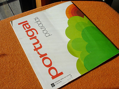
Beautiful brochure for a chain of hotels in Portugal.
From the inside of the brochure: “From the oldest times, “pousada” in Portuguese has meant “resting place”"inn”. Quiet isolated situations by the sea shore, in the mountains or on the plains. Lovely views, wealth of history, traditional culture.
The Pousadas make up a network of hotel establishments built by the state, housed in historic buildings, castles, palaces, and monasteries or specially built.”
——————–
Also worth checking: Portugal 1981 Census Stamps.
Not signed up for the Grain Edit RSS Feed yet? Give it a try. Its free and yummy.
——————–
No Tags
Share This
Congrats to B. Rane! She is the winner in the Photo-Lettering giveaway.
Grain Edit recommended reading: A Russian Diary
©2009 Grain Edit - catch us on Facebook and twitter

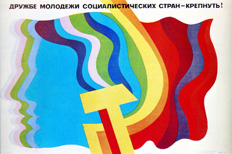
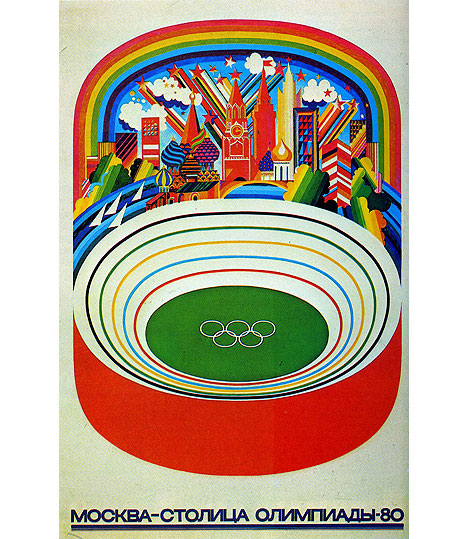
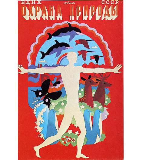
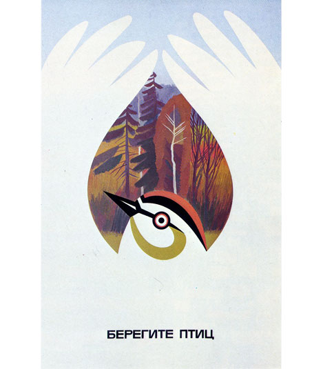
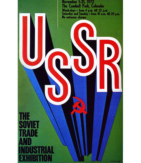
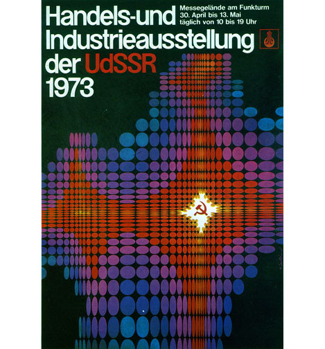
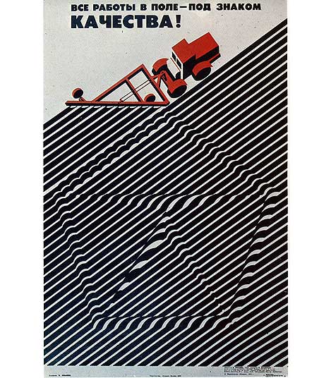
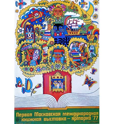
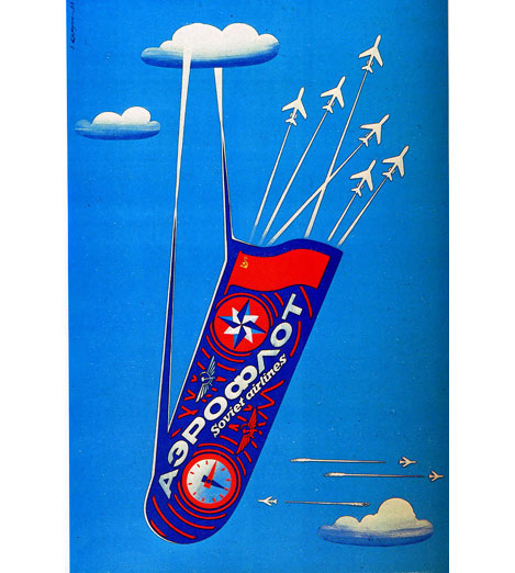
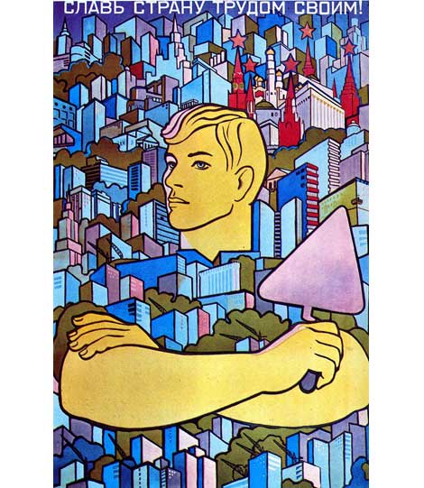
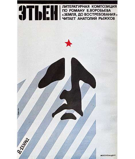
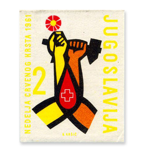
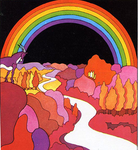
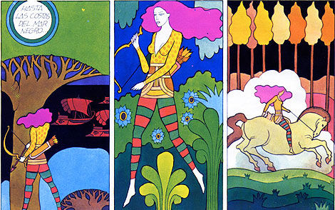
Most articles I see related to Russian poster design tend to focus on the film and propaganda posters of the 1920s and 30s. Works by Alexander Rodchenko and El Lissitzky as well the Stenberg brothers often come to mind. This post is dedicated to an era of Russian poster design that seems to get less coverage. The 1970s.
Don’t miss this one!
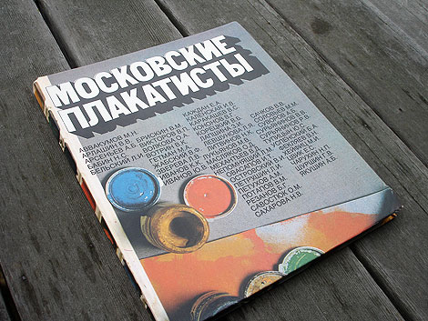
All the posters in this post come from this bad boy seen above (could someone translate the title? ). I discovered the book at the annual San Francisco Book sale back in September. I must of passed it two or three times. I thought it was some cheesy art text book. Let’s face it, that cover sucks. I finally decided to open it, because I thought it would be good for a couple of laughs. Little did I know this beast was hiding a motherlode of poster gems. Here for your viewing pleasure are a few of my favorites.
——————–
Also worth checking: Stefan Kanchev Logo Design, Stamps & TV Graphics.
Not signed up for the Grain Edit RSS Feed yet? Give it a try. Its free and yummy.
——————–
No Tags
Share This
Congrats to B. Rane! She is the winner in the Photo-Lettering giveaway.
Grain Edit recommended reading: A Russian Diary
©2009 Grain Edit - catch us on Facebook and twitter

By: Dave,
on 10/1/2009
Blog:
inspiration from vintage kids books and timeless modern graphic design
(
Login to Add to MyJacketFlap)
JacketFlap tags:
BOOKS,
illustration,
germany,
Off our book shelves,
vintage,
1960s,
1970s,
swiss,
switzerland,
graphic-design,
Add a tag
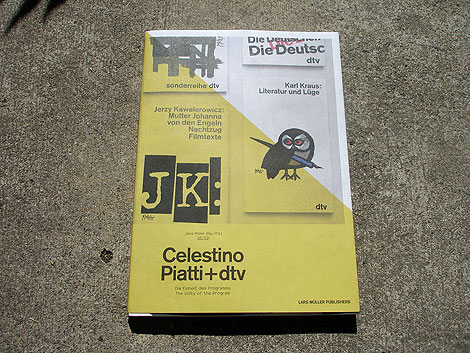
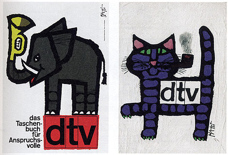
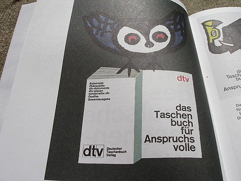
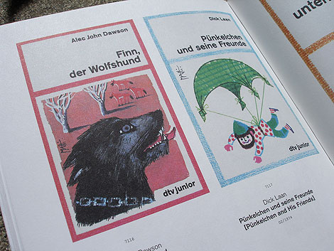
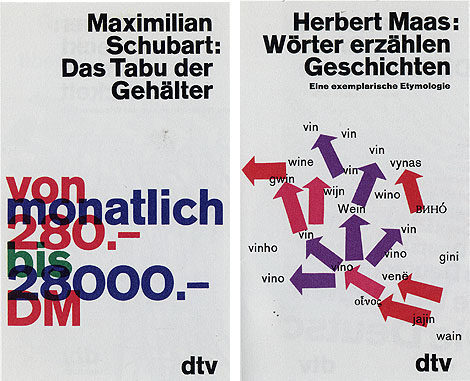
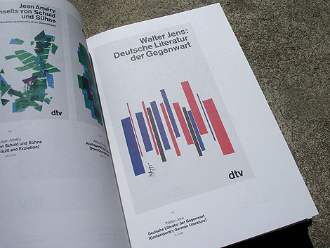
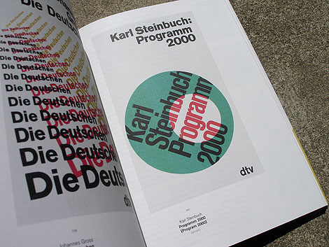
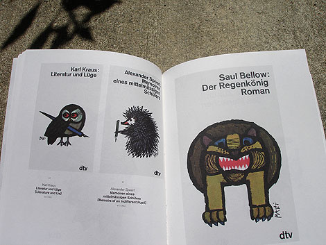
Celestino Piatti + dtv: The Unity of the program - Edited by Jens Muller
Two weeks ago we featured the Philips-Twen book from Lars Muller’s new A5 series. Celestino Piatti + dtv is the third title to be released in the series and my favorite of the bunch.
Celestino Piatti was born in the little Swiss village of Dietlikon on January 5,1922. Early on his parents recognized his talent and secured him training at the Kunstgewerbeschule (School of Applied Arts) in Zurich and later a graphic design internship with fellow Swiss designer Fritz Buhler. After four years with Buhler he left to start his own studio and eventually landed the job of a lifetime. In 1961 Deutscher Taschenbuch Verlag (dtv) hired Piatti to design their bookjackets. A comission that lasted up to his death in 2007. For over thirty years, he endowed the books published by dtv with a singular and unique look. He became the most productive book designer of all times, producing covers for over 6300 books that sold in a total print run of over 200 million copies.
——————–
Also worth checking: Corporate Diversity: Swiss Graphic Design by Geigy.
Not signed up for the Grain Edit RSS Feed yet? Give it a try. Its free and yummy.
——————–
No Tags
Share This
Congrats to MCHL of Sacramento. You are the winner of the Incase HunterGatherer laptop sleeve.
Grain Edit recommended reading: A Russian Diary
©2009 Grain Edit - catch us on Facebook and twitter

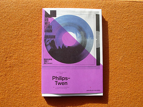
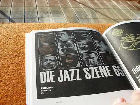
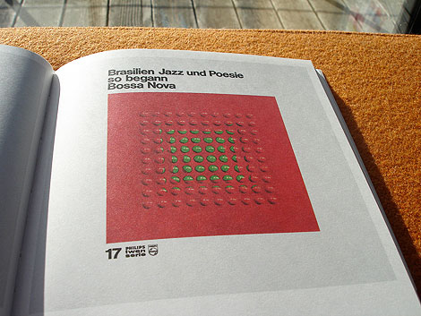
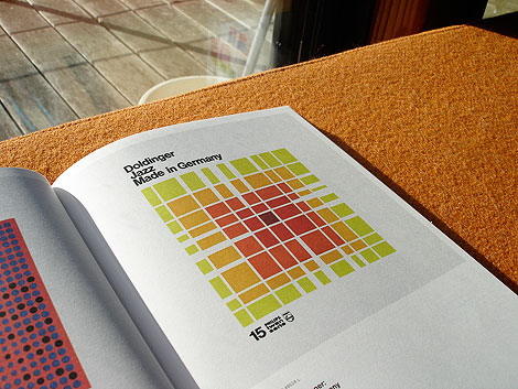
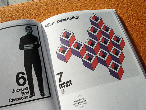
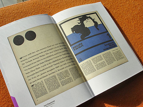
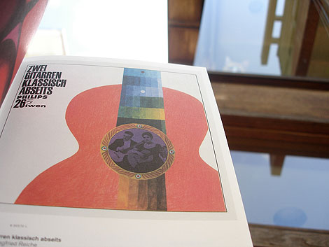
Philips-Twen: Realism is the Score - Edited by Jens Muller
Just got my hands on a few of the Lars Muller A5 titles and they don’t disappoint. I’ll try to get photos of all three titles up on grain edit within the next week or so. Unfortunately these titles are unavailable in the U.S right now, but should be available soon. Amazon has a release date of October 1st.
First up is Philips-Twen: Realism is the Score. Between 1961 and 1968, the magazine Twen produced a series of LP recordings in collaboration with the Philips record label. This book illustrates all 70 sleeves from this LP Series and includes an interview with jazz legend Klaus Doldinger, whose first three records appeared on Philips -Twen. The roster of artists/designers who contributed work for the cover art is quite impressive. Willy Fleckhaus who served as the art director for the Philps-Twen series used work by Karl Gerstner, Max Bill, Heinz Edelmann, Michael Engelmann and others to guide the look of the series.
If your interested in the book, you might want to consider pre-ordering it from amazon. I have a feeling the first batch to hit U.S. soil will sell out fast.
For more info check out the Lars Muller website.
——————–
Also worth checking: Corporate Diversity: Swiss Graphic Design by Geigy.
Not signed up for the Grain Edit RSS Feed yet? Give it a try. Its free and yummy.
——————–
No Tags
Share This
Congrats to MCHL of Sacramento. You are the winner of the Incase HunterGatherer laptop sleeve.
Grain Edit recommended reading: A Russian Diary
©2009 Grain Edit - catch us on Facebook and twitter

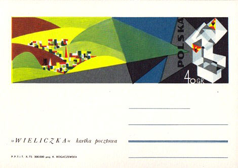
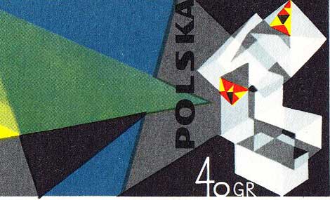
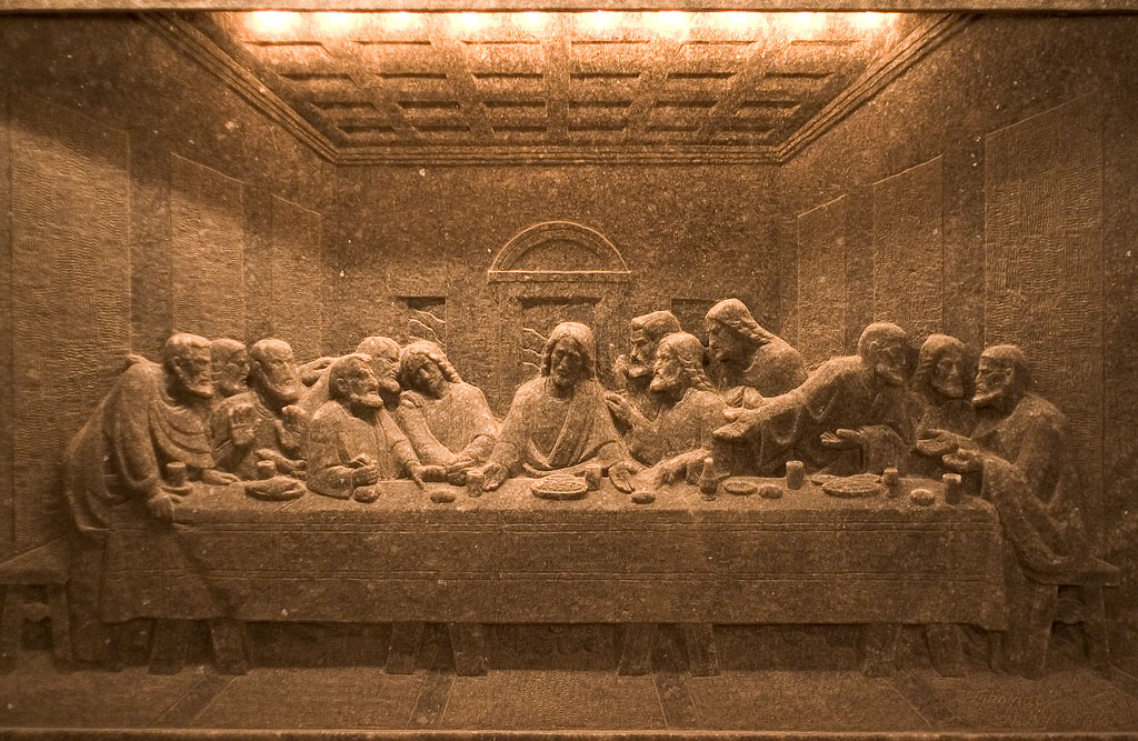
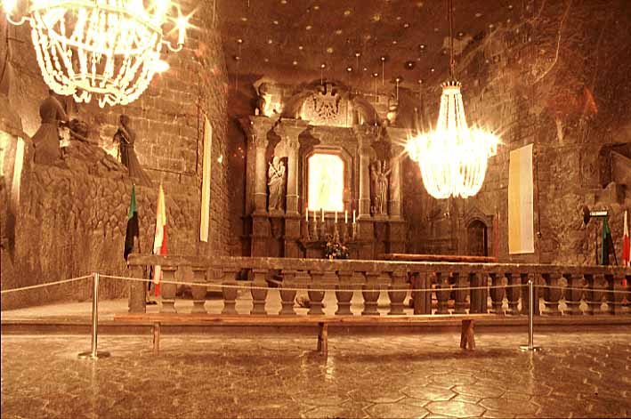
1972 Poland Wieliczka salt mine postcard designed by K. Rogaczewska.
Poland’s Wieliczka Salt Mine, in the suburbs of Kraków, produced table salt continuously for over 700 years. Although operation ceased in 2007, visitors can still tour the mine, where they can see statues and artwork carved entirely out of salt (including a chapel, complete with salt chandeliers!). In 1972, K. Rogaczewska designed this postcard, which depicts the hillside town of Wieliczka and the salt crystals of its mine.
——————–
Also worth checking: Modern Polish maps and sharp stinking teeth.
Not signed up for the Grain Edit RSS Feed yet? Give it a try. Its free and yummy.
——————–
No Tags
Share This
Congrats to MCHL of Sacramento. You are the winner of the Incase HunterGatherer laptop sleeve.
Grain Edit recommended reading: A Russian Diary
©2009 Grain Edit - catch us on Facebook and twitter

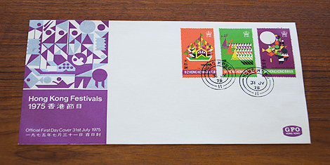
1975 Hong Kong festivals - official first day cover and stamp set designed by Tao Ho
Tao Ho is a Hong Kong-based architect, designer, teacher, and writer. He studied under Sigfried Giedion and Josep Lluís Sert at Harvard’s Graduate School of Design and worked with Bauhaus founder Walter Gropius at the Architects Collaborative. In 1975, Tao Ho designed this first day cover and stamp set to commemorate Hong Kong’s Tin Hau, Dragon Boat, and Mid-Autumn festivals.
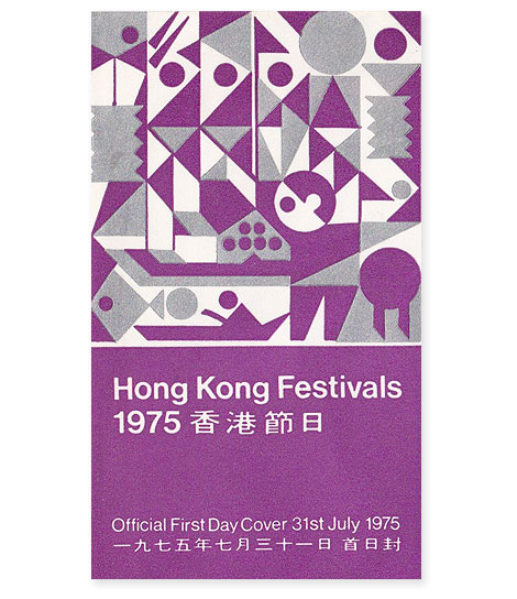
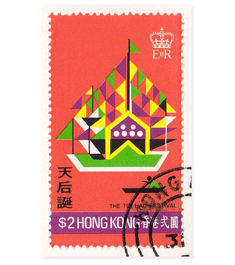
Tin Hau, Goddess of the Sea, is celebrated as the protector of fishermen and sailors. During the Tin Hau festival, fishing boats covered with colored streamers and flags sail through Joss House Bay in Sai Kung.
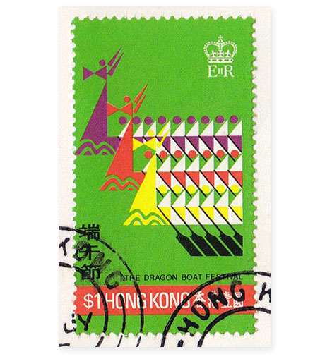
The Dragon Boat festival features teams of up to eighty oarsmen who race against one another in long wooden ships.
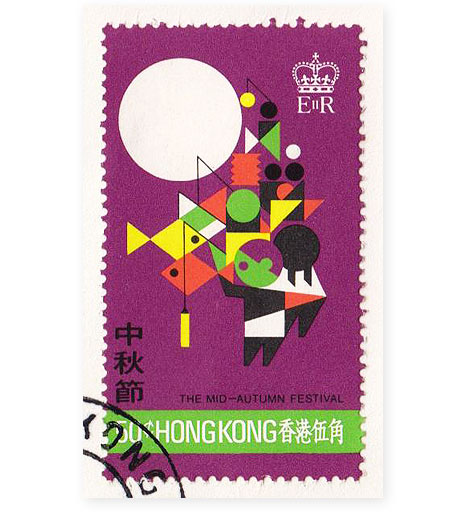
In the 14th century, a Chinese man named Liu Bowen planned to rebel against the Mongol overlords. Liu organized this uprising by concealing the message, “Rise against the Tartars on the 15th day of the 8th moon,” inside mooncakes (pastries with a lotus seed paste filling and a crust made with salted duck egg yolks). Mongols didn’t eat mooncakes, so Liu’s secret message was spread across the land and the rebellion was a success. The Mid-Autumn festival, which falls on the autumn equinox, when the moon is at its brightest, celebrates Liu’s uprising. Traditional festival activities include eating mooncakes outside under the moon, wearing pomelo rinds on one’s head, and carrying brightly lit lanterns.
——————
Also worth checking: 1966 Norway first day cover.
Not signed up for the Grain Edit RSS Feed yet? Give it a try. Its free and yummy.
——————
No Tags
Share This
Congrats to Jenny Eng. She is the winner of the Kevin Dart giveaway.
©2009 Grain Edit

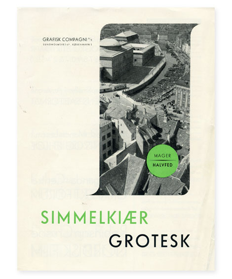
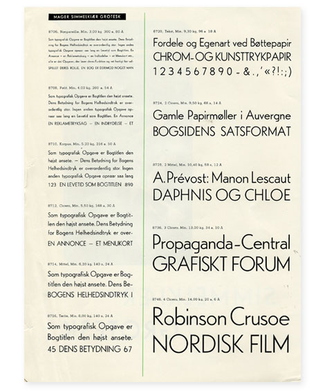
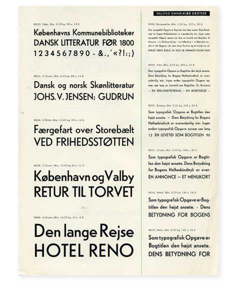
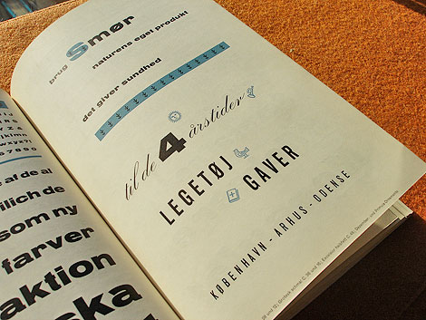
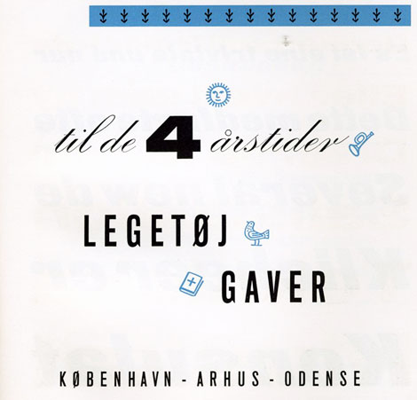
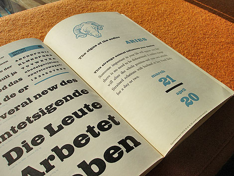
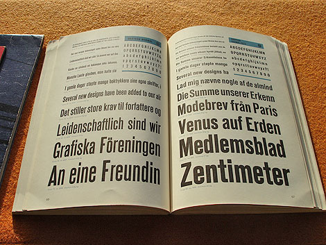
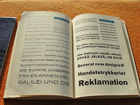
Simmelkiaer Grotesk - Grafisk Compagni
I found this type specimen sheet when I was digging through a printer’s collection last summer. Anyone have any info on Simmelkiaer Grotesk or Grafisk Compagni?
———————-
Also worth Checking: Vette Annonce type specimen sheet, Plakat Schriften, Aldo Novarese - Recta
Not signed up for the Grain Edit RSS Feed yet? Give it a try. Its free and yummy.
———————-
No Tags
Share This
Congrats to Jenny Eng. She is the winner of the Kevin Dart giveaway.
©2009 Grain Edit

View Next 25 Posts


