new posts in all blogs
Viewing: Blog Posts Tagged with: illos, Most Recent at Top [Help]
Results 1 - 8 of 8
How to use this Page
You are viewing the most recent posts tagged with the words: illos in the JacketFlap blog reader. What is a tag? Think of a tag as a keyword or category label. Tags can both help you find posts on JacketFlap.com as well as provide an easy way for you to "remember" and classify posts for later recall. Try adding a tag yourself by clicking "Add a tag" below a post's header. Scroll down through the list of Recent Posts in the left column and click on a post title that sounds interesting. You can view all posts from a specific blog by clicking the Blog name in the right column, or you can click a 'More Posts from this Blog' link in any individual post.
<!--[if gte mso 9]> Normal 0 false false false EN-US X-NONE X-NONE MicrosoftInternetExplorer4 <![endif]--> My “Dreamtime Man” is taking shape
A rhyming picture book for grades 4 and up
Illustrator, Ioana Zdralea, did an awesome job of interrupting this wild and mysterious Dreamtime land. I am thrilled!! This is the illo she sent me for the first two verses. The verses describe the harshness of where the Australian aboriginals had to scratch out a living,
<!--[if gte mso 9]> Normal 0 false false false EN-US X-NONE X-NONE <![endif]--> Imagine a wild place where sun burns the sand,
Where water and food must be scratched from the land.
This place is the wellspring of men black as coal,
And Dreamtime ruled all who endured as one soul.
While shy Daintree tribes hunted deep in the shade,
Tough bush and outback men learned how to trade.
Whether hunting, or fighting, or struggling to live,
All respected the Dreamtime and what it could give.
*******************
More sketches and finished artwork will
come to this page soon.
***************
Books for Kids - Skype Author Visits
Manuscript Critiques
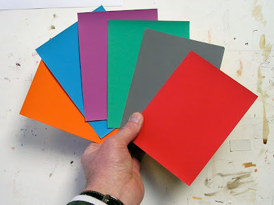
Like a glissando in music, a color gradation moves smoothly from one note to another. Gradations can be very beautiful in purely abstract terms. They take you from one hue to another, or from a light color to a dark color, or from a dull color to a saturated one. Let’s have a look at some examples.
 This gradation goes from a dark desaturated blue to a pale desaturated yellow. So it shifts in hue and value, but not very much in saturation.

This one is fairly similar, but it moves from a neutral (or grayed down) dark to a warm light tone, passing through a slightly more saturated oranges in the middle of its range.
Here are three gradated strips of color. The top one changes primarily in hue as it goes quickly away from a dull red-orange and gradually arrives at a saturated blue, without changing very much in value. The middle one shifts darker in value, and the third one moves in and around related pinks and oranges before arriving at a paler pink.
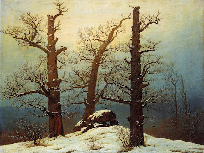
Now that you’ve seen some gradations out of context, let’s see where they came from. The first color strip comes from the right side of this painting by Caspar David Friedrich. Note that the brownish color of the trees also gradates as it moves away from the bright center of light. When two color sets move together, I call it a "parallel gradation."
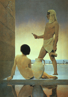
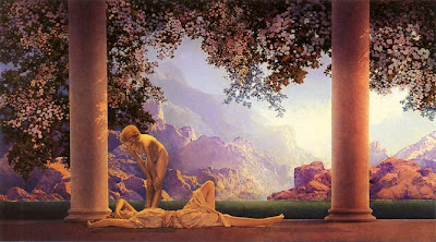
The second color gradation appears in the sky of this painting by Maxfield Parrish. The stone wall also gradates very slightly from warmer at the top to cooler at the base.
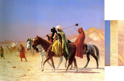
The group of three strips are all taken from a single Gerome painting of Arab horsemen. This painting is full of gradations, many more than I’ve shown. It owes much of its luminosity to the skillful use of changing color.
John Ruskin observed in Modern Painters (1843) that a gradated color has the same relationship to a flat color as a curved line has to a straight one. He noted that a painting of Turner—and that nature herself—contains movement or gradation of color both on the large and the small scale:
“I wish to insist…that nature will not have one line nor color, nor one portion nor atom of space without a change in it. There is not one of her shadows, tints, or lines that is not in a state of perpetual variation.”
Gradations don’t just happen. They take planning. In some future post we’ll explore some techniques for painting gradations and look at ways to use them in composition.
More from the Art Renewal Center database on Friedrich, Parrish, and Gerome.Tomorrow: Backs of Heads
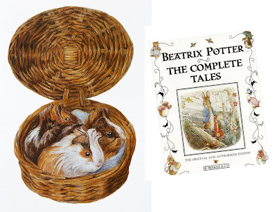 Radikin guessed it right: Today's painting called “Blossomed Furze” was by Beatrix Potter. Most of her famous books, like Peter Rabbit and Benjamin Bunny were based on her own pets by the same name. She carried them around with her on vacations and sketched them often. Throughout her life she made many studies of mushrooms, flowers, animals, birds, landscapes, and interiors, which still set a high standard of observation, even among natural science illustrators.
 She was a stickler for truth to nature. As much as she adored Wind in the Willows, she once offered this gentle criticism:
Kenneth Grahame ought to have been an artist—at least all writers for children ought to have sufficient recognition of what things look like—did he not describe “Toad” as combing his hair? A mistake to fly in the face of nature—a frog may wear galoshes, but I don’t hold with toads having beards or wigs! So I prefer Badger.”
Artwork and quote from The Art of Beatrix Potter, © Frederick Warne Co, 1955.Tomorrow: Motion Blur
Moonlight is about 400,000 times weaker than direct sunlight. It’s so dim that the color receptors in our retinas, called the cones, can barely function.
In moonlight the other retinal cells called rods are doing most of the work. Rods detect relative lightness and darkness, but they are entirely color-blind.
Moonlight is simply the white light of the sun reflecting off the gray surface of the moon. There’s nothing in that interaction to give the light a bluish or greenish quality. In fact, scientific instruments have shown that the light from the moon is very slightly redder in color than direct sunlight.
These facts added together suggest a mystery at the heart of how we as artists choose to portray moonlight in paintings. If moonlight is just gray-colored light, and if it’s close to the minimal threshold of our color receptors anyway, then why do so many artists paint moonlight as bluish or greenish? Do we really see it that way? Is it some kind of illusion, or perhaps is it just an artistic convention?
Let’s look at some paintings by master painters of moonlight. As you look at them, consider your own perception of the colors at night, and ask yourself which of the paintings best convey your own experience.
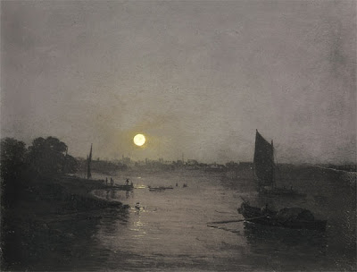 Here’s a painting by J.M.W. Turner. It’s fairly gray, with just a hint of warm color around the moon. Notice that there isn’t much detail in the shadow area. All you really see clearly are the silhouettes of the sail and the boat on the water.
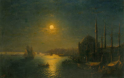
Russian seascape painter Aivazovsky painted this night scene lit by a golden moon. The sky, the water, and the shadows all sink into blue-green tones. He doesn’t show very much detail, and he stops well short of black in the shadows.
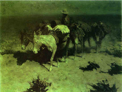
This lightening of darks was also a feature of Remington’s nocturnes. The cast shadow to the left of the pony’s nose is composed of dull umbers and greens. These luminous shadows lighten and liven the obscurity. Except for the light saddle cover, Remington has left most of the edges soft and undefined, especially on the donkey on the right.
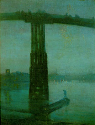
This famous nocturne by Whistler of the Battersea Bridge uses a fairly saturated blue-green color, especially in the water and in the silhouetted figure. The detail is blurred throughout, even in the areas where the bridge appears against the sky, setting up for the tiny sparkles of light in the distance.
One of the reasons for softening the edges is that we depend on the cones for fine discrimination of edges. Unfortunately the cones are located on the fovea, the centerpoint of vision, and with them off-line in the darkness, we just can’t sort out small details.
If you take a book or newspaper outdoors in moonlight, you can see that there is writing on the page, and you might be able to read headlines or other large type, especially when you glance around with your peripheral vision. But reading normal size text is almost impossible. When you look directly at the words, the blind spots get in the way.
I said earlier that our cones are barely functioning in moonlight. In fact, contrary to what some authorities have claimed, most people’s cones can make basic color judgments by the light of a full moon. But how much variation in color can we really see?
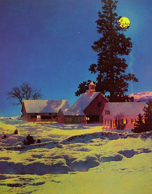
Maxfield Parrish rendered this moonlight scene with quite a bit of color saturation. He painted the yellow moonlight, the reddish cupula on the barn, the deep blue of the sky, and the orange color on the shadow side of the house. Did he really see such colors in moonlight, or did he invent them for pictorial effect? Too bad he’s not here to ask.
Direct plein-air painting is virtually impossible in moonlight. Every artist has to work from memory and imagination. We may try to convey our actual optical sensations, but we’re not scientists. Each of us is also trying to make a subjective aesthetic statement intended to evoke a particular mood or emotion. Any moonlight painting is an attempt to translate a “rod experience” into a “cone experience,” an image that will be seen in a brightly lit environment.
 Here’s how you can test how your cones actually respond to color in moonlight. Paint a set of separate, matching, unmarked color swatches or find some construction paper at about the same value. Take them into full moonlight (this Tuesday) and let your eyes adjust (it takes about 30 minutes). Shuffle the cards, and while you’re still outdoors, mark on the back what colors you think they are.
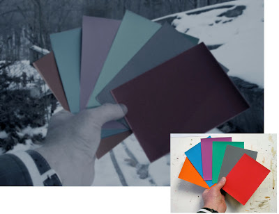 I have used Photoshop to manipulate a photo of the swatches (actually shot in daylight) to simulate how they appeared to me under the full moon: dulling, darkening, and blurring them. Both Jeanette and I could easily identify the basic hue family of each swatch. But beyond that basic classification, we weren’t sure, and the gray swatch confused us both.
When I looked at the same swatches in the much dimmer light of a half-moon, or in a moon shadow, I found my cones went sub-threshold and shut down completely, and the swatches became completely monochromatic.
Although the rods of the eye can’t actually see color, scientists have shown that they are most sensitive to greenish wavelengths of light. As a result blue-green hues appear lighter in tone in dim conditions. There’s a name for this: the Purkinje Shift. It’s a different phenomenon from, and often mistaken for, the perception of moonlight as blue.
You can demonstrate the Purkinje Shift by comparing a red and green swatch that start out indoors at the same value. If you take them outdoors in moonlight, the greenish one will seem much lighter in tone. Many observers have noticed that red roses look black in the moonlight.
If you scroll back up to my Photoshopped version of the moonlight color swatches, you can see I’ve adjusted the values to simulate the way the red and green looked to me as a result of the Purkinje Shift.
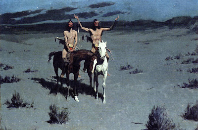
Here, Remington shows a scene with Indians in moonlight. We see their flesh tones and some clear red touches in their costumes. Throughout, the edges are much crisper than his other painting.
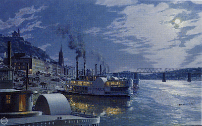 This nocturne of old Cincinatti by contemporary artist John Stobart has a distinctly bluish cast. He introduces much more detail than we’ve seen in the other examples, reminiscent of the “day-for-night” film shoots in old westerns. You can even read the name “Bonanza” on the shadow side of the ship.
In addition to the moonlight, there’s a secondary source of yellow-orange lamplight. In this case, one could argue that the blue cast to the picture may be a complementary color induced in opposition to the color of the lamplight.
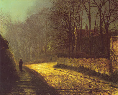 Atkinson Grimshaw was famous for his poetic moonlight studies. Here the shadow masses at the left are fairly soft and impenetrable, but the bricks and branches show up very clearly. The moonlight on the road is an intense yellow-orange, assuming this reproduction is accurate. The shape of the patch of light points to the lovers standing in silhouette at left.
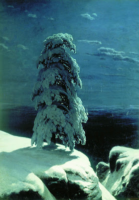
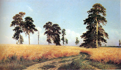
Russian landscape realist Ivan Shishkin, painted this haunting image of a winter night in the wild north. The snow in moonlight is relatively brilliant, with a soft halation along the edge at left, but it’s not yellowish. The cast shadow gradates in tone, getting lighter as it catches more sky fill and bounced light. There’s quite a bit of detail in the tree form, but he has kept the foreground and background description to a minimum.
So, to get back to the question posed earlier, why do we see moonlight as blue?
Saad M. Khan and Sumanta N. Pattanaik of University of Central Florida have proposed that the blue color is a perceptual illusion, caused by a spillover of neural activity from the rods to the adjacent cones.
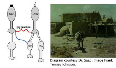 A small synaptic bridge between the active rods and the inactive cones touches off the blue receptors in the cones, kind of like an insomniac turning over in bed and rousing his sleeping spouse.
This influence of rod activity on the adjacent cones tricks the brain into thinking we’re seeing blue colored light, even though we’re really not.
As the authors put it: “We hypothesize that the rod cells predominantly synapse onto the S-cone (cone cells sensitive to bluish light) circuitry resulting in the visual cortex perceiving a tinge of blue.”
So moonlight isn’t blue; our eyes are just playing tricks on us.
Unfortunately, this tantalyzing hypothesis remains untested. I contacted Dr. Khan and he told me that because of other projects he hasn’t had time to prove the hypothesis in controlled conditions. I hope that he can shed more light—of whatever color—on this elusive topic.
Until then, moonlight remains a mystery at the meeting point of art and science.
Further reading:
- Khan and Pattanaik’s summary article in Journal of Vision, 2004. Link.
- Related discussion on the NASA web site. Link
- "The Eye and Night Vision," from American Optometric Association. Link.
- More on Remington’s nocturnes at David Apatoff's blog. Link
Tomorrow: Elegant Graphics
Enduring masterpieces have two qualities. They INVITE and they DELIGHT.
INVITE
A picture invites us by presenting a clear effect at a glance. It grabs us from across a room. The composition makes a definite statement. The lighting conveys an unmistakable mood.
The basic idea or situation of the picture must be evident right away. It must be understandable without too much explanation. Avoid concepts that are too intellectual. Avoid illustrations that depend entirely on an extrinsic narrative, unless it is universally recognized. People are easily embarrassed if they cannot begin to respond to a picture right away.
At the same time most masterpieces raise a question, suggest a mystery, leave a doubt, or present an unresolved conflict.
 DELIGHT
While a strong singular impact invites us into a picture, what really captivates us are the delights that we discover after the first impression.
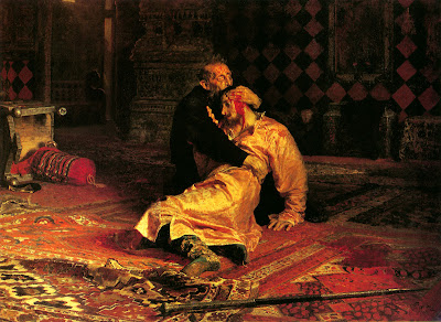
“Delight” doesn’t mean the picture is necessarily cheery and optimistic; even if the story is horrifying or foreboding, we find a strange pleasure in exploring the sources and consequences of the tragedy. For this reason, we're usually more interested in the moment just before or just after the peak of the action.
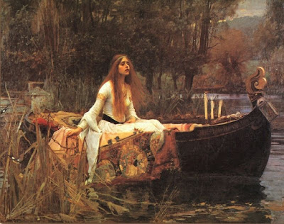
We like pictures that let us discover things on our own. We connect with a picture when we find subtle, hidden elements.
We want to study a picture to become familiar with the supporting characters or details. We want to discover hints of a story beyond the obvious. If this is done well, we will say, “I see something new every time I look at that picture.”
When a picture contains human figures, we automatically identify with them. The human factor helps us live inside the scene. We respond to real people in real situations. Poses must be based on life, even if they are idealized.
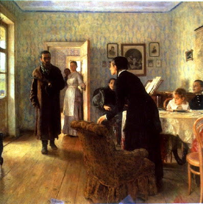
Emotions, such as humor or pathos, must be sincerely felt by the artist, and transmitted by every pictorial means possible.
In landscape, the human factor can be the mere suggestion of a human presence, such as a road or a tree stump.
 Next time you’re planning a picture, let those words dance in your head: “invite, delight.”
Jeanette and I spent most of last Friday at the Delaware Art Museum in Wilmington for a presentation to K-12 art instructors as part of their teachers’ in-service day. Newpaper article here. Thanks to all who attended my talk and stopped by to say hello at the signing afterward.
We also had some time to pore over the extensive collection of paintings by Howard Pyle and his students. Curator Joyce Schiller then met us in the galleries to discuss the core of Pyle’s teaching and his methods of picturemaking.
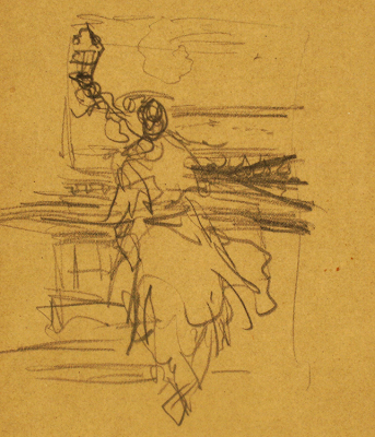
Although Pyle did not leave behind a systematic theory or method in his own writings, many of his students kept copious notes of his spoken words. According to Dr. Schiller, there is no evidence that Pyle photographed costumed models for reference. There are only “fun photos of his students dressed in costumes as though they were preparing for Halloween.” Drawn figure studies are extremely rare.
What remain are many of his rough, exploratory sketches drawn from imagination.
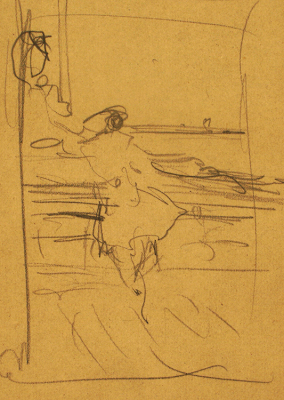
Dr. Schiller kindly permitted me to share a few of these preliminary sketches, appearing for the first time here on Gurney Journey. They were made in preparation for “Kid on the Deck of the Adventure Gallery,” shown for comparison at the end of this post.
According to Dr. Schiller, “they are for compositional arrangement only and are not model studies or preliminary layout images. After Pyle made his composition decisions he went directly to the canvas.”
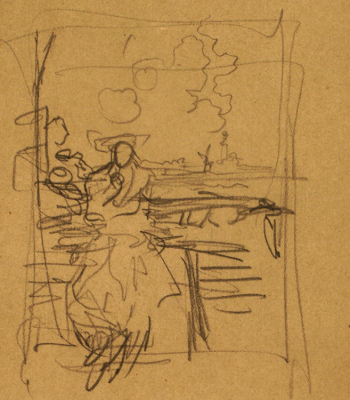
They have the flavor of a vision snatched from the ether, a snapshot from the swirling creative vortex, a half-remembered dream.
Although Pyle was both a proper gentleman and a respected scholar, he was also a mystic, following the beliefs of Swedenborgianism. This ecclesiastical organization was popular among artists in the 19th Century because of its associations with divination and theosophy. Picturemaking was for Pyle a process more mysterious than mechanical.
 My thanks to Joyce K. Schiller. The foregoing images are provided by and copyright of the Delaware Art Museum, reproduced here with their express permission.
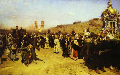
I couldn’t move on from the recent posts about shape welding and the Pyle school without mentioning one other quality of the Brandywine tradition that I so admire. Again, there’s no name for it that I’ve ever encountered, so I propose the word “clustering.”
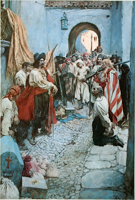
Clustering is the method Pyle used so often to arrange a tight group of detail in one interest area, in contrast with large blank areas. This composition, called "Extorting Tribute from the Citizens," packs dozens of faces in one small section in front of the arch, while keeping the wall above and the street below completely empty.
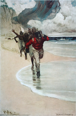
Anyone but Pyle would have painted this scene from "Sinbad on Burrator" with the figures spaced out evenly, each silhouette separate from the others. By clustering them all together, the eye sees them as one shape first and wants to go in and sort them out.
Shape welding and clustering look easy, but in my experience it takes real determination to pull them off. I have to fight the lunkhead instinct which wants to line up the toy soldiers, spread out the cookies on the table, give everything equal importance, and define every edge equally.
I can't wait until this Friday, when we'll bring you via this blog to the Delaware Art Museum, home of Howard Pyle's originals.
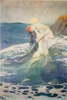
The best pictorial compositions are simple. Simple shapes are easy to recognize and remember. Busy pictures with lots of little separate shapes have less impact. My own work stands improvement in this area, so I’ve been trying to figure out how the masters did it. Below: Mermaid, by Howard Pyle.
Achieving simplicity doesn’t always mean restricting yourself to just a few minimal forms, like one apple against a blank background. You can have plenty of elements or figures and still have an uncluttered picture. The trick is to cleverly arrange the elements so that adjacent tonal shapes fuse together into larger abstract patterns.
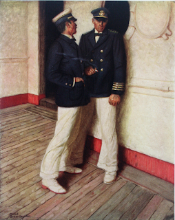
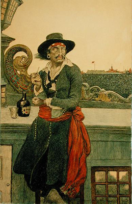
According to Charles DeFeo, Howard Pyle used to say, “Put your white against white, middle tones (groups) against grays, black against black, then black and white where you want your center of interest. This sounds simple, but is difficult to do.” The picture above is by Mead Schaeffer, a grand-student of Pyle through Harvey Dunn.
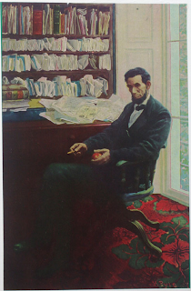
You can unify shapes by losing them in an enveloping cloud of shadow, and the light areas can spill over into each other. The Lincoln picture below is by Pyle.
This automatically sets up unexpected larger shapes with great abstract beauty and expressive power.
To my knowledge there’s no word in art theory for this idea, so I would like to suggest the term “shape welding.”
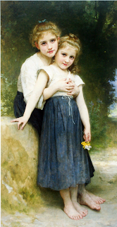
Shape welding shows up not only with Howard Pyle and the Brandywine School, but also with academic painters like Bouguereau (above). All these artists were clearly thinking about shape welding, but I don't know what they called it. The only word I’ve run across to name it is the French word “effet,” which in the academies meant the large overall pattern of light and dark.
Maybe someone reading this blog will know other terms that have been used by artists to describe this principle.


.jpg?picon=1009)


James,
I am continuing to love your posts. You bring up so many different ideas that i had never heard about or thought about as well as ones that have taken me years to stumble onto myself.
Thanks so much.
Jacob
I think I've learned more from reading your posts than I have in all my art classes, dating back from high school. Thank you.
Maria