Viewing: Blog Posts Tagged with: pinocchio, Most Recent at Top [Help]
Results 1 - 5 of 5
How to use this Page
You are viewing the most recent posts tagged with the words: pinocchio in the JacketFlap blog reader. What is a tag? Think of a tag as a keyword or category label. Tags can both help you find posts on JacketFlap.com as well as provide an easy way for you to "remember" and classify posts for later recall. Try adding a tag yourself by clicking "Add a tag" below a post's header. Scroll down through the list of Recent Posts in the left column and click on a post title that sounds interesting. You can view all posts from a specific blog by clicking the Blog name in the right column, or you can click a 'More Posts from this Blog' link in any individual post.
Here are some little bits scanned from my sketchbook, most I tweaked in Photoshop. They aren't very new, but I wanted to post something.... anything really. I feel stale so I'm attempting to motivate myself by using this blog to post ideas and sketches and finished work as much as possible. I don't know what (if anything) will come of these, but there you have it.
This is my Thumbelina as directly inspired by an illustration by David Johnson.
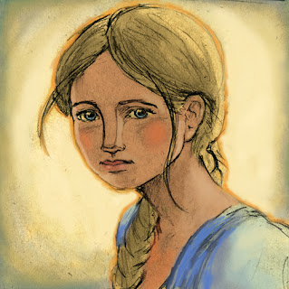
This was a character sketch of Oliver Twist. I'm currently working on an actual painted version of this. It's not an illustration so much as it is practice on my stylization. I'll post that painting as soon as it's done. Maybe tonight even.

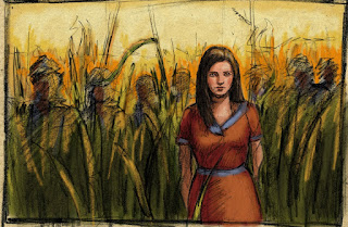
Just a girl in a field with some dark figures surrounding her....don't really know where this was headed.
Here we have a little piggy ala Wilbur, but that's just a coincidence. I like piglets is all. I started a painted version of this but hated it so I will probably retry it someday.

Some character studies I did for Pinocchio...

This is a sketch for a spot illustration for Pinocchio.

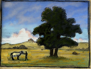
Um, I guess this would be a knight and white horse near a pretty tree with a castle in the distance...I find this really boring, actually...
It needs some spice. Plus I think the colors are too cheery for the mood I originally wanted to give it.
I wanted to do this piece to continue exploring the theme of humanized animals and parental bonds, but I thought it wasn't really presenting much more than a cute-ified Corbis photo, so I put it on hold.

I guess this is my try at a cool old sea captain, but the picture isn't very narrative and he kind of looks like my dad, so I've not pursued this any further yet.

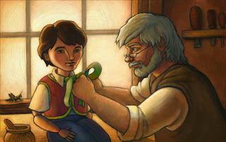
Ok, so I think I'm finally settled on this piece. Although I'd finished the painting of it a couple weeks ago, I was still unsatisfied with it. So I took it into Photoshop and tweaked it a bit to my liking. The original painting wasn't as luminous as it is now. I really wanted to add to the glow of the window, cool down the orange of the back wall, and darken the right side in general. So I did.
I think it was for the better.
So here goes:
What I like About It:
I'm happy with my stylization of Pinocchio and Geppetto, and I like the color. I like the warm color scheme and my minimal use of green for extra flavor. I also like the moment that I chose to depict... a quiet, intimate moment between father and son, you could say. I'm also kind of happy that Geppetto turned out to somewhat resemble of my own dad (a carpenter). It made it more personal for me I guess, seeing as how my father had three daughters but no son.
What I'd Do Differently:
Every piece is a learning experience, and with this piece I learned more about working with the acrylic on cold pressed illustration board. But I might like this piece more had I done it on gessoed board, with the swirly underpainting that I sometimes use. I just feel it needs some sort of underlying visual interest to really pull it together. I also wish that Geppetto felt less stiff, and more organic and natural. His arms are kind of posed and solid, and I think that if he were more loose than it would really make Pinocchio feel that much more wooden. Also, in my original sketch, Geppetto's expression bordered more on concentration and melancholy, and the final painting he's sort of smiley. I think I would like the tone more if he was a bit less happy and a bit more...something saddish.
Perhaps I'll do another from the story...




Great photo!