


The Arken Museum in Copenhagen is presenting an exhibition called “The Skagen Painters —In a New Light,” currently on view until the first of June, 2008. The principal work in the show is called “Hip Hip Hurra!” by the Danish/Norwegian painter Peder Krøyer, the ringleader of a group of genre painters who gathered in the fishing village of Skagen.
Krøyer, like the Juste Milieu painters in France and the Newlyn painters in England, blended the insights of Impressionism with the skills of traditional academic craftsmanship, which he perfected in Leon’s Bonnat’s atelier in Paris.
The small color study above shows how the design looked as it was almost fully crystallized. Between this sketch and the final painting he removed the hat from the man with the glasses, and he added a man with a light jacket leaning into the picture at right.
The current exhibit in Denmark examines how Krøyer achieved the feeling of a spontaneous, offhand composition in “Hip, Hip, Hurra!”, which in fact was carefully staged and arranged. The painting took him over four years to complete.
The detail of the final painting shows a principle Krøyer would have learned from Bonnat, namely to be careful not to violate the lights. The large light area composed of the tablecloth, the girl’s dress, and the woman at right is skilfully shape-welded together, with no dark accents interrupting it. This unified structure makes a strong, simple mass that holds the painting together despite a prodigious amount of detail.
Here I’ve taken the final painting and exaggerated the underlying tonal structure. The light shape is an abstract unit that looks something like a butterfly. The light woman’s arm extends upward from it at right, and the dark woman’s arm comes into the shape at left. These two gestures are given compositional salience and they help us recognize the theme of the picture immediately.
Two smaller light shapes float like islands in the dark background of foliage: the head of the woman at left, and the cluster of revelers in the distance.
Further Reading
Related Gurney Journey Posts: Shape Welding, Juste Milieu, Color Sketches
More on Skagen painters, Link.
More on the exhibition, Link.
OutdoorPainting.com feature on Peder Krøyer, Link.
Thanks to Armand Cabrera for telling me about the Skagen painters.
Viewing: Blog Posts Tagged with: thought, Most Recent at Top [Help]
Results 26 - 35 of 35
.jpg?picon=1009) By: James Gurney,
on 3/27/2008
By: James Gurney,
on 3/27/2008
Blog: Gurney Journey (Login to Add to MyJacketFlap)
JacketFlap tags: Academic Painters, Composition, Preliminary Sketches, Add a tag
 By: Rebecca,
on 2/14/2008
By: Rebecca,
on 2/14/2008
Blog: OUPblog (Login to Add to MyJacketFlap)
JacketFlap tags: blogs, read, language, celebrate, A-Featured, happy, Lexicography, From A To Zimmer, thought, wonderful, Add a tag
Happy Valentine’s Day to all! To celebrate Valentine’s Day I thought it would be nice to share the love, language love that is. So today, instead of Ben’s column, please go check out some of his fellow wordies. Be sure to leave comments and let them know how much you love their blogs. Over the next couple weeks some of these illustrious bloggers will be guest blogging in this space so stay tuned.
Take a look at Mark Peter’s language guide for parents or his Wordlustitude blog.
Swing by Jeff Prucher’s blog for an interesting meditation on horror as a genre.
Then click over to Grant Barrett’s Double-Tongued Dictionary which can keep you busy for hours on end.
Don’t miss Erin McKean’s Dictionary Evangelist blog which proves just how much fun you can have with language.
By: Rebecca,
on 2/12/2008
Blog: OUPblog (Login to Add to MyJacketFlap)
JacketFlap tags: TOC2008, TOCconf08, learned, o reilly, passionate, change, Technology, Current Events, conference, tools, Media, A-Featured, share, users, oupblog, good, thought, morning, Add a tag
Good morning everyone. I thought I would share some of what I learned at the first day of Tim O’Reilly’s Tools of Change Conference. I took an enormous amount of notes but to be honest the most important thing I heard all day was that Publisher’s Weekly has partnered with Netgalley to allow publishers to send and track galleys electronically. This is huge. Galley production is not only expensive but it is also wasteful. Many if not all galleys end up in the garbage and it is, therefore, difficult to know if they are actually reaching the desks of reviewers. Hopefully, with Netgalley, publishers will be able to cutback on the amount of paper they waste creating galleys and further encourage the publishing industry to go green.
There is your public service announcement for the day. (more…)
.jpg?picon=1027) By: Eugenia Gina,
on 2/10/2008
By: Eugenia Gina,
on 2/10/2008
Blog: eugenia gina - dua mata saya (Login to Add to MyJacketFlap)
JacketFlap tags: wallpaper, thought, illustration friday, wallpaper, thought, Add a tag
Again, I make the green monkeys, yes I love green monkey,
maybe someday I will make the figure :).
I even make the wallpaper for this green-wise monkeys, just click here to download the wallpaper version, and make them remind you what to choose today.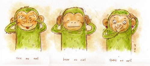 This time IF topic is about 'choose', it's a deep topic for me, applicable to my everyday life,
for every thing, we can choose...
what we want to see,
what we want to hear and
what we want to speak,
so.. be wise then..
 By: Eugenia Gina,
on 1/29/2008
By: Eugenia Gina,
on 1/29/2008
Blog: eugenia gina - dua mata saya (Login to Add to MyJacketFlap)
JacketFlap tags: little moment, thought, thought, little moment, Add a tag
Days of balloon and treasure :)
Balloon Mika always love balloon, anykind of it, since she was little, the sound of the 'balloon-man' always
capture her attention, and it is true, a balloon a day makes the worry away :)
We're trying to make a shape from this long balloon into anything or something.. perhaps .. :') ,and the experiment need a lots of squeaze, a squeak and a biiiiig heart- because I am afraid of the sound of a popping balloon- and actually- we have successfully make a few of it.... *_*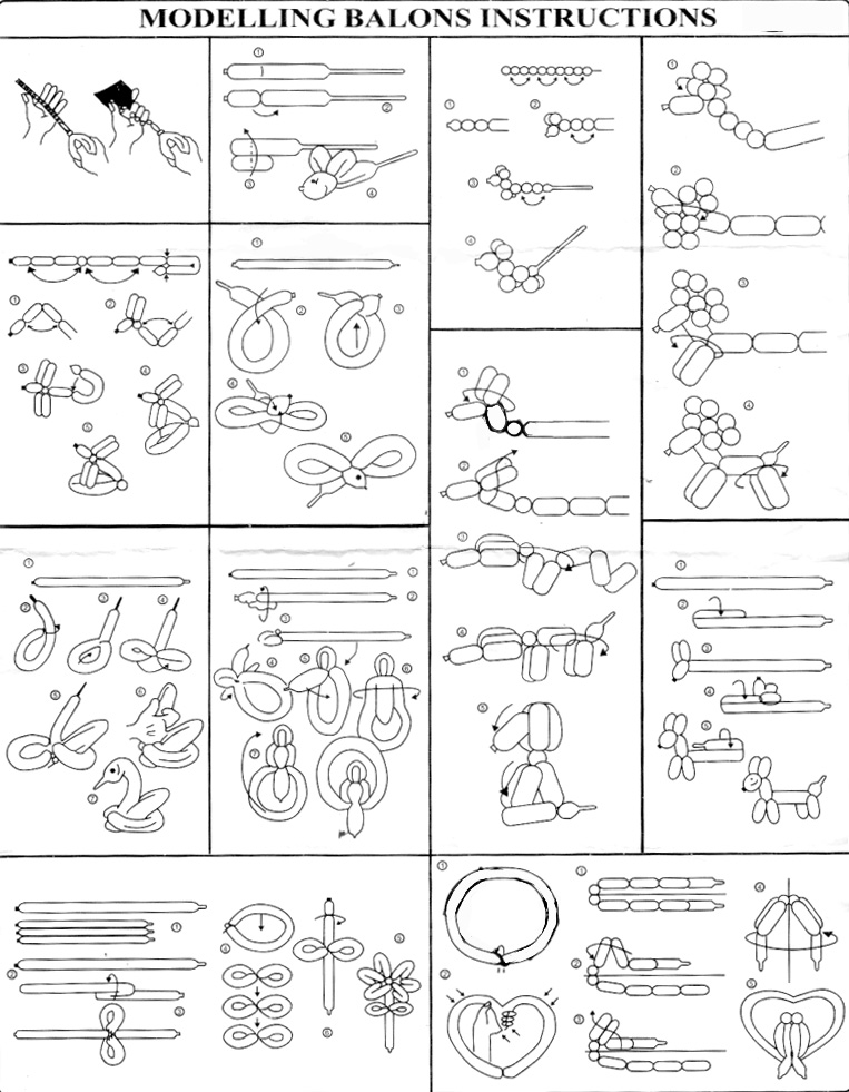 This is the 'how-to' instruction, maybe we could make a monster shape someday, just learn from the basic first shall we..?
Our treasure! There once a poem about little things that children adore, for example, the balloon,
sometimes adult just don't realize how this small things is actually a big matter for them, maybe we -adult- have to learn to listen and look carefully from the eye of the children... just remember when we're little.. you must have one- remember..? :)
And her treasure is this:
bing and bong doll, extra ordinary, rare collection, made from pillow, with a handmade face, and legs stick with a tape.. :)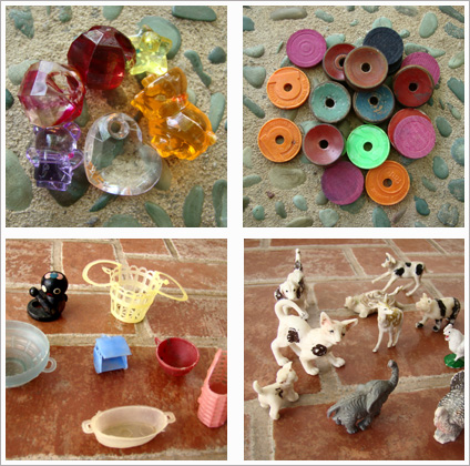
:: little gems, and coins, lots of them.. very precious..
And my treasure?
:: plastic mini becak, basket, coffee cup
:: vintage animals, I love the kitten and the baby elephant the most.. :)
By: Eugenia Gina,
on 1/1/2008
Blog: eugenia gina - dua mata saya (Login to Add to MyJacketFlap)
JacketFlap tags: work, thought, thought, Add a tag
Our first lunch on the year 2008

 I haven't buy the product, but this is the character study and final :).
By: Eugenia Gina,
on 12/22/2007
I haven't buy the product, but this is the character study and final :).
By: Eugenia Gina,
on 12/22/2007
Blog: eugenia gina - dua mata saya (Login to Add to MyJacketFlap)
JacketFlap tags: thought, thought, Add a tag
Apa yang aku ingat tentang ibuku adalah
 By: Eugenia Gina,
on 12/21/2007
By: Eugenia Gina,
on 12/21/2007
Blog: eugenia gina - dua mata saya (Login to Add to MyJacketFlap)
JacketFlap tags: thought, thought, Add a tag
Breathe... And this is a doodle about what I feel right now..,
it's time to pause - look around - embraced the one you love tighter - and be thankfull..
for the family, the friends,
new friends especially from IF :) all of you who come to my blog and make such a nice comments, I really appreciate that.. , it just so nice to read all your comment and see your works...
As a newbie in this illustration thing, it is very inspiring, like a positive vitamin capsule that can boost the creativity inside me.. :D
Thanks all!
And have a nice Happy Holiday too ^_^!
By: Eugenia Gina,
on 12/7/2007
Blog: eugenia gina - dua mata saya (Login to Add to MyJacketFlap)
JacketFlap tags: thought, thought, Add a tag

By: Rebecca,
on 8/24/2007
Blog: OUPblog (Login to Add to MyJacketFlap)
JacketFlap tags: blog, kids, Poetry, school, Education, Art, youtube, friday, A-Featured, watch, jam, feeding, courtesy, ppcrg2y3ygm, thought, def, funion, Add a tag
A thought for your Friday courtesy of Def Poetry Jam and the wonderful poet Idris Goodwin.
"don't violate the lights!"
*slaps forehead*
wonderful piece there and i enjoyed your analysis. i find taking pieces you really enjoy into and editing program and reducing them in this way can be really helpful to understanding why they work.
i've had a piece take 4 years off and on (with a year off here and there) but I jut can't imagine working on something continuously for that amount of time.
Thanks for the wonderful analysis! Shape welding is a great term. It's such an important compositional concept and you've managed to explain it so well, largely by giving it such an obvious and expressive name. I know I had teachers in art school who understood this idea and probably even tried to teach it to me. It just didn't resonate until I saw "shape welding"! Thanks.
Jim, great, thoroughly enjoyable blog.
I believe the terms for shape welding used at the Art Students League was "massing."F.R. Gruger says "massing of contrasts", which I always found a bit confusing, though I think he means the same thing... the unifying of shapes with similar value scales for the purposes of poetic effect.
Often objects that have similar narrative roles are unified in such a way... color or value coded or shape coded. I believe the idea was to create a visual metaphor of the graphic design. That is, the gesture of the graphic design has metaphoric import as it unifies with the subject matter. This may be the reason why so much emphasis seems to have been put on strong silhouettes during that era of painting.
In Kroyer's piece, the white shapes seem to be used to represent "celebration". In this interpretation the tiny gathering of hands of the dark coated men seem insignificant compared to the area of "celebration" occupied by the mother and her child and the large clean white table cloth that is welded to them.
Anyhow, thanks so much for the blog. And everything.
Kev Ferrara
Button Holder - Oh Rats club.
Unbelievable...just fantastic. I really don't know what to say. This painting has me dumbfounded. It's just beautiful. Thanks for posting it Jim, much appreciated.
What a beautiful painting. The lighting is incredible!! Kroyer is amazing. Look at those warm and cool tones in the table cloth. :-O
You know...I like the people and what's going on with their faces and gestures but there is one thing that disturbes me about this painting :
the front of the white table cloth.
It looks like a bright flash light into my eyes, thereby obscuring the rest of the painting.
I really think that a dark table cloth, or at least the front of the table not covered by the cloth would do justice to the other values.
Sure, might be the reproduction, but still : it would suddenly make the girl and mother jump out, and they are much more important than that cloth. And you would still have a single white mass. And their clothes would appear white !
Currently they look like the bad side of a comparative washing powder commercial.
I know, I know: how dare I !
If the painter were still alive he'd turn around in his grave !
You raise an interesting point, Erik.
Now that you mention it, the figures in the scene appear to be backlit from the left side, yet the front plane of the tablecloth is receiving direct frontal illumination. Shouldn't that plane be in shadow? Maybe that's why it looks unnaturally bright.
In any case, it would be a great assignment for a group of design students to try to recompose this picture using all the same shapes and poses but with a completely different value arrangement. What if the woman on the left had the light dress? Now I am afraid Mr. Kroyer's ghost wants to kill both of us!
HI James
Great blog, I have become a regular reader. In regard to your concept of shape welding if I remember right Vernon Blake in his book How to Sketch and in his "The Art and Craft of Drawing" says that large parts of your painting should be kept in the same value, 2 or 3 big simple distinct masses. He uses a French word a lot "envoplement" (which I have probably spelled wrong). He also makes the interesting point that how an artists uses light or value in painting will have a lot to do with the artist philosophical outlook on life.
And the Chinese painters have that wonderful compositional idea of open and close. One shape should open up and allow the viewer to fly free and the next shape should close down the space and anchor the viewer. Again these are the initial large masses from water to Mountains to sky.
Thanks for the blog
Tom Morris
Tom, the word you are looking for may be "envellopement". Same as
english appart from the double 'l':
"to enclose or enfold completely with or as if with a covering"
Erik
OK I had to go see if Vernon Blake define and spelled (correct spelling) "envelopment" and he does in "Relation in Art" He defines it in a chapter on light and shade. "Envelopment means the sacrifice of sharp division between two tints, forms, or values, and the insistence on the merging of one into the other with a resulting "soft" affect. In painting Eugene Carriere pushed envelopment to excess" I still not sure if it matches James's shape-welding. But maybe a picture meant to be hung on a wall does want the same kind of immediate impact an illustration wants to deliver. I remember reading John Ruskin somewhere and he said Turner would disguise or hide the focal point (avoiding making it too obvious) so the picture would not be read to fast.
Tom
Thanks, Tom and Erik, for shedding light on the terms "massing" and "envellopement" or "envelopement." I don't quite understand the Chinese concept of opening and closing. How does a shape open or close the viewer's movement through a picture?
In Erle Loran's excellent book, "Cezanne's Composition," he refers to the grouping of the lights (or darks) in a painting as a closed pattern, and the breaking up of the lights and darks as an open pattern. I don't know if he came up with these terms on his own or got them from his teacher, Hans Hofmann.
Hey Mr Gurney! Loving your blog, and I thank you very much for the mass of info you are providing us all with, as well as fodder for thought and reflection! I was very glad today when i logged on and saw that you are talking about the Skagen painters! Finally someone else knows them! My dad introduced me to them a few years ago, and I've loved them ever since.You'll be jealous to know I am going to see the exhibit with my family on May 24th!
Timpa,
Have fun at the show. And if you feel like taking pictures and writing up a report, send it to me and I'll post it on GJ or link to your blog.
Hi James
Opening and closing come from idea of the yin and yang. This is only as I understand it of course. One thing bows down to another but the two things create the one something that is higher or more mysterious then the individuals. The two interact form (closing) and opening (space). The foreground (closing) creates and allows the viewer to see or experience the empty space of a mist or sea or river until our journey leads us to the next form, i.e., the distance shore and a mountain which closes the emptiness of the open from and carries us on to the next open space. I don't know if I have explain it but I feel the same sensation of opening and closing with Turner. He carries one on to a sense of vastness which is not immediately definable as anything. I live in Washington Dc and his recent show at the National gallery was extraordinary, not so much for the stories in his painting, but for the vastness and the sense of space that is felt in his work almost a limitlessness, but you feel like the limitlessness is what you are, the paintings felt incredible freeing. Whether they were large or small. The objects boats and shore only seem to bring the vastness into being. I am not saying this is the whole story but these are my reactions to the painting.
What is interesting about Chinese painting is the philosophically outlook they bring to painting. They seem more interested in how the universe is put together. That painting is an expression of the universe, just like everything in the universe is and expression of the universe, it does not have mimic it but it does have to structure itself like it.
Thank you, Tom...
You did a beautiful job of explaining those concepts. Now I better understand why I love Chinese landscape painting and the whole sweep of Turner's work. And why I have to work out the foreground and the framing masses of a landscape in order to pull off the ethereal distances.
James,
I was taught that when you squint your darkest lights can not be any darker than the lightest areas in your darks. So is the shape welding the same concept?
Enzie,
That's good advice about separating the lights and darks, and it applies both to the larger composition shapes and to the modeling of form, where the lightest shadow values are usually darker than the darkest light values.
Shape welding (or "massing" as Kev reminded us it was once called) refers to the linking of 2D shapes of similar value into larger mega-shapes within the composition.