JacketFlap connects you to the work of more than 200,000 authors, illustrators, publishers and other creators of books for Children and Young Adults. The site is updated daily with information about every book, author, illustrator, and publisher in the children's / young adult book industry. Members include published authors and illustrators, librarians, agents, editors, publicists, booksellers, publishers and fans. Join now (it's free).
Login or Register for free to create your own customized page of blog posts from your favorite blogs. You can also add blogs by clicking the "Add to MyJacketFlap" links next to the blog name in each post.
Blog Posts by Tag
In the past 7 days
Blog Posts by Date
Click days in this calendar to see posts by day or month
Viewing: Blog Posts Tagged with: thought, Most Recent at Top [Help]
Results 1 - 25 of 35
How to use this Page
You are viewing the most recent posts tagged with the words: thought in the JacketFlap blog reader. What is a tag? Think of a tag as a keyword or category label. Tags can both help you find posts on JacketFlap.com as well as provide an easy way for you to "remember" and classify posts for later recall. Try adding a tag yourself by clicking "Add a tag" below a post's header. Scroll down through the list of Recent Posts in the left column and click on a post title that sounds interesting. You can view all posts from a specific blog by clicking the Blog name in the right column, or you can click a 'More Posts from this Blog' link in any individual post.
A couple of months ago we took a look at Ivan Shishkin's opinion of photo reference in his landscape painting. Now let's examine more about his specific working methods.
Preliminary Drawings
He would advise his students: "Before starting the painting, you have to do a sketch to clarify the idea and plan what you're going to be doing on a big canvas."
Note in the sketch at left, Shishkin draws a grid, probably to help him enlarge the composition onto the canvas.
Shishkin continues: "It's also important to do a preliminary drawing [on the canvas] with charcoal. Put a layer of charcoal on a clean canvas and wipe it with a dry tissue. You'll have a smooth base tone, and you can draw over that with more charcoal. You can erase off halftones and lights using an eraser made from a chunk of black bread. If you do that you will get the effect of lighting you need, and then you're ready to continue with the final painting."
Shishkin typically used ink to clarify the outlines of the trees in his preliminary drawings. Once the preliminary drawing was finished, he would proceed to do a tonal underpainting in monochrome before painting in full color.
Paint and palette organization
"He carefully mixed organized groups of colors on his palette. All the colors must be prepared in groups in advance on the palette. He began by applying the darkest tones of paint. Then he proceeded to the halftones, and so on up to the light." (From a letter from Ivan Shishkin, St. Petersburg, 1896).
Shishkin studied in Düsseldorf, so it's not surprising that he used primarily German paints. "He used zinc whites for big studio paintings and lead whites during his traveling and for outdoor painting, because they dry more quickly. He painted on canvases from Dresden if he could."
"He used to buy a lot of different paints. But if he didn't know the specifications of a given kind of paint, such as lightfastness and durability, he avoided it."
"Because of this he completely stopped using carmine oil paint after [Vasily] Polenov showed him a chart of paints that was left in the sun for 10 years, and carmine completely disappeared."
Ivan Shishkin and A. Guinet in the studio on the island of Valaam
Here's a list of Shishkin's paints:
Red paints:
English red, Chinese vermilion, rose madder, and rose doré, mostly used for glazing. Burnt sienna was his favorite.
Yellows:
Yellow ocher, cadmium yellows and oranges, zinc yellow (for backgrounds and leaves in the sunlight), raw sienna, chrome yellow (rarely), and Indian yellow (for glazing). He never used gamboge or aureolin. Sometimes he used Naples yellow for sand and roots. Occasionally for foreground textures he would mix fine sand into the paints.
Blues:
Sky blue (?) and Prussian blue.
Greens:
He used a lot of different ones, including: permanent green, cobalt green, chrome green, vermilion green, emerald green, and others.
It doesn't take very long to do a preliminary tonal study, but the time spent pays big dividends. Here's a small pencil sketch that I did in preparation for a painting in Dinotopia: Journey to Chandara.
For example, the tonal study helped me plan the dark area behind the light feathered dinosaur in the lower right, and it helped me work out the chiaroscuro of the bearded farmer.
Once I get into the details of the painting, I'm making decisions at a more micro level. Without that tonal study, it's hard to see the big picture.
The original pencil tonal study appears in The Art of James Gurney exhibit at the University of the Arts in Philadelphia through November 16.
I just discovered a forgotten file folder with all these preliminary drawings for my painting of Giganotosaurus.
These are all separate attempts to work out the pose and the lighting. I drew the same scene again and again until my head hurt.
In the lower right, I photocopied one of the drawings, glued the copy down on board with matte medium, and then painted a color sketch over it in oil. Some of the drawings have notes on them because I intended them to help the art director to plan the exact layout. I sent others to paleontologists to solicit their expert input.
With scientific illustration, you can't just dive in and paint; it's necessary to get sign-offs at various stages. By the time I transferred the drawing to the board and started painting, I had solved all the basic problems, and I was ready to think about colors and textures.
The painting was commissioned by National Geographic magazinefor a 1997 article on Argentinian dinosaurs, and it recently appeared on the cover of a Scientific American special issue on dinosaurs. ----- For more on painting dinosaurs, check out my three dino DVDs, which you can get directly from the manufacturer Kunaki at this link: They're also available on Amazon: Tyrannosaurs: Behind the Art How I Paint Dinosaurs Australia's Age of Dinosaurs: The Art of the Postage Stamps or, if you prefer downloads, get the latest video, "Tyrannosaurs: Behind the Art" as an HD download.
0 Comments on Draw it Again....and Again! as of 1/1/1900
In this post, I would like to cover your desktop with preliminary sketches.
The article by scientist Stephen Brusatte mentions a number of early tyrannosaur relatives: Kileskus, Guanlong (both with impressive head ornaments); Yutyrannus and Dilong; and the dwarf arctic Nanugsaurus. Any of these are candidates for the title spread.
I use gouache, a good medium for rapid visualizing in color. I indicate headline and text blocks with a pen to try to imagine the final effect of the page. Everyone likes the idea of the multiple-predator interaction, shown in the sketch at the lower right.
Freelance Art Director Juan Velasco and SciAm's Design Director Michael Mrak suggest expanding the art to fill the entire spread, with allowance for the headline to reverse out of the art. I do these black watercolor pencil sketches to explore various points of view, almost as if I was a movie director planning a shot.
I paint this small comprehensive sketch (5 x 7.5 in) in casein to give the art director something more complete that he can use for the layout. We decide to stage the scene inside a forest rather than in the open plains. The art director wants to make sure the little Dilongs don't get too close to that gutter, and also that the back of Yutyrannus isn't tangent to the top of the frame.
Mindful of the risk of getting carried away with too much detail and middle tones, I remind myself to keep it simple. These black and white thumbnail sketches, sketched with a pigmented brush marker, force me to interpret the image to its tonal essentials.
Meanwhile, for the cover, we want to feature Qianzhousaurus,aka "Pinocchio Rex," a strange long-snouted tyrannosaur that happens to be one of the author's most celebrated finds. As fun as any of these would be to paint, none of them are really striking or simple enough in their design.
Design director Michael Mrak proposes that I show the face up close with a simple background, maybe coming into frame from above. I paint these two sketches in casein. The one on the left gets the magazine's approval, with the suggestion of flopping it left to right.
Dr. Brusatte sends me more photos and drawings of the skull and asks me to reduce the convexity of the ventral end of the maxilla and to reduce the proportional depth of the skull.
I do the pencil drawing directly on the heavyweight illustration board, using a fairly soft pencil. Note the light indication of the "S" of "SCIENTIFIC AMERICAN" to be sure I've got room for the graphics. The rest of the pencil work is darker than I might usually use, because I want it to show through the thin passages of paint. I seal the drawing with workable fixatif and acrylic matte medium before heading into the final paint.
Pruett Carter (1891-1955) was an American illustrator who lived in Los Angeles and freelanced for the women's magazines in New York. In the days before email, faxes and FedEx, he often had to ship sketches back and forth to the art directors by special air couriers.
Here's finished illustration, a double page magazine illustration for a story called "Summer Land."
In Carter's day, sometimes the art director would suggest a rough layout. Back then, most art directors could draw well. Carter himself was an art director for a while.
But Carter himself planned this composition. After reading the manuscript he did several thumbnail roughs. This one includes a box for the copy and the title block, and a strong triangular shape awareness for the girl.
In his early days, Carter drew and painted from live models, but he later shot photo reference. This is the pencil underlay for the color sketch, made with the benefit of models. The original is 17 x 22 inches.
He had an unusual method for color comps (above). He would transfer the drawing to transparent acetate sheets (like animation cels) and then paint the color in oil on the acetate, trying out different color combinations on overlaid layers. "The spots which look like dirt on the girl's legs and jacket and the boy's trousers are actually shadows created by air bubbles between the layers of acetate."
Ernest Watson writes that the acetate comp method "allows the greatest possible flexibility. If dissatisfied with any part, the painting can be wiped off and a new trial made. Usually, however, another sheet of acetate is laid down right on top of the first painting. This adheres to the wet painting and affords a fresh surface upon which the new trial for that particular area is to be made. The new transparent sheet may cover the entire picture or, as is usual, it may be a small piece designed only to cover the area to be corrected. There might be as many as fifteen or sixteen such overlays on a completed painting, a patch here, a fragment there....The advantage of this method of painting on overlays is obvious. The original drawing is not lost in the painting process; it is always under the acetate to be used as a guide."
Illustration by Pruett Carter -----
Note for researchers: There's a chapter about Pruett Carter in Fred Taraba's excellent book Masters of American Illustration: 41 Illustrators and How They Worked However, there is no Wikipedia page for Pruett Carter. Would someone like to create one? His was an interesting career, and he had a sad end. The material in this post is adapted from American Artist, March, 1950. These old American Artist magazines aren't online or digitized anywhere to my knowledge, so if you like I'll keep bringing you nuggets like this.
0 Comments on Pruett Carter's Preliminaries as of 6/25/2014 9:01:00 AM
Here's a small spot illustration called "Strategy Session" that I did for the back cover of a science fiction paperback in the late 1980s, showing a group of interplanetary military types planning their next move. Here's the first concept sketch from imagination, drawn with a pen and markers. I did four or five of these sketches, and the art director and I chose this one with a red dot.
The next step was to work out each of the creatures. I did this charcoal study of "Hammerhead" while wearing an old costume and looking in the mirror. Yeah, that's me posing. That's pretty much how I look when I try to pull an all-nighter.
Here's another study on tone paper. I put on the costume, took the pose, and used two mirrors so that I could see myself in side view. The little planar study helped me focus on the big simple forms of the head.
I like doing studies instead of taking photo reference not because I want to be low-tech and classical, but because this method is more practical. It's faster than taking a photo—or at least it was faster when you had to get photos processed overnight. But more importantly, it gets me thinking about artistic choices right away, and I'm not swayed by incidental details.
Once I had all the studies, I worked them into a line drawing, which I transferred down to the panel in preparation for the oil painting, which is about 6 x 12 inches. ------ The painting appeared on the back cover of The Fleet #4: Sworn Allies by David Drake
0 Comments on Steps for "Strategy Session" as of 5/24/2014 10:00:00 AM
The Guardian announced yesterday that the bones found underneath a parking lot in Leicester, do indeed belong to Richard III, England's last Plantagenet king, who was killed in 1485 in the battle of Bosworth. The clues included DNA tests, the variety of injuries, and the distinctive deformed spine.
Richard III was the subject of a Shakespeare play, a famous scene of which was painted by Edwin Austin Abbey (1852-1911).
The painting is in the collection of the Yale Art Gallery, which says the painting "shows the villainous, humpbacked Richard proposing to Lady Anne, Henry VI's widowed daughter-in-law, as she walks in the late king's funeral procession. Swathed in a sheer black veil and wearing a gown stiff with heraldic embroidery, she is accompanied by Richard's two young nephews and black-cloaked, halberd-bearing honor guards, their halberds reversed as a sign of mourning."
Abbey's preliminary studies show how the composition took shape. This early oil study concentrates on the protagonists, with Lady Anne leaning away from Richard's dastardly gesture as he offers the ring.
Another oil sketch resolves the finery of their costumes, and the dark processional figures begin to emerge from the background.
Here's a later sketch, which Abbey would have done from his imagination, while doing studies of models taking the poses in recreated costumes.
Yale describes the scene further: "Shortly before the moment depicted, Anne has heaped curses on Richard for having brutally stabbed to death both her father-in-law and her husband, Edward, Prince of Wales. Undaunted, the fawning Richard praises her extravagantly, asserting that he killed them in order to get near her, and offers to let her kill him, or to kill himself with the unsheathed sword that he holds up. But instead of plunging it into his breast, as she asks, he offers her a wedding ring. She will later succumb to his flattery and declarations of remorse, and accept his proposal."
Abbey shows her after her earlier rage has transformed to numbness and vulnerability.
The painting was the sensation of the 1896 Royal Academy exhibition. Punch dubbed it "The picture of the year." The Art Journal said it was "one of the artistic surprises of the century."
Creepy and cool at the same time about finding the king's remains. Regardless, thank-you for posting about Edwin Austin Abbey. He is at the top of my all-time favorites list. I've never seen these sketches of his process. Thanks!
Miss Langley was strolling across the car park used by Leicester social services while researching a play about the king when she felt a chill in August 2009.
'It was a hot summer and I had goosebumps so badly and I was freezing cold. I walked past a particular spot and absolutely knew I was walking on his grave,' she told the Sunday Times.
'I am a rational human being but the feeling I got was the same feeling I have had before when a truth is given to me.'
Another gorgeous post: So interesting to follow up the whole meticulous painstaking process leading to the final painting. (Anyone remembers WORK as the biggest buzzword in Artspeak Word Cloud?)
Great rendering of the final scene; astonishing to see it all ending up beneath a parking lot:-(
I know this isn't related to this post, but I made it to the Lyman Allen Art Museum on the very last day - - I am really glad that I did. The paintings are even more amazing in person. If this exhibit moves on to a local near you, make sure you make the trip.
A nice painting but a horrible distortion of Richard. Scoliosis doesn't indicate a huge hump a´la Tudor Propaganda. He was considered a good king a a fine warrior in his lifetime. To sit a horse and swing a battleaxe suggests he wasn't the horrible thing depicted here.
I wish someone would do a big book on Abbeys paintings. As nice as his drawing and pen work was we already have three books about that aspect of his career. He was more famous and successful than Sargent in his lifetime Abbey really deserves a serious book on his major works.
Here's the compositional study for the finished painting called "Breton Women at a Pardon" (French: Les Bretonnes au Pardon) painted in 1887 oil on canvas by Pascal Dagnan-Bouveret (1852–1929).
The painting shows seven women in regional French costume waiting for a religious ceremony to begin. The compositional study helped work out the shapewelding of the women at right, whose white shapes are linked together into an interesting larger unit. He also tightened the clustering of the tree and the far figures in the distance, opening up negative space in the far hill.
But before he even got to the compositional sketch stage, Dagnan-Bouveret did a considerable amount of preliminary studies for this painting. In a previous post we looked at some of the photo reference that he used. He also painted studies of the model from life. At right is a photo of the artist in his greenhouse studio, with his wife posing in costume, as he appears to be working on a related painting called The Pardon in Brittany, which is at the Met.
Wow, it always impressed me when artists from the past would do amazing studies that in some instances looked like finished pieces. Reubens studies sometimes looked cooler to me than his final paintings. Not entirely sure why.
On a side note, shape welding is something that since having clearly defined in your imaginative realism book I've been able to see it lacking in certain pieces by other artists. They seem to over detail or paint every form and it makes the painting look less realistic and I don't think that is their purpose.
I look at both and see the critical eye at work. Several changes caught my eye immediately - my eye was naturally drawn almost directly into the spire(s), ignoring the two gentlemen altogether.
Amazing to see the study and finish together, and analyze what he did to make it "work" the way it's supposed to.
Artist Karl Kopinski has just completed a painting of one of the most challenging subjects imaginable: historically accurate equestrian battle subjects.
This paintings depicts the First Lifeguards counter attacking the 4th cuirassiers at the battle of Waterloo 1815. The painting went through innumerable pencil and color sketch stages.
He says: “I first started the painting over 3 years ago, but due to my workload I could only manage to work on it sporadically, which became quite frustrating, although it did allow me to do quite a lot of preparatory work for most of the figures. I spent a lot of time looking at the great French military painters, Meissonier, Detaille and deNeuville."
“I also had to do an awful lot of research into uniform details, I managed to get a lot of help including a friend of mine who is a Saville Row tailor and also an expert on Napoleonic tailoring, I also managed to borrow a helmet and cuirass from a similar period along with a very well made reproduction uniform of the period.”
Nineteenth century German artist Adolf von Menzel (1815-1905) was a tirelessly curious artist who drew everything, from buildings to wagons to his own big toe. Here’s one of his late drawings, a study of an old woman.
“I never do drawings with a view to selling them,” he said. “As a rule I do them only as nature studies for a particular picture or as a casual thing for later use.”
His drawings often capture life on the run. “Art is a bolting horse,” he said. His pencil captured the tumultuous modern scene around him. He made many studies on location for a painting of the interior of an iron rolling mill (link to painting). “For weeks on end from morning to evening I stood between the huge whizzing, oscillating wheels and belts with red-hot blocks, and sketched.”
“Art has kept pace with all the advancements and deviations of the development of the mind and will always keep pace with them, as artists, like mankind, are an integral part of this development.”
Thanks for thinking on Menzel today, James! For me he's one of the most important german realist painters. The "flute concert of Friederich the Great in Sanssouci" painted in 1851/52 is one of my favorite paintings by him: http://www.bilder-geschichte.de/imgsg/menzel-konzert.jpg In a letter from 1861 he states: "I have never taken my material lightly, but never have I set myself such a task: candle light from all sides and from above." In 1903 he wrote to an admirer of his art: "Anyway, I only painted it because of the chandelier..." Even more intricate are his studies of family members and scenes from everyday life, many of them on display in Berlin.
Tomorrow, the National Institute of Health will host a symposium discussing sickle cell disease. On display at the gathering will be the original oil painting I produced for the 2004 U.S. Postal Service stamp commemorating the disease.
Today and tomorrow I’ll tell the story of the making of that stamp.
Over the years the U.S. Postal Service has released stamps designed to help raise awareness about health issues. When the Stamp Committee decided on a stamp recognizing sickle cell disease and asked me to design it, I was honored to take on the challenge.
I knew it would not be easy to visualize an incurable hereditary blood disease in a way that would be inviting and interesting. The image that comes readily to mind when people think of sickle cell disease is a microscope slide showing the elongated red blood cells alongside normal round cells.
The credit for the design solution belongs to veteran art director Howard Paine, who suggested portraying the scene in universal human terms. Because the disease or the trait is passed down from parent to child, he proposed showing a parent’s love for her baby. Why not show a mother and a child interacting with love and affection? The message then becomes a positive one, reminding at-risk parents to test early to find out whether they carry the gene.
I sketched up several different design ideas in color. The most successful version shows the mother holding up her year-old child in profile and giving him a kiss. The committee approved the design (sans microscope slide) and gave me the go-ahead. -------- Tomorrow I’ll describe how I went from the roughs to the finished art. ------- Sickle Cell Conference at the NIH Campus in Bethesda, MD, Nov. 16 and 17 Wikipedia on Sickle Cell Disease
Folks in Boston, Massachusetts: I’ll be lecturing tonight at the Art Institute of Boston. It's open to the public
3 Comments on Sickle Cell Stamp, Part 1, last added: 11/15/2010
Here's a preliminary sketch by Yoshitoshi Tsukioka (1839-1892) of a warrior leaping from a rooftop.
He used exploratory colored lines just as modern animators and comic artists do. The jagged lines of the figure contrast with the rounded lines of the landscape.
I was just thinking of asking you to speak to the training received by the Chinese artists who do the street portraits in NYC -- yes, I KNOW China is not Japan! The beautiful draftsmanship of one Asian country reminded me that I'd been thinking about the beautiful draftsmanship in the other. Have you seen them in action? They start with the eyes, contrary to everything I've ever learned.
Ukiyo-e artists did not make the prints. The drawings were done for the printers, but it was from what I have read about it a collaborative effort. Some of these prints would take up to 30 to 40 blocks depending on how many colors they used.
There is a wonderful film called Sharaku by Masahiro Shinoda (1995) which is based on the life of Sharaku and it has some great scenes that show how Utamaro lived. He was an art star in his day.
The best part of the film is procession of the concubines which is one of the most erotic street parades ever filmed.
Here’s the preliminary line drawing for a Dinotopia painting called “Flight Past the Falls.” I did it on a separate piece of paper, photocopied it, and transferred it to the canvas with an Artograph projector to the canvas.
The rider on the pterosaur was drawn on a separate layer of paper and moved around until I got the position I wanted.
What I want you to notice is the “draw through,” which means the lines carried across to invisible parts of the form. For example: 1. Circular curve of the bottom half of the globe. 2. Chest of pterosaur hidden by wing. 3. Eye level or horizon hidden behind falls. 4. Curvature of Moorish arch hidden by the flanking buttresses.
Note also the centerline markings on the globe, and the winged sculpture. Also note the perspective grid on the side of the drawing.
Draw-through helps you keep track of what the form is doing when it slips behind something else. If you work out the draw-through on a separate piece of paper from the finished work you don’t have to worry about erasing the lines or covering them up.
You can apply the draw-through principle to figure drawing or any drawing, especially in the early stages. It will make your final drawing or painting more solid and convincing. When an architect draws a building elevation, she knows where the windows and doors are located on the back side of the building. --------- Earlier GJ post about the skybax model and the finished image.
Long ago with your first DINOTOPIA book you created "Waterfall City." Now everyone who designs a "fantasy city" feel obliged to put waterfalls in it. I wonder if these fantasy cities are hydro-powered.
Let's return to that series of paleo reconstructions for next month's Ranger Rick magazine.
You may have heard about that amazingly well preserved baby mammoth named Lyuba that was found two years ago in the Russian arctic.
Scientists studying her frozen tissues speculate that she was healthy before falling into a stream and drowning.
I wanted to show her with her mother near the water's edge. Her mother's trunk reaches over her to protect her, as modern elephants do. This concept sketch in water-soluble colored pencils, ink-filled water brush, and fountain pen was drawn out of my head.
Tomorrow I'll show how I went from this sketch to the finished painting.
I look forward to the finished painting. The man who led the partial dissection of the baby mammoth, and developed the hypothesis as to its cause of death, Dr. Dan Fisher of University of Michigan, is a friend of a friend.
By the way, Jim, we are in Needham, Massachusetts this week and were pleasantly surprised when stopping in the library here to find a room full of original paintings by N.C. Wyeth!
Today we continue the behind the scenes look at the new paintings for the October issue of Ranger Rick magazine.
The next creature I needed to visualize was a duck-billed dinosaur called a Gryposaurus (and I misspelled the name). As you can see from my colored pencil sketch, I wasn't too sure what the forms would look like. Even though I was looking at lots of fossils, he looks lumpy and unconvincing. If I went ahead on the final painting, it would only have looked about 10% better.
I think you really learn a form through your fingers (that's why I love museums that have casts of great sculptures that you can run your hands over). By making a tiny sculpture of this particular dinosaur, using Fimo over tin foil and armature wire, I came to know my subject.
I kept checking it against the drawing. That nasal bone is not quite high enough.
I painted it with acrylic, darkening around the eyes. Many animals have dark color around their eyes for the same reason that football players smudge stuff around their eyes: to cut down on glare.
Tomorrow I'll show you how I photographed the maquette and proceeded with the painting.
13 Comments on Gryposaurus, Part 1, last added: 9/10/2009
Awesome as always. I'm actually in the process of sculpting a stegosaurus, mostly for kicks (and to have a nice little dinosaur model to keep on the shelf.
I'd like to actually ask a question that was put forward yesterday that I don't think got answered -- What happens with all these little maquettes you make? Do you eventually toss them, or is there a slowly growing pile of half-made dinosaurs, snakes, creatures from other worlds, and ruins of fictional architecture in your closet?
Hi, Drew, sorry I didn't get to your question yesterday. Yes, usually I hang onto small maquettes. They go up on a shelf or in a drawer in case I need to use them again. I once visited Ray Harryhausen's studio in London, and it's full of maquettes and puppets and armatures.
JG: There was a book called 'the hand' that goes into the relation between the hand and brain ( i think harold speed touched on this too)
As an interesting side note -in the book "The brain that changes itself" (about neuroplasticity) there is a non drug cure for ADD that involves having students memorize long poems and learn a new alphabet (like urdu) and this is key - BY HAND not computer - in the 19th century and up til the 60s of course, there was a heavy emphasis on both memorization (your grandparents can probably still recite the poems they learned) and penmenship but they were jettison by 'progressives'.
I'm curious to know if you ever use 3d software for previsualization techniques Like 3D Studio, Zbrush or Maya. While the organic stuff would be a bit more problematic to recreate the geomtery would be very fast and easy.
ime, I think that multi-sensory learning is a great teaching tool, and the smart teachers have always done it.
Thanks, Douglas, thanks you're enjoying these posts.
Hey, Armand--I haven't had time to explore the 3D programs, though they intrigue me. I wonder if you can get all the nuances of lighting, with various colors of key and fill and reflected light, and blue overhead light to interact with shadows. I also wonder how they work with shading and surfaces: specularity and absorption and all that.
Seeing how a form interacts with these lighting and shading features is the main reason I build maquettes, so the 3D programs would have to really deliver to beat physical models set up in natural light.
Hi James! Thanks a million for posting these. I learn SO MUCH from the way you work! Do you ever make maquettes of people? I have seen that you use models, but is there ever an occasion where you will sculpt a reference for a person instead?
In regard to Armand's question about the imaging software, I feel -- based on years of working with schoolkids -- that humans are "wired" to make sense of the world in a tactile way. I believe that when Jim builds the maquettes, a feedback loop is activated between his hands and the visualizing portion of his brain that simply can't happen by looking at a screen. Given that it is those same hands that will later use a brush to paint the image, it would be a great advantage to have felt the shape of the subject right through the fingertips. And, recalling Jim's upside down portrait of Lincoln, he just might paint with both hands!
I thought I remember seeing you in a picture with a completely built scale model of waterfall city. If this is true do you still have that stored somewhere?
Woos, yes, I've done maquettes of key characters in the Dinotopia books, like Arthur Denison and Lee Crabb, as well as generic character heads of various sorts. Those maquettes appear in Imaginative Realism, and some of them are on the blog if you dig back a ways.
Jon, yes, I've made a schematic maquette (http://gurneyjourney.blogspot.com/2008/06/schematic-maquette.html) of Waterfall City, as well as a couple of close-up details that are more finished. One of them is in the exhibition that will be at the Delaware Art Museum early in 2010.
Jeremy, I don't think I've gone into a whole lot of detail yet about maquette construction, but I'll try to give more nuts and bolts in the upcoming posts about the other Ranger Rick critters. There are some guys on ConceptArt who know a lot more about maquette building than I do. Mine are rough and fast.
Steve, I agree with you about the feedback loops. When I was working with the creature design class on drawing the goat-man Pan, I got to hold Billy the goat for about three hours, and everyone came up and patted him (Billy loved the attention). Now each of us knows exactly how a goat is put together in a way that no amount of photos ever could.
If anything there is too much control over all those aspects especially the lighting. The drawback is you have to set all of them yourself. I guess the limitations are the tech itself. Clay doesn't require a power cord.
For the next week or so, I’ll be sharing the story of the making of six recent paintings that will be appearing in the upcoming October issue of Ranger Rick magazine.
If it’s not on the newsstand already, it will be very soon. The article is about six of the strangest recent discoveries in fossil science.
One of the subjects is the giant snake Titanoboa, the largest snake yet discovered, known from its remarkable vertebrae, which dwarf that of a modern anaconda, shown beside it for comparison. All we really have to start with are a few bones like this.
The rest I had to conjecture by extrapolation from living snakes. How do you show it was over forty feet long? I thought it would be cool to show it in a death match with a crocodile.
There are videos of anacondas killing and swallowing crocodilians called caimans. This usually happens underwater, but I wanted to show the Titanoboa lifting part way out of the water.
So I sketched it over and over again in several pages of thumbnail sketches like these. I liked the one in the upper right, and tomorrow you’ll see that the final painting follows this mental conception fairly closely.
This was the comprehensive sketch I showed the art director. It’s about the size of a trading card, and it's made with water-soluble colored pencils and a water brush filled with black ink. Tomorrow I’ll show you how I went from this comp to the finish.
11 Comments on Titanoboa, Part 1, last added: 9/8/2009
I remember deciding to live in the tree in our backyard when I was about 7 years old, and taking a knapsack full of Ranger Rick magazines and a peanut butter sandwich up the tree with me.
Glad to see it retains high standards with you James! I'll have to watch out for that one.
For virtually every one of my 30 years teaching elementary school, I subscribed to Ranger Rick for my classroom. It will be strange to have to track one down in a bookstore, but I certainly will!
Kendra, Steve, and Glendon: Ranger Rick is just as great a magazine as it was when we subscribed for our kids, who are now in college and beyond.
It's still my favorite magazine for animal reference photos for the illustrator, and the writing is compact and accurate, as writing for children always must be.
Wow, Ranger Rick! I was always excited to get a new copy when I was a kid...I'm quite surprised (and happy!) to see it's still around.
There's other incidents of snakes fighting crocodiles (or, in this next case, alligators), mostly right here in FL. Pythons escaped into the wild years back, and have become an invasive species, living comfortably at the top of the food chain, though it puts them in direct competition with the native alligators in the area.
So naturally, fights between the species break out, over food, territory, etc. There's been quite a few times where the python miracuously wins, then proceeds to devour the gator...in the end, the gator always gets the last laugh: Either he kills the python in the deathmatch and lives to hunt another day, or HE get's killed and promptly swallowed by the python, which causes the python the python to explode just from the sheer size of the gator being too large for the python.
If you ever see photos of it, it always looks like those cartoon renderings of snakes eating things far larger than them: there's always a perfect outline of the gator inside the snake. The only difference is the snake has practically split at both ends from overeating...
I also loved Ranger Rick as a kid! I'm very excited to see the work you did for the magazine- giant reptiles and prehistoric creatures always grab my attention!
Fantastic sketches, Jim, The video is amazing! I like how you captured the hand silhouetted against the negative space, suggesting a last plea for help.
As always, I'm enjoying the process steps, so thanks for sharing.
Do you always work tonally? Even for roughs they have a fair degree of sophistication so I wonder if that is just the master hand from years of experience or if you flesh each them out more to help give you a better idea of where to go next.
We picked sketch #2 (Décollage nocturne) from yesterday, mainly for the light, color, and mood. I liked the idea of a giant insect vehicle departing at night, but I wasn’t happy with the design of the aircraft. It looked like a cricket with wings. It was too much like a real bug and not enough like a fantastic flying machine. It needed to look both more believable and more magical.
I studied a great book called Insects in Flight by John Brackenbury. It’s loaded with super high-speed color photographs of all sorts of insects in flight postures. With these photos as a starting point I did many pages of sketches. These sketches are made in pencil, fountain pen, watercolor pencil, and water brush.
At this stage I try to absorb as many new ideas as possible, and just draw the scene over and over again, looking for unexpected variations. Some sketches show two sets of wings working in opposing pairs.
The breakthrough was learning about the unique flight mechanics of butterflies. Mr. Brackenbury explains in great detail how they use a “clap and peel” (also called "clap and fling") system for generating lift. The wings are brought up together vertically, and the leading edges pulled down, creating a cone-shaped funnel that draws in a vortex of low-pressure air.
I was surprised to learn that butterflies, along with dragonflies, are among the most adept fliers of the insect world. They’ll maneuver in high winds that will ground other insects. I had to revise my notion that butterflies are capricious or random aeronauts.
Anyway, the butterfly breakthrough also helped with the problem of appeal. Everybody loves butterflies. Who wouldn’t want to fly in a butterfly ornithopter?—(OK, it would be a pretty bumpy ride).
So now my job was to draw up plans for the maquette. I looked not only at butterflies, but also flying fish, old trolleys, and WWI aircraft.
The next task will be to build a 3D maquette.
16 Comments on Utopiales Poster, Part 2, last added: 7/2/2009
I like that we get to see much of the decision making process as well. I'm not going to comment on what I agree with or not, but I'm sure everyone will agree or disagree with certain choices here. As a beginning artist, putting aside your own preference is also something you have to learn. (But it's even more difficult to retain this as you become a perhaps very renowned artist!)
That I'm not giving my own choices here is not because I disagree with most of the choises here (which you might too easily assume), but more out of the awareness that in the end all artistic 'tastes' are different, personal and equal. So every choice in such matters is arbitrary. A (humble) thing to always keep in mind as an artist when you tend to feel hurt by another persons view or irritated by it's apparent 'naivity': it's just a view. Nothing more. No better nor worse than yours. Latter implies of course that I do not believe that artist have a 'better' taste that others. Only a more 'knowlegdable' one.
Or, as one fiddler used to say. "There is only one thing that I regret about being a violin player. I can no longer listen to a beautifull piece of music without being aware of the technical aspects, like playing difficulty or the quality of the instrument".
So, 'we artist' actually have certain disadvantages in appreciating art!
especially because of the guy who looks like he is toasting to the big bug flying machine for no reason, haha, yes like yes humans built this and it is great, and i just happen to have alcohol on me to toast its flight, haha, so funny!
In regard to butterflies being "capricious or random aeronauts": For several years my fourth grade students in Michigan collected Monarch caterpillars in August and September. We'd raise them in the classroom, through the chrysalis stage, and watch them emerge as adults -- which, incidentally, has the feel of being present at a miracle. Using tiny adhesive circular tags provided by Monarch Watch from University of Kansas, the kids would press a tag (we called them "license plates") on the wing of each butterfly before releasing it. Twice, we received word that one of our butterflies had been found by Monarch Watch volunteers in El Rosario, Mexico. For our butterflies, that was a very purposeful, focused flight of over two thousand miles! Millions of North American Monarchs head to El Rosario every fall from all over the continent.
I'm happy you picked "2", for just the reasons you gave, "mood" being foremost among them. It's such a treat to be given a window into your decision-making process.
Interesting seeing the process. You're like the fantasy Syd Mead in many ways, working this hard to bring a concept to finished illustration to land is very inspiring to see. Makes we put another gear in my work:)
This looks like a very cool and fun project! Thanks for sharing your process with us. It's inspiring how much work you're putting into the research portion of this job. There's a lot of truth to the saying "you can only draw what you know," and it seems that you now know the subject very well. Rather than "butterfly ornithopter," I think a simpler and more accurate term for this vehicle would be "lepidopter."
I just watched a program recently where someone flew a small model of a double winged bug-like plane. I wish I could remember what show it was on. It was amazing how well it flew.
I can't wait to see your model. I think it's cool that you put in the time to build a 3D model of your concept.
You should also show-off the model of waterfall city you built some day. I remember seeing a picture of it in a magazine a few years back. I think it was the "Smithsonian". That was awesome.
I thought you might find this of interest. Thanks for the Journey -RQ
“A team of Dutch and American scientists from Wageningen University and Caltech measured the flow of air created by swirling seeds by creating plastic models of the seeds and spinning them through a large tank of mineral oil using a specially designed robot dubbed "Robofly." The scientists used light from a powerful laser to measure the motion of tiny glass beads in the oil as the model seed spun through the tank. The images the team obtained showed that a swirling maple seed generates a tornado-like vortex that sits atop the front leading edge as the "helicopter" spins slowly to the ground. This leading edge vortex lowers the air pressure over the upper surface of the maple seed, effectively sucking the wing upward to oppose gravity.
The mechanism is remarkably similar to the trick employed by insects, bats, and hummingbirds when they swing their wings back and forth to hover.
Thus, the new study, detailed in the June 12 issue of the journal Science, shows that plants and animals have converged on an identical aerodynamic solution for improving their flight performance.” From: http://www.livescience.com/strangenews/090611-birds-seeds-fly.html
More at: http://www.livescience.com/php/multimedia/imagedisplay/img_display.php?s=strangenews&c=news&l=&pic=090611-seeds-swirl-02.jpg&cap=Maple+seed+swirling+through+the+air.+Credit%3A+Copyright+David+Lentink&title=
I have to tell you, these process posts are my favorites because I learn so much from them. I usually end up using that information soon after in my own illustrations work. I'm currently doing a children's book in which the main character is a train. We wanted to stay away from the Thomas look so I ended up with an engine that had characteristics of a horse head and was styled after a mallard steam engine. I can't tell you how many times I wish I could have you in my studio telling me how to solve the perspective issues I've been having.
As I looked at this it brought to mind being at an air show that had a Harrier...at the time (about 20 years ago) I guess they were less concerned with safety and the crowd was VERY close to the jet (as were multiple tents)...as the engines fired up it was funny to see tents, clothing, and lighter people getting blown all over the place...me included...second is the downdraft caused by helicopters and all of the 'particles'/small items getting blown around. Since you discussed the way the flight is accomplished I guess my question is...with the crowd around will we see the effects of the wing-beat drafts on the surroundings??? Someone chasing a hat? 'Particle' effects on the lighting? I enjoy the way the illustration brings the viewer a 'feeling' of being there as does all of your work...
Yesterday’s post about “Drawing from Maquettes,” brought up some really interesting comments about the pros and cons of using reference, especially photo reference.
Some realist painters scrupulously avoid photo reference altogether, including Jacob Collins and his group of artists studying with the Hudson River Fellowship, mentioned in an earlier post yesterday. They get fine results by concentrating on purely observational work.
Other artists in the comics and fantasy field, such as Moebius and Frazetta, achieve extraordinary artwork by drawing entirely from their imaginations, creating forms from their visual memory.
And some artists use photo reference extensively and unabashedly, especially for action poses and effects that are difficult to observe, such as water effects, explosions, or action poses.
An interesting historical note is that some realist artists, including artists in the academic tradition, have been using photos for nearly a century and a half. According to art historian Ross King, forty percent of all photographs taken in Paris in the later part of the nineteenth century were commissioned by artists, usually taking photographs of nude models for “academies” or figure reference studies.
When Pascal Dagnan Bouveret painted “Breton Women at a Pardon” in 1887 (above), he took photos of women sitting outdoors. But in his final composition he clearly didn’t use the photo literally, and was in control of the design of his picture.
In this photo you can see that he drew each of the figures on a separate piece of tracing paper, a method I’ve discussed in a previous post.
My own views on this topic are moderate and pragmatic. There’s no right or wrong method: the final result is the test, and you should choose a process that will give you the results you want.
I have done some paintings without photo reference and others with it. I use photos as one kind of reference, along with traditional charcoal studies from observation, maquettes, and scrap file reference.
The caution I feel about using photos is that I’m easily lured into copying their random details. Photos are compelling. Without conscious effort, I tend to forget what I had in my mind’s eye at the beginning of the picturemaking process. Characters based on photos of friends or neighbors sometimes have a mundane snapshot quality, rather than an otherworldly “storybook” feeling.
There’s also the danger of copying the colors and the black shadows literally from the photos.
If you want to work only from observation or only from imagination, more power to you! But if you want to use photos, let me suggest the following four safeguards:
1. Do your initial sketches purely from your imagination and develop those sketches as much as you can before going after reference. Even if those sketches don’t look that great, trust your mental image and let it guide you later.
2. Try using the photos only for the comprehensive stage, and put them away for the final painting.
3. Print your photos in black and white to avoid being influenced by the color.
4. Take lots of photos, and use more than one model or more than one costume.
I’d be very interested in your thoughts on this topic. ----------- I am indebted to art historian Gabriel Weisberg’s article on Dagnan’s use of photography, link.
The Norman Rockwell Museum will give an exhibition: "Norman Rockwell: Behind the Camera" on November 7, 2009 through May 24, 2010, link.
GJ post on tone paper studies, link. GJ post on action poses and photography, link. GJ post on tracing paper as a compositional tool, link.
25 Comments on Using Photo Reference, last added: 4/6/2009
I like your stance on it, James. A healthy mix of observational drawing and a good-sized morgue file never hurt anybody.
I hardly use reference photos, especially when it comes to organic things like people or animals. Usually, I use them to find an exact costume detail or to see how fabric falls on a figure a certain way. I've found at least for myself if I tend to reference living things heavily, it comes out really stiff. But if I'm unsure about how something looks after doing a couple of sketches, I look it up and try to incorporate what I learned.
Frazetta is a GREAT example of someone who clearly didn't use reference. I remember a painting of his that had a woman perched on top of a rock with two lions surrounding her.
The lions are clearly not based on anything, but they're believable, partly because I think there's no sense of him at some point in the painting thinking "Well, I'm not really sure how this is supposed to look. Is that what a big cat looks like?"
It's an old guideline, but it does make a profound difference whether you take your own photo or use someone else's. Being present, using your own eyes, allows a visual memory to form. Later, the photo can serve as a support to that memory, but it isn't the sole source of visual information.
I agree with your suggestions. Over time I think every artist finds the most efficient way to use ref. It's funny that the topic of using photos in some form is still an issue at all after all this time. The waters will get even muddier now with a lot of digital artists using the photos themselves as part of their illustrations. The ironic thing is that most of the general public is impressed when a painting "looks just like a photograph" but somehow using photos to get there is "cheating" LOL!
Those guidelines are good. And I agree that an artist should use his/her own photos as reference whenever possible. But, as technology progresses so does the prospect of using photos in a multitude of different ways.
For example...Using Google Streetview technology to do "virtual plein air" work. I've been playing with this for some time. Using a screenshot as a loose ref. With this application, you can virtually walk the streets, looking around with a 360 degree view.. Finding your comp is now up to you, and not the camera that recorded everything. It's fun exploring. In fact, I'm 35 small studies into a U.S. state series, with plans to use the studies for larger works.
I do think this technology can open some windows of opportunity for artists who are confined to their homes. It gives them a chance to see the world and pick their own compositions.
I recently did a small landscape commission. My client had seen a plein air painting I had done of the Sutter Buttes on my website and had liked it. He wanted a painting of Red Cloud Buttes in Nebraska. I would have preferred to go to Nebraska and do a few paintings on site because it was a really cool looking place but I had to settle for using a couple of photos he emailed me. I was glad that he had specifically mentioned a piece I had done on location that he liked and had reminded him of the thing he was looking for in his painting. He and I were both happy with the final piece. I sure am glad that I had been getting outside to paint pretty frequently though. It definitely gave me a lot more confidence when working from a photo.
This post brought to mind one of the uses I put my Canon Rebel to.
As an illustrator that flips back and forth between cartooning and nature/conservation illustration I have found photography (mine)invaluable as a reference tool.
The images I take and save on my files are to jog my memory.
Experiencing (drawing from and observing) real life has always helped me to understand size, scale, and lighting. A photograph flattens the "feel" of an object or animal.
My camera is used in conjunction with my sketchbook and notes.
Your take on the use of photos seems right to me, James. I don't think it's dirty pool to use photos as reference, but it's obvious when an artist relies on them too much to compensate for a lack of drawing ability, or even the ability to think visually. Ultimately, the artist is abdicating creative control over his efforts by allowing photo reference to dictate the terms of his thought process along the way. Having said that, in the end I don't think it matters whether an artist uses photos but rather how he or she uses them that is important.
I get way too hung up on what the painting actually looks like!
How it came to look that way is only important to the guy who has to make it.
Whether or not you use photographs is irrelevant.Its okay to use photographs, it's not okay to have photographs use you.
There are painters who have made "meat cameras" out of themselves, copying that which is front of them so carefully and accurately that they end up with results that might as well have been copied from photographs.
A perfect laundry list of the things before you, rendered without style or feeling is not art it's accounting. Both nature and photography are styleless. I think a painting should look as if it could only have been made by the hand of one particular artist.
Another great post and another thought provoking take on the use of those darn photos.
I really admire photorealists like Ralph Goings and Richard Estes but somehow I never wanted to paint like them. Being " Exposed" to painters such as Sargent early on in my career made a huge impression to learn how to paint and draw from life. The photo was just an aid to the process. I remember feeling a sigh of relief when I read that artists like Thomas Eakins and Brangwyn used photo reference that they commissioned and of course Norman Rockwell , among many other illustrators.
As you know, by painting from life, one can see where the photo reference, especially one taken from a landscape, will make shadows darker if you expose for the light and light areas lighter if you expose for the dark. Being trained on site , outdoors is a wonderful teacher and really helps us SEE.
But I also think its also a matter of taste. Does one like the stiffness of an Ingres or the alla prima approach of Sorolla?
I am still thinking about your recommendation of putting away the photo reference...that's a good challenge.
hi! such a great question... personaly, i think that photography is a great help for understanding complex things like drapery, or unusual body contours. But it would be a shame to be addicted to this. To me, the first vision that you have in mind, when you begin to think about a new painting, is always stronger than any photo reference you can produce to help you during the process...
that's why i totally agree with your safeguards, especially the first one.
about photoprints in B&W, it's a good way to avoid some superfuous things. mistakes (especially according values ) can easily be commited, due to color photo references. i use this tip myself ( to my ink cartridge fault, at first, but i thought that it was much better finally :D )
thank you for keep posting plenty of great posts. it a wonderful blog that i check every day since more than a year!!
Thank you for this great post. I've recently learned, through my own paintings, that using a photograph too literally can kill the flow and life of the outcome.
I'm changing the way I use photographs, using them now to provide me with a general guideline. I've been thinking about it deeply, trying to expand my outlook and knowledge to incorporate more movement into my paintings.
I very much want to focus on emphasizing what I find uniquely interesting in a scene or object, rather than to present all its details in accurate duplication.
I'd strongly second your guidelines -- especially the part about refining the idea as much as possible before turning to photos. A picture in your head is delicate and tentative, a photo is powerful and right there in front of you. A really good reference photo can completely overwhelm the thing you had in mind. It takes real skill to work with them and not get that look.
For beginners, the most common errors are at the opposite ends of this spectrum: either trying to work solely from imagination (dude! You're a beginner, you're not Frazetta yet) or slavishly copying reference photos.
I should have added in yesterdays post that I believe in using reference material to be accurate about a particular subject. If you want to have a proper representation of say a T-Rex then it would be a good idea to look at one. But I wouldn't suggest copying it. I would look at it to make sure I'm getting all the proportions correct and try drawing it at a different angle then what I'm seeing in the reference. I would say I usually try to draw from my imagination for most all of my art but sometimes an artist needs to be accurate about how something looks a style of car or an actor or a breed of dog etc. I don't like to just copy because I feel like a copy machine could do a much better job why go through all the work. But of course you can always make an argument for when using images directly to build a composition can work to. Thanks James for all the great posts your an incredible inspiration!
I'm a 3D guy, any thoughts on using 3D for reference? I've done it a few times, using a rig to get a visual of a pose in my mind, if just for the sake of figuring out the perspective, for the same reasons you give; if too much of it ends up in the final product, I could have stopped with the 3D render. It's along the same line as using the maquettes, but with more points of articulation. Similar benefits, similar pitfalls.
I believe there's absolutely nothing wrong with photo reference.
Most of us have access to a very limited number of subjects that we would want to draw, and many, many more things that are simply impossible for us to witness in person - using photo reference is crucial for this point in particular.
I also think that there's another (touchy) side to this topic, and that is the ego, i.e. artists who feel they're above using photos.
I think these artists need to swallow their pride and learn to use photos to become better artists.
Having said that, it is of course many artists' wish to have the freedom to draw accurately purely from the imagination, however this does not come without the years of dedication to studying from life and photos.
Sometimes being accurate with dimension for an object, especially in animation, forces an artist to rely on reference. I just remembered watching a behind the scenes look at the making of Disney's "101 Dalmatians". They built a model of the car Cruella De Vil drove in the movie so that they could draw each frame without worrying about distorting the dimensions of it from frame to frame. You could say today they do the same thing but now it's all done in the computer. So they basically had come up with a primitive wire frame model. And I would say that ego should never be part of art. You should do it for the enjoyment. If you are good enough that you are able to draw something from memory it is only because you have studied the object or drawn the object enough that you have it saved in your memory. I don't think anyone would say art is simple. It is difficult work no matter what your skill level.
James, I wish you were one of my college professors!
When I was studying illustration, we were taught to shoot our reference as slides, and to project and trace the images. There was little editing, and there was limited ability in combining aspects of different photos to make a single figure. We were even required to watch the movie "Loving" in which the star George Segal plays an illustrator, just so we could watch his technique: he sat in a dark room painting on a canvas with a super-imposed projector image on the surface, and would pull a chord by his shoulder to turn on the lights every couple of minutes to see what he was actually painting.
At first, it was great. It was as if my drawing ability had improved exponentially overnight. Then the second semester hit, and I was depressed because I no longer felt integral to my own art, but by then I had lost all confidence to draw any other way. My drawing class didn't help any, since we were encouraged NOT to draw the model posing for us, and received assignments like "draw what it feels like to sit in a chair, from the chair's point of view." I really learned to draw by tracing photographs!
When I think of using photo-reference I liken it to the often mis-quoted phrase, "the LOVE of money is the root of all evil." Like money, photo-reference is not good or evil; it's the way you use it that counts. The photos should be used as tools to further your own art, not crutches on which the whole work is based.
As illustrator Eric Peterson once said to me, "if it were the goal of every artist to be a photo-realist, then the only thing that would make someone's art different would be what they COULDN'T do." Photo-reference has that ability to rob art of personal identity (unless, I guess you claim that the subject matter alone makes the art unique). The best art seems to reflect the artist behind the creation, whereas too much reliance on photographs makes art that is often too clinical.
Artists like Norman Rockwell may have used photographs, but it was a matter of expediency and only after years and years of working solely from a live model. He never let the reference dictate the painting.
There is a certain energy which comes from working from the live model. There is a give and take between the artist and the model which fuels the art (muses perhaps?), and it is in the decisions of what we include and exclude that we really claim the subject as our own. When we impart more of ourselves into the art, we create our best opportunity to move beyond talent, and reach for genius.
I struggle too much everyday now because my previous reliance on photographs still leads me to draw from life in a manner that looks like I traced the photo! This is why I turned to plein air painting to try and help me break old, bad habits.
To me, James, your guidelines are right on the mark, and I wish I had learned them in school, rather than having to learn them over time from my mistakes.
I may be mistaken but, I have to respectfully disagree with stapelton kearns when he said "..Both nature and photography are styleless." Nature is, but I don't think that photography is. I think that if everyone who commented on this blog went out and shot the same subject, we'd all come back with completely different original photographs, with a huge variation of styles.
Whoa. Wait a sec. I absolutely won't get on board with the idea that working from photos is somehow superior to the alternatives. Or that artists who refuse to use photo refs have a distasteful motive for refusal.
Working from life is a thousand times more enlightening...for all sorts of reasons too complicated to cram into a Blogger comment.
Working from photos is an aid that too easily can become a crutch...if not a crippling weakness. I do it...but I do it very, very carefully.
S.M. Forgive me.Perhaps I might have said it better.I meant no disrespect to photographers.I am not actually talking about photographers. While a photographer may have a style,photography itself is styleless. There are cameras that can be strapped to a tree that shoot a picture of anything that passes by. Does this machine have a style? Would two different models of such a device have differing styles? I sought to clarify the problem with the uncritical copying of photography in the creation a painting. My point is that human decisions are essential to style, It is created by a mind . Style is imposed on nature and not discovered there.You must think to have style. A photographer may think,photography itself does not.
As primarily a wildlife artist working in oil, I draw from live animals as much as possible, but, to get where I want to go, must use digital images as reference for my finished paintings.
Fortunately, my illustration training (Academy of Art, 1987-89, BFA), included a lot of instruction on how to correctly use photo reference, most of which you covered in your excellent post.
I also only use my own reference except for specific details that I can't see and still have most of my old scrap file from my illustration days, plus an extensive reference library. And now there's.....Google Images!
I don't paint what I haven't seen and photographed/sketched myself and have spent a lot of drawing time learning to compensate for the distortion and flattening effect of photos. That is where the live animal drawing is invaluable.
My painting took a BIG step forward when I got a 24" glossy screen iMac last year. The luminosity makes it easier to see form and the colors and details in the shadows. Having 10 megapixel RAW images helps, too.
I paint from a combination of preliminary thumbnails, drawings and then directly from the monitor.
I do small (6x8s or so) oil studies in a couple of hours or less every week to keep loose and to avoid getting, as they said at the Academy, "seduced" by my reference.
For fieldwork, I carry two Nikon D80s, one with a Nikon 80-400mm and one with a Promaster 28-300mm, because with wildlife, there's never time to swap lenses. Each camera has a 2gb memory card, each of which will hold about 165 RAW files. I never shoot jpegs.
A wildlife artist named John Banovich told us at a workshop once that "you are only as good as your reference", mostly with wildlife art in mind, and I've encountered nothing in the succeeding years to contradict that statement.
I 'collect' information in my head on objects by looking at photo references or observing real objects. I prefer observational, especially when I can pick something up and turn it around. For photos I prefer a 3/4 view if I can't get several angles or a video. From there I can build a 3-D image in my head that I'll distort or change to fit what I want to draw. In my case, I don't really need a reference photo for most of what I do, so I look them up very rarely. Many of the other artists I know like to collect references and use them quite a lot in their work (though it does bring up a question at parties on why someone has a bunch of dead birds in the freezer).
One of my teachers once gave my class a cheap take-out carton (seen in stereotypical Chinese food places) and told us to learn every feature on the box until we could draw it in our sleep. Then we were required to do a drawing of it with one imaginary/fantasy element. Mine was of an octopus opening the container to find a human inside, while a friend's was of the carton with its flaps out, landing on an airstrip.
This is great topic which I have extensive thoughts about. As soon as I am through with this flu I will be in touch with specifics. Looking forward to your workshop at the Woodstock School of Art!
How do you get a mermaid to pose? Like unicorns and dragons, they are fantastical creatures, not entirely of this world. I wanted my mermaid painting to look real but not in a literal or material sense.
Although in previous posts (here, here, and here and here) I’ve suggested using photography for figure reference, when it comes to mythological or storybook beings I prefer to use life studies rather than photos because I feel freer to be guided by my imagination.
I did two studies, one in charcoal and one in paint, both directly from the model. In the charcoal study I concentrated on the basic linear gestures and on the soft lighting of the form. I also started thinking how to join the human form with a fishlike tail and how to bend the tail so that she could ride “sidesaddle” on a tamed sea creature.
I recalled from my experience snorkeling that skin tones appear cooler in water than they do in the air, and the side planes of the figure fall away to a bluish hue, lit from all directions by scattered light in the water. The color study above, made with the model in front of a blue cloth, allowed me to start exploring this unusual and magical color quality.
In both studies I took the first step toward my mental image, making changes in what I was seeing and not copying the model literally.
19 Comments on Model to Mermaid, last added: 3/7/2009
Haylee: What? Gold? This is news to me. Thanks so much for letting me know. The competition at Spectrum is really tough--I always feel like I'm hanging by a thread to get anything in!
Thanks for sharing these -- I especially like the charcoal.
I'm curious, what sizes are these studies? And the finished piece?
Also you solved the color issues nicely based on your memory/ experience. Nowadays, I would pobably play with a photo in PS to get the affect of water on the subject and couple that with other reference to create a palette.
But I wonder if there is a way to create the effect in the studio? One of the ways they used to shoot underwater model work for movies was "dry for wet" using a combination of colored filters and smoke and diffusion scrims.
I suppose that would require you also give the model hazard pay.
hey jim! I also compliment you on winning the Spectrum gold. I've painted a fair amount of mermaids in the last few years, and I can never get why people keep splicing a fish and a mammal together. Why wouldn't a mermaid be totally mammalian? Like not cold-blooded below the waist, and warm-blooded above the waist......minor detail, I suppose............
Thanks, everybody! What a surprise and a delight. I am especially glad if it brings attention to Maison d'Ailleurs, the science fiction museum in Switzerland that created the poster. Both they and Spectrum are doing great things to promote fantastic art.
Daroo, the charcoal study is 9x12 and the oil study is 8x12. The finished painting is 20x24, if memory serves, and it was painted in 1989.
I didn't blue-filter the light model, but that would have been an interesting experiment.
Jeff, yes, the more you think about the logic of mermaid design, it takes you down very interesting roads, and away from the traditional image of the fish-human.
Donato Giancola, the brilliant artist who announced the awards on the Spectrum video himself came up with one of the most memorable recent designs for merfolk:
Gorgeous painting! I was stunned by it when I first saw it. The bottom colour study is wonderful as well, it reminds me of a symbolist, post impressionist painting.
When I painted a mermaid for a picture book there was a huge disagreement on what she should be wearing. They were really pushing for a sweater!
I'm sure you've heard of Weta, your latest post made me think of this -- http://www.telegraph.co.uk/news/newstopics/howaboutthat/4839818/Disabled-woman-given-mermaid-tail-to-help-her-swim.html
beautiful painting! I wonder a bit that she doesn't have any sort of saddle, or apparatus to help her stay on. not that I've ridden a lot of aquatic lizards myself, but it seems as though it would be difficult for this underwater undine to stay attached to something this... undulatory, especially if I didn't have any legs to grip with...
but none of that stops me from enjoying the picture!
I know this finished piece. A friend of mine owns it. Only, I recall it being smaller than 20 x 24. Did you also make a study that was smaller roughly 8 x 10, but very close to this final, refined, details worked out. I remember the shelled bikini. I'm pretty sure it was the same piece and if not a very similar one in the series.
...this is just beautiful. For some reason I've been endlessly drawing mermaids since December - and yet I never thought of this approach to the lightning in the skin!
Wow, James that is a beautiful preliminary drawing you did for this piece. Finished painting reads beautifully as well. Congrats on the Spectrum gold as well.. that sounds like a huge award!
Hey, Michael, it looks like I'll be coming to Toronto during the week of the 20th, and I'll mention on the blog soon the exact dates of my talks. Hope to meet you, and I love your plein air paintings.
When you’re developing a preliminary drawing for a composition, it often helps to refine it with layers of semi-transparent tracing paper. Architects use a cheap, pulp-based sketch paper that comes on a roll, available in white or canary.
It has been affectionately called “bumwad,” “fodder,” “tissue,” “trash,” "onion skin," “flimsy,” and “pattern paper.”
For the illustrator, it’s especially helpful for planning a group of overlapping figures, or for flopping a drawing. I know—you can do all this in Photoshop. But working out the drawing on paper is deliciously tactile, and just as fast. ---------- Bienfang's line of bumwad: link.
11 Comments on Translucent sketch paper, last added: 2/21/2009
Never thought about that. I usually worry about refining and pre-planning too much, since I think somewhere along the line the drawing gets its energy killed. This might be worth trying though.
Is it a more durable type of paper than the sort of tracing paper you see strathmore put out in pads? That would definitely get me to try it out.
Drew, no, the sketch paper is actually less durable than tracing paper on a pad. It's fairly thin and fragile, just a step in the process. When you're ready to develop a charcoal comprehensive (aka "cartoon") then you can switch to a 100% cotton architect's detail paper, which can really take a beating. This is what Rockwell used for his charcoal preliminaries.
Rockwell made, as I am sure you know, totally finished drawings for his illustrations. He wrote about making preliminary drawing on some kind of sheet of large architects paper, mentioning erasing the whole surface once before he used it. It was not transparent. Do you know what that was, and if it is still available today?
That was so strange I was writing this question and it fell in line just an instant after its answer,where do I buy the stuff, does it have a trade name?
I dunno if I would've included bumwad and deliciously tactile in the same post -- but its great info none the less.
Seriously, the lack of tactile feedback is one of the drawbacks with working digitally. When I'm primarily working on the cintiq -- I miss not only the feel of pencil on paper but also the sound it makes. This audio-tactile feedback was part of the process of drawing in different styles (a skritchy line drawing sounded different than one with flowing line work.)
You mentioned in an earlier post the benefits of switching between media and I think this applies especially to working with digital and analog methods.
When I want to do a quick (oil) color sketch I grab some tracing vellum and place it over my drawing -- then I can quickly try out some color ideas or rendering approaches. It may not be permanent but its a fun surface to paint on.
What brand of architects' detail paper do you use. Do you have to remove the sizing with an eraser before applying charcoal (Rockwell complained of this)?
Daroo, I don't know the brand of cotton detail paper (aka Drafting Vellum) that I use, because I lost the wrapper. But I know you can get the similar stuff, and also the cheaper sketch paper from draphixdirect.com, a good supplier for architect supplies. Their brand of bumwad is called "Sun-Glo." The good vellum costs about $40 for a 24 inch by 50 yard roll. The bumwad goes for about 10 bucks for a 24" x 50 yd roll.
I never ran into the problem Rockwell talks about with the sizing.
As you suggest, you can also use the thin tissue over the top of a half-finished painting for trying out changes.
Strathmore offers pads of a vellum that takes pencil, charcoal and erasing very well.
Daroo, I completely agree about the missing elements working digitally. I've discussed it with avid digital artists and I no longer think this is a universal complaint as I originally suspected. Perhaps some of us have a full sensory experience when working. Everything is part of the process. Those tactile qualities present a sculptural element to drawing and painting.
Well, I don't know about JUST as fast... but it certainly was the ONLY way to do things just 15 years ago. It's the enlarging/reducing process that always made this method so time consuming. It meant redrawing everything, or a million trips to Kinkos for Xerox enlargements in 5% increments!
I remember comps like this taking me days, but then again, I'm no Gurney.
I do a lot of compositional sketches this way, but I can't stand the flimsy nature of trace paper. Like Michael, I use translucent vellum and it's a whole lot more enjoyable. It's easier to erase on and rework without tearing. Thanks for the post James!
In CG- or cel-animated films, every shot is planned in small sketches. Most effects-heavy live action films are also extensively boarded. The storyboards not only help plan the cinematic art, but they also serve as the director’s map for how all the separate elements will fit together.
Many films now use digitally animated storyboards or cinematics to allow the director and the effects supervisor to give a semblance of how the parts of the scene will move.
I did these storyboards in 1992 for a contemplated TV ad spot for the Dinotopia book. The ad was never produced. The idea of a skeleton rising from the earth is based on the classic story from Ezekiel of the dry bones lifting up and coming to life.
11 Comments on TV Spot Storyboard, last added: 12/6/2008
Yes, that looks like a great idea for a commercial - everything gradually building up. But it also looks expensive:) You also use the little arrows to unambiguously define direction of movement. I guess there are a number of convensions to use for storyboarding just as there are for comic books.
the dinotopia series is painted in such a realistic way it would proably be hard to get that same realistic quality in animaiton?
that old pbs show "reading rainbow" always did a good job of bringing life to books when they would show them. proably just a slow pan over your book images with a few sound effects and a good author denison voice over would do the job....and save you tons of cash, haha. i loved that show!
butterfly in the sky! i can fly twice as high! take a look! its in a book! a reading rainbow...reading rainbow!
Hi Mr. Gurney. I've been a huge fan ever since I discovered your books a couple years back. I'm wondering what you might say is the one thing you could pinpoint which ultimately lead to the recognition of your first book. This comercial idea sounds amazing. I've never heard of any other children's author even consider doing that.What sorts of things did you ultimately resort to? Thanks.
Hi James, Yeah its a very good idea to raise up a skeleton to live, When i just saw the picture, i search a link for the video and too bad there's not!! I hope for one day!!
I have a question, do you works on another book of no?? and do you think you'll do another one??thanks
That looks super! Well, the book was beautiful and it jumped off the shelf in the bookstore for me without any commercial. I often love the storyboard sketches more than the movies that came from them.
I've just got to wonder; do you have a lot of those weird fundies for fans? I mean those... reality challenged people who actually think that the earth is only a couple of thousand years old and man and dinosaur lived together until the Flood wiped the dinosaurs out? (y'know, the people who raised 25 million to build a 'museum' to illustrate just that) What do you say to them if they send you a raving email or letter?
Marionros, you're raising a pretty sensitive issue. I don't make value judgments about the belief systems of Dinotopia fans, who range across the spectrum about earth history and origins. What's important for this blog discussion is that Dinotopia is a fantasy world with its own set of rules that hopefully can speak universally to a variety of people.
Dag, I'm working on other projects and books, but not a sequel to Dinotopia/Chandara at the moment.
Matthew, actually there were a few TV commercials for the Dinotopia book in 92, thanks to the book being published by Turner Publishing.
When an author doesn't want to distanciate from any culture or believe, I always think he mainly doesn't want to exclude any group of potential buyers.
But in the case of Dinotopia one has to acknowledge that the author of a book that illustrates a utopian edenic world where both people from different origins and cultures as well as even animals(!) live peacefully together with respect to their differences, would suddenly call people (that may have significantly different believes than himself) 'weird' and 'challenged'.
Dinotopia is full of temples, parades and rituals. You can find many hints to different (existing) cultures and religions, most of them which we would call 'exotic': Buddhistic/Asian, Islamic/Arabian, etc... As a (young) reader you are invited (guided by the author) to walk through this unknown world and be amazed by and learn from that what is different from what you know.
Ah! If only I had been able to read Dinotopia as a kid...I would have turned out to be so much more tolerant to others!
(But the book being a major source of inspiration for a beginning illustrator is also not bad...)
[EDIT of one-but-last post, as that was one horrible sentence]
... But in the case of James Gurney we're talking about the auther of a book that illustrates a utopian edenic world where both people from different origins and cultures as well as even animals(!) live peacefully together with respect to their differences. What confusing message would he give if he were to suddenly call people, that may have significantly different believes than himself, 'weird' and 'challenged'.
When I first designed Waterfall City (detail, above) I hadn’t dreamed up the idea of Dinotopia yet, with its partnership of humans and saurians. The logical way to travel across the chasm was by a giant pterosaur, but at the time I was thinking of hang gliders.
These design sketches imagine configurations for hang gliders a little different from the ones Otto Lilienthal and the Wright Brothers came up with.
5 Comments on Waterfall City Concept 2, last added: 12/4/2008
I think this was the first image I'd ever seen from you. It had my head spinning of how convincing your world was.
Definitely redefined what fantasy art could and should be for me.
I just finished reading a really excellent book on Hal Foster last night. He set such a high standard for the comic strip that barely anyone could touch him.
I certainly hope you continue storytelling. It's yet another keen lesson in the persistance of vision.
It is fun to create and draw an imaginary world with technology, science and the world interacting. Have you built any 3d models of the gliders and tested them out? It is fun to see bird inspired designs. Did the Leoarndo DaVinci sketches of flying machines inspire your imagination for your creative sketches? As always thanks for what you share. I look forward to it daily.
Over the next few days, while I'm assembling some of my trip sketches, I thought I’d show you some of the early concept sketches for Waterfall City (1988). Here’s one from 1987 showing the water emerging from two big arches, like something at the edge of the world. The lighting is from below, which gives it a strange feeling, and the architecture is reminiscent of the early skyscraper architecture of Hugh Ferris.
6 Comments on Waterfall City Concept 1, last added: 12/1/2008
I sure love seeing these process developments or what ever would be the right term. Ideas flowing and creative solutions etc. Thanks so much for posting these jewels!
I'd call it instead of the 'making-of', the 'did not make it of' or something. But yes, I love it too. There's so much to learn from the scrubbed scribbles.
As always I try to see why it didn't make it and if I agree - as it's always very subjective and often personal.
In this case the Ferris-like drawings have something of the Dark Force to them. 'Edge of the world' is a good one, but I also see two eyes (of a skull?). I can imagine that to many people this city looks more evil than edenic.
Good scrub? Me thinks so. The ability to scrub early on is a major reason to spend much time on preparation/preliminary stuff. Better to (violently) trow away a sketch than to burn a finished painting.
Ok- I have just spent the last 45 minutes discovering Hugh Ferris. And the latter part of that was trying to contain my excitement that his collection is available in my city. Thank you Gurney Journey!
In a scene that takes place on flat ground, the eye level (EL) usually intersects everything at about five feet above the ground. That’s because most of us of average standing height look out at the world from that elevation, and most photos are taken from that height as well. You can imply that the viewer is seated or that the viewer is a child by placing your eye level at a lower height.
Since the eye level line cuts through every figure at the same relative point, you can sort of “hang” the figures on the eye level line, just making sure the line runs through everyone at the same height. In the throne room scene here, for instance, the EL is exactly at the height of the top of the dais, or platform. If you carry that line across the scene, it will intersect every standing figure just below the shoulder.
I could have chosen to place the EL at ankle height, but then it would have intersected every figure at the ankle.
On this drawing, by the way, the vanishing point for the edges of all the carpets is just visible on the shoulder of the figure standing just to the left of the leftmost lion.
The drawing above was not drawn as a separate charcoal comprehensive. It is a pencil drawing made directly on the illustration board prior to painting. What you're looking at is a photocopy of that early stage of the painting, with the EL accentuated.
10 Comments on Eye Level, Part 3, last added: 11/2/2008
This is one of my favorite tricks to quickly lay people into the composition without figuring out vanishing lines to see where another person would be. It just feels like a more natural method of placing people into perspective.
I just remembered another trick long after I read yesterday's post concerning vanishing points that are a few feet off in one direction or the other. While you could plot them, it's a real hassle, so there's a workaround. Figure out your EL/HL first. Then, draw a line that would be going off to one of the vanishing points. How severe of a grade it is depends on your preference, and it may take one or two tries to get right. Once that line is laid down, the measure the space from the line to the EL on both sides. Use those measurements, and set out little ticks on both sides of the composition that represent the intervals. After that, it's a matter of connecting the ticks together to form the perspective lines! You can repeat the process for lines going to the other vanishing point as well. Immensely helpful if your points happen to go off the page a couple of feet.
Hopefully that's explained well enough. Pictures always explain things better.
Drew, that's a great explanation of one of the most useful methods in perspective. Subdividing slopes means you never have to go searching for remote VPs again.
Yes, I also use the trick of 'hanging' the whole crowd like laundry on a line. It's so simple, yet effective. But I never read it in any book (or chapter) on perspective drawing. The second tip here (by Drew) on subdividing is also one I use often, and I think I did read about it somewhere.
In any case, it seems that a little bible of PRACTICAL perspective would be nice. After all, a typical drawing isn't made of cubes on chessboards and cylinders like you see in most introductions to perspective. Usefull as an introduction, sure, but the tutorials generally stop there where you are desperate for more practical applications.
I'm also thinking of the perspective of a body or face. E.g. the shoulder line that should point to the horizon, or the line of the eyes and mouth...
Typically an artist has to figure this out for her/him-self.
Successful Drawing is the most practical one I've seen. I use perspective almost every day and I still learned something new (and extremely useful) yesterday when I took another look.
Thanks for your comments, Munchanka. If I'm not mistaken, Wallee was also shot from a low eye level to give it that sense of wonder, right?
Paolo, I really appreciate that link on Loomis's book. I've downloaded it and will print it out. Great stuff. It's hard to find perspective taught so clearly.
I enjoyed reading the posts on eye level, as perspective is close to my heart. In looking back to my Art Center class, Ted Youngkin did not use the term 'horizon' if at all, perhaps because of it's ability to confuse the process of constructing an accurate drawing.
Let me offer my thoughts understand the concepts of 'horizon' and 'eye level'- they are two distinct entities, although in many situations they might happen to be in the same place. The use of 'horizon' I more commonly used for a actual place seen, such as the line of the ocean where the sun disappears. Eye level should be thought of more, however, as a horizontal reference to the height of view in relation to objects and other planes.
Before writing this, I also looked closer through the perspective pages of Andrew Loomis' "Successful Drawing" which deal with horizon, inclines/declines, and eye levels. Loomis was a fabulous artist and teacher that I respect a great deal. Knowing that his books and ideas are in high demand today would please him very much, but one bit of terminology I do disagree with.
Loomis uses the term 'horizon' for many and multiple things- base planes, inclines, roofs, and even introduces a 'false horizon'. Perhaps it's a matter of semantics, but if the 'horizon' in views is hidden, why include it? Any horizontal used in construction of slopes or inclines/declines large and small is just that- a construction reference- and needs no separate label to complicate matters.
What? An Arthur Denison action figure? And isn’t that Nallab the librarian all beefed up and ready for adventure?
Back in 1995 when Dinotopia was in development for a theatrical motion picture, the Hasbro toy company embarked on an ambitious proposal for a Dinotopia toy line. What you are looking at are one-of-a-kind presentation prototypes, not production toys.
Focus group tests at Hasbro showed that boys and girls liked Dinotopia equally and that kids spontaneously played with dinosaur toys by having people feeding the dinosaurs and riding them, not just the “attack mode” that has become so commonplace. Hasbro took the unprecedented step of teaming up their boy and girl toy designers to generate ideas in what is normally a very gender-segregated and conceptually stereotyped category of merchandise.
For my own part, starting as early as 1991, I did a number of sketches to explore how my characters might look if they were translated visually in other forms.
Above are some character key drawings in gouache with an acetate overlay to see how they would look in line and flat color.
The theatrical motion picture never came to pass, and neither did the toys, which is a common fate of concept proposals. In 1999, we decided to permit a TV miniseries to move forward instead, and we strictly limited the merchandising—but that’s another story.
On future posts, if you’re interested, I’ll share a few of the exploratory prototypes as well as some of my own unpublished development sketches. --------- I’d like to express my thanks and appreciation to the talented team at Hasbro, as well as Michael Stone of The Beanstalk Group, plus Jim Black, Ken Ralston and Lynda Guber, together with Robert Gould of Imaginosis, who helped develop the film project.
12 Comments on Action Figures, last added: 6/30/2008
For several years, I sculpted toys for The Toy Vault, and it was an interesting experience. You never know how literary works will be interpreted. With the physiques of your characters looking so "beefed up," they look more like figures from an animated series. Has there been talk of a Dinotopia cartoon?
Yes! I would love to see more from the unproduced toy line. I am also curious as to why the merchandising for the miniseries was limited; the Alpha-Series eggs for Hallmark were awesome!
Thanks for sharing these great prototypes with us=) Who is the guy on the far left?
How frustrating (for me). I'd love to have Dinotopia toys. Love seeing the characters rendered in flat colours, this is what I imagine the comic book might look like.
Those toys look awesome! I'd love to hear more. I guess I never grew up. I still have action figures on my file cabinet at school. It's just really cool to see characters in 3D, relatively inexpensive.
The characters translate well into line art with flat color. I think there should be Dinotopia comics as well.
I would definitely love to see more about this... always up for more dinotopia!
merchandising seems to be a tricky thing, something I don't quite understand yet... I guess there is the right balance between enriching/ further developing a line and innundating the market.
I too am very curious about the figure on the far left... i have no idea who he is...
James, Trust me, with my kids loving all things Dinotopia, we would have had Dinotopia figures everywhere in the 90's if these came out. I'm sure a skybax rider would have been introduced in series 2. Randall
Thanks, everyone. I have lots of other prototypes to show you in future posts.
Ricardo, I tried developing character models in a lot of different media—pen, ink, oil—but sculpting them helped me finalize them the most.
Azonthus and Ljay, I think the character on the left was named Thomas, if memory serves. He was a rival of Will's in the skybax camp of the Columbia screenplay, which adapted the first two books.
Even though I'd be as happy to sell out as the next guy, there were two main reasons we limited licensing. One is that it's really time consuming to supervise unless you have a staff (which we don't) and I wanted to keep my time for writing and illustrating.
The second reason is that I really wanted any new licensed form to advance the narrative and build the world in interesting ways. So it was a privilege to work with Alan Dean Foster, Scott Ciencin, and others on the novels.
Eric, we had the opportunity to do a line of Dinotopia comics, but I said no, thanks, because I felt that the art form of comics is too similar to the sequential art form of the original books.


.jpg?picon=1009)


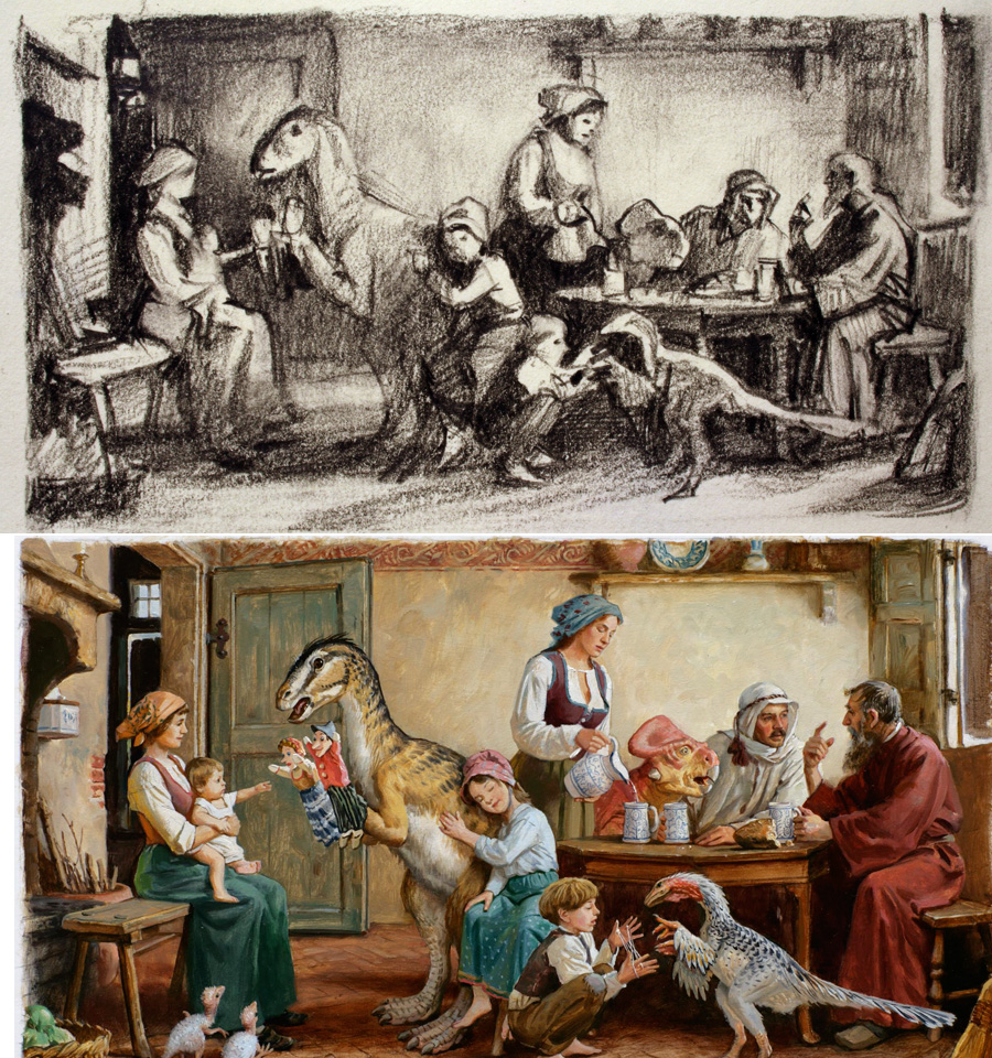
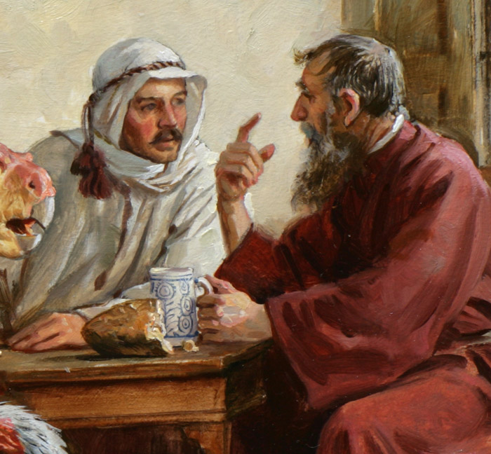


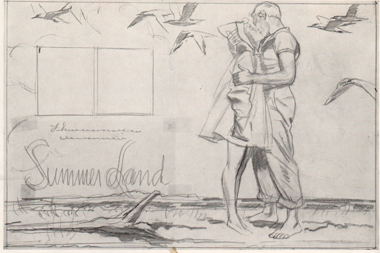
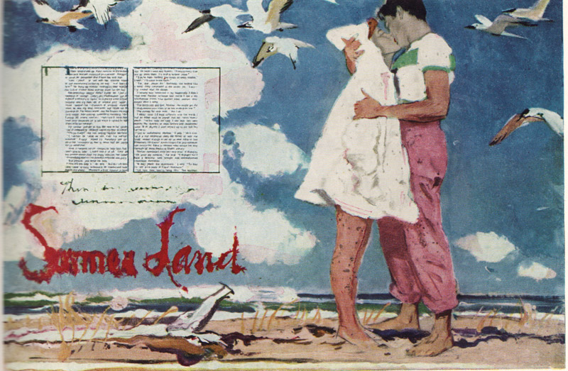

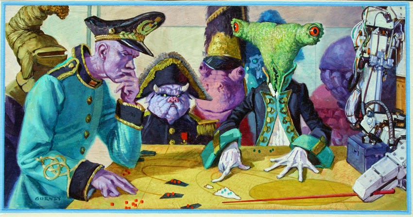
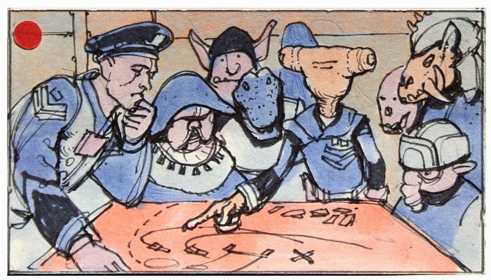
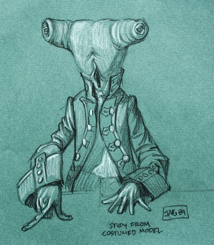
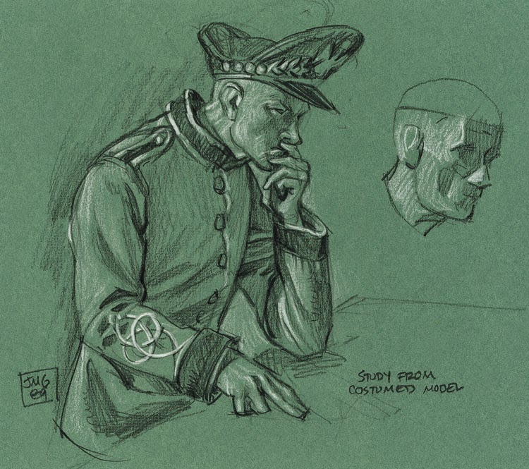


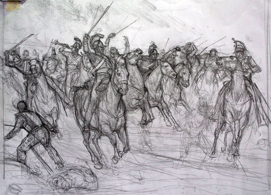


Creepy and cool at the same time about finding the king's remains. Regardless, thank-you for posting about Edwin Austin Abbey. He is at the top of my all-time favorites list. I've never seen these sketches of his process. Thanks!
Many argue that Richard's sinister reputation is more the result of propaganda (and Shakespeare) than reality.
The Richard III society offers a 'different' viewpoint:
http://www.richardiii.net/
Here's a facial reconstruction:
http://www.bbc.co.uk/news/uk-england-leicestershire-21328380
PS another fascinating aspect of the find:
Miss Langley was strolling across the car park used by Leicester social services while researching a play about the king when she felt a chill in August 2009.
'It was a hot summer and I had goosebumps so badly and I was freezing cold. I walked past a particular spot and absolutely knew I was walking on his grave,' she told the Sunday Times.
'I am a rational human being but the feeling I got was the same feeling I have had before when a truth is given to me.'
http://www.dailymail.co.uk/sciencetech/article-2273164/Richard-III-Scientists-reveal-DNA-results-confirm-kings-body-car-park-Leicester.html#axzz2JxOHdWGI
Another gorgeous post: So interesting to follow up the whole meticulous painstaking process leading to the final painting. (Anyone remembers WORK as the biggest buzzword in Artspeak Word Cloud?)
Great rendering of the final scene; astonishing to see it all ending up beneath a parking lot:-(
I know this isn't related to this post, but I made it to the Lyman Allen Art Museum on the very last day - - I am really glad that I did. The paintings are even more amazing in person. If this exhibit moves on to a local near you, make sure you make the trip.
The clincher was the DNA test.
A nice painting but a horrible distortion of Richard. Scoliosis doesn't indicate a huge hump a´la Tudor Propaganda. He was considered a good king a a fine warrior in his lifetime. To sit a horse and swing a battleaxe suggests he wasn't the horrible thing depicted here.
I wish someone would do a big book on Abbeys paintings. As nice as his drawing and pen work was we already have three books about that aspect of his career. He was more famous and successful than Sargent in his lifetime Abbey really deserves a serious book on his major works.