new posts in all blogs
Viewing: Blog Posts Tagged with: Pencil Sketching, Most Recent at Top [Help]
Results 1 - 25 of 133
How to use this Page
You are viewing the most recent posts tagged with the words: Pencil Sketching in the JacketFlap blog reader. What is a tag? Think of a tag as a keyword or category label. Tags can both help you find posts on JacketFlap.com as well as provide an easy way for you to "remember" and classify posts for later recall. Try adding a tag yourself by clicking "Add a tag" below a post's header. Scroll down through the list of Recent Posts in the left column and click on a post title that sounds interesting. You can view all posts from a specific blog by clicking the Blog name in the right column, or you can click a 'More Posts from this Blog' link in any individual post.
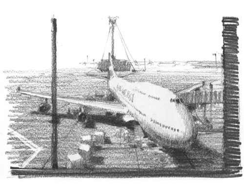
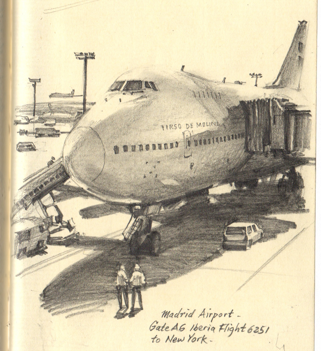
This is a small pencil drawing, only about four by five inches. But I wanted to give it scale, to make the airplane look as big as possible.
What I did was alternate the big shapes (the fuselage and the big shadow shape) with some very small, delicate touches: the windows, poles, railings, and figures. I also left off the contour lines on the top of the airplane's form, letting it blend into the sky.
Scale has nothing to do with the size of the drawing itself. It's all about the contrasts within the drawing.

Here's another sneak peek at the current issue of
International Artist, where I answer your questions about concert sketching.
Gustavo Torqueto asks: “How do you draw someone that is in constant movement?”The amount that musicians move around varies a lot, depending on the style of the performer and the kind of instrument. A few are reliably rock-steady—Irish flutists, for example, especially if they are playing into a microphone. They tend not to budge, so you can settle into a careful drawing.
It’s a good idea to watch any performer for the first few minutes to observe the range of poses they’re likely to take, and to let them settle in. If the subject is going to move a lot, such as this symphonic conductor, I start a series of smaller sketches, each one representing a keyframe or characteristic pose that they cycle back into. I lock a pose in my short term memory by snapping my eyes shut and studying the afterimage.
-----
International Artist magazine issue 107

I enjoy sketching people when they're talking and moving around. This is
Harmon Simmons (1931-2013), a tour guide at the
Vanderbilt Mansion in New York, back in 2001.
He described himself this way: "I'm Irish, Dutch, English, and Indian—Duke's mix. Open the can and I come out."
Doing a sketch of a highly animated person means choosing a characteristic expression and lock that expression in the short term memory as the person moves around.
----

Today marks the 200th anniversary of the birth of the German artist
Adolph Menzel.
Adolph Menzel’s drawing supplies accompanied him everywhere, whether on a short walk or a long journey. He was always prepared to draw. One of his overcoats had eight pockets, each filled with sketchbooks of different sizes. On the lower left side of his coat was an especially large pocket which held a leather case with a big sketchbook, some pencils, a couple of shading stumps, and a gum eraser.
His personal motto was “Nulla dies sine linea” (”Not a day without a line”). He drew ambidextrously, alternating between the left and the right, sometimes on the same drawing. If he was ever caught without drawing paper, he sketched on whatever was available, even a formal invitation to a court ball. Whenever he was spotted at a social event, the whispered word went abroad that “Menzel is lurking about.”
He was known to interrupt an important gathering by pulling out his sketchbook, sharpening his pencil, casting an eye around the room, and focusing on a coat, a chair, or a hand. This sometimes brought the proceedings to a halt until he finished. He preferred to draw people unawares, often catching them in unflattering moments of eating, gossiping, or dozing. Once his friend Carl Johann Arnold awoke from a nap to find the artist busily drawing his portrait. “You just woke up five minutes too early,” Menzel told him.
The above teaser excerpt is taken from an introduction that I wrote for a book on Menzel's
Drawings and Paintings
that will be coming out next year. About that, more later. But for now, There's an
exhibition at the Stiftung Stadtmuseum in Berlin to mark the occasion.
If you do a sketch today, do it in honor of Mr. Menzel. It's always good to have his ghost on your side.
----

I like switching from paint to pencil when I'm sketching on location. It's easy to overlook the fun of pencil and be lured into paint. But pencil, even in its elemental simplicity, lends itself to painterly effects, too.
I'm interested in all the rigging, but I'm also trying to convey the blinding light in the bay. I partially erase the lines that cross those hot reflections in the water, and I add a softening
sfumato or enveloping tone, smudged with my thumb, to the area where the hull meets the water.
----

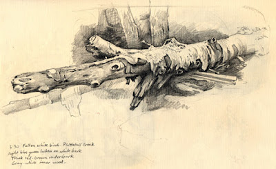 |
| Study of fallen white birch, pencil, James Gurney |
Pencil is the medium of choice when I'm more interested in form than in light or color. In this case, I was fascinated by the way the white paper-like bark peeled off the rotting log. This is a page from a 9x12 sketchbook that is devoted just to nature studies.
I usually use two hardnesses of graphite: HB and 2B and switch between them.

The Finnish National Art Gallery has released online the sketchbooks of Albert Edelfelt (1854-1905).
Since the 104 sketchbooks are in chronological order, you can trace the journey of his mind and see the people he met and the moments he lived.
The books begin in his youth and reflect his early exposure to academic drawing at the Drawing School of the Finnish Art Society. He also studied with
Adolf von Becker and later with
Jean-Léon Gérôme at the Ecole Nationale des Beaux Arts in
Paris (1874-1878).
There are babies newly born and relatives on their death bed, both common subjects of 19th century artists.
Edelfelt had a special gift for painting children. His sketchbooks reflect unselfconscious moments of children's lives, such as musical evenings, and kids at play.
Here's one of his finished paintings of children, for which he is justly revered not only in Finland, but around the world.
Don't miss his copies of Sargent in #19, dissections ub #22, studies at the Prado in #27, and testing out a watercolor set in #100 (above).
-----
Thanks to the
Finnish National Gallery for making these works accessible to the public, and thanks to Finnish illustrator
Ossi Hiekkala (check out his work) for letting me know about it.

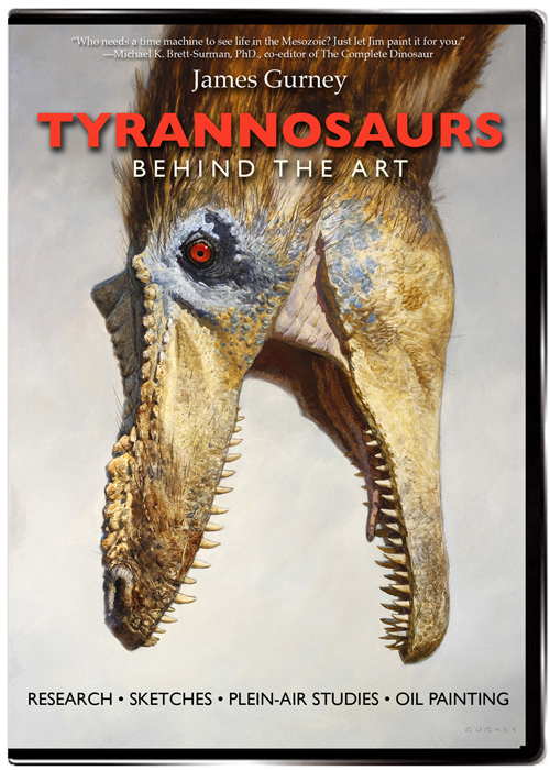
The DVD of "Tyrannosaurs: Behind the Art" is now retail ready.
The DVD version has the 40-minute production about the making of the paintings I did for Scientific American. But it also has a slide show and a special 13-minute bonus feature, where I pose the question: "What can we learn about dinosaurs by sketching a chicken?" The abbreviated YouTube video above gives you a sample of that feature. (Link to YouTube)
The full 13-minute chicken feature on the DVD
also considers:
• Differences between chickens and theropods
• Feathers on dinosaurs in Dinotopia
• Function of feathers in chickens
• What's the purpose of the comb and wattles?
• More chicken sketches
• Feather groupings on a bird's body
• Can we make a dinosaur from chicken DNA? Should we?
• How are bird tails different in ground-loving birds?
The list price of the 53-minute DVD (NTSC, Region 1) is just $24.50. You can
preorder it on Amazon, where it officially releases on June 22. But for the next two weeks only, GurneyJourney readers can order the DVD
direct from the manufacturer at Kunaki for a 10% discount sale price of $22.00.

Here's a pencil sketch from more than 10 years ago, when we had a kitten named Sunlight, and she always loved to curl up in an empty box.

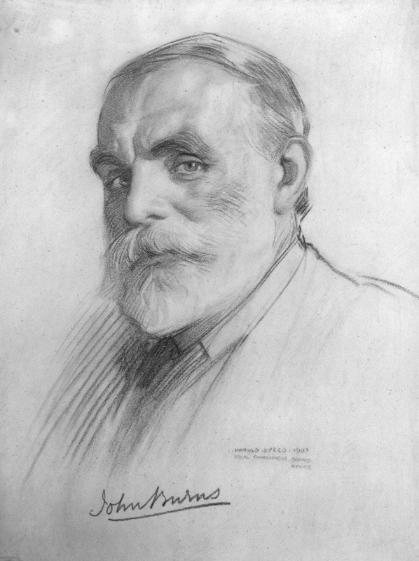 |
| John Elliott Burns by Harold Speed, 1907 |
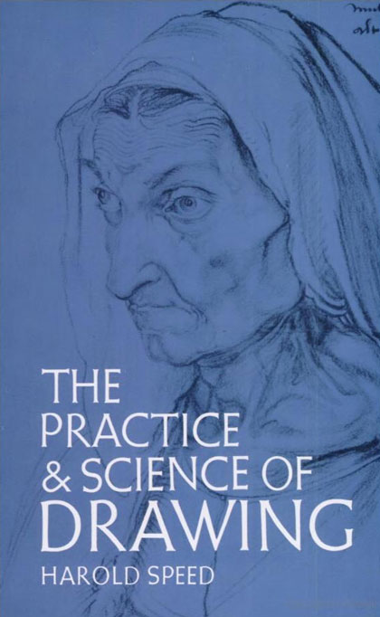
The following numbered paragraphs cite key points in italics, followed by a brief remark of my own. Your thoughts are most welcome in the comment section of this blog. If you would like to respond to a specific point, please precede your comment by the corresponding number.
1. The expression of form upon a plane surface.
Speed's definition of drawing emphasizes form. That is consistent with most academic training. For the purposes of this chapter at least, he is not focusing on other qualities of drawing, such as the ability to capture texture or atmosphere.
2. Apelles
Apelles was a renowned artist of ancient Greece. His actual original paintings and drawings are lost to history (except for supposed copies), but he is known from his reputation in written sources.
More on Wikipedia.
3. Drawing, although the first, is also the last thing the painter usually studies.
Many great artists such as Rembrandt kept drawing central to their practice throughout their lives. Some, such as Adolph Menzel, pursued drawing relentlessly into their old age. For composers like Beethoven and Bach, keyboard or chamber music occupied a similar place.
4. Colour would seem to depend much more on a natural sense and to be less amenable to teaching.
As an author of
a book about color
, I have to disagree with him here. There's a lot to teach about color, especially given what we've learned since Speed's time about visual perception and optics. Even though color can be approached subjectively and personally, the aesthetic aspects of color can be taught. In fact, Speed himself must have changed his mind on this topic, because he includes two excellent chapters on color in his subsequent book on oil painting (
Oil Painting Techniques and Materials
), which we'll study after we get through this one.
5. To express form one must first be moved by it. There is in the appearance of all objects, animate and inanimate, what has been called an emotional significance, a hidden rhythm that is not caught by the accurate, painstaking, but cold artist.
Speed's definition of rhythm recognizes how emotion drives artistic choices. Rhythm therefore is not merely a design principle.

Charles F. A. Voysey by Harold Speed, chalk, 1896 |
6. Selection of the significant and suppression of the non-essential.
These choices, so central to a successful work, usually happen unconsciously, driven by the emotion the artist feels at the outset. The challenge is hanging onto that guiding feeling in the labor of making the picture.
7. Fine things seem only to be seen in flashes.
In my experience, I find this to be true not only of the process of drawing, but in my creative life more generally. In the fields of character development, scriptwriting, and world-building, the deeper inspirations come unexpectedly in torrents, separated by periods of steady craftsmanship.
8. Art thus enables us to experience life at second hand.
Through great art, we see the world in a more meaningful or enhanced way. After a visit to the picture galleries, our senses are heightened. This effect is even stronger to a student who makes a faithful copy of a master painting or drawing.
 9. One is always profoundly impressed by the expression of a sense of bulk, vastness, or mass in form.
Later he talks about lightness. It's always good to think about gravity when drawing. Muscles are always pulling against gravity. Wings struggle to lift a bird through the air against the pull of the earth. Drawing someone off-balance generates interest, but balance and imbalance are factors of gravity.
10. In these school studies feeling need not be considered, but only a cold accuracy....These academic drawings, too, should be as highly finished as hard application can make them, so that the habit of minute visual expression may be acquired.
In the French schools at least, there were different aesthetic criteria applied to studies from the model. Student studies were expected to be as accurate and finished as possible, and more interpretive works, which allowed for much more distortion and interpretation. A lot of schools in recent decades, needing to cover a lot of ground, tend to skip over the exacting practice of these coldly accurate school studies. It is like playing scales for the musician, or knowing the rules of grammar for the writer, as Carol Berning mentioned in the comments last time.
11. Drawing, then, to be worthy of the name, must be more than what is called accurate.
This point was illustrated by Sargent's portrait of Carolus-Duran in a recent blog post. Speed concludes that "Artistic accuracy demands that things be observed by a sentient individual recording the sensations produced in him by the phenomena of life." Art, then, becomes life filtered through a consciousness. This is a very idealistic view of drawing, and it sets up for next week's Chapter 3: "Vision"
-----
The Practice and Science of Drawing is available in various formats:
1.
Inexpensive softcover edition from Dover,2.
Fully illustrated and formatted for Kindle.
3. Free online
Archive.org edition.
4.
Project Gutenberg versionArticles on Harold Speed in the
Studio Magazine The Studio, Volume 15, "The Work of Harold Speed" by A. L. Baldry. (XV. No. 69. — December, 1898.) page 151.
and
The Windsor Magazine, Volume 25, "The Art of Mr. Harold Speed" by Austin Chester, page 335. (thanks, अर्जुन)
------
GJ Book Club Facebook page (Thanks, Keita Hopkinson)
Pinterest (Thanks, Carolyn Kasper)
Original blog post
Announcing the GJ Book Club
In March of 1956, Harvey Dinnerstein and his friend Burton Silverman traveled to Montgomery, Alabama to sketch the civil rights movement that was happening in the African-American community.
 |
| Rev. M.L. King, by Burton Silverman, 1956 |
The two 28-year-old artists were witnesses to the protest events in which Dr. Martin Luther King rose to national prominence.
 |
| Drawings from the Montgomery Protests by Harvey Dinnerstein and Burton Silverman, 1956 |
They produced over 90 drawings directly from life, in bus stations, courtrooms, churches and people's homes.
They were fully aware they were covering pivotal historical events, but they tried to capture universal human emotions, rather than making political statements.
 |
| Drawing by Harvey Dinnerstein |
Silverman says, "We were incredibly moved by black gentleness and humanity. And our drawing skill was put to a rigorous test: to convey the dignity and strength of the blacks and get it all down in the rush of ongoing events. This meant trying to remain 'distant' enough to make an effective piece of art without losing contact with the intense feelings being generated at the moment of creation."
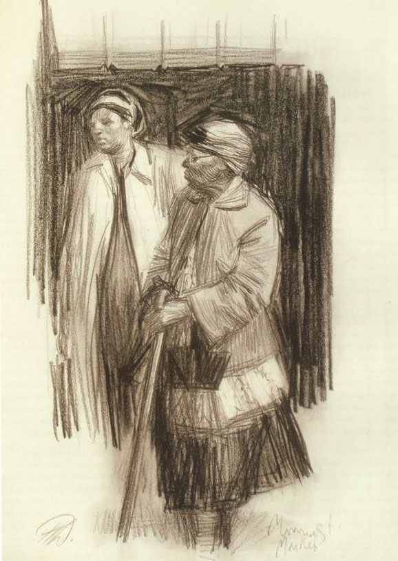 |
| Monroe Street Market by Harvey Dinnerstein |
They acted both as participants and observers. Silverman drew furiously in the midst of the most intense church rallies, while "swaying and chanting to the marvelous Gospel music."
The drawings were published in newspapers, magazines, and print portfolios. Some were given to museums. In 2004 the Delaware Art Museum presented 38 of the drawings in the exhibition "
Glorious Dignity: 45 Drawings of the Montgomery Bus Boycott," followed by a 50th anniversary exhibition at the Montgomery Museum of Art.
------
The quotes are from
Painting People
by Burt Silverman.
Burton Silverman's websiteHarvey Dinnerstein on Wikipedia

At my friend
James Warhola's house in Long Island City, I sketched his Welsh corgi named Maya.
She wondered why I was giving her so much attention, and whether I might feed her a bit of spaghetti or garlic bread.
She only held this pose for about 30 seconds. After she moved on, I tried to remember the initial position. I continued the sketch for about 15 minutes as she moved around the kitchen.

The drawing is in a
Pentalic
watercolor sketchbook. I used
Caran D'ache Supracolor
water-soluble colored pencils, blended with a
Niji
water brush. I always carry a tube of
white gouache
with me, and used it for highlights in the eyes and touch-ups along the muzzle.

My friend David Starrett is the son of Charlie Starrett, the great cowboy actor. A few years ago I sketched David and one of his dad's old holsters.
And that's David's loyal dog Randy, a sweet bear of a dog. Jeanette and I got to take Randy on a walk around the block. Randy passed on last week, so so we send our sympathies to David on the loss of his best friend.

In the 1970's he was taking pictures of things that no one else was. He took a trip across country with the goal of documenting everything: including every meal he ate and every toilet he used.
A formative influence was hanging out at Andy Warhol's Factory. By age 23 he had a show at the Metropolitan Museum.
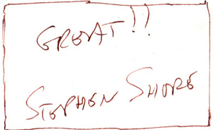
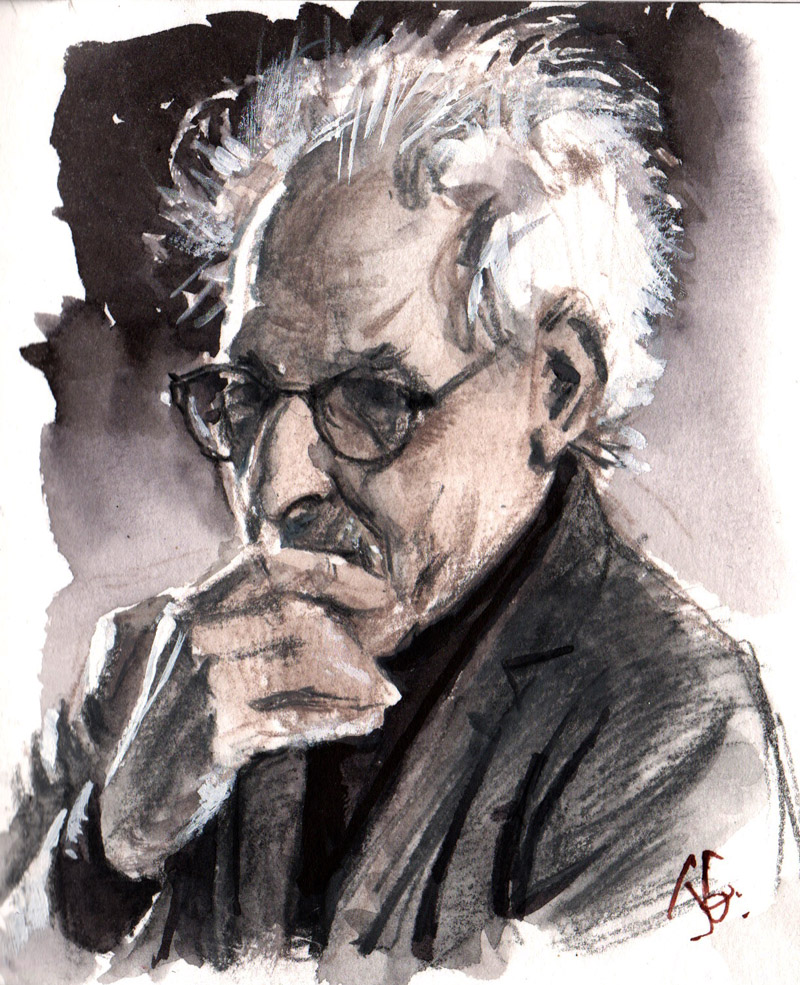 |
| Portrait of Stephen Shore, photographer, drawn from life by James Gurney |
Last night Stephen Shore gave a slide show of his work in Rhinebeck, New York, and I drew his portrait as he spoke. He briefly struck a pose with a hand to his mouth, both pensive and guarded. The lecture gig had somehow slipped his mind, and he drifted in a half hour late after a few nervous phone calls from the bookstore owners.
His wild nimbus of white hair was rim-lit from the fluorescents of the bookstore. The projection screen lit him with soft light from the other side. I chose to portray him in grays, anticipating that he might talk about color vs. black and white.
He said:
"When I started this work, no art photography was in color. Paul Strand told me, 'Higher emotions couldn't be communicated in color.' Mind boggling! What would Kandinsky think of that? I see the world in color. It's what it's like to see. Color gives cultural information. By 1990 almost all art photography was in color. Then in contrariness I started working in black and white."
 |
Stephen Shore, Columbia South Carolina June 1972 |
Shore said, "I was interested in the immediacy that some snapshots have. I wanted to use repeated motifs, to capture some aspects of our culture. I was taking what we would now call screenshots of our field of vision."

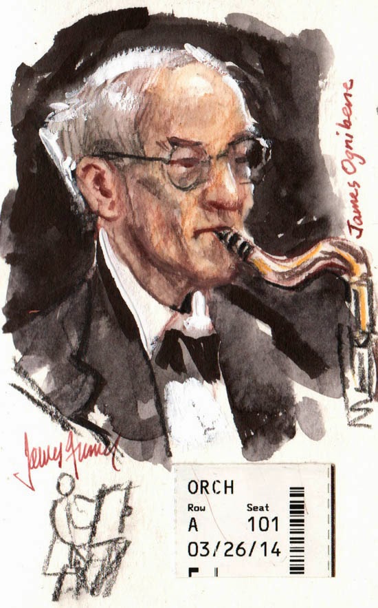
Last night, James Bagwell conducted the Bard College Chamber Singers and the Symphonic Chorus in a performance of G. F. Handel's oratorio Esther.
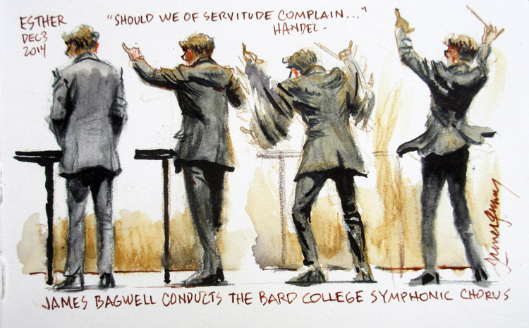 |
| James Bagwell, conductor, Bard College Symphonic Chorus |
Bagwell spent most of the time in a resting position (leftmost pose), as the chorus waited for their parts, between the arias and recitatives, which were directed from the keyboard by Alexander Bonus.
Then he flew into action. As he lifted his arms in precisely measured movements, his fitted jacket reflected the pull of his shoulders. When the chorus declared "Pour our vengeance on our foes," he leapt up in great animation, the tails of his coat lifting up like the flounces of a lady's skirt.
I sketched from the third row, using water-soluble colored pencils and a black and a clear-water brush pen. To record these faster motions I had to blink my eyes shut and try to hold the poses in short-term memory.
---
Previously on GurneyJourney:Maestro BagwellJames Bagwell at a RehearsalPrevious posts on concert sketching:The "Flash-Glance" MethodGouache portrait of an Irish whistle playerSketching a vocal concert Violinist in ink washHorn PlayerMirko ListeningClub Passim GigShapewelding Sketching The Cello and the PencilConcertgoerMass in CHandel's Messiah

Today we'll be fondly remembering Joe Fusillo, one of my uncles on Jeanette's side, who passed away earlier this week. I knew him as a fun-loving, larger-than-life person who organized the kids' games at family parties and he always had everybody laughing.
He was a great builder and restorer, and always had ambitious projects in the works. I did this sketch at a family party a while ago, and I remember that even when his hair was white, his eyebrows were always dramatic and dark.

Every Thursday night in Los Angeles, a group of artists gets together to draw from the model, but this is no ordinary sketch group.
Organized by
Art Center teacher Bob Kato, attendees of
the Drawing Club work from costumed models who are set up with props and set pieces to suggest a specific character. Themes include such classic types as "The Detective," "French Maid," "The Samurai," or "The Rock Star."
The Thursday night sessions are mostly short poses ranging from 5 minutes to a half hour, and they have long poses on Sundays.
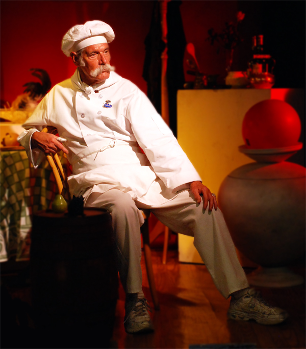
For example, here's Steve Jacobsen modeling as The Chef.
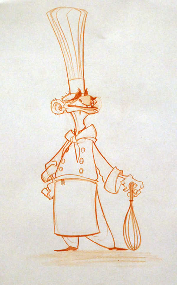
And here's one of the drawings by visual development artist and character designer Brett Bean.
The Drawing Club is not a class; it's more of an open workshop. Anyone who pays the $20.00 entry fee can attend, and the regulars include a lot of master animators and character designers from Walt Disney Feature Animation or DreamWorks Animation who are looking to brush up on their drawing skills. There are also plenty of students, and a spirit of experimentation.
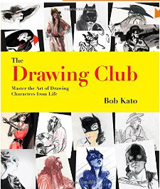
Bob Kato recently released a book of some of the work that has come out of the Drawing Club. The 9x9 inch softcover edition is 144 pages long, and is lavishly illustrated with examples from 66 different artists.
The text by Mr. Kato is full of encouraging tips for going beyond what you're actually observing from the live model. He suggests a variety of media: pencil, markers, brush-and-ink, watercolor, and digital.
Mr. Kato explains how each artist approaches the challenge differently depending on the kind of work they do.
"Story artists like models to do quick, daring poses because they're looking for gestural movement as it relates to storytelling. Their sense of design is heavily invested in the communication of the moment, rather than what media looks best....The character artists, on the other hand, are always looking at the model like a raw ingredient that will be turned into their own version of the character. When the model shows up in costume and starts posing, they look at the shapes made by the costume and character and get to work redesigning...to make the character funnier, scarier, happier, or sadder. They take the pieces apart—a gangster's hat, tie, overcoat, drooping cigarette, and gun—and create their own version."
Book:
The Drawing Club: Master the Art of Drawing Characters from Life
Website:
The Drawing Club

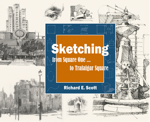
Richard Scott's new book, "Sketching - from Square One to Trafalgar Square " is a comprehensive introduction to drawing from observation.
The book presents practical advice for achieving accuracy, including measuring angles and organizing value shapes. One tip is that you can size up an appropriate cone of vision by holding your arms out at the width of your shoulders in front of you.
Scott includes a variety of excellent examples of sketch techniques, including pen and ink, marker, pencil, and wash drawing, all in black and white.
He discusses not only linear perspective, but also the simplification of a subject into tonal shapes, with fresh ideas that will appeal to painters, too. He acknowledges not only objective features of the scene, but also subjective aspects of visual perception, such as how certain edges go in and out of focus when you squint.
Scott's background is in architectural rendering, so he approaches subjects from the built environment with particular authority.
Although his approach is clear and analytical, it's not just technical. He has an artist's eye throughout. One of the inspiring qualities of the book is the focus on conveying feeling, and the emphasis on digging into why a subject appeals to you in the first place and how to play up that emotional quality.
The book lays out useful methods that anyone can use to see better, think better, and draw better. The result is a practical drawing manual that is a worthy successor of classic sketching books by Betty Edwards and Arthur Guptill, one that will improve the drawing skills of the beginner and master sketcher alike.
-----
Details: 192 pages, 8" x 10" (horizontal format), softcover (with covers that are a bit too thin, unfortunately). The book is organized into three parts, with 10 chapters and 419 illustrations. It is priced at $29.95.-----
Available on Amazon: Sketching - from Square One to Trafalgar Square
Official website: Sketching from Square One
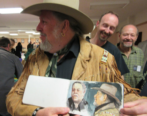
Portrait sketch of Sir John Seerey-Lester, fellow instructor at the SKB Workshop in Dubois, Wyoming.

During this "Watercolor Week," I thought I would share just two of the 5-minute demo segments (Tortoise and Zouave) from the new watercolor video "Watercolor in the Wild." If you have purchased the DVD or download, thanks!—and don't worry: I'll hold back the four remaining longer segments (Miniature Horse, Carriage House, Greenhouse, and Churchyard)—which actually translates to more than 3/4 of the running time that you can see only if you purchase the video.
Sharing these sample clips on the blog gives me a chance to amplify them with closeups, and it gives everyone an opportunity to comment and ask questions so that these blog posts can be more interactive.
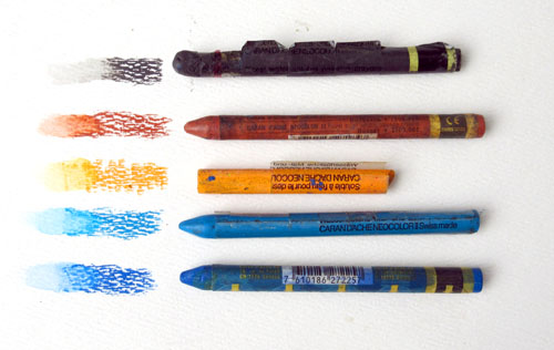
For example, yesterday in the comments after the art supply list, Irene mentioned that you can get woodless watercolor pigment sticks or crayons, something I didn't discuss in the video. Thanks, Irene. As she indicated, Derwent makes Aquatone Woodless Pencils , which are like pencils made of solid pigment, and square pigment sticks called Derwent Inktense Blocks
 . Caran d'Ache
 makes round water-soluble pigment sticks called Neocolor Pastels
 (shown above)
These are shorter than the colored pencils and a bit softer, like crayons. Lyra's have a bit more the feel of wax crayons. But they're all a good value because you get a lot of pigment for the price, and although I didn't use them on this drawing, I do use them occasionally for creating rough textures.

Whether you use the wood pencil or the crayon version of these water-soluble drawing tools, they offer three big advantages over a pure watercolor rendering.
First off, they're a fast way to get texture. I used the colored pencil dry over the first base layer of watercolor.
Secondly, as you can see in the little round scales above, you can add water later to soften or blend the pencil. That's how I made those smooth dots: just a touch of water on each. And I used the water brush to group them together into a shadow, as along the right side of the form.

The third virtue of the colored pencils is that you can draw lines with exactly the color you want. You're not limited to black or brown, as with most pen lines. In the case of the growth rings on the shell, the lines looked gray in the upper areas, and they got darker on the sides. So I switched the color of the pencils as I went down the side of the shell.

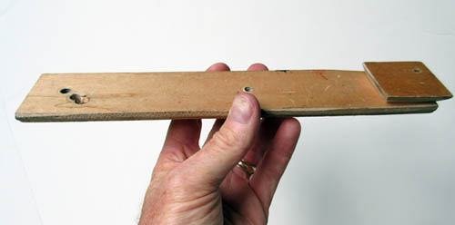
Some of you asked how I shot the video while doing the drawing. For the tortoise segment, I used one video camera and one tripod. I held the camera off to the side with a "camera extension bar" that I made out of 1/4 inch plywood. This holds the camera over my lap without getting in the way too much. I also used this for shooting the miniature horse sequence.
The camera extension bar has a wooden wedge on the side that fits the quick release slot of my tripod.
To learn more about the 72-minute video "Watercolor in the Wild":
HD download: (Credit Card) HD download: (Paypal) buyDVD: (NTSC, Region 1) 
(Link to video excerpt)
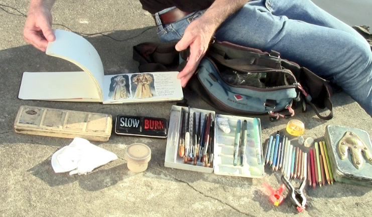
Here's a complete list of materials and a buyer's guide for plein-air watercolor painting.
This is a supplement to my instructional video "Watercolor in the Wild."
I carry these art supplies practically everywhere. The basic elements are pretty simple: a sketchbook, a paint box, a few brushes, watercolor pencils, a rag, and some water. They're all listed in detail below.
Watercolor Sketchbook
• I have often used the
Moleskine Watercolor Album (5 x 8.25 inches) 
I like the fact that it opens flat and I like the horizontal (landscape) format. It has 36 pages—72 if you paint on the facing pages. It has a fake leather hardbound cover, an elastic strap, and a pocket in the back. The paper is 90-pound weight, which is rather lightweight for very wet watercolors, but it's OK if you're doing mostly drawings rather than juicy paintings.
• I also recommend the
Pentalic Aqua Journal (5 x 8 inch), which is priced about the same as the Moleskine but has better paper — 140 lb (300gsm) cold press, acid-free paper. With the heavier paper, it has just 24 pages. But they'll hold up to wet washes or even light impasto, such as with casein. It has generous extras, such as an elastic strap, a back pocket, an elastic brush-holding sleeve, and a placeholder ribbon.
• The
Stillman and Birn Beta Hardbound Sketchbook (5.5 x 8.5 inches)
is a vertical book with 26 pages of cold press 180lb. archival paper. The paper is substantial, but it doesn't open flat easily. It can be held flat with clips. If you're thinking of working in casein, the heavier paper reduces the chance of impastos cracking.
• The
Pentalic Watercolor Field Book (7 x 10 inches)
, is well suited those who prefer a spiral binding. It's bigger, so check to make sure it will fit in your belt pouch or purse.
To decorate the cover, I use the oil-based
One-Shot Sign Painter's Lettering Enamel
, which is very opaque. Paint markers also cover fairly well, but they tend to wear off faster. I usually title the sketchbook with a phrase taken from the first page of the sketchbook.
Watercolor Sets
Quality Metal Pan Sets
Custom Sets Made from Empty PansYou can get exactly the colors you want by buying an empty metal box and filling it with colors that you choose. When the colors run low, you can refill the pans with tube colors.
Large size empty box. In my videos, I'm using an old Talens box from the 1960s. You can get a similar
large empty metal watercolor box, which holds 24 half pan colors or 12 full pans. This box opens up to 9 x 8 x 1 inches. You can combine half pans and full pans in the same box, using full pans for colors you use more often. Sometimes I put in two pans of the same color if I use them a lot.
Small size empty box (left). The
smaller empty metal watercolor box
opens up to about 5 x 8 inches, which fits the left side of a Moleskine or Pentalic sketchbook. This box will hold 12 half pans or six full pans.
Empty half pans. The most economical route is to buy plastic
empty half pans
and fill them with tube colors. The empty pans cost only 34 cents each. For students or anyone on a tight budget, you can get the
12 Tubes of Student Grade Winsor and Newton Watercolor Tubes
for just $30.00. If you have dried up watercolor tubes, don't throw them out; cut them open and scrape out the tar-like pigment to fill empty half pans. Even if they're dried hard you can reactivate them with water once you cut the tube open.
Alternately, you can fill your box with factory-filled pans.
Colors--Here's a basic set of 12 half pans. These are really all you need.
Eight more classic colors if you have room for them.
Economical options
If you're looking for a super-compact pocket rig, or if you're a student, a first-timer, or on a budget, I recommend the
Winsor and Newton pocket watercolor set with 12 colors
, which you can get for around $15.00. This has a plastic box containing
Cadmium Yellow Pale Hue, Ultramarine, Yellow Ochre, Cadmium Yellow Hue, Cobalt Blue Hue, Burnt Sienna, Cadmium Red Pale Hue, Sap Green, Burnt Umber, Alizarin Crimson, Viridian Hue, and Chinese White. That's a pretty good assortment, and the quality of the paint is OK. Note that when it says "hue," they're replacing an expensive pigment with a cheaper pigment of a similar hue.
A lot of field artists and urban sketchers love the
Sakura Koy 12-Color Field Set with Water Brush
, which is under $20. It includes the brush and fits in your pocket. The case is made of plastic, so you can't use magnets on it, but the lid has mixing wells, which helps if you're laying down larger washes. Two cautions: the lid doesn't open all the way flat, and when the colors are wet they can spill over into each other.
There's kind of an arms race for small sets. Some of the smallest watercolor sets are the size of a business card, and easily fit into a pocket. At left is the
Pocket Palette by Expeditionary Art. The metal pans can be filled with tube colors, and they're held in place by a magnetic backing inside the case. The flip-up metal lid has a white surface for mixing colors. The downsides are: 1. The lack of mixing wells to hold wet washes, 2. The reflective metal, which can be blinding on bright days, and 3. The overlapping flange on the left side that covers part of the pans.
At lower right is a 30-year-old Winsor and Newton "Bijou Box," which they no longer make. It has an enameled steel case with 18 colors and a tiny travel brush. The pans are tiny, and I think there are more colors than necessary. I'd rather see 6 or 8 for a box this size. The lid has four mixing wells, which is a big plus. If you can find one of these used for a good price, grab it, but a comparable super-mini set that you can get in USA is the
Winsor and Newton Cotman Water Color Mini, or you can make your own equivalent of the Bijou with an old Altoid tin, some spray enamel paint, and some extra half pans.

Water Cup and Rags
I keep a second jar with clear water handy, and often just a regular drinking water bottle, and I use an old plastic "Tupperware" basin or yogurt cup for a brush cleaning bucket when I'm painting with the tripod easel.
I cut up old cotton T-shirts for paint rags, or use paper restaurant napkins or paper towels.
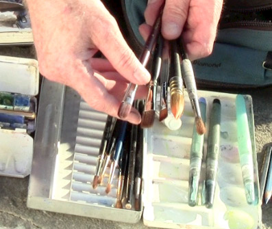
BrushesHere's a good inexpensive starter set of brushes:
Richeson Sable Hair Watercolor Brush Set/5
I like sable flat brushes, such as:
1/2-Inch Sable Brush 3/4-Inch Sable Brush
I also use a
1/4-Inch Synthetic Watercolor Flat Brush
, which work well for architectural detail.
For laying bigger washes and wetting the paper, a
Cat's Tongue Wash Brush is a good tool. It has a flattened ferrule similar to a filbert brush.
Round Kolinsky sables (note: some brands may become discontinued in the U.S. as the
Kolinsky ban exhausts stock on hand):
Winsor and Newton Series 7  Richeson Siberian Kolinsky brushes
 Escoda Optimo KolinskyDa Vinci Maestro Series Kolinsky Red
If you have a very compact kit and can't carry a box of brushes, you might want to use a
Sable Round Travel Brush
, which safely stows the brush tip inside the handle.
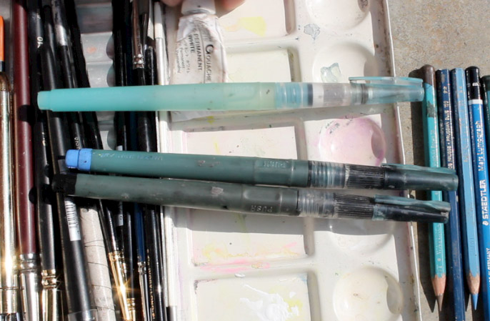
Water BrushesI always try to carry four
Niji Water Brushes with large round tips
. They're the best brand I've found, and stand up to a lot of hard use. For info about filling them with ink, please scroll farther down this post.
I also carry a tube of
white gouache, such as
Holbein Permanent White Gouache.
Winsor and Newton is also good. Sometimes I bring a whole set of
gouache colors to supplement the transparent watercolors, but gouache will be the topic of future posts.
Plastic clampsHere's a
2-Inch Plastic Clamp
and a
3.75-inch Clamp
. Of all the clips and clamps that I've tried, these seem to be the most versatile for holding the book open or clipping the watercolor box to the easel.
Sharpener
I use a
Kum Pencil Sharpener
, which not only catches the shavings, but also has a little flap that covers the hole, so the shavings don't leak out and pollute the pages of the sketchbook.
Eraser
Water-Soluble Colored PencilsThese add a lot of options and variations to traditional watercolors. I recommend trying a few test pencils from several different brands to see which ones you like. My favorite brand is
Caran D'ache Supracolor
, but I also like
Derwent Inktense Pencils
for rich, saturated colors.
I started with a
Caran d'Ache Supracolor Set of 18
. Over the years I have added and subtracted individual colors from the standard set. Below are the colors I take with me most often. It emphasizes warm colors that I like for portraits and animal drawing.
Caran d'Ache Supracolor watercolor pencils
#001 White
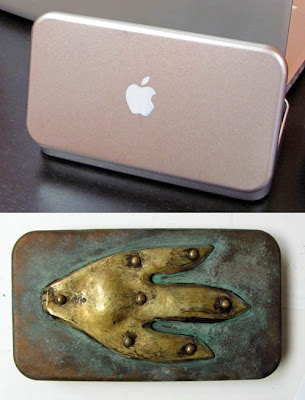 Pencil Box
The pencil box I use was customized by armorer
Tony Swatton. It began as a metal box I bought at a Japanese bookstore called
Kinokuniya in Los Angeles. (I painted the
Apple logo as a gag.)
Tony then added the hammered brass piece with rivets and I aged it with paint.
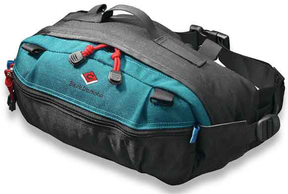
Waist Pack / Fanny Pouch / Belt Bag
[The Explorers] Multi-Purposes Fanny Pack
looks pretty similar. I recommend that you buy the pack at an outdoor store
after you select the contents to make sure everything fits. A quiet zipper and minimal Velcro is a consideration if you plan to sketch in quiet places where you don't want to attract attention.
I use a
Velbon CX-444 Tripod
because it's lightweight, folds small, and reaches up to a reasonable standing height when fully extended.
Three legged stoolA
Tripod Stool
is something I carry in the car or in a backpack when I plan to sit. Sometimes I bring an extra to use as a field taboret for art gear.
Sketchbook Pochade The simplest sketchbook holder is a piece of 1/4 inch or 5/16 inch thick plywood cut to the dimensions of the sketchbook opened up flat. I call it a "sketchbook pochade." I drill a hole in the back of the panel and insert a
1/4-20 Tee Nut
which will attach to the tripod and securely hold the plywood. The sketchbook attaches to the plywood base with rubber bands or plastic clamps.
Homemade EaselI made this device, which I call a Sketchbook Pochade Easel to hold the paint set, the water, and the sketchbook. I also use this for gouache and casein. The diffuser frame attaches to the top, and it uses
White Rip-Stop Nylon Fabric
that I sewed onto an old aluminum Pendaflex file folder frame, a holdover from the dinosaur era.
Here's a clearer shot of the sketchbook pochade. It attaches to the tripod (I use a
Velbon CX-444 Tripod) with a
Tee Nut, and uses a
Southco SC-773 Adjustable Torque Hinge and a furniture slider to hold the parts at the proper angle. The "camera bar" for holding the video camera swings out from the front, held at a constant position by a piece of brass furniture hardware called a
Friction Lid Support.
The palette area is made from the lid from a pencil box, primed and then spray-painted with white enamel, and held on with Velcro. That way it can be removed for cleaning, especially when I use it for casein or gouache.
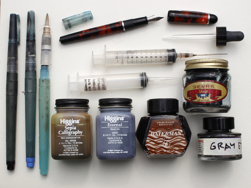
 Refilling Water Brushes and Fountain Pens
Water Brushes I've tried several brands, but none seem as reliable as
Niji Water Brushes. I recommend the ones with
round tips, but you can also get them with
a 12mm Flat Tip
. I normally carry between three and five water brushes. One is filled with water, which fills easily under a normal faucet by unscrewing the handle and squeezing the barrel.
The others are filled with blue, black, brown, and gray. I mix the gray myself, put it in an empty bottle, and mark the bottle. To identify which water brush is which, I paint the back end tips with acrylic (see lower left of photo above).
InkThe ink in a brush pen should be water-soluble so that it doesn't clog the brush fibers. I use
Higgins Eternal Ink
0 Comments on
Watercolor in the Wild Materials as of 8/11/2014 10:58:00 PM
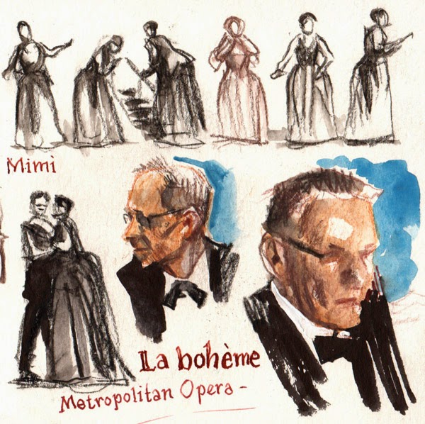
Last night we attended the Metropolitan Opera's performance of Rossini's little-known comic opera Le Comte Ory.

The seats were orchestra center, third row back, a generous gift of a friend who couldn't use them that night. We could see every flick of the eyebrow of the singers.

We arrived a little early and I sketched the patrons chatting. I used a black Caran D'Ache colored pencil in a Moleskine pocket sketchbook
 .
.
Even though the story takes place during the Crusades, Bartlett Sher's production conceives the action as an opera within an opera, set loosely in Rossini's time. Catherine Zuber's eclectic costumes mix medieval headdresses with hip panniers of the eighteenth century.
During the break between acts I sketched people in the lobby. One gentleman reviewed the playbill, his glasses hanging down below his nose, while others sipped champagne. When Liszt conducted the opera, he said it "bubbled like champagne," and distributed bottles of champagne to the audience, a perfect gesture for this effervescent opera.
Adèle was played by 27-year-old South African soprano Pretty Yende, whose
Met debut was last week in this opera. These drawings, all made during the show, are about two inches high. The house lights were so dim that I could barely see what I was doing, so I was working by kinesthetic memory, and concentrating on big shapes.
In the story, the amorous Count Ory, played by Juan Diego Flórez, adopts a variety of disguises to woo ladies whose husbands have gone off crusading. In the second act he and his men gain access to the castle by pretending to be female pilgrims lost in a storm.

On the way home, the subway was jammed as tight as I've ever seen it. Everyone was bundled for the icy wind.
It has been the coldest week in New York in 17 years, but Rossini had us warmed up from the inside out.
-----
Review in New York TimesThe sketchbook was a gift from my pals over at
White Cloud Worlds/
WETA in New Zealand.


.jpg?picon=1009)


I really love how you simplify your shapes, Mr Gurney!
I hope this means we can expect sketches of lambs in about 15 days.
And I, too, learn from how you simplify shapes. My love of detail too often leads me astray...
This comment has been removed by the author.
I'm impressed by the straight lines. Mine are always wobbly, even more when my sketchbook doesn't lie on the table, but in my lap...
oh, and do you make a sketch, then paint in the washes and go over it with pencil again?
Zeitwolf, the lines are freehanded, and for the perspective, I laid down some light perspective guidelines at the outset to establish the slopes of the shelves and the stove. And yes, in this case I used regular graphite pencil and did the pencil work first and added the washes after.
Steve, this is not the main farm we go to but another one about an hour away (where we did the fleece skirting). We hope to get up there to see and sketch the lambs. They are So Cute!
Thanks, Zishen. It's all geometry. I love to sketch in kitchens, and this one was a gracious old historic one that has hosted many warm gatherings of friends and families. That's what I wanted to capture--the smell of the potatoes in the frying pan.
Another great drawing/painting. Are the different values created with repeated layering of the washes or with different concentrations of the value?
Jim, I think I used two washes: one really light one at left and another a bit darker. I watered down one premixed gray for the light tone. As I recall I packed a little plastic analog film cannister with a wash tone--that was before I discovered brush pens.
Hi Jim,
I'm just curious of your process. You are using regular graphite, correct? Not water soluble graphite? So you are putting your washes in with those brush pens? Do you actually use ink or just water? Would you mind explaining a bit further? If you sold a book or DVD on your sketching methods I would be the first in line.
Thanks, Melissa. This one was used a couple of regular graphite pencils and some premixed diluted watercolor in a little canister applied with a watercolor brush. This was how I sometimes worked before I started using the watercolor pencils and brush pens. It would be fun to do some videos. I want to work on releasing some videos, but have to finish a couple of other projects first.
I think I can almost smell the onions w dem 'taters, and if I'm not mistakin'... I swar Ah kin smell bacon!-RQ
truyen sex