new posts in all blogs
Viewing: Blog Posts Tagged with: stock photos, Most Recent at Top [Help]
Results 1 - 18 of 18
How to use this Page
You are viewing the most recent posts tagged with the words: stock photos in the JacketFlap blog reader. What is a tag? Think of a tag as a keyword or category label. Tags can both help you find posts on JacketFlap.com as well as provide an easy way for you to "remember" and classify posts for later recall. Try adding a tag yourself by clicking "Add a tag" below a post's header. Scroll down through the list of Recent Posts in the left column and click on a post title that sounds interesting. You can view all posts from a specific blog by clicking the Blog name in the right column, or you can click a 'More Posts from this Blog' link in any individual post.
Great faces below. It’s fun to see these all together…
This round (there’s more to come- next, the illustrated covers) is the photographed faces of 2010 books that have “African American” as an LOC subject (with 1 exception: Between Sisters takes place in Ghana). They are: Teenie by Christopher Grant (Knopf), Sell-Out by Ebony Joy Wilkins (Scholastic), Between Sisters by Adwoa Badoe (Groundwood), Something Like Hope by Shawn Goodman (Delacorte), Maxine Banks is Getting Married by Lori Aurelia Williams, (Roaring Brook), Good Fortune by Noni Carter (Simon & Schuster), A Girl Named Mister by Nikki Grimes (Zondervan), Sweet, Hereafter by Angela Johnson (Simon & Schuster), Secret Saturdays by Torrey Maldonado (G.P. Putnam’s), Can’t Hold Me Down by Lyah B. LeFlore (Simon Pulse), We Could Be Brothers by Derrick Barnes (Scholastic), Enjoying True Peace by Stephanie Perry Moore (Moody), Split Ends by Jacquelin Thomas (Simon & Schuster), Caught Up in the Drama and Drama Queens by ReShonda Tate Billingsley (Simon & Schuster).<
Still looking at ’90s covers (more specifically, 1997 covers), I came across this title by Margaret Peterson Haddix. I read this pre-Among the Hidden title, Leaving Fishers, when it was first released. I have no vivid memory of the book, however the original cover (left) fits with my emotional memory of the story of a young woman feeling alienated, swept up by people who seem sympathetic (a cult).
The first cover makes sense, and draws me in. The girl on the cover looks unhappy. You can tell she is feeling like an outsider. The only iffy thing here is audience. This cover seems pitched a little young.
The 1999 paperback cover (middle) … what does it say?

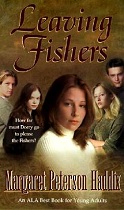

You can tell we’re moving into the photography era here, even though this cover was in the earlier days of all-photography all-the-time. Do you get a sense of the alienation here? Yeah right. She looks like she’s part of the brat pack. The cover is disingenuous and would, I think, draw in kids just to trick them about the content of the book.
The newer cover (2004) is certainly of our era. It says nothing. A girl with her eyes covered… she’s blind? (okay, figuratively – a little). Is there really a clue at all about the book’s content? Should there be?
The thing about illustration is that emotions can be brought into the final work so much more effectively. I think that’s a very difficult thing to do with patching stock photographs together – difficult, but no, not undoable…
Leaving Fishers (Simon & Schuster 1997): After joining her new friends in the religious group called Fishers of Men, Dorry finds herself immersed in a cult from which she must struggle to extricate herself. Ages 12+. Reviews 1, 2, 3.


 8 Comments on Defining Fishers, last added: 7/29/2010
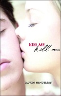
Many have commented on the “face cover.” Recently I’ve noticed some covers where one face is just not enough. Two faces – or more precisely, parts of two faces – are squeezed into the confines of a book jacket. It means that the two faces must be very close together. Most here seem to be moments of intimacy – Kiss Me Kill Me by Lauren Henderson (Delacorte 2008), Going Too Far by Jennifer Echols (MTV Books 2009), Tell Me a Secret by Holly Cupala (HarperTeen 2010), Heartbreak River (2009) and Winter Longing (2010) by Tricia Mills (Razorbill).
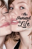
In my circles of friends and family, we’ve had several discussions about the kinds of photos that teens like to post on their Facebook pages. They are often like the pictures I see here – particularly on My Invented Life by Lauren Bjorkman (Henry Holt 2009). There is a physical closeness in photos that people of this generation are snapping, that people of my generation might have felt uncomfortable with.
So I wonder how these book covers fare with their target audience. I’m guessing they work well with the teen female audience.




Faces
Kiss Me Kill Me: Longing to be part of the in-crowd at her exclusive London school, orphaned, sixteen-year-old Scarlett, a trained gymnast, eagerly accepts an invitation to a party whose disastrous outcome changes her life forever. Ages 12+. Reviews
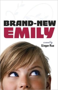
These days by the time I see a double dip (or some call them lookalikes) it’s on someone’s else’s book cover blog. But here’s one I haven’t seen spotted. What amazes me about these is how similar the cropping can be. I mean… does this photo model have a really weird mouth or something?
And so often, the chosen background color is the same, too.
Brand-New Emily (by Ginger Rue, Tricycle 2010, c2009) is more tan than TMI (by Sarah Quigley, Dutton 2009). Hair and eye-color has been changed. I always wonder how hard it is to do that. Which one of these pictures is closer to the real girl?

TMI: Fifteen-year-old Becca has the habit of revealing too much personal information about herself and her friends, but when her boyfriend breaks up with her and she vows to stop “oversharing,” she does not realize that her blog postings are not nearly as anonymous as she thought. Ages 11+. Reviews 1, 2, 3, 4, 5.
Brand-New Emily: Tired of being picked on by a trio of popular girls, fourteen-year-old poet Emily hires a major public relations firm to change her image and soon finds herself “re-branded” as Em, one of the most important teens not only in her middle school, but in celebrity magazines, as well. Ages 12+. Reviews 1, 2, 3, 4.


On the left, the hardback cover of Prism by Faye Kellerman and Aliza Kellerman (Harper 2009). On the right, the paperback cover to be released in June. This is another one of those cover changes that make me wish I could have been a fly on the wall of the room this was discussed in… While the overall look from a distance is pretty much the same, let’s look at the changes. The authors’ names shrunk. The title font changed and moved. And there’s this girl’s face looking over the horizon like a rising moon.
What’s strange, is that I prefer the paperback better. I don’t understand why, because I rarely lean toward face covers. Especially partial faces.
Don’t get me wrong - this won’t make my best of the year list – it’s still too busy for my taste. But I think more readers will be drawn to the paperback. The text change makes a big difference, both the change of font, and the shrinking authors. Maybe the names didn’t draw the teen audience like they might have drawn adult fans.


Prism: California high school students Kaida, Zeke, and Joy fall into a parallel universe in which all resembles their normal lives except that there is no medicine nor health care, which could mean big trouble for Joy, whose arm was injured in the accident that started their troubles. Ages 12+. Review 1, 2, 3.


When I was three years old, my dad took me trick-or-treating for the first time. I loved candy. Even so (the story goes), when I got home I dumped all my candy on the rug and separated it into piles, like with like. I couldn’t eat it until it was all sorted out.
This may have been the first hint that I would ultimately end up being a librarian. I loved categorizing and sorting things. Couldn’t play with them (or eat them) until they were in their proper order.
I’m guessing this is the same compulsion that pushes me to categorize book covers. The brain is a mysterious organ.
So I present you with another set – another mini-trend. It is a sly way to do the partial face thing – make the face unrecognizable by hiding a part of it behind a book (or a notebook, or a letter). The books: Sucks To Be Me by Kimberly Pauley (Wizards of the Coast 2008), The Rule of Won by Stefan Petrucha (Walker 2008), Does This Book Make Me Look Fat? edited by Marissa Walsh (Clarion 2008), and You’ve Got Blackmail by Rachel Wright (Putnam 2009).


I rarely see a book review blogger comment much on the cover, but a 20-something reviewer of Rule of Won had this to say: “I’ve always made a concerted effort to not judge books based on their jacket art, but I’m ashamed to admit that the cover of The Rule of Won is so uninspiring that I just couldn’t help it.” This reviewer was turned off by the brown-ness of the cover but is “happy to report that the contents of the novel are more appealing than falling in a puddle of sloshy mud.” (My advice to the reviewer: No need to be ashamed. Everyone does it…).
 For so
Here’s an interesting hardcover-to-paperback switch. At first glance, what do you see? Telescoping, yes… but what else?


Yeah, somebody didn’t like it that Ivy (by Julie Hearn – Atheneum 2008) was naked. Don’t worry – she’s covered now!
 Here’s the UK cover.
Ivy: In mid-nineteenth-century London, young, mistreated, and destitute Ivy, whose main asset is her beautiful red hair, comes to the attention of an aspiring painter of the pre-Raphaelite school of artists who, with the connivance of Ivy’s unsavory family, is determined to make her his model and muse. Ages 12+. Reviews 1, 2, 3, 4, 5.


Take a look at this amazing set of double dips, sent to me by Kerry from New Zealand (Thanks, Kerry!), a reader of this blog. The photographer who took this photo has apparently captured an iconic war image. What’s funny about the use of this image here, is that they look like World War I or II boots, and two of these books cover more recent wars. All except the Morpurgo book are published by the adult market. At least two of the three are recommended for teens.
x
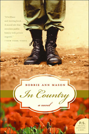

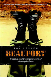
The cover of War: Stories of Conflict edited by Michael Morpurgo (from UK, apparently not in the US, Macmillan 2005) is a pretty straightforward use of the image. In Country by Bobbie Ann Mason (HarperCollins 2005, c1985), incidentally popular required reading for high school students, is a clear use of the Rule of Three. Hiroshima Joe by Martin Booth (Macmillan: Picador 2003, c1985) changes up the color of the photo by monochromizing it. And Beaufort by Ron Leshem (Delacorte 2008) intensifies the contrast and completely turns it upside-down. All except Hiroshima Joe, stay fairly true to the (probably) original colors in the photo.
Two of these are under the Macmillan umbrella, though one from the adult and one from the children’s market. And one available in the UK, but not in the US. So here’s the question. Is the use of an image tracked at least within a publisher and it’s houses? If so, are there rules of use?
War: Explores many aspects of war, featuring conflicts from the Crusades to 1970’s Beirut and the Falklands. (South Lanarkshire Council). Age: Teens. Reviews 1.
In Country: Vietnam War. Adult book, recommended for YAs by SLJ. Reviews 1, 2,. Censorship Attempt: Book Controversy at Delphi High (defeated).
Hiroshima Joe: World War II. Adult.
Beaufort: Set in Lebanon in 1999. Adult book, recommended for mature YAs by Booklist. Reviews 1, 2.


I noticed a run of new face covers where the eyes are blocked out with a graphic (a strip of paper, the illusion of a torn out section, a color block) which contains the title of the book. I’d collected three and I was watching, waiting to see if another one would come up.
This morning I read Elizabeth Bird’s Fuse #8 post pointing out the new covers for Julie Anne Peters Snob Squad books. I clicked on her link to Peters’ MySpace page and found a fourth. You may have noticed I like to have a nice block of four for my posts ;-)
This one’s a little older – King of the Lost and Found by John Lekich (Raincoast 2007). But the remaining three book jackets are new Band Geeked Out by Josie Bloss (Flux 2009), Looking for JJ by Anne Cassidy (Harcourt 2009, c2007) and A Snitch in the Snob Squad by Julie Anne Peters (Little Brown 2010, c2001)


When you consider how many ways a close up photo can be manipulated to give a particular impression, this is surely one you’d think of. And when you look at the other new Snob Squad covers, you see two more to watch for: Speak no evil and…. smell no evil?
King of the Lost and Found: Ages 12+. Reviews 1, 2, 3.
Band Geeked Out: As her senior year of high school nears the end, marching band member Ellie finds herself doubting her plans for the future when she meets a fascinating and sophisticated girl while taking a tour of a college out of state. Ages 12+. Reviews 1.
Looking for JJ: Seventeen-year-old Alice, released from prison with a new identity after serving six years for murdering a child, tries to keep her anonymity from the British tabloids, while haunted by memories of her past trauma. Ages 12+. Reviews 1, 2, 3, 4, 5.
Snitch in the Snob Squad: Twelve-year-old Jenny and the other members of the Snob Squad suspect that one of them, or someone close to them, is behind the thefts at their school. Ages 8-12.


Nothing new here. Along with scores of other bloggers, I have posted plenty about multiple uses of the same stock photo. But I do enjoy seeing covers like this all together on a page.
The Eyes of Van Gogh by Cathryn Clinton (Candlewick 2007) and The Book of Jude by Kimberley Heuston (Front Street 2008) are teen books, but The Triple Bind: Saving Our Teenage Girls from Today’s Pressures by Stephen Hinshaw with Rachel Kranz (Ballantine Books 2009) is a parenting book. I included a parenting book in another similar post - so that makes me wonder if parenting books are more likely to use the same photos as books for the teens they address.


It is interesting to note that both of the fiction titles turn up in booklists on mental illness. The model does not look to me like the poster child for mental illness (maybe that’s the point?). I wonder how she feels about her face turning up on so many book covers. And does she get paid each time it happens? (I’m guessing not).
Eyes of Van Gogh: After many moves with her peripatetic mother, seventeen-year-old Jude begins to believe that she has finally found a home, friends, and some purpose in life when the grandmother she never knew has a stroke and she and her mother come to live in the same town to be near her. Age 14+. Reviews 1, 2, 3.
Book of Jude: In 1989, when fifteen-year-old Jude’s mother wins a Fulbright fellowship to study art in Czechoslovakia, the family postpones a planned move to Utah to join her, but the political situation and the move itself are too much for Jude, who is overwhelmed by a previously undiagnosed psychological disorder. Age 14+. Reviews 1, 2, 3.
Triple Bind: Parenting Book. Reviews 1, 2, 3, 4,


This week on the YALSA-BK list, Liza Gilbert, Head of Youth Services* at a library in a Chicago area suburb in Wisconsin posted the results of an informal survey. She has a teen group that meets once a week to talk about books nominated for YALSA’s Best Books for Young Adults. At a recent meeting she informally surveyed members about the covers of about 24 nominated books. She asked for a “3-second” response - yes or no.
The results were interesting. There were about eight kids, so not enough for anything conclusive. But this little group made the case for something I’ve thought as long as I’ve been doing this blog.
The first three books here, The Fetch by Laura Whitcomb (Houghton 2009), Fade by Lisa McMann (Simon Pulse 2009), Bones of Faerie by Janni Lee Simner (Random House 2009) were the top vote-getters. Eight of eight voted yes on The Fetch. I haven’t seen the actual cover, but someone said “I like the shininess,” so I’m guessing there’s some foil, probably well done (foil can be overdone).
The other two had seven yes votes and a no. The comparisons between them are pretty obvious. Each has a real focal object, and a mysterious atmospheric quality. Mostly good type treatment, especially with Fade. Good hooks.


The second set here are some of the less-favored covers. This Full House by Virginia Euwer Wolff (Bowen Press 2009), Sister Wife by Shelley Hrdlitschka (Orca 2008), and Belle by Cameron Dokey (Simon Pulse 2008) each received five no votes and one yes vote (for some reason only six were voting here). “Boring” was a favorite descriptor.


It’s kind of surprising - because I’ve always loved the Once Upon a Time covers, and I was very intrigued by Sister Wife. I wasn’t real fond of the colors and mirroring on This Full House, but I thought kids would like it.
It begs my question. Are teens really attracted to what another poster on YALSA-BK called “torso books“? If these kids are representative, then I would say some market research needs to be done with the target audience. They are tired of this common cover choice.
I still wonder: Do they like it better when there’s a face? Does it work to have huge numbers of books come out every year with stock photos of girls on them?
Of all the books on the list, only two with humans on them appealed to this group - Evermore (compared to Twilight) and Larry and the Meaning of Life. Each had five yes votes and three nos. And they didn’t like really plain books. 3 Willows had six no votes and two yes. Big surprise - NOT. It’s the most puzzling cover choice I’ve seen yet this year. The publisher really is counting on the Brashares name to sell this one. Same goes for the other very plain jacket - Forever Princess - with five no votes and three yes. Counting on Cabot.
*This is posted with Liza’s permission.
Fetch: After 350 years as a Fetch, or death escort, Calder breaks his vows and enters the body of Rasputin, whose spirit causes rebellion in the Land of Lost Souls while Calder struggles to convey Ana and Alexis, orphaned in the Russian Revolution, to Heaven. Age 12+. Reviews: 1, 2.
Fade: Using her ability to tap into other people’s dreams, eighteen-year-old Janie investigates an alleged sex ring at her high school that involves teachers using the date rape drug on students. Ages 14+. Reviews: 1, 2, 3.
Bones of Faerie: Fifteen-year-old Liza travels through war-ravaged territory in a struggle to bridge the faerie and human worlds and to bring back her mother while learning of her own powers and that magic can be controlled. Age. Reviews: 1, 2, 3.
This Full House: High-school-senior LaVaughn’s perceptions and expectations of her life begin to change as she learns about the many unexpected connections between the people she loves best. Ages 14+. Reviews: 1, 2.
Sister Wife: Ages 12+. Reviews: 1.
Belle: Ages 12+. Reviews: 1..


It’s always interesting how the same basic image can be used for books with totally different plots. Here Reincarnation by Suzanne Weyn (Scholastic, 2008) is fantasy - a romance with a prehistoric beginning. Crush by Carrie Mac (Orca, 2006) deals with issues around sexual orientation (the two about to kiss are both girls). Kiss Me Kill Me by Lauren Henderson (Delacorte, 2008) is a murder mystery, and A Bad Boy Can Be Good for a Girl by Tanya Lee Stone (Wendy Lamb, 2006) is realistic fiction (the title’s a very short plot summary?).
All eyes are closed - except the guy on A Bad Boy. Fitting, probably, when you read the plot summary. I like the halo effect outlining the two faces on Reincarnation, and it helps give the impression of fantasy. Lots of light on Crush makes me think these girls may have their first kiss in the spotlight. Perhaps that fits?


And then there’s Torched by April Henry (Putnam’s) coming out in March of 2009, which combines the kiss with fire.


I would think that the pre- (or post?) kiss image would draw teen girls. How does it do with boys?
UPDATE: Come in from the Cold by Marsha Qualey (Houghton Mifflin 1994 - this paperback edition Graphia 2008) - thanks to Laurie (comments).
Reincarnation: When a young couple dies in prehistoric times, their love–and link to various green stones–endures through the ages as they are reborn into new bodies and somehow find a way to connect.
Kiss Me Kill Me: Longing to be part of the in-crowd at her exclusive London school, orphaned, sixteen-year-old Scarlett, a trained gymnast, eagerly accepts an invitation to a party whose disastrous outcome changes her life forever.
Crush: During a summer in New York, Hope falls in love with another girl and must decide whether she is gay.
Bad Boy: Josie, Nicolette, and Aviva all get mixed up with a senior boy who can talk them into doing almost anything he wants. In a blur of high school hormones and personal doubt, each girl struggles with how much to give up and what ultimately to keep for herself.
Torched: In order to save her parents from going to jail for possession of marijuana, sixteen-year-old Ellie must help the FBI uncover the intentions of a radical environmental group by going undercover.


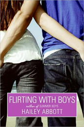
A real mishmash of topics is covered in this set of four books. The choice of background color is interesting. It would seem that if you choose a stock photo of a girl in denim, sticking a thumb in a pocket (or pulling the pocket inside out), the background color has to be blue. Even a similar shade of blue…
The cropping is similar as well. Segmenting people like this, cropping between the waist and knees, and vertically is so popular that it makes me wonder what it is about it that people find appealing (if they do). The Complete Guide to Personal Finance: For Teenagers by Holly Jill Schubert (Atlantic Pub 2008), Gotcha! by Shelley Hrdlitschka (Orca 2008), and Klepto by Jenny Pollack (Speak 2008, 2006) are books for teens. But So Sexy So Soon by Diane E. Levin and Jean Kilbourne (Ballantine Books 2008), using the same stock photo as Klepto, is a parenting title.


Gotcha!: A bead game spins out of control.
Klepto: In 1981, fourteen-year-old Julie, a drama major at the High School of Performing Arts in New York City, becomes best friends with an attractive new girl who introduces Julie to the exciting but dangerous world of shoplifting.


Several new books with feathers on the covers: Feathered by Laura Kasischke (HarperTeen 2008 ) has that lacy overlay thing going on and the feather looks like some kind of inkblot. From the publisher’s description, I can’t see the connection - beach, Mayan ruins, Mayan sacrifice, high school girls. Hmmm. I don’t get that from this. Not sure I like the shape of the feather either, but the overall look is interesting.
Real feathers have such an amazingly beautiful look. Feathers float down to the beach from a gray sky on The Ghost’s Child by Sonya Hartnett (Candlewick 2008, c2007 - the Australian cover is so different, it’s hard to imagine it’s the same book). Nice images - and here’s the beach not present on Feathered. With a spirit named Feather in it, this cover looks like it might be a fitting ad for the plot.


I’d like to see the real jacket on Impossible Things by Robin Stevenson (Orca 2008 ). Any cover scan I could locate online seemed flourescent, without much contrast or detail. The plot seems to include a bit on telekinesis, and I suppose a feather is a good representation. Any of us can move a feather with our minds, right? (And a little breath of air).
My favorite here, the only one of these titles published last year, is Feathers by Jacqueline Woodson (Putnam’s 2007). The colors are nicely chosen. I like the bright yellow feather against the blue blue and the stark white. Warm and cool. A feather falling in the midst of a snowfall is an intriguing image - though I’m not sure what it means. It seems fitting for a book by Woodson though. Her words are always so beautifully crafted - though I have not yet read this one.
Feathered: While on Spring Break in Cancun, Mexico, high-school seniors and best friends Anne and Michelle accept the wrong ride and Michelle is lost–seemingly forever. Ages 14+. Jacket design by Joel Tippie, jacket photograph Andy Whale/Getty Images.
The Ghost’s Child: Ages 14+.
Impossible Things: Ages 9-13.
Feathers: Feathers: When a new, white student nicknamed “The Jesus Boy” joins her sixth grade class in the winter of 1971, Frannie’s growing friendship with him makes her start to see some things in a new light. Ages 9-12. Cover design by Linda McCarthy, snow photo by Getty Images, feather photo by Veer Images.


 For so


 Here’s the UK cover.





I love love love the cover of MAXINE BANKS IS GETTING MARRIED. The bling on her finger and her big grin immediately caught my eye and made me want to pick up the book!!